
Loading...
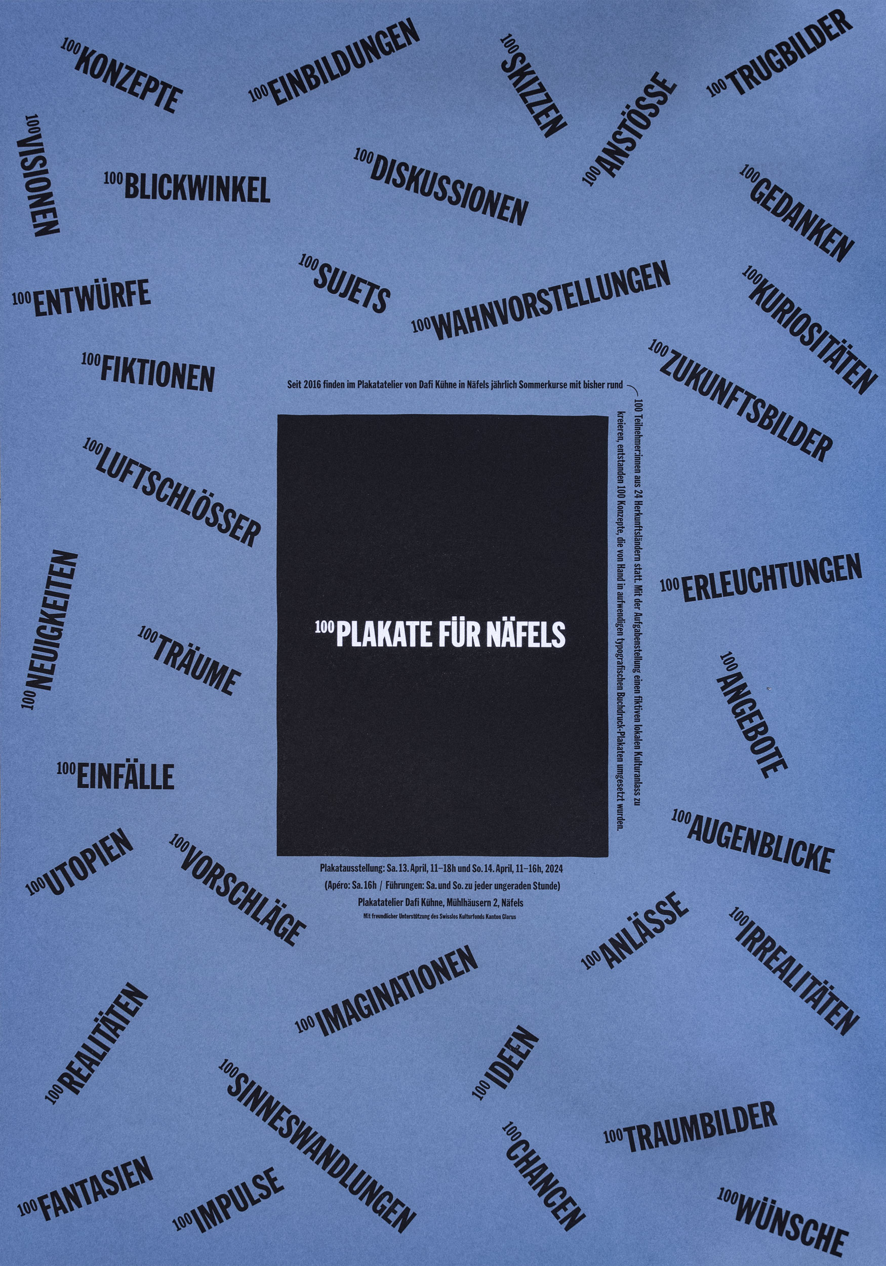

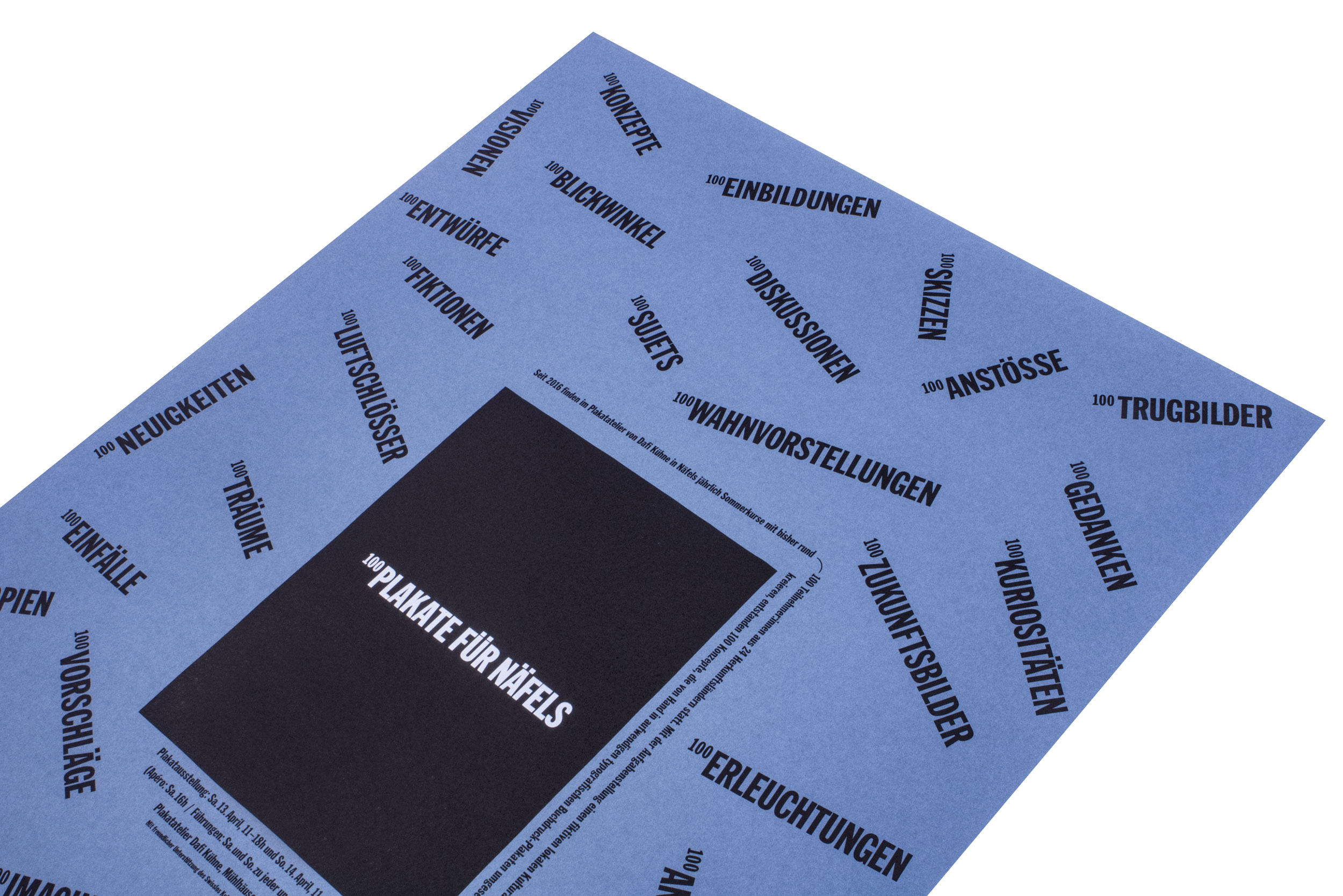
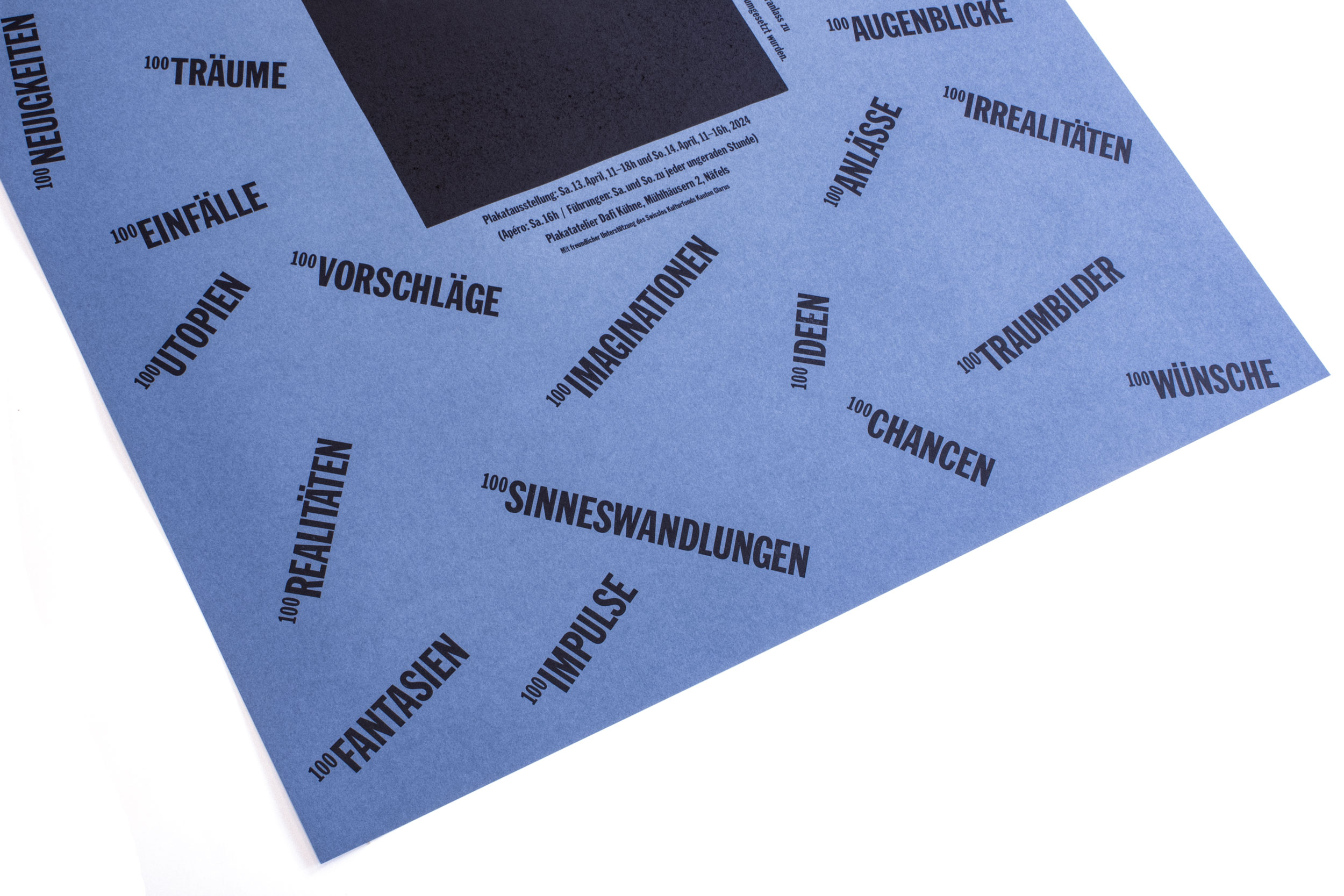
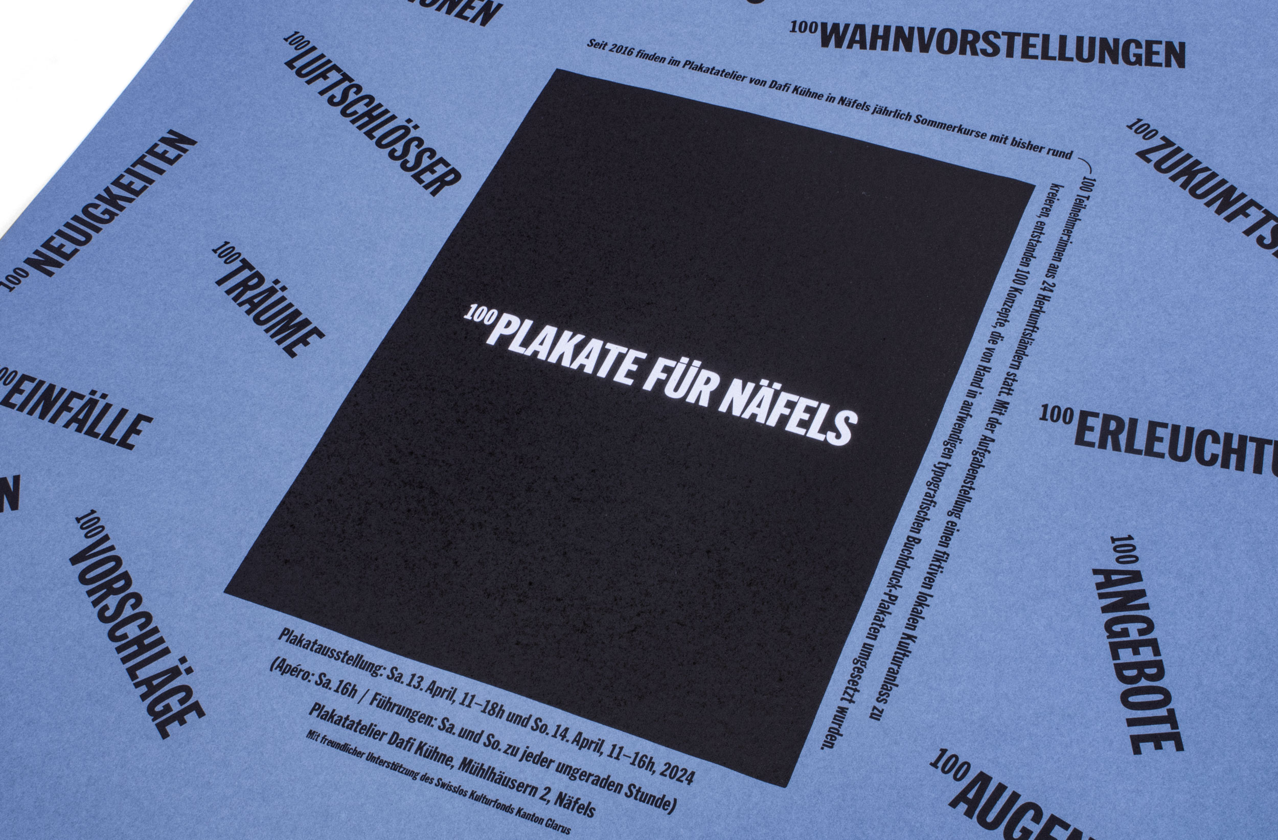
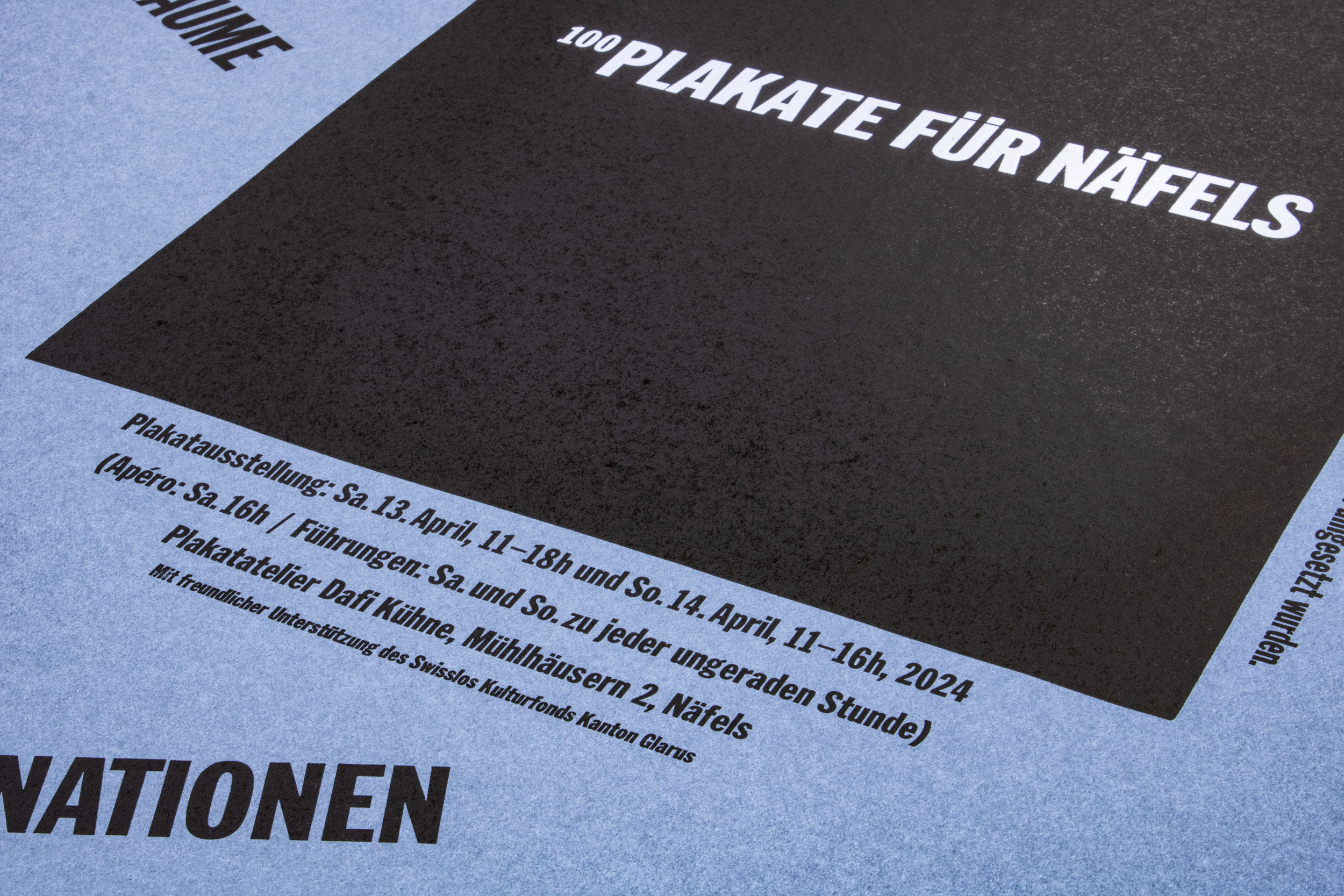
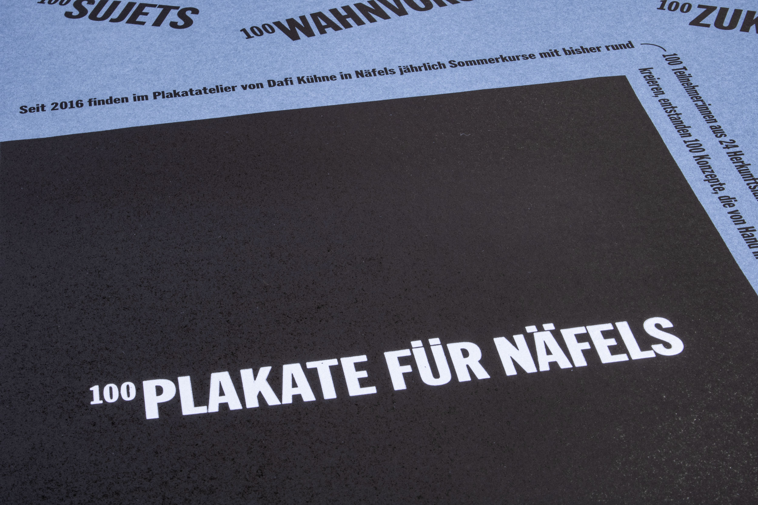
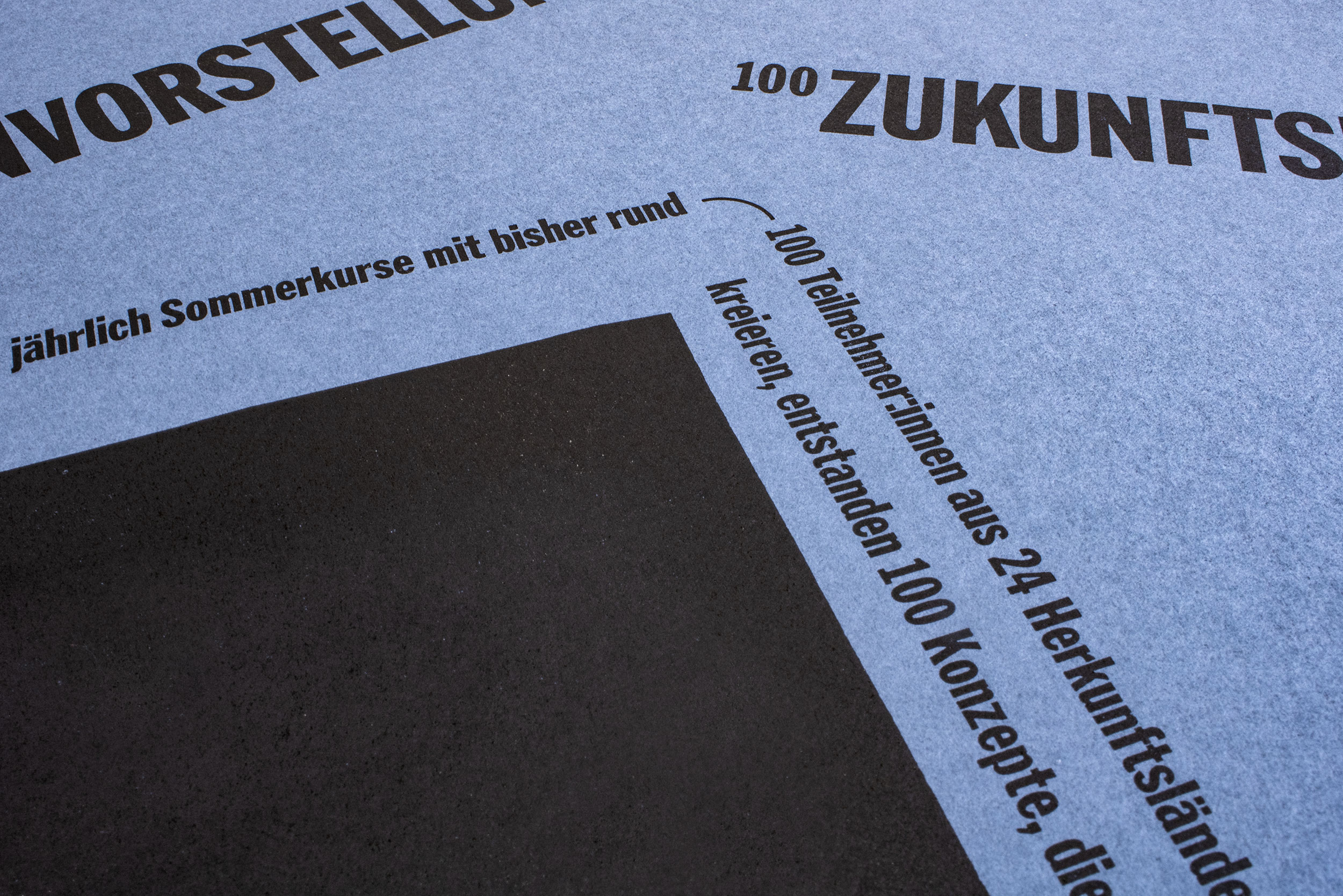
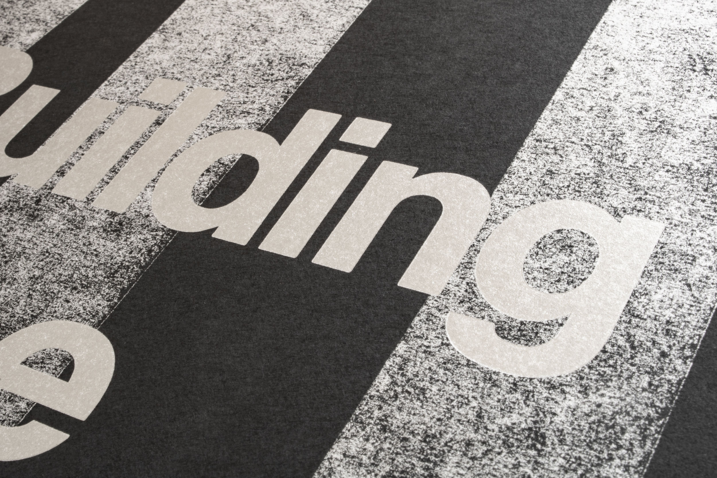
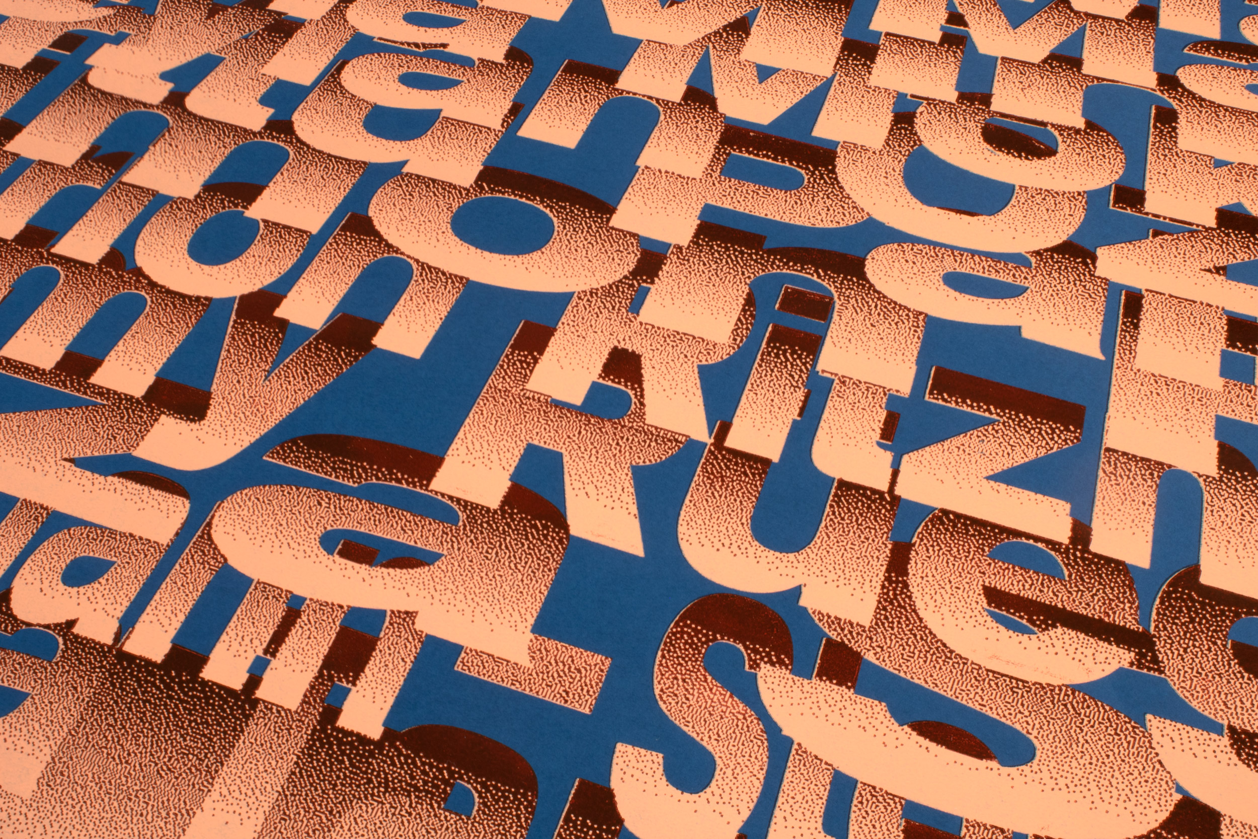
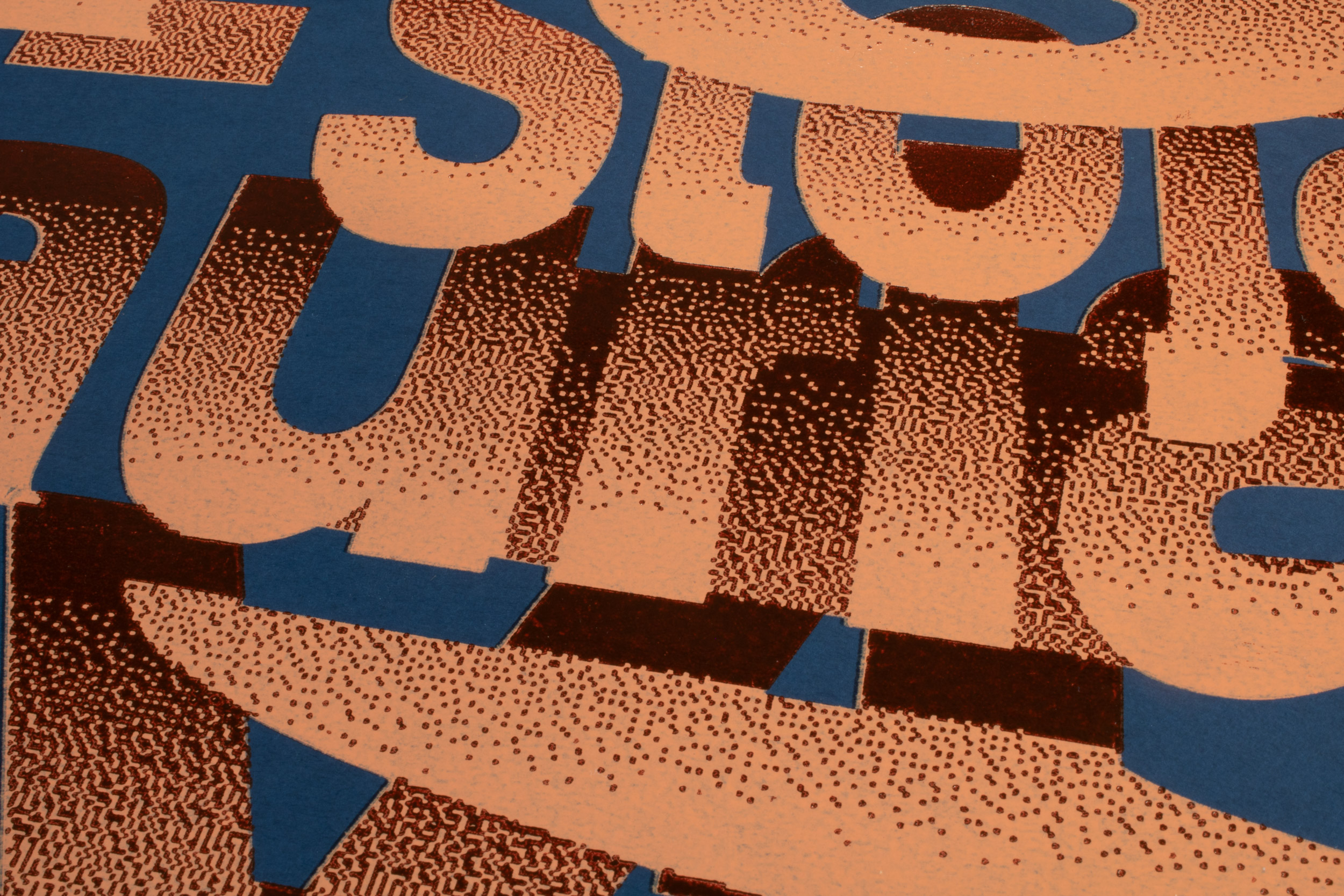
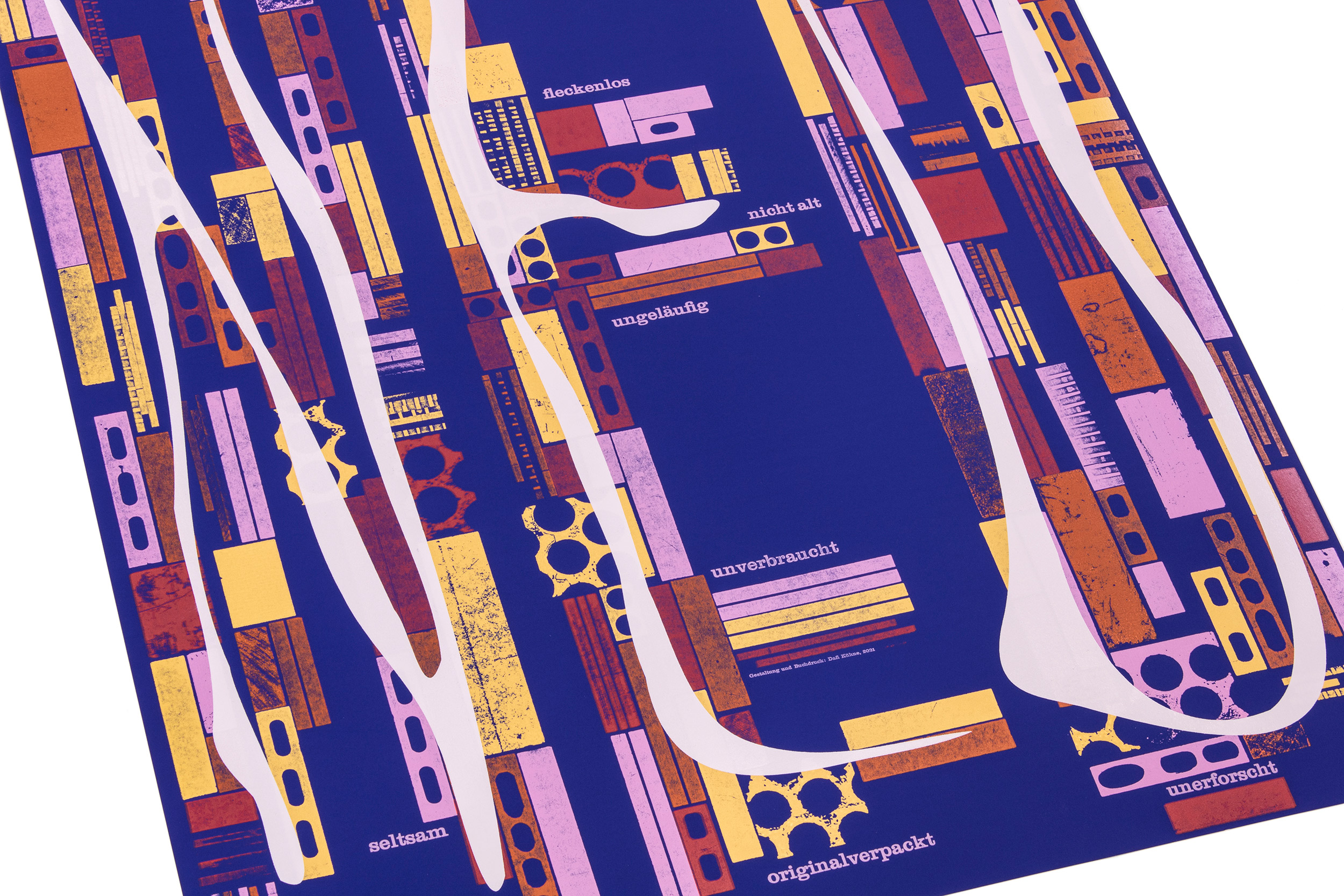
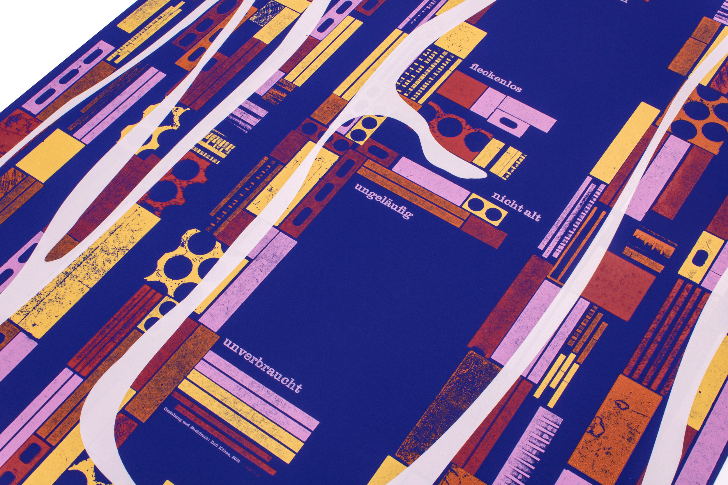
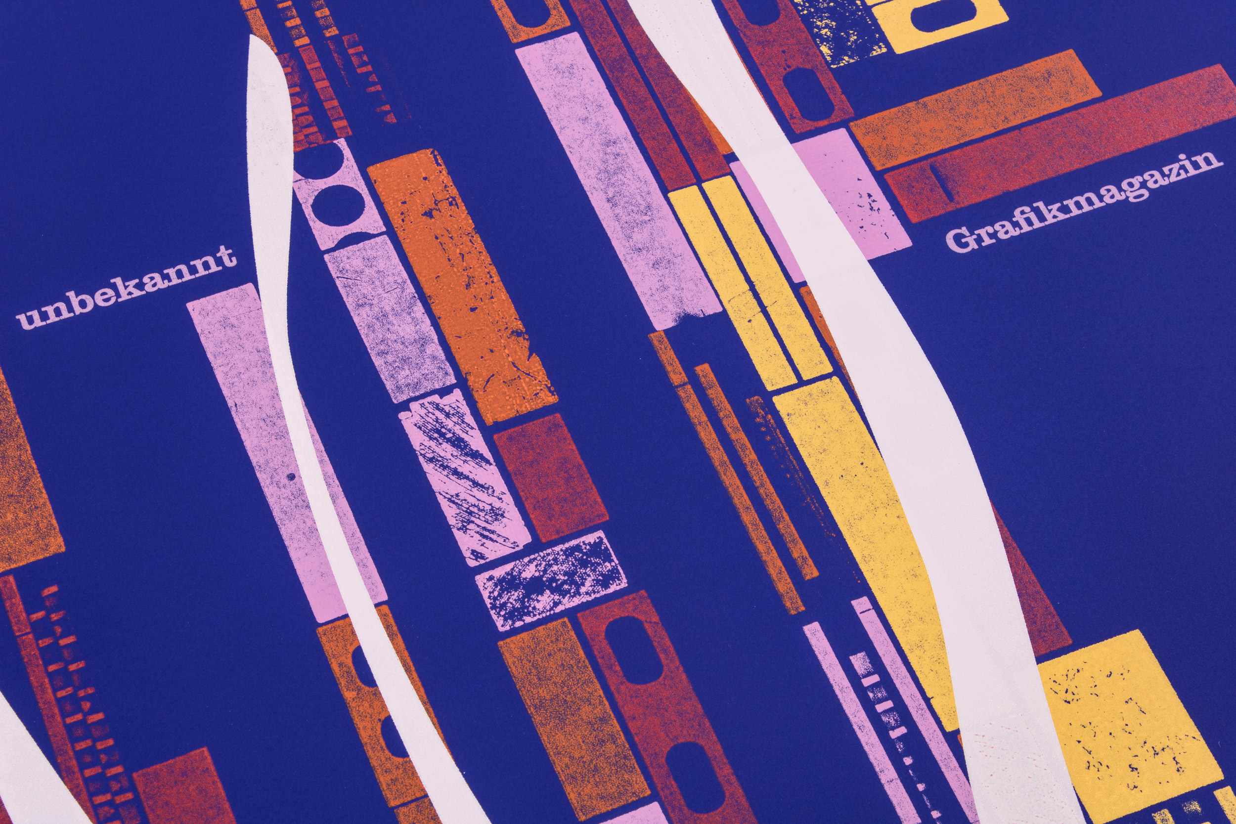
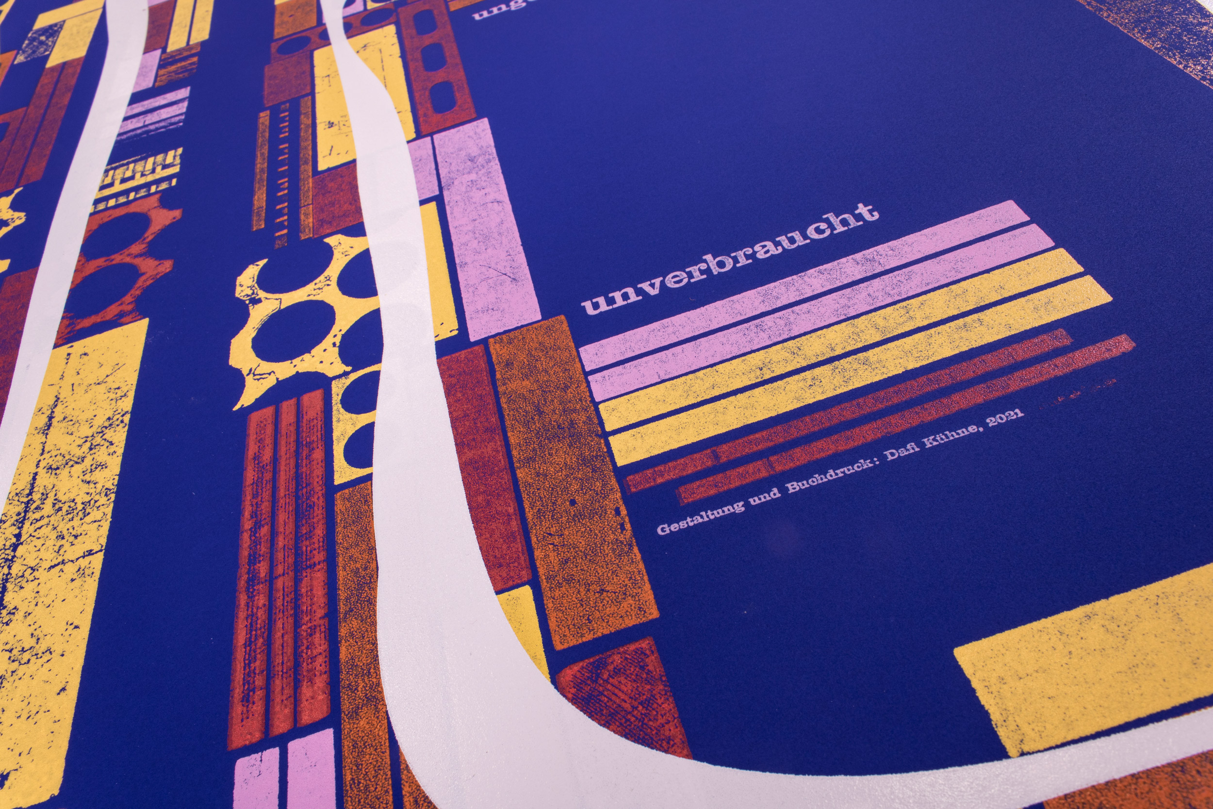
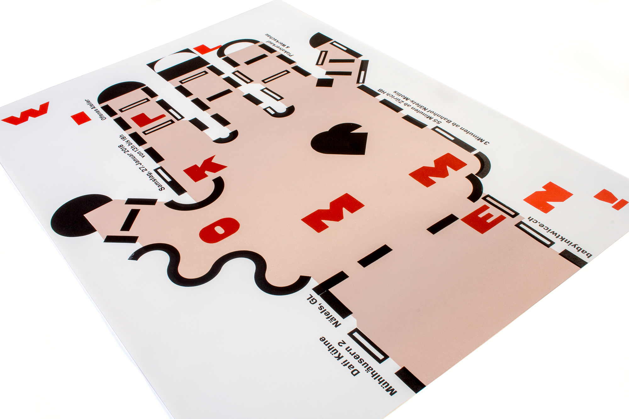
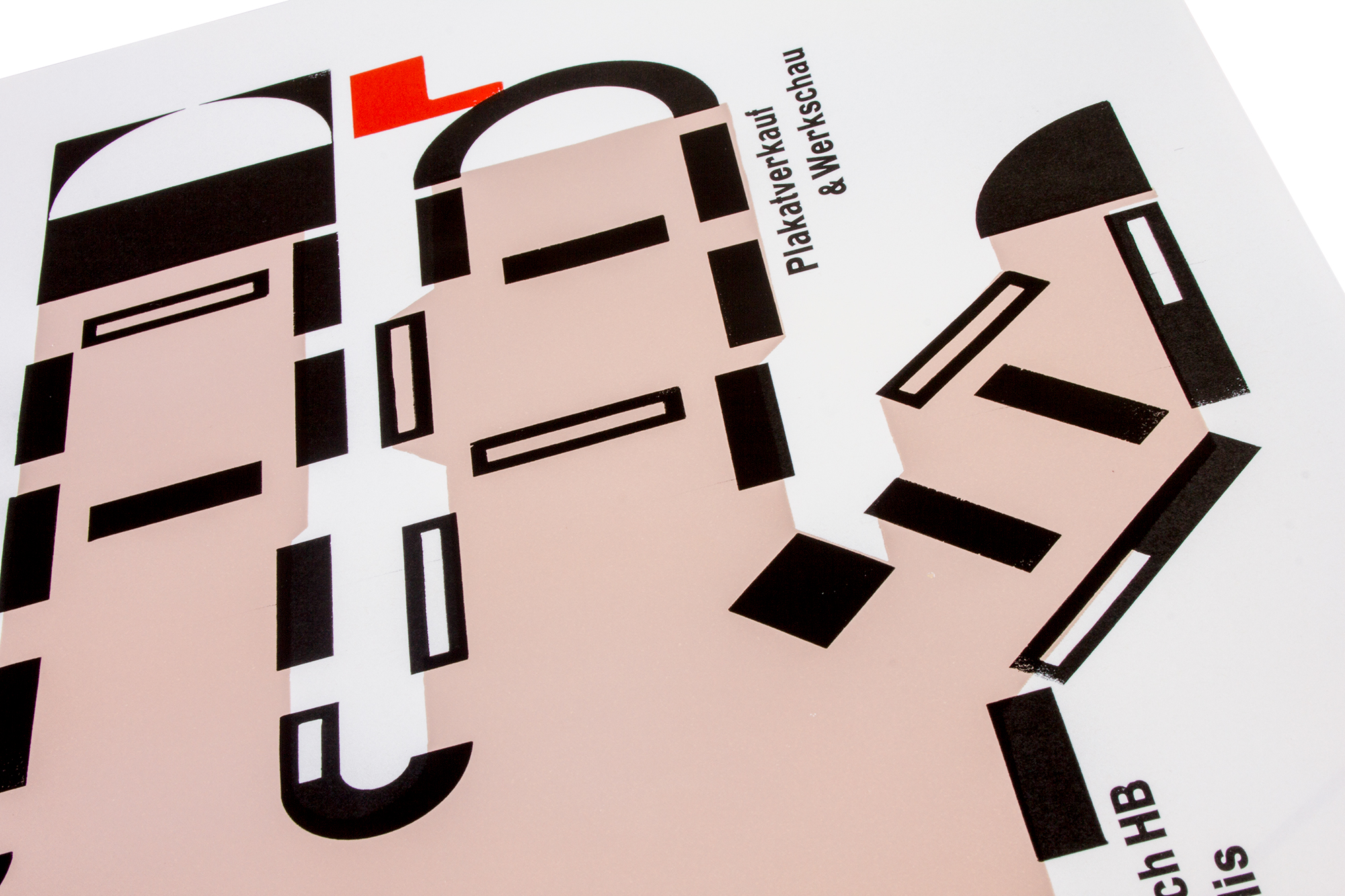
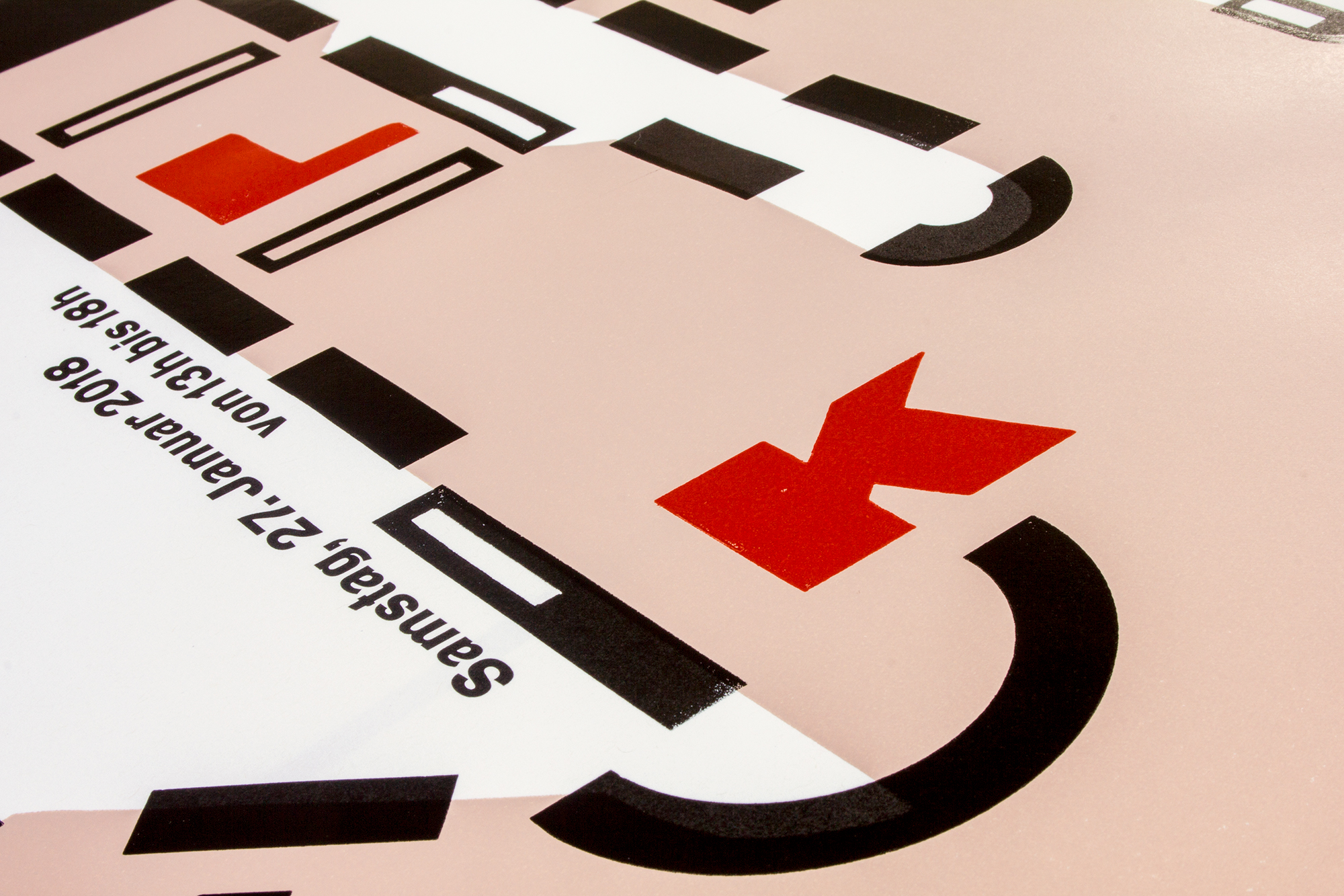
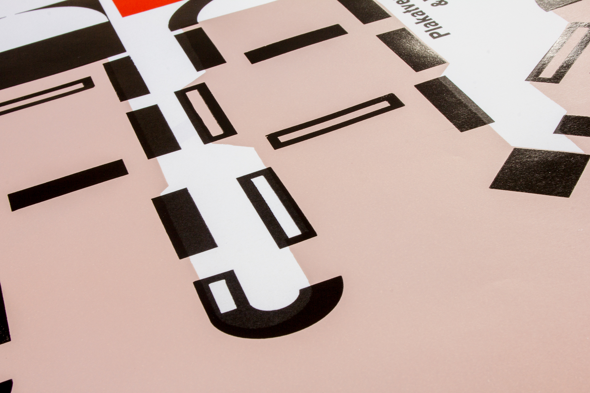
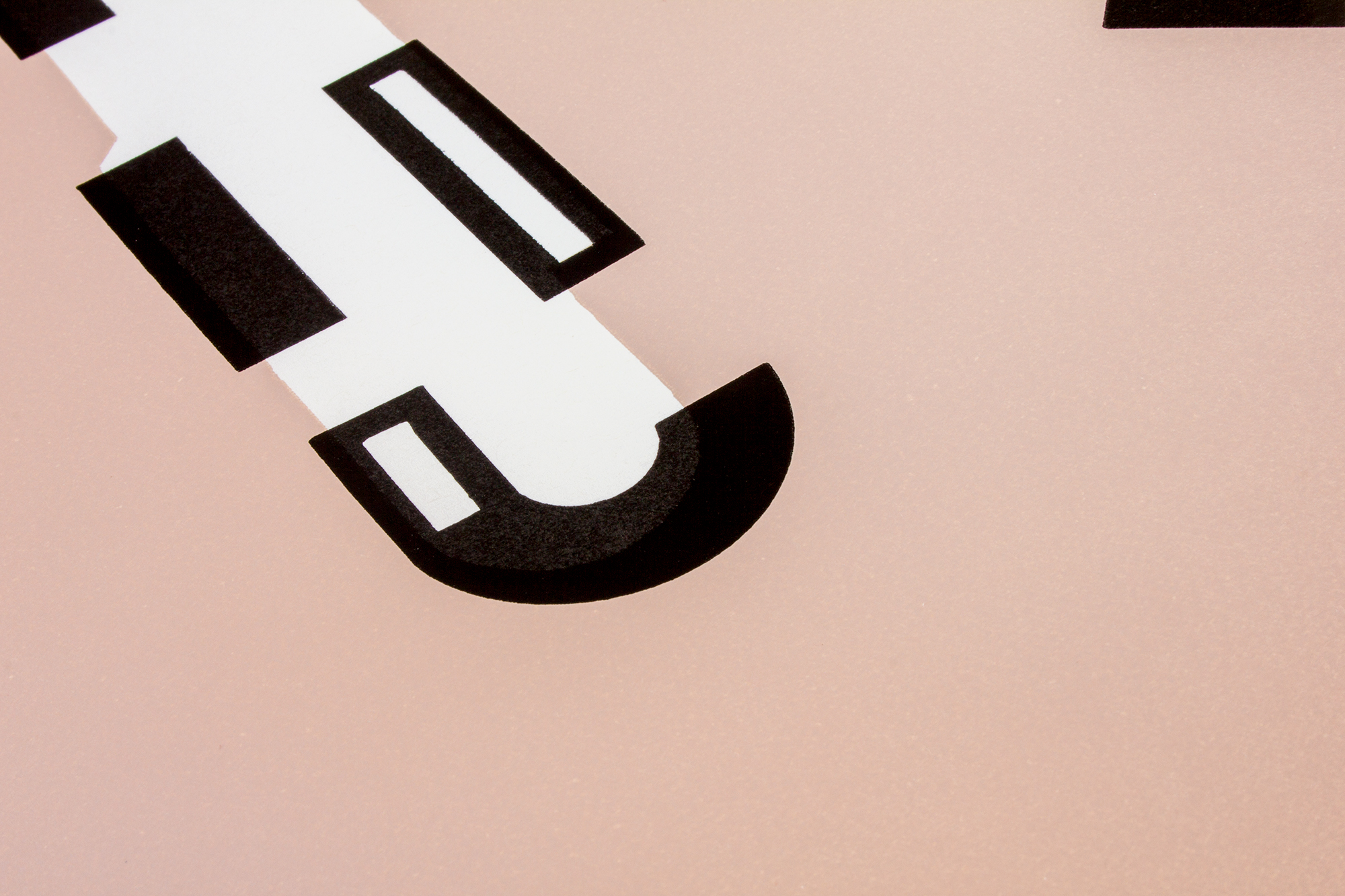
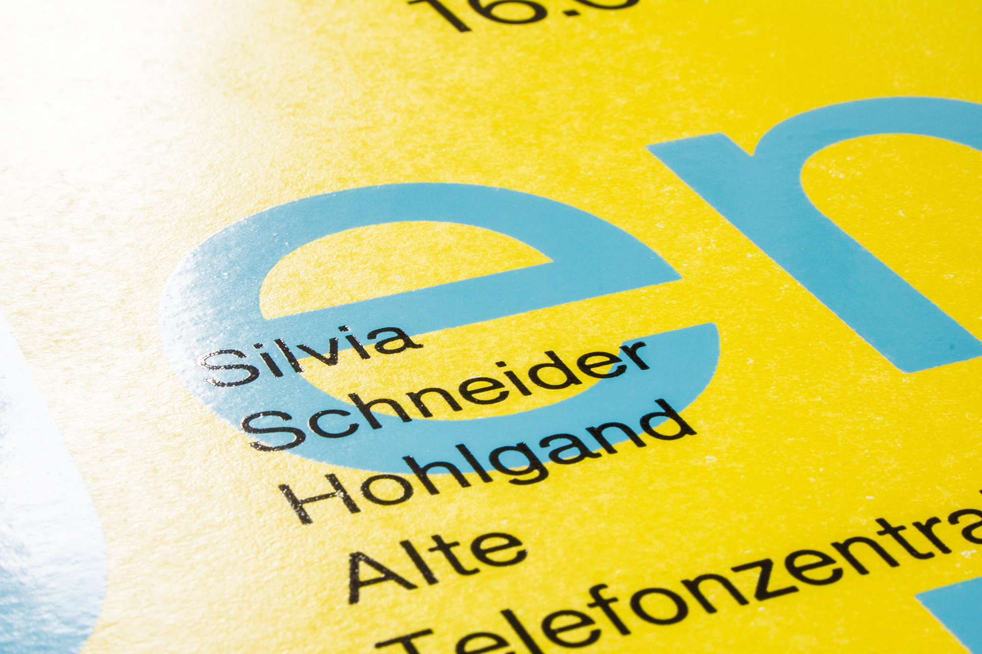
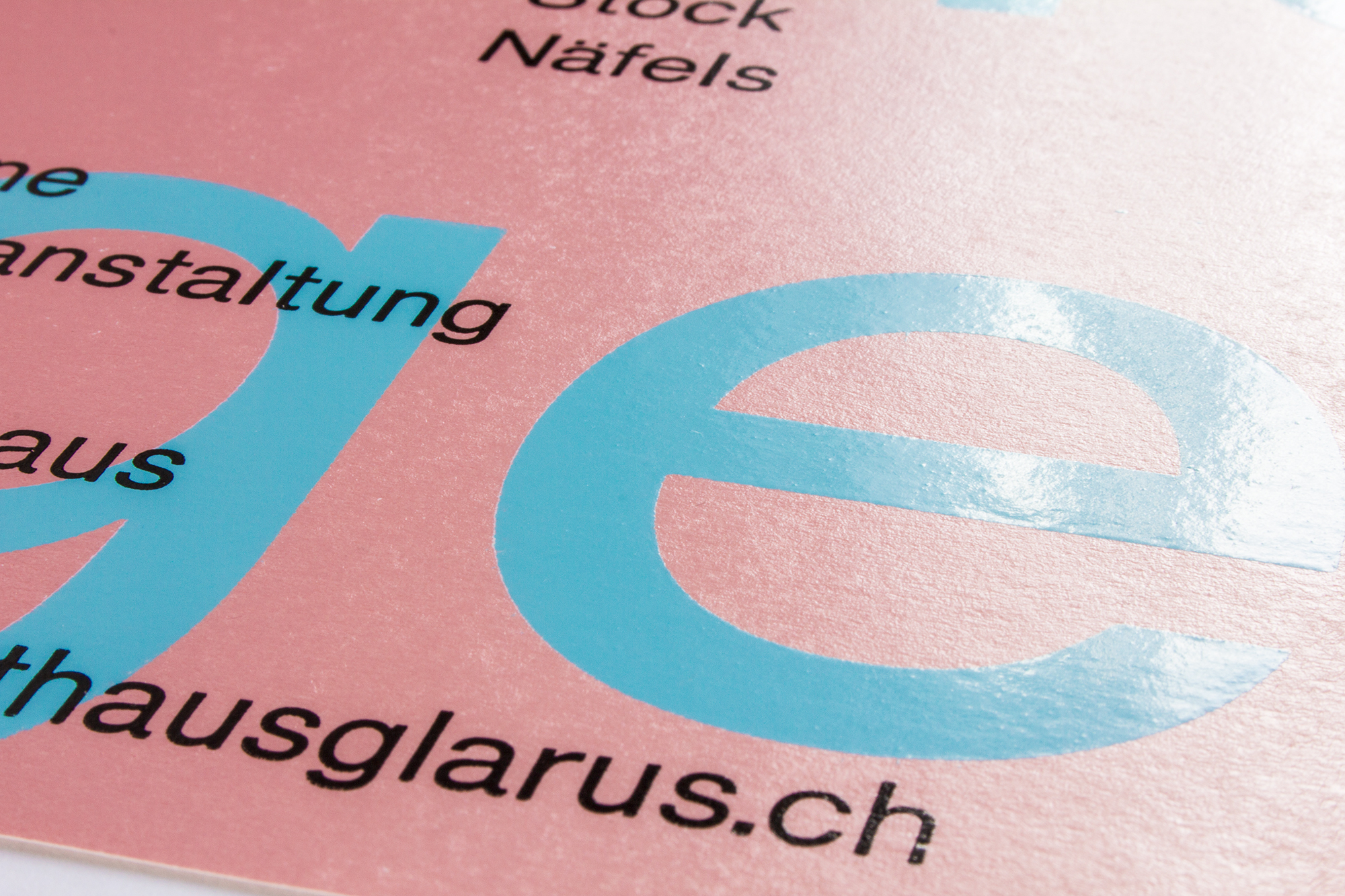
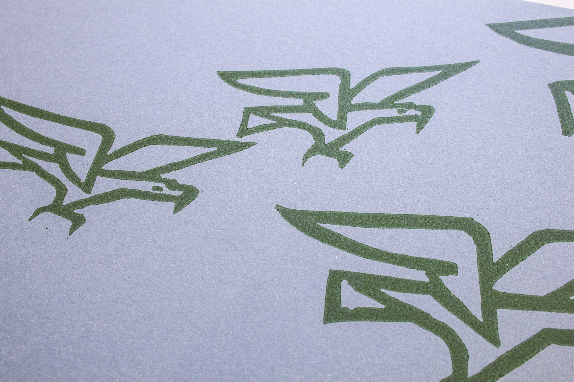
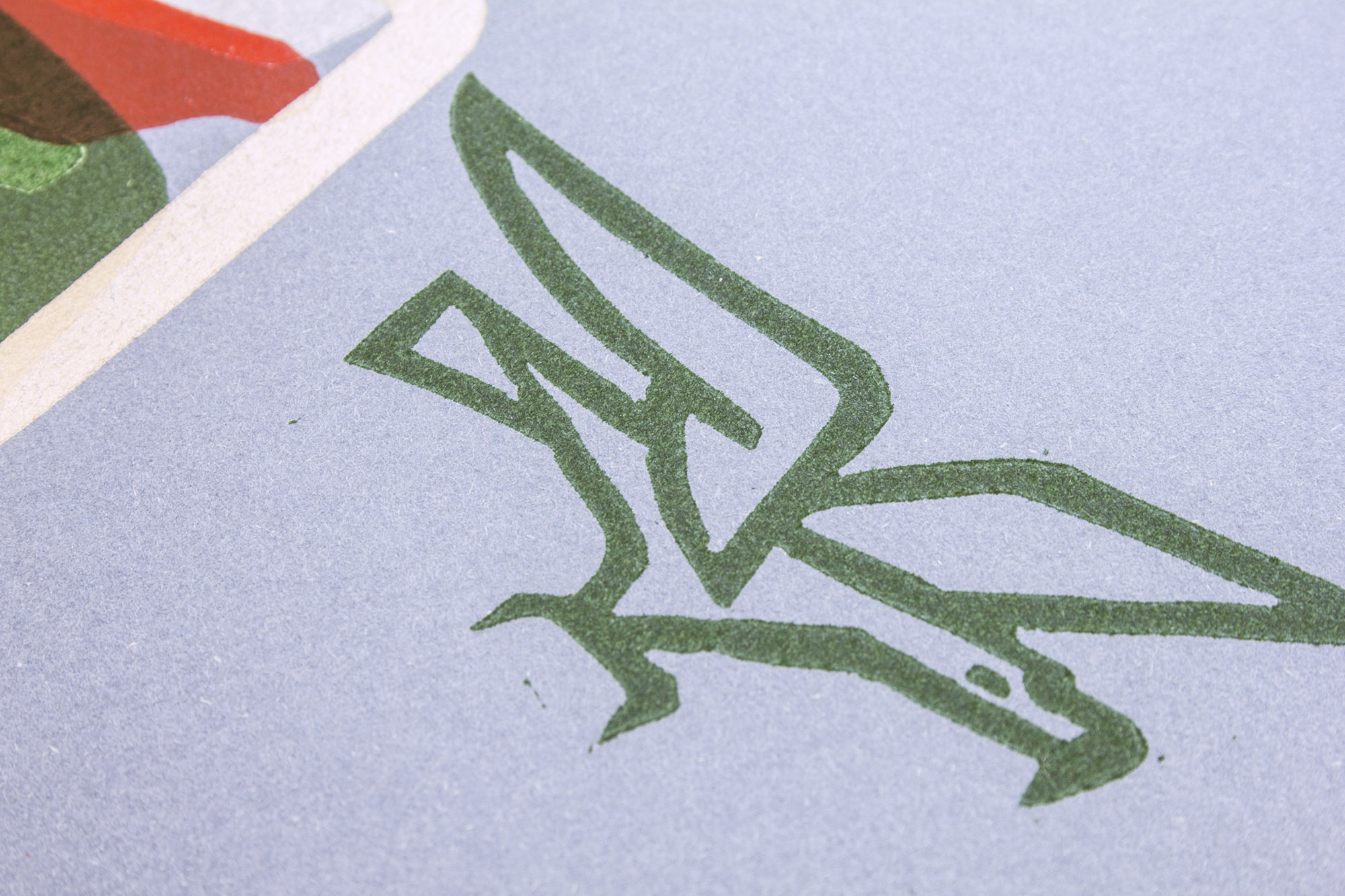
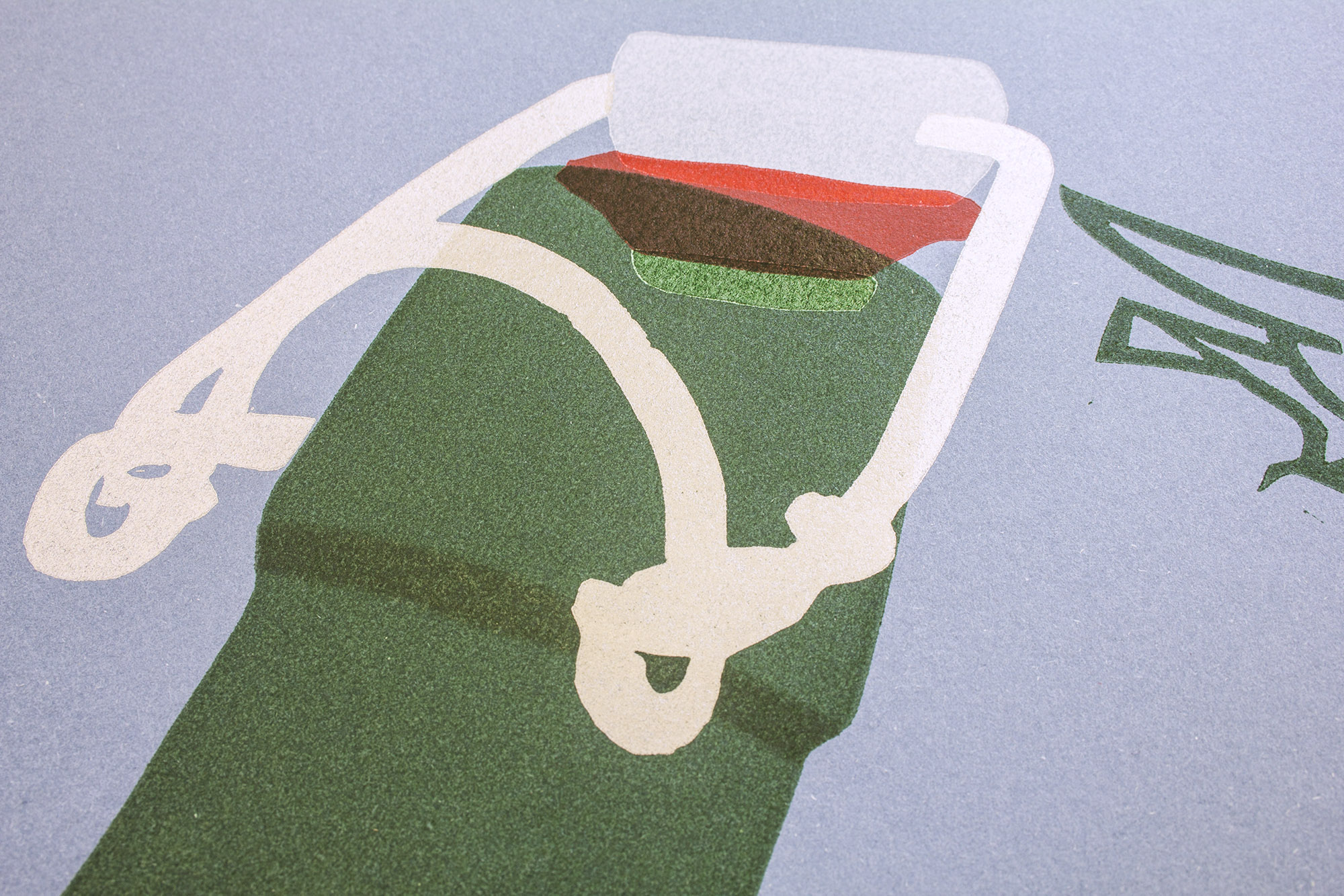
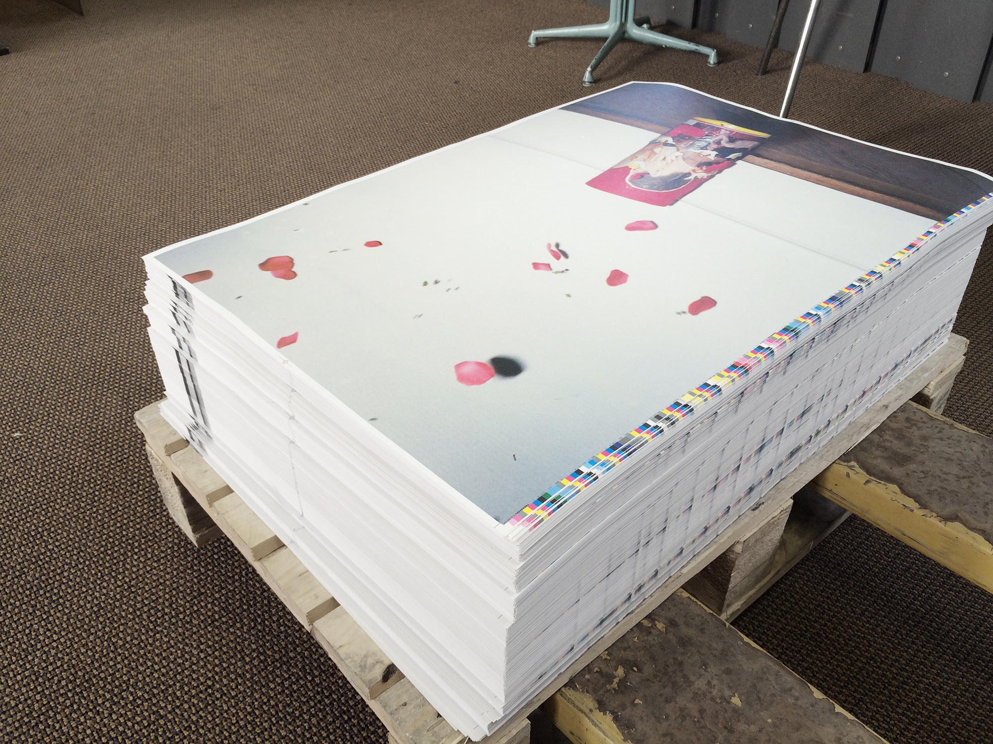
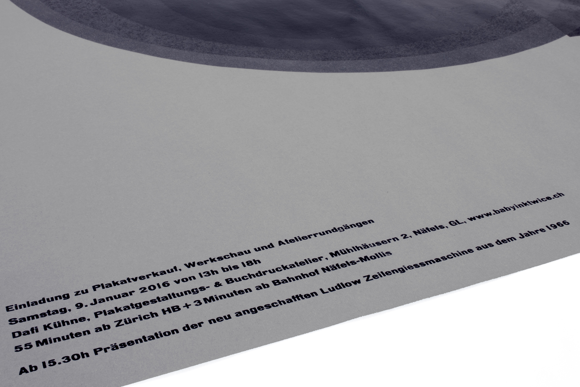
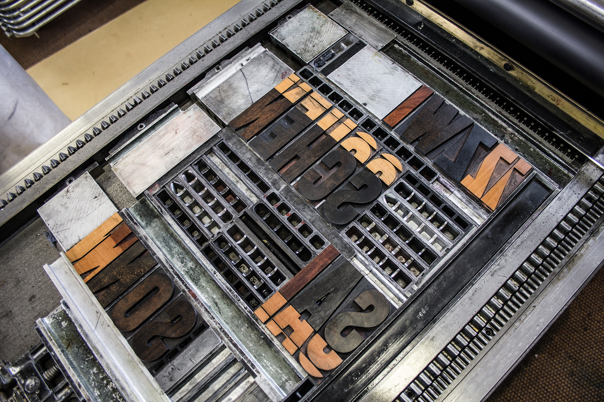
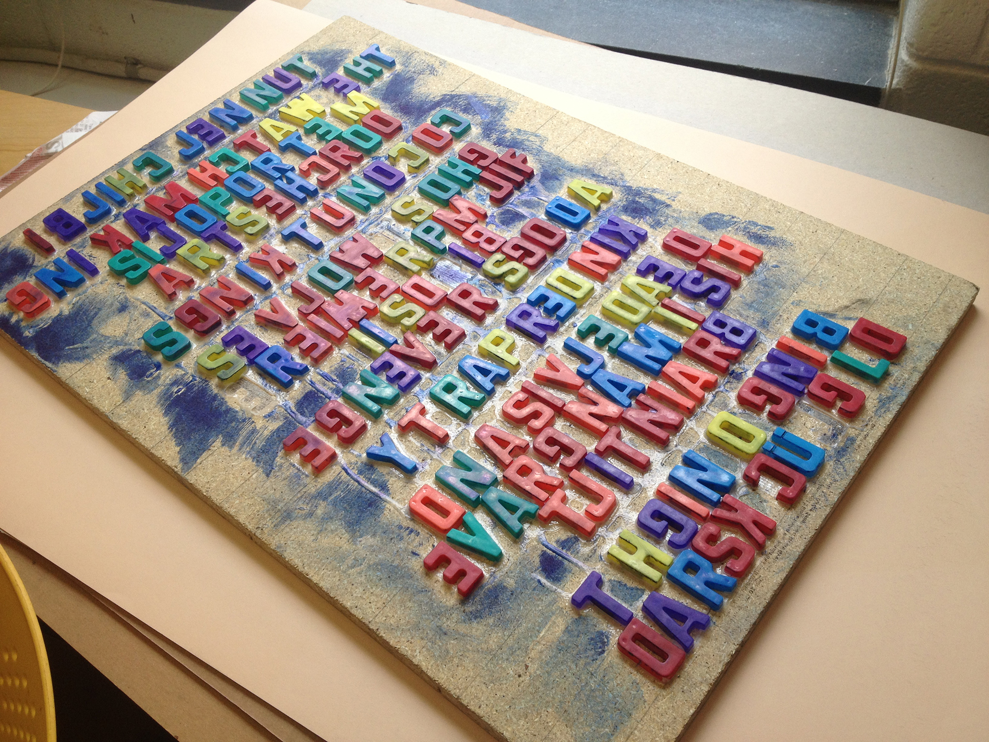
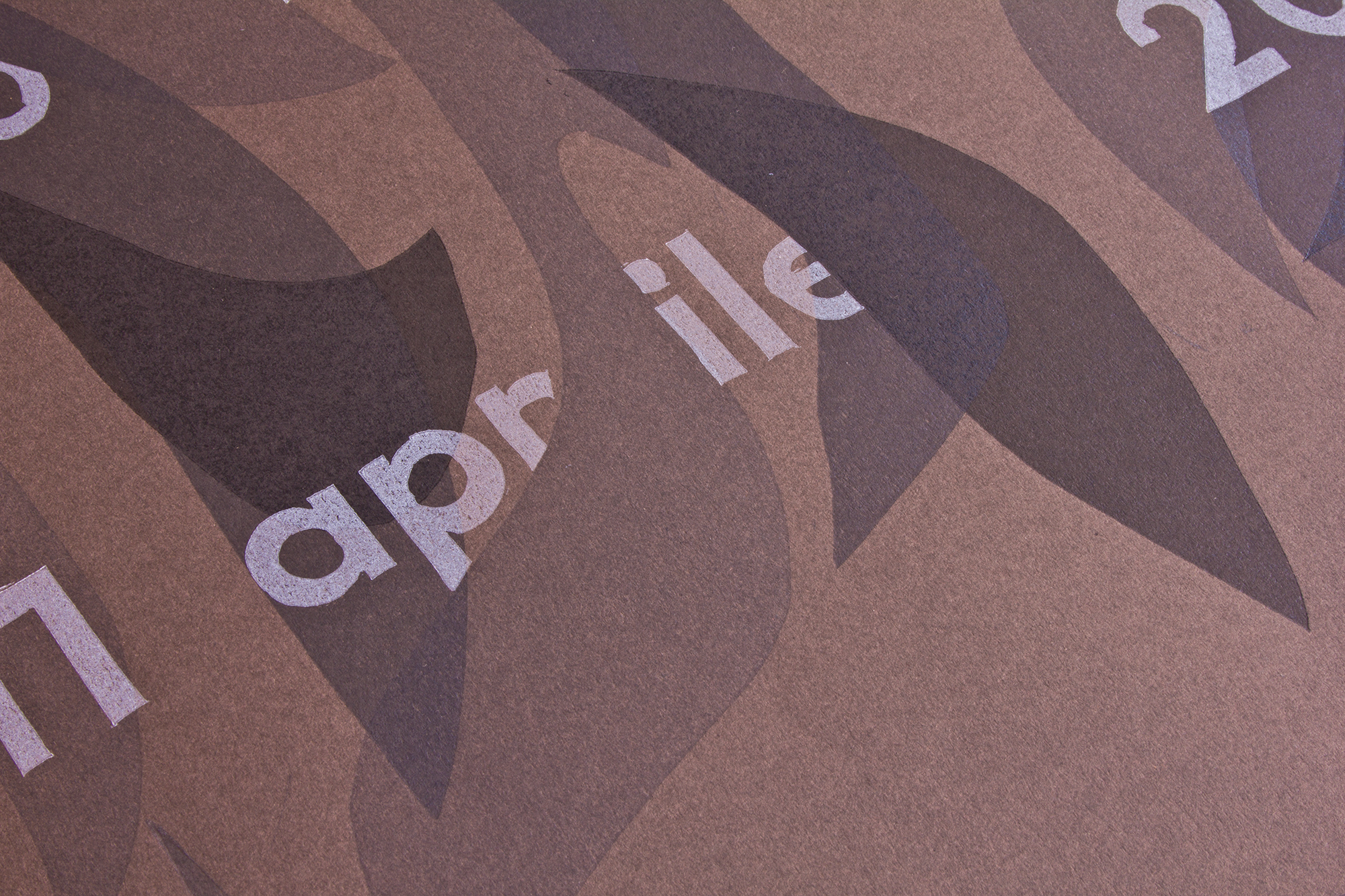
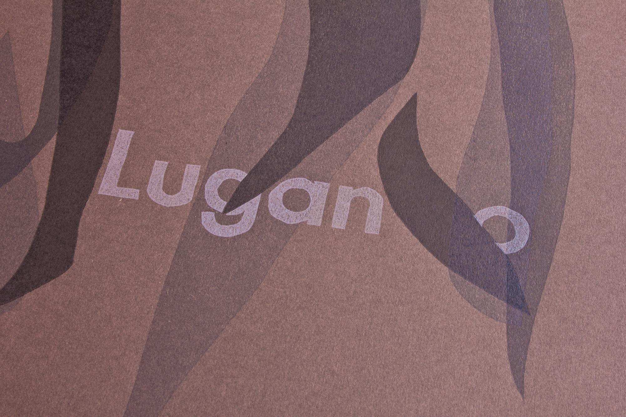
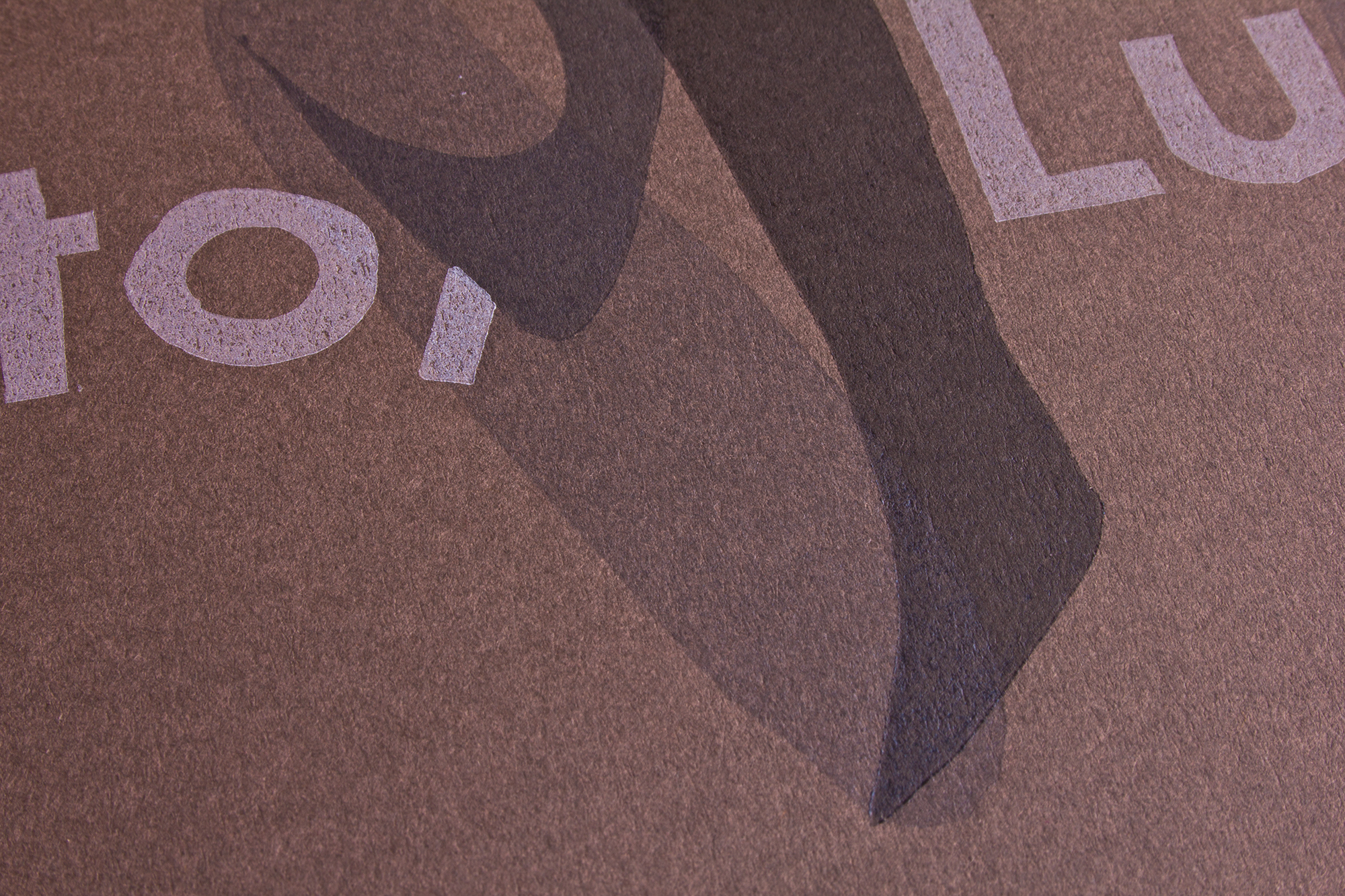
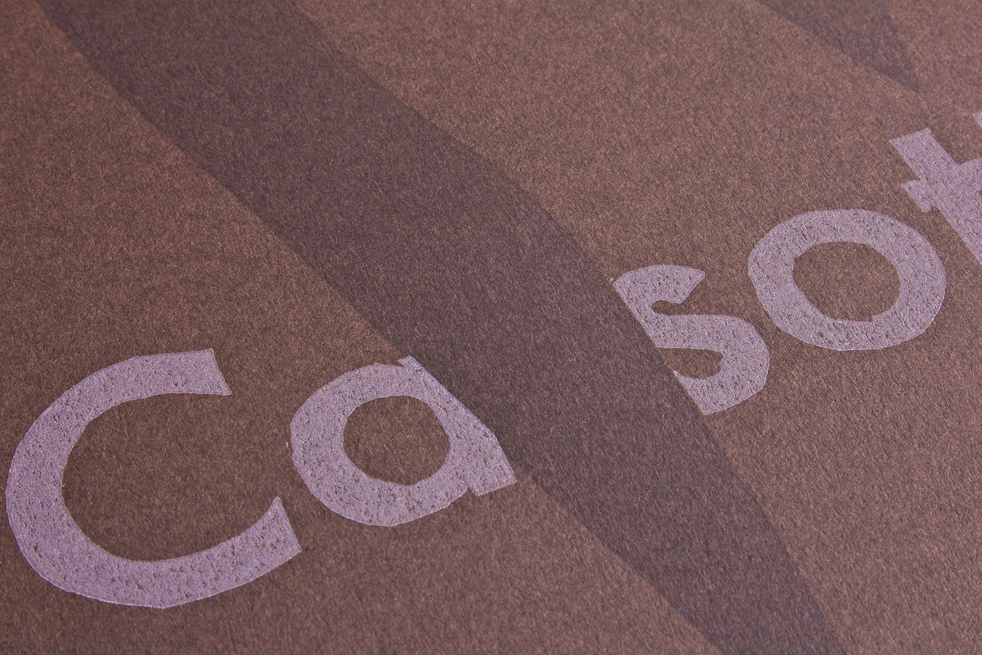
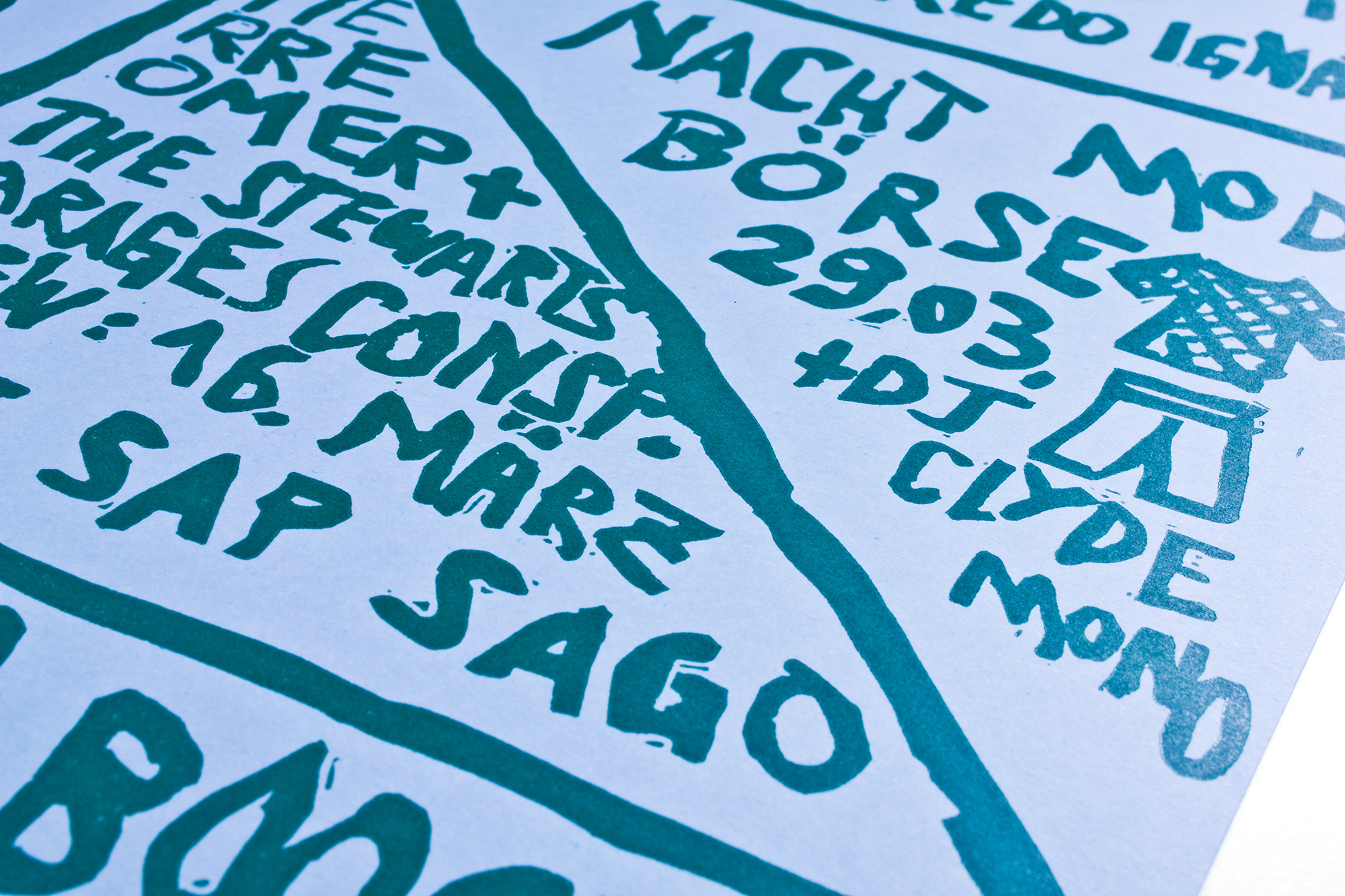
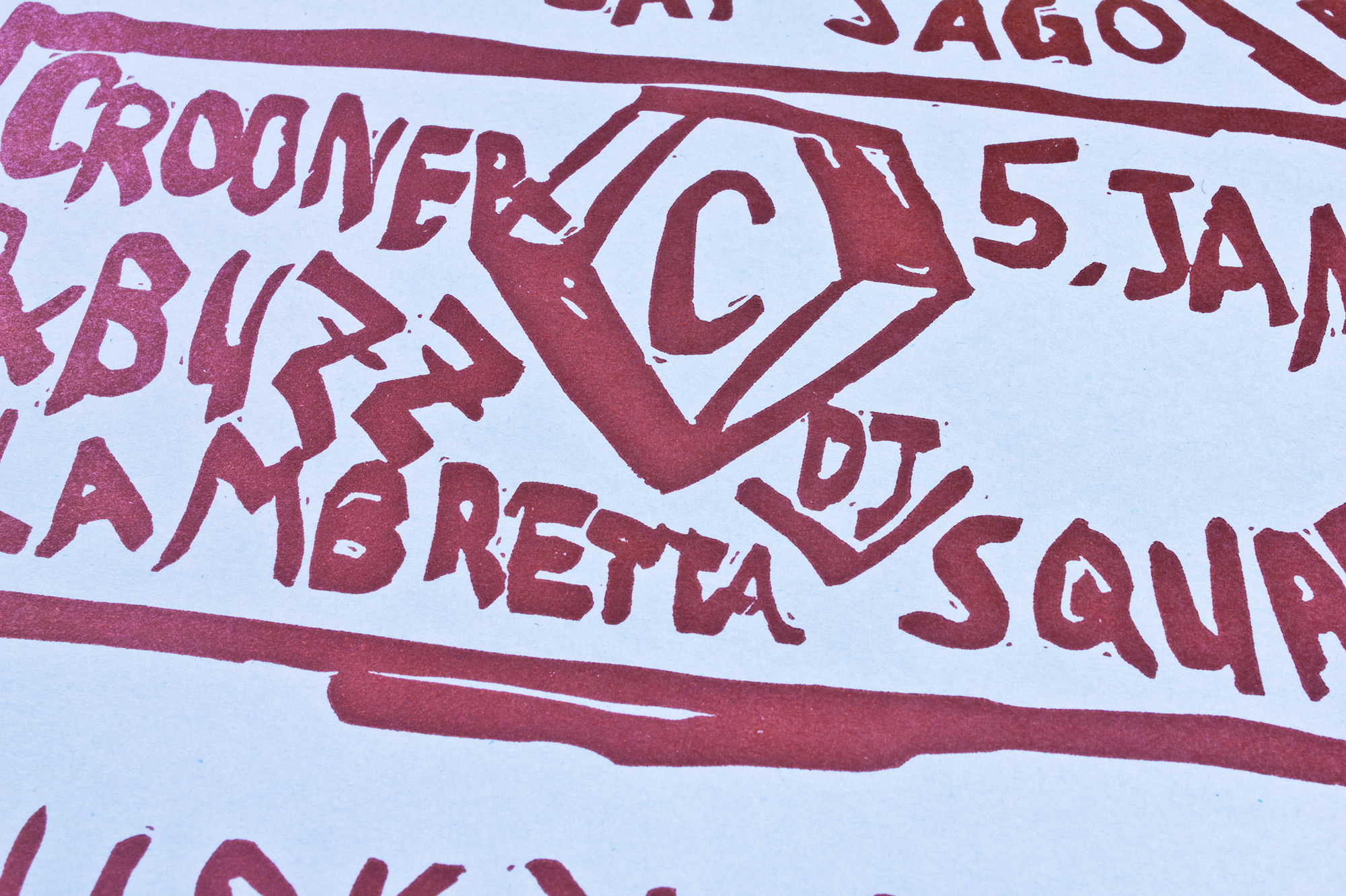
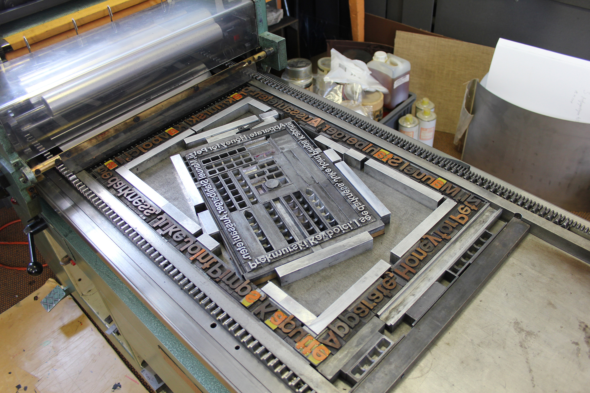
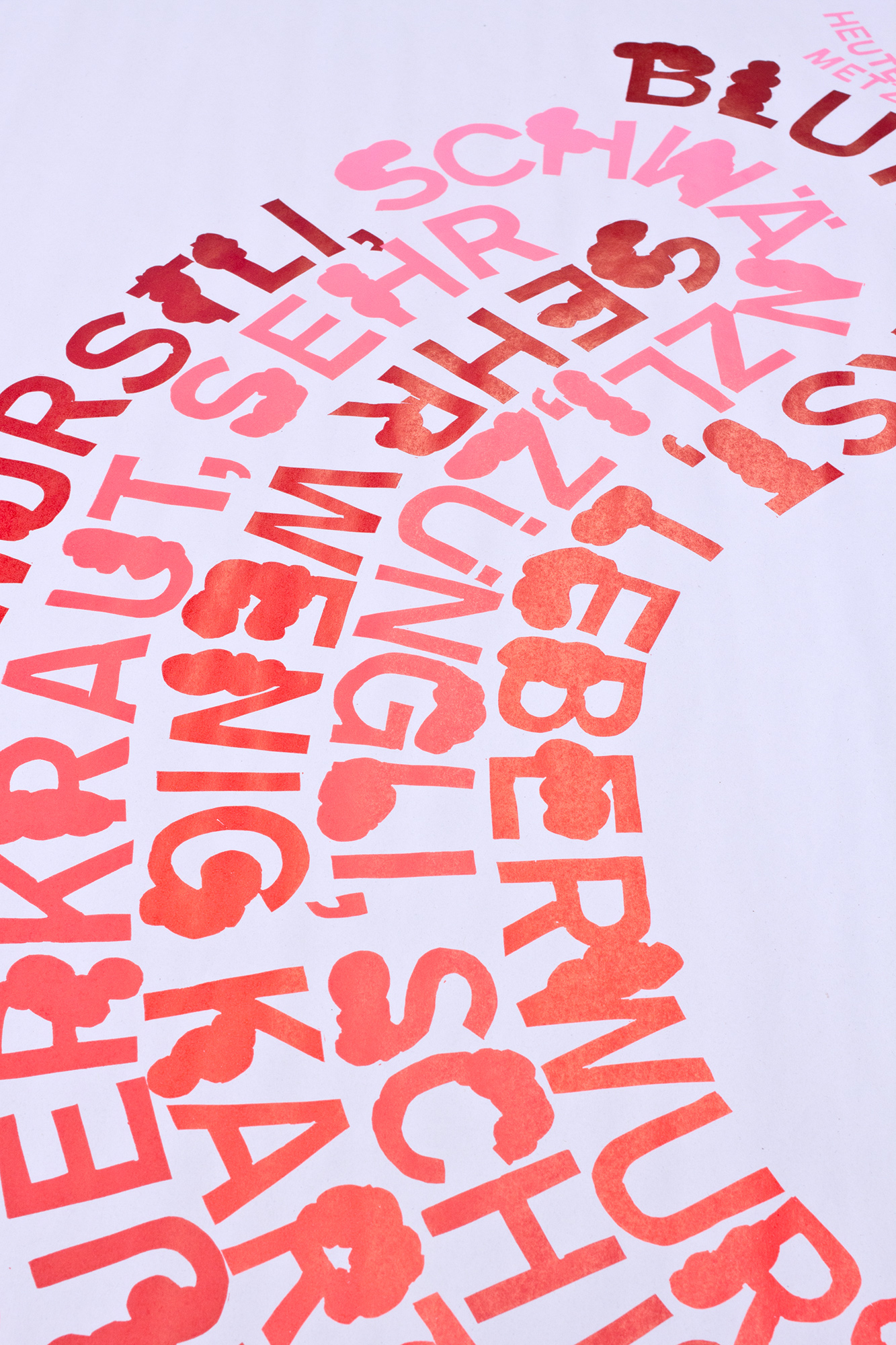
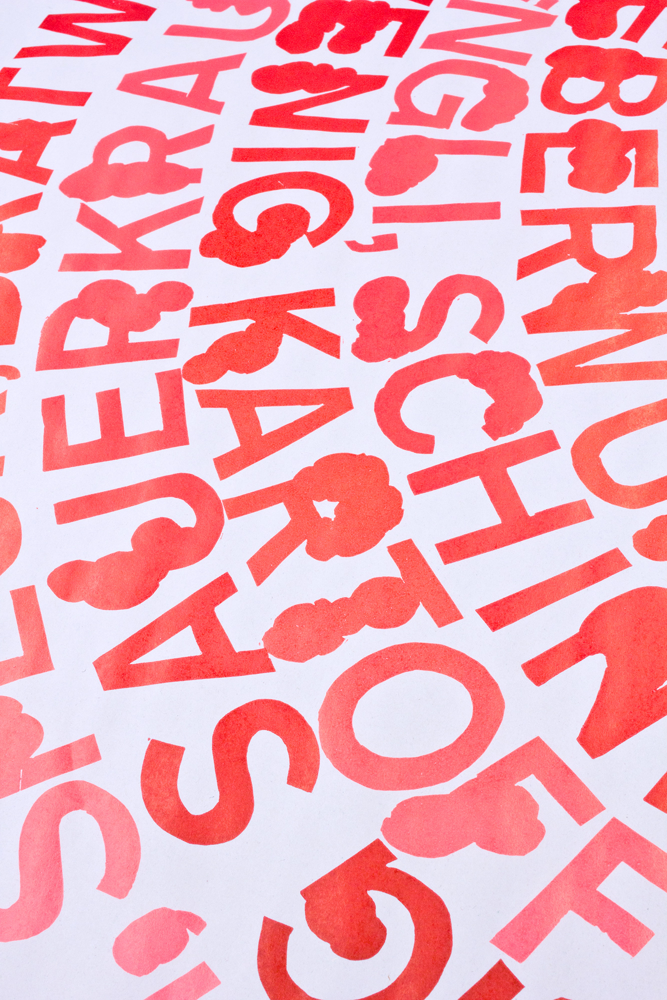
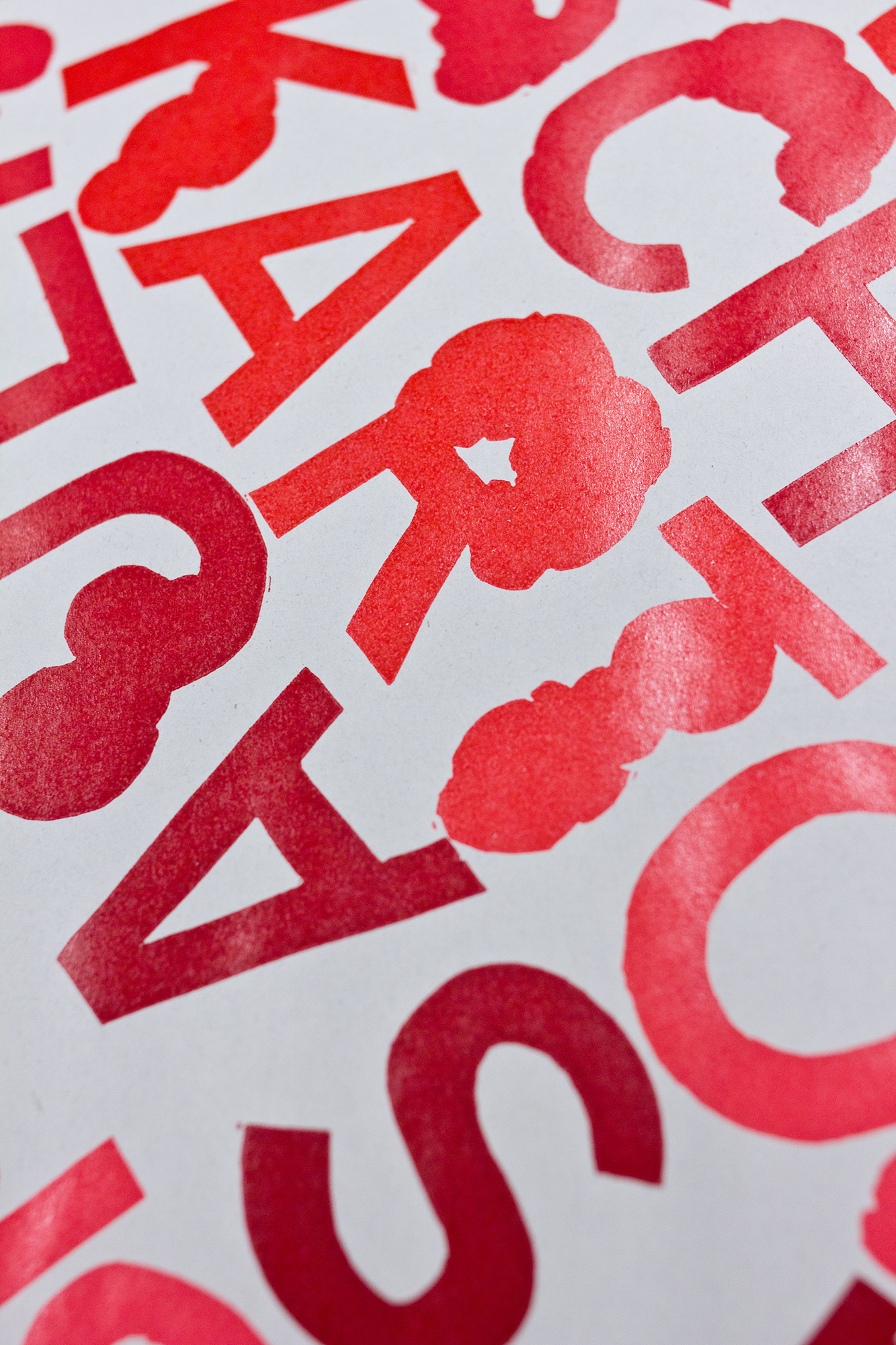
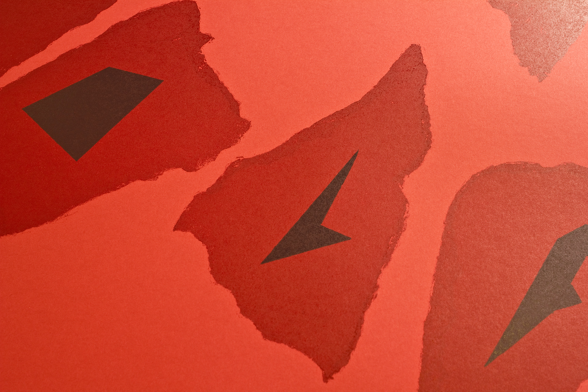
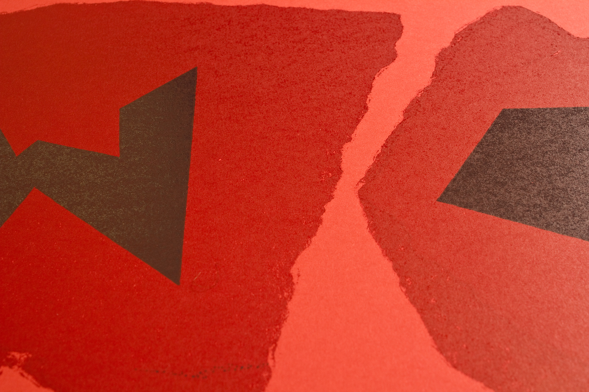
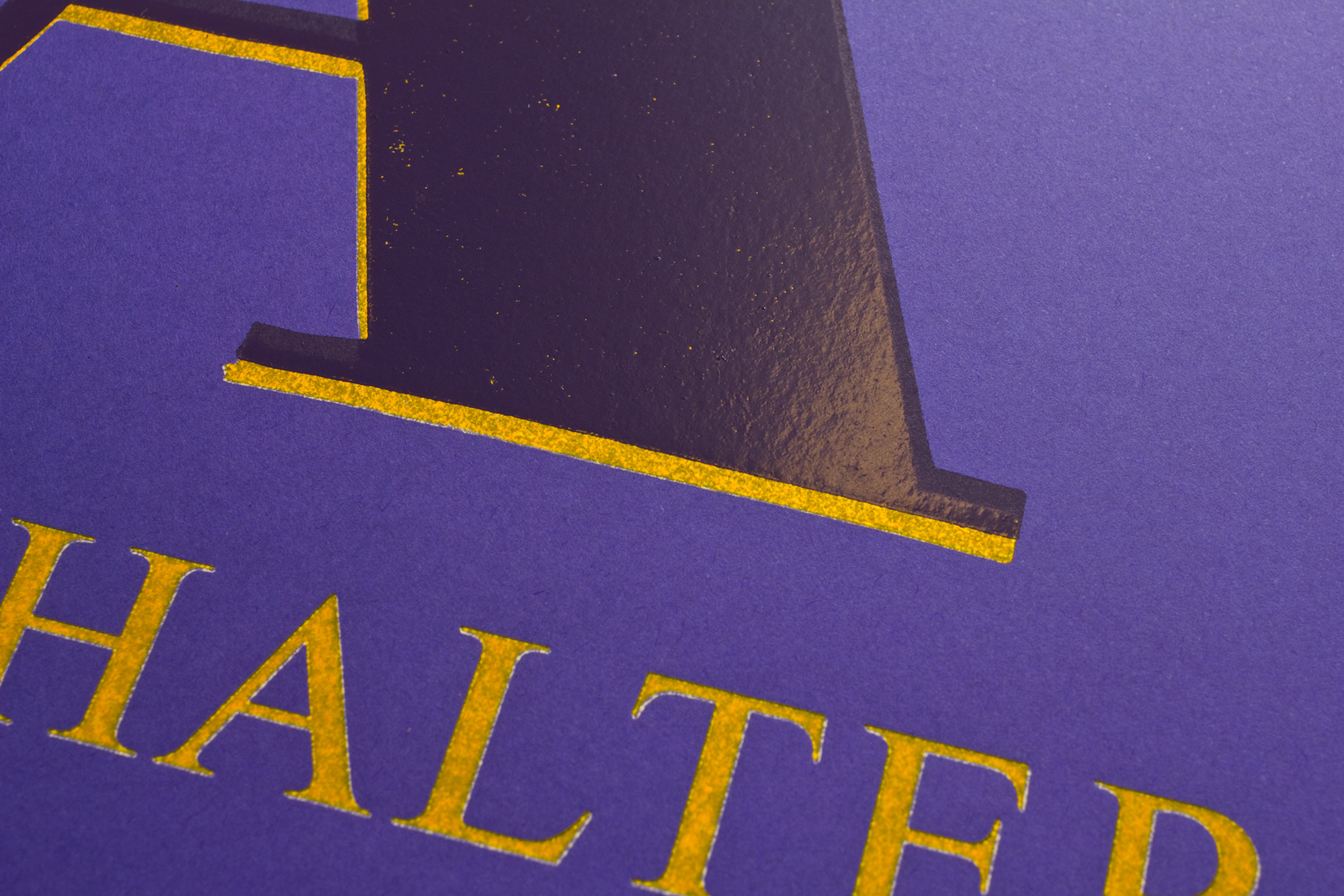
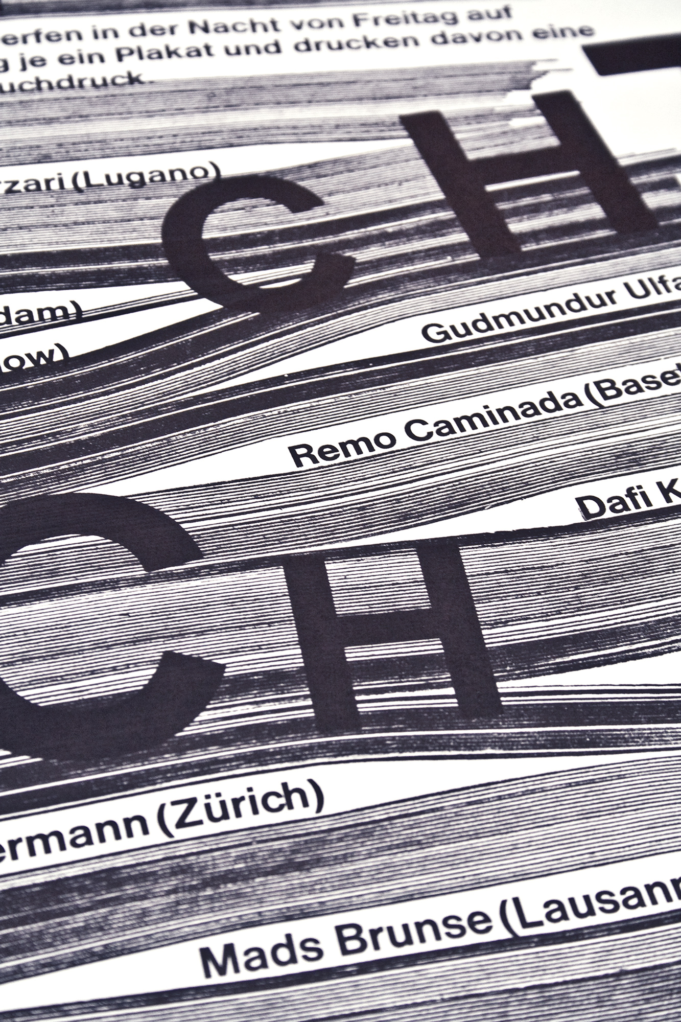
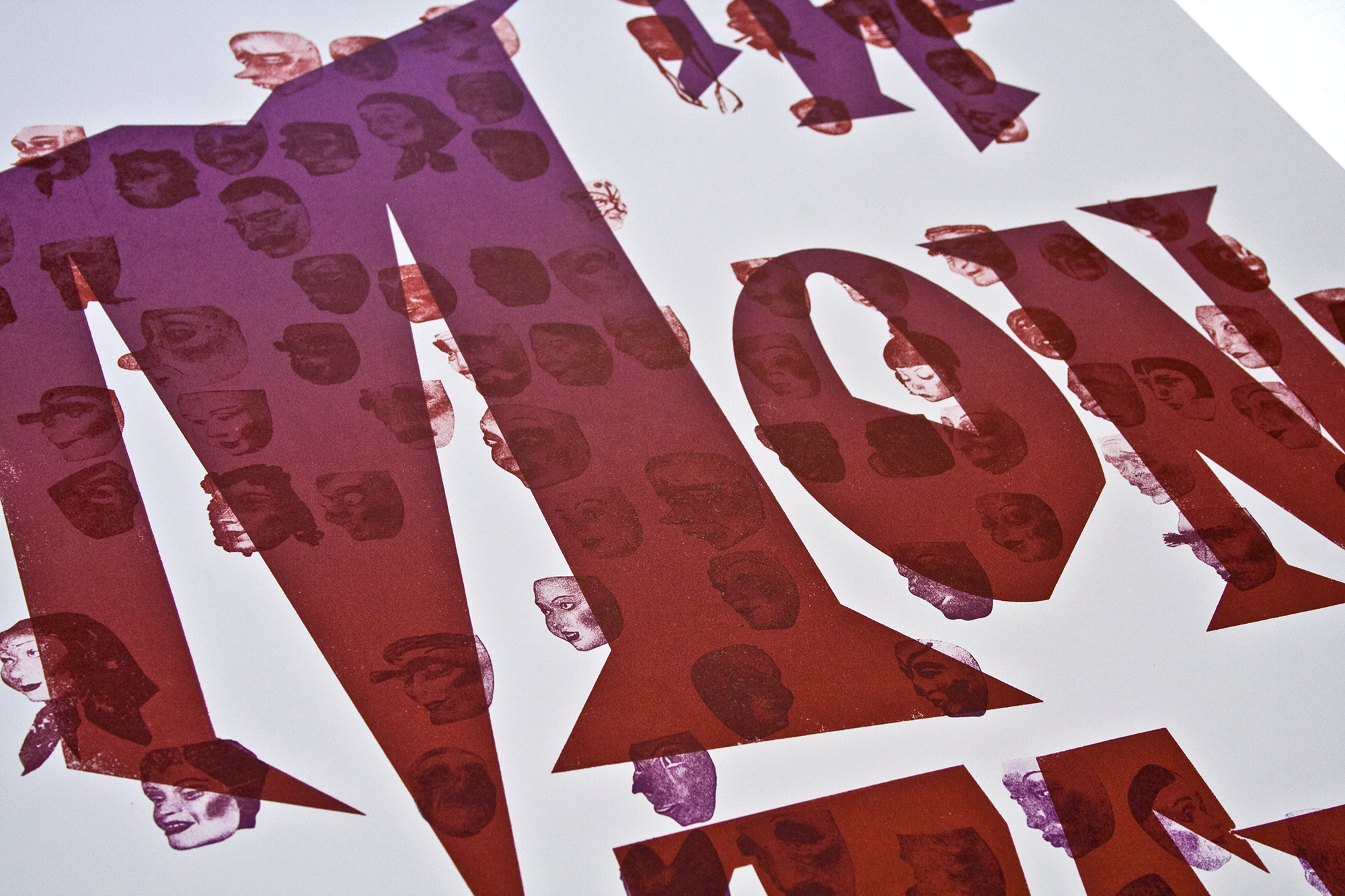
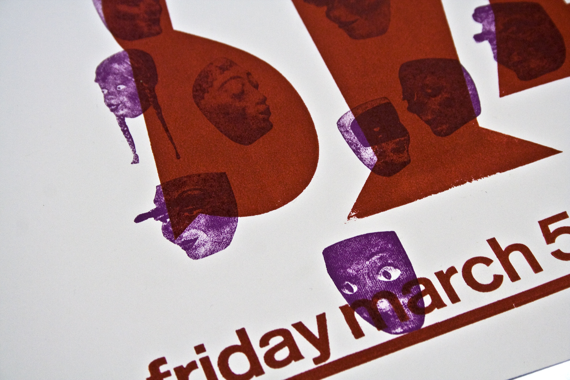
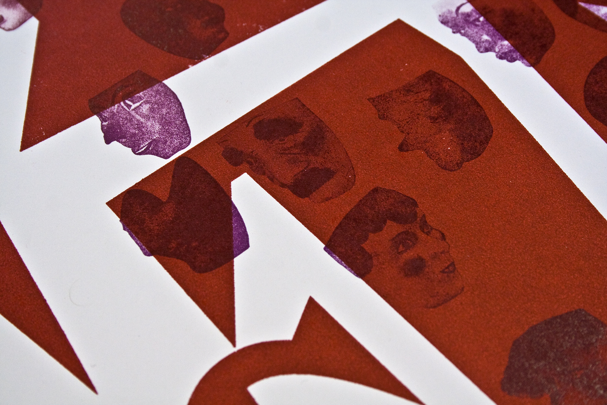
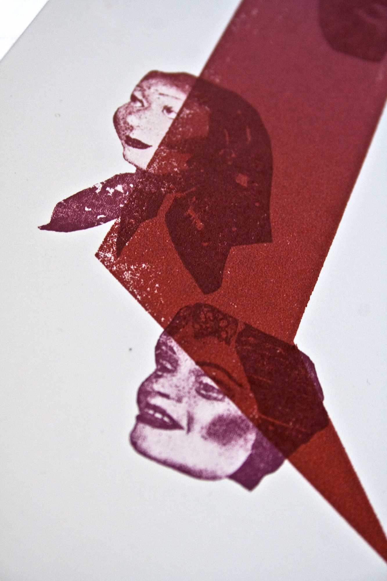
100 Plakate für Näfels
Exhibition poster celebrating 100 posters from Typographic Printing Program participants for Näfels.
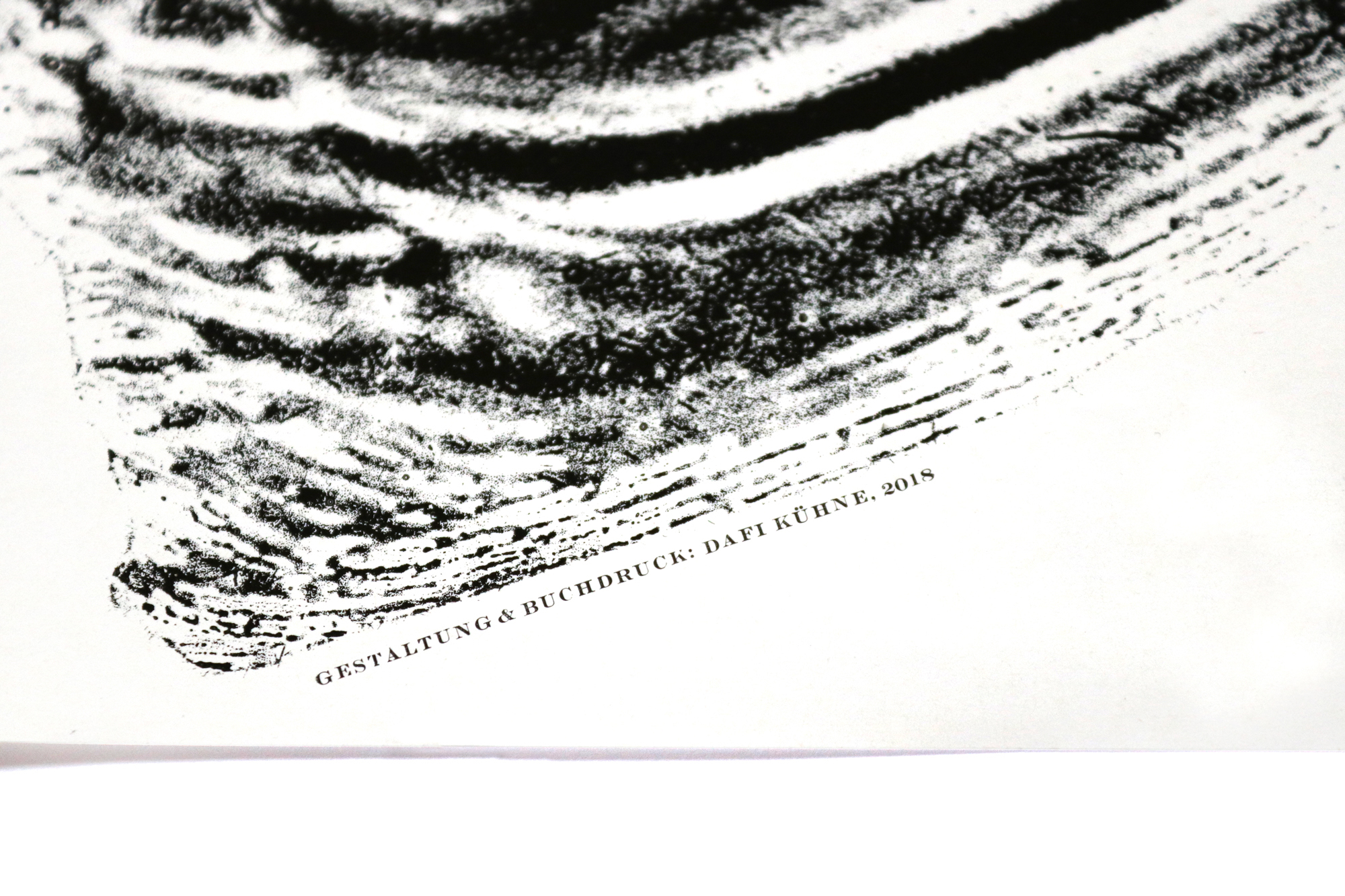
Printed from hand-cast Ludlow hot-metal slugs and a rectangle block of linoleum.
Client: Typographic- Printing Program, Näfels Switzerland
Format: 70×100cm
Paper: Gmund Colors Matt 14, 100g/m2 and 200g/m2
Edition: 200+50 posters on a Grafix GX4
March 2024
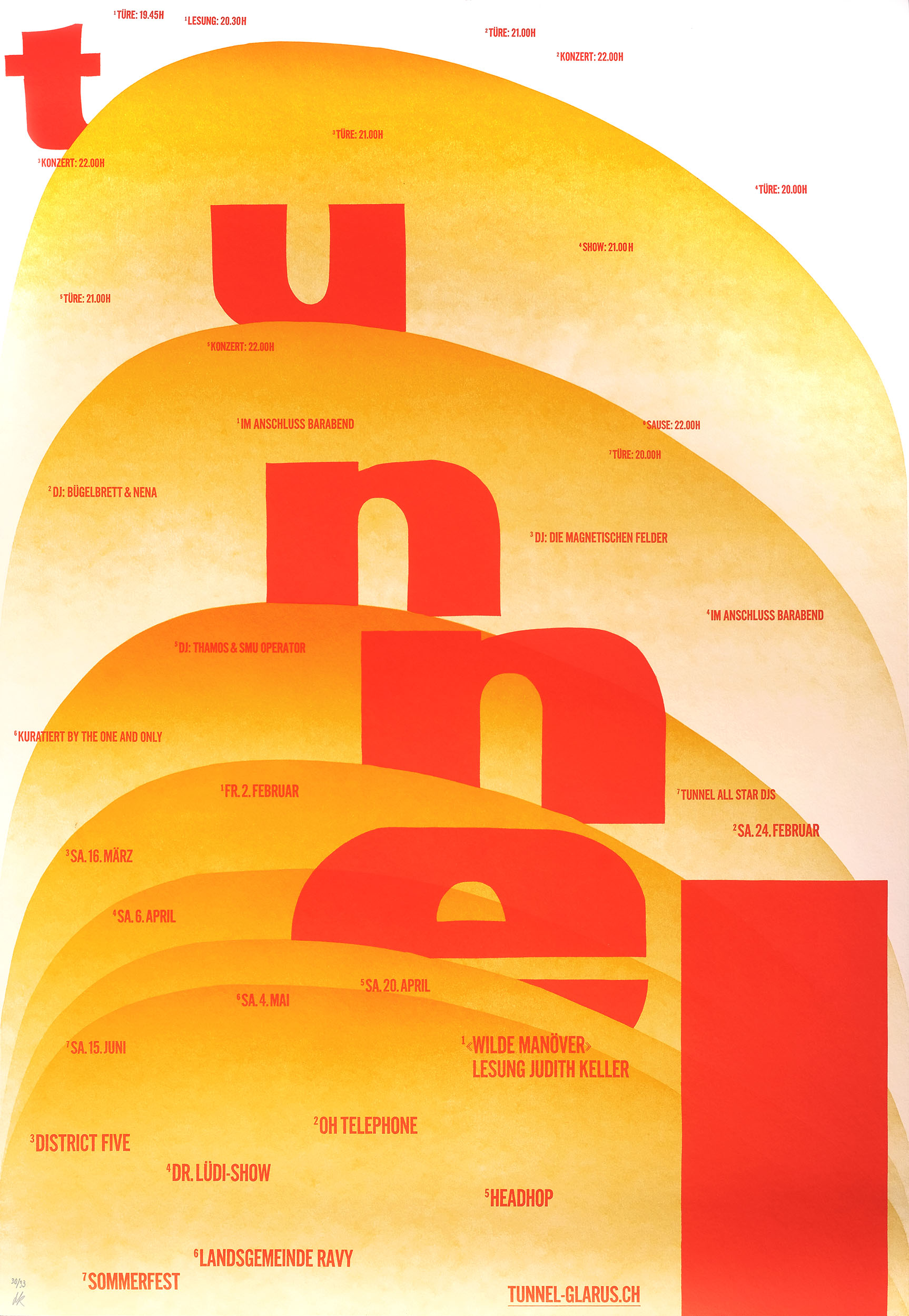
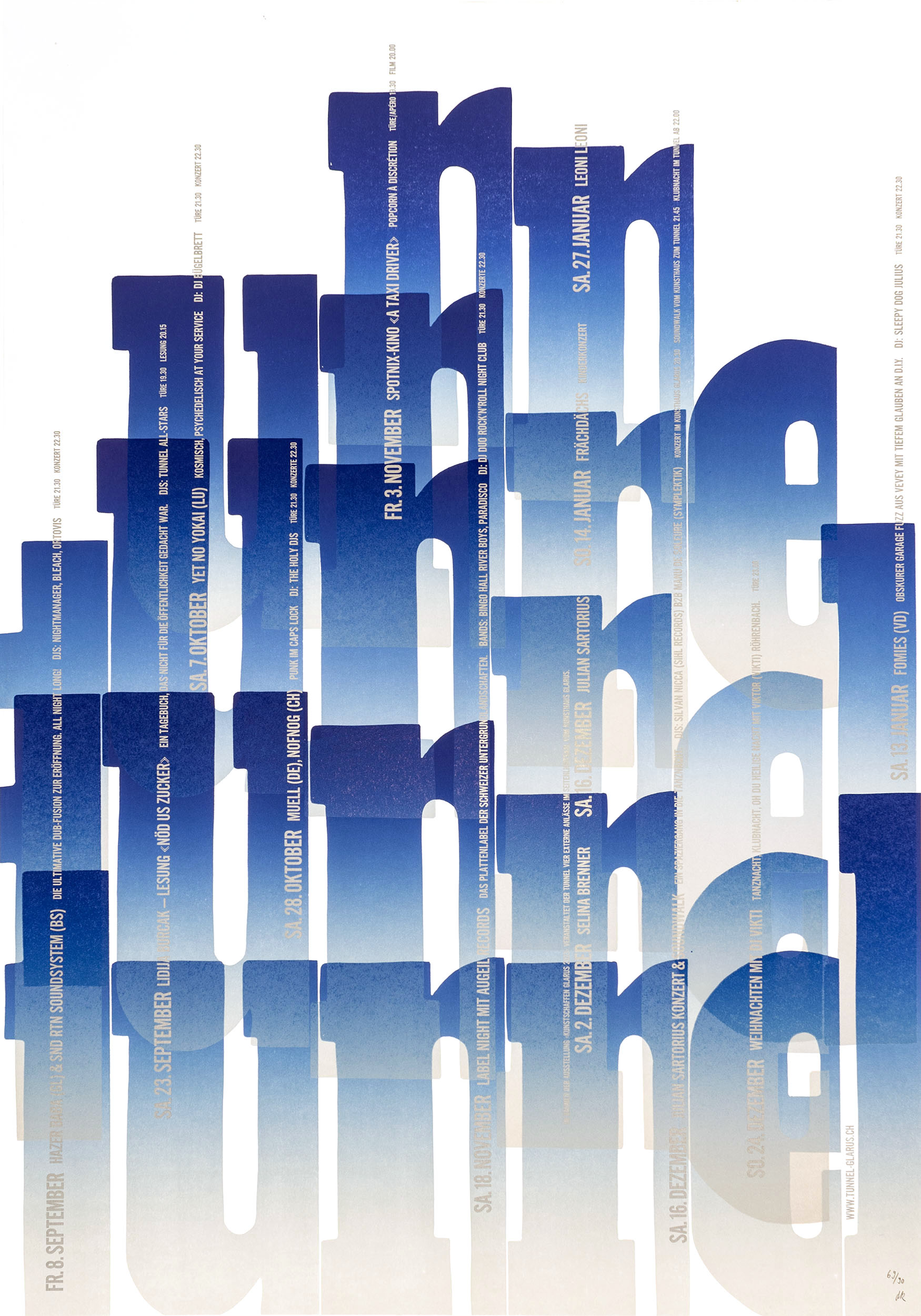
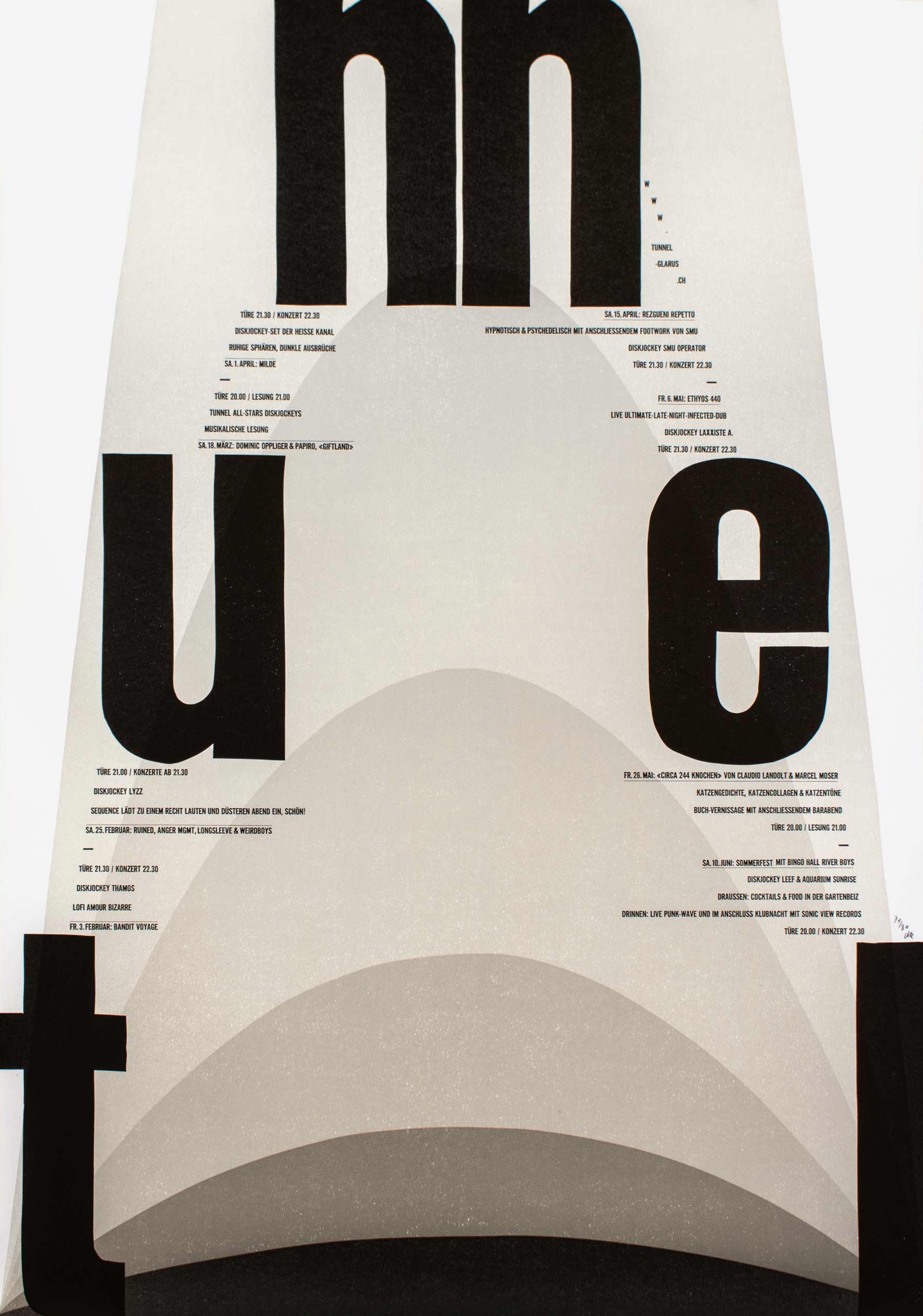
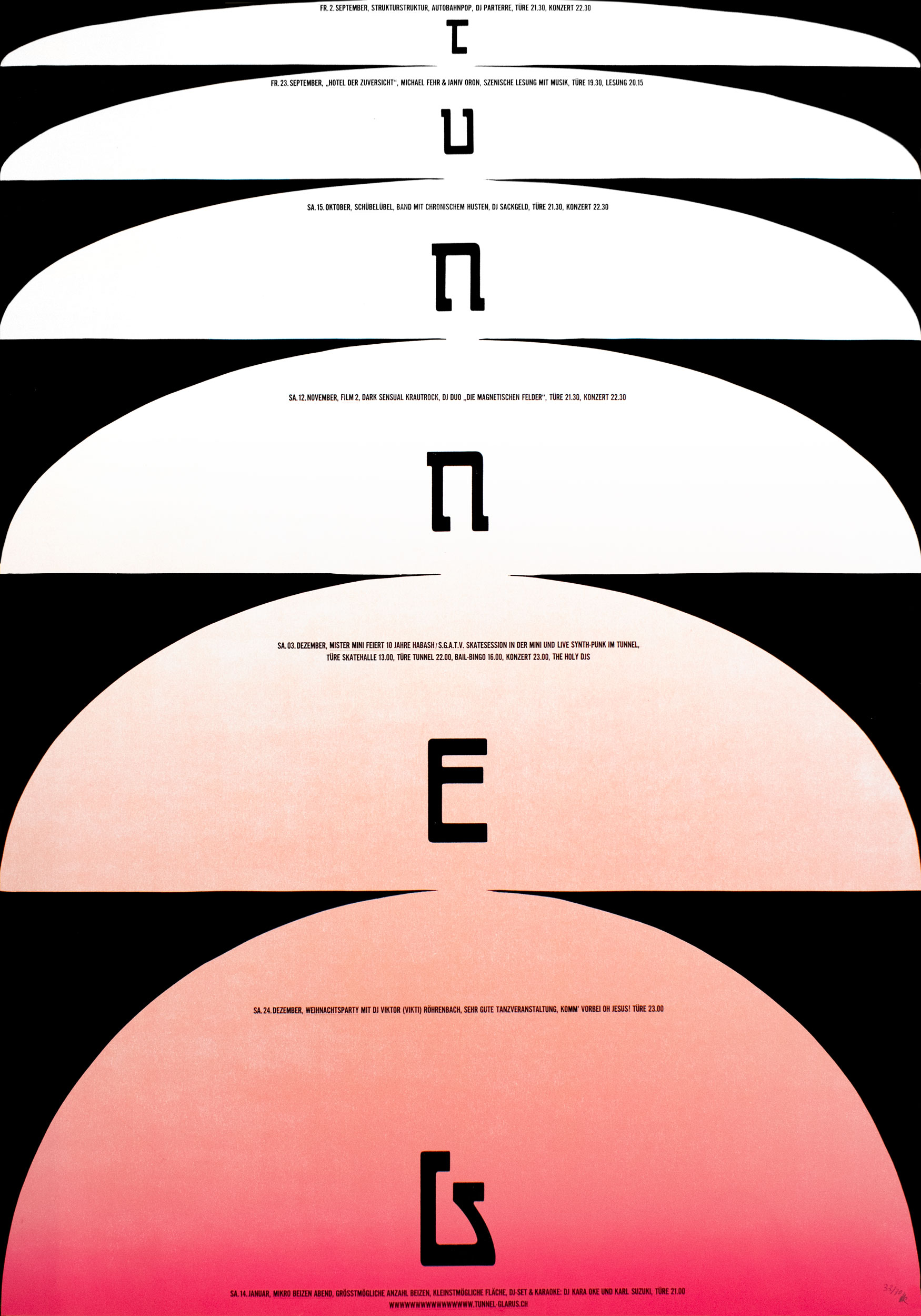
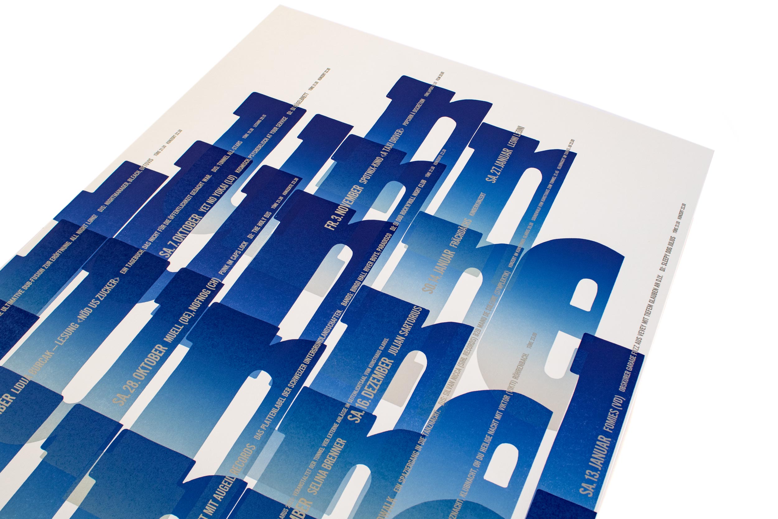
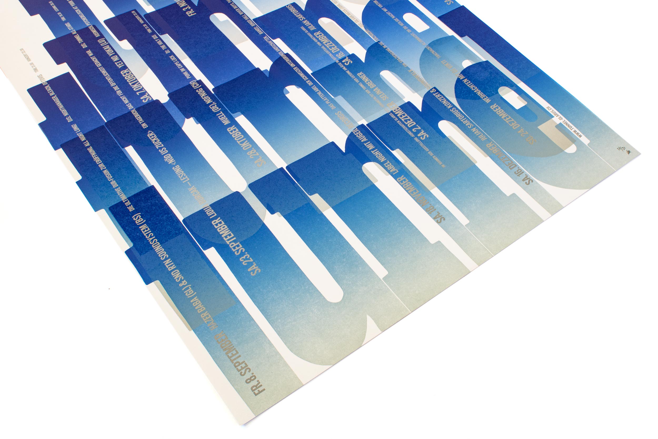
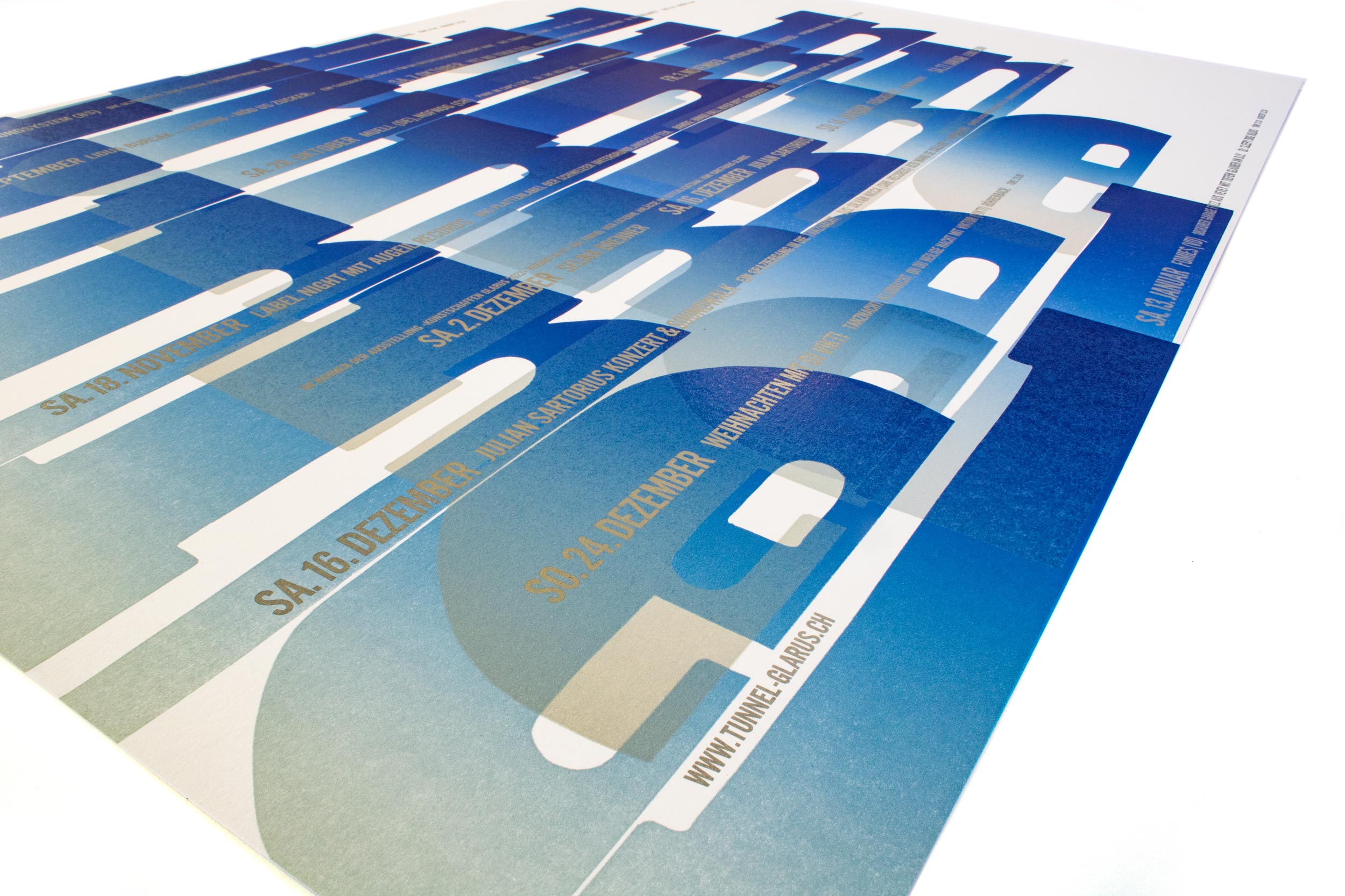
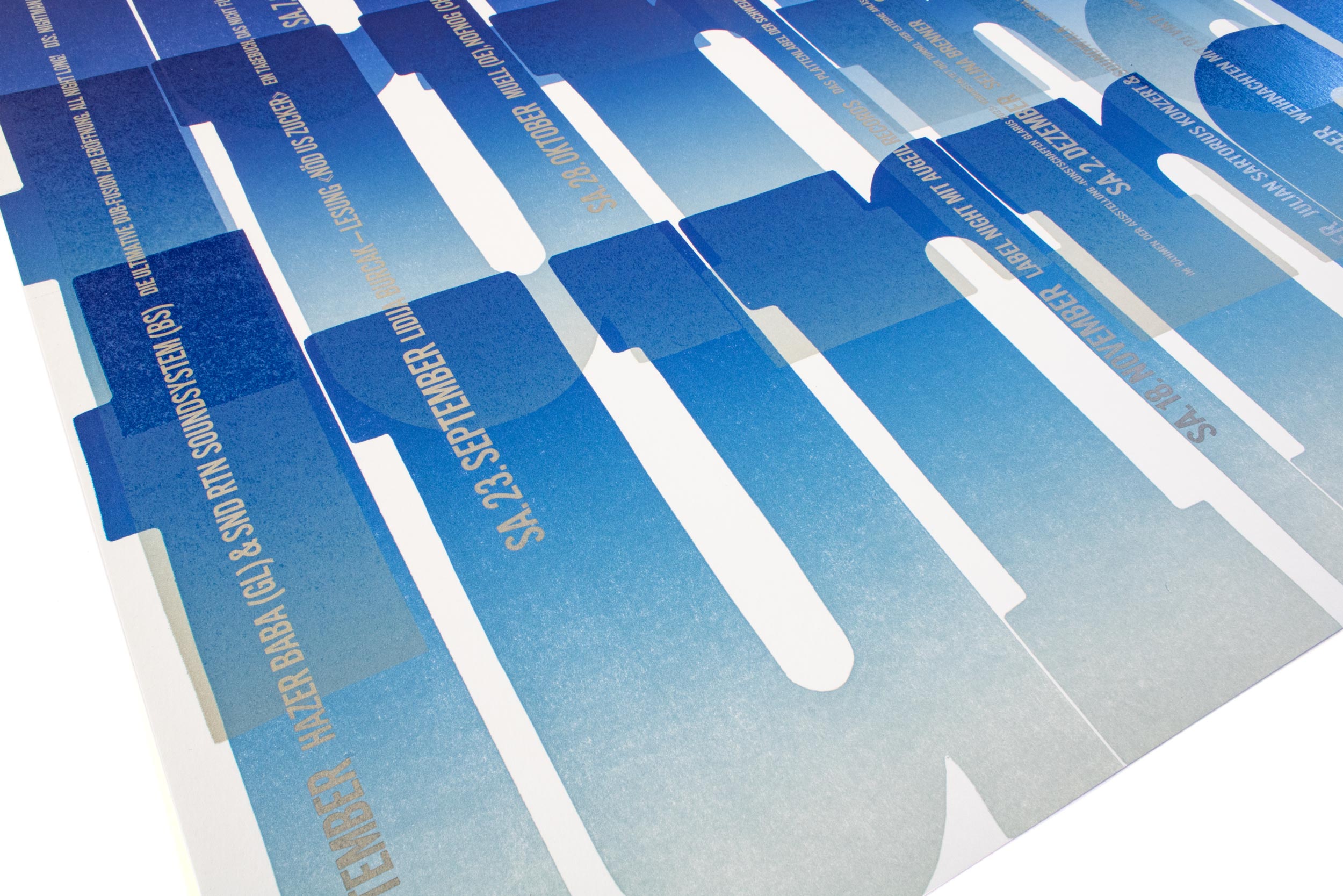
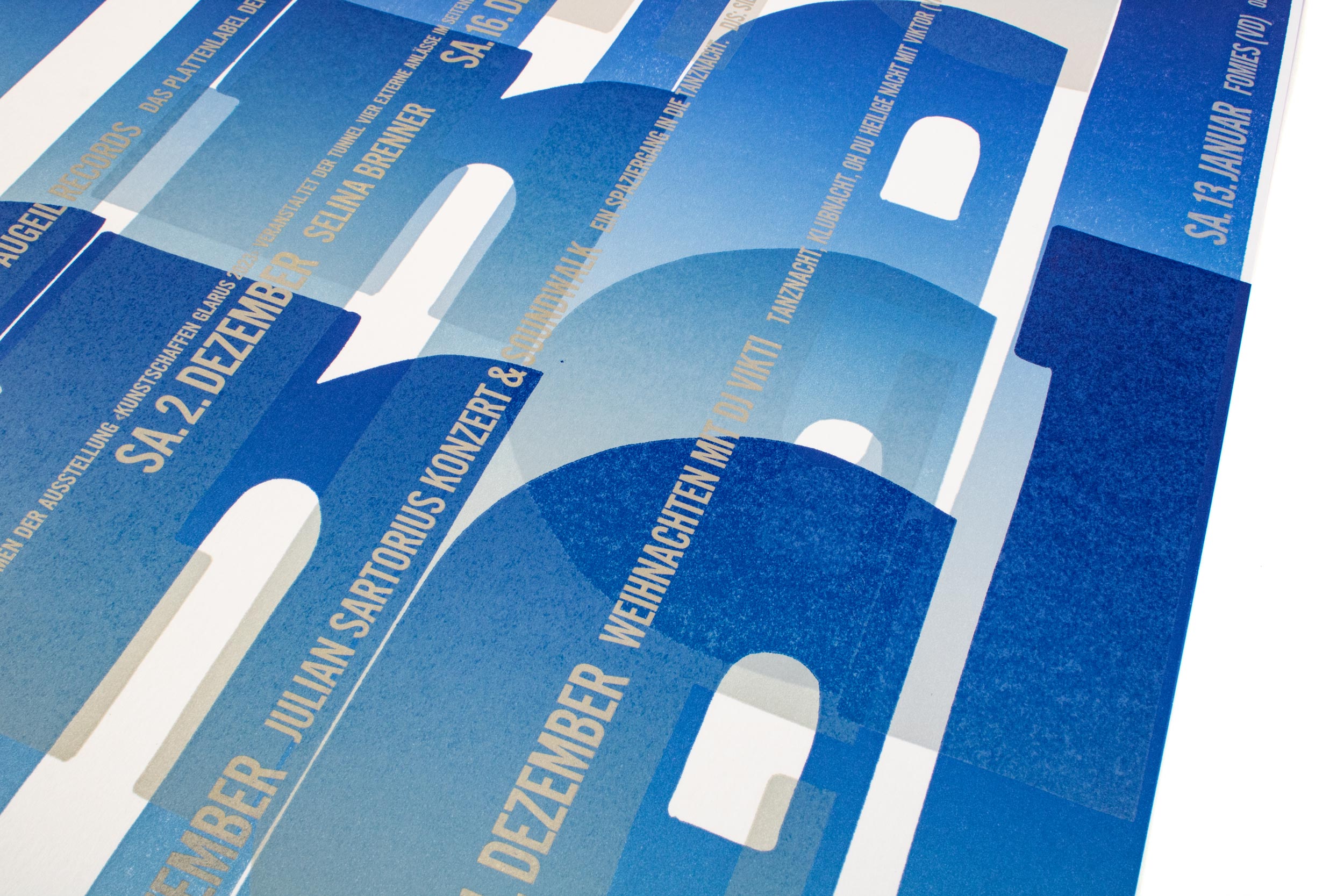
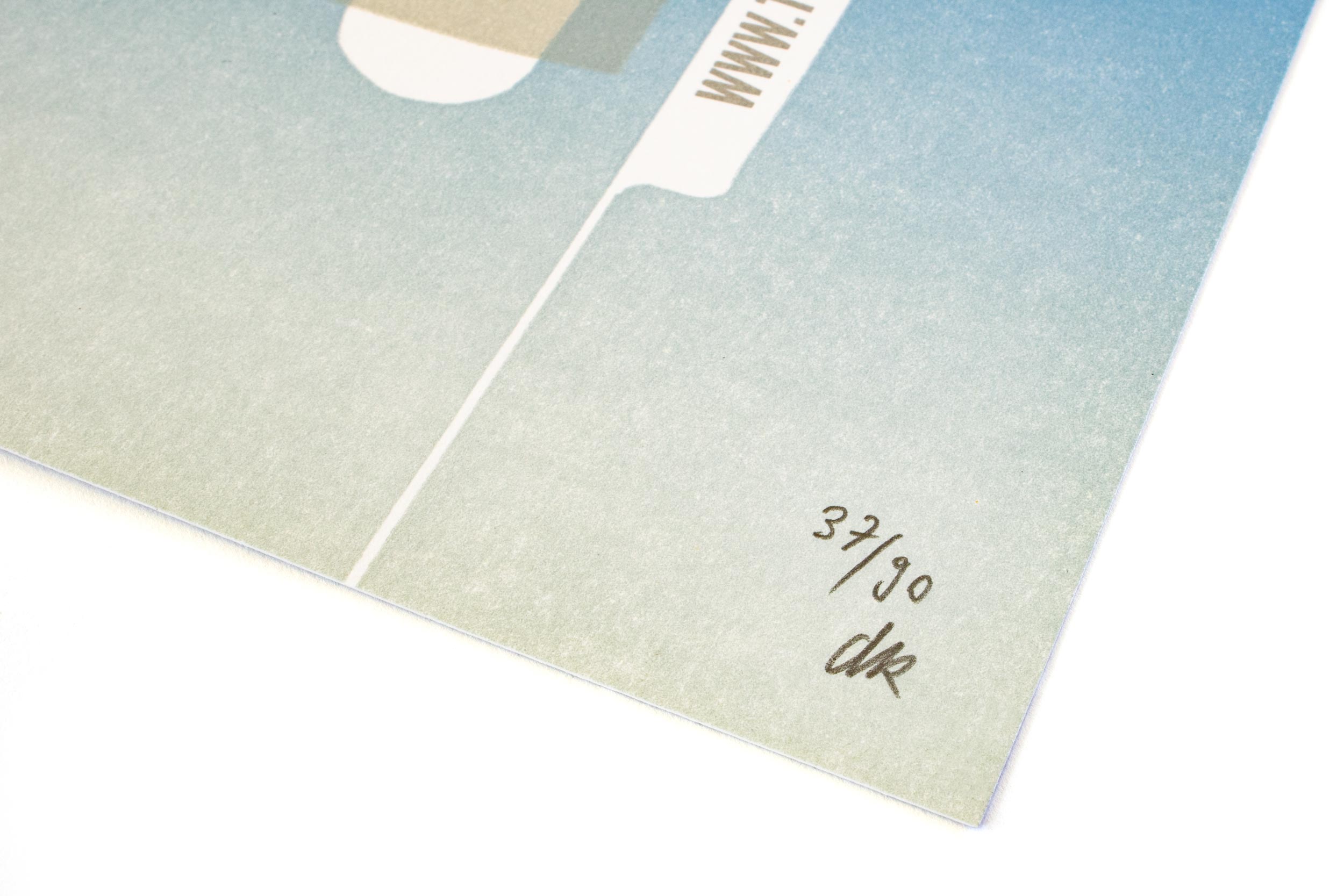
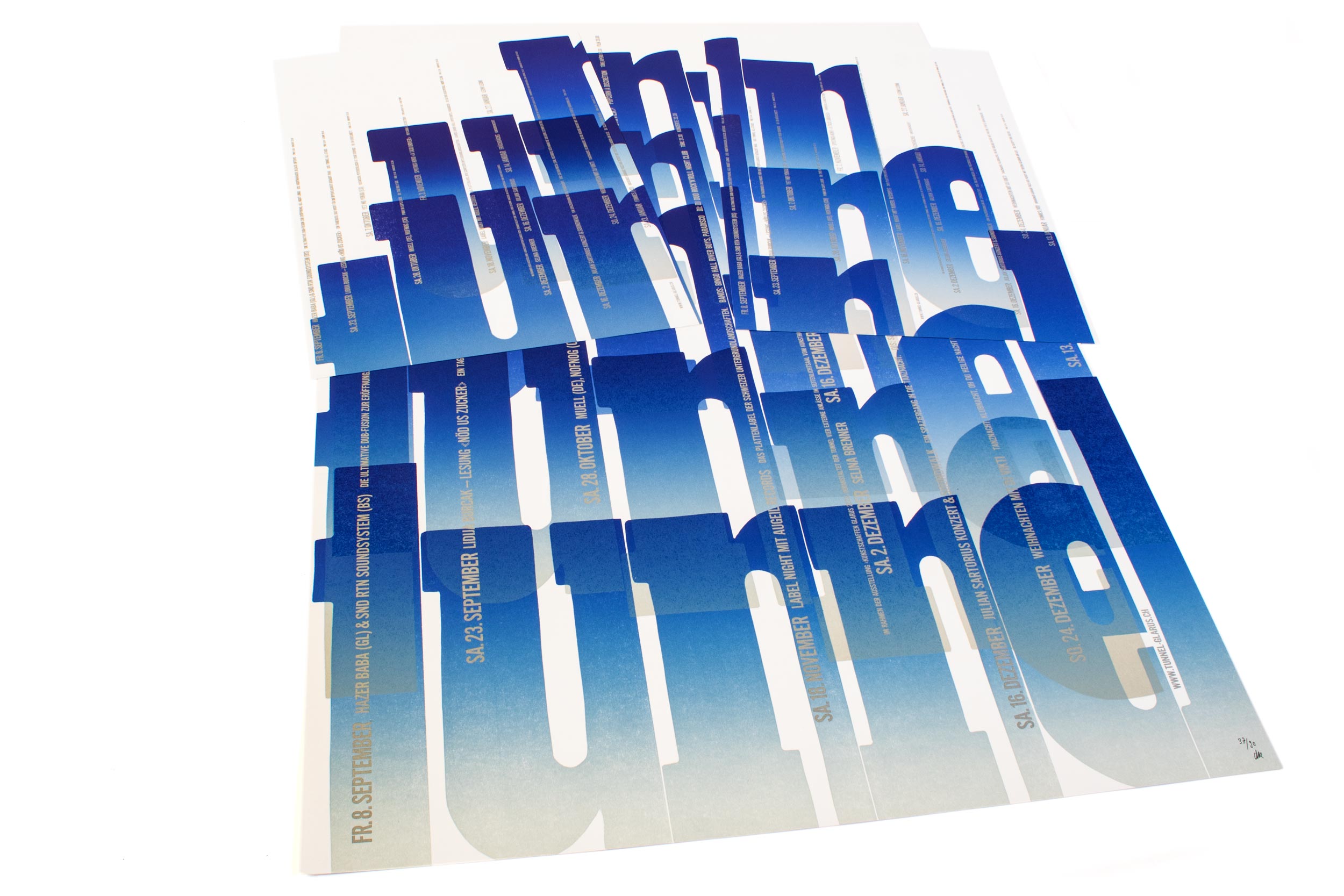
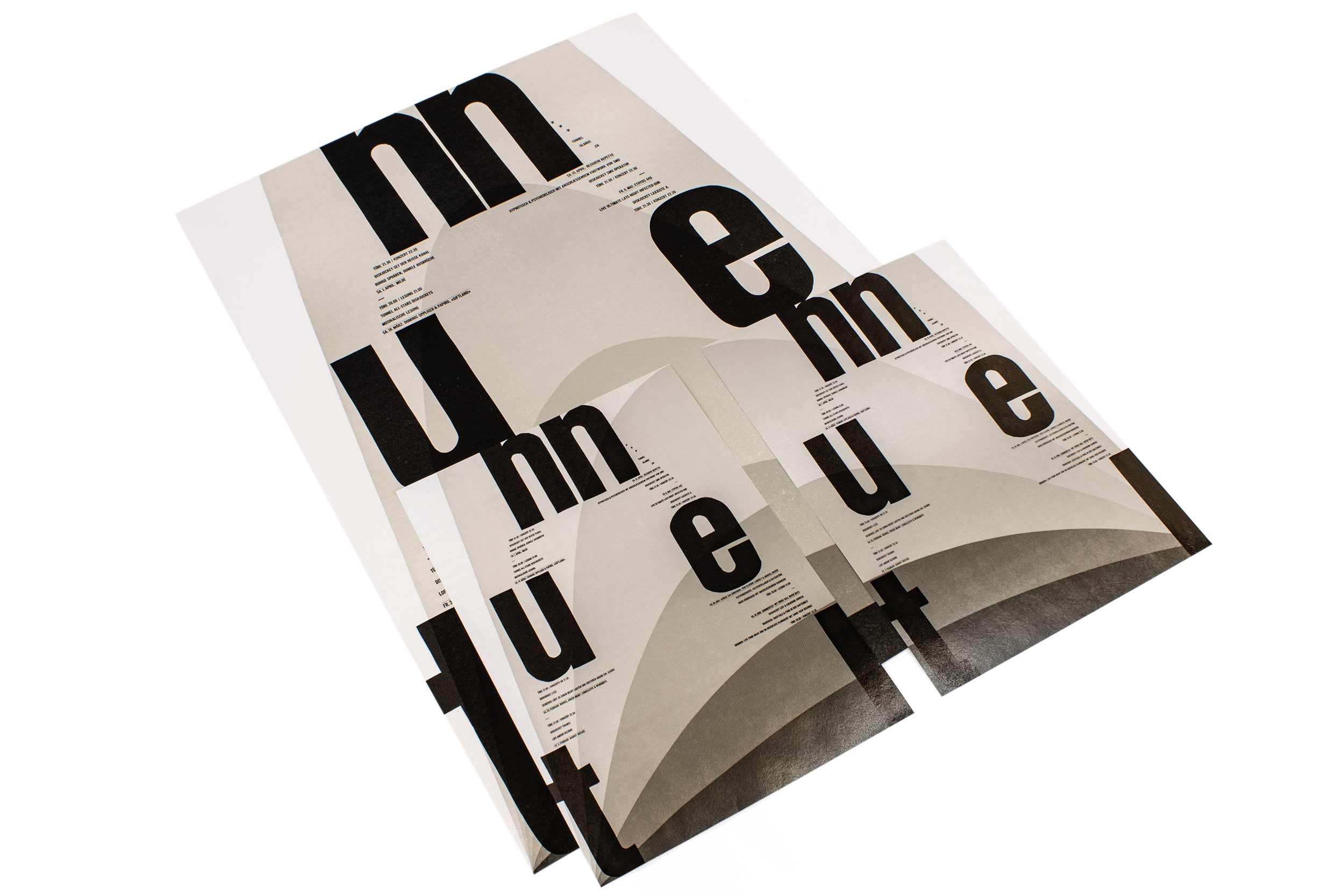
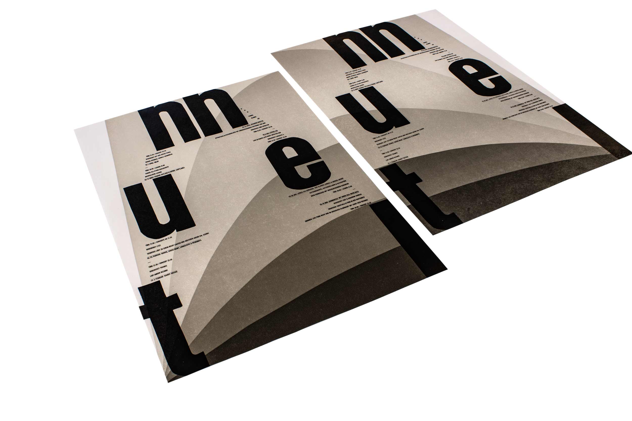
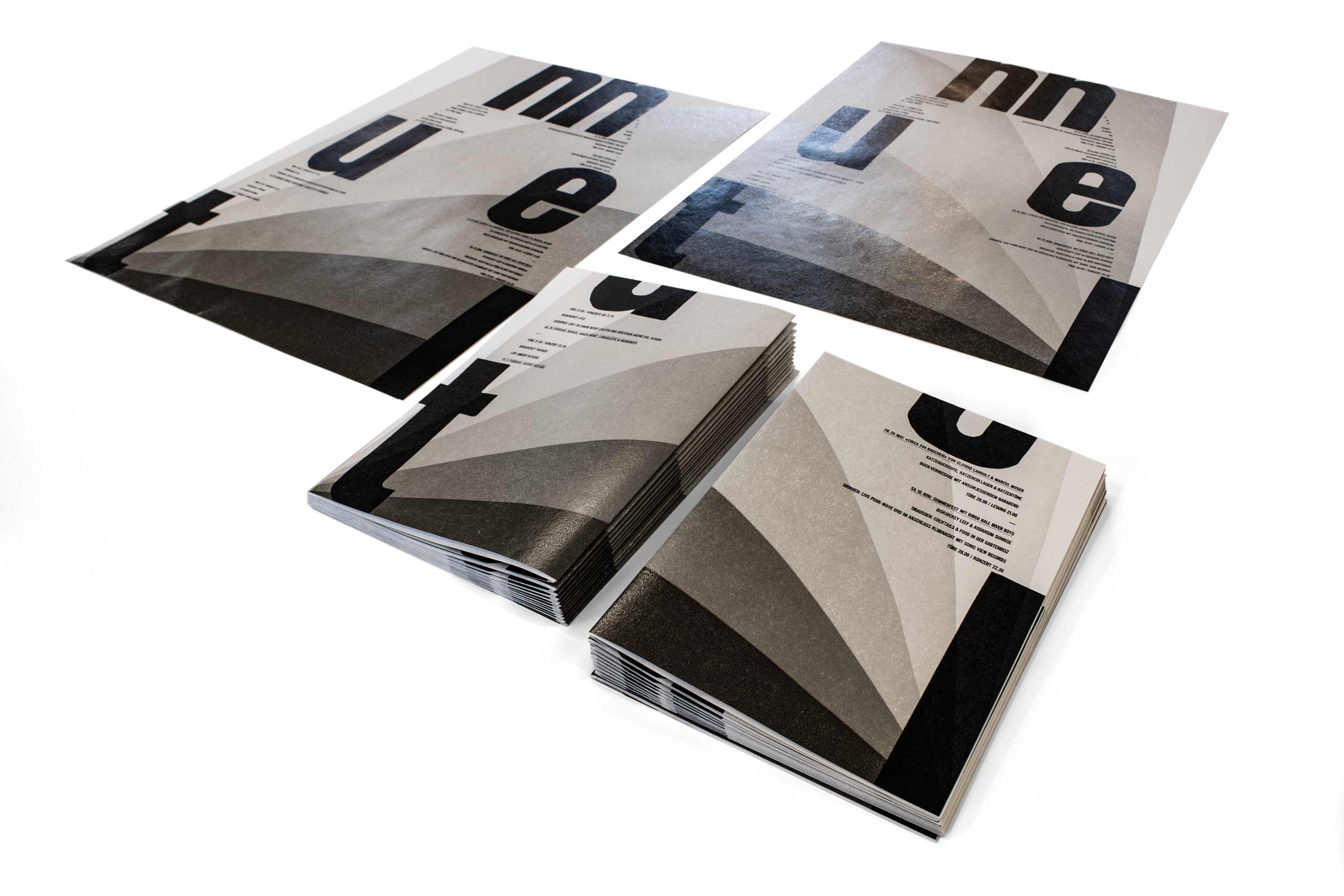
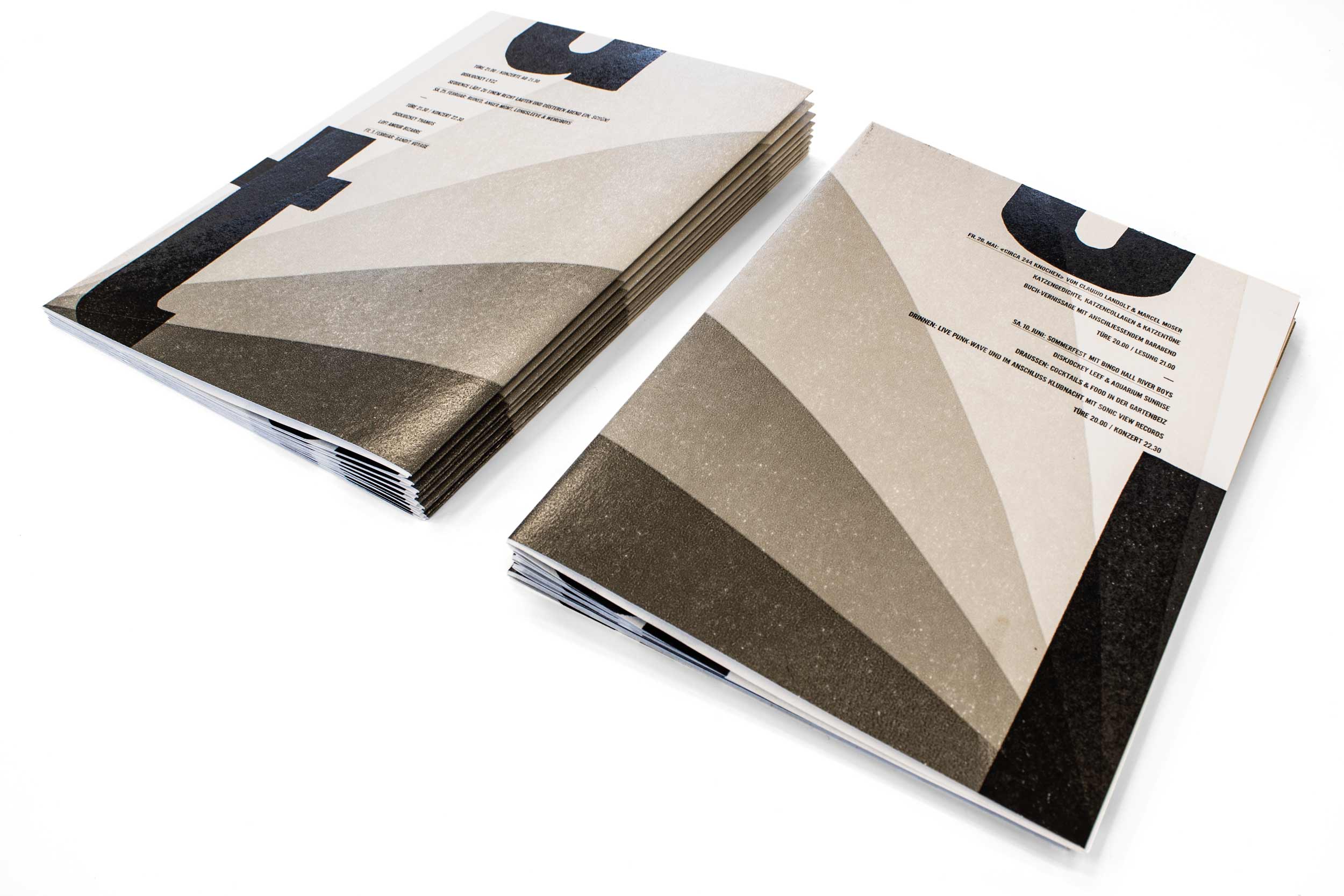
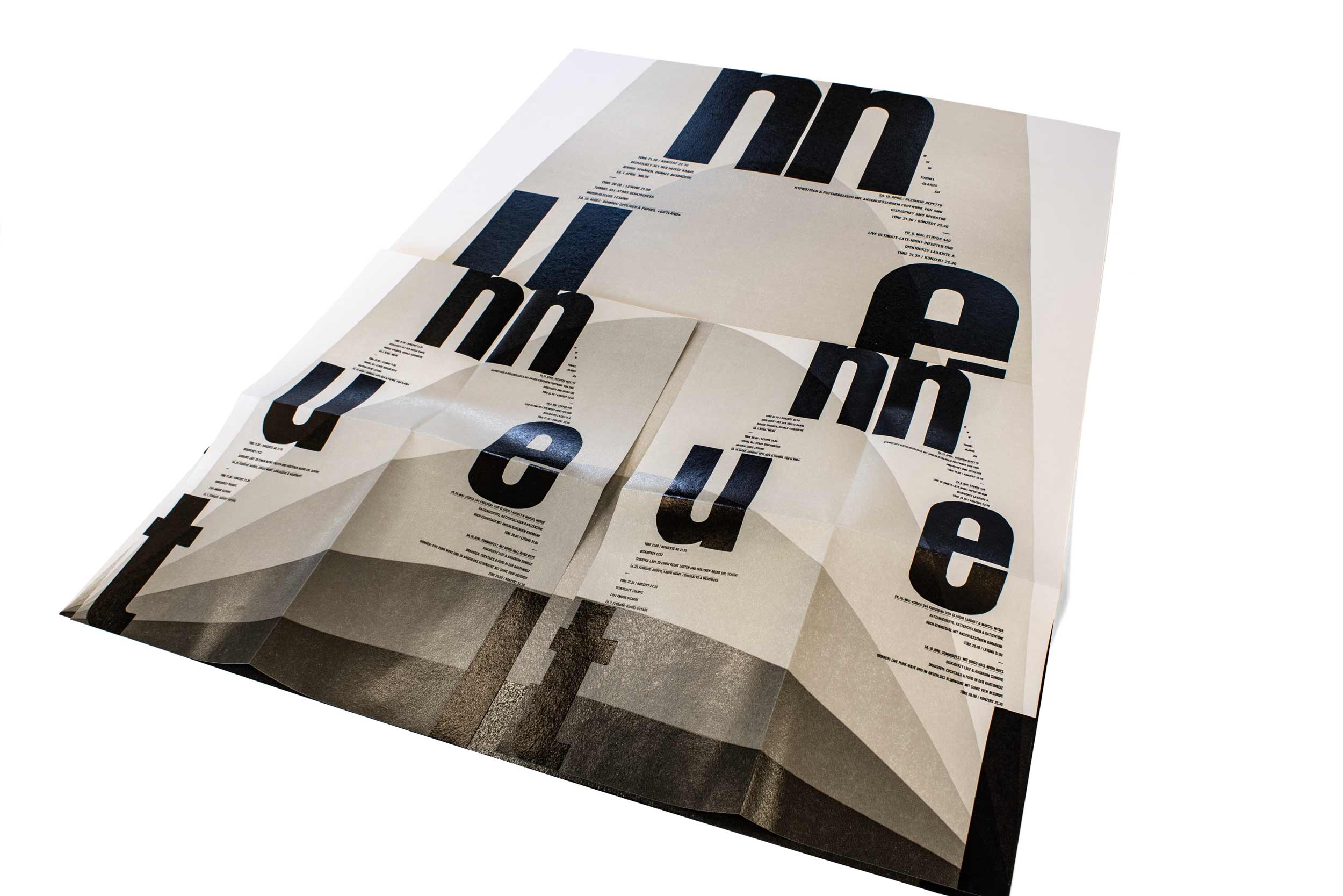
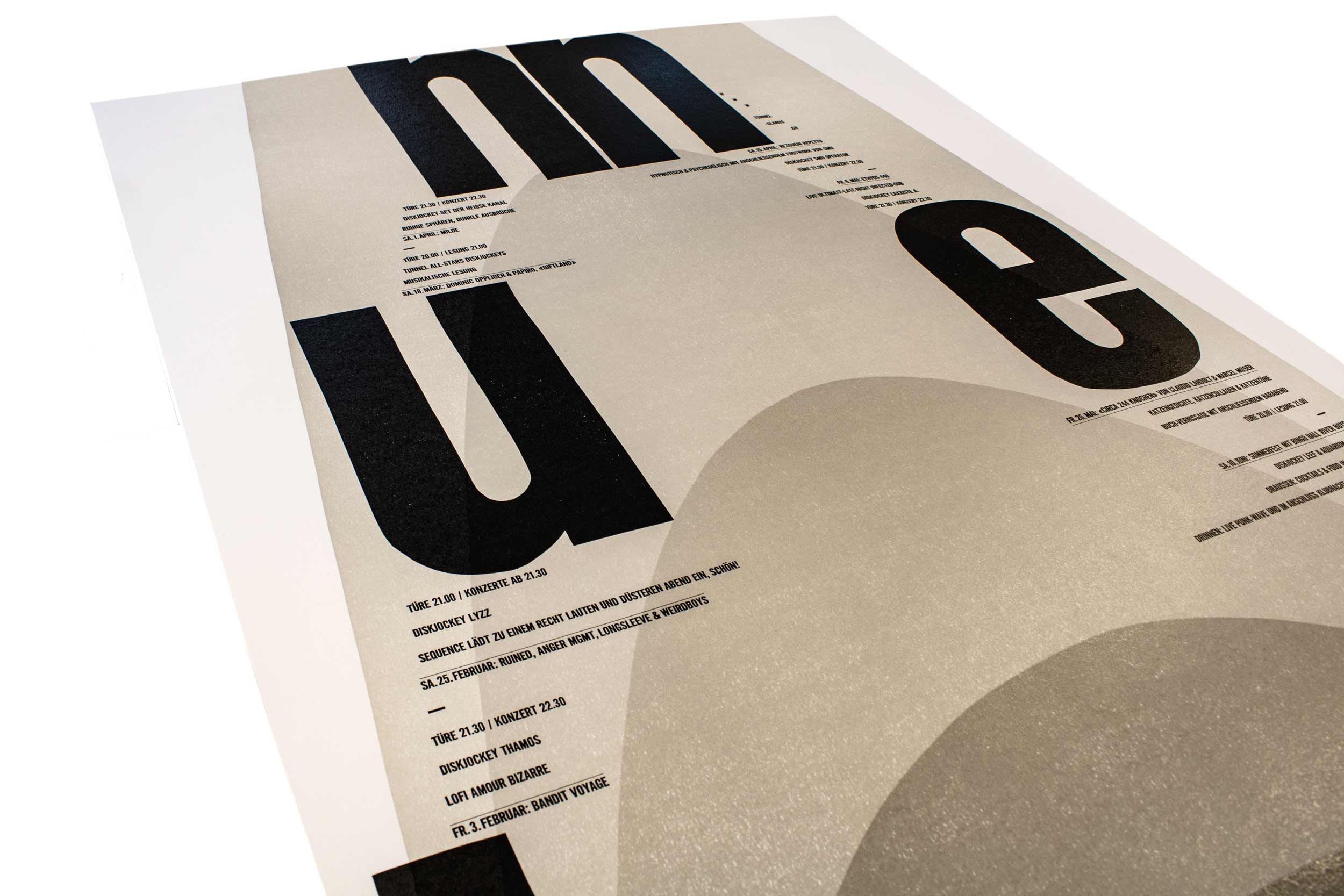
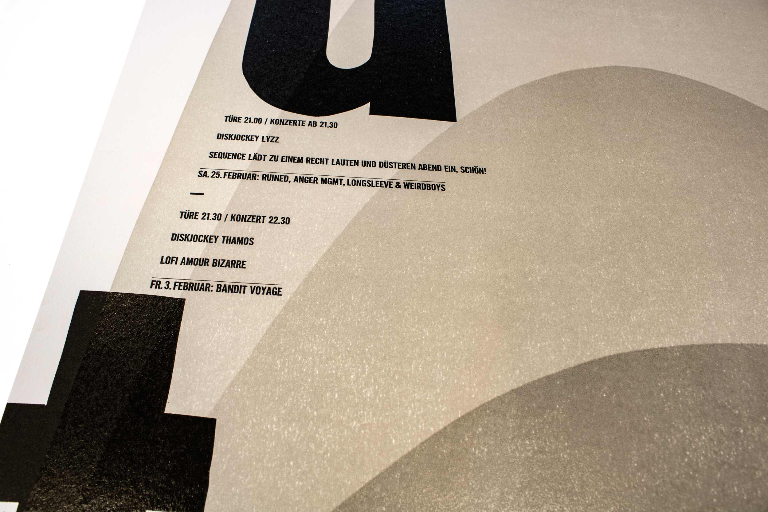
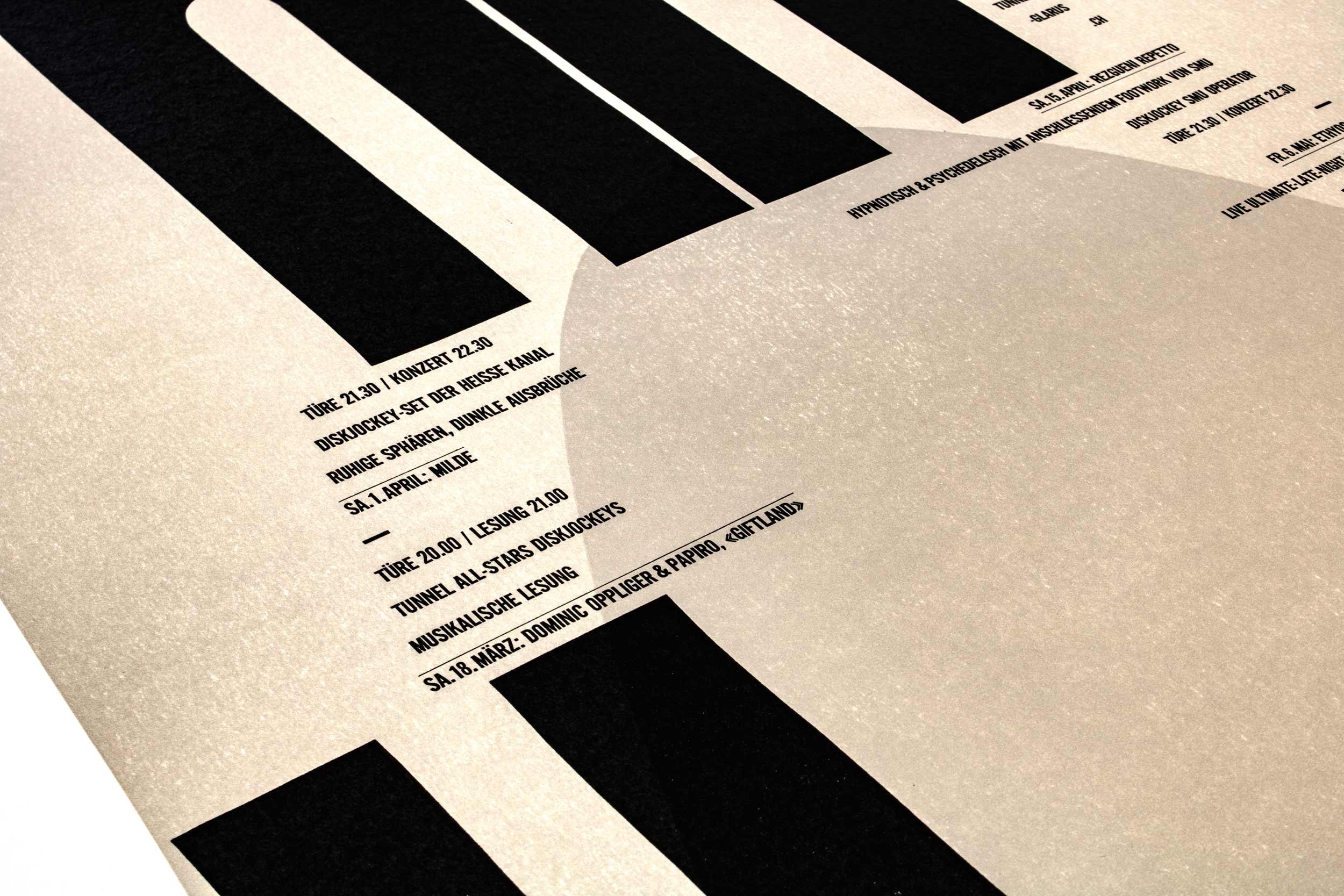
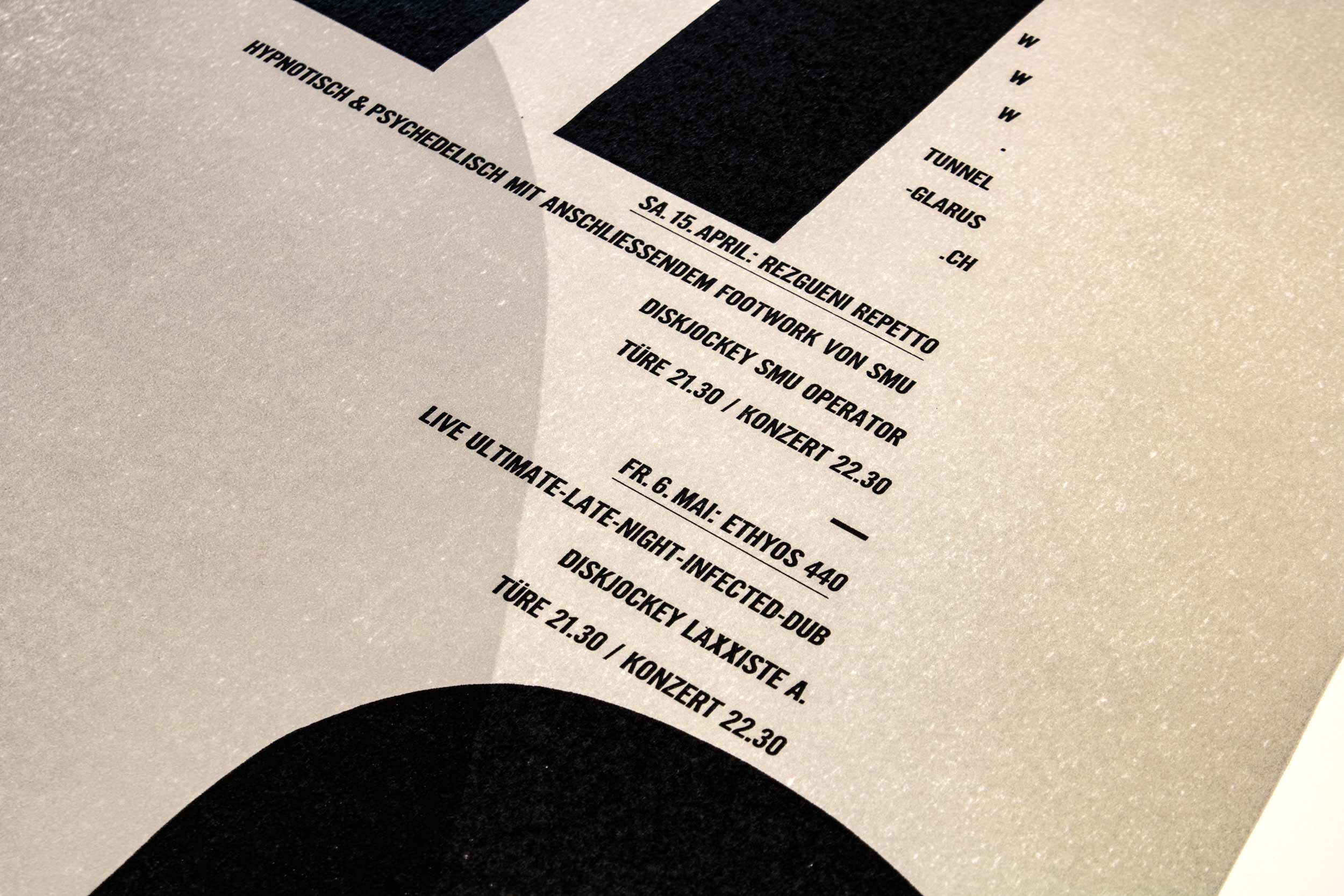
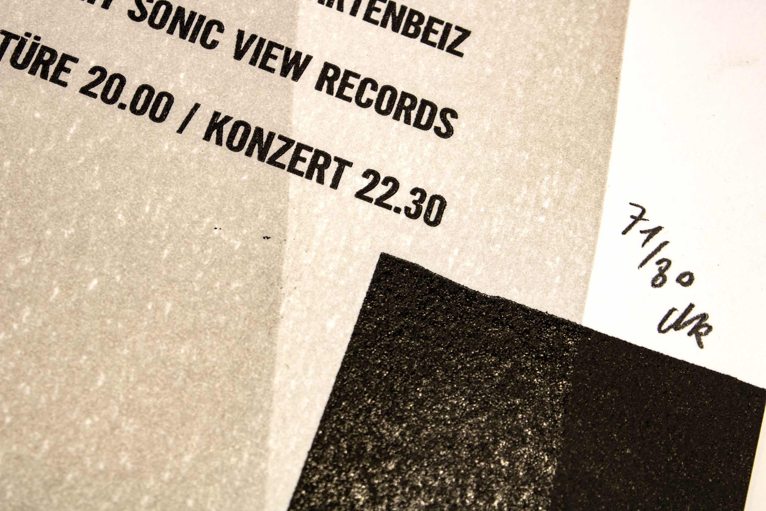
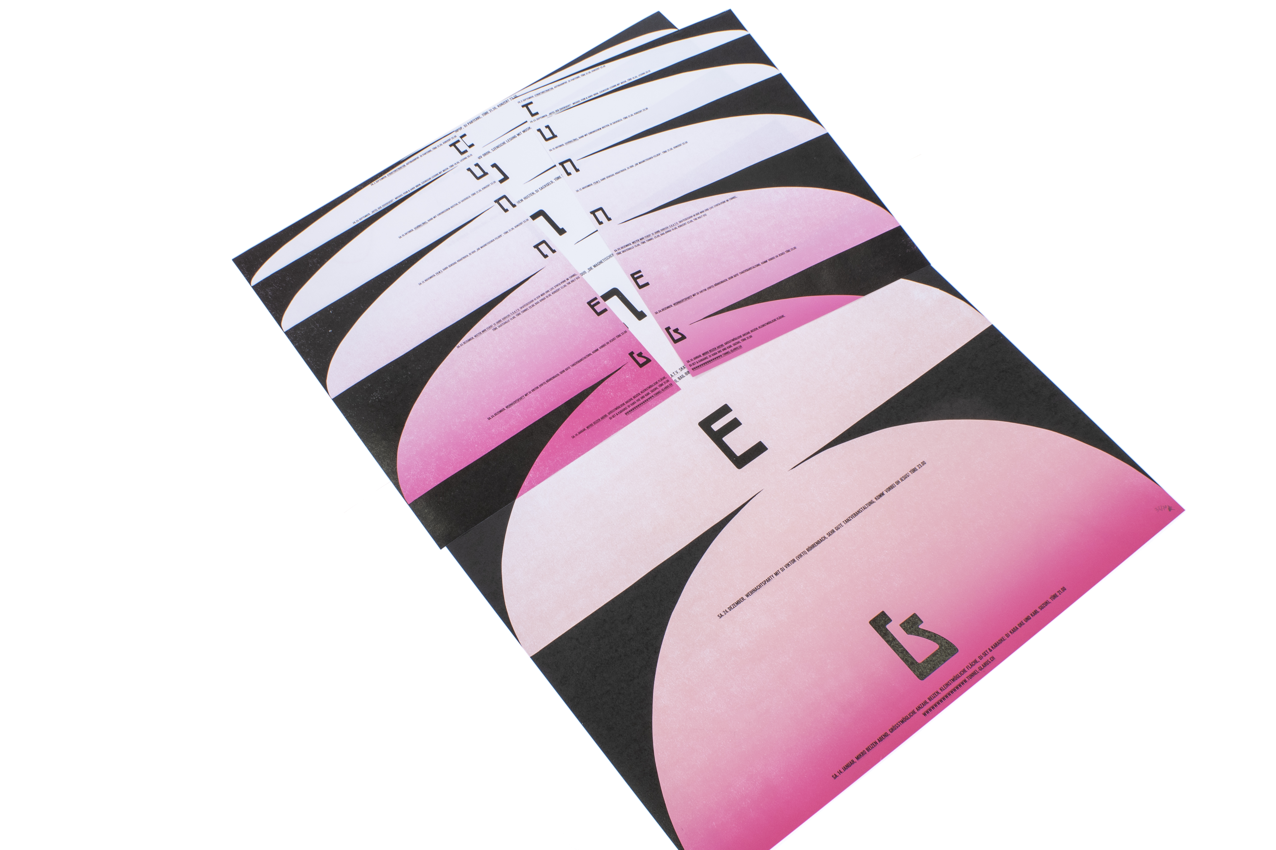
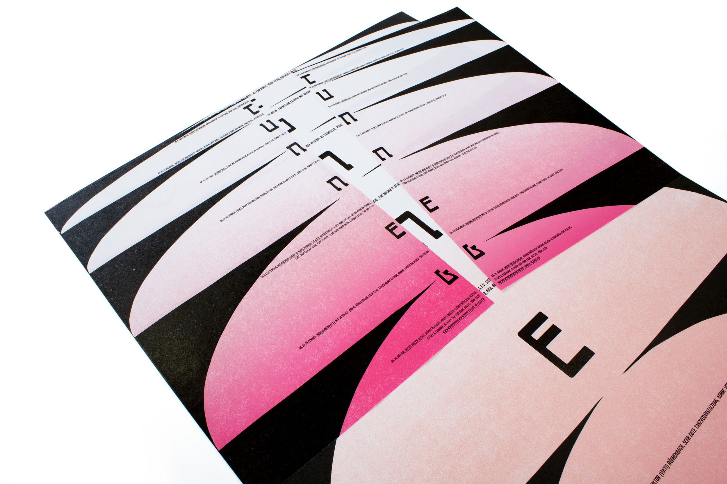
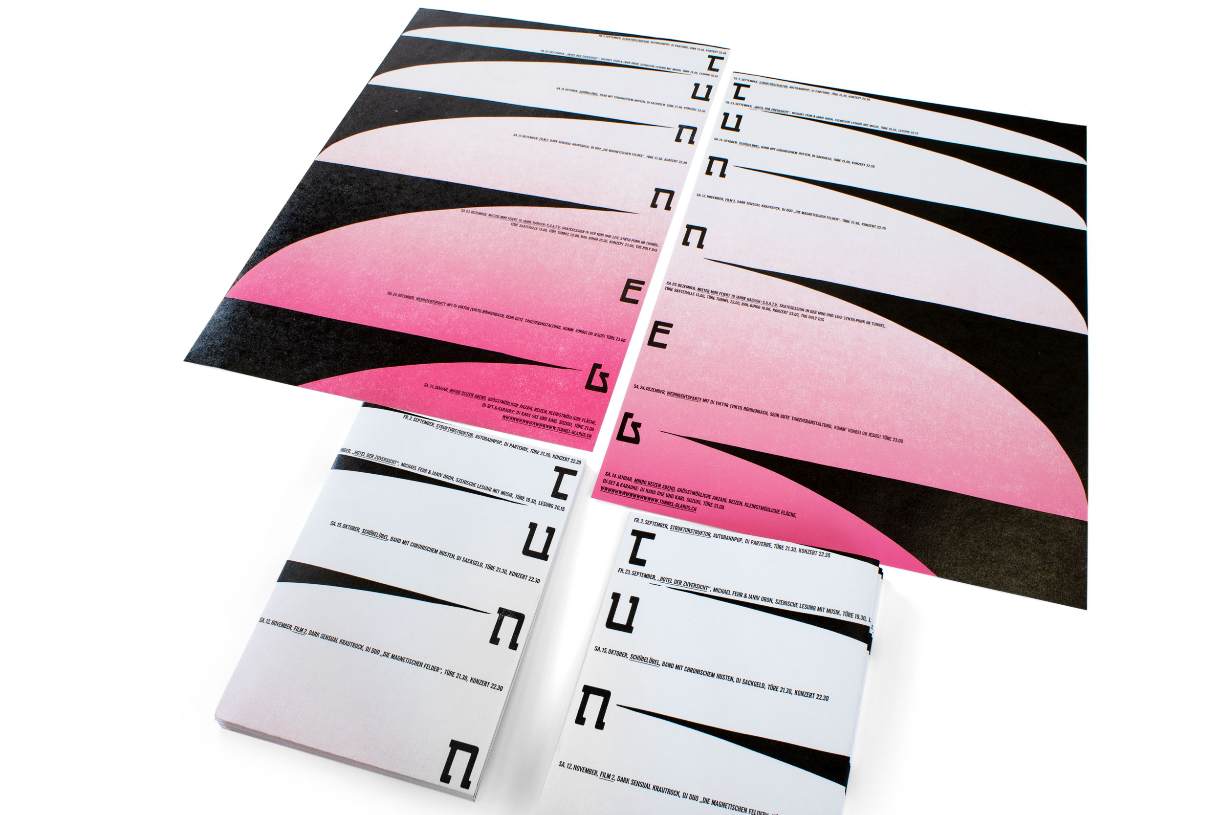
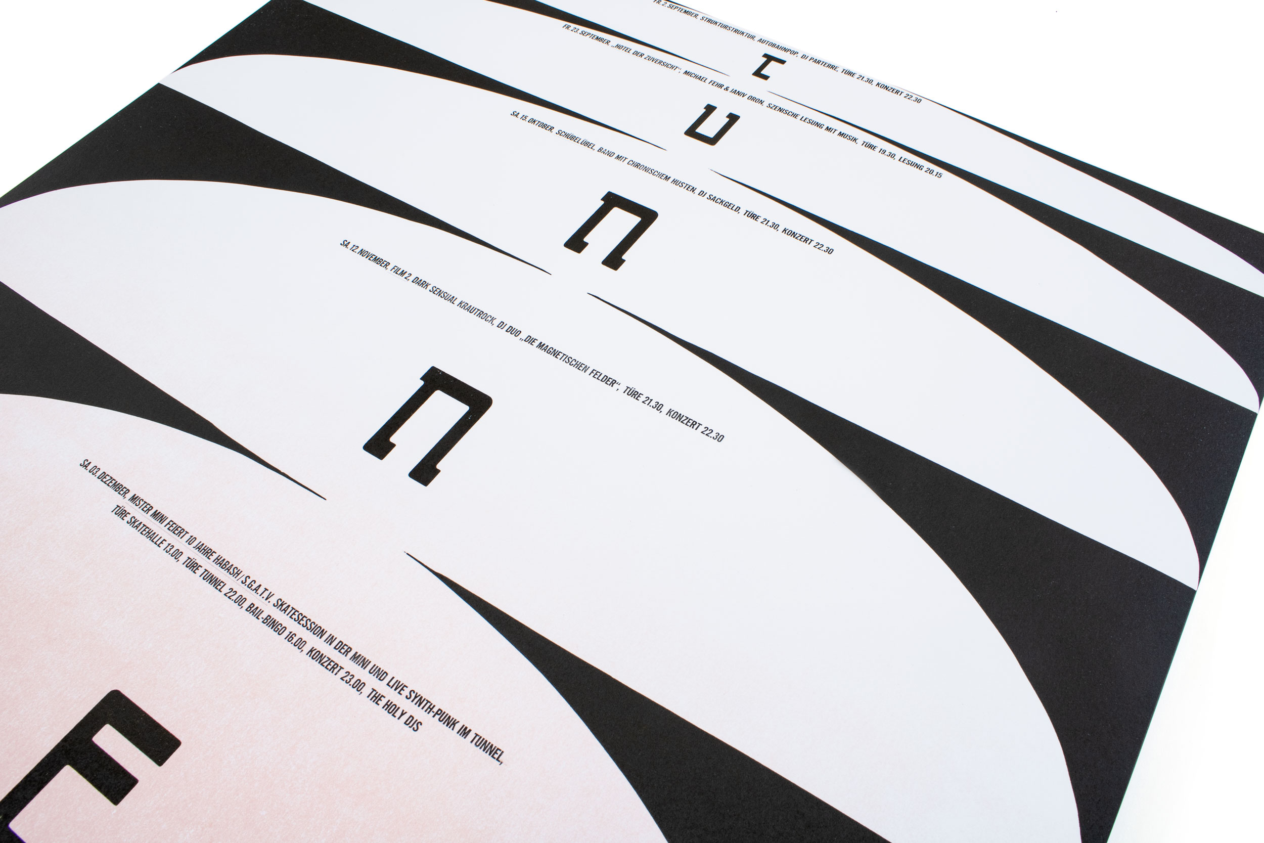
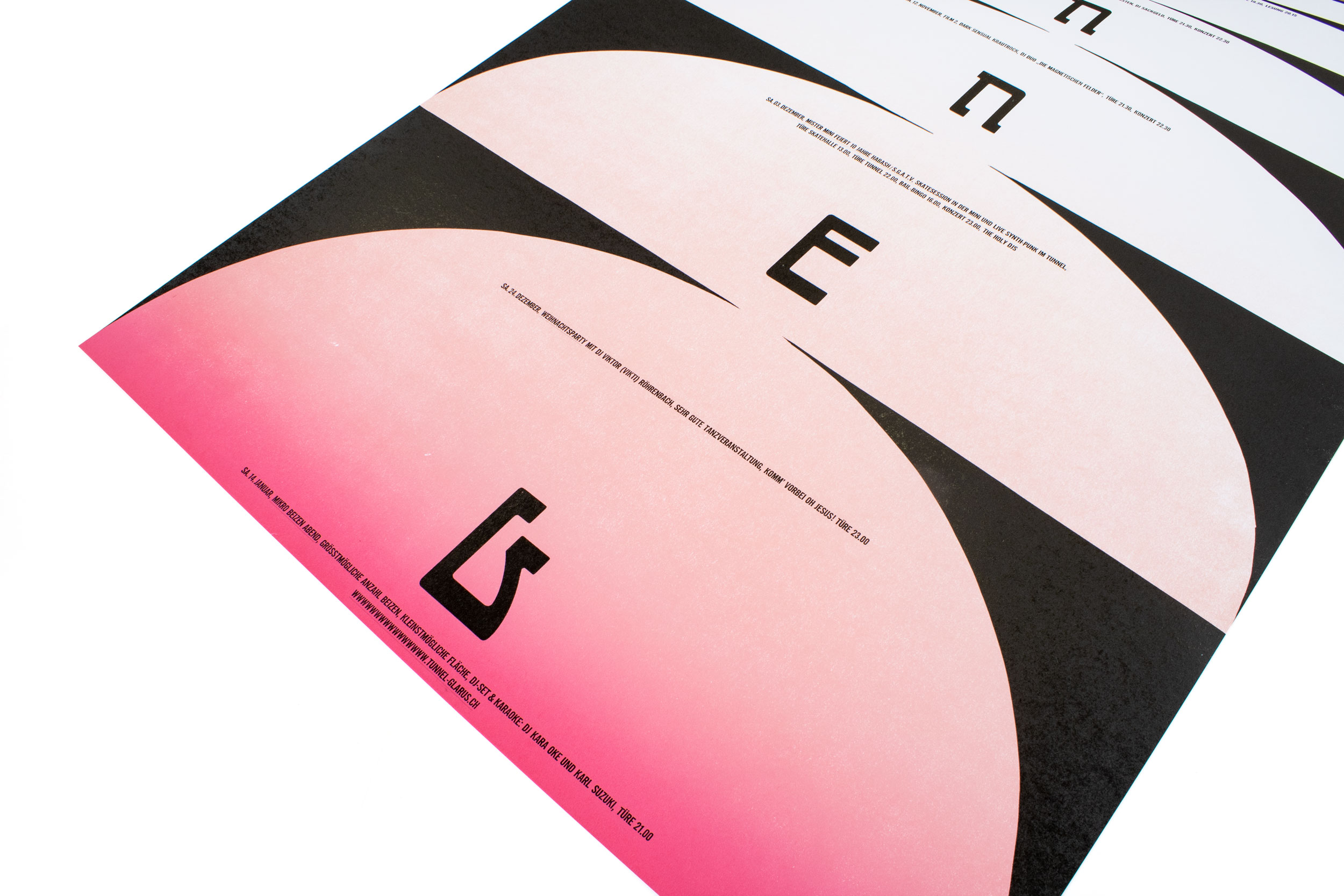
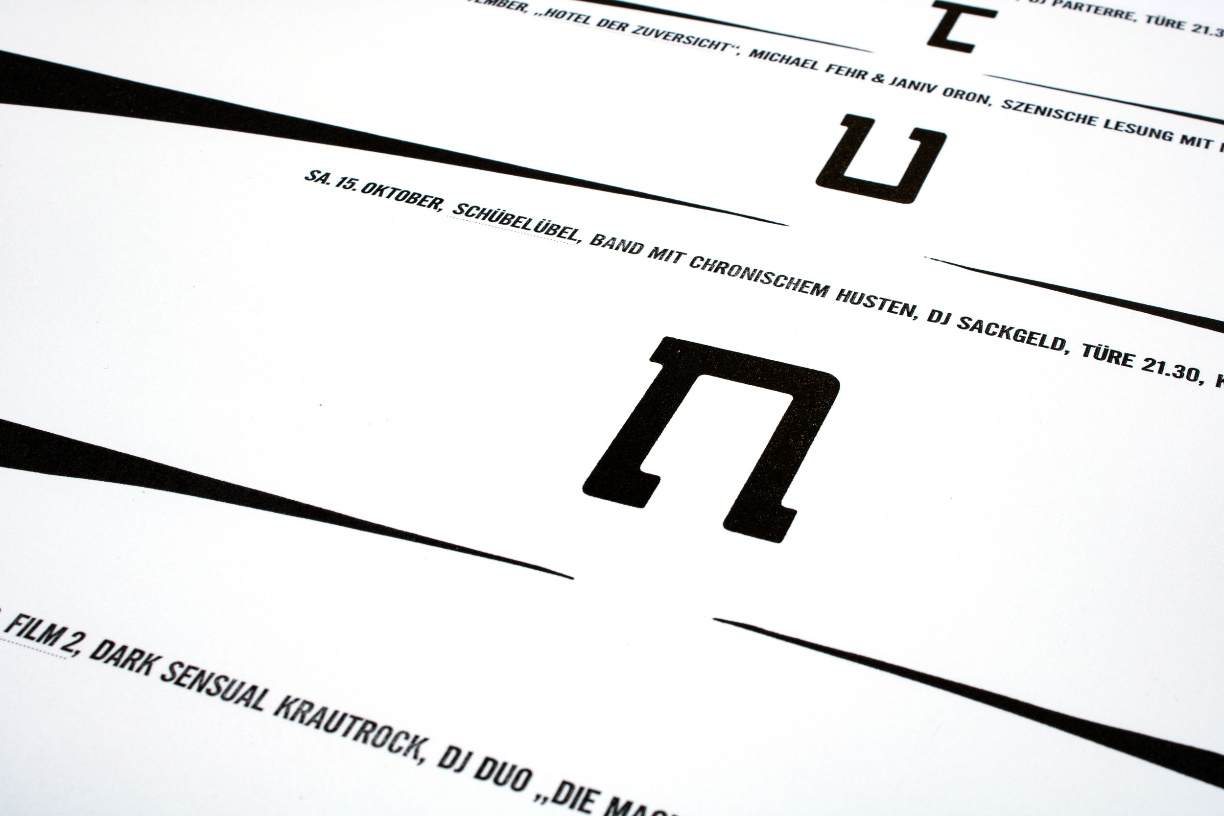
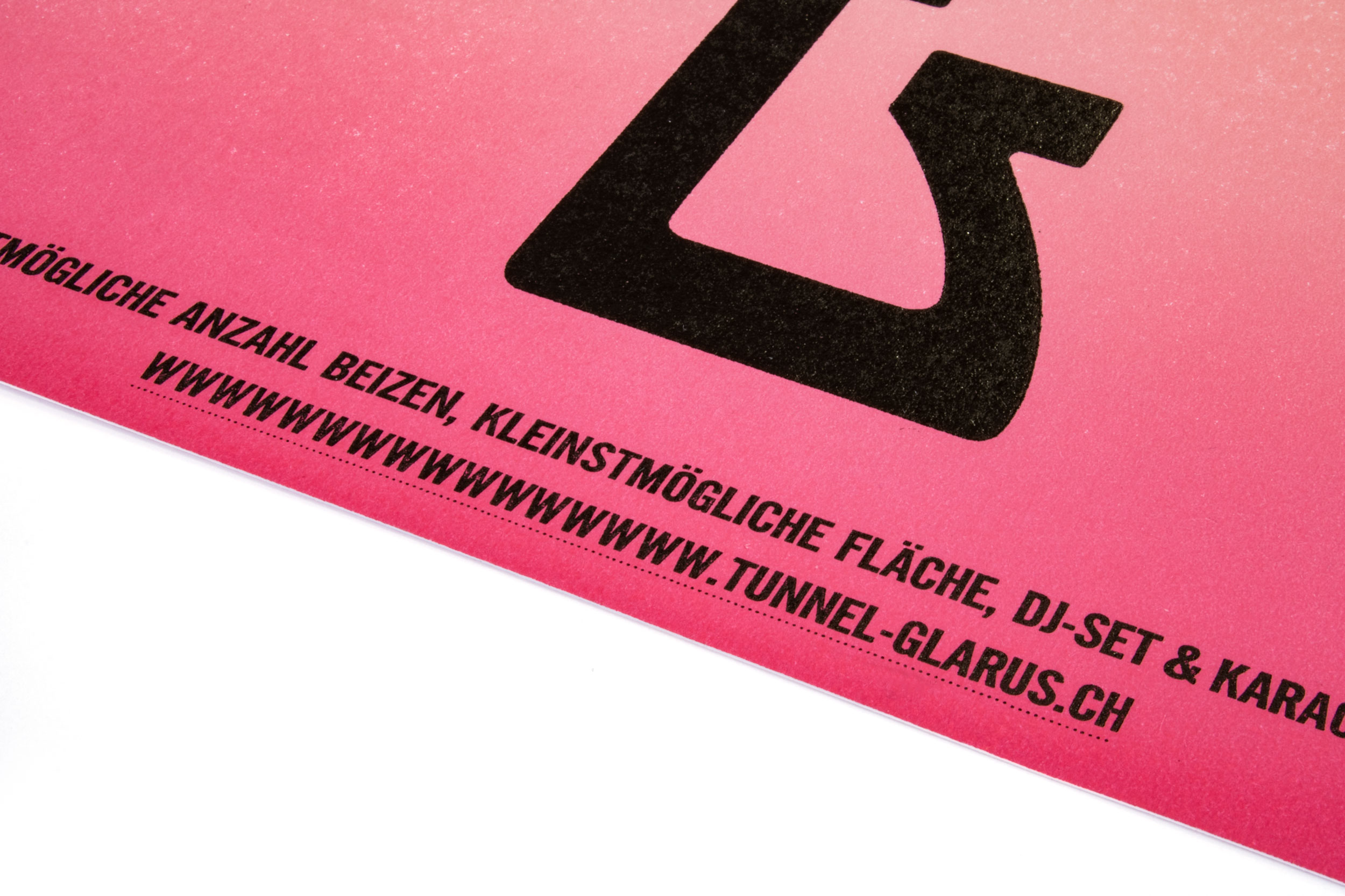
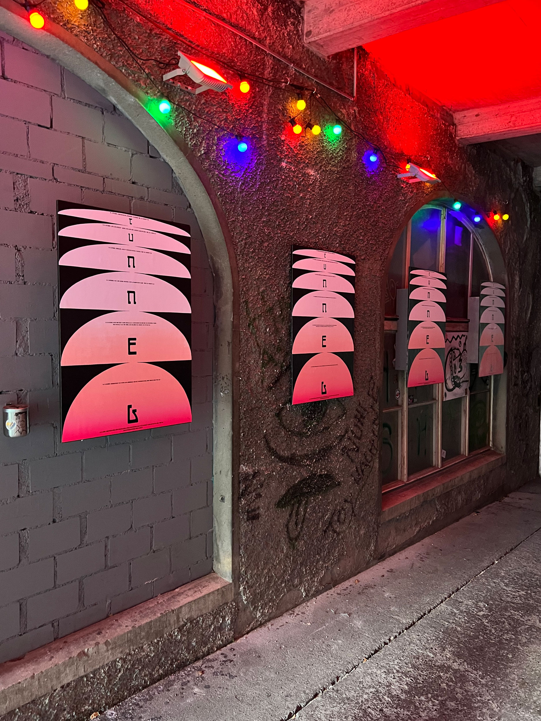
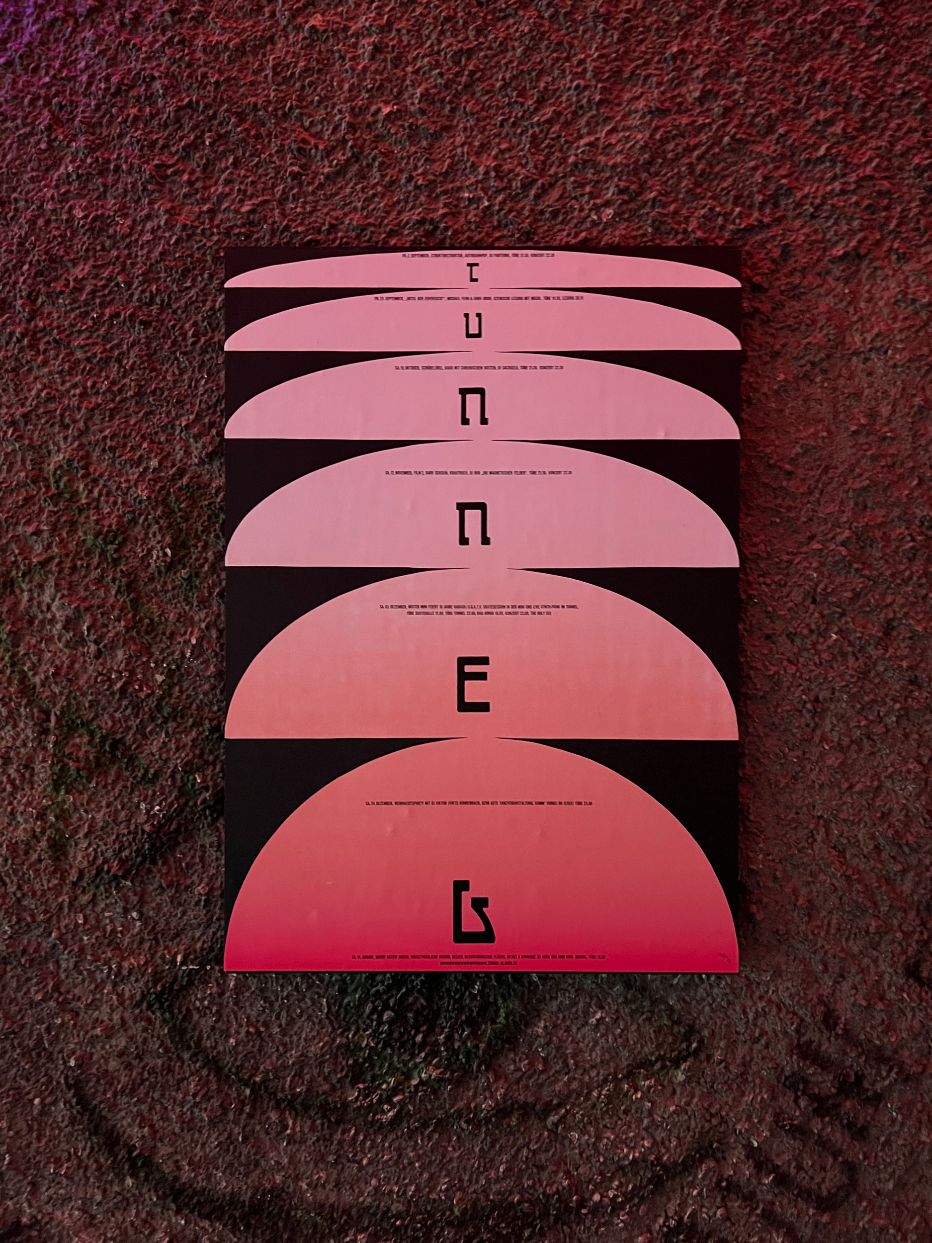
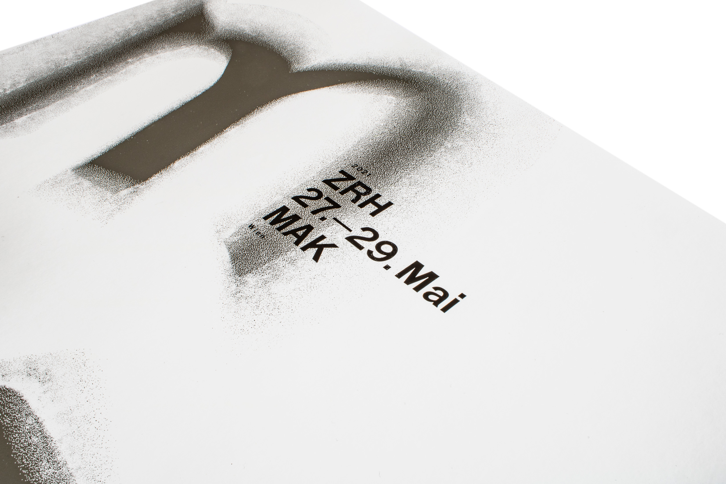
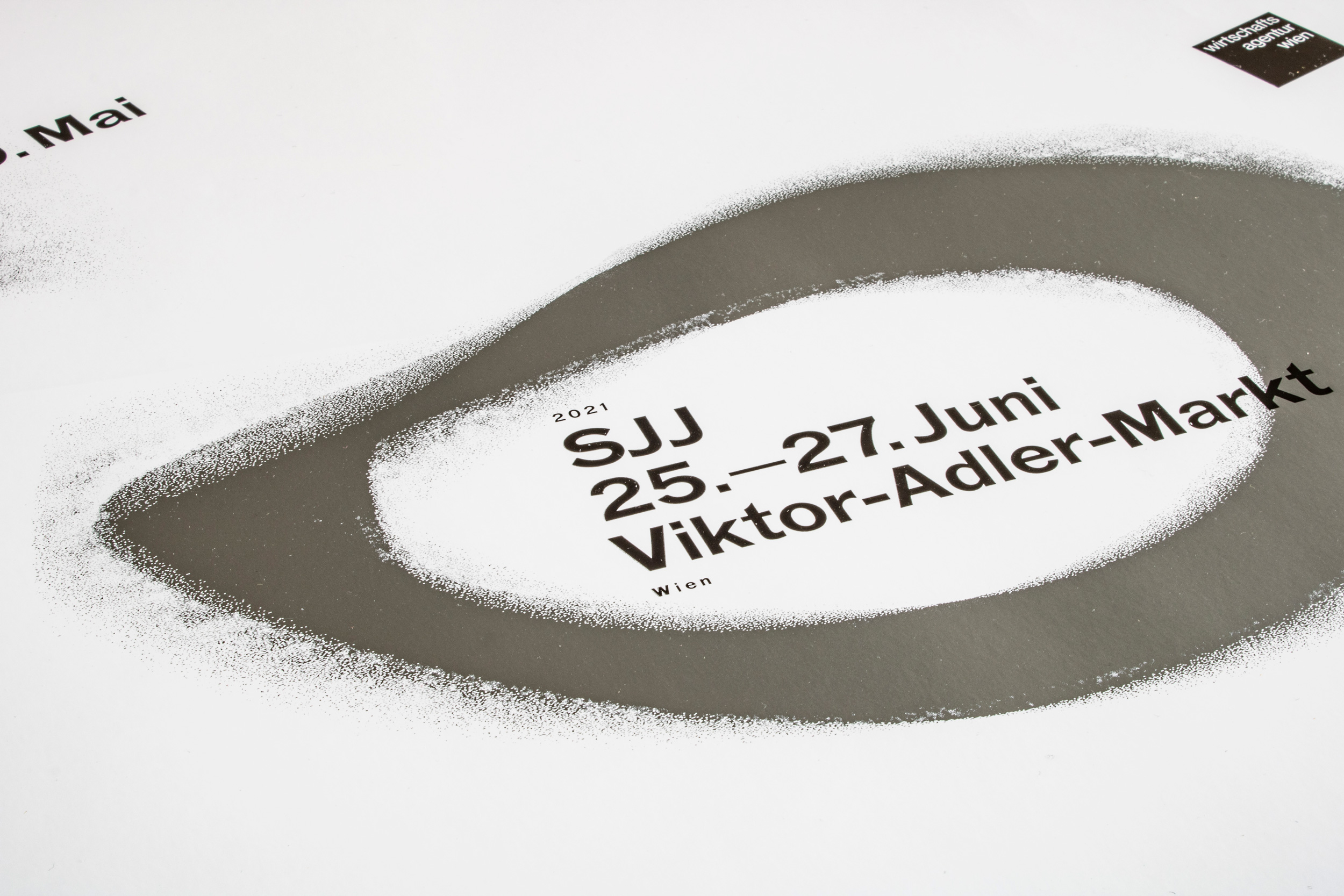
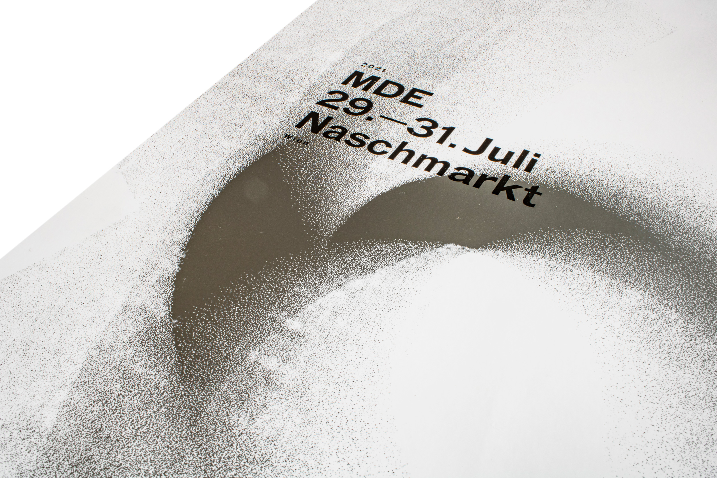
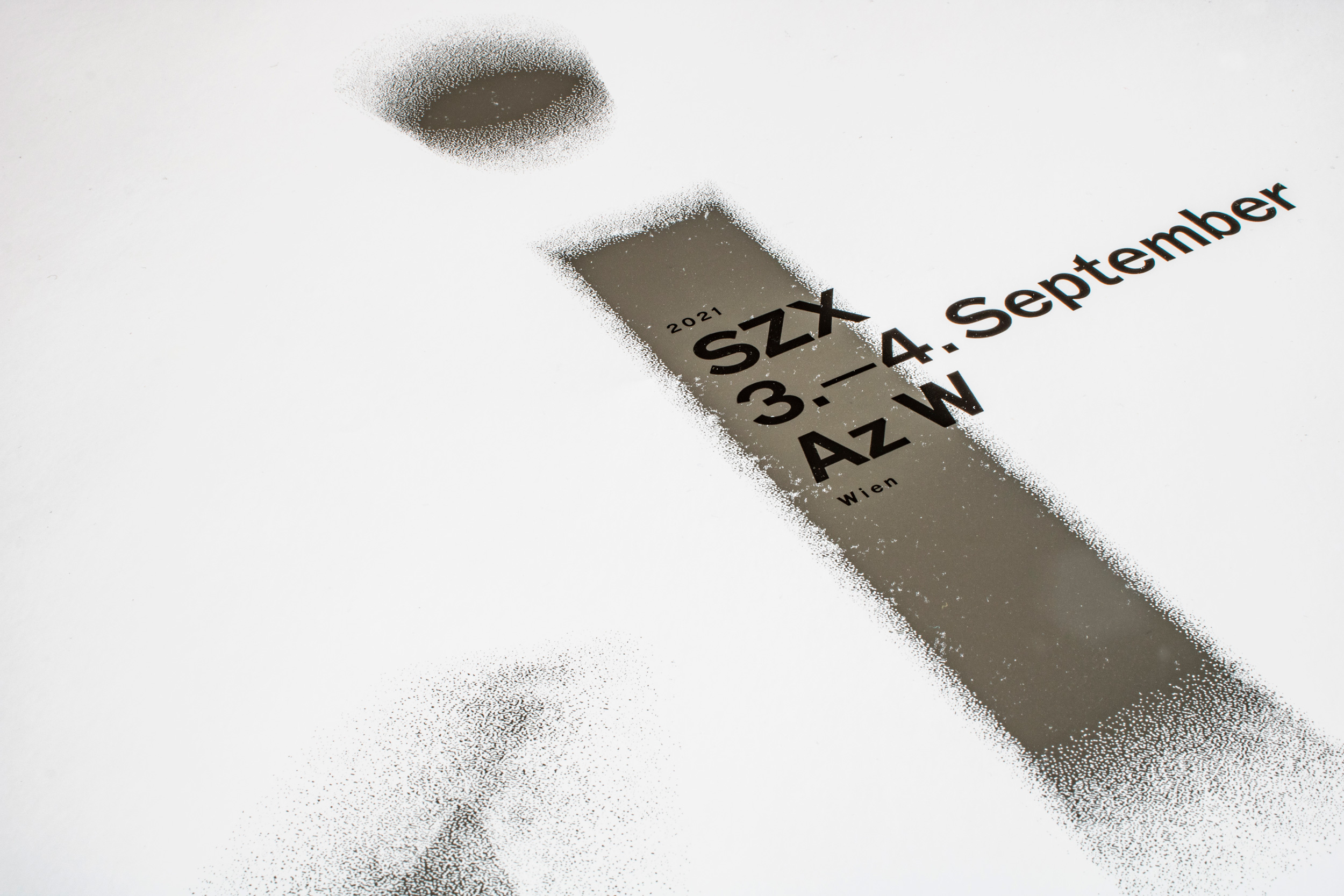
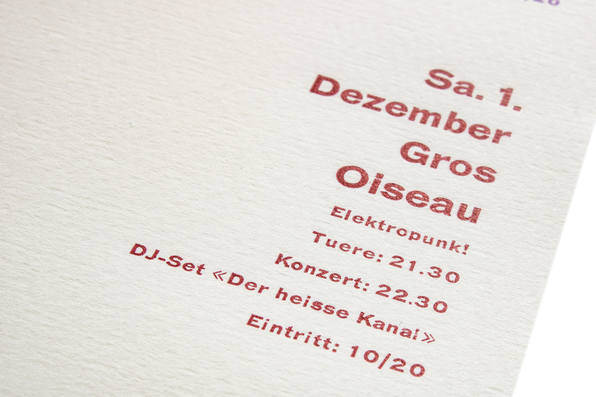
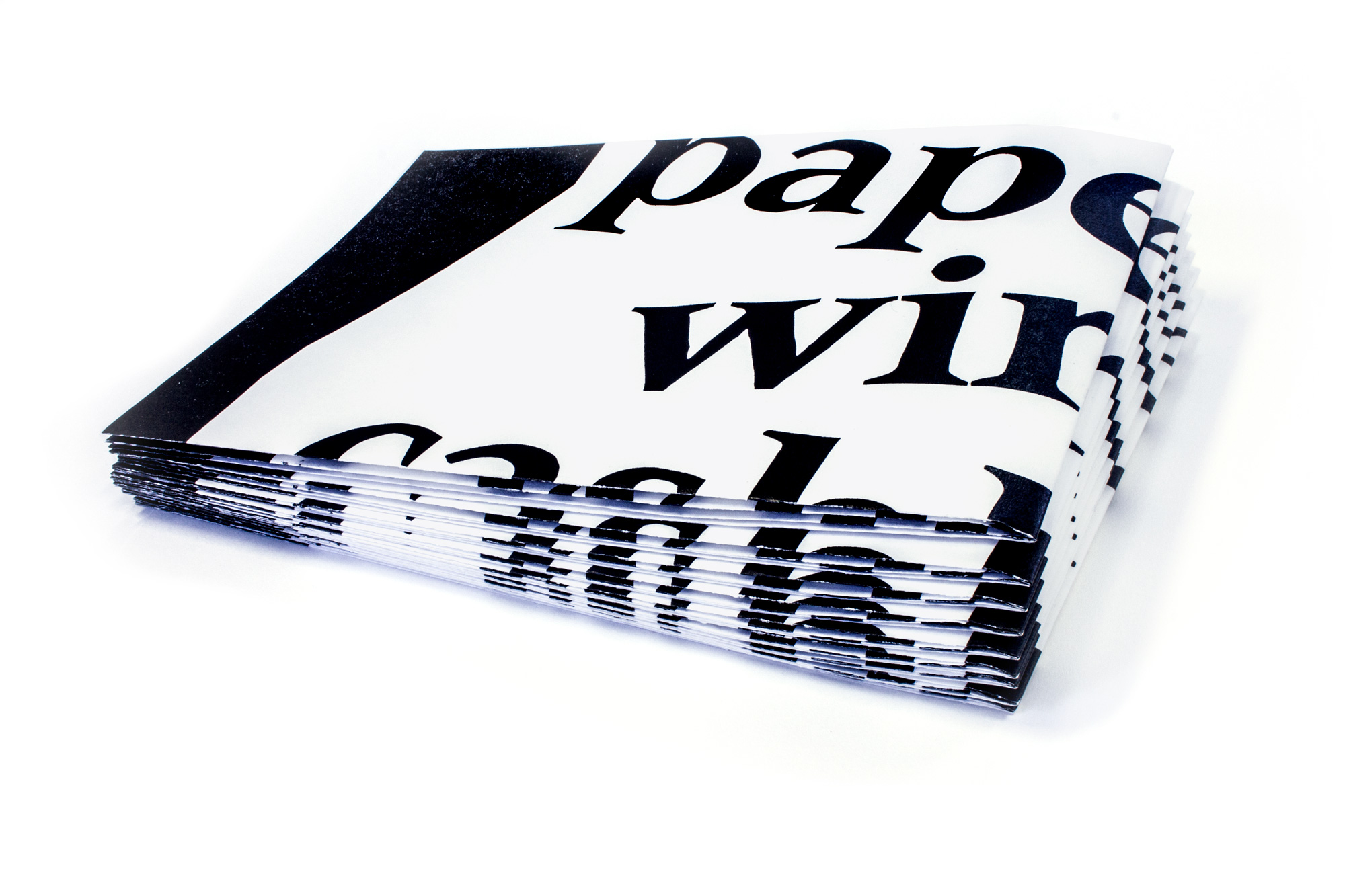
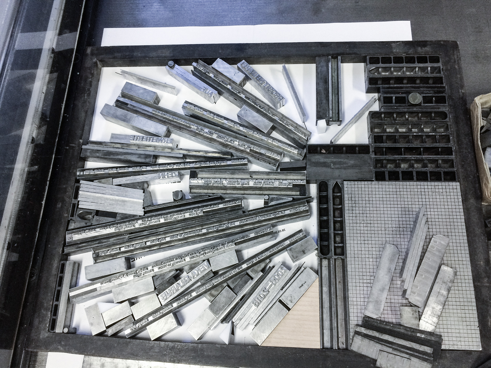
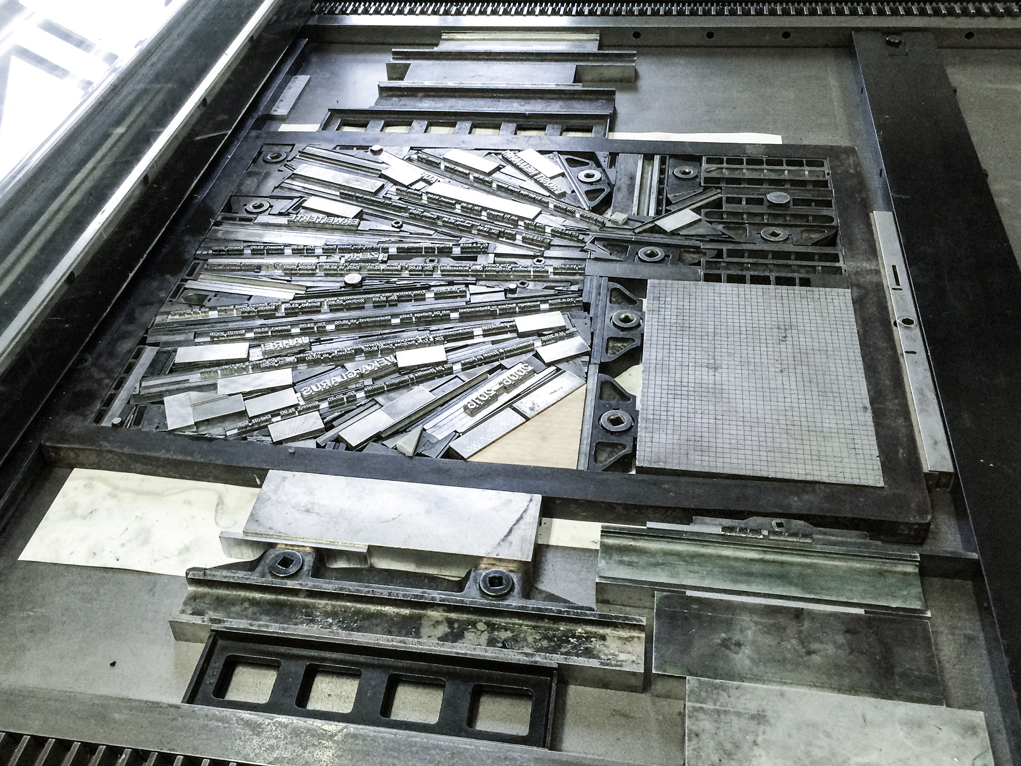
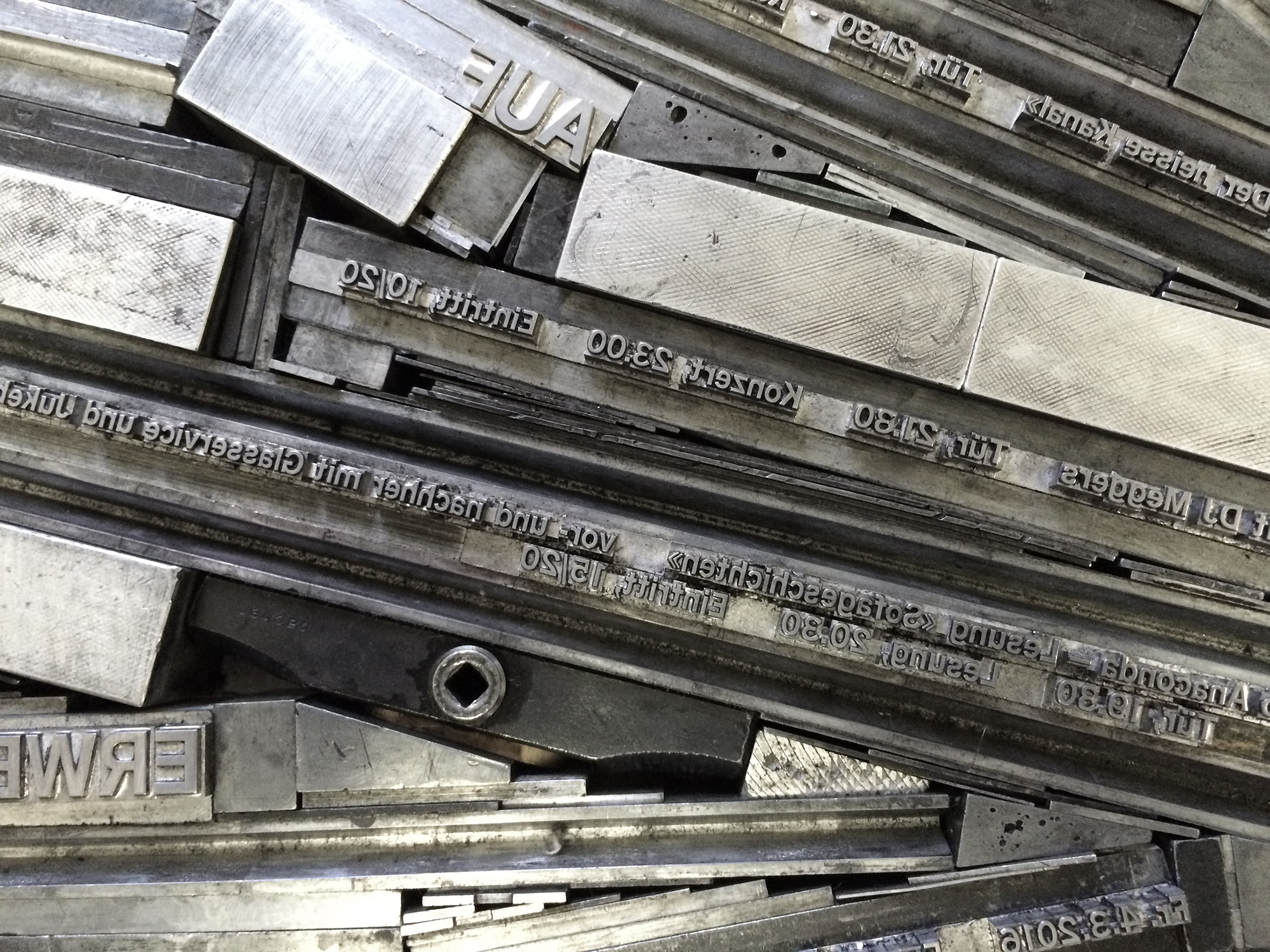
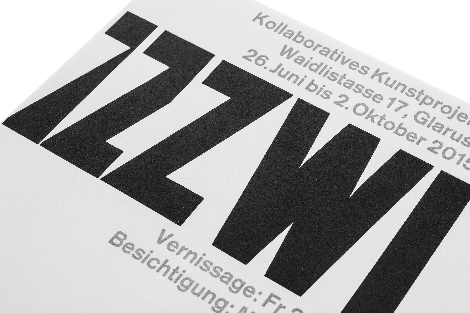
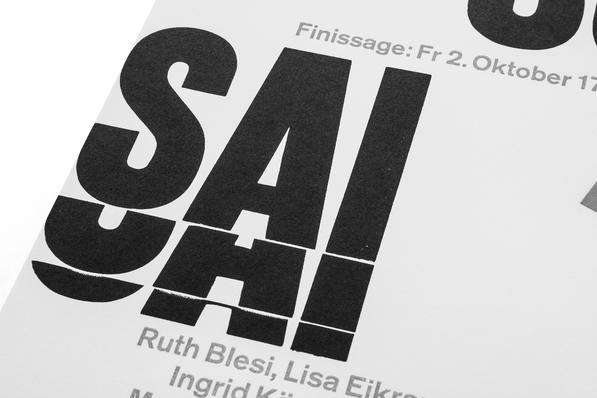
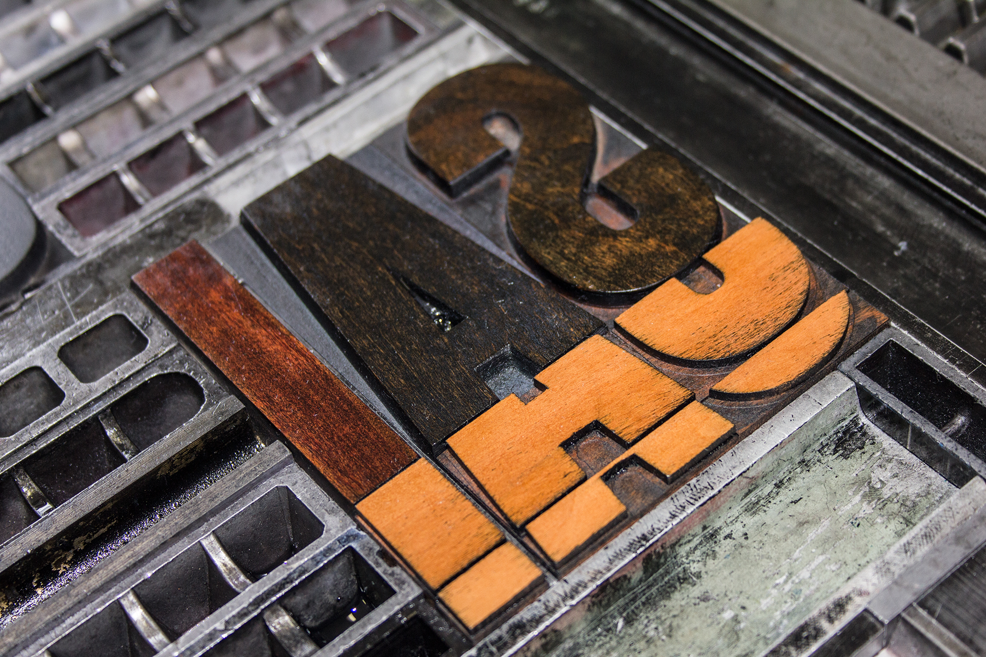
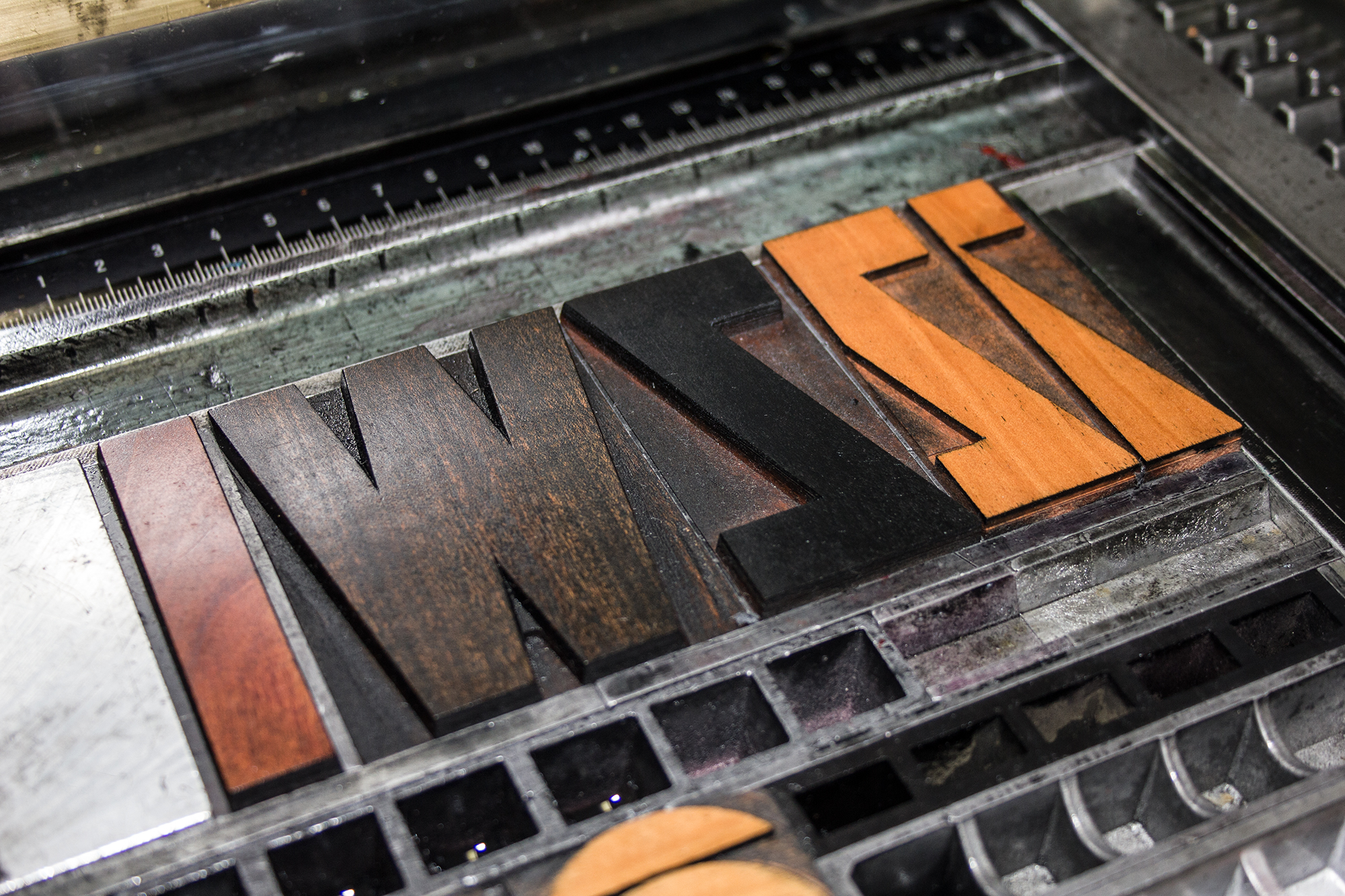
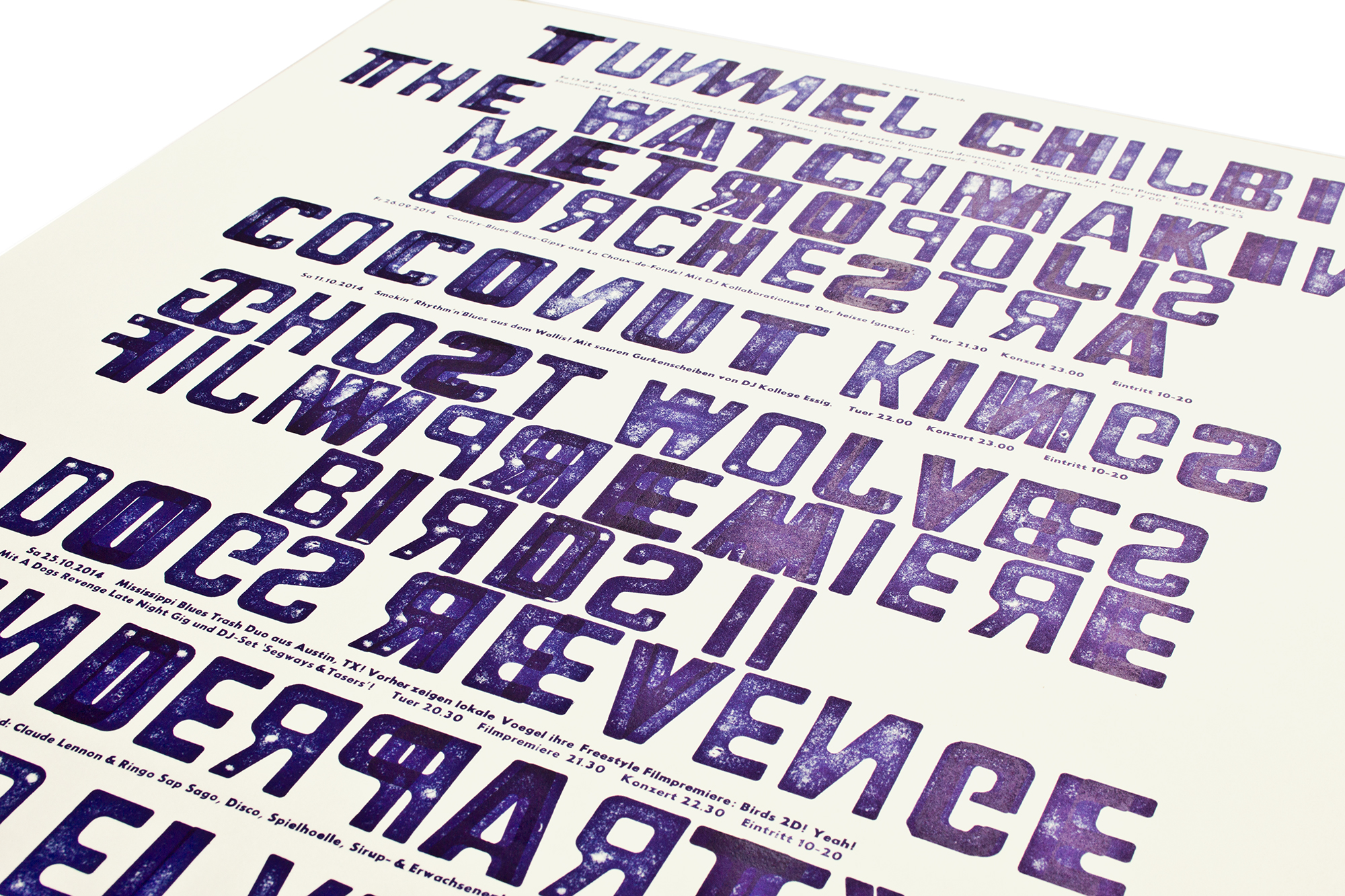
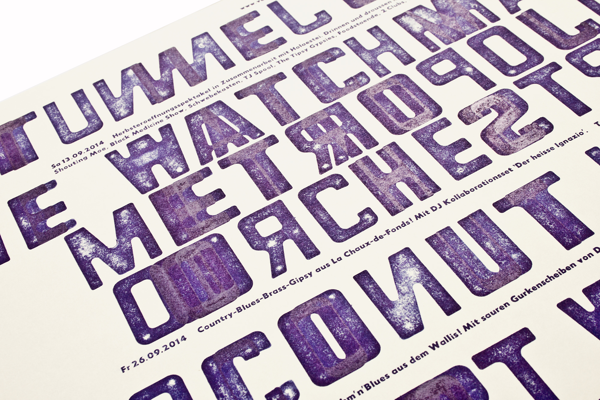
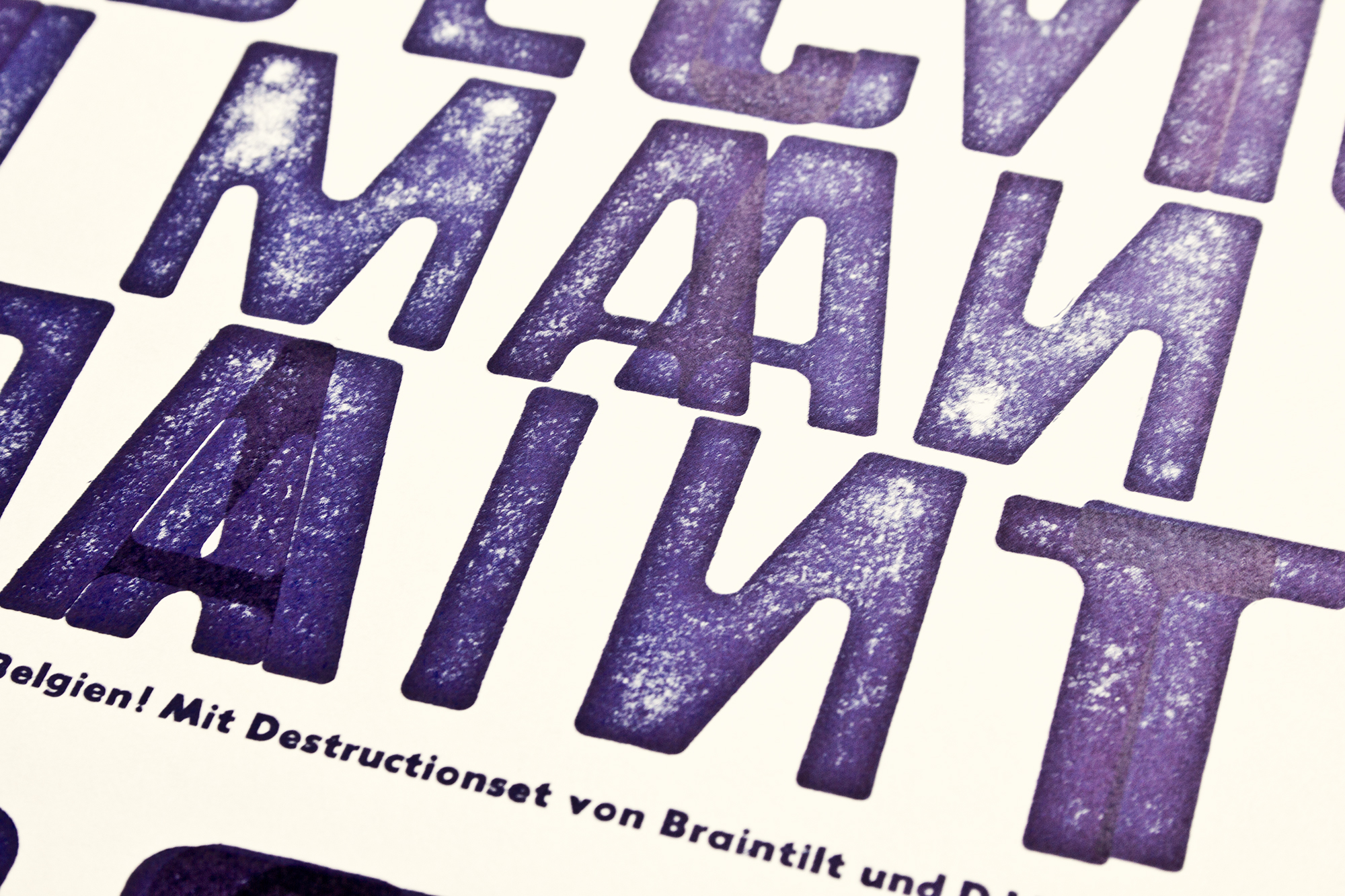
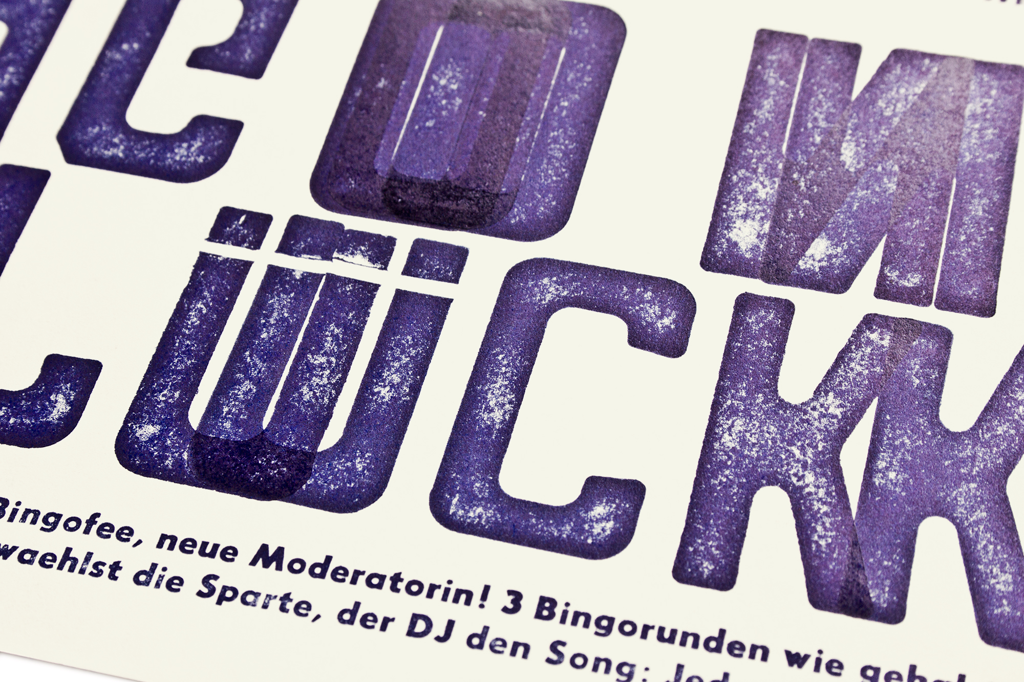
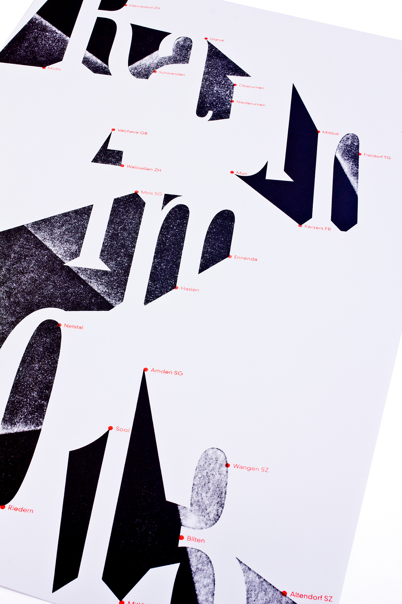
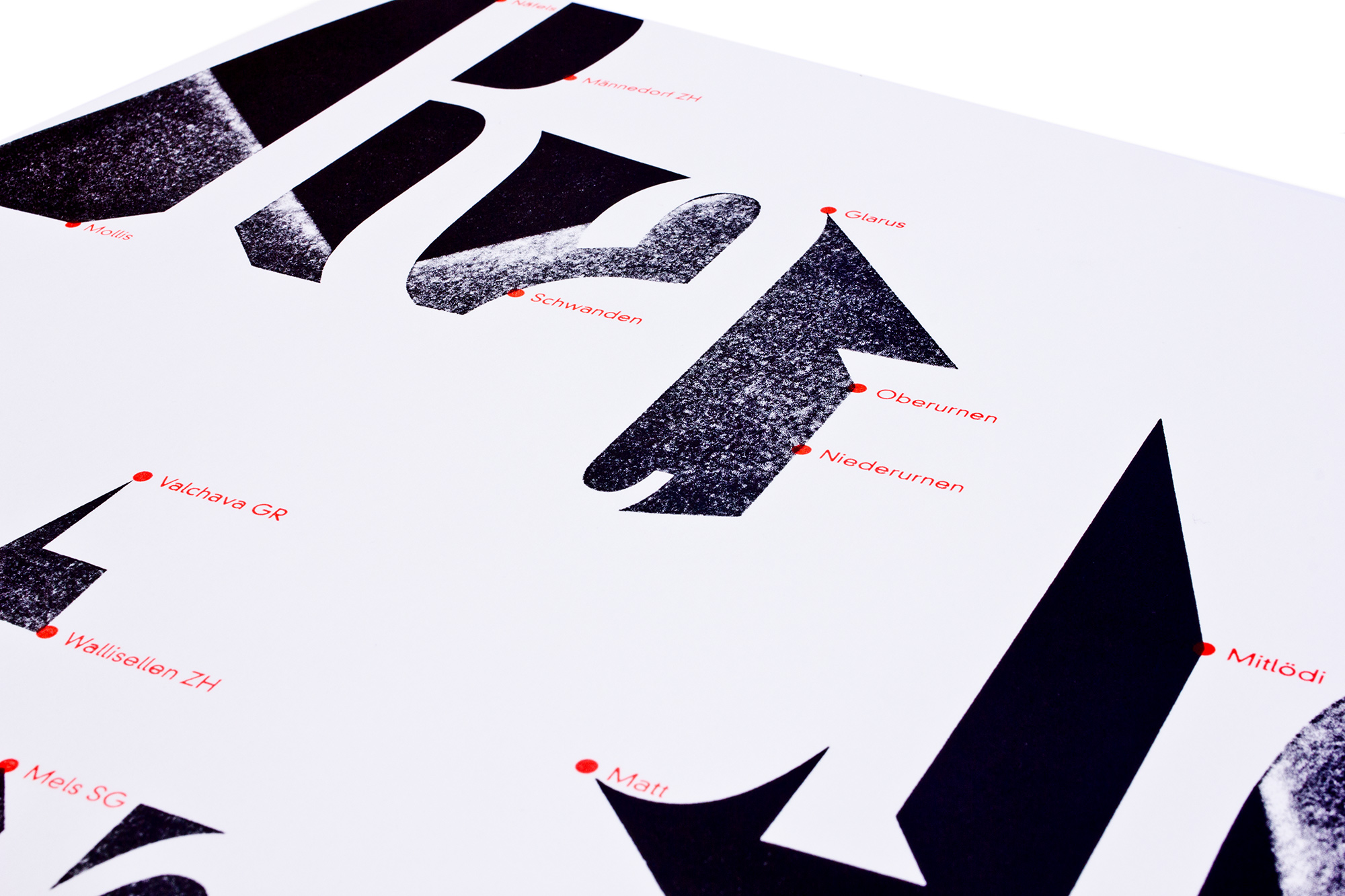
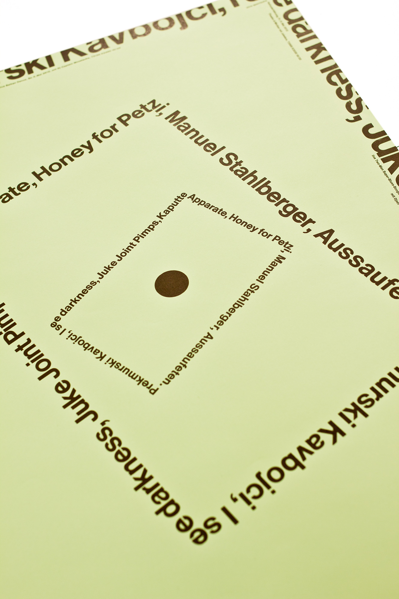
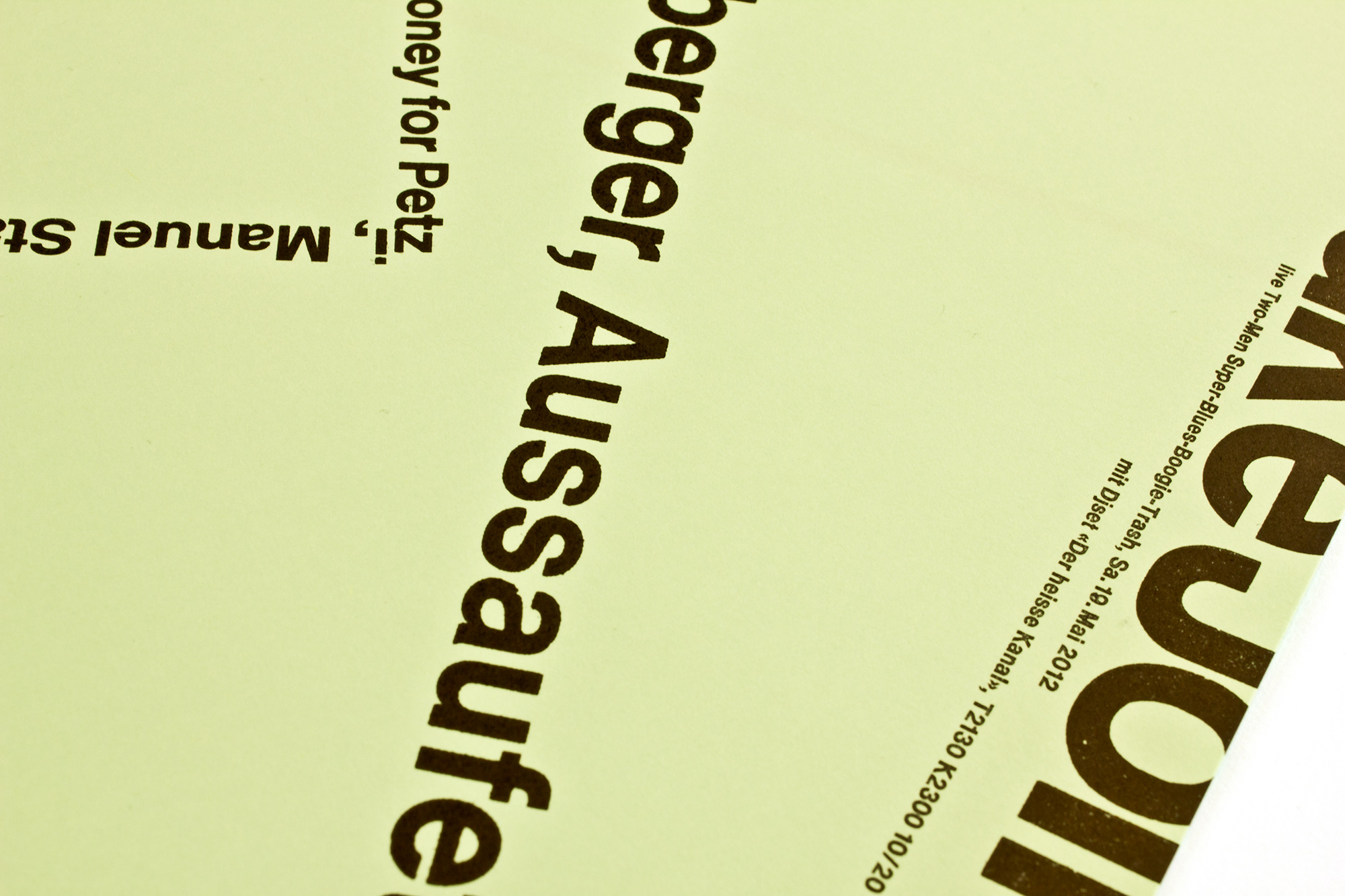
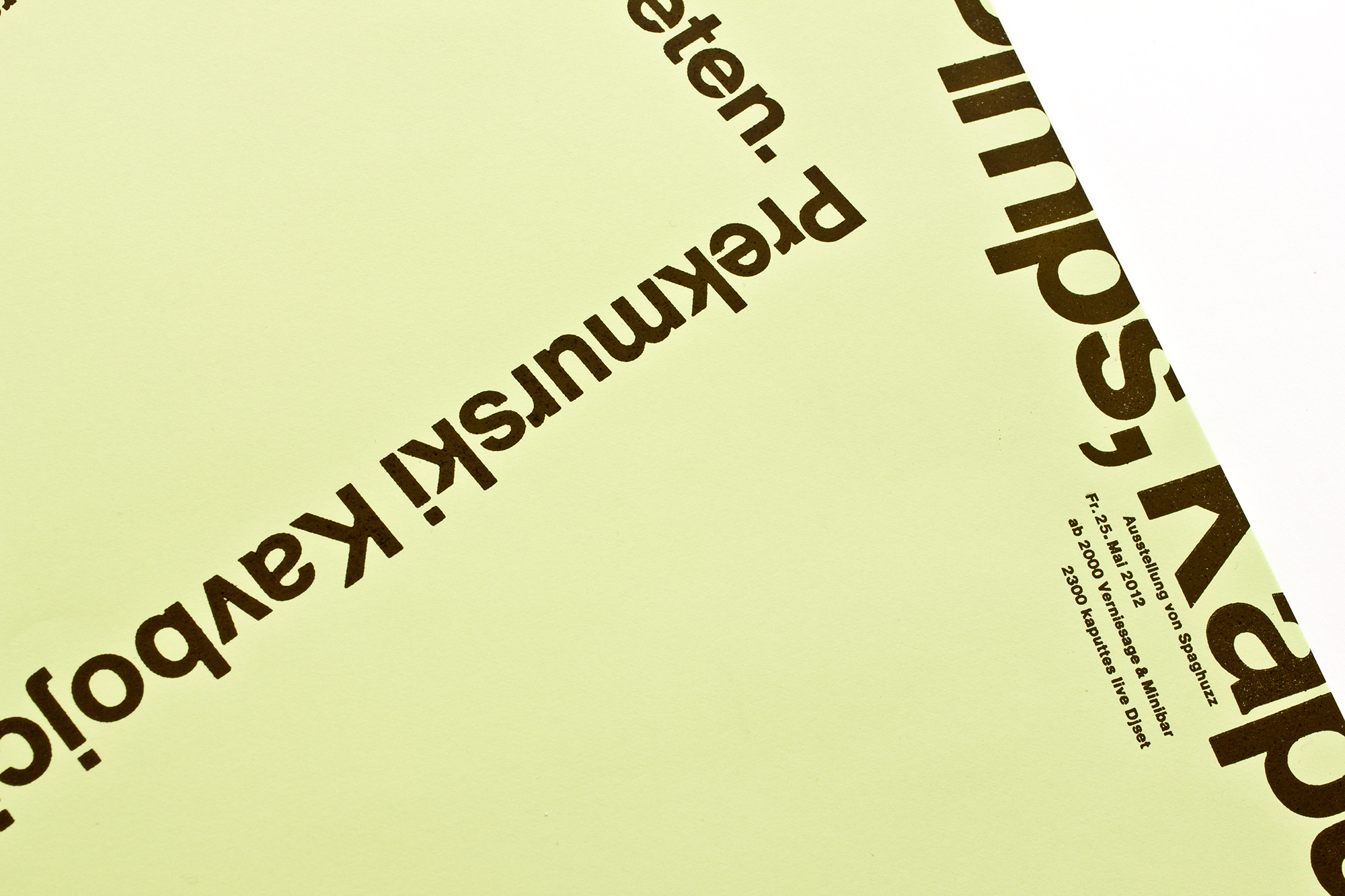
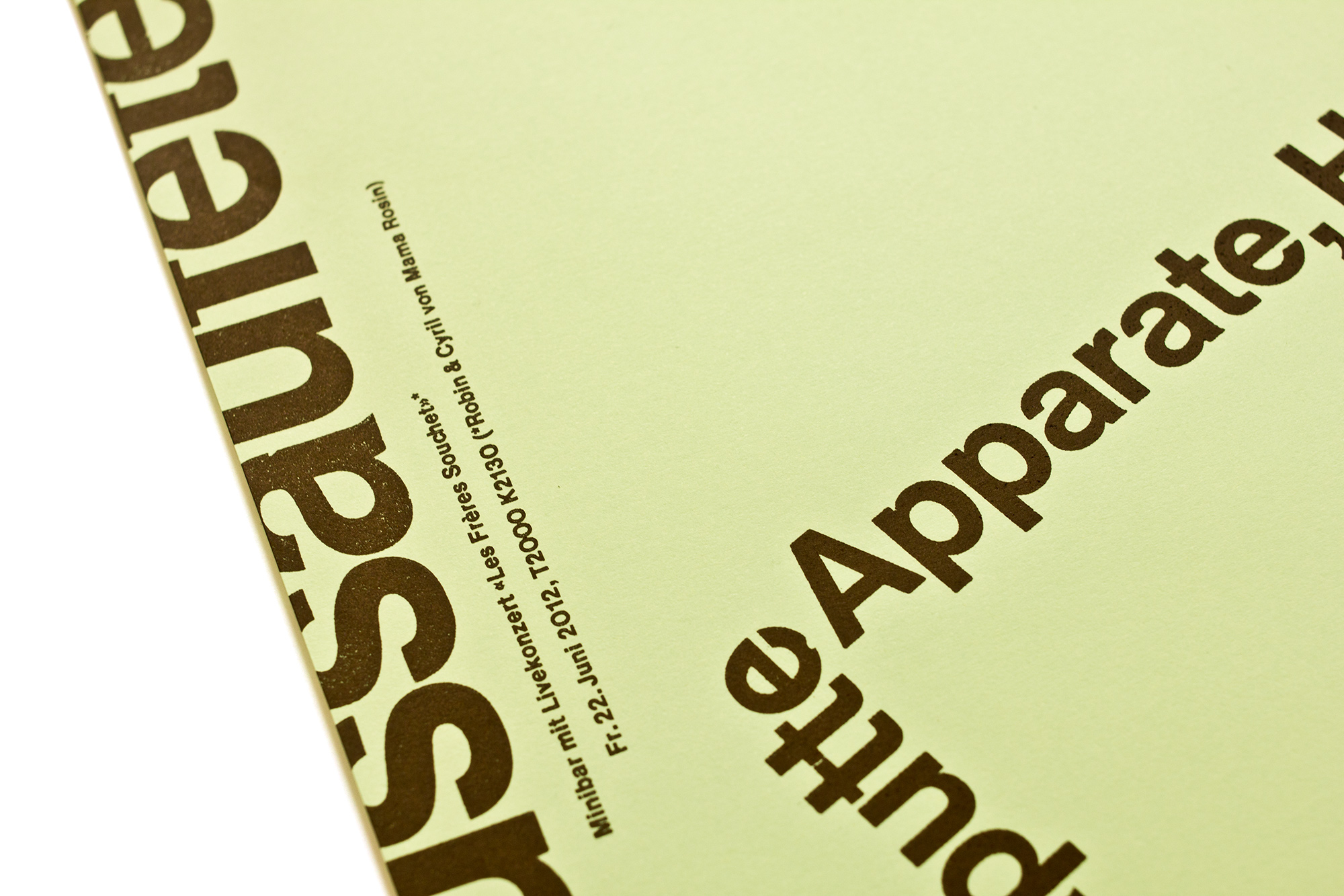
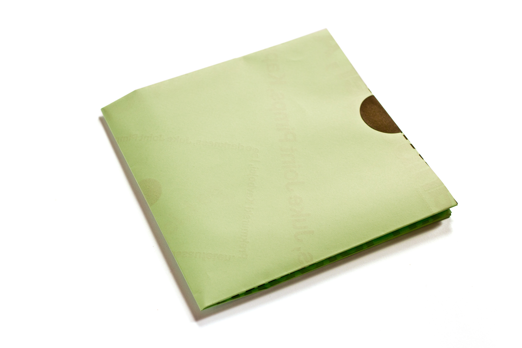
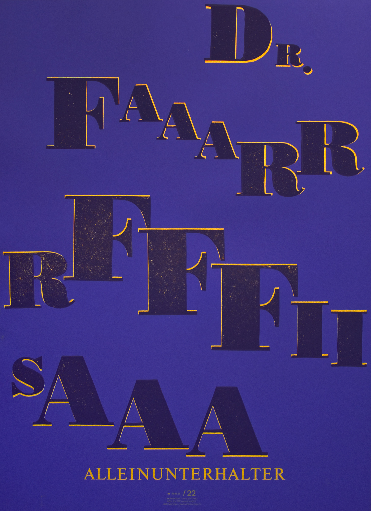
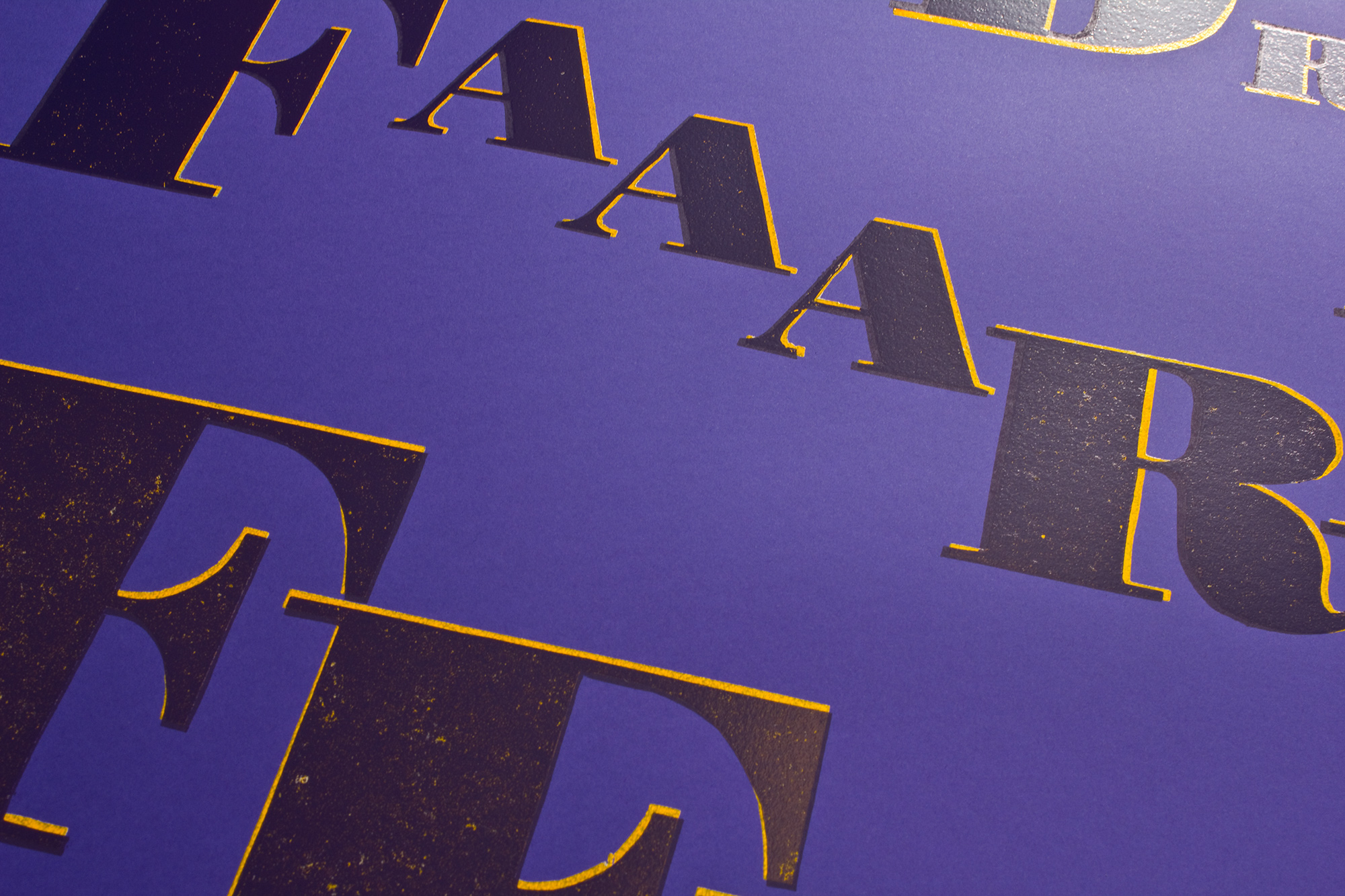
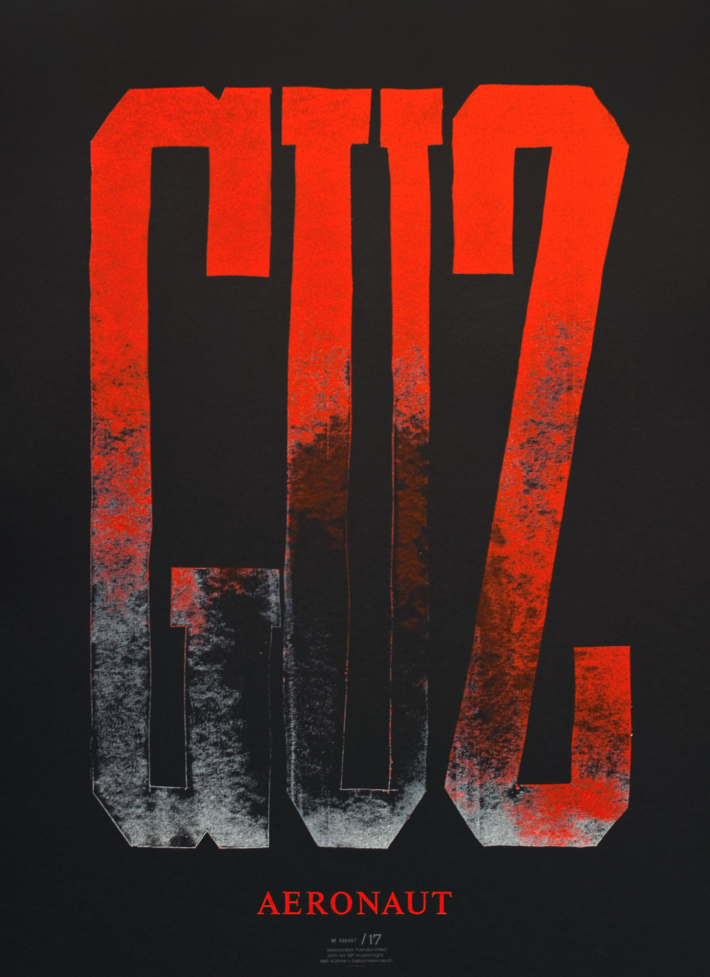
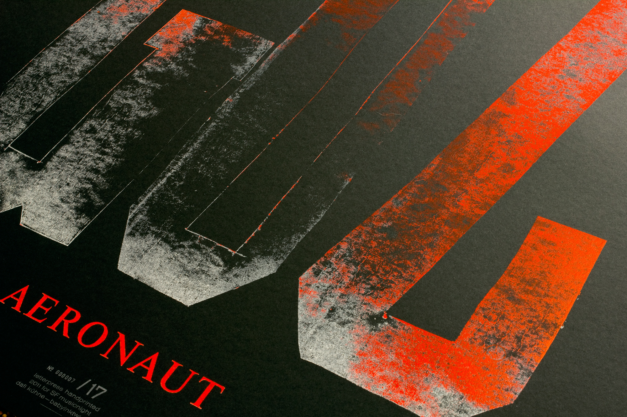
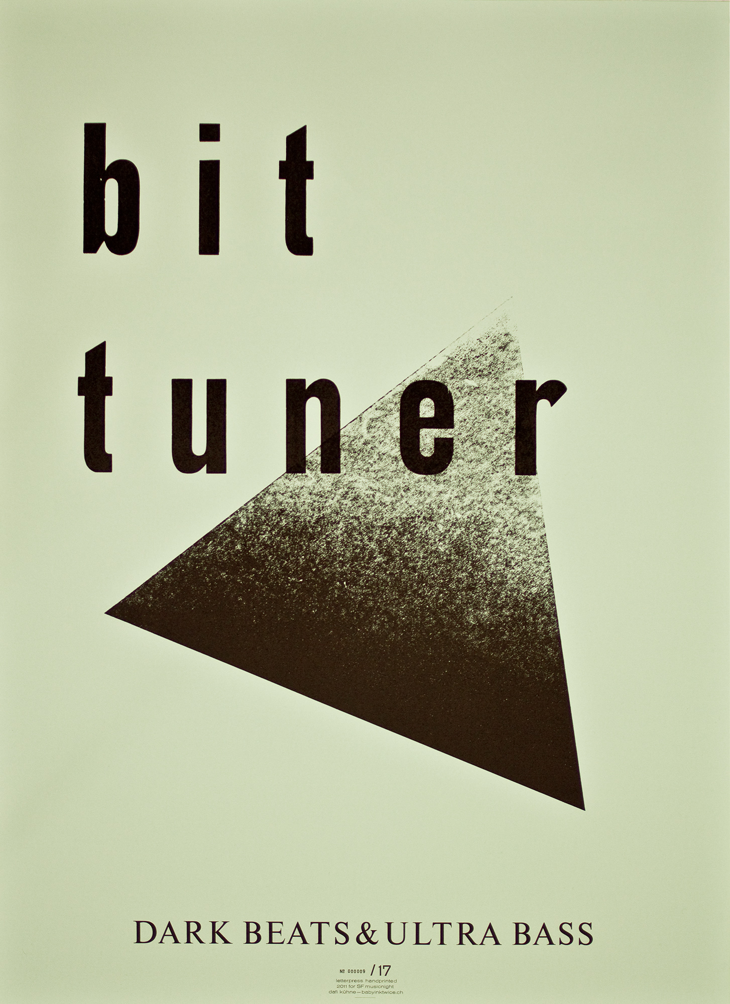
Tunnel IV
Fourth letterpress printed program poster in the series for tunnel-glarus.ch. Actually 3 posters in 2 sizes, printed from modular linocut letters and fresh cast Ludlow hot metal slugs. Check out the video!
Client: Tunnel, Glarus
Format: 70×100cm and 2×35×50cm
Paper: Materica Gesso, 120g/m2 and 250g/m2
Edition: 93 + 300 posters on a Grafix GX4
February 2024
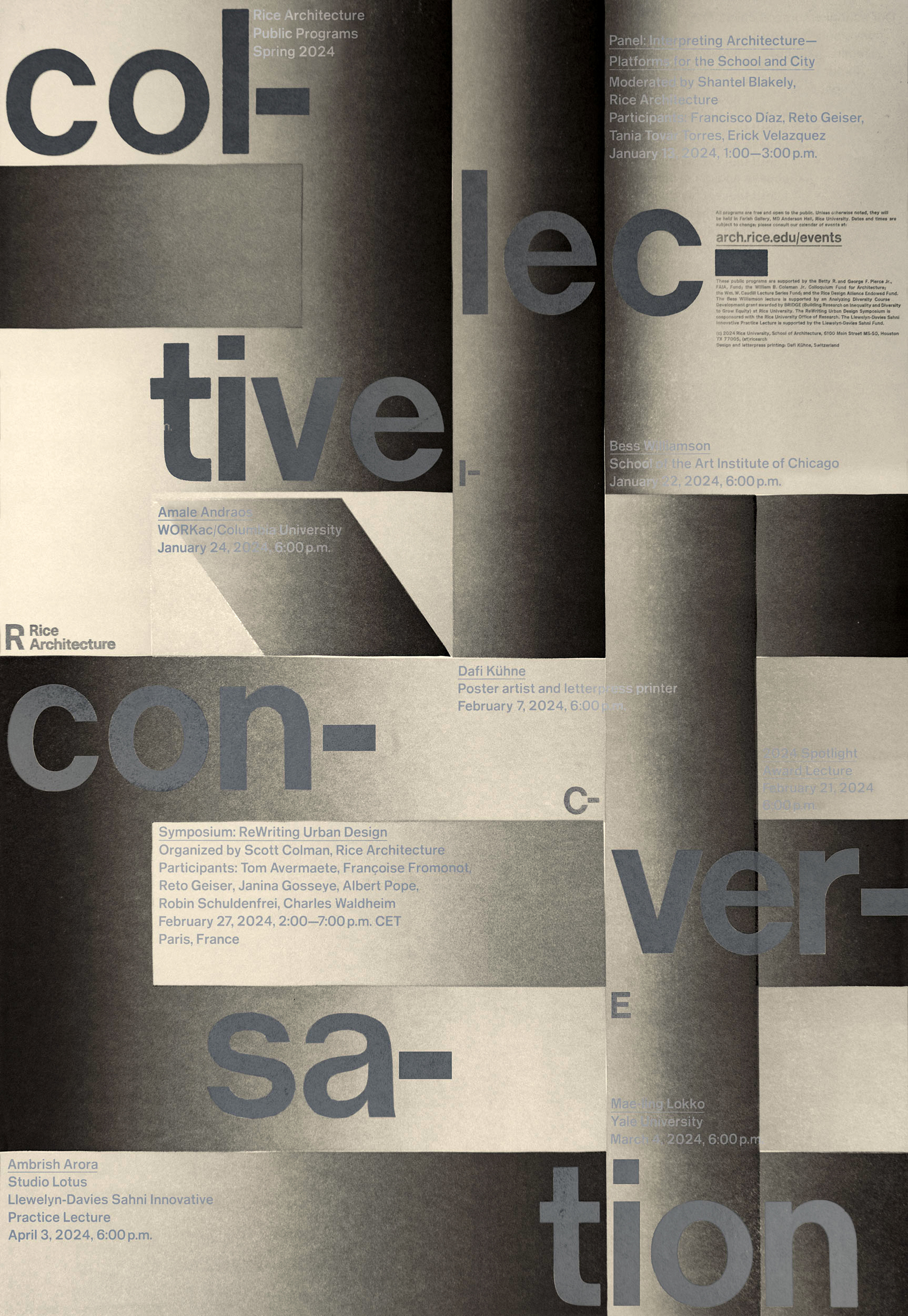
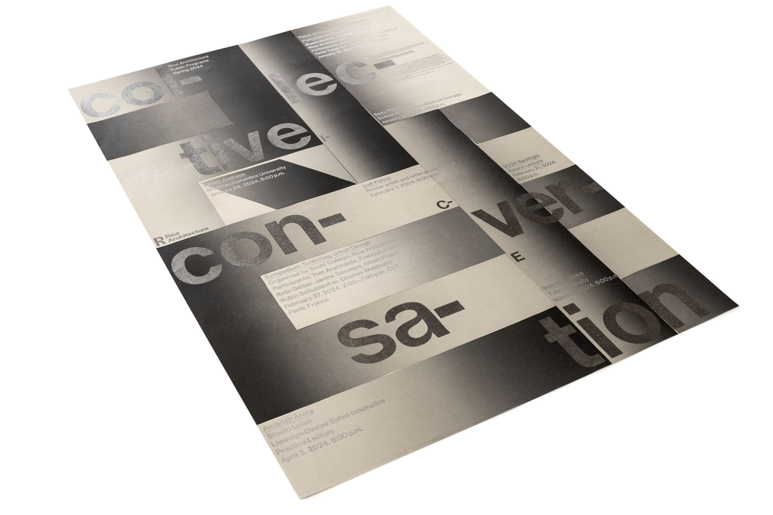
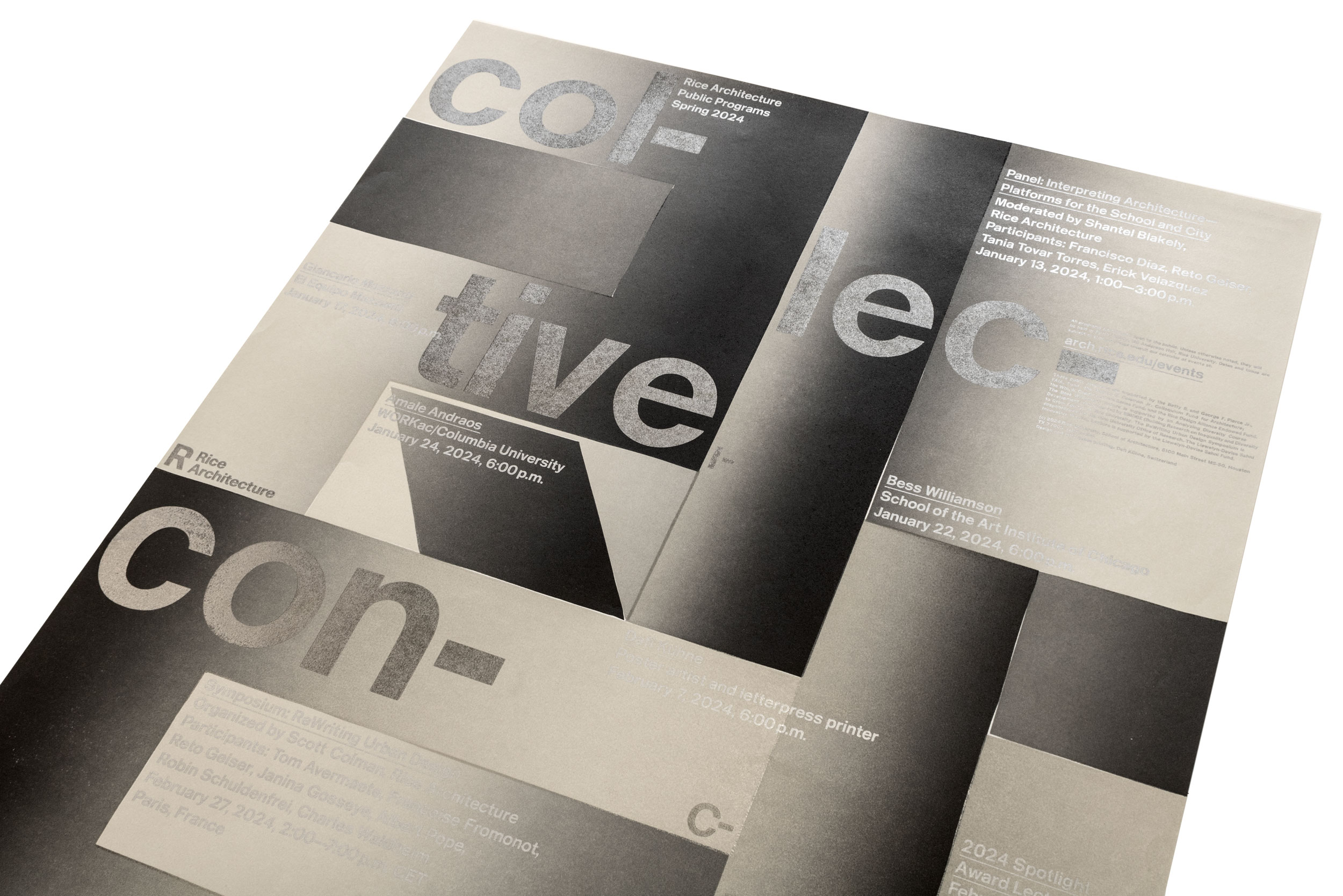
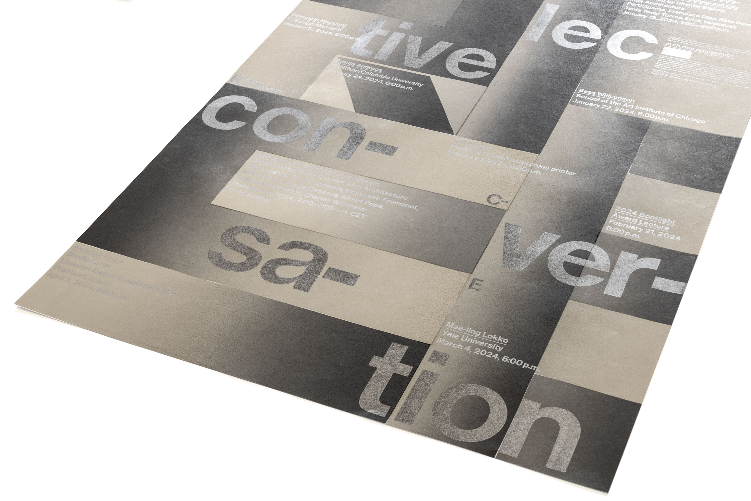
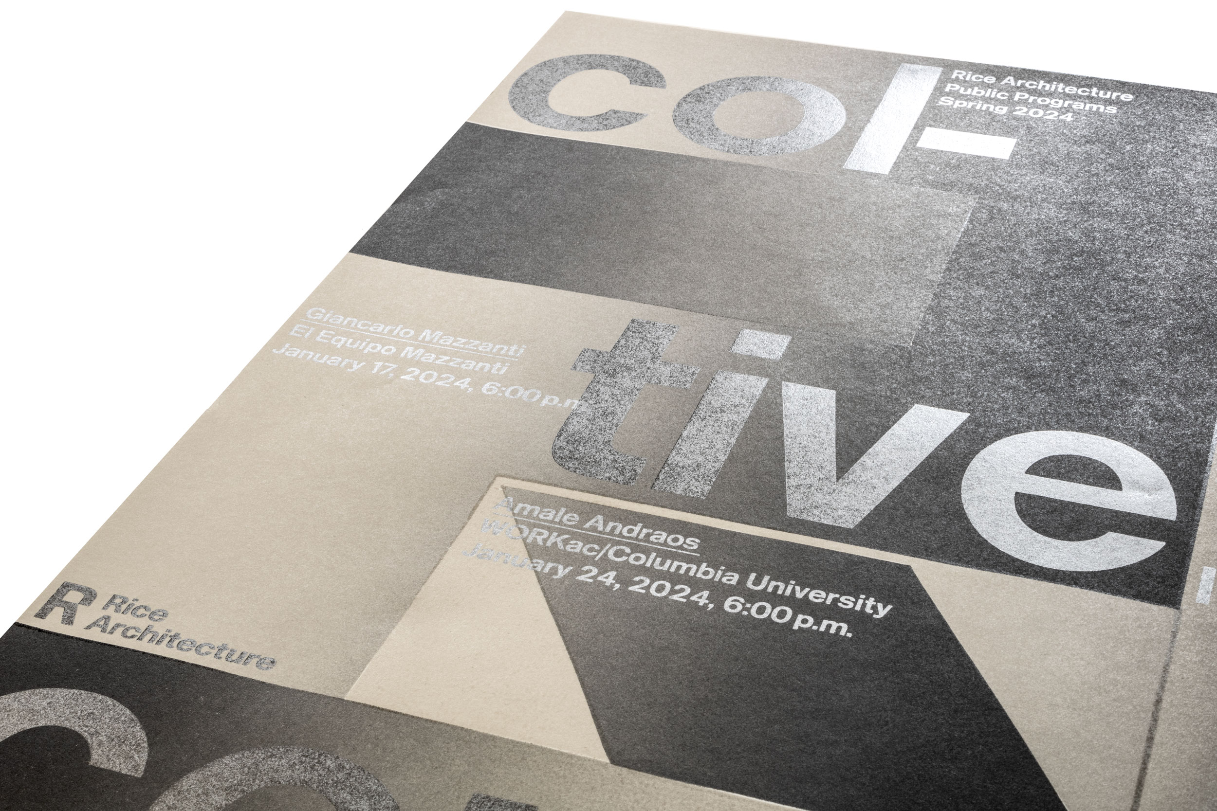
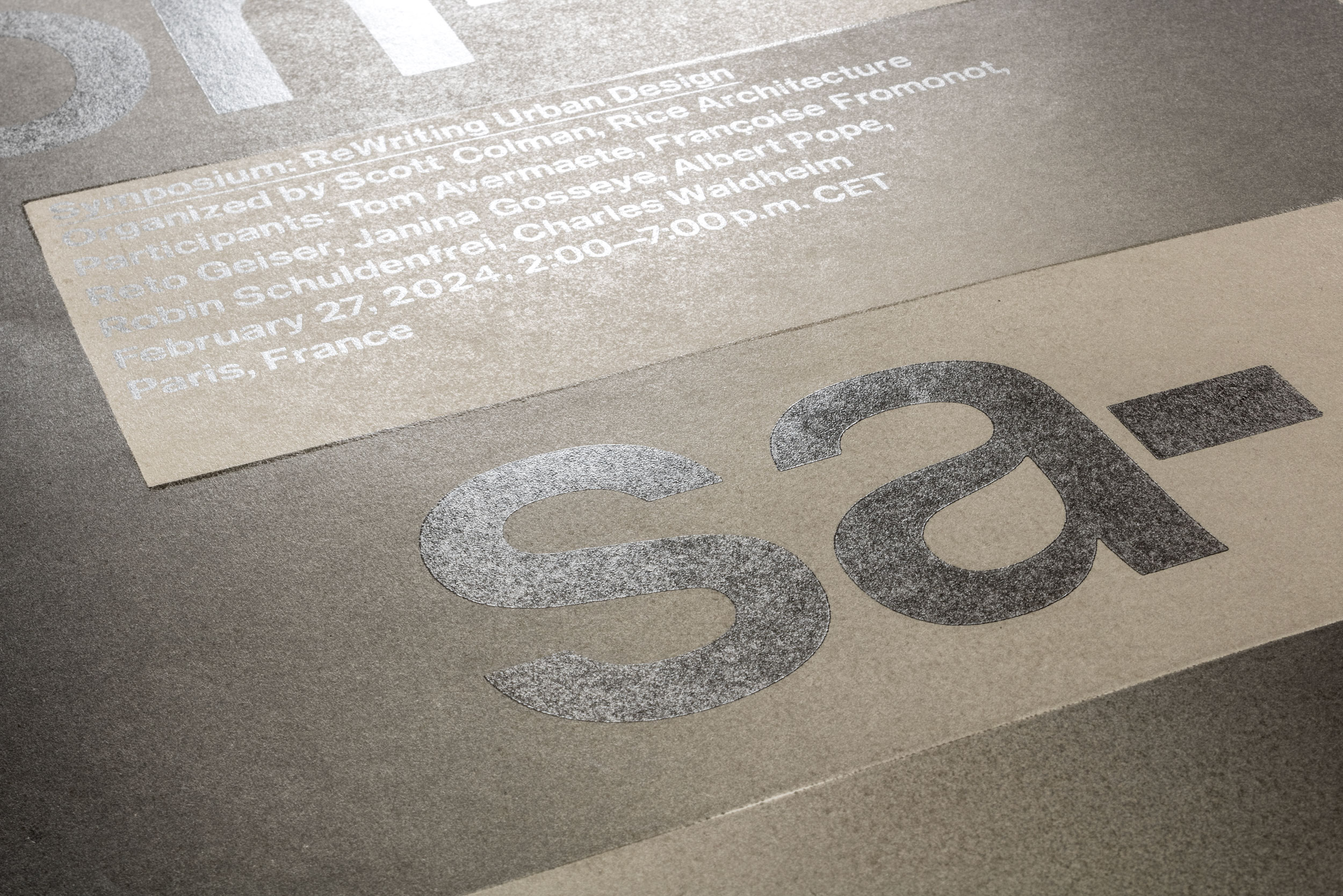
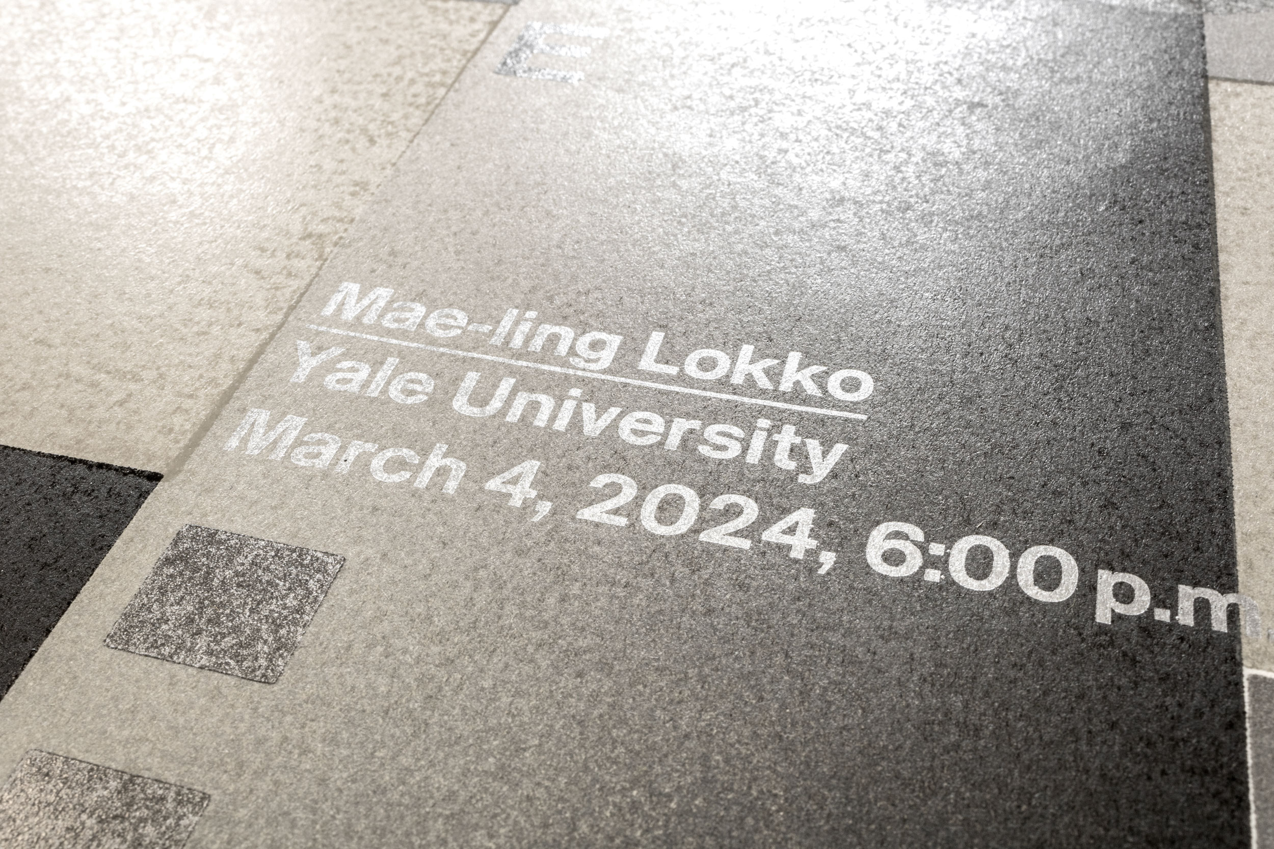
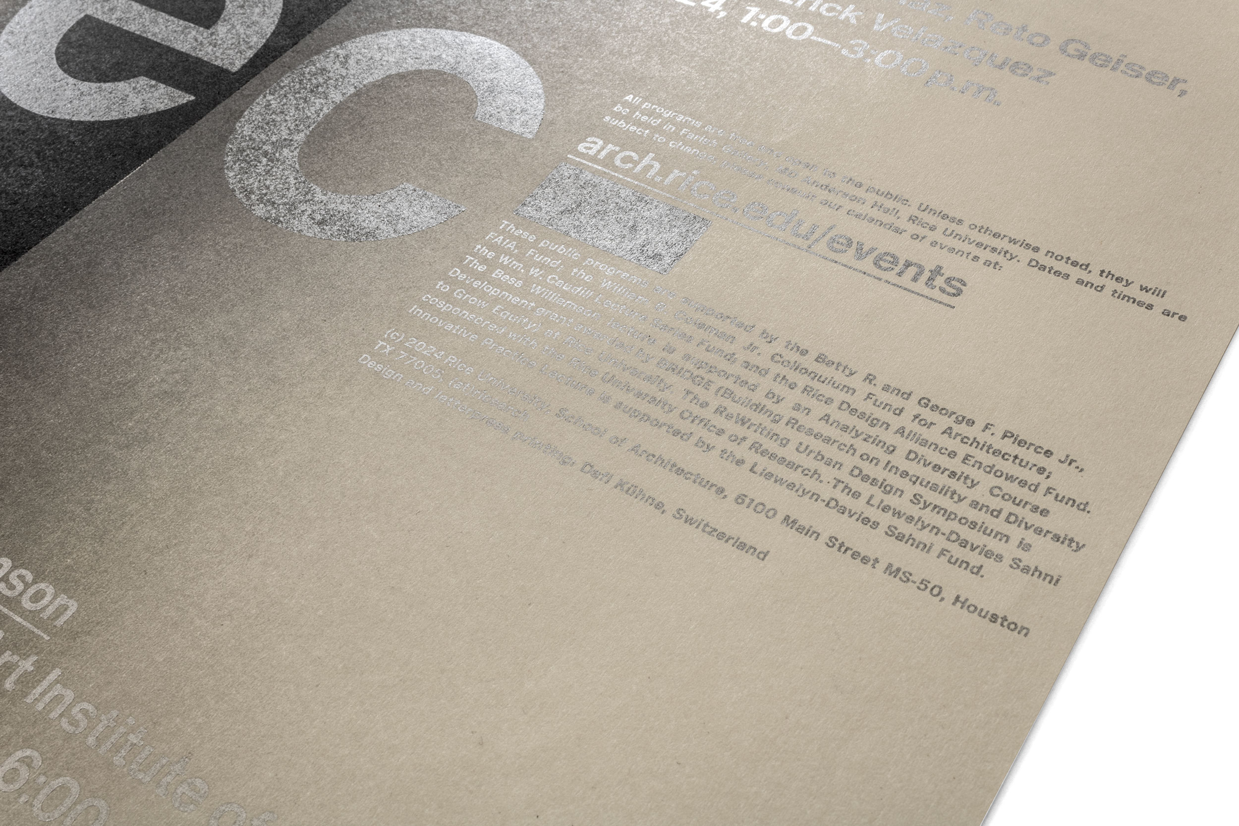
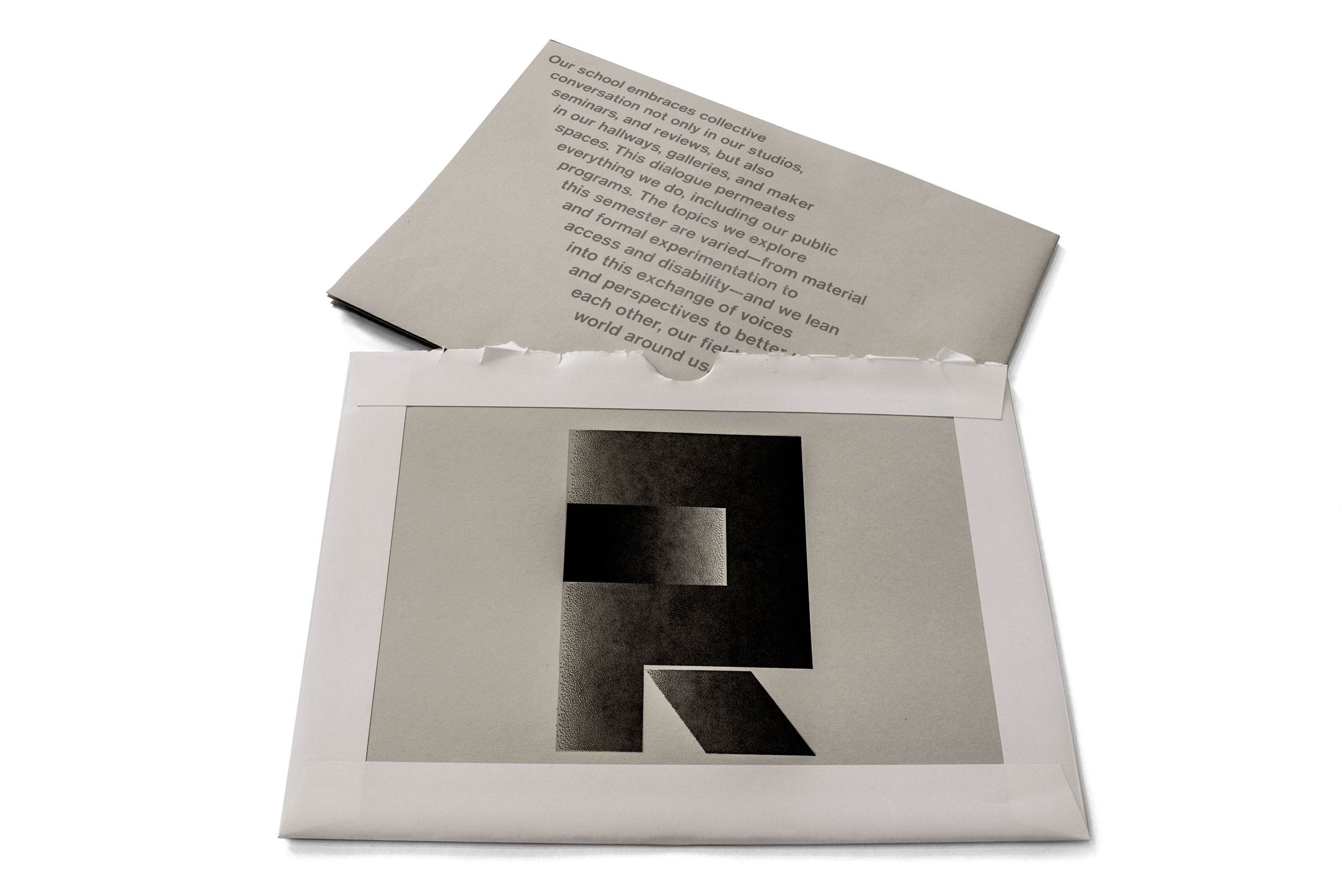
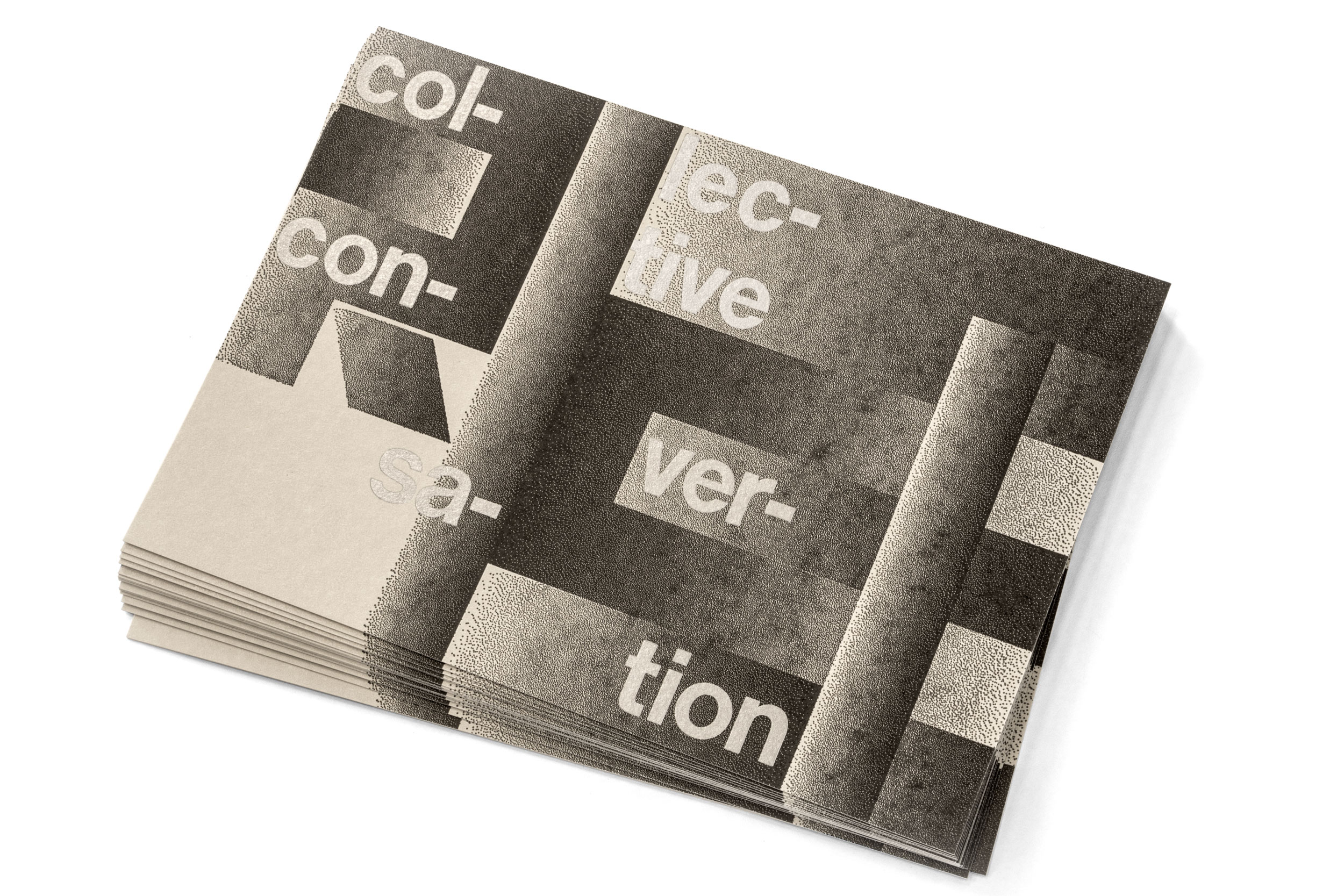
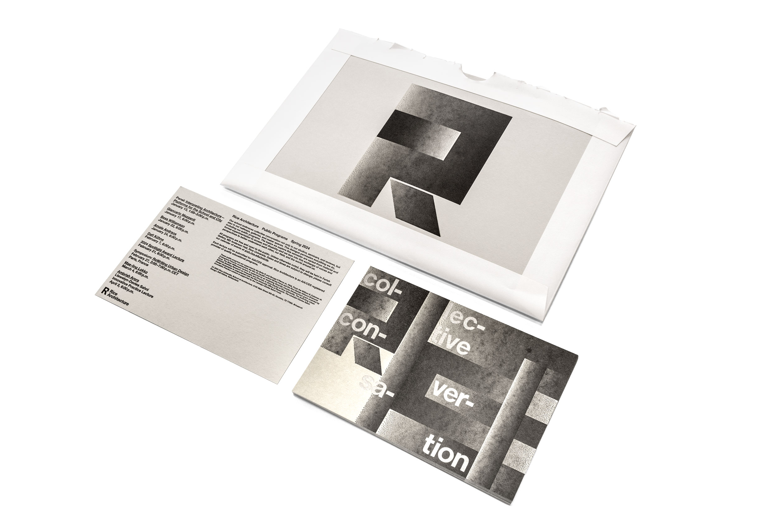
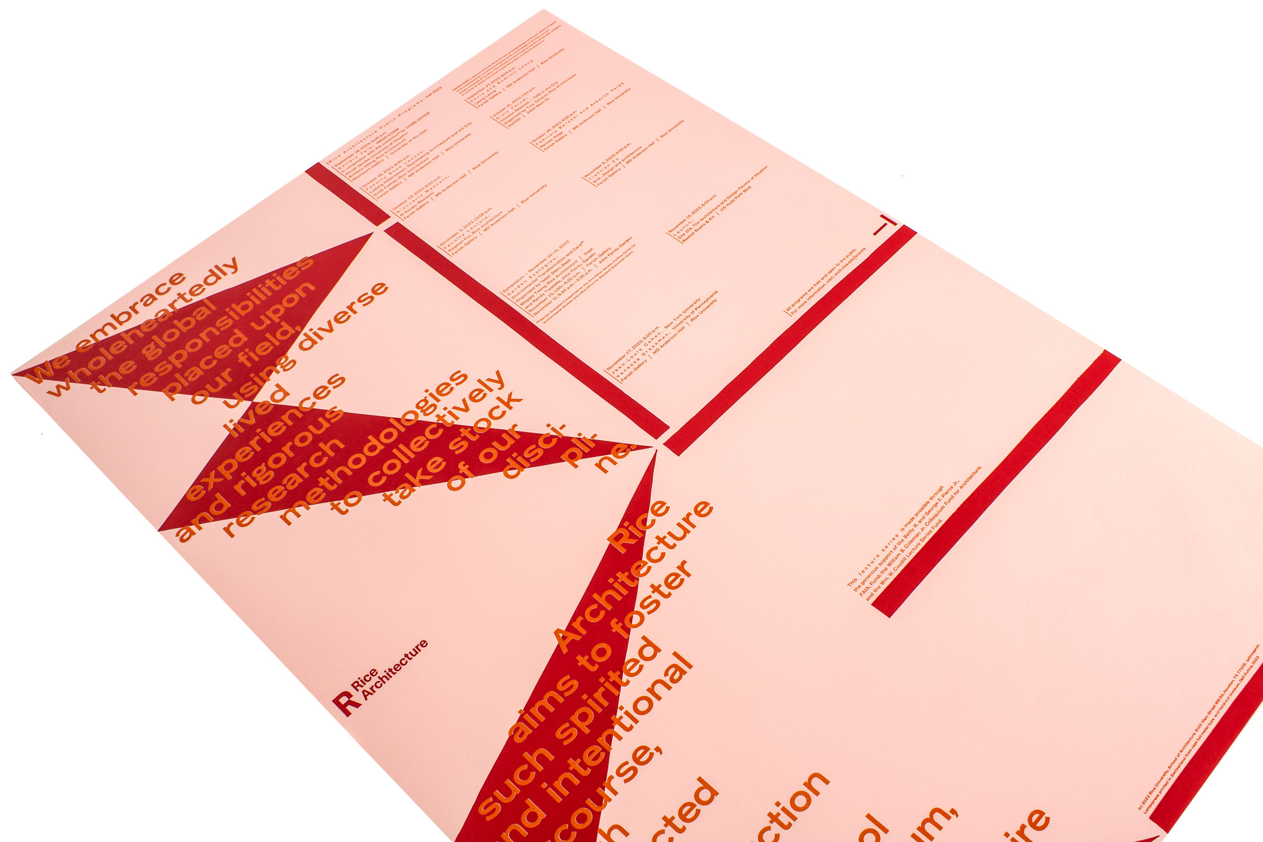
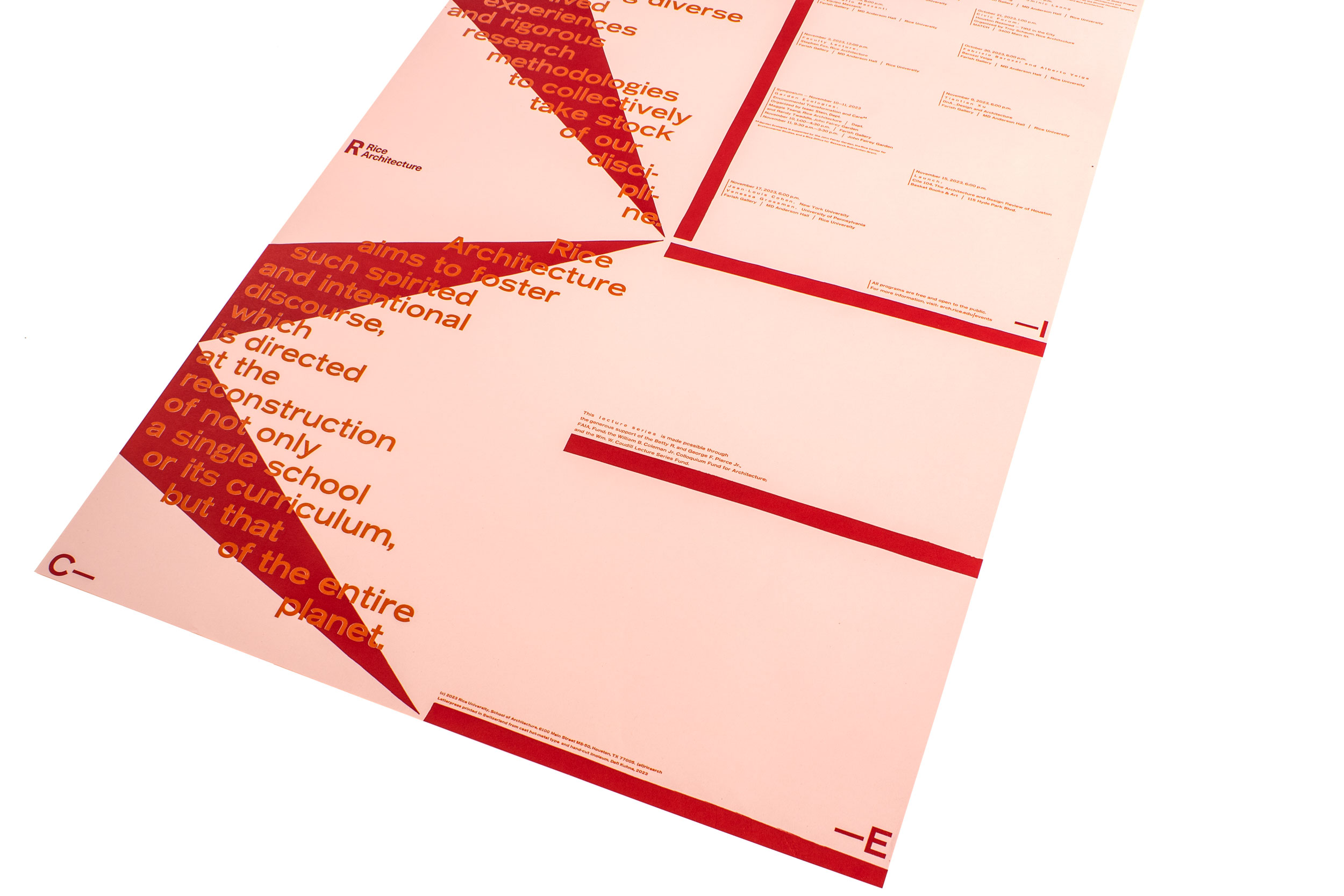
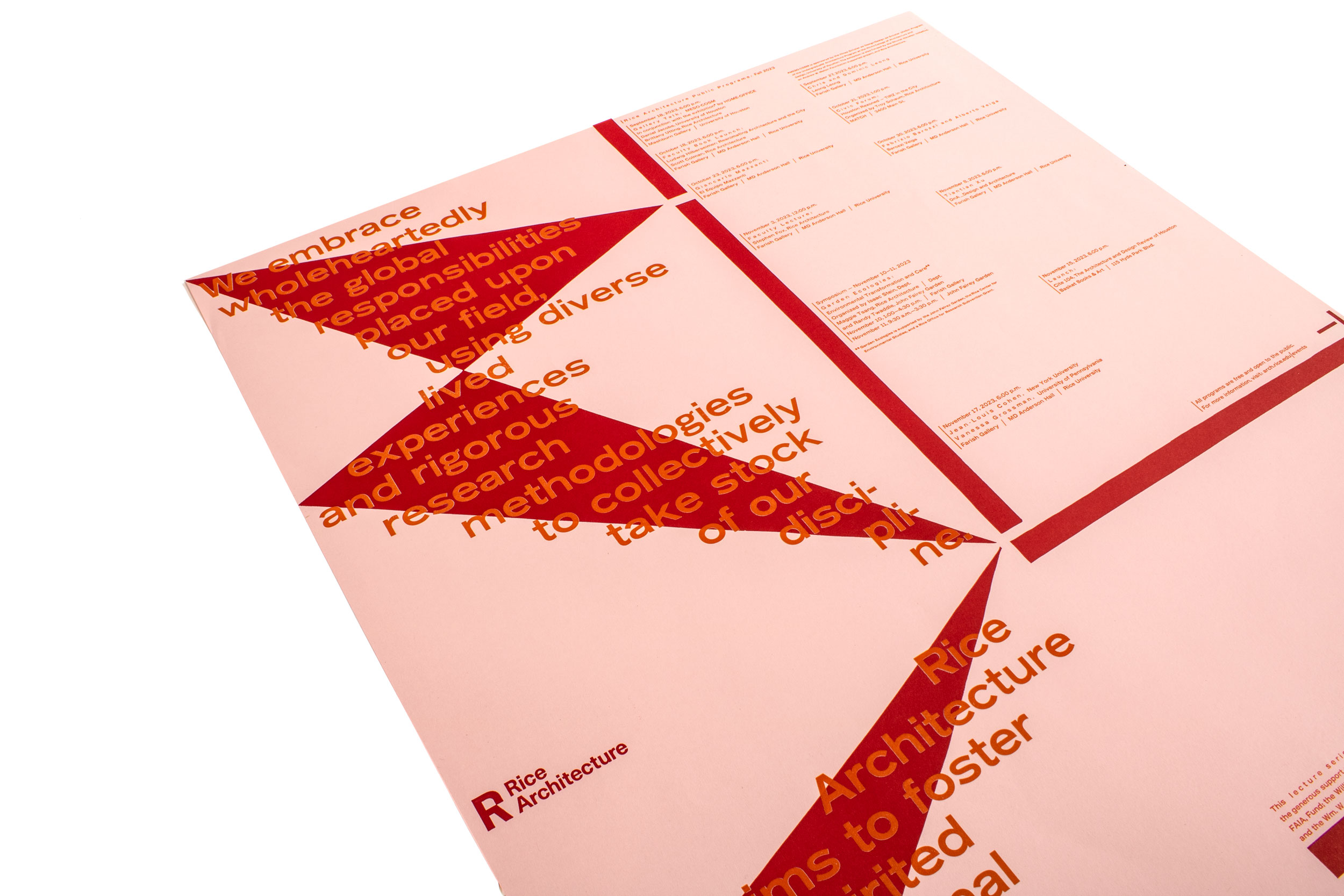
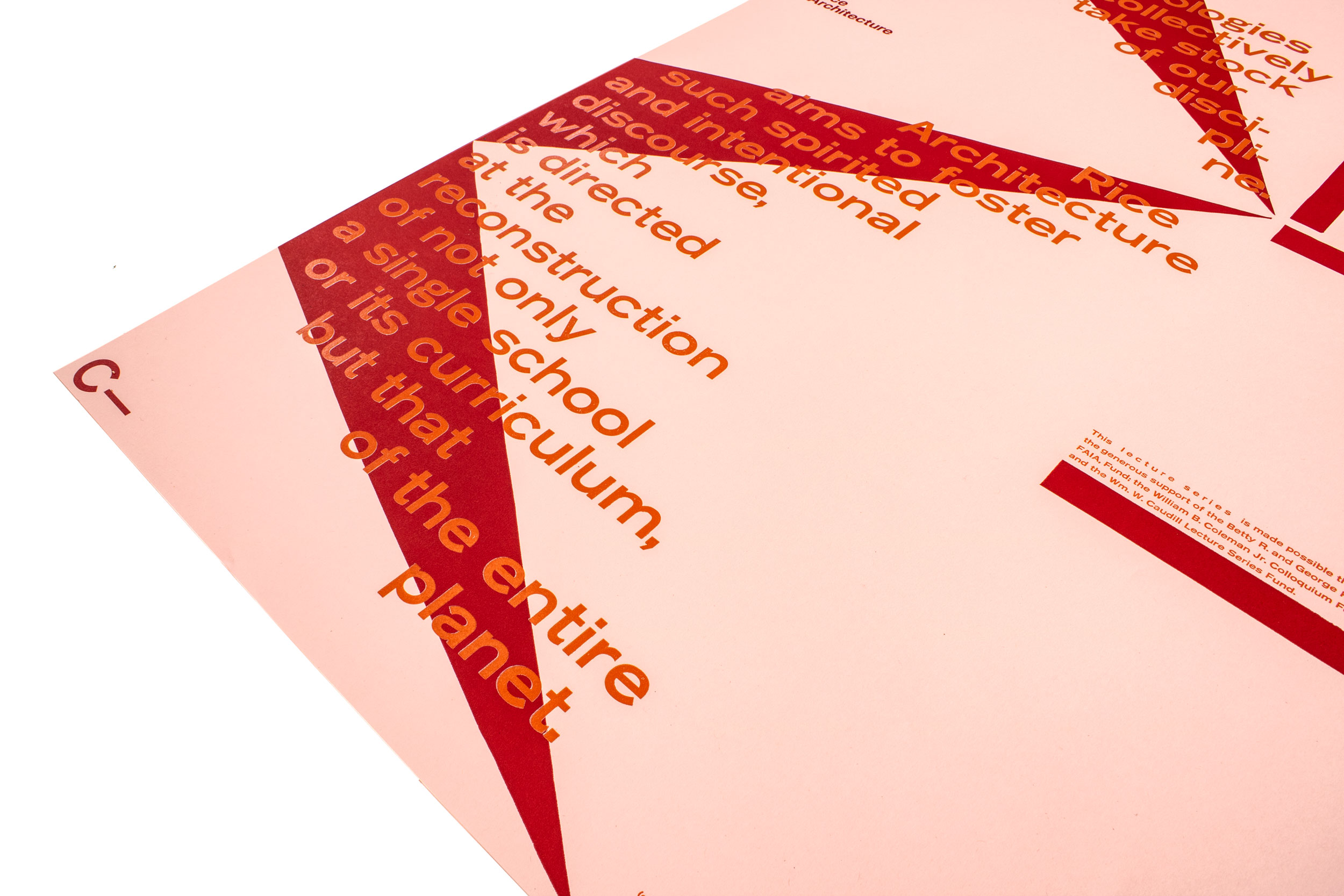
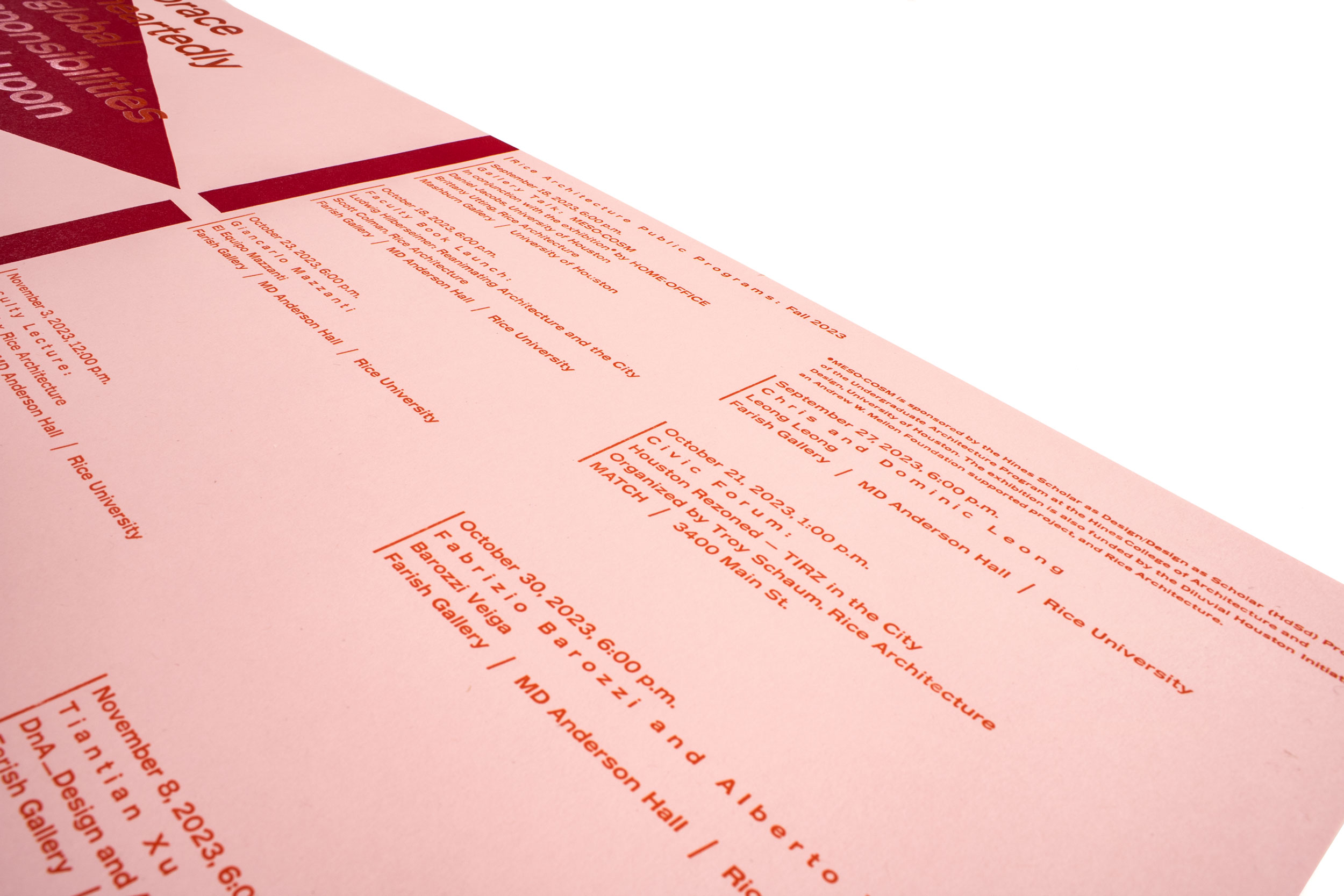
Rice Architecture II
Semester lecture program for Rice Architecture—the smallest professional degree program situated within a top research university in Houston, TX. Letterpress printed from hand-cut linoleum, traditional wood type and freshly cast Ludlow hot metal slugs.
Client: Rice Architecture, Rice University, Houston, TX
Format: 70×100cm
Paper: Colorplan Pale Grey, 100g/m2
Edition: 300 posters on a Grafix GX4
December 2023
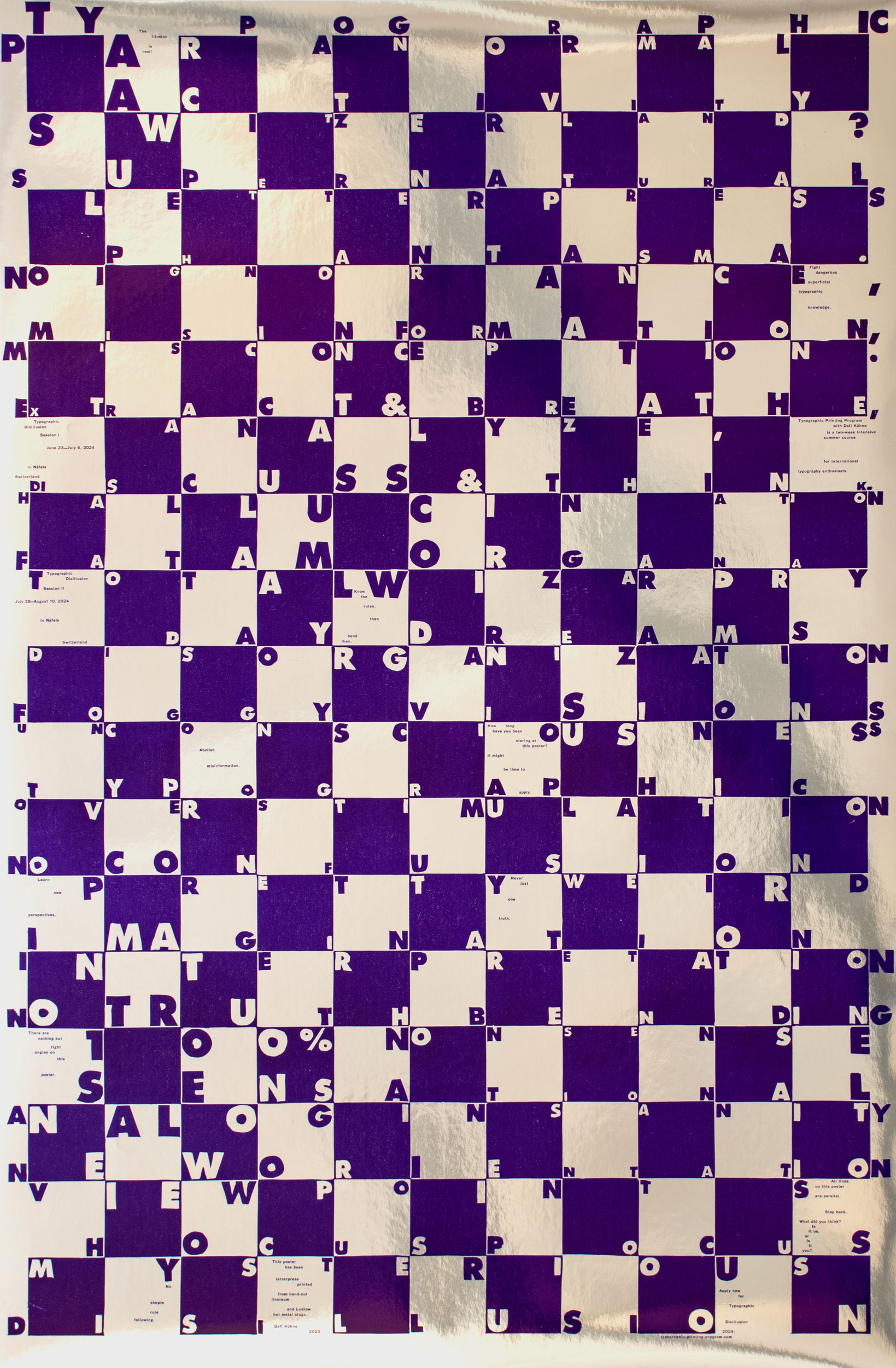
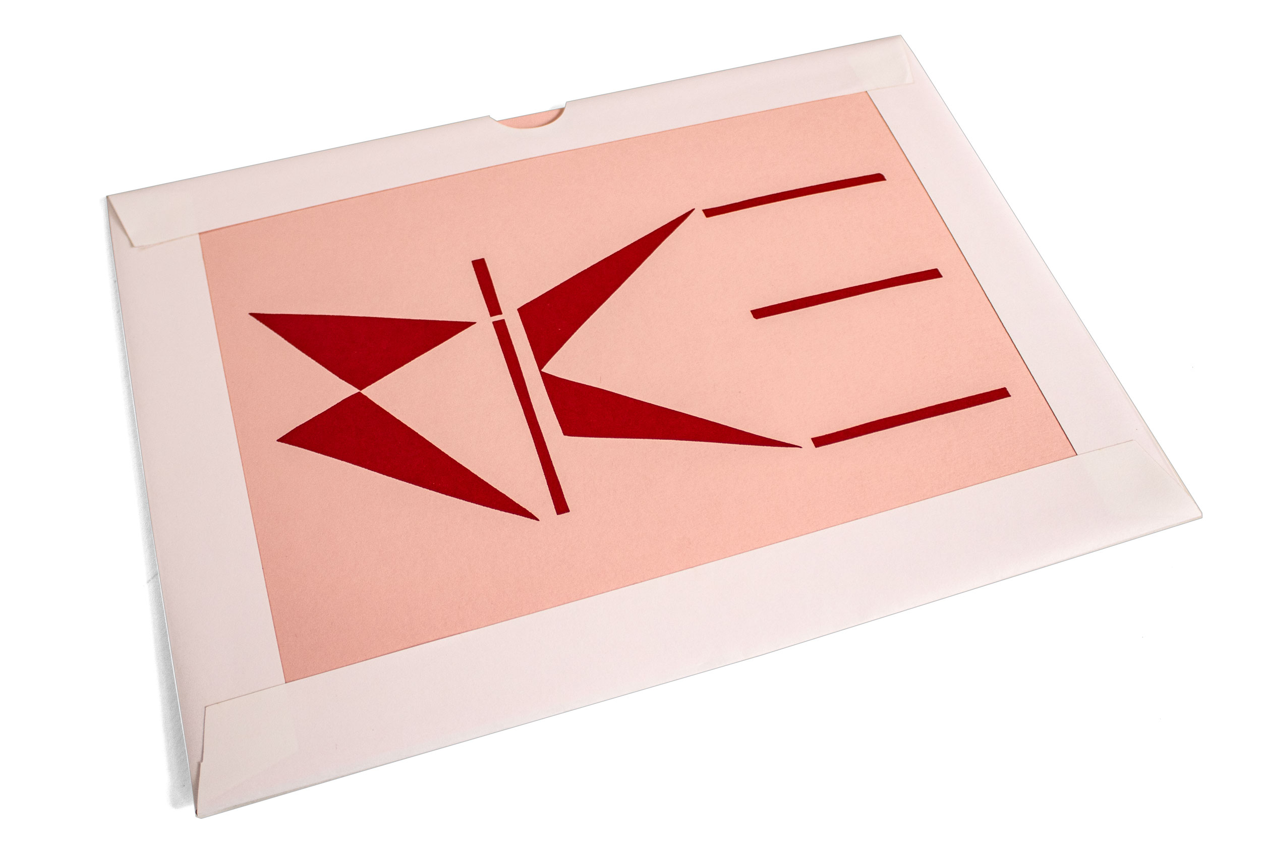
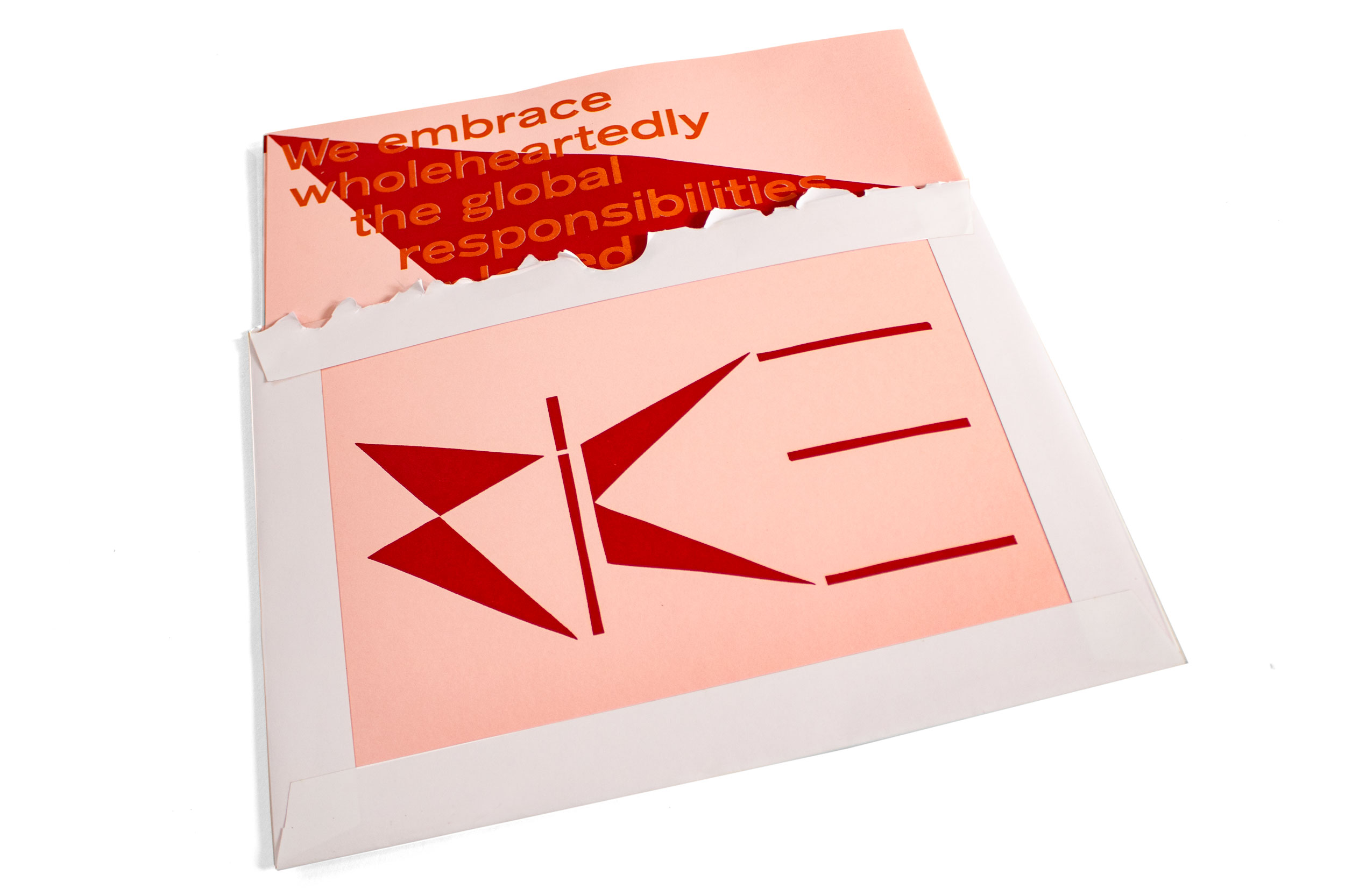
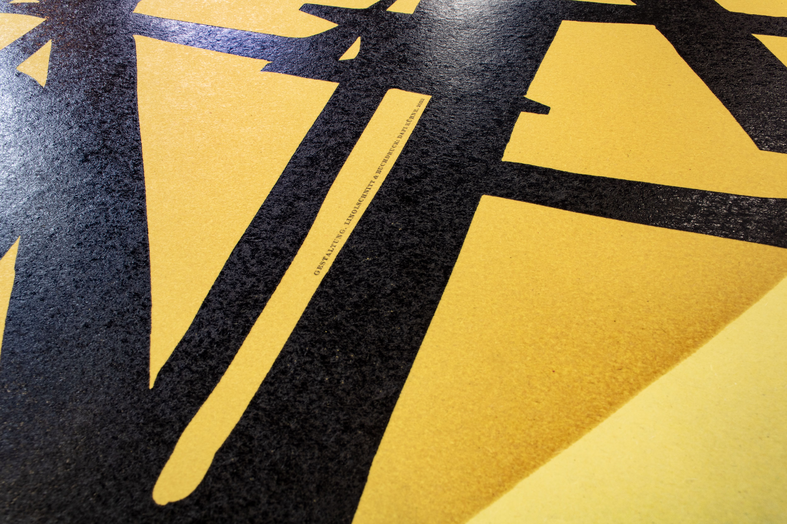
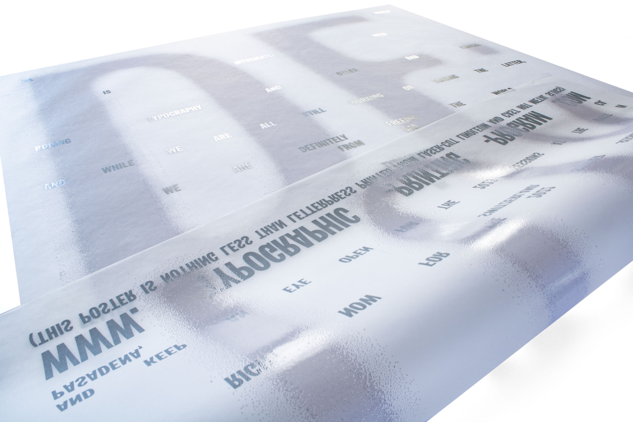
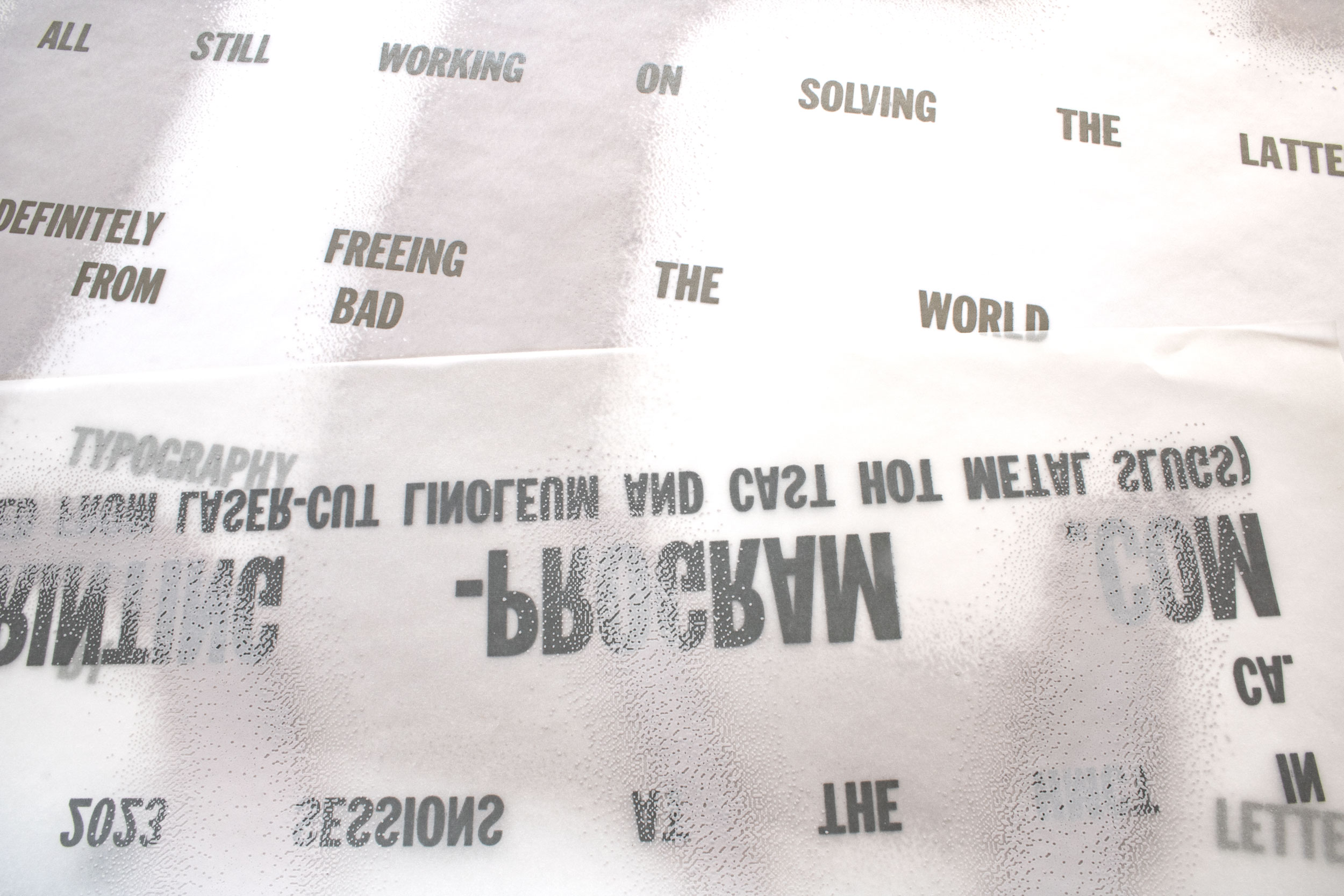
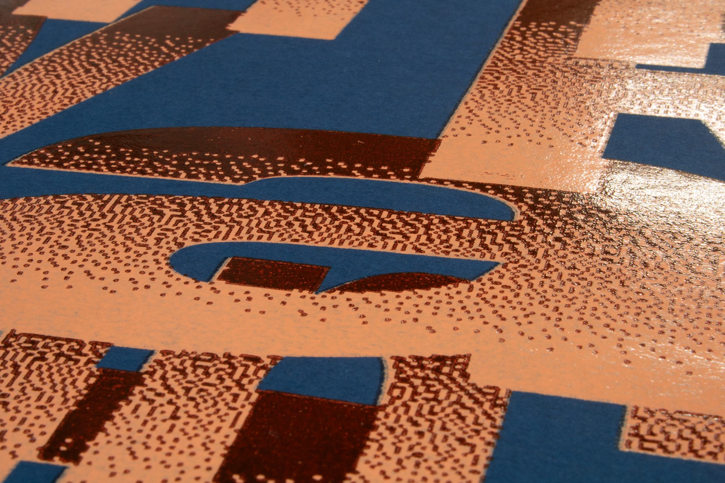
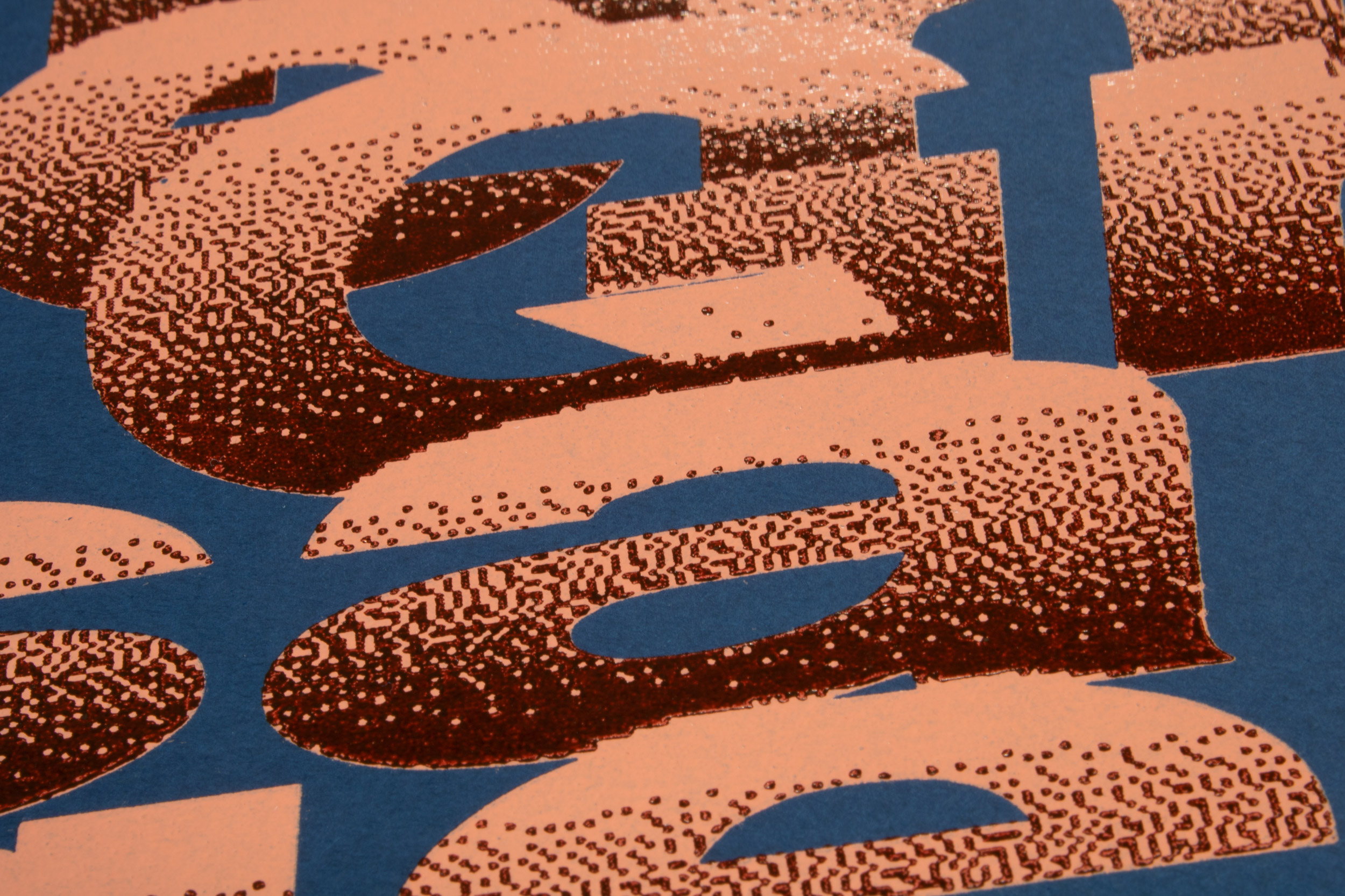
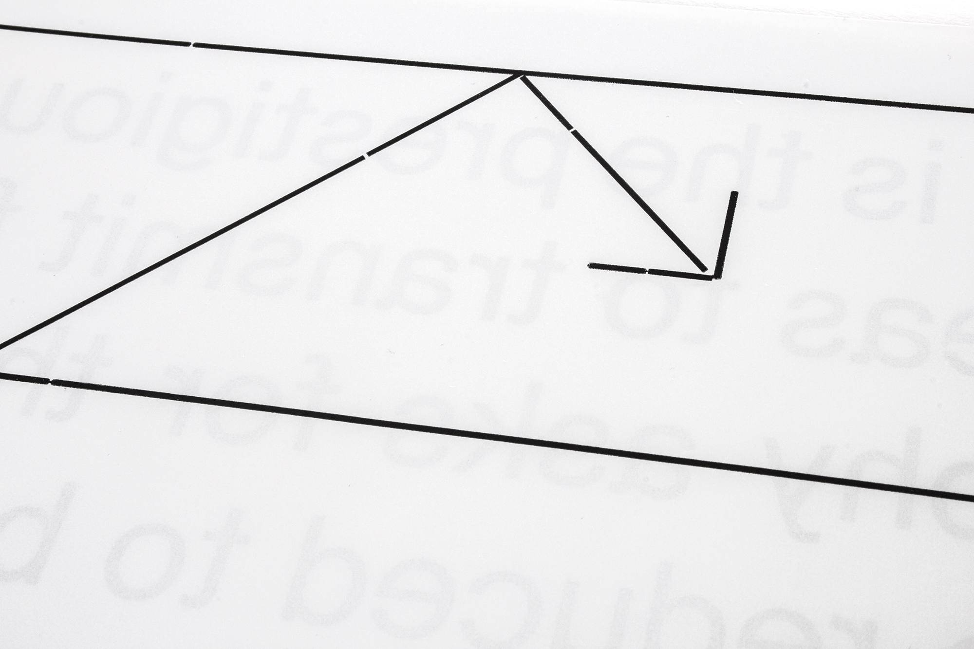
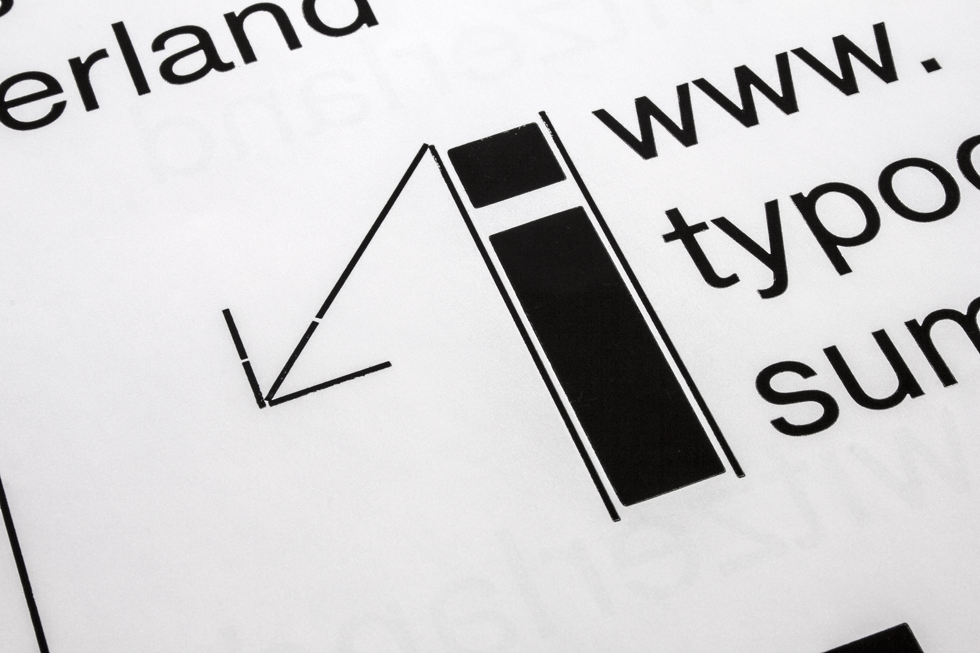
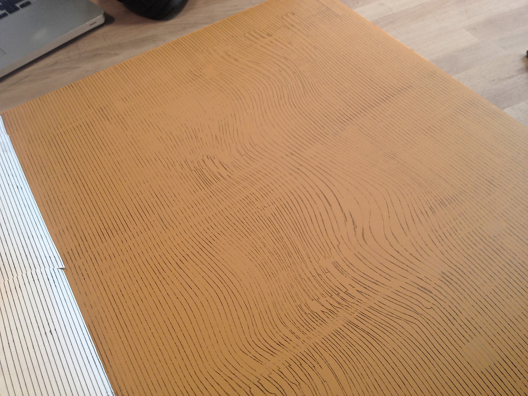
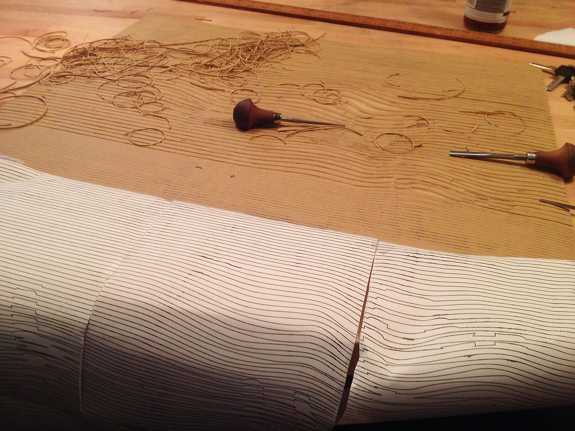
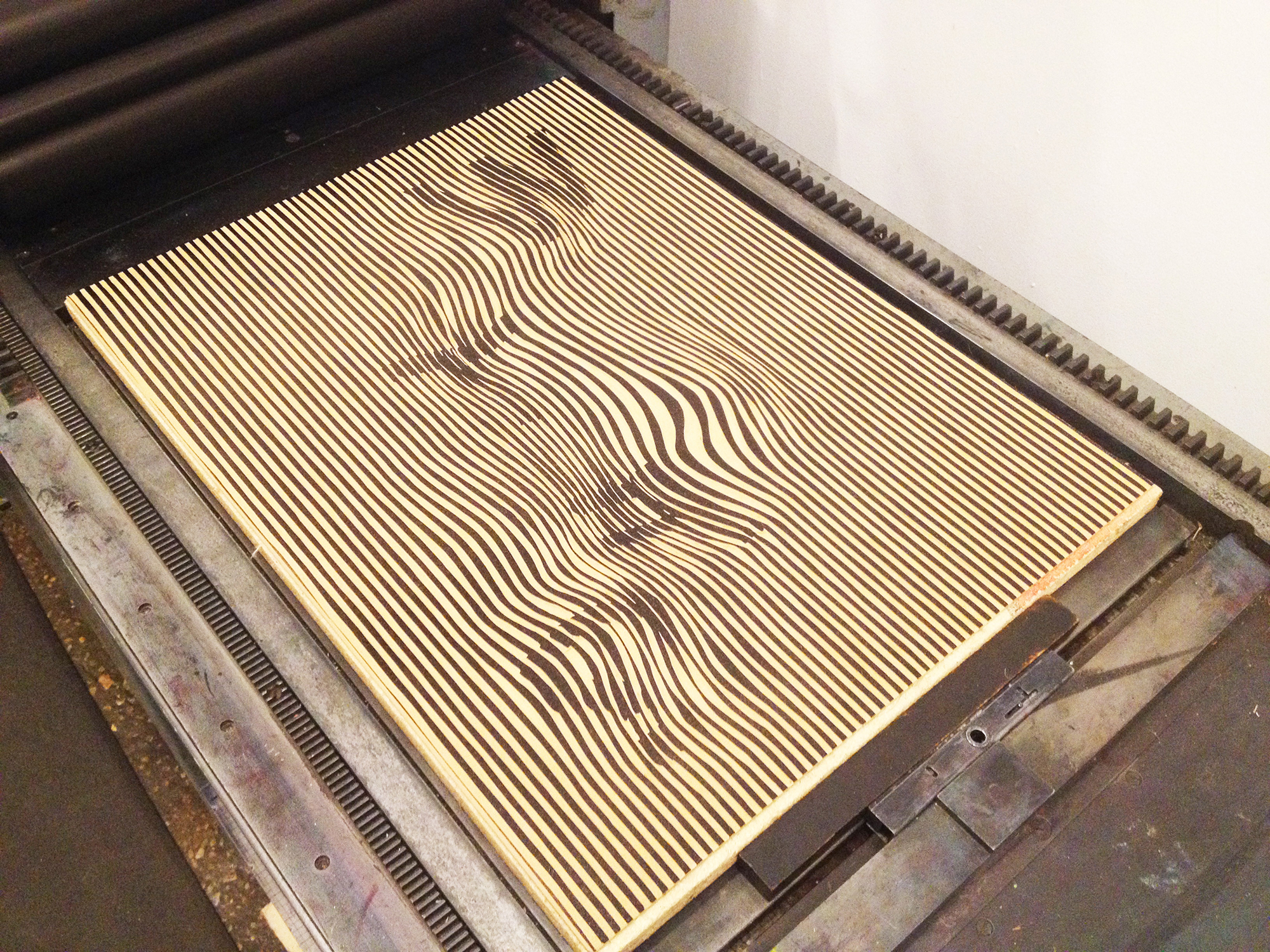
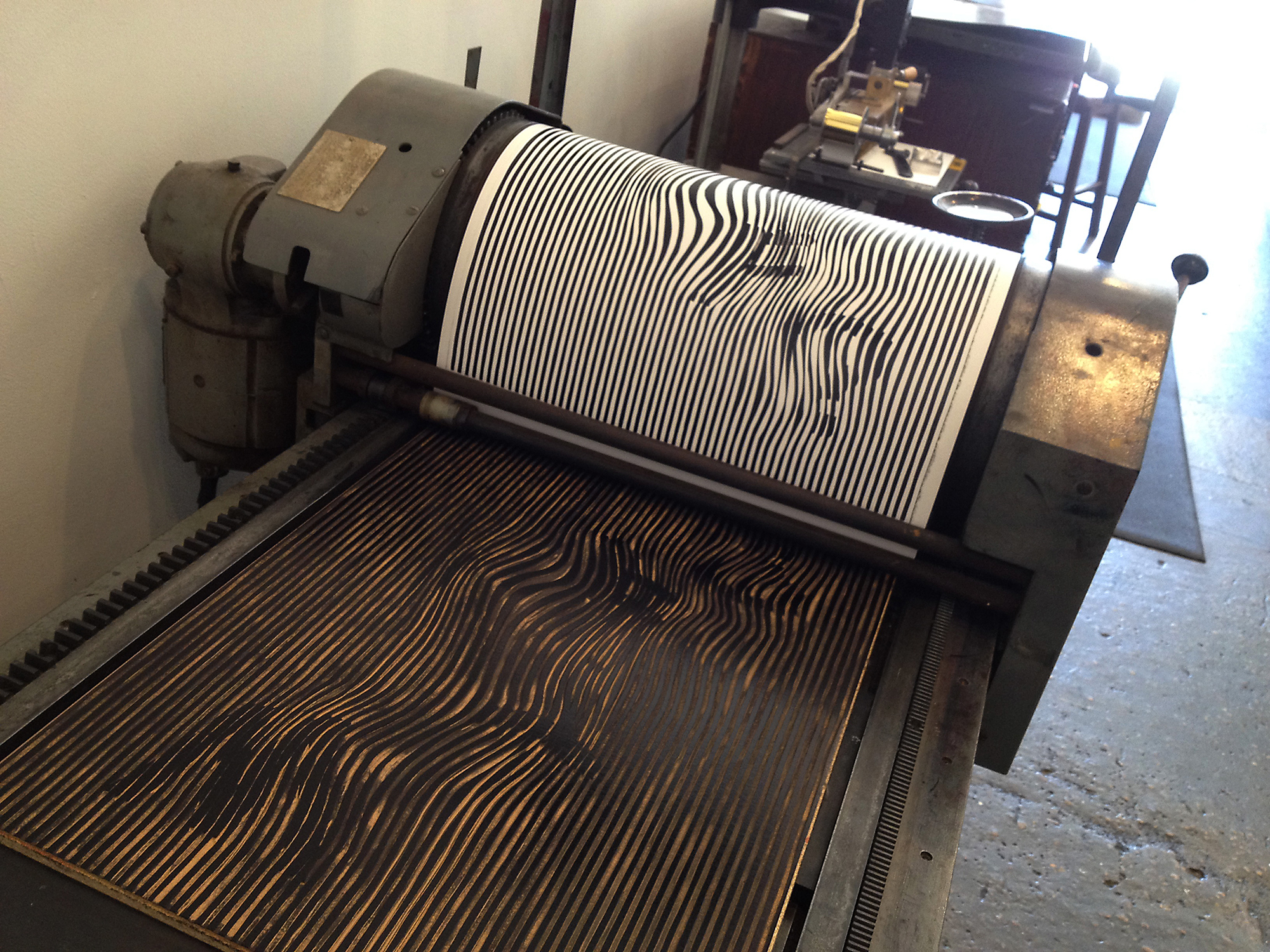
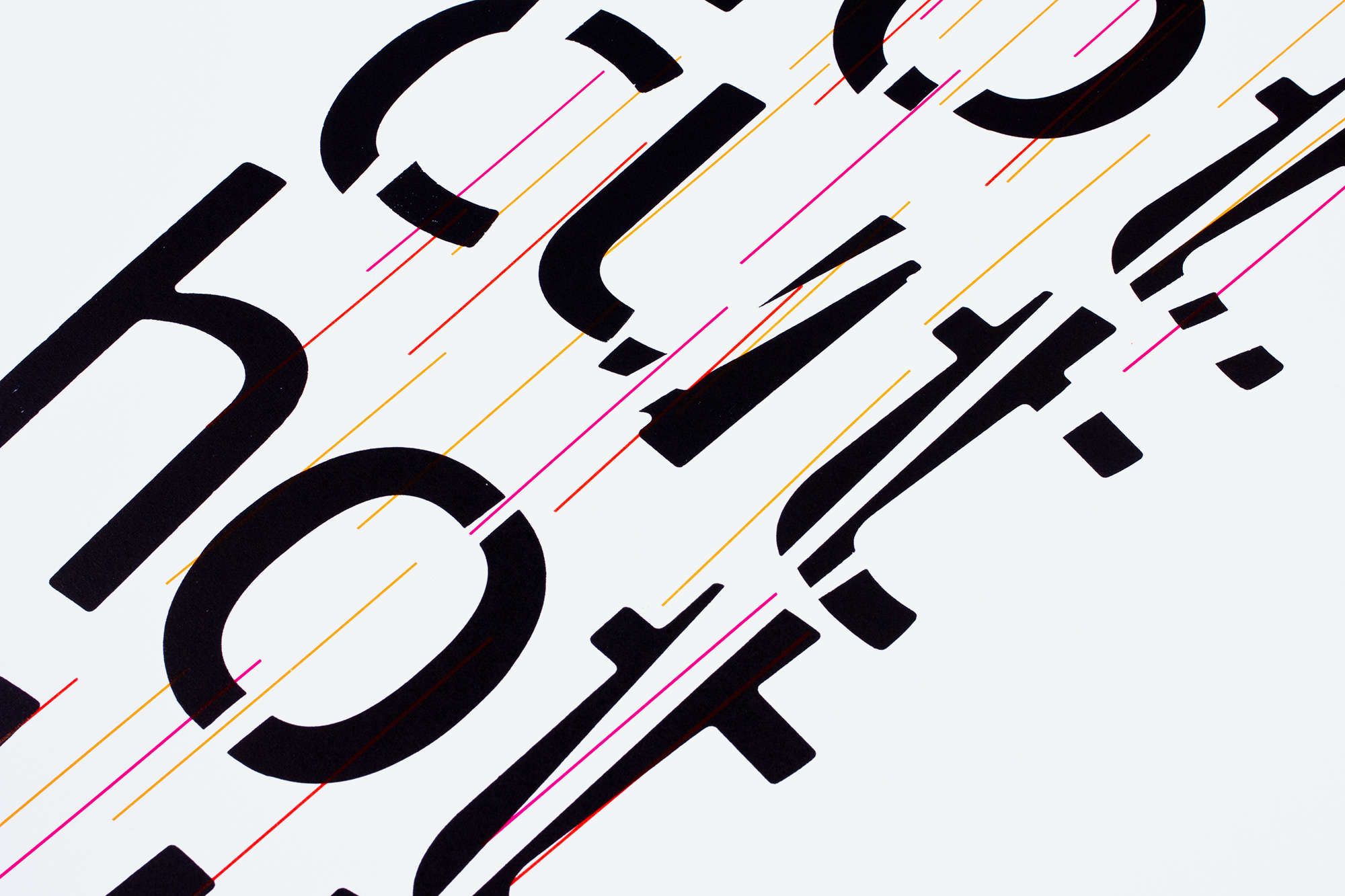
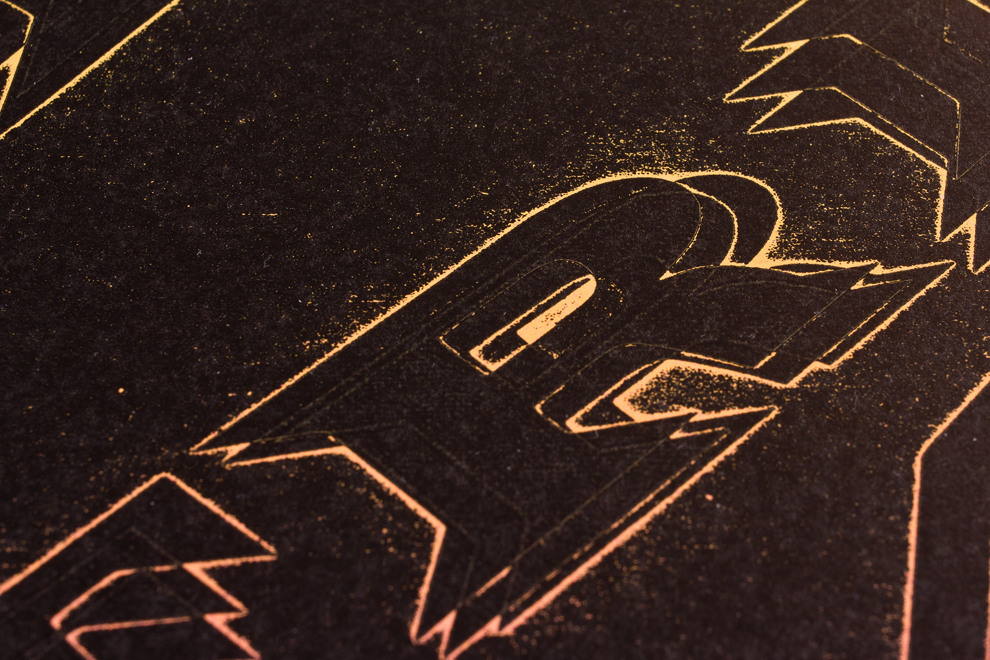
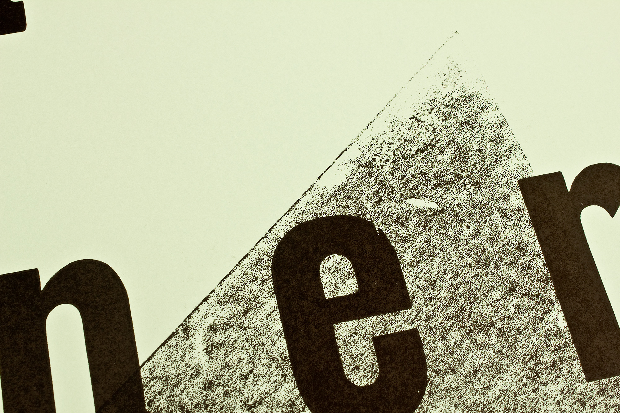
Typographic Disillusion
Are you ready for the total typographic disillusion? Letterpress printed poster for typographic-printing-program.com printed on mirror gloss paper from a large hand-cut linocut and some freshly cast Ludlow hot metal slugs.
And don’t worry, all lines on this poster are dead-straight.
Client: Typographic Printing Program, Switzerland
Format: 64×97.6cm
Paper: Heavymetal, 170g/m2
Edition: 300 posters on a Grafix GX4
November 2023
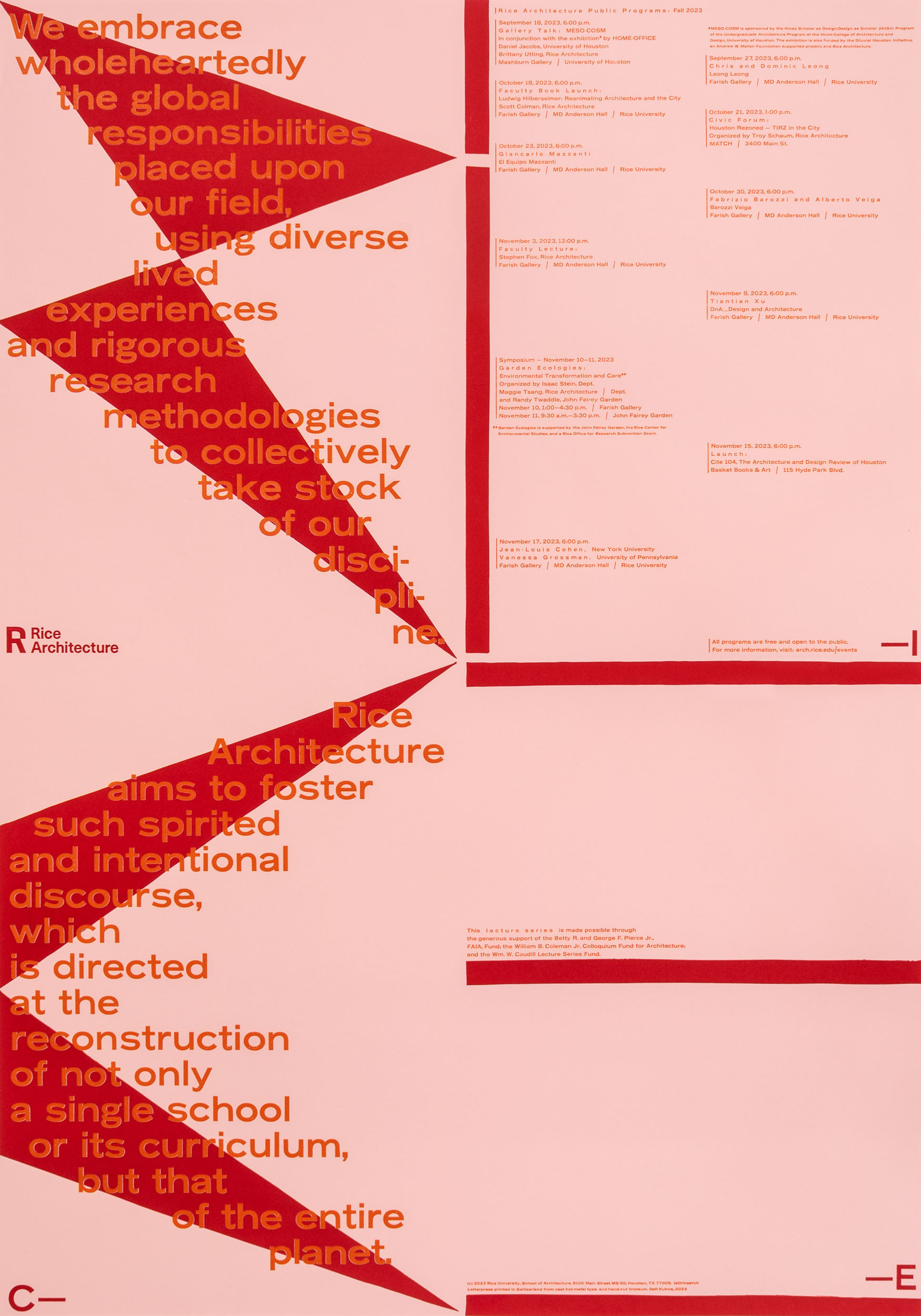
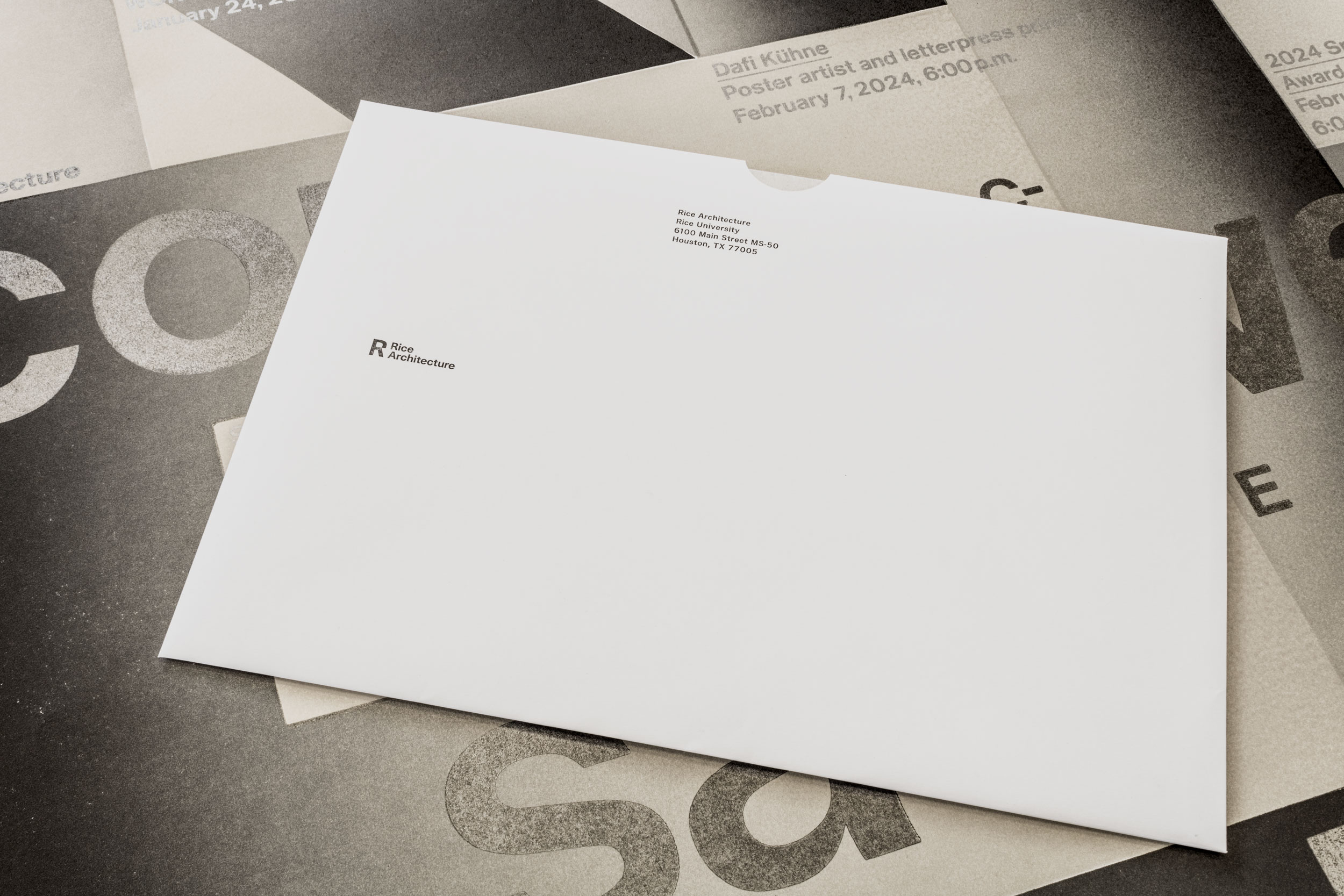
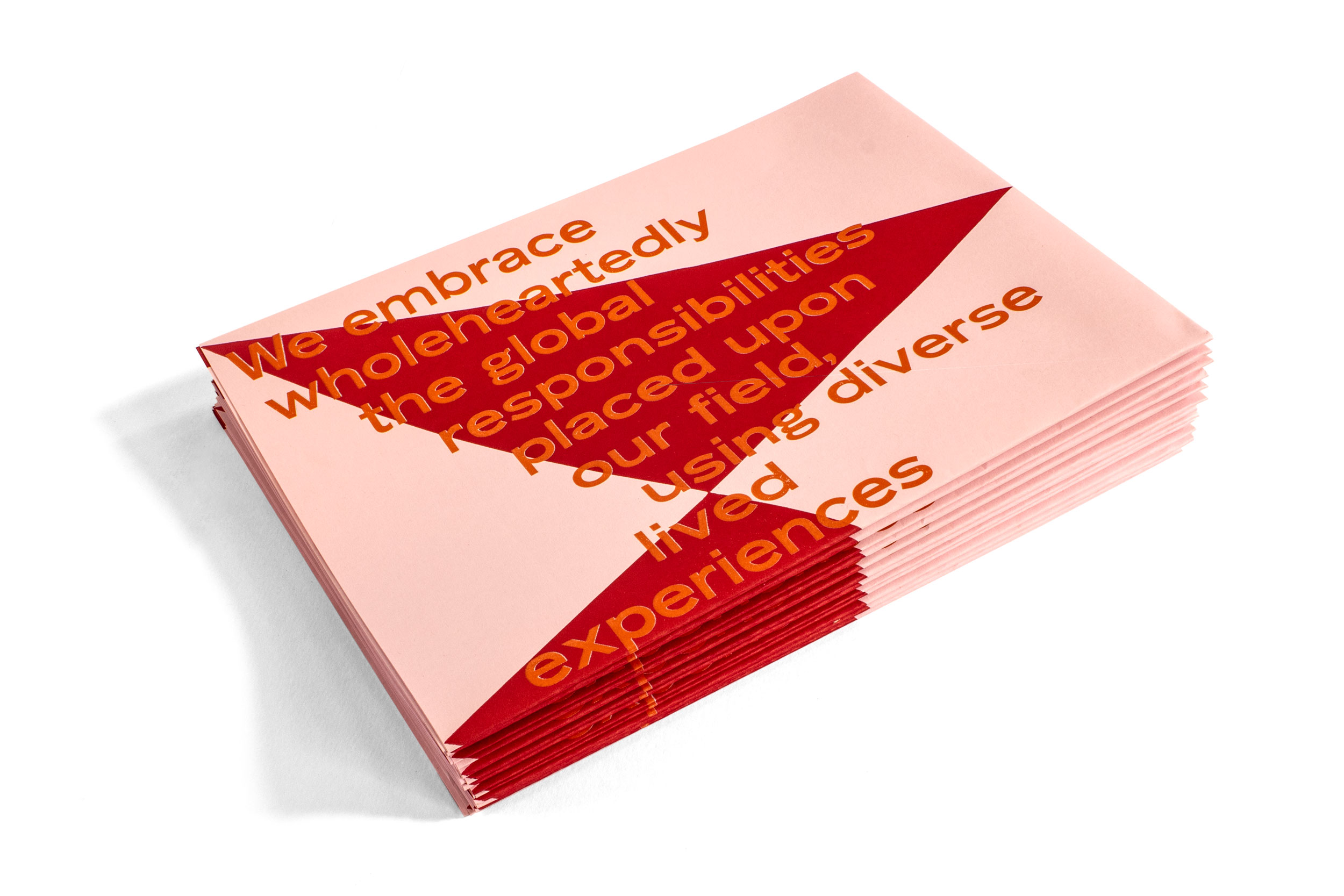
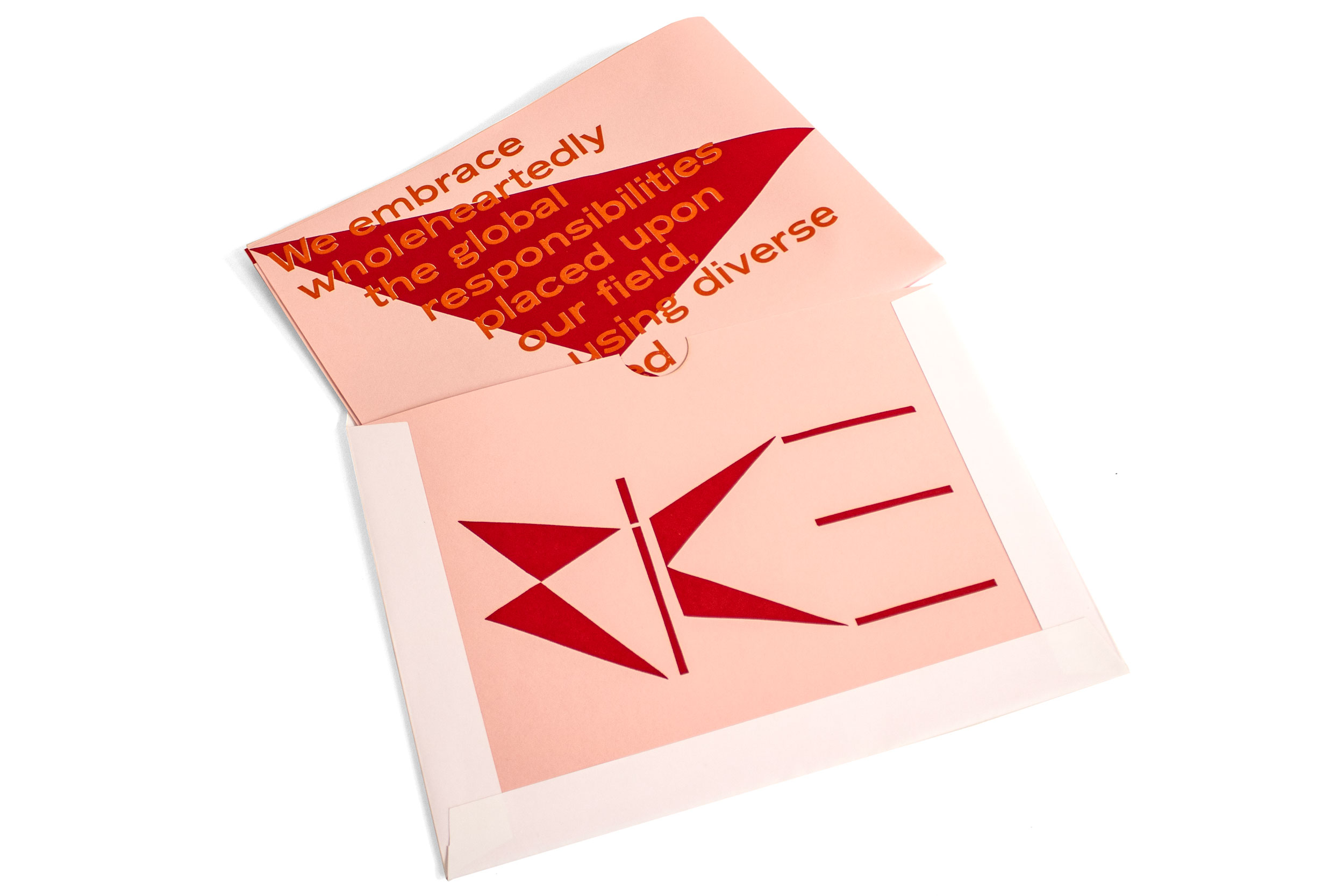
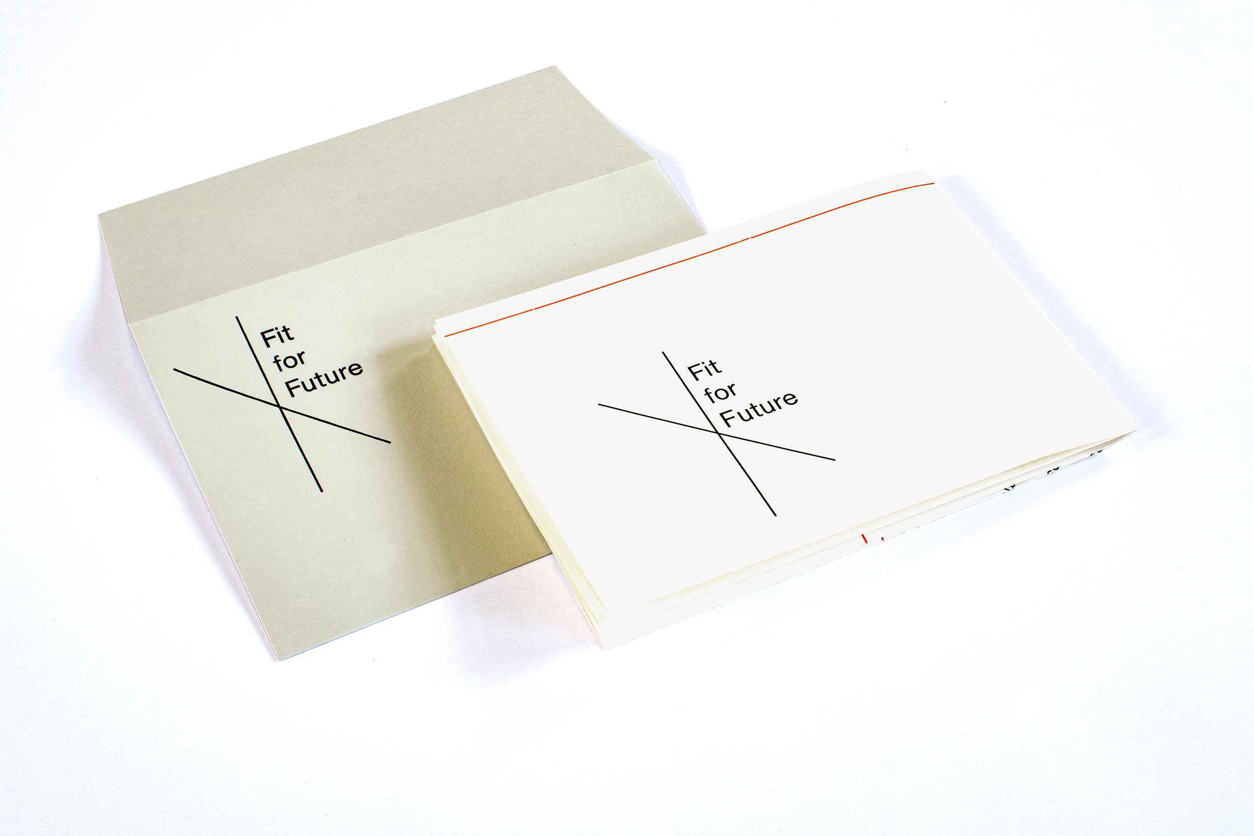
Rice Architecture I
Semester lecture program for Rice Architecture—the smallest professional degree program situated within a top research university in Houston, TX. Letterpress printed from hand-cut linoleum and freshly cast Ludlow hot metal slugs. And also check out the custom made envelopes!
Client: Rice Architecture, Rice University, Houston, TX
Format: 70×100cm
Paper: Colorplan Candy Pink, 100g/m2
Edition: 300 posters on a Grafix GX4
September 2023
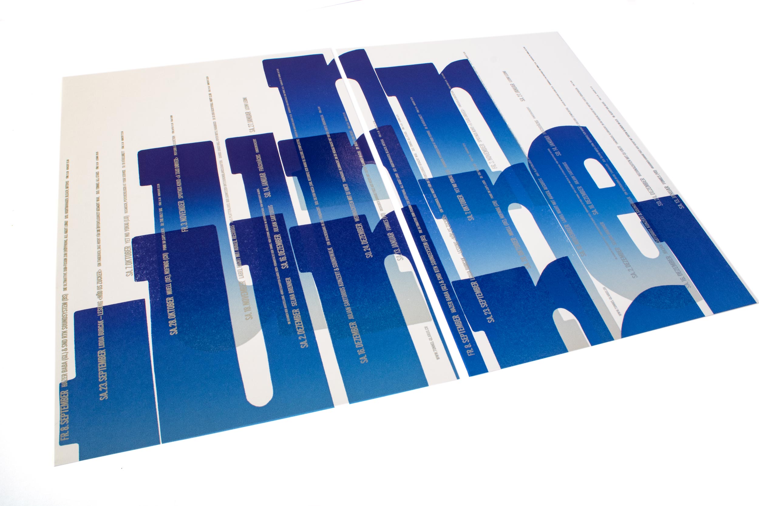
Tunnel III
Third letterpress printed program poster in the series for tunnel-glarus.ch. Actually 3 posters in 2 sizes, printed from modular linocut letters and fresh cast Ludlow hot metal slugs. Check out the video!
Client: Tunnel, Glarus
Format: 70×100cm and 2×35×50cm
Paper: Materica Gesso, 120g/m2 and 250g/m2
Edition: 90 + 300 posters on a Grafix GX4
August 2023
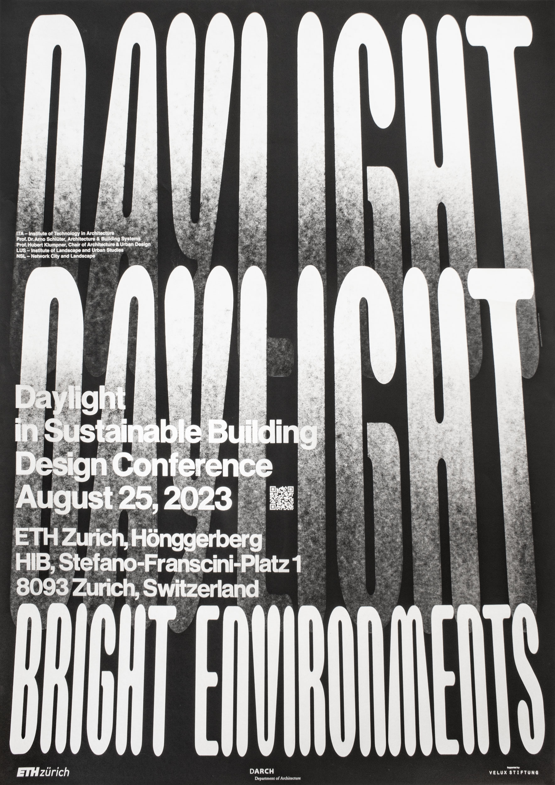
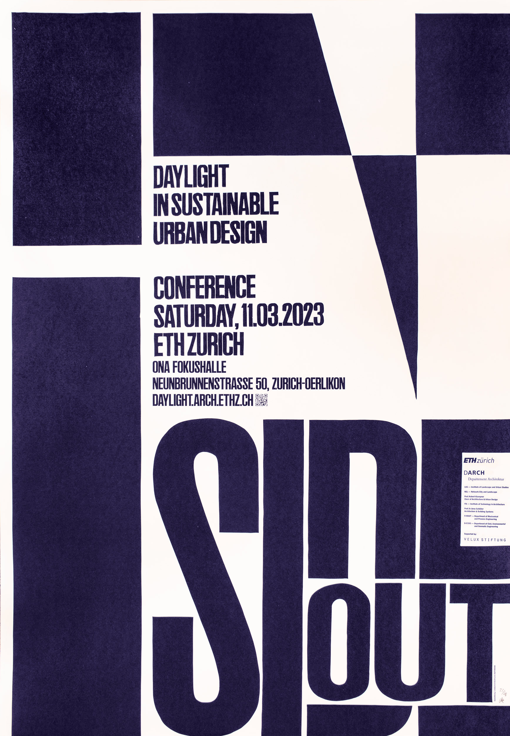
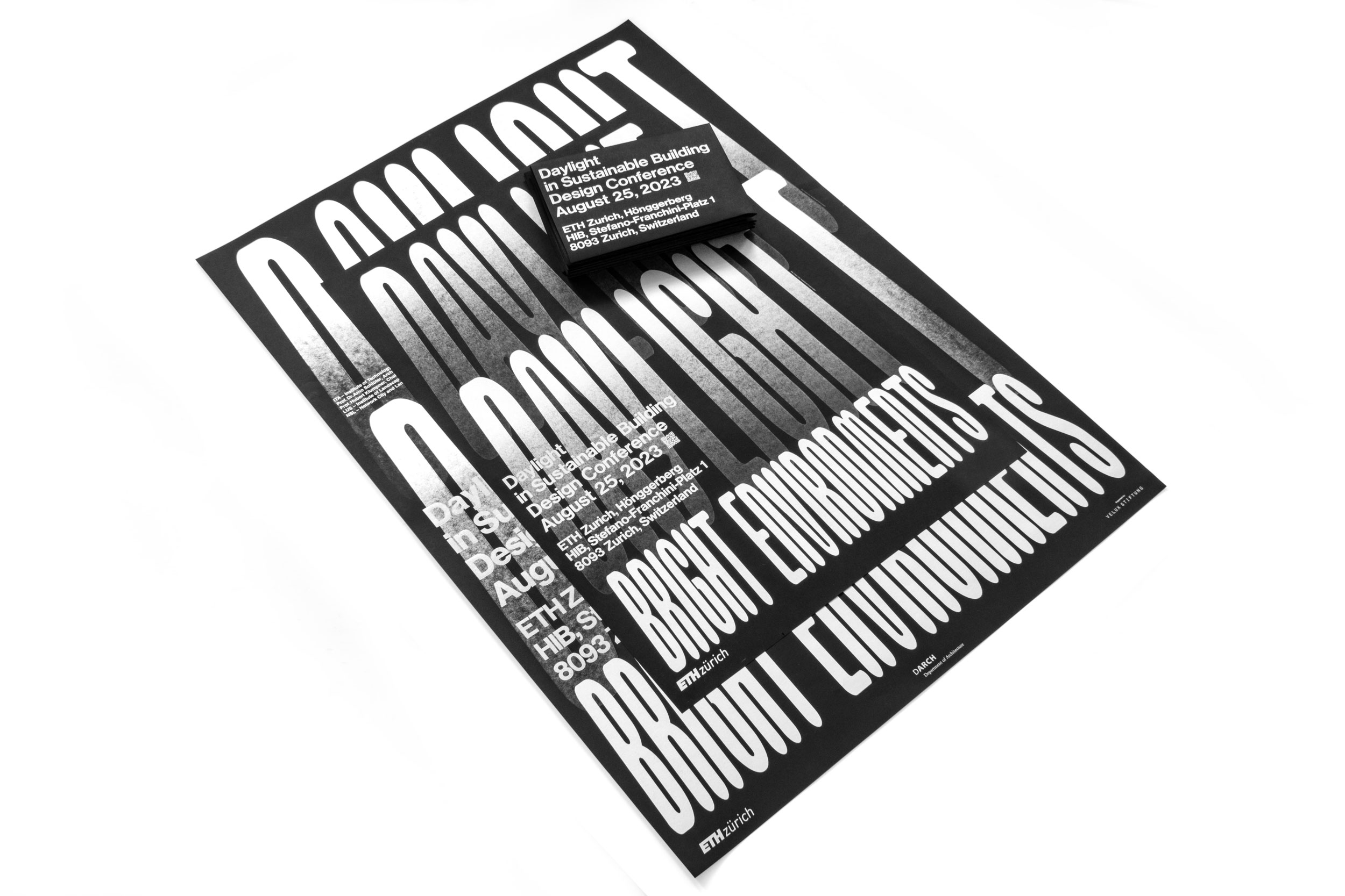
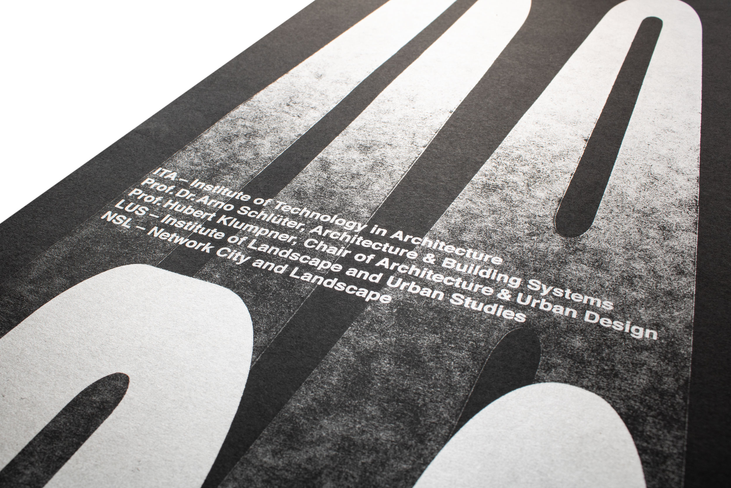
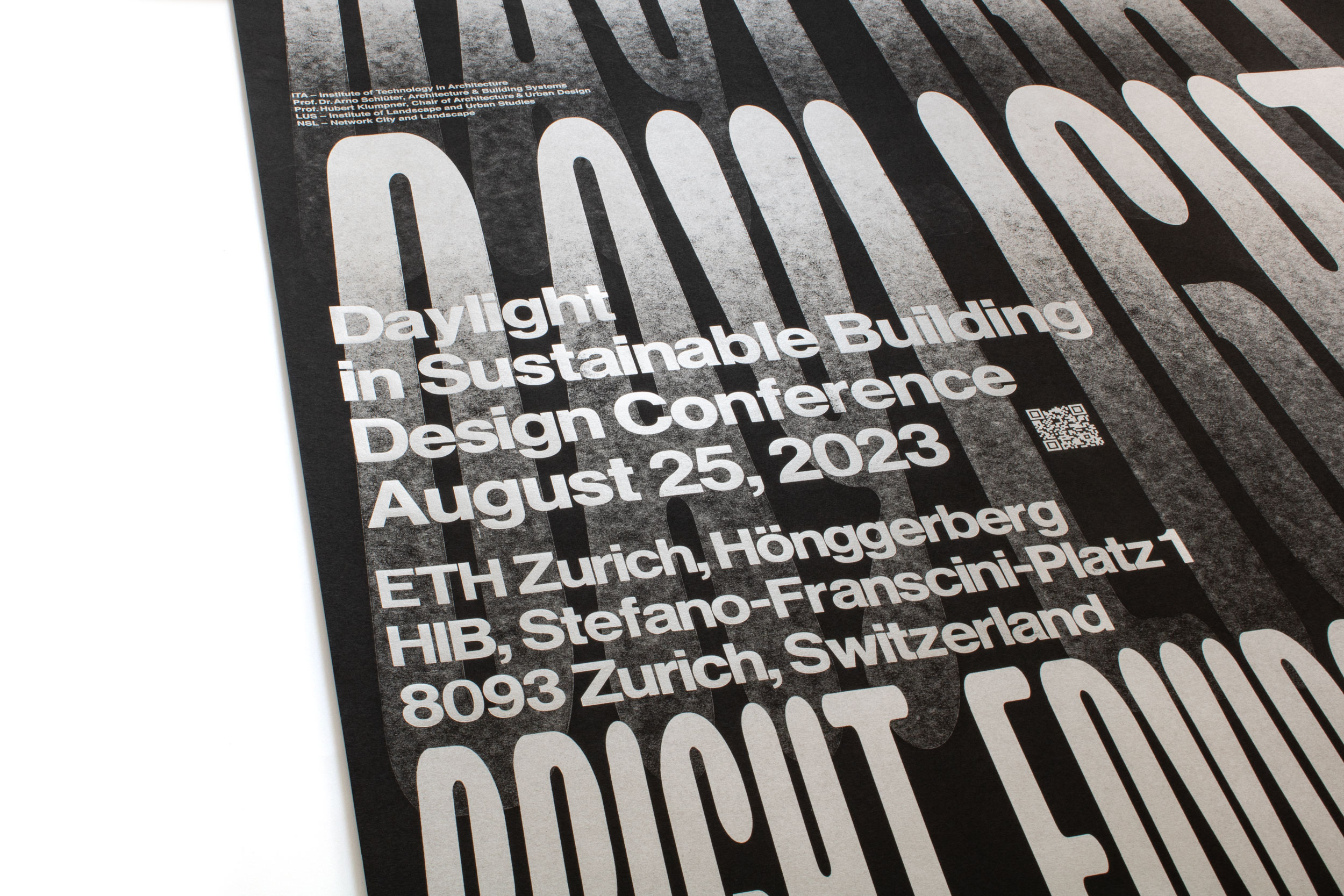
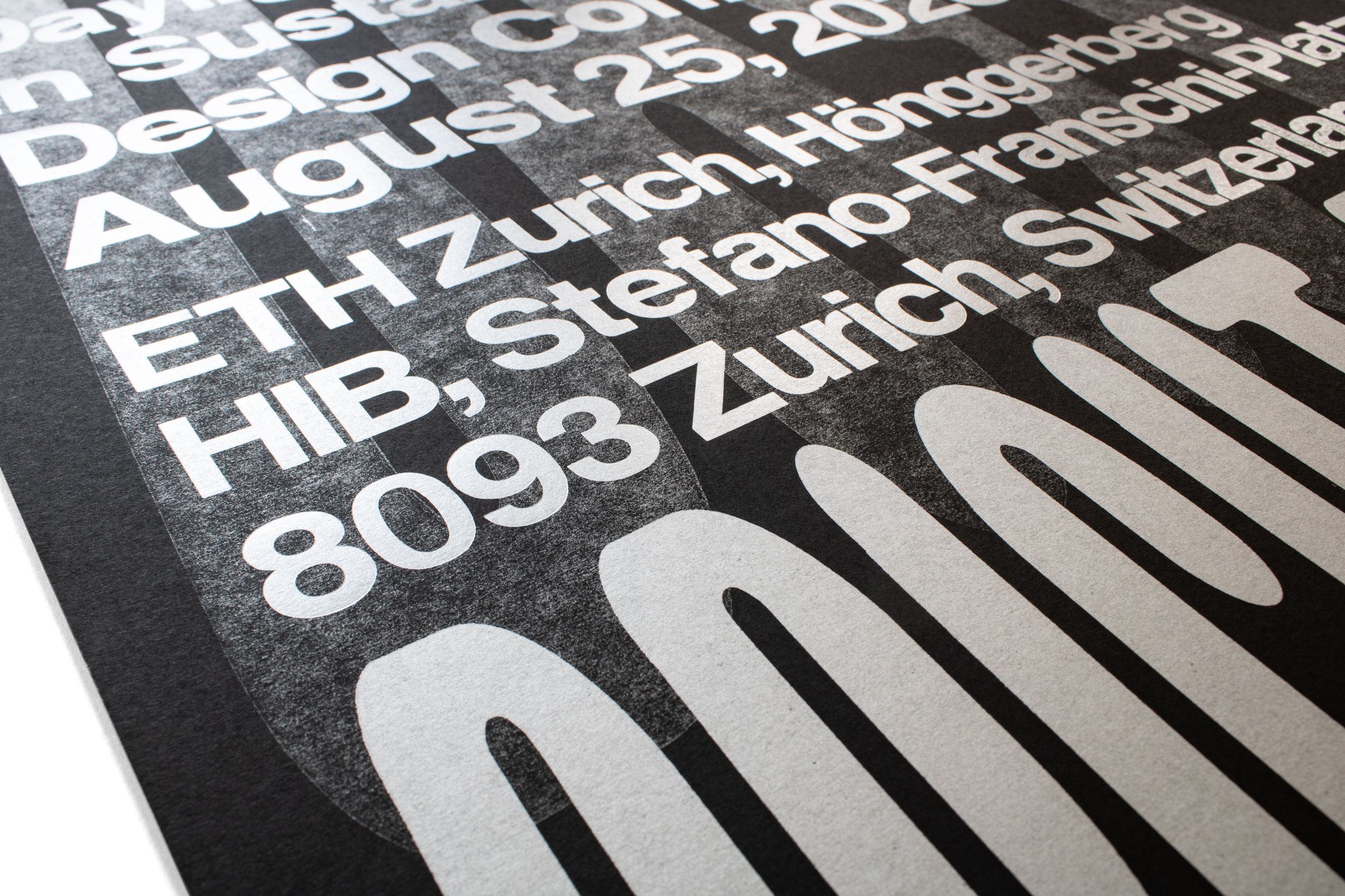
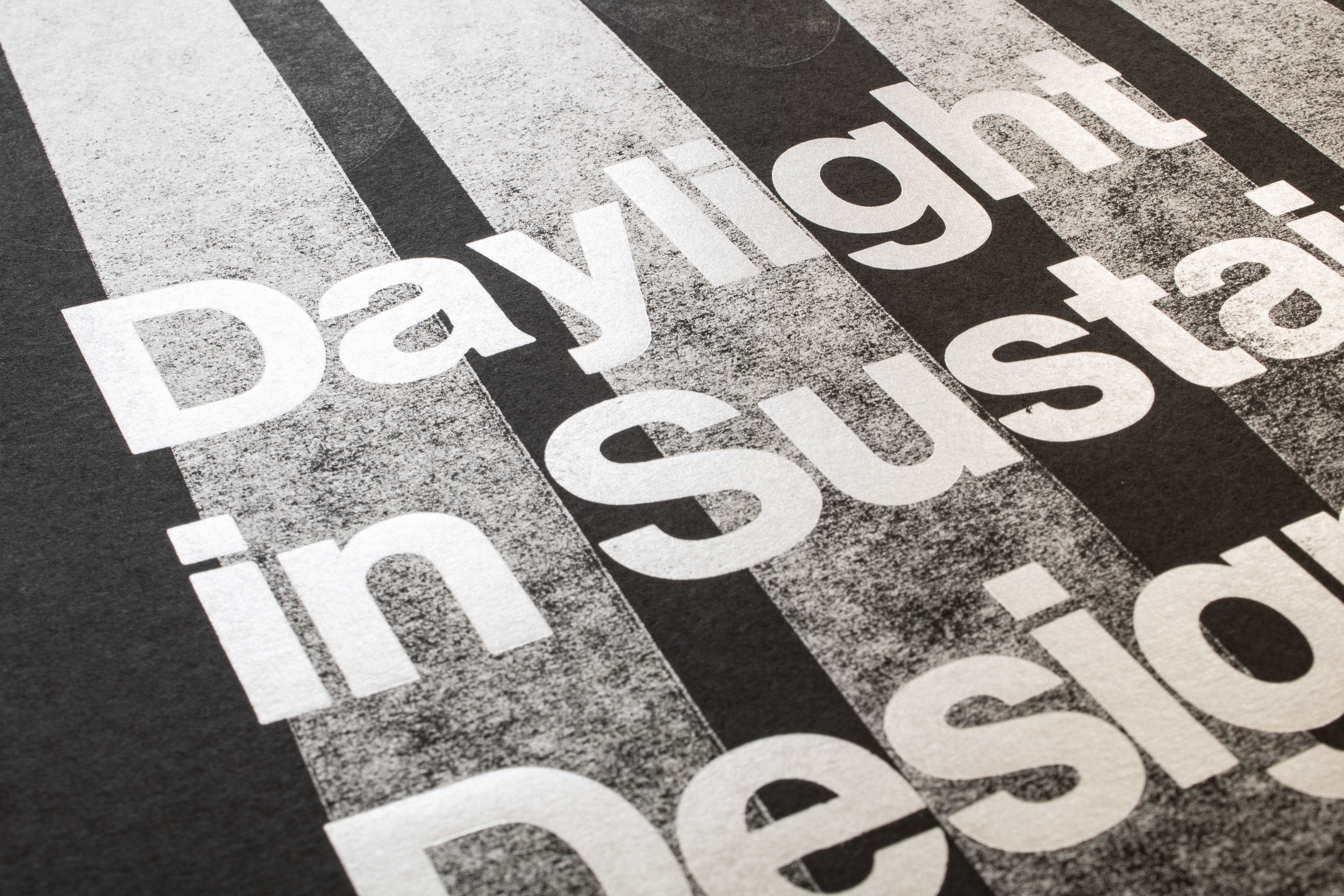
Daylight
Letterpress printed poster for an architecture conference with the topic ‹Daylight›. Printed in two versions (A1 and A0 format) with laser-cut MDF and hand-set metal and wood type.
And if you’re a production nerd like me: check out the gradients in the video and how they’re printed against the printing direction! They’re made in two steps: Inking in the roller direction, then printing in a 90° rotation. Yes yes, we know all the magic!
Client: Prof. Hubert Klumpner, Prof. Dr. Arno Schlütter, ETH Zürich, Zürich
Format: A1 59.4×84.1cm
Format: A0 84.1×118.9cm
Paper: Surbalin, tiefschwarz, 115g/m2
Edition: 200×A1 and 55×A0
June 2023
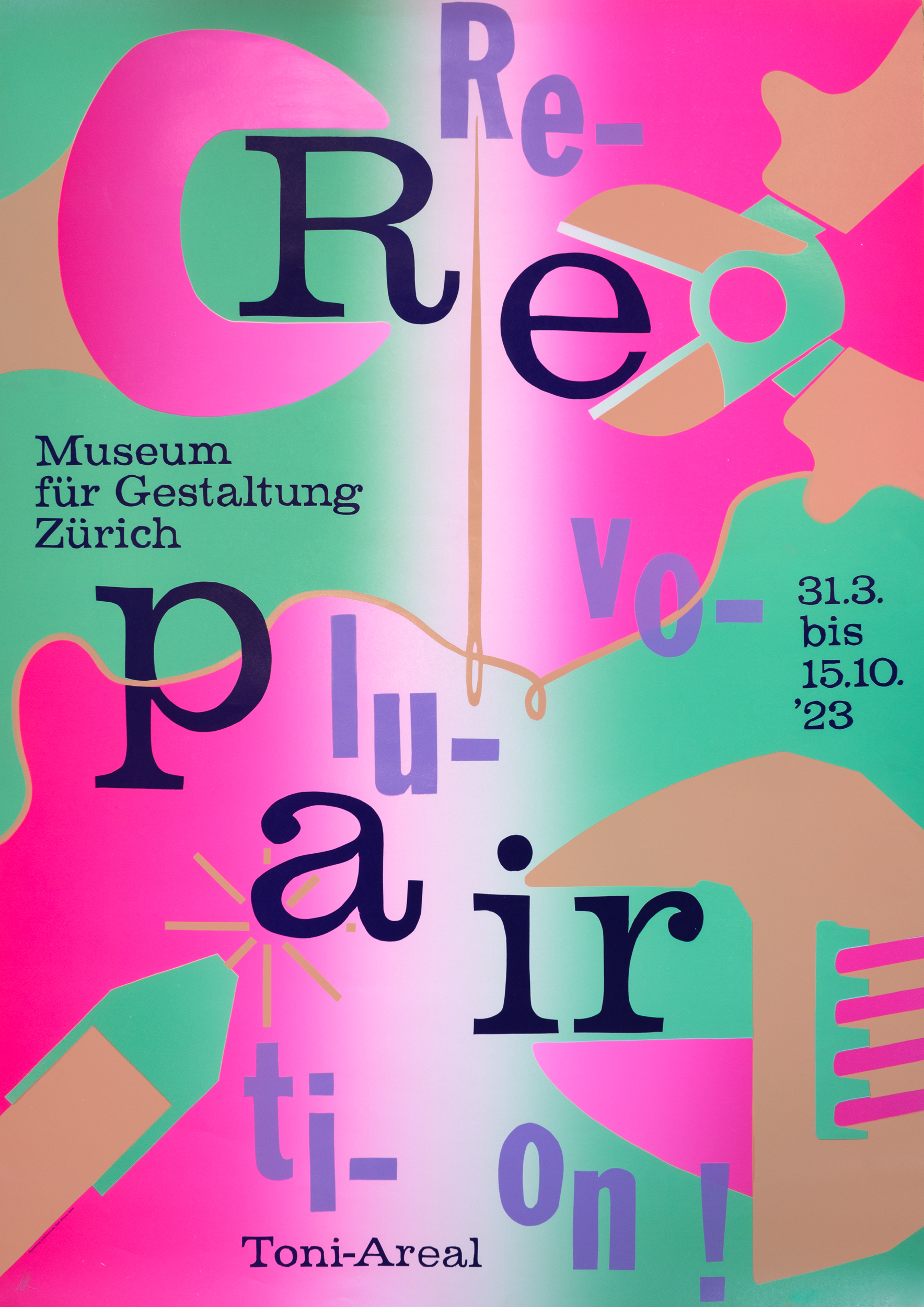
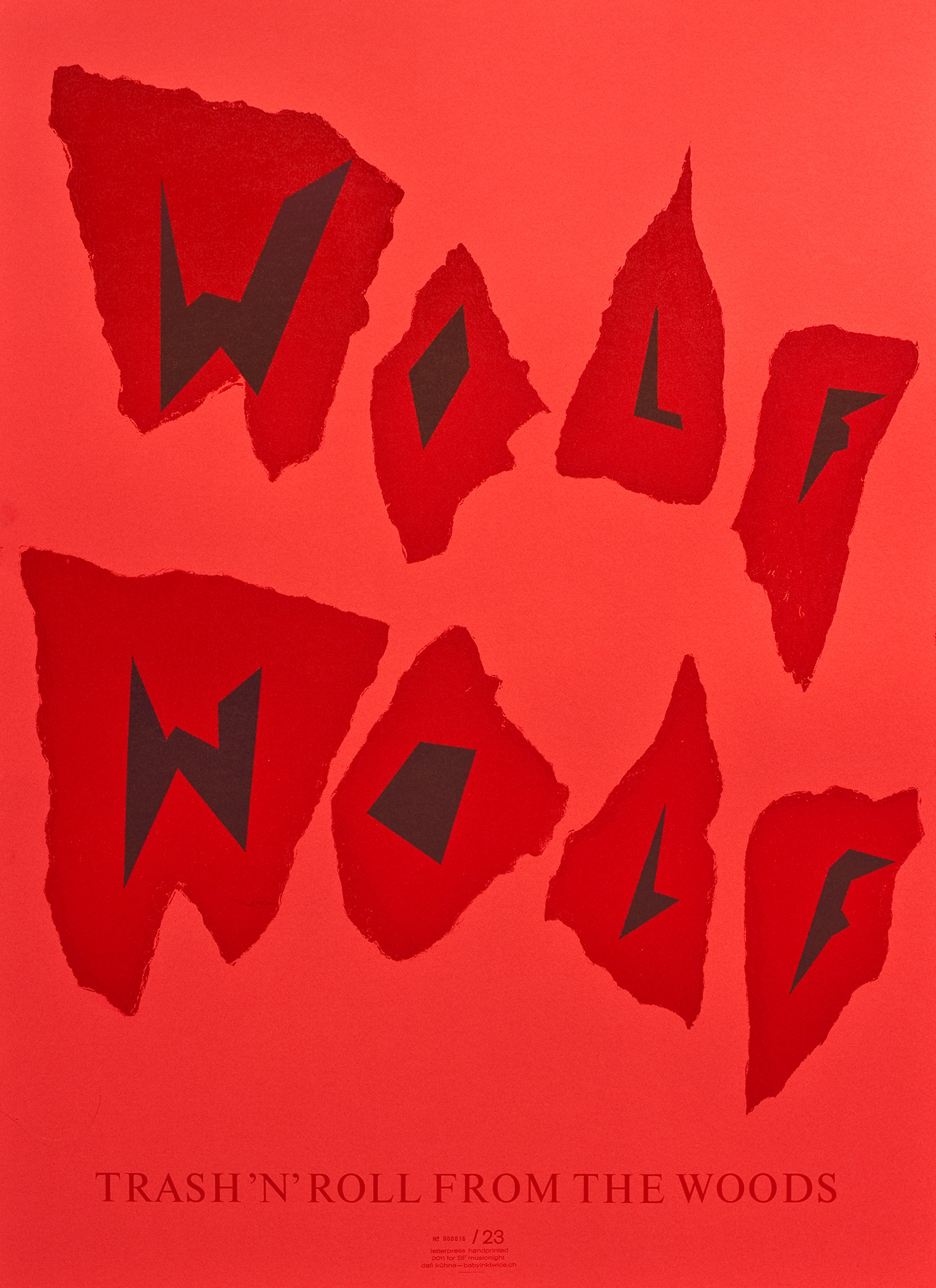
Repair Revolution!
Poster for the exhibtion «Repair Revolution!» from March 17—October 15, 2023 at Museum für Gestaltung Zürich.
Hand-printed in 11 print runs from hand-cut linoleum and a small metal type tag line. And btw, yes, the edition was 850 posters. F#%k me! What a pleasure seeing these posters in the city of Zürich.
Client: Museum für Gestaltung, Zürich
Format: 89.5×128cm
Paper: Surbalin, rosa, 115g/m2
Edition: 850 posters on a Grafix GX4N
March 2023
In–side–out
Letterpress printed poster for an architecture conference with the topic ‹Inside out—daylight conference›. Printed with hand-cut linoleum, photopolymer plates and a metal type tag line.
Client: Prof. Hubert Klumpner, ETH Zürich, Zürich
Format: 89.5×128cm / 47.5×68cm
Paper: Surbalin, rosa, 115g/m2
Edition: 30 large posters on a Grafix GX4N
Edition: 50 small posters on a FAG Control 900
March 2023
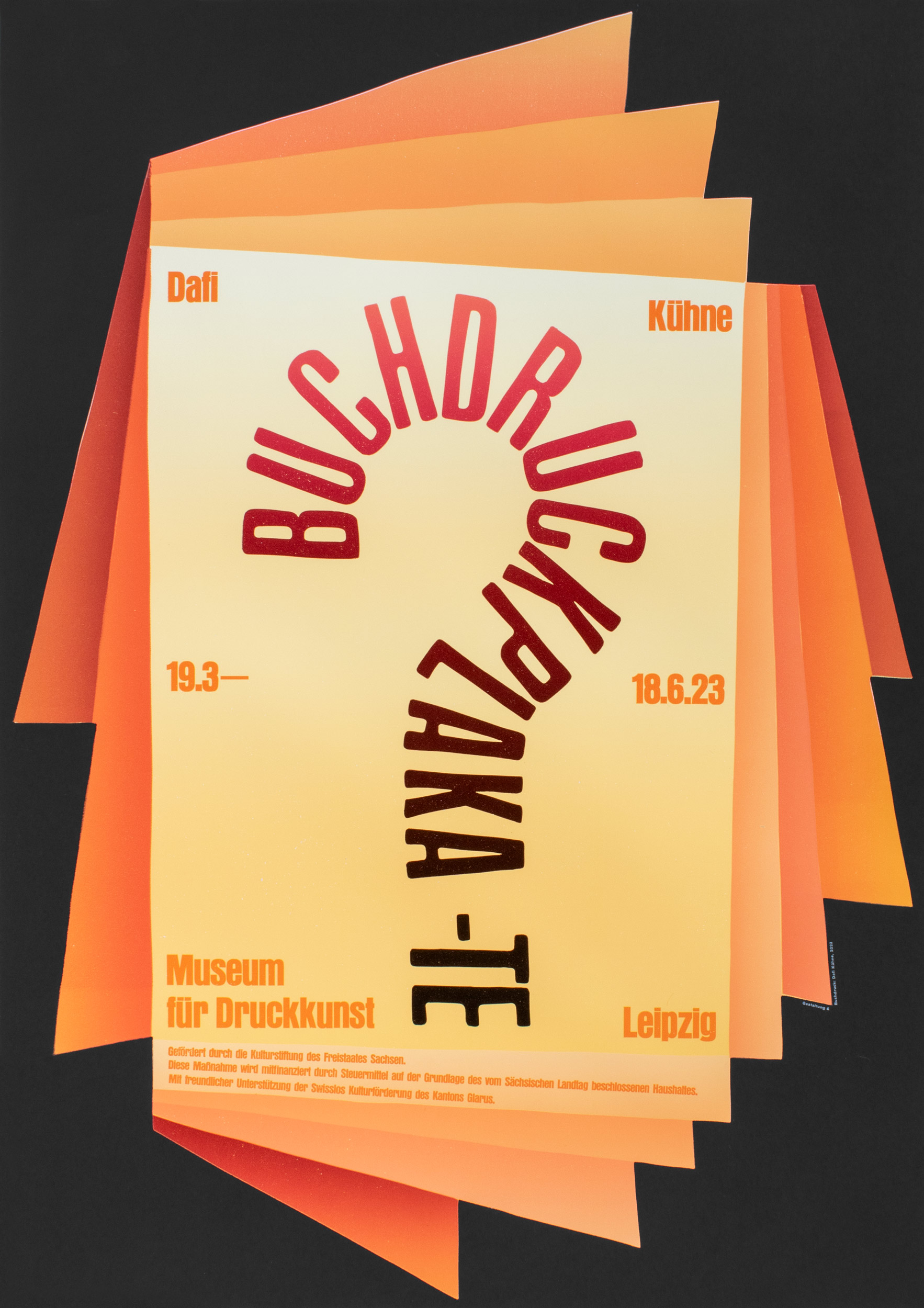
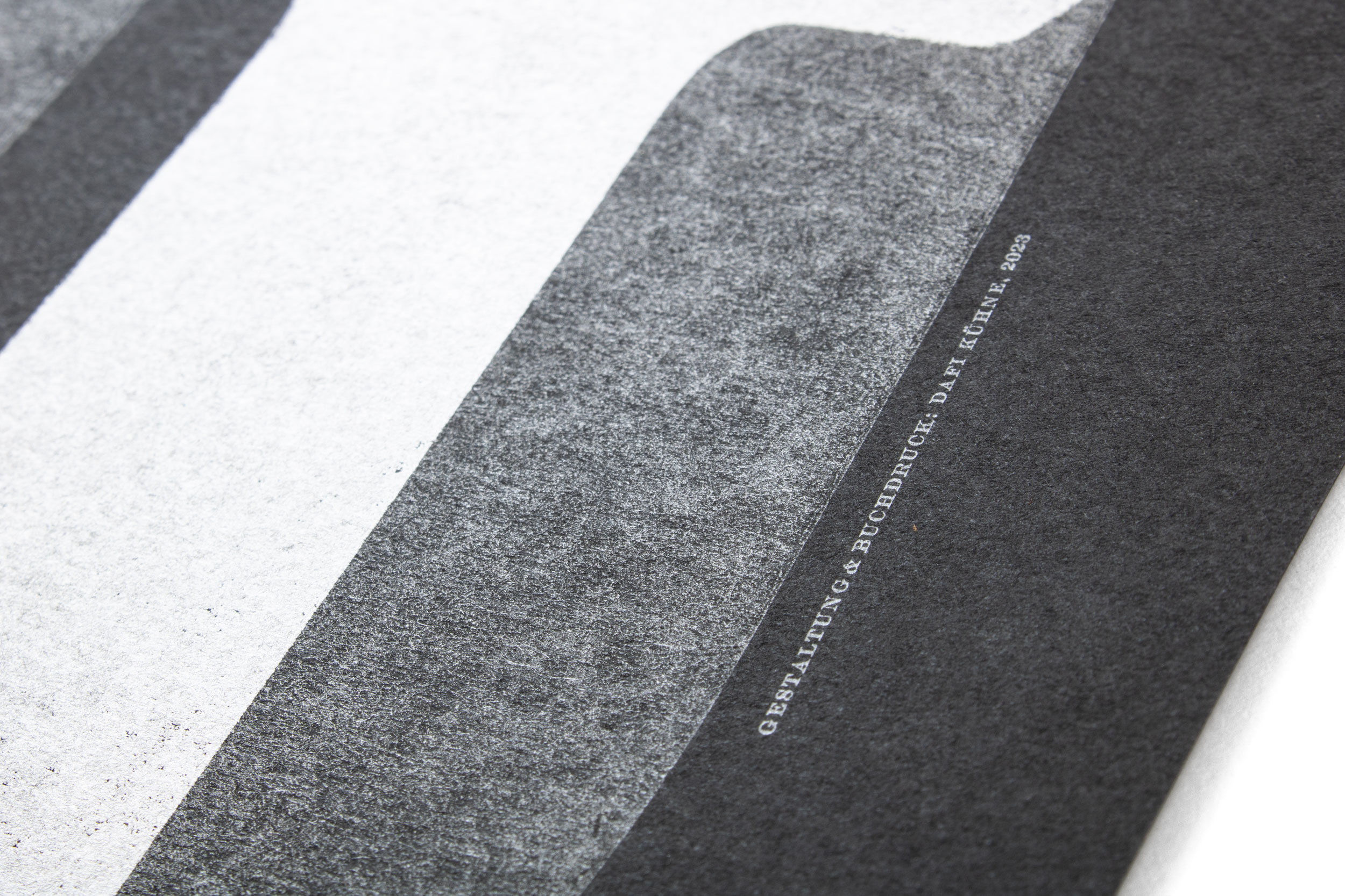
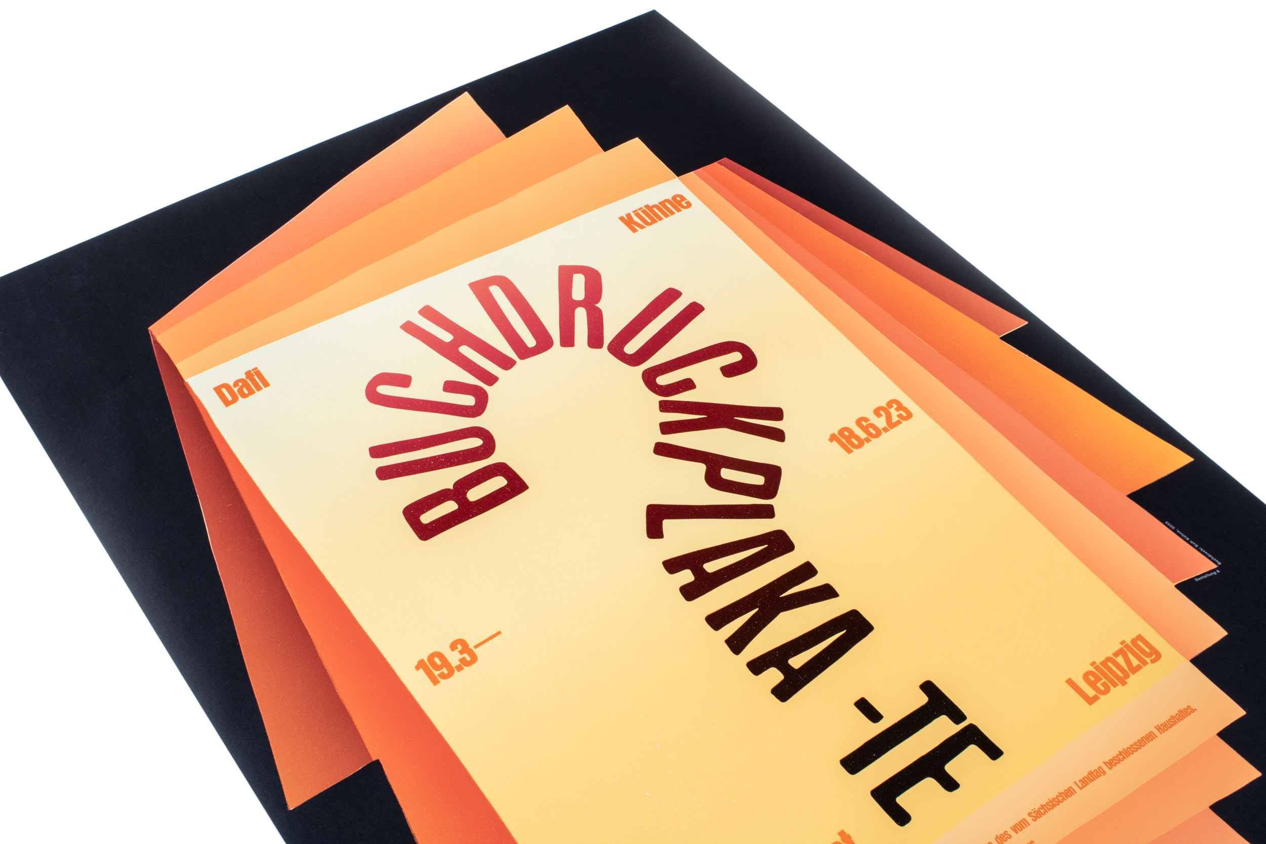
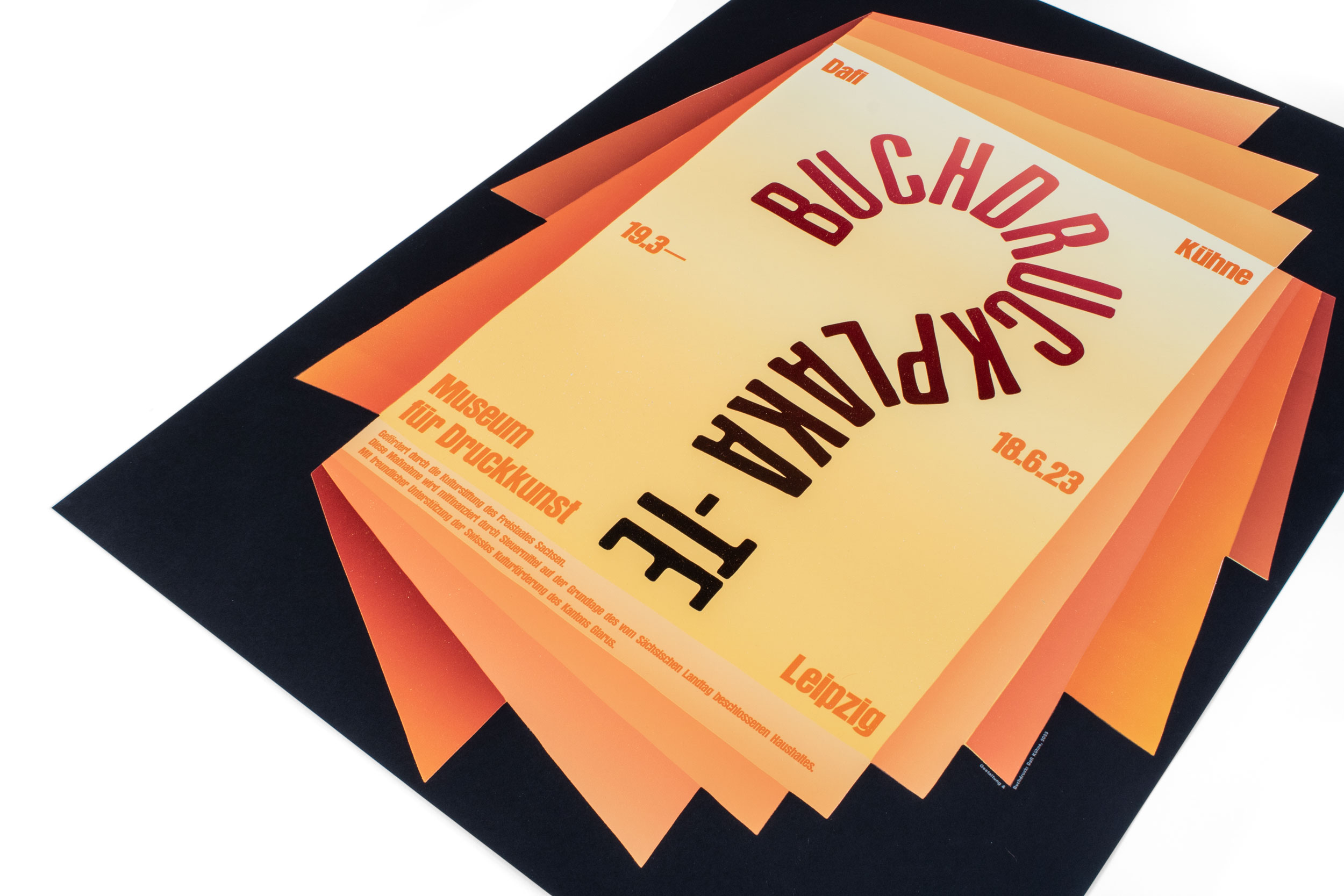
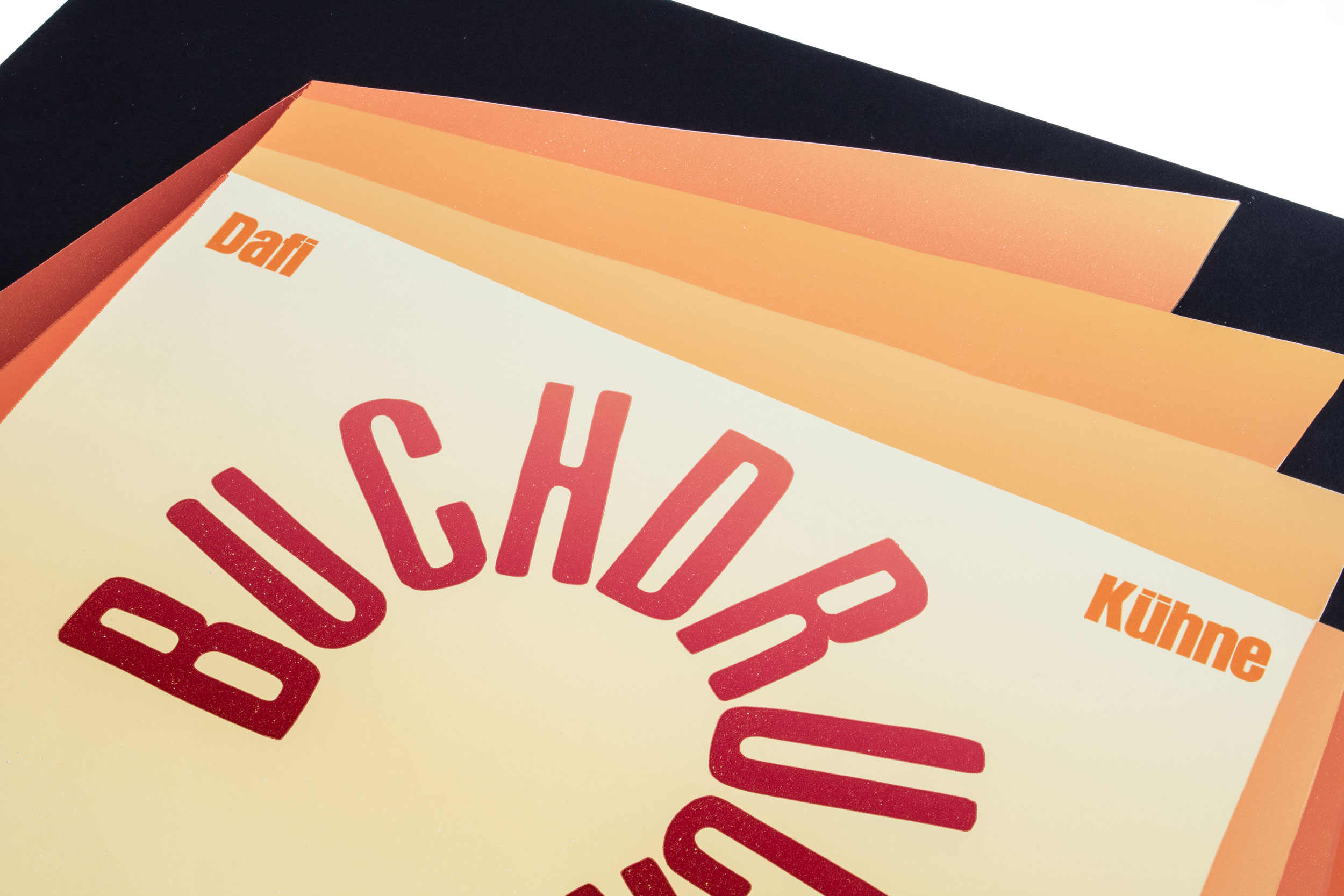
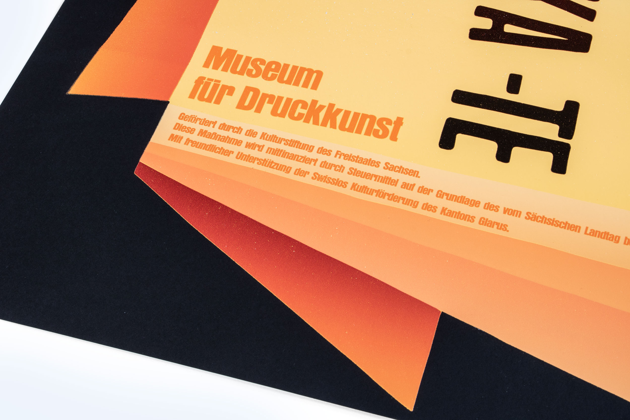
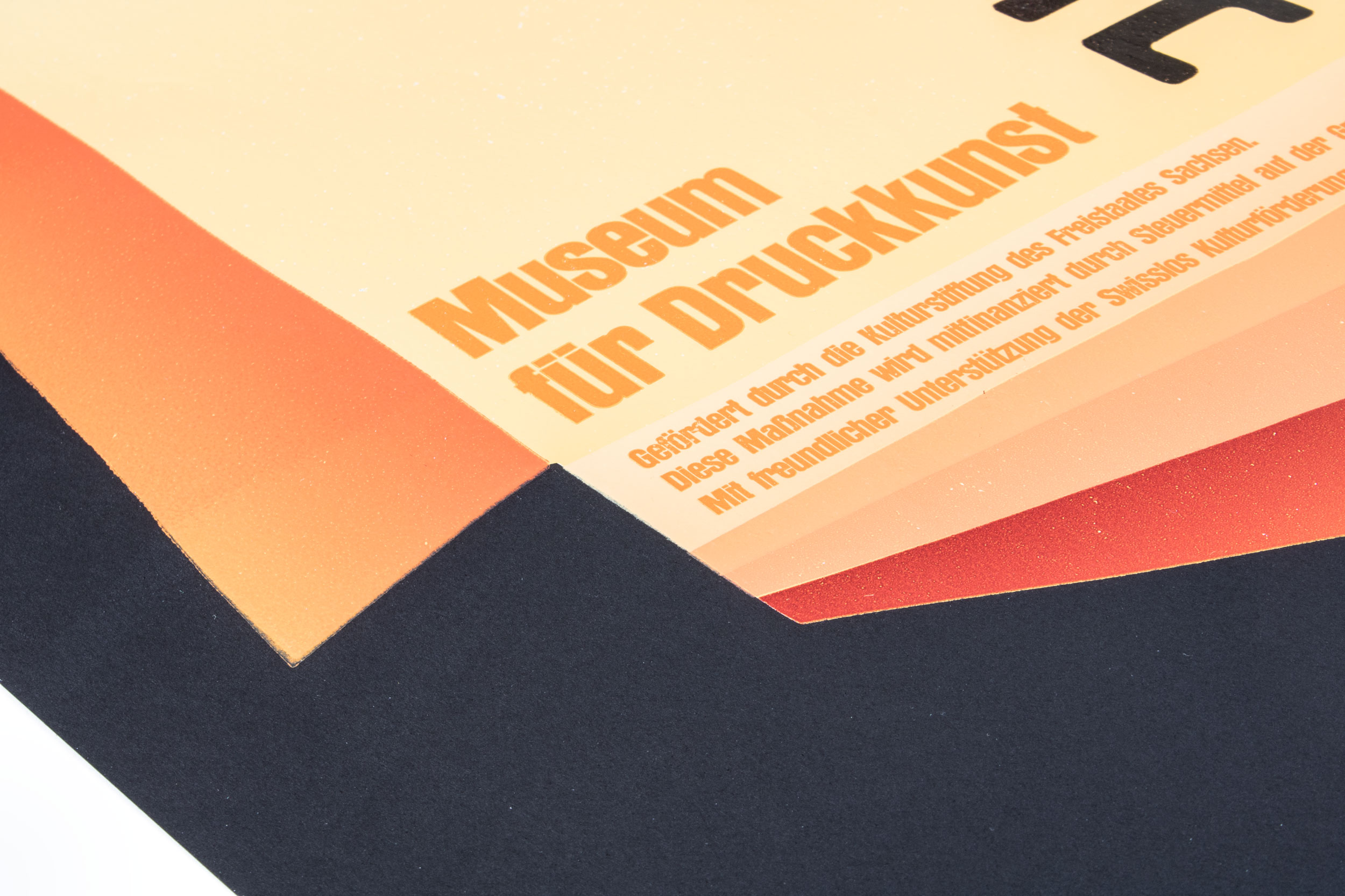
Buchdruckplakate?
Exhibition posters for my solo poster exhibition (March 19—June 18, 2023) at Museum für Druckkunst in Leipzig, Germany. Printed in 16 runs, with hand-cut linoleum, hand-set metal type and a photopolymer plate. 9 of these runs are printed with splitfountains—yes, we have nothing but fun here!
Client: Museum für Druckkunst, Leipzig, Germany
Format: A1 / 59.4×84.1cm
Paper: Surbalin, tiefschwarz, 115g/m2
Edition: 300 posters on a FAG Control 900
February 2023
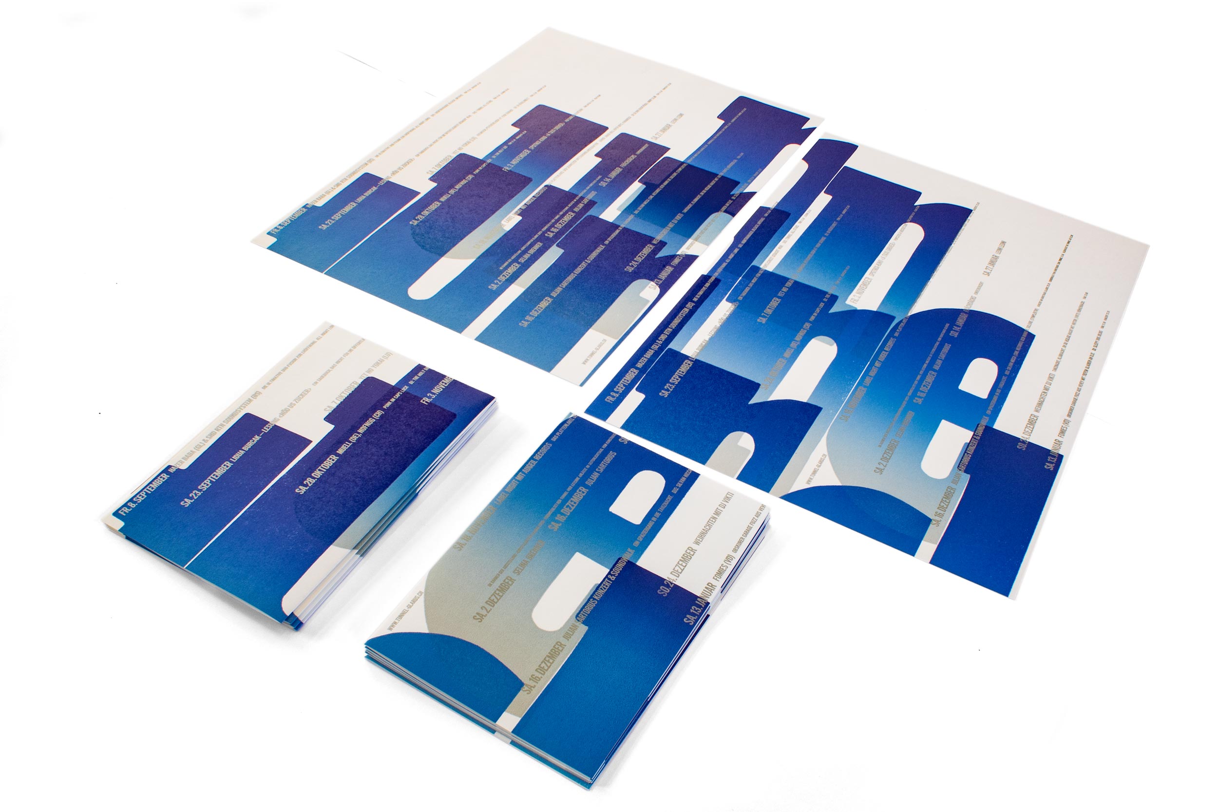
Tunnel II
Second letterpress printed program poster for tunnel-glarus.ch. Actually 3 posters in 2 sizes, printed from the same linocuts plus some freshly cast Ludlow hot metal slugs. Check out the video!
Client: Tunnel, Glarus
Format: 70×100cm and 2×35×50cm
Paper: Materica Gesso, 120g/m2 and 250g/m2
Edition: 80 + 300 posters on a Grafix GX4
January 2023
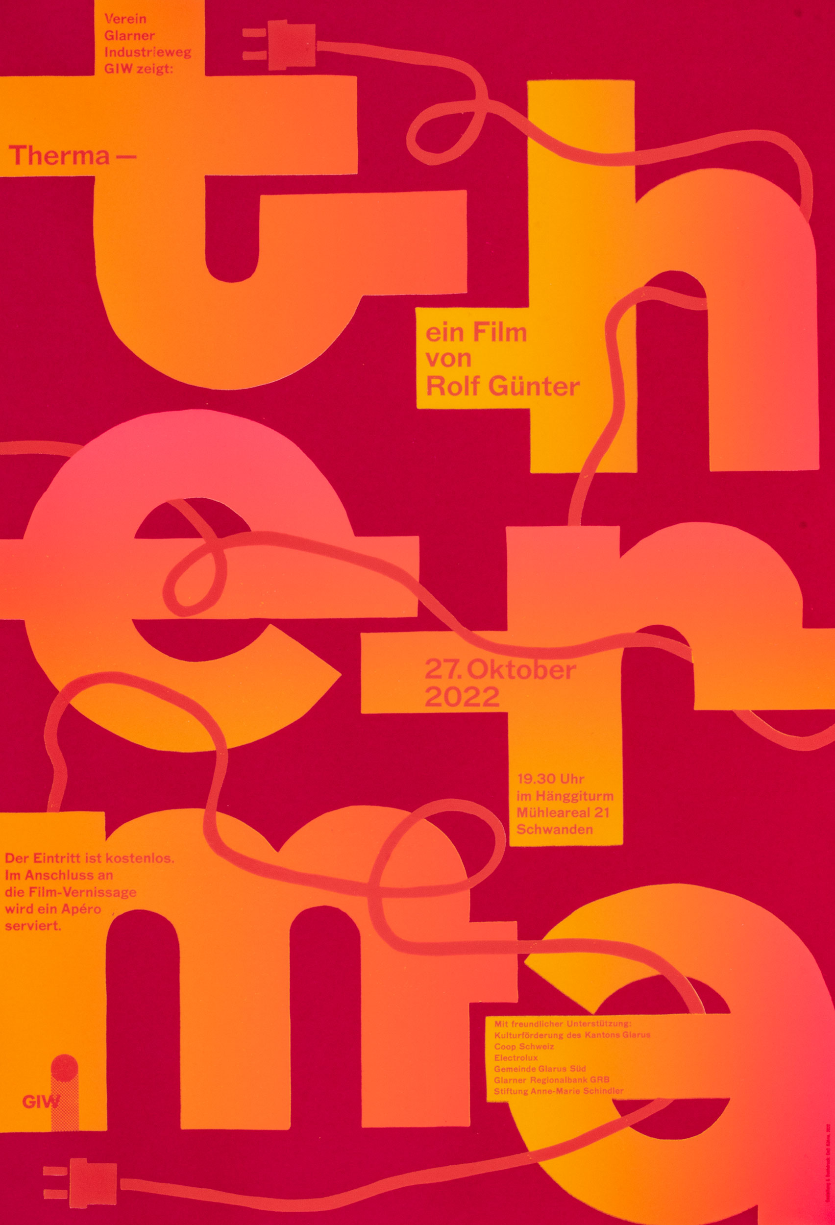
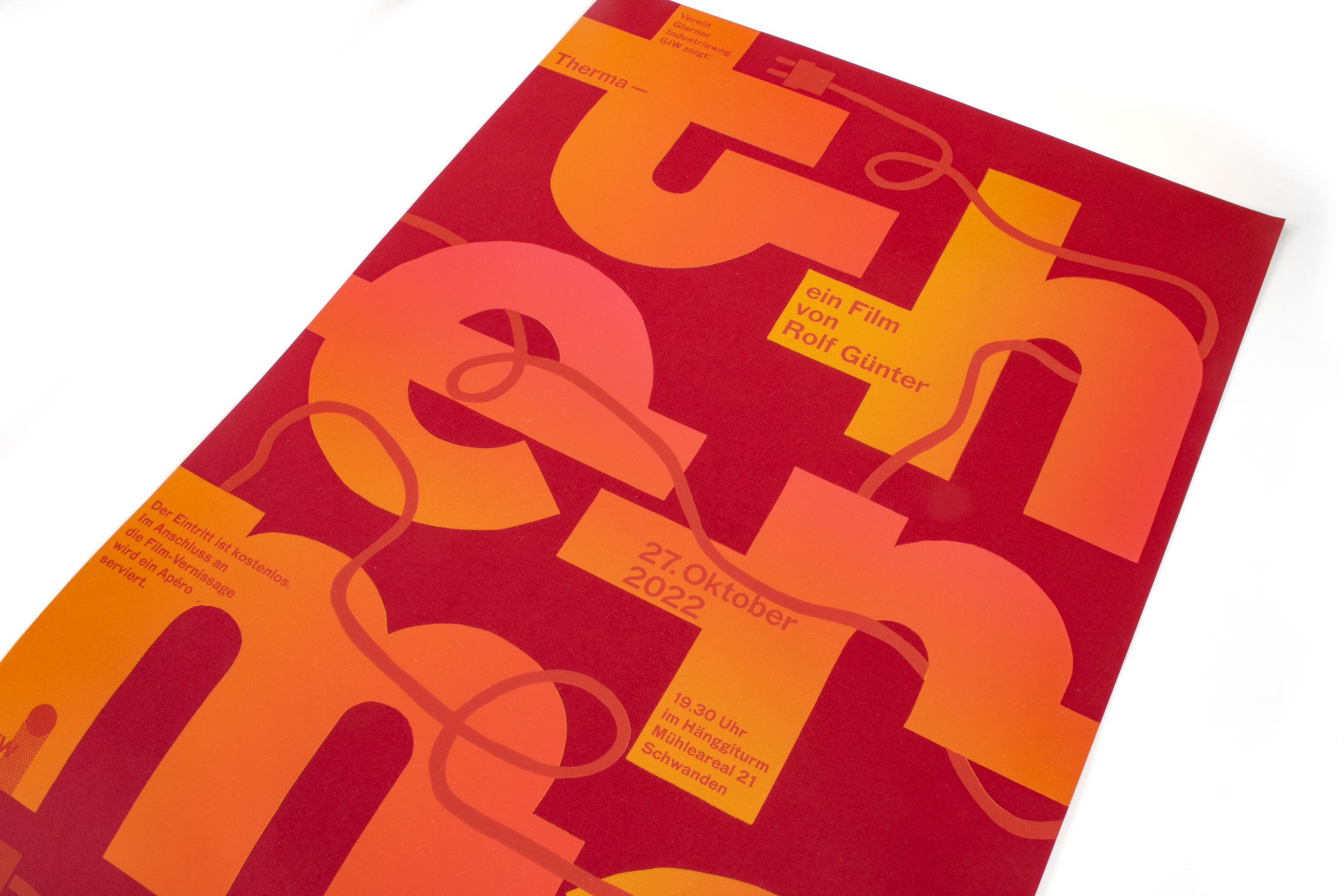
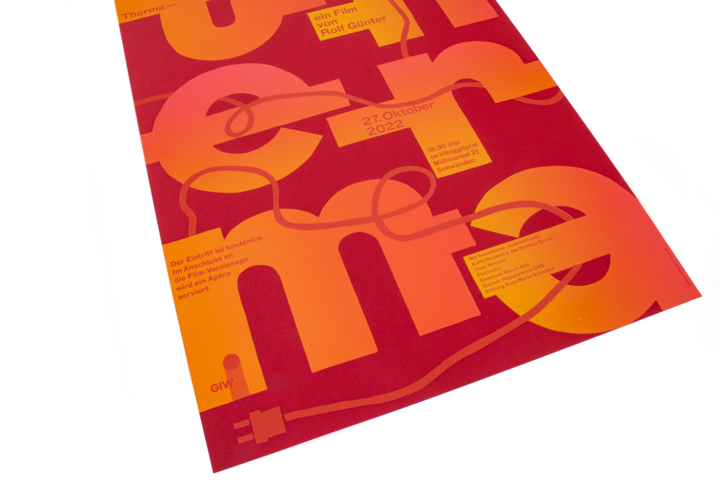
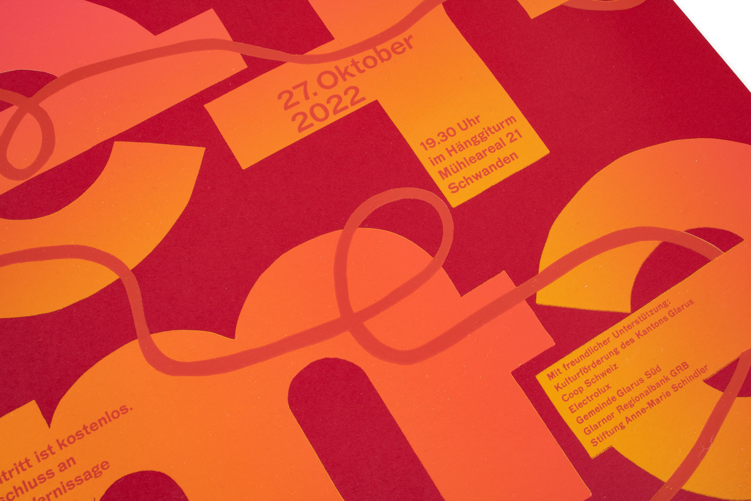
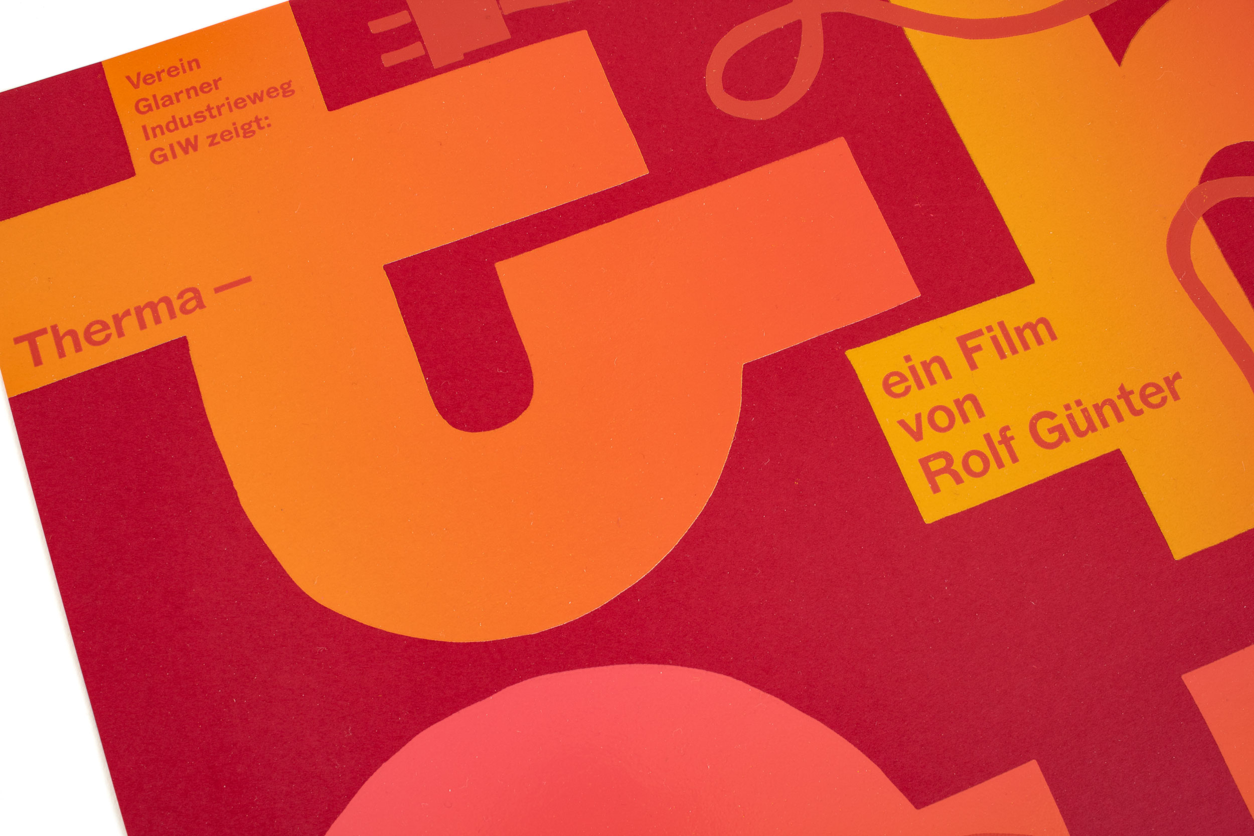
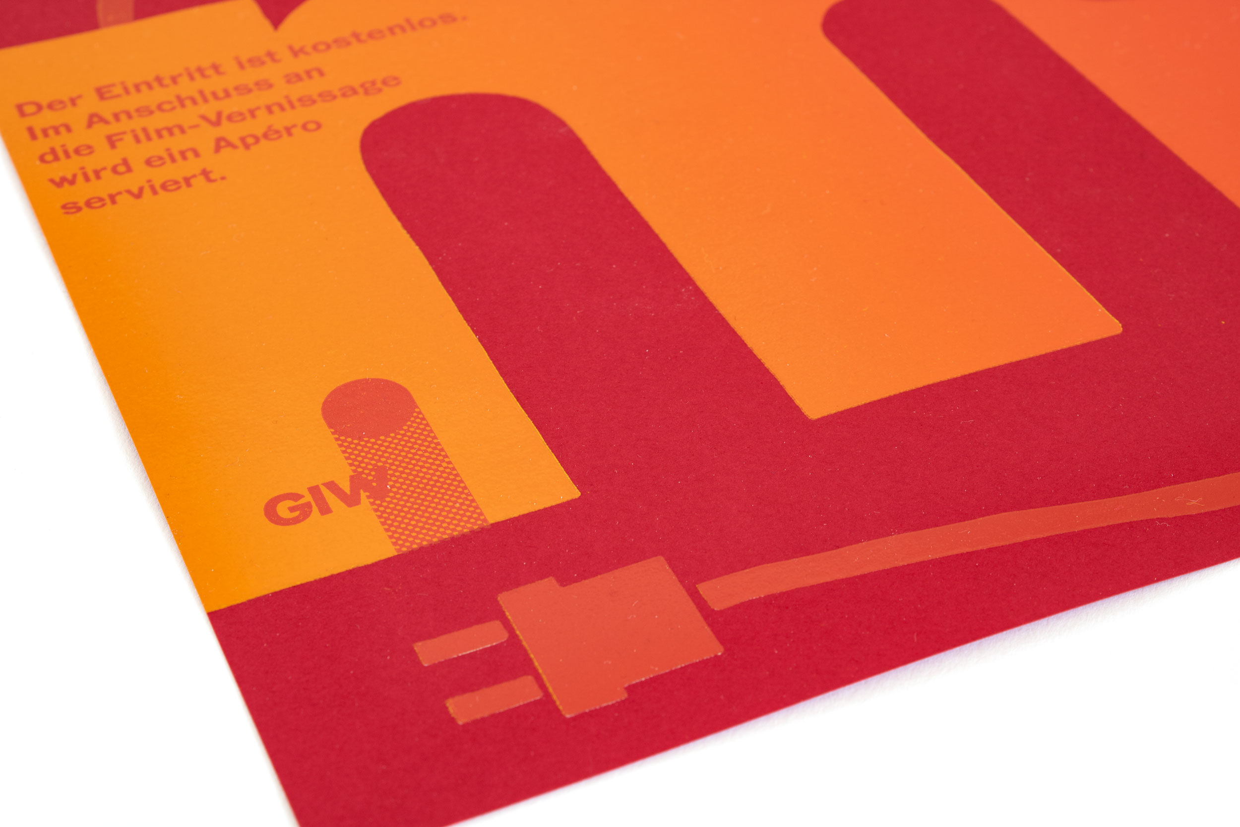
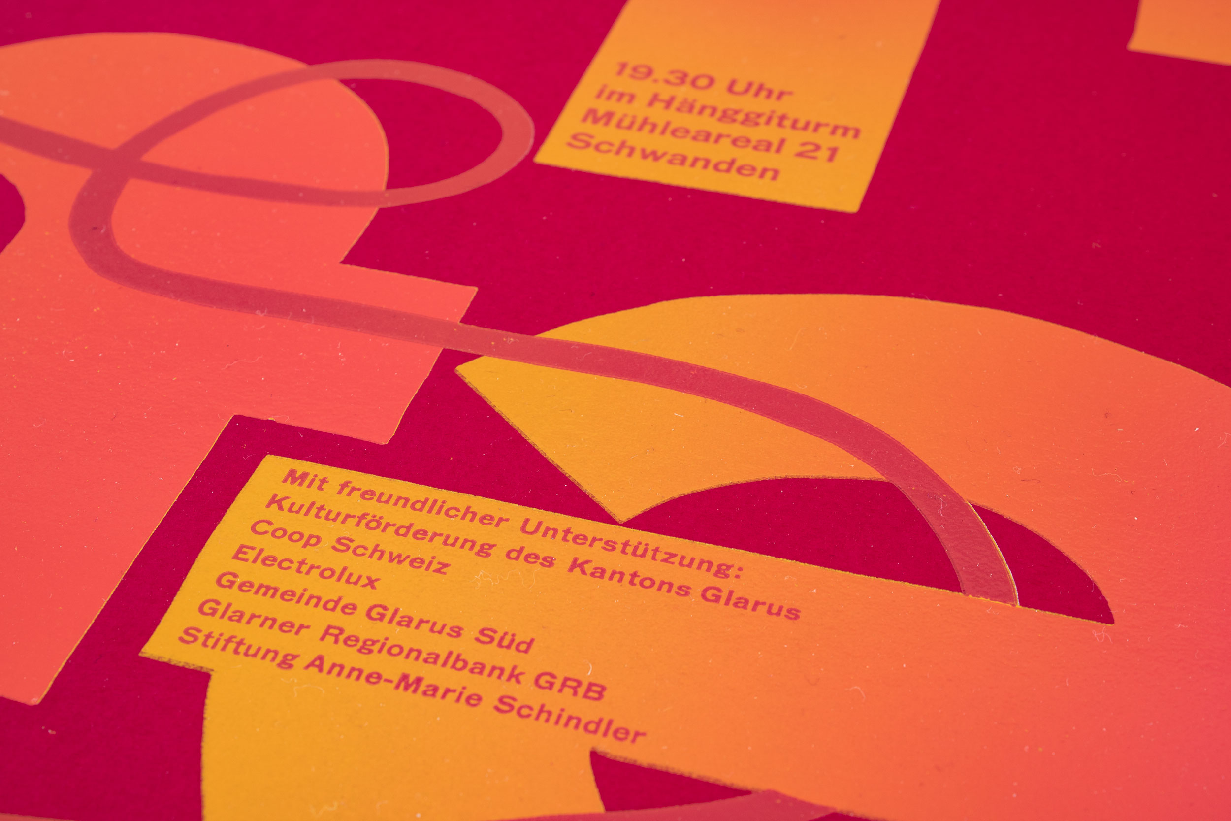
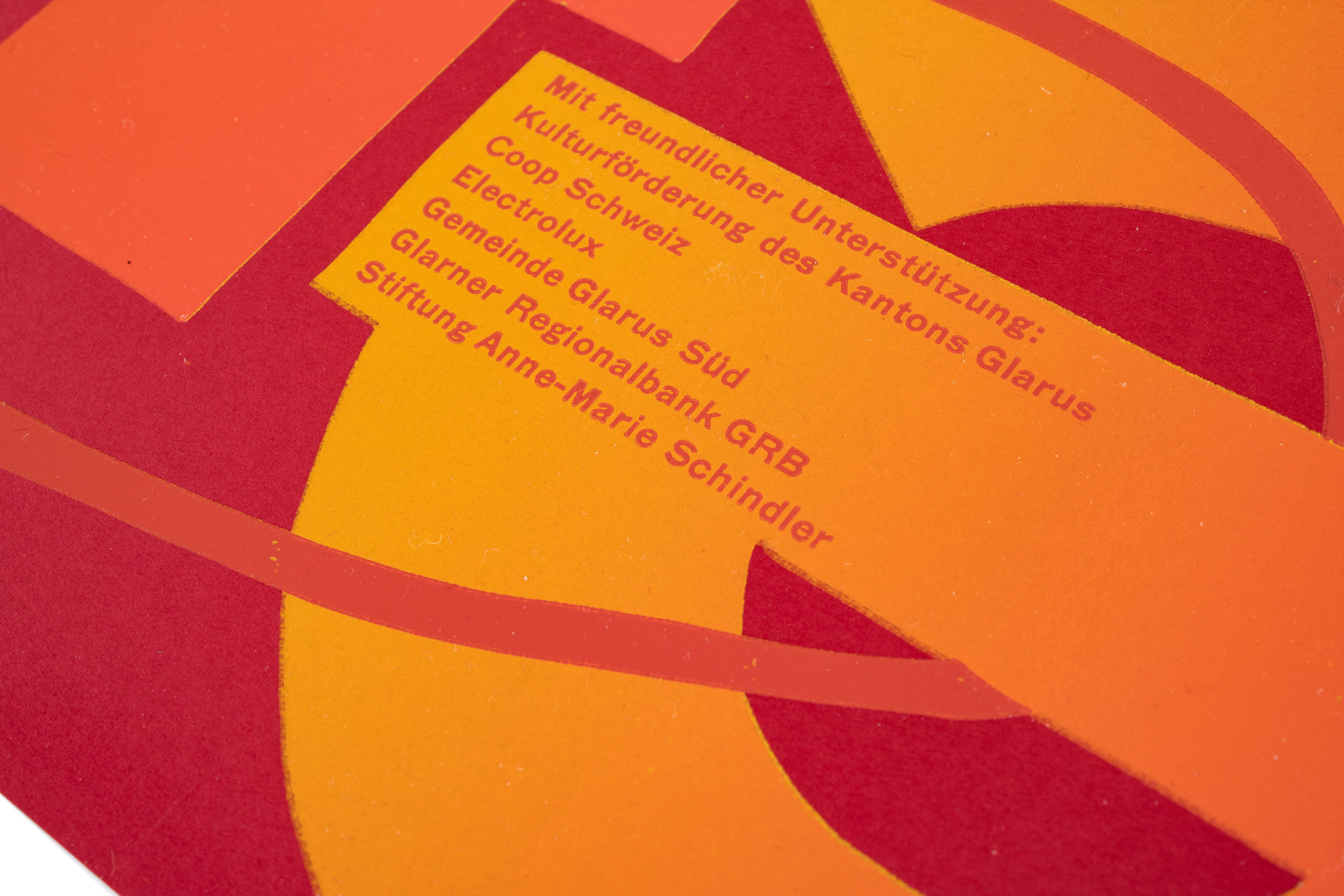
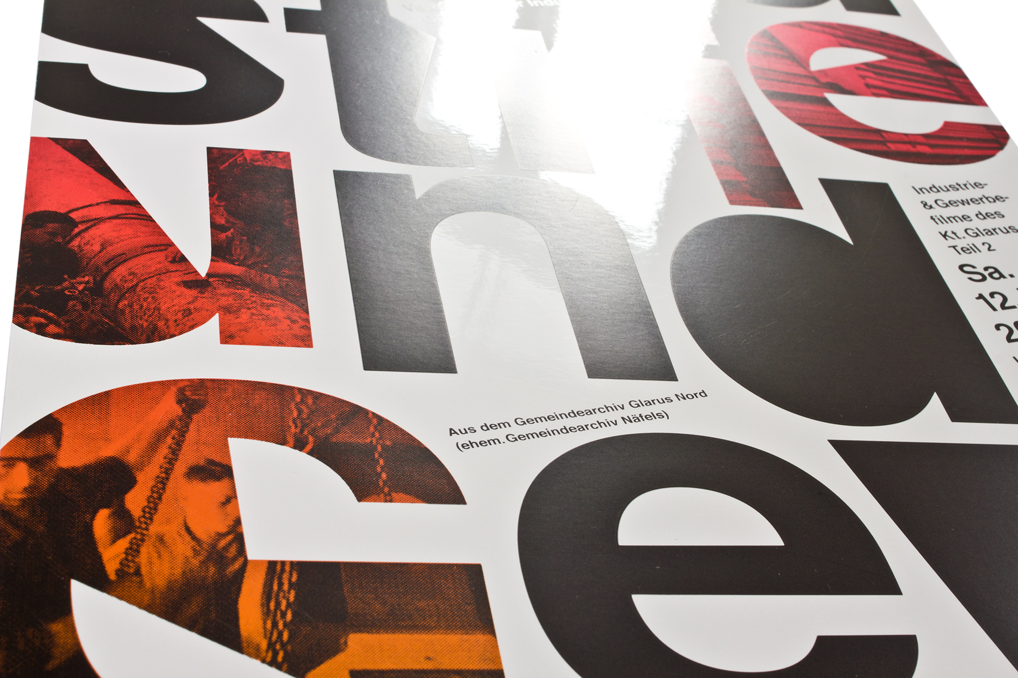
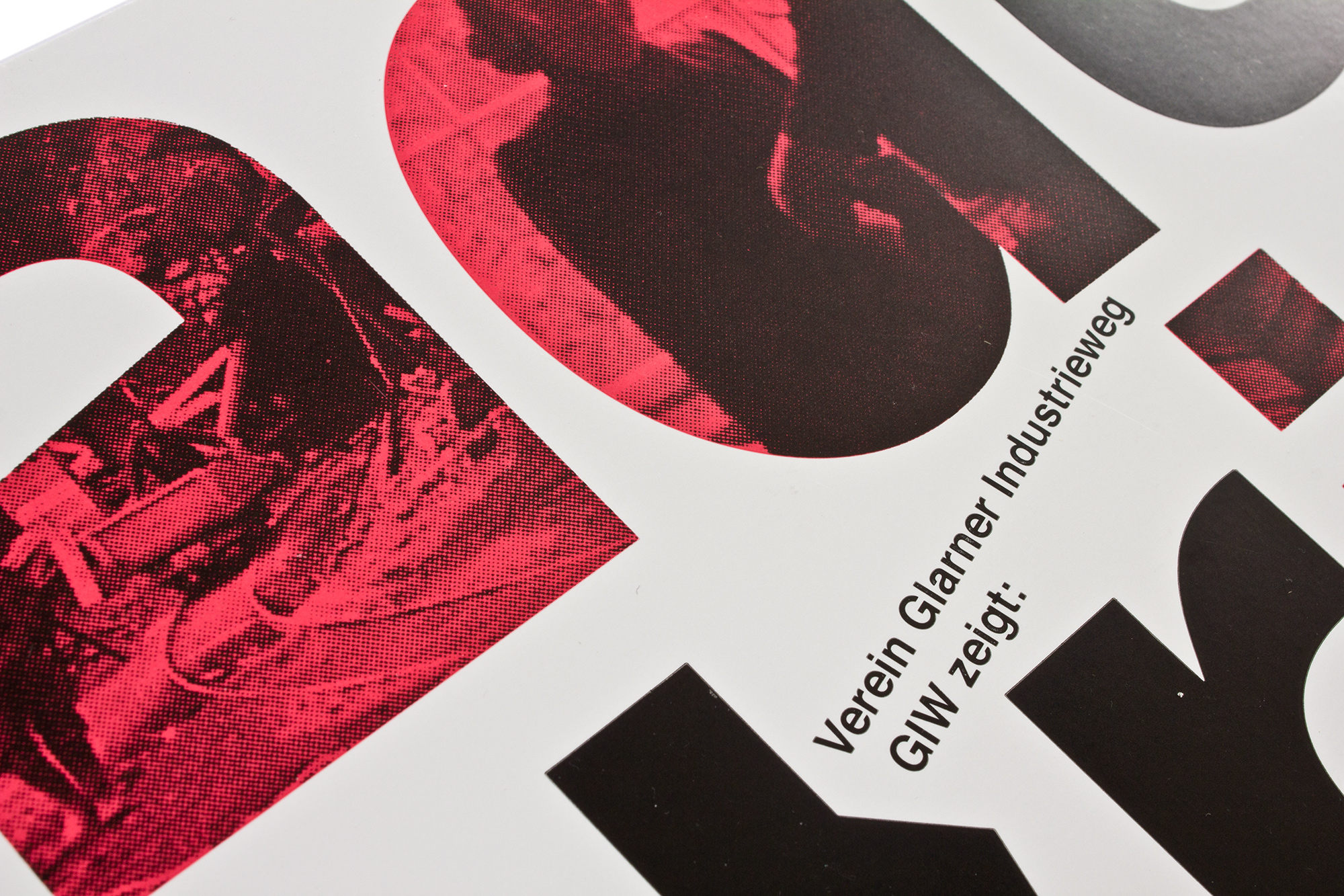
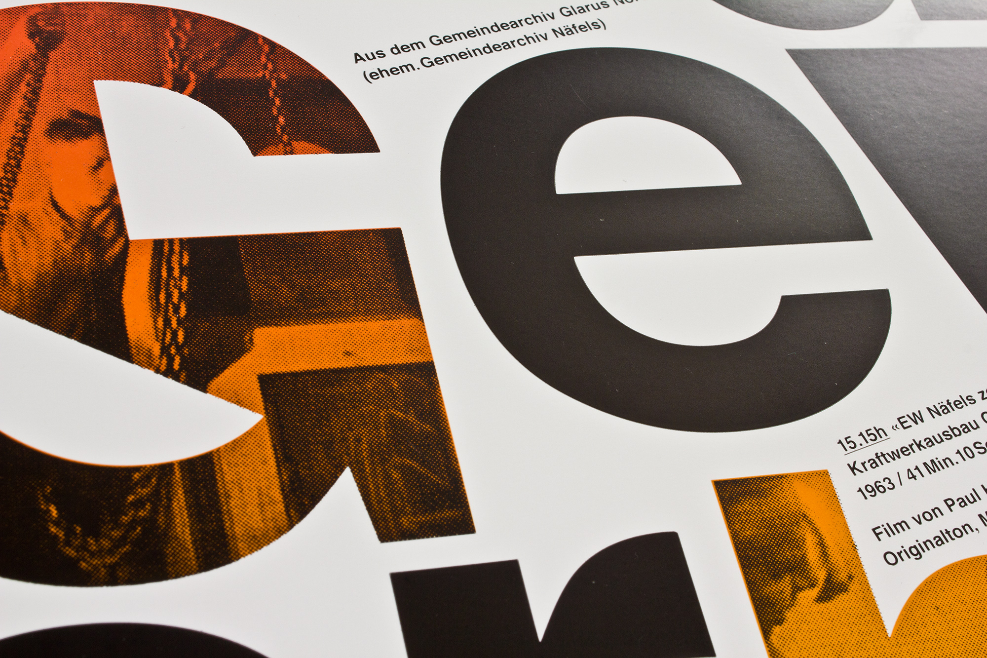
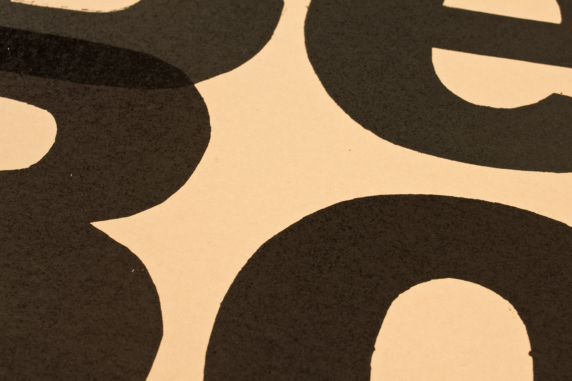
Therma
Poster announcing a movie screening about a historic local manufacturer of electric heaters, stoves and fridges called «Therma», Schwanden (1907–1978).
Letterpress printed from hand-cut linoleum and Ludlow slugs.
Client: Verein Glarner Industrieweg GIW
Format: 40×58cm and 70×100cm
Paper: Surbalin Glatt, karminrot, 115g/m2
Edition: 410 posters small ones / 50 large ones
October 2022
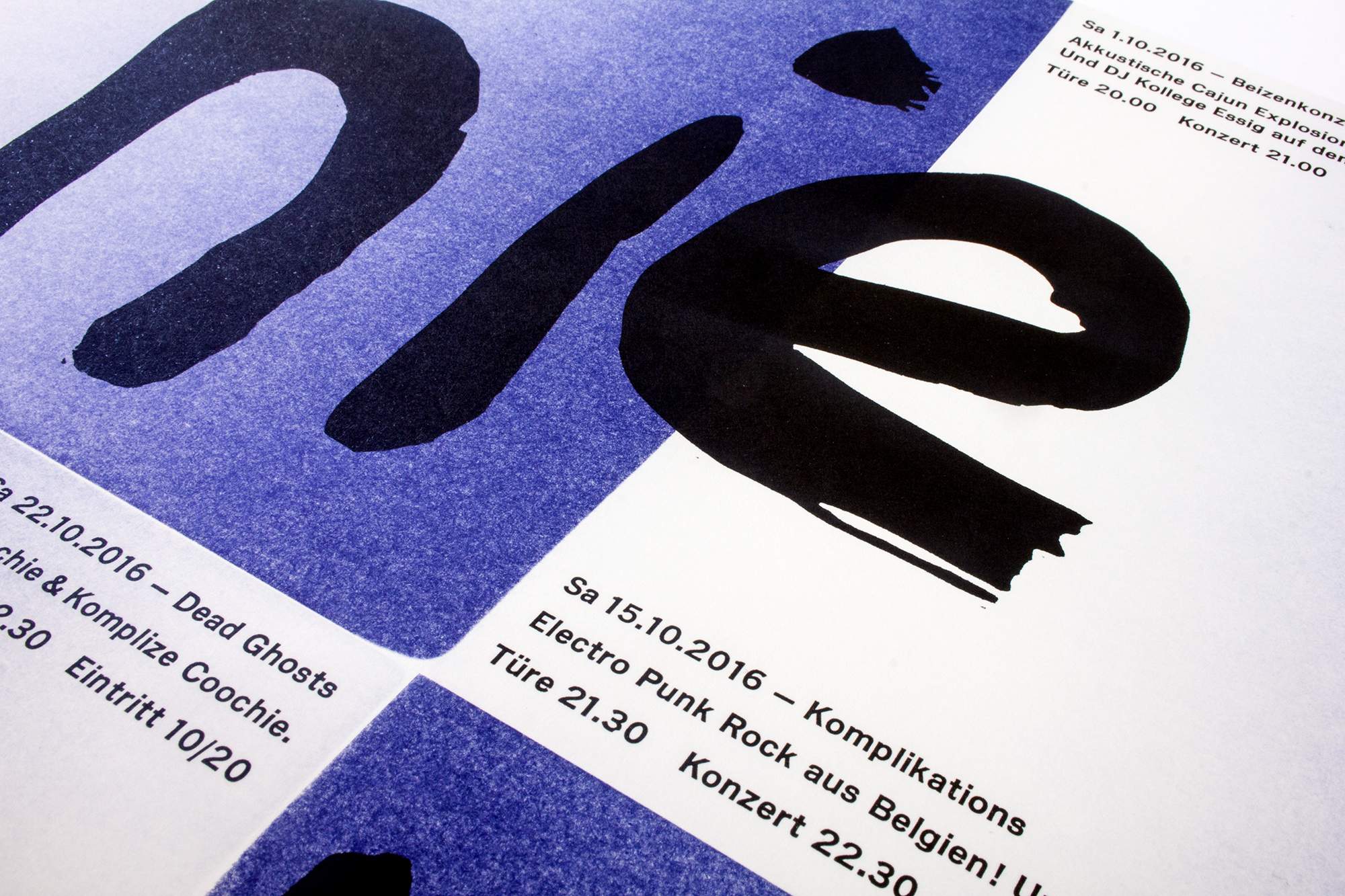
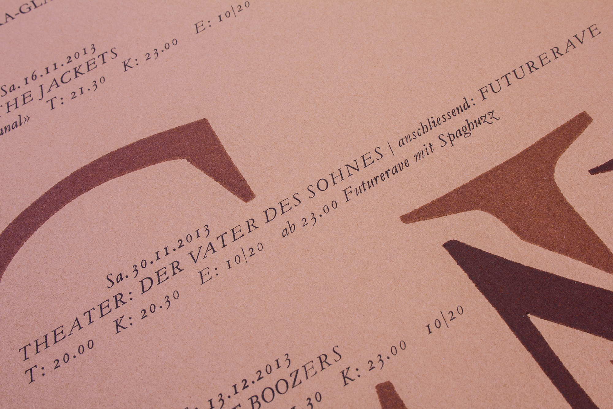
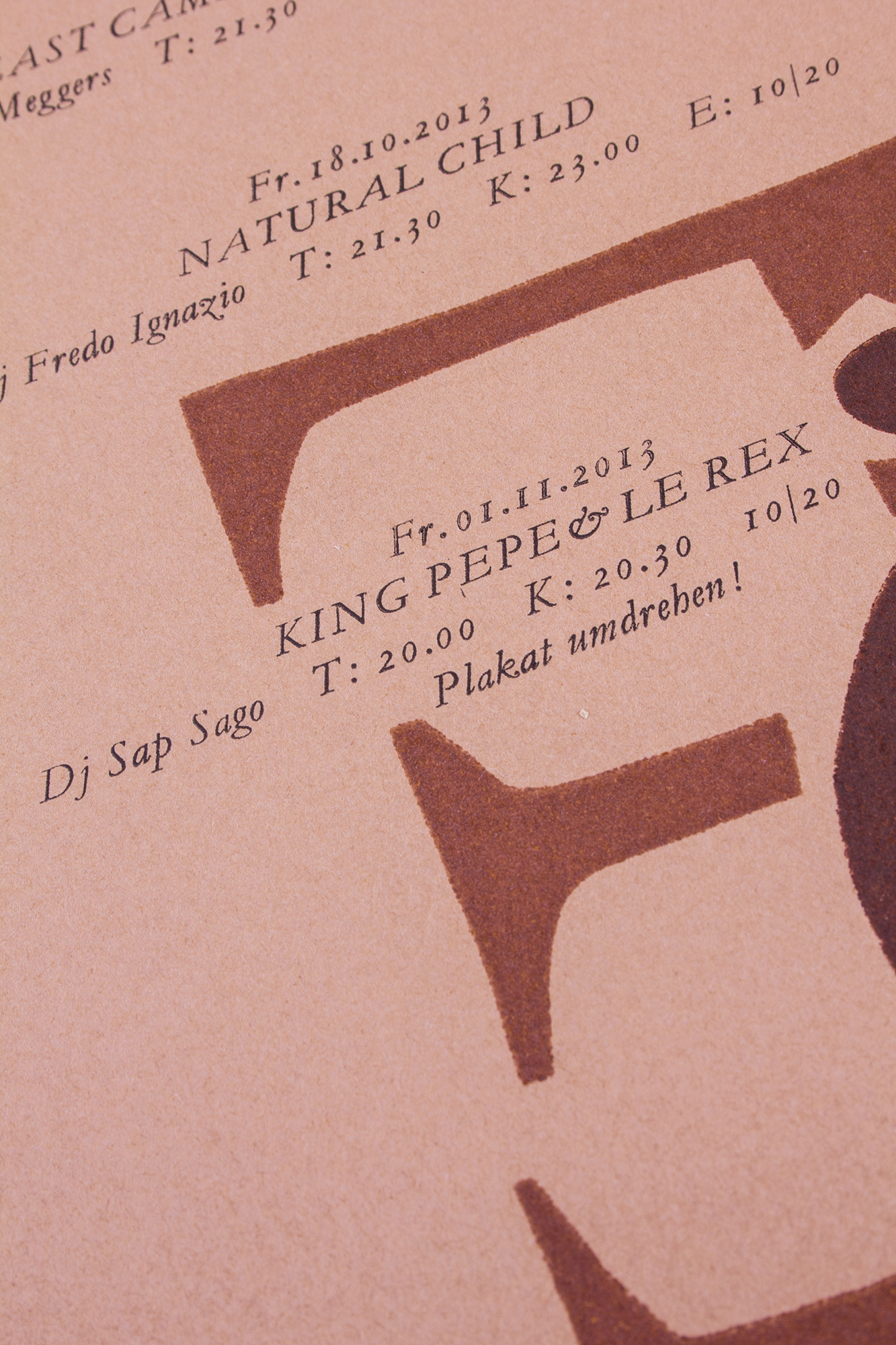
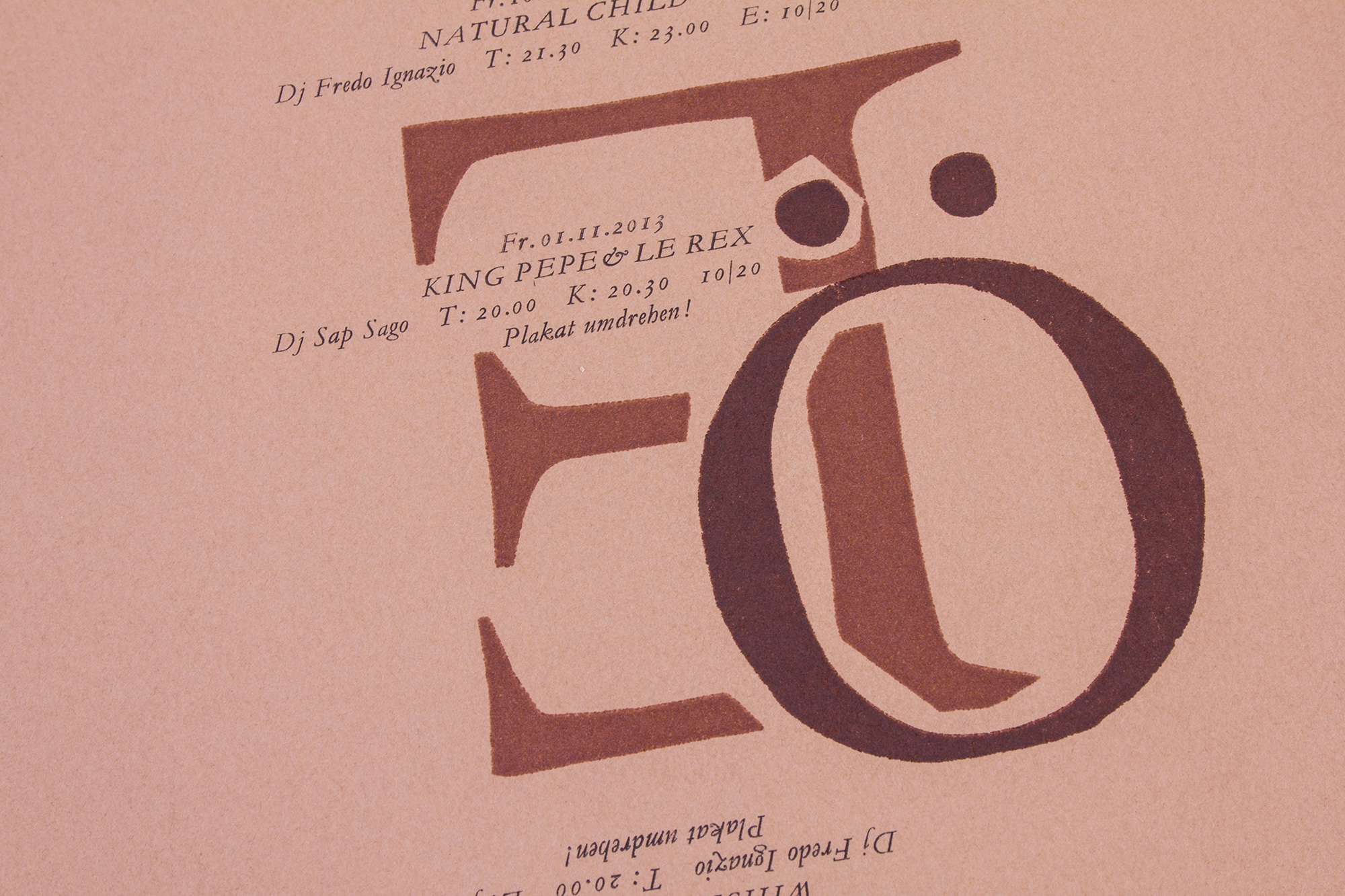
Tunnel I
Letterpress printed program poster for tunnel-glarus.ch. Actually 3 posters in 2 sizes, printed from one linocut plus addional metal and wood type. Check out the video!
Client: Tunnel, Glarus
Format: 70×100cm and 2×35×50cm
Paper: Materica Gesso, 120g/m2 and 250g/m2
Edition: 70 + 200 posters on a Grafix GX4
August 2022
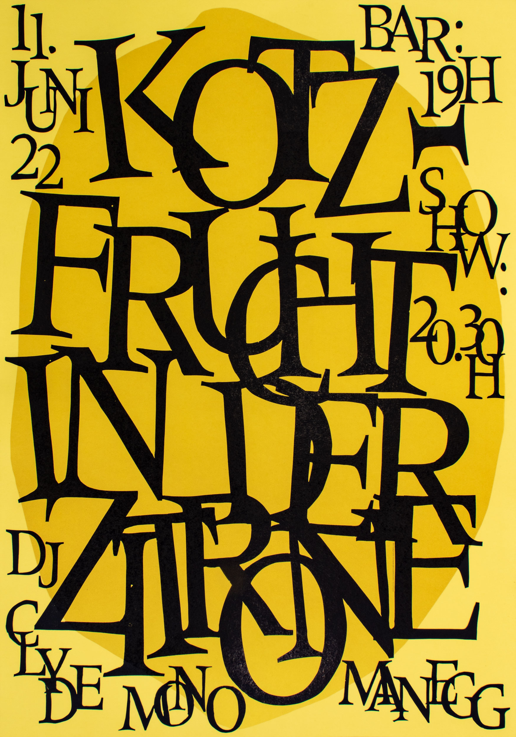
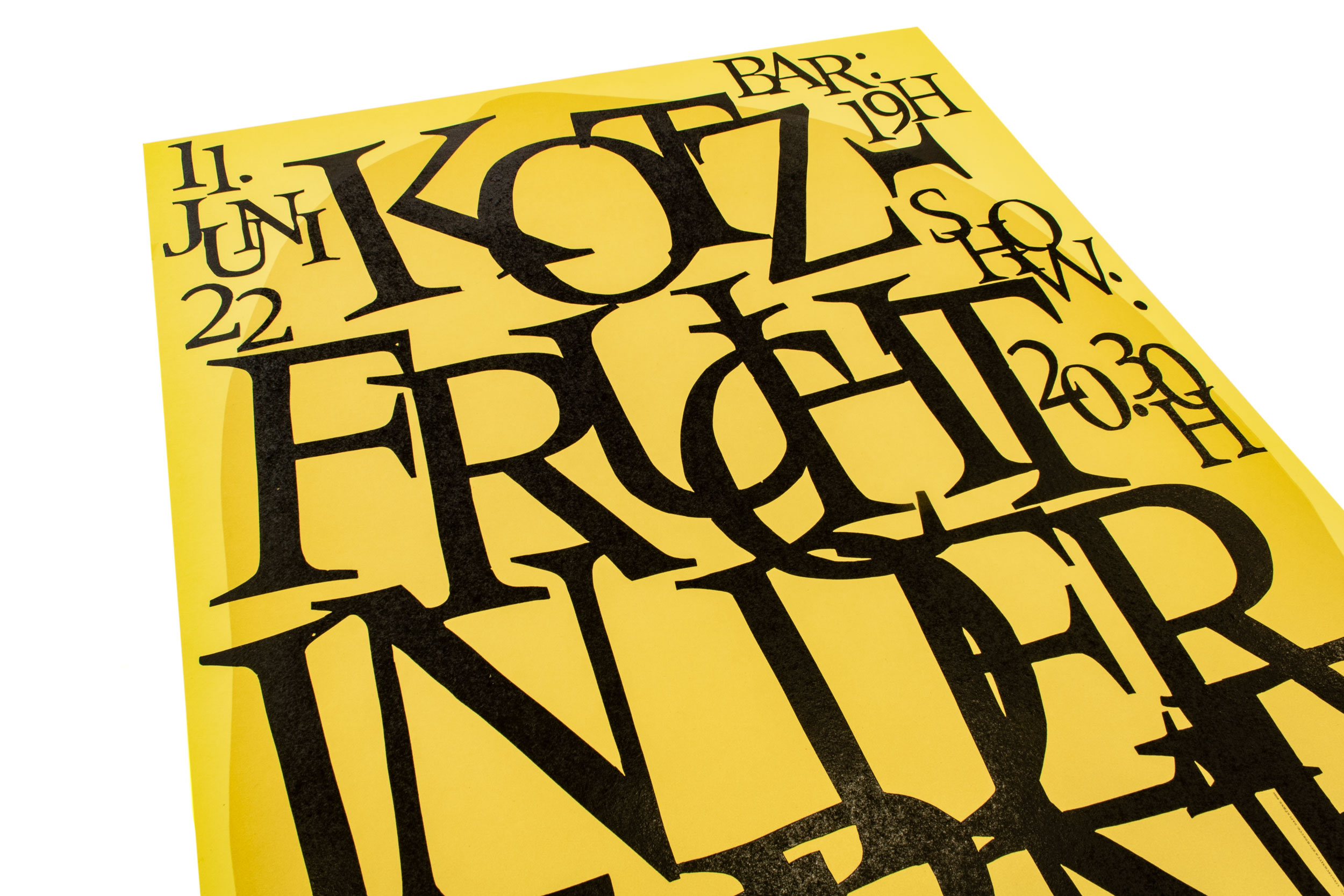
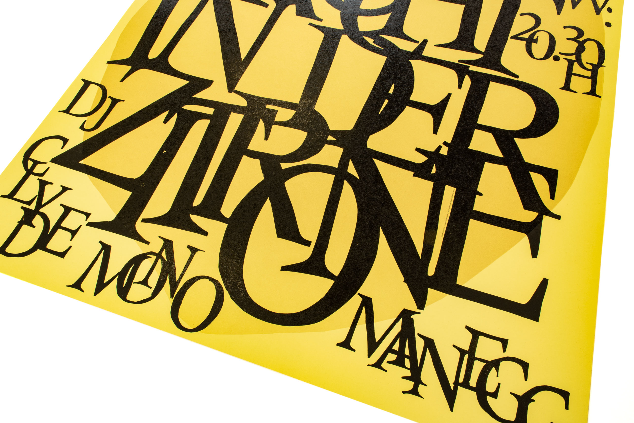
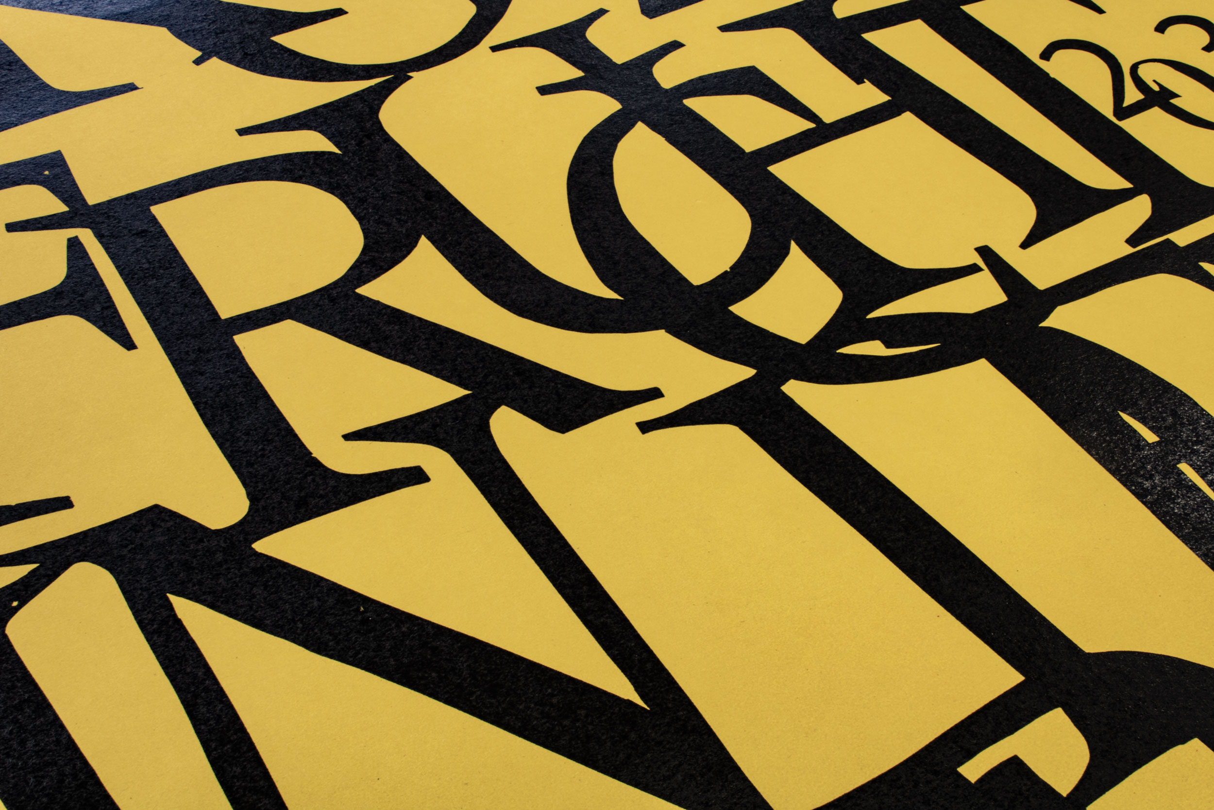
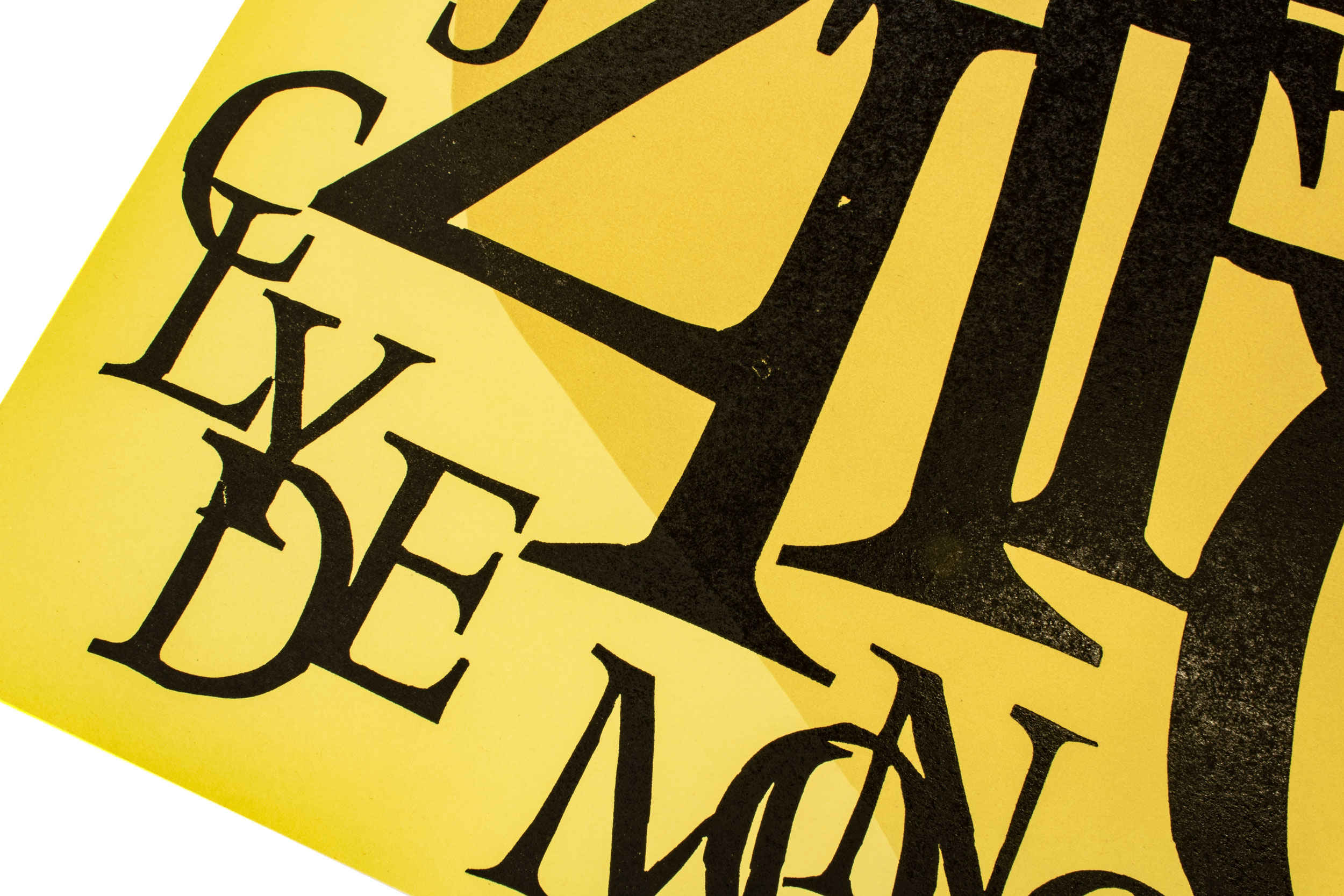
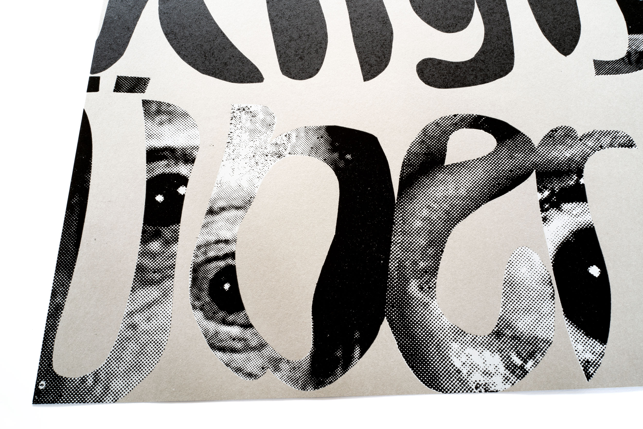
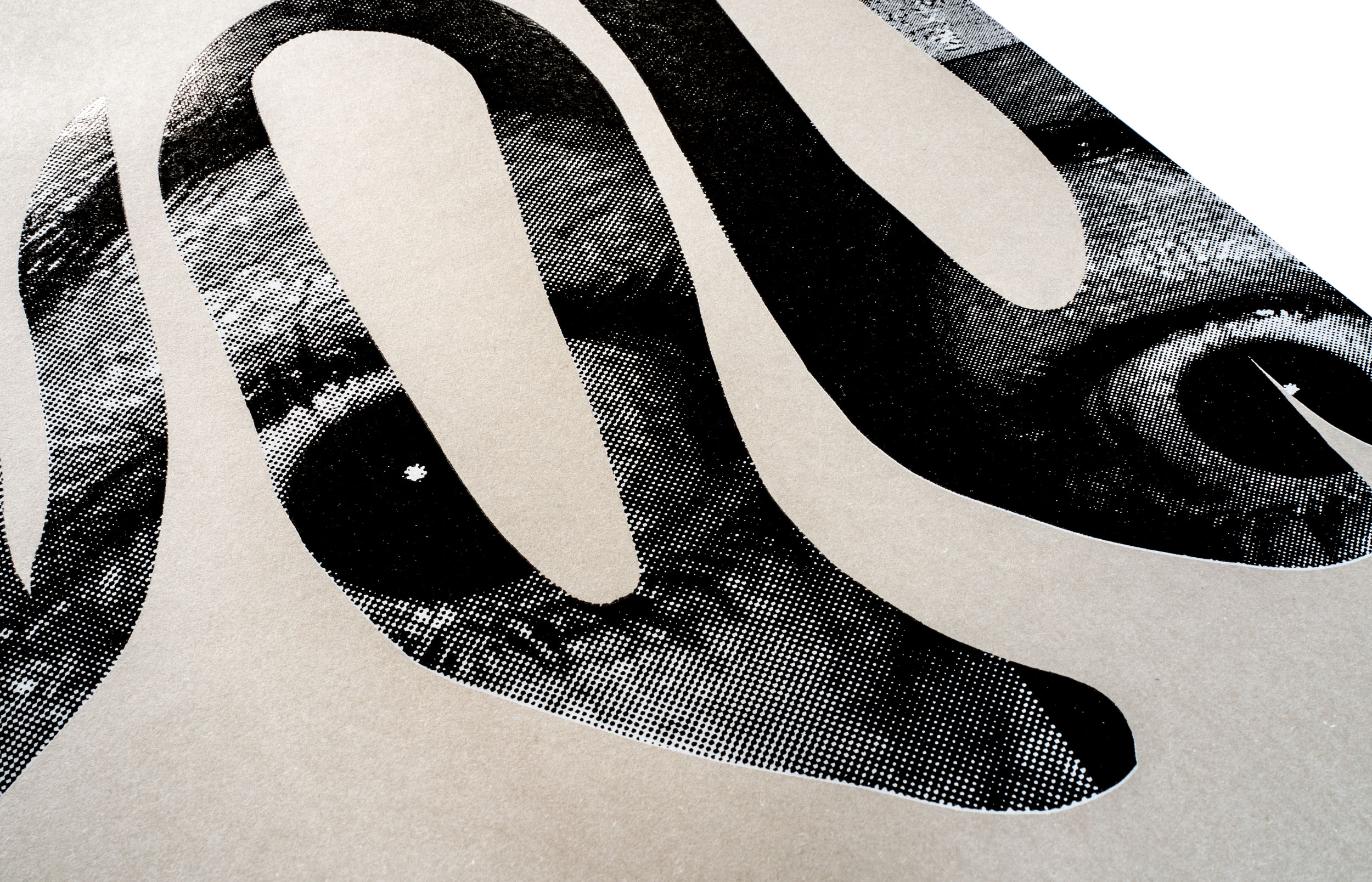
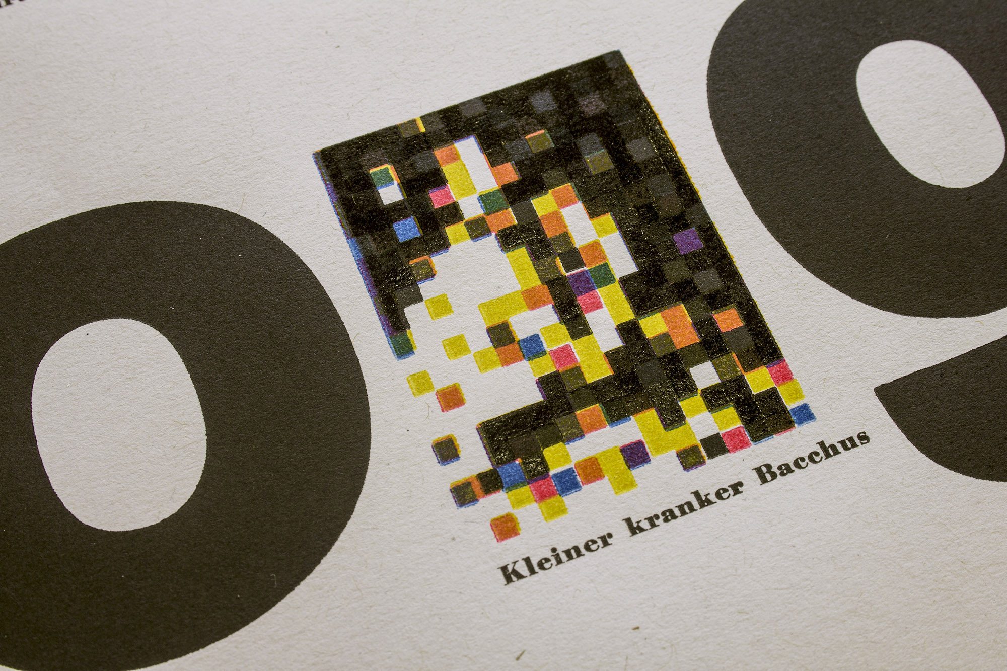
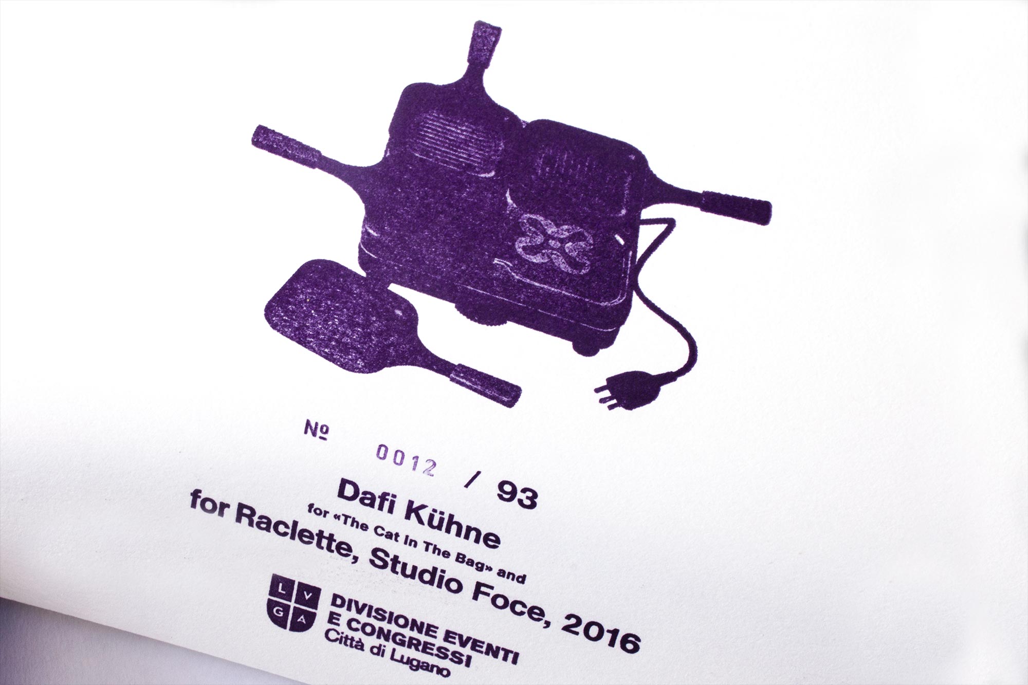
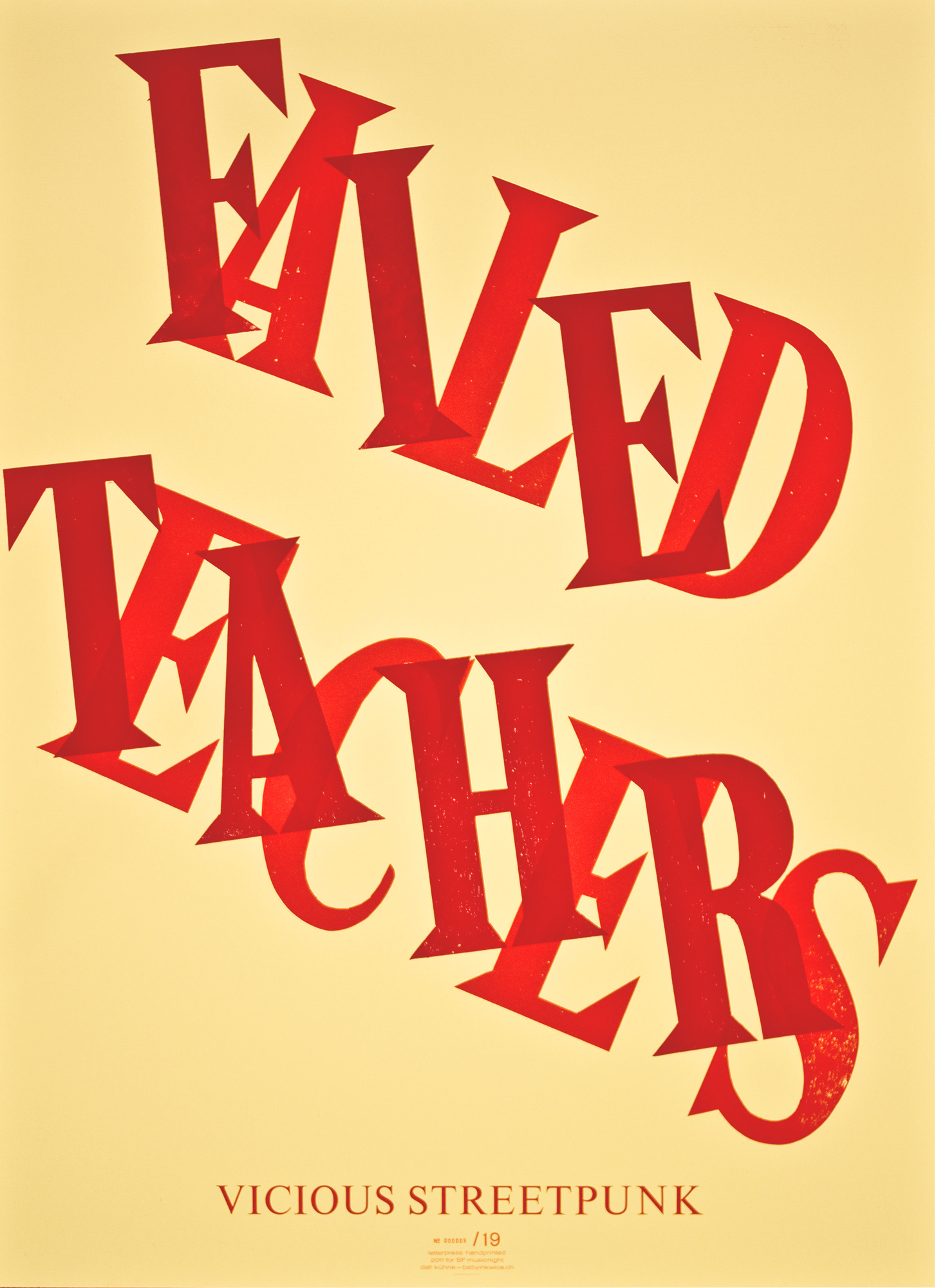
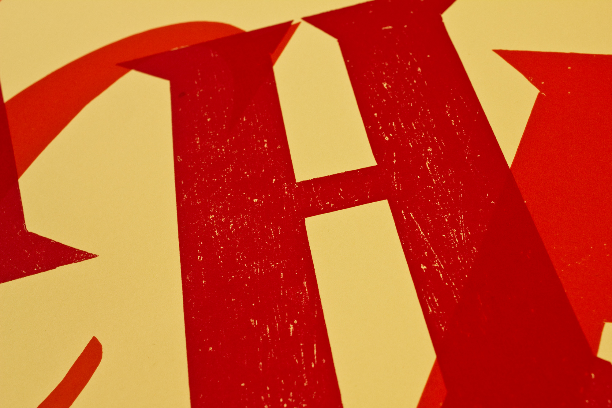
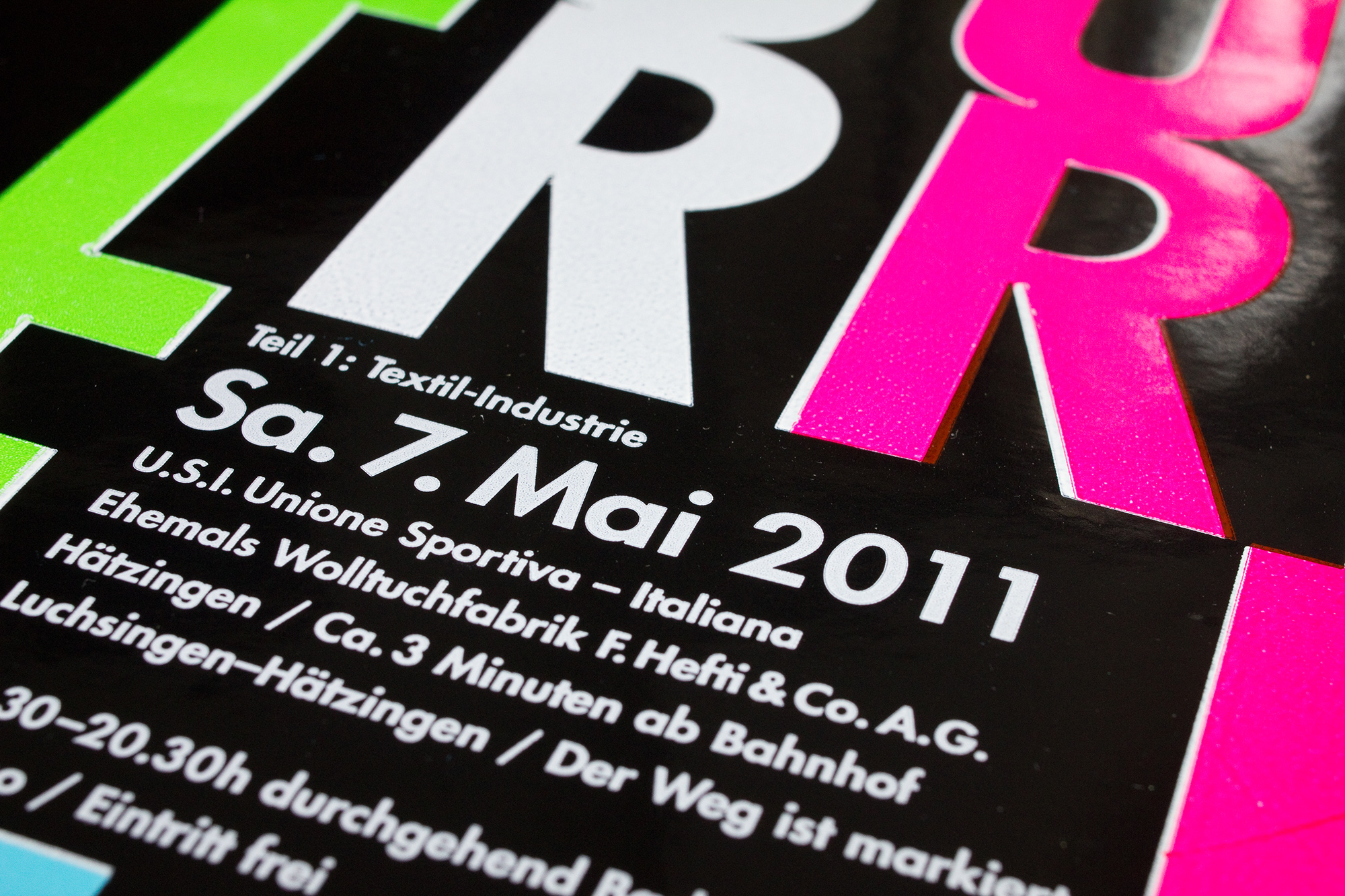
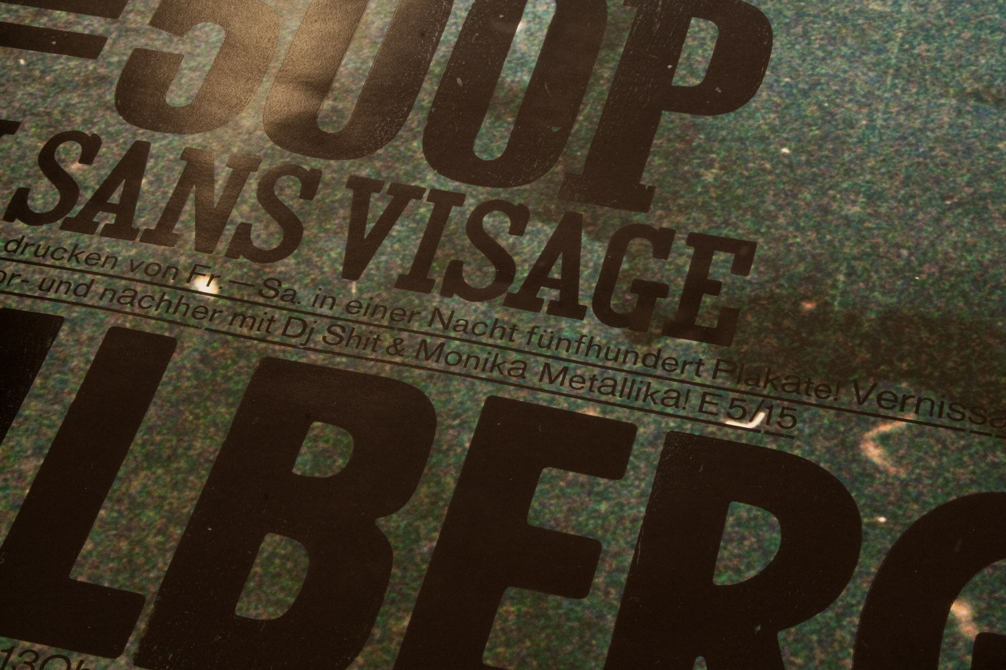
Kotzfrucht in der Zitrone
Concert poster for Kotzfrucht playing in Zitrone (the name of the place is Lemon), Zürich. C’mon Kotzfrucht, squeeze that lemon!
Client: Kotzfrucht (Band), Glarus / Zitrone, Zürich
Format: 70×100cm
Paper: Forever Gelb, 200g/m2
Edition: 100 posters on a Grafix GX4
June 2022
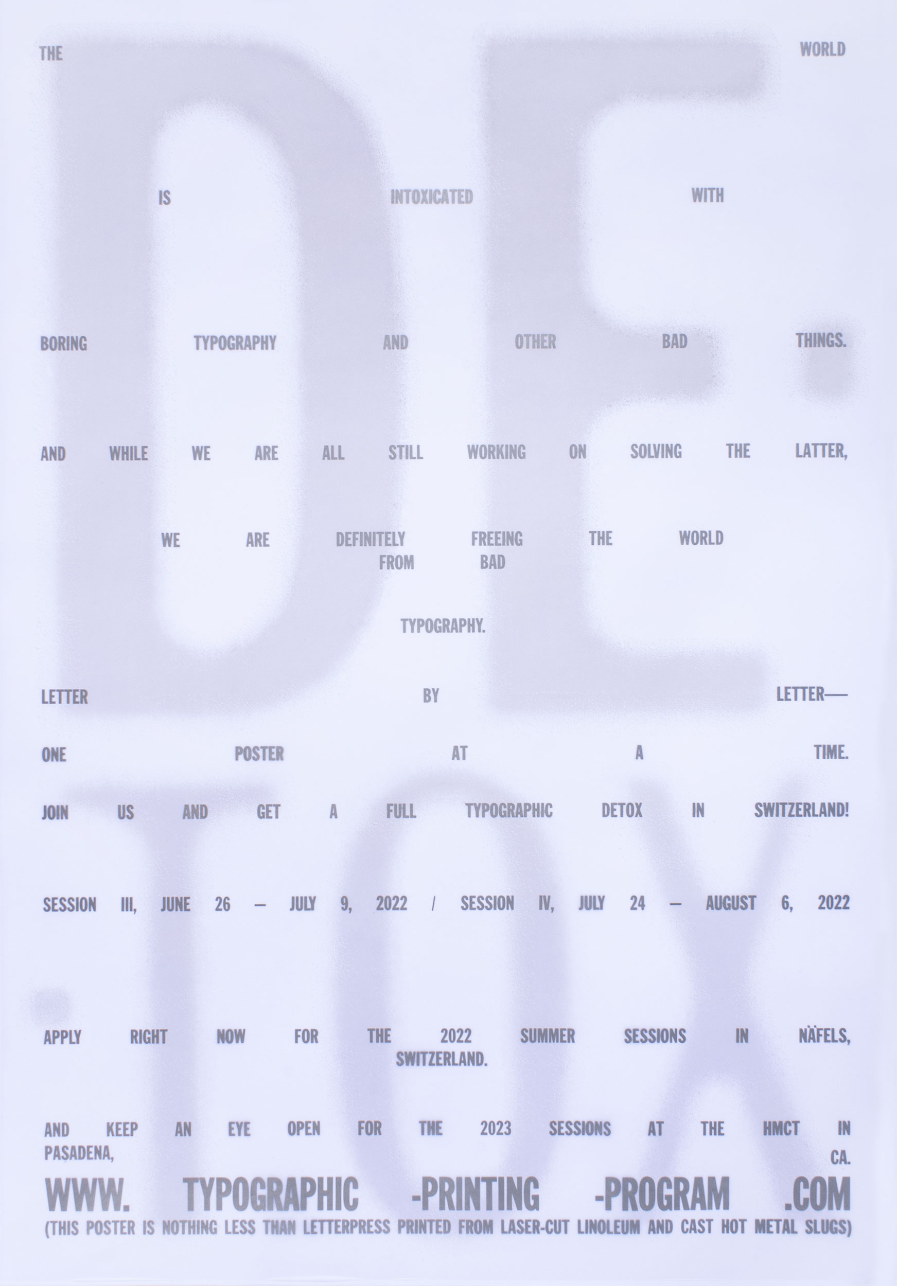
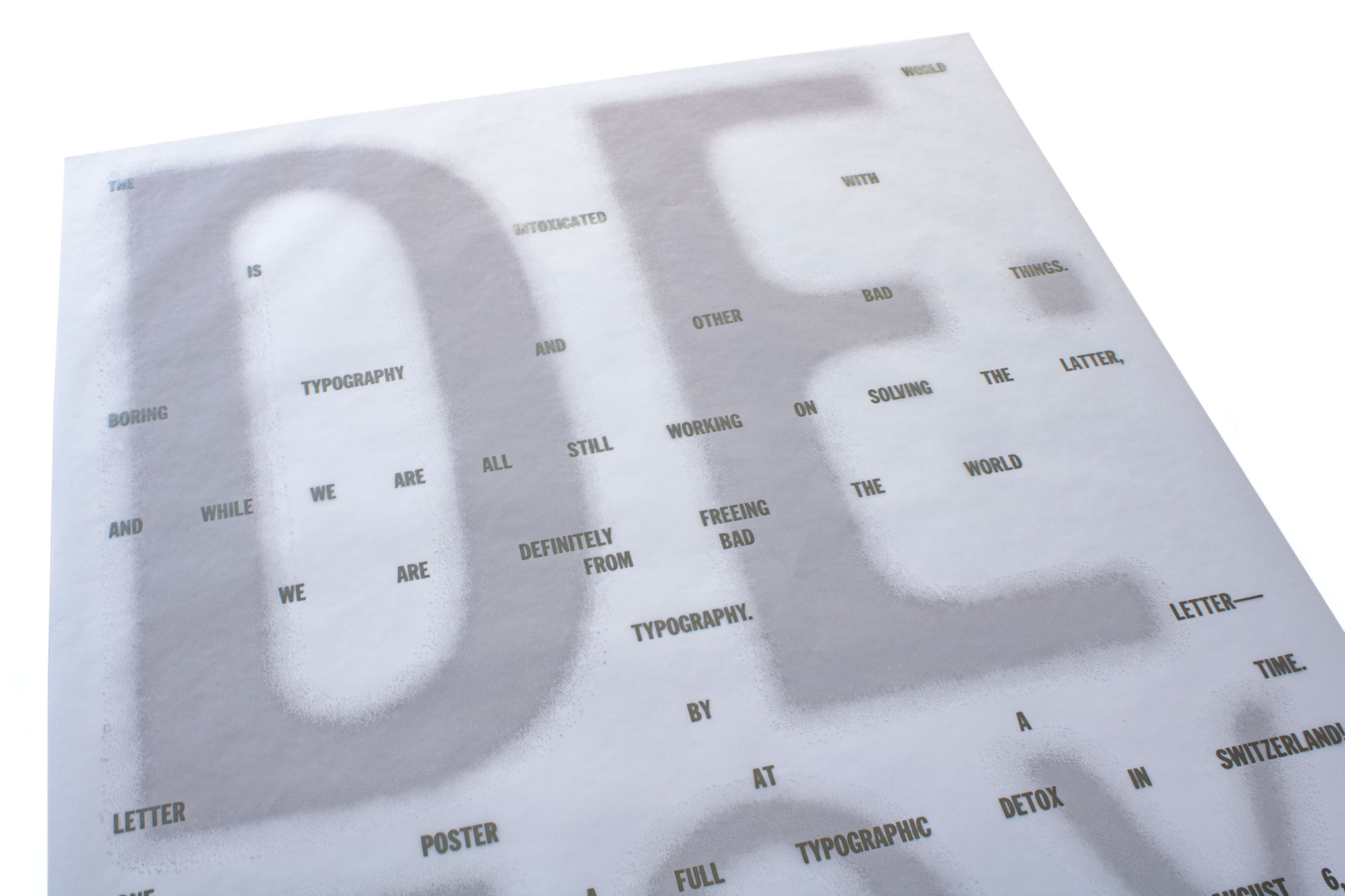
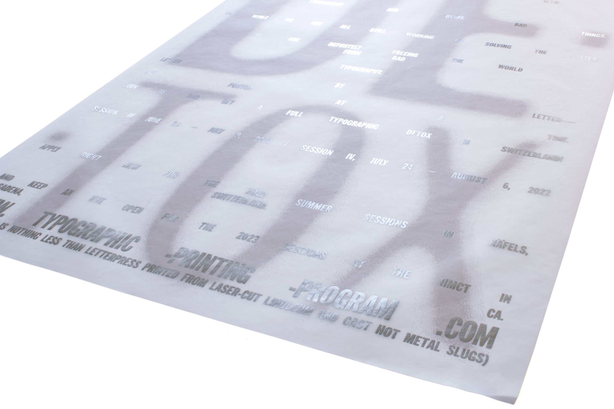
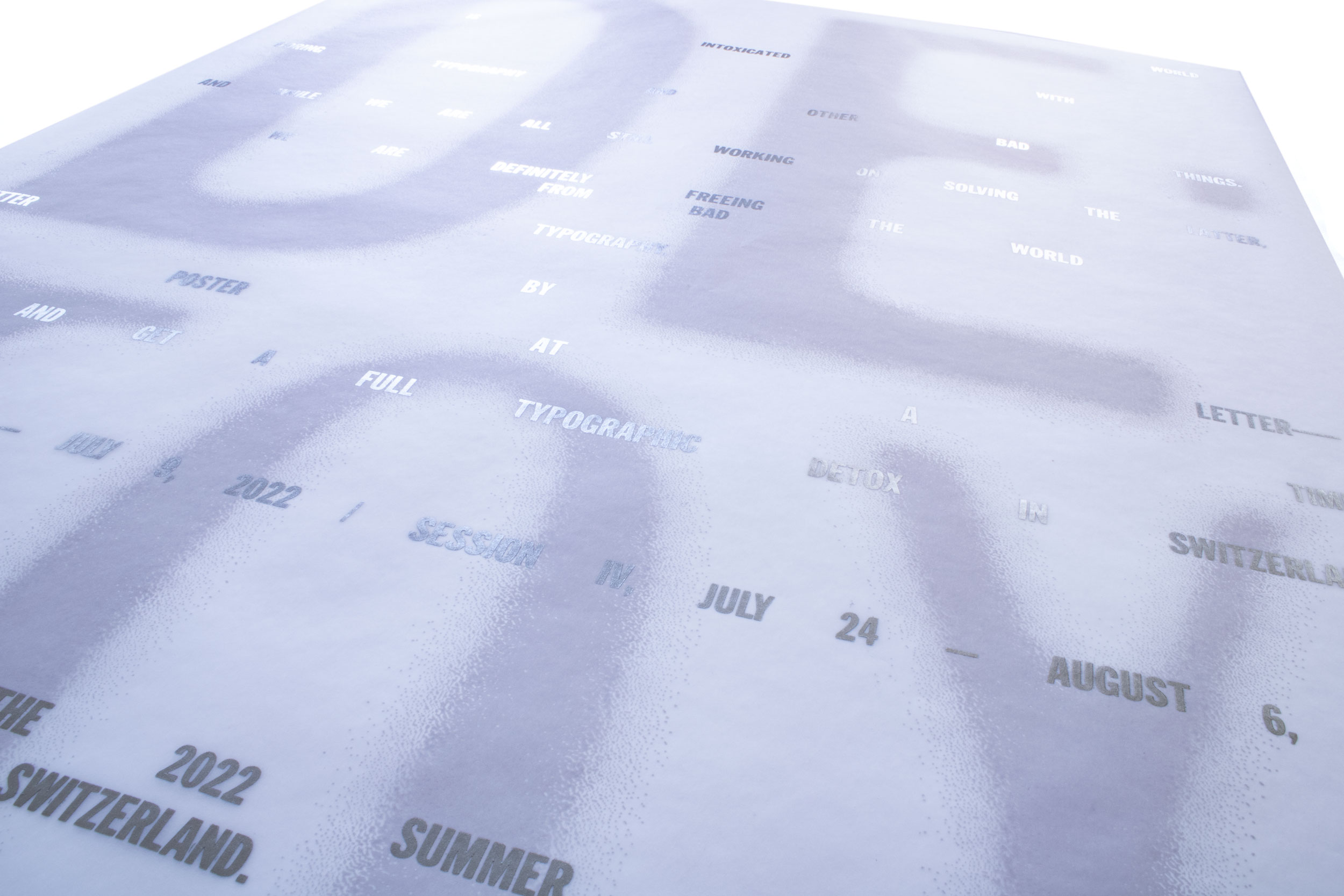
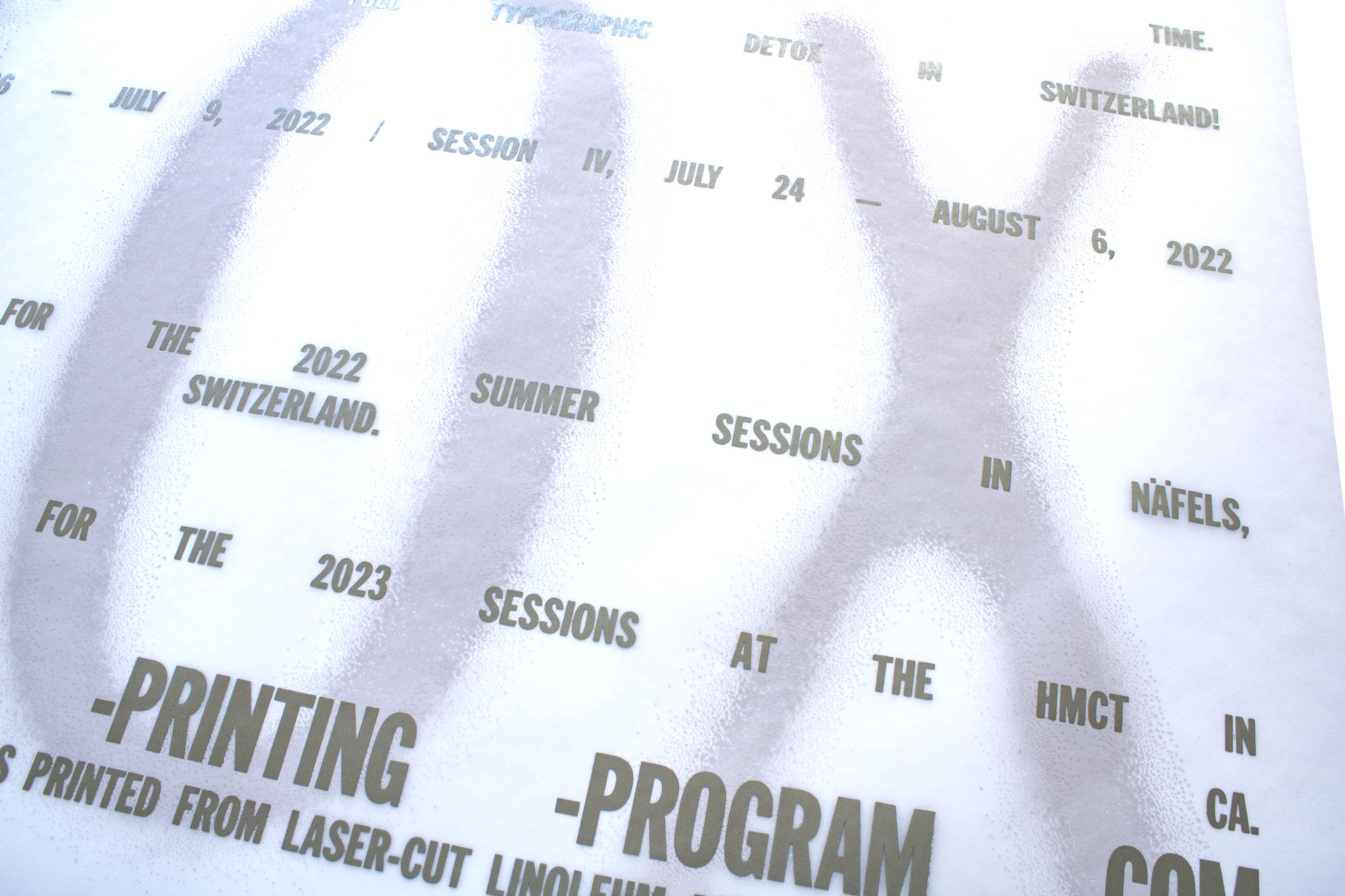
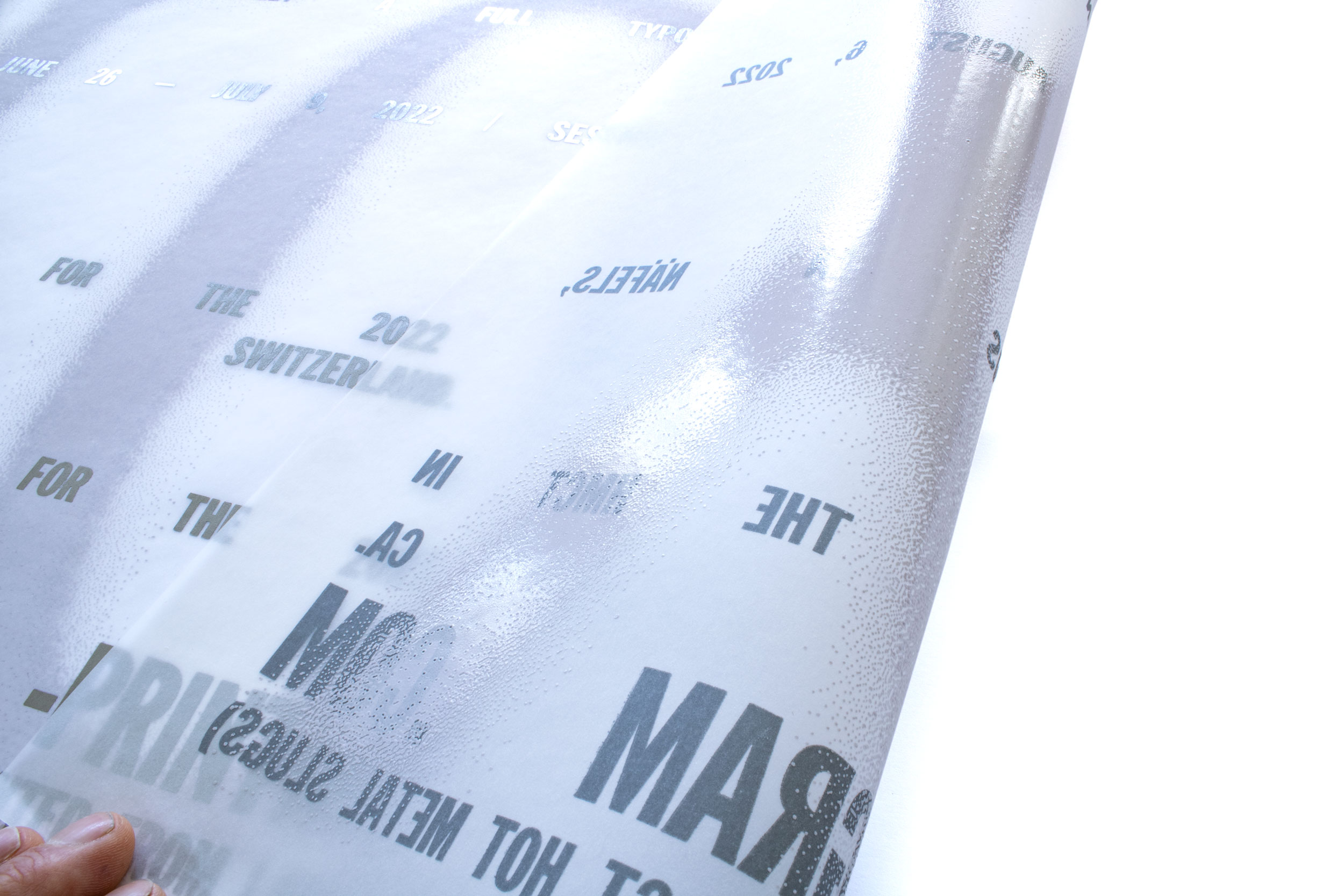
Typographic Detox
White on white is the new black on black!
Double sided poster for typographic-printing-program.com printed on transparent paper back and front to get the ultimate detox feeling. Stick this poster on top of any bad type posters, and it will automatically detox your environment! Letterpress printed with laser-cut linoleum and hand set and freshly cast Ludlow slugs.
Client: Typographic Printing Program, Näfels
Format: 70×100cm
Paper: Translucent white, 90g/m2
Edition: 300 posters on a Grafix GX4N
April 2022
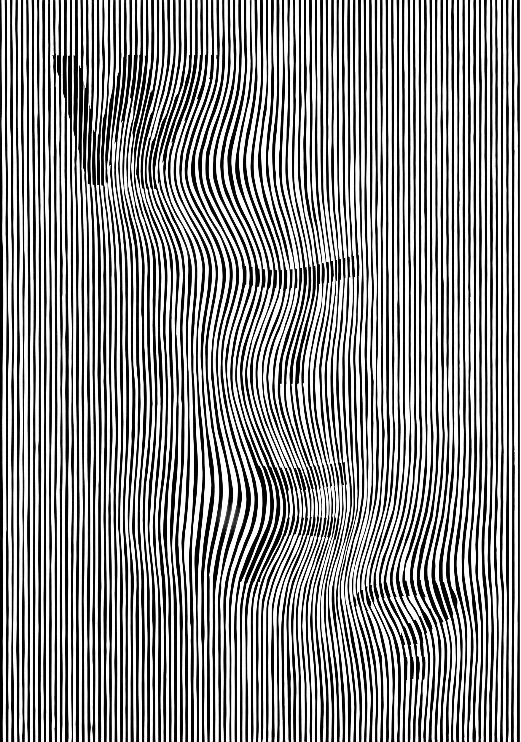
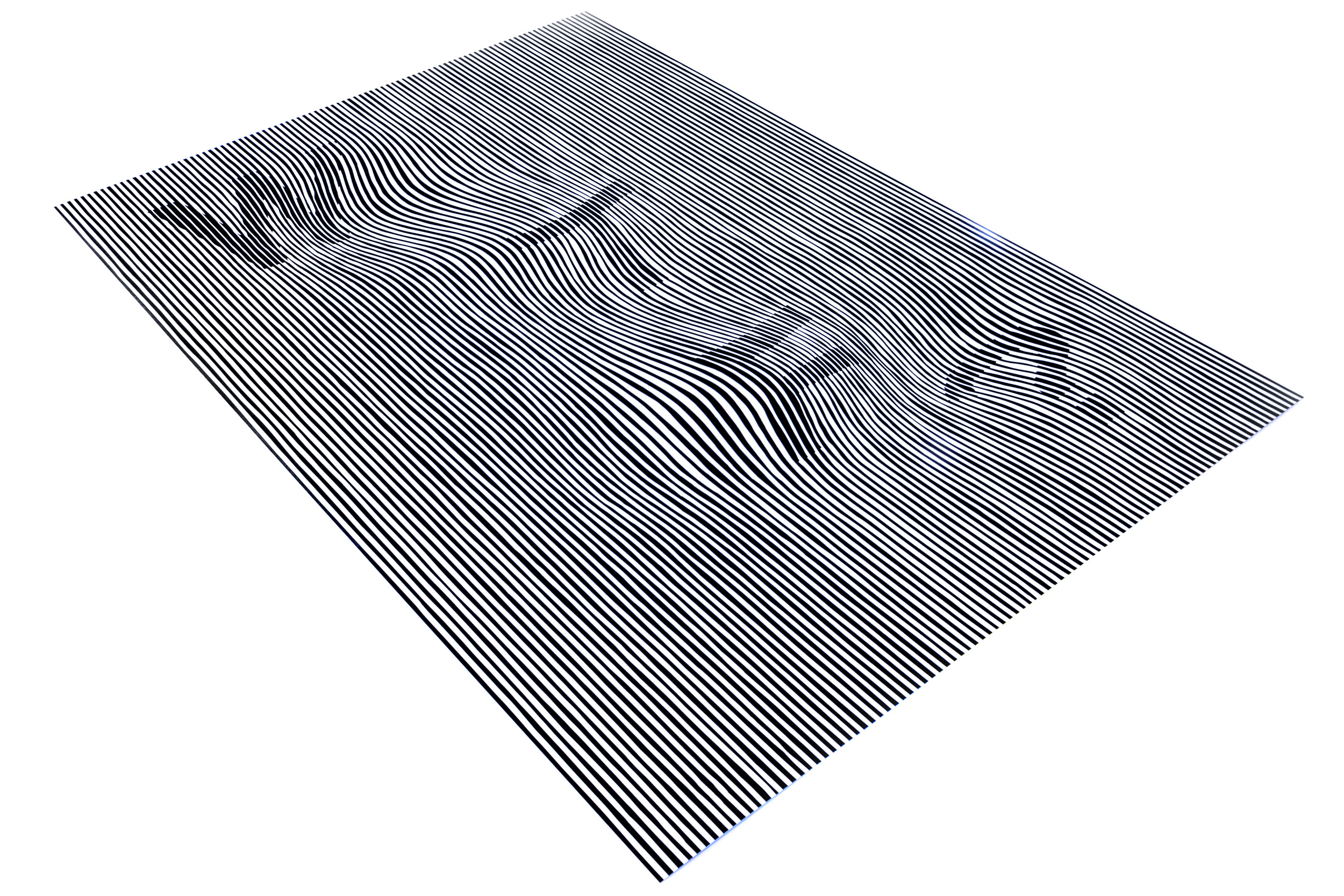
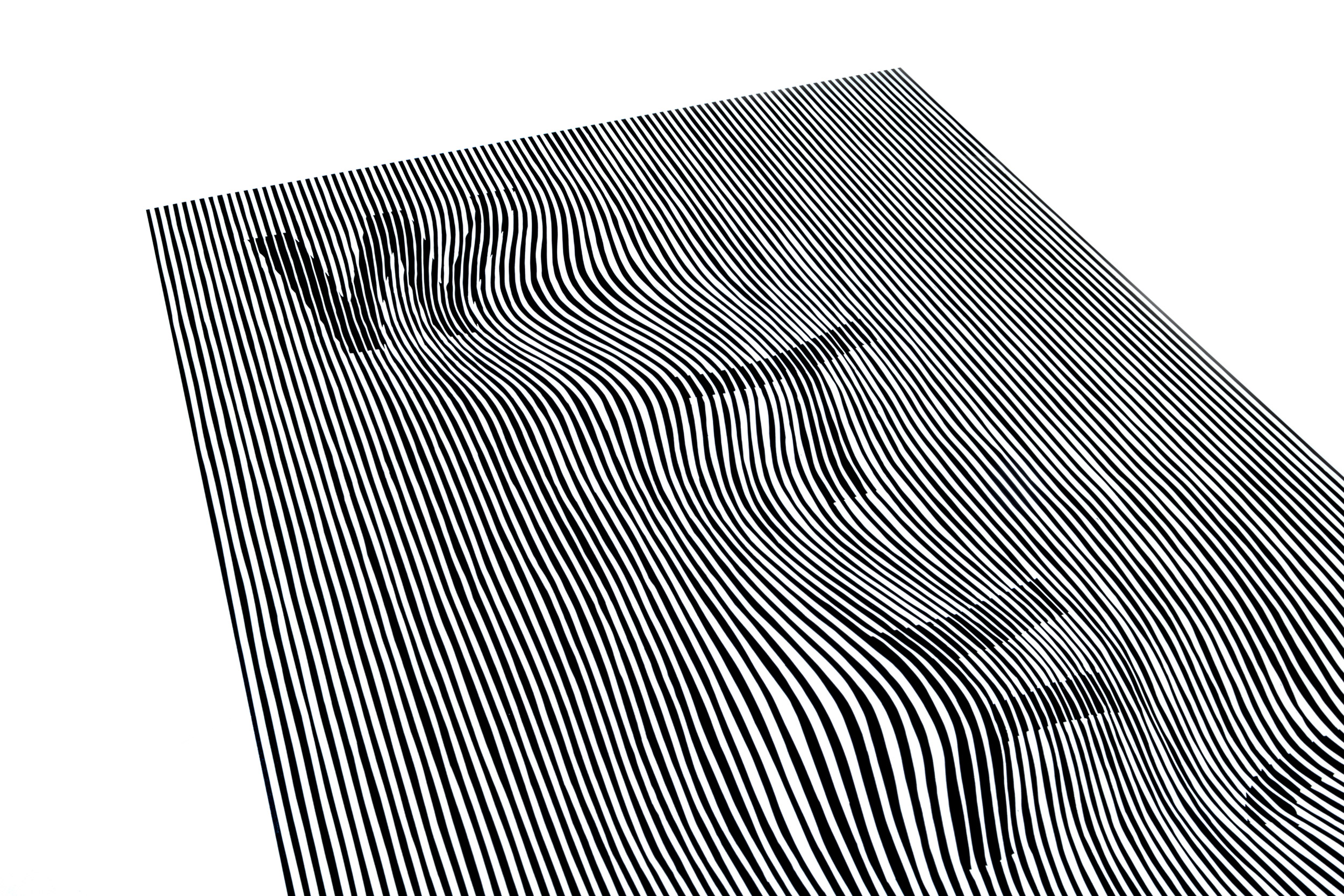
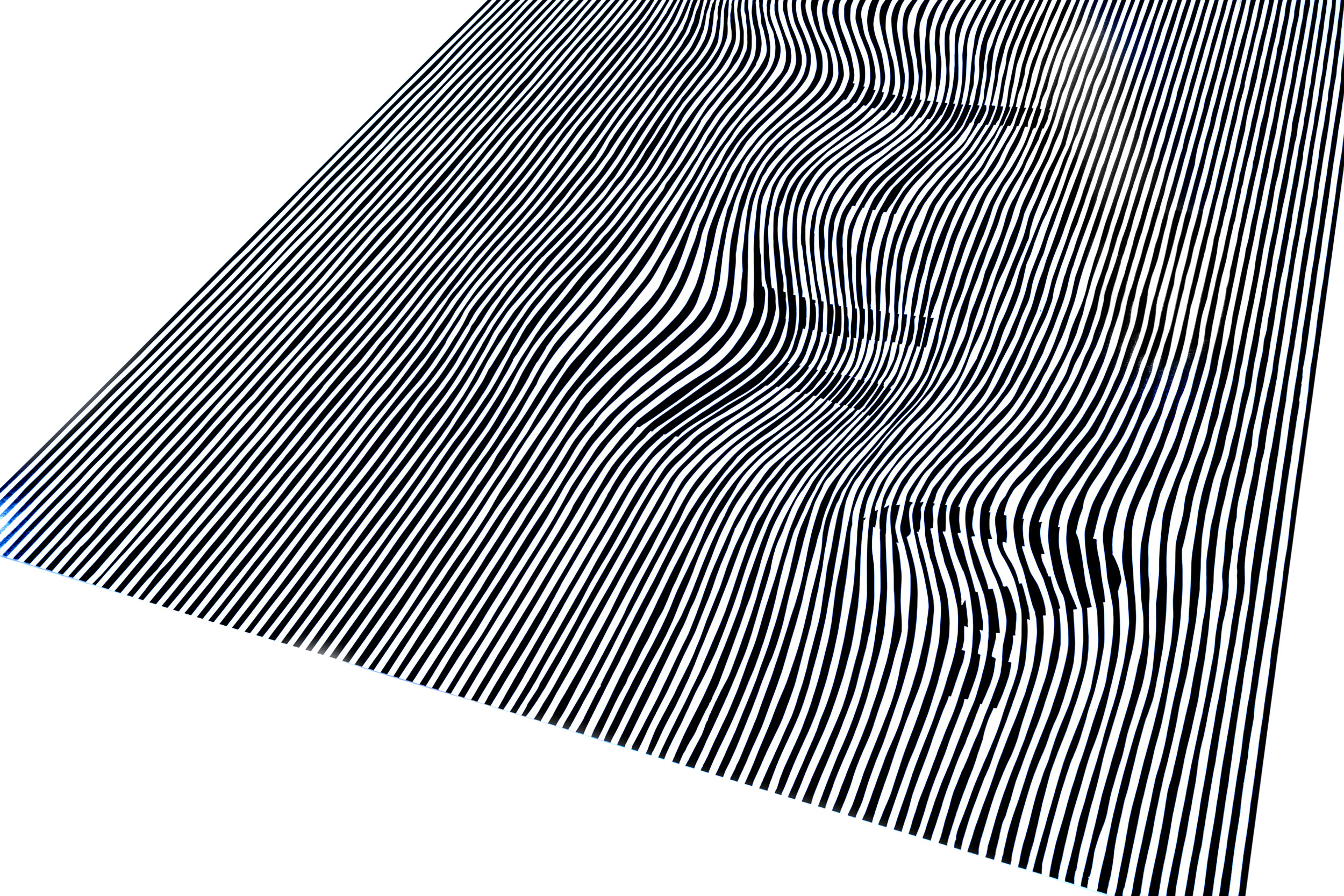
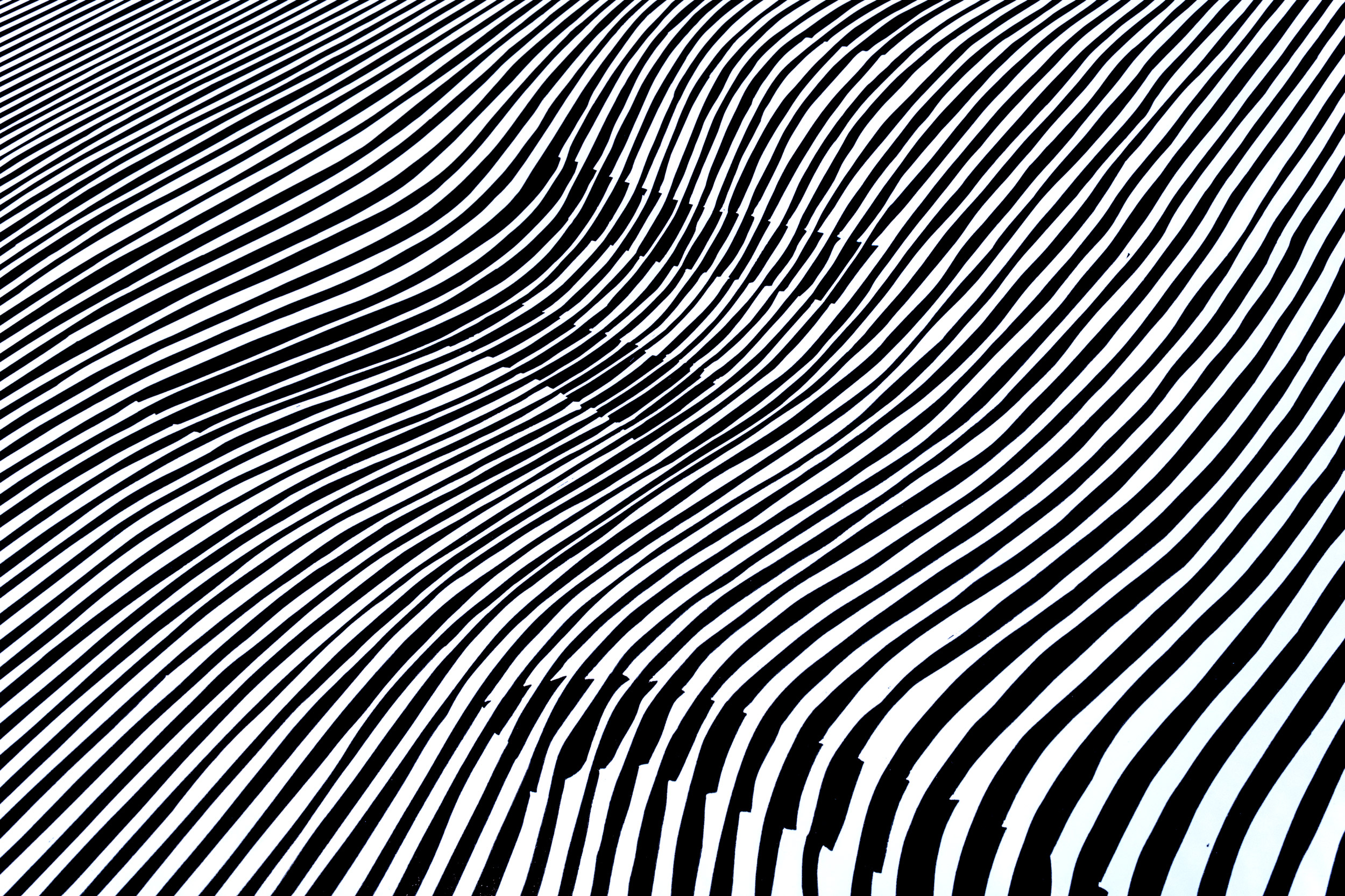
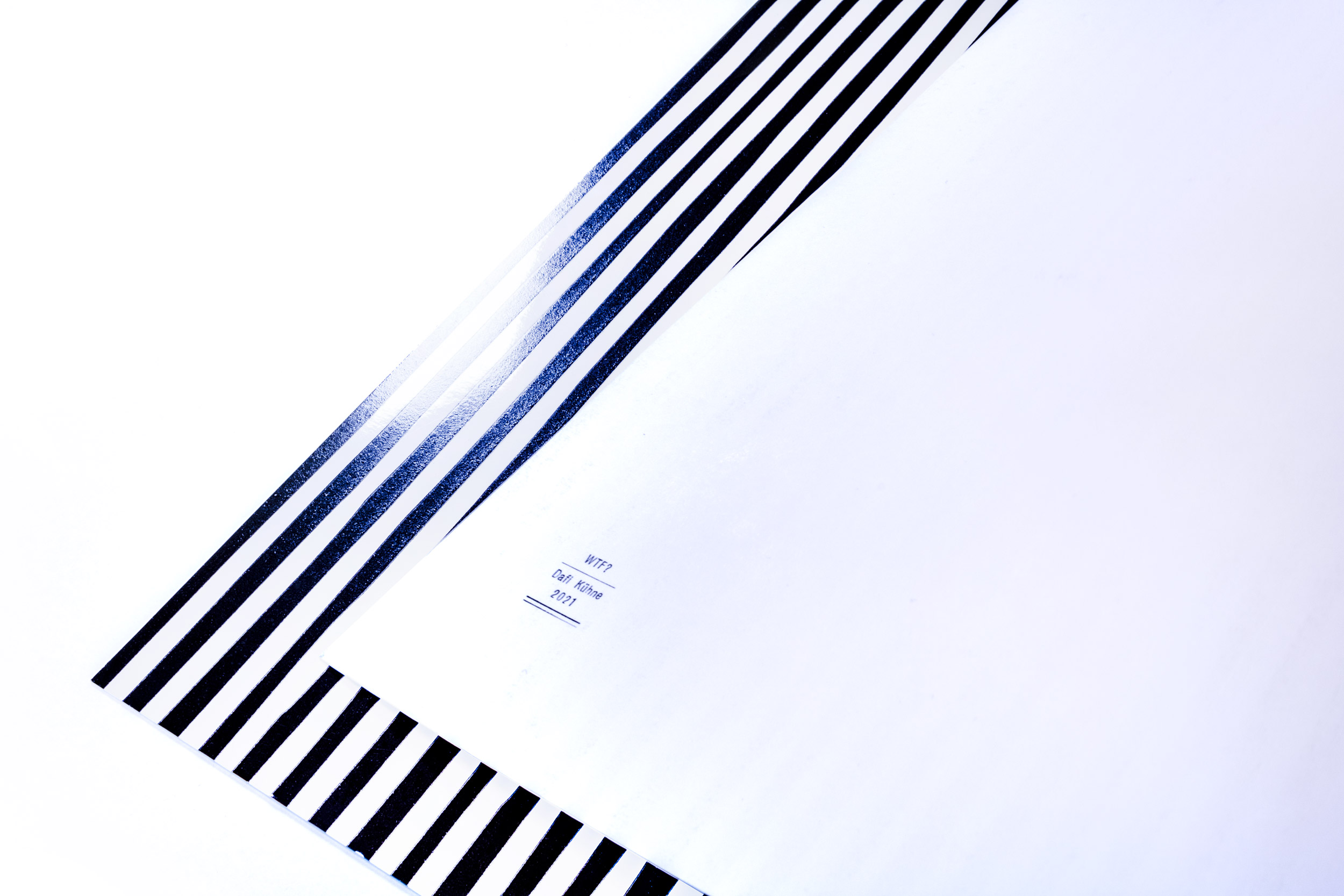
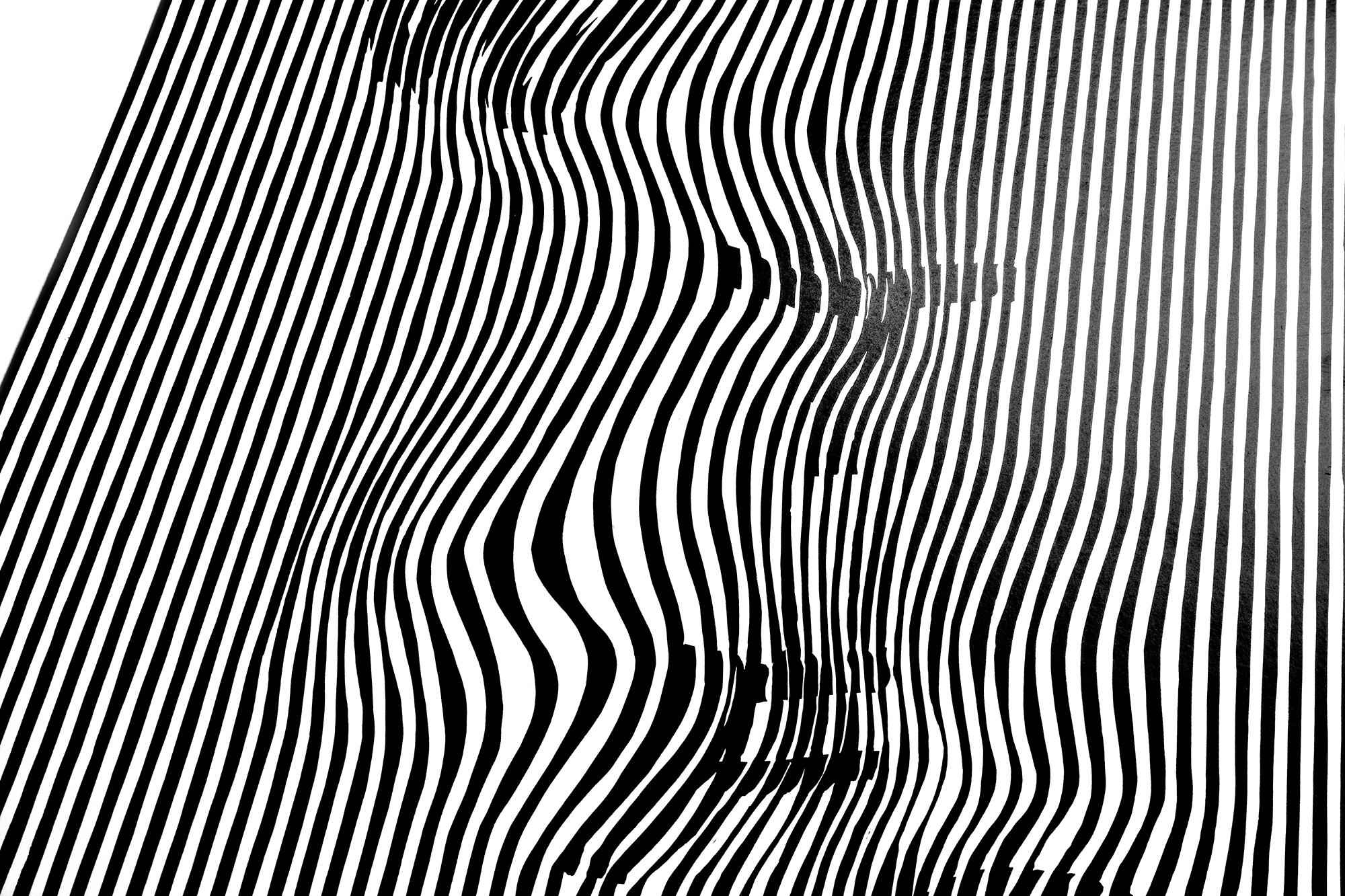
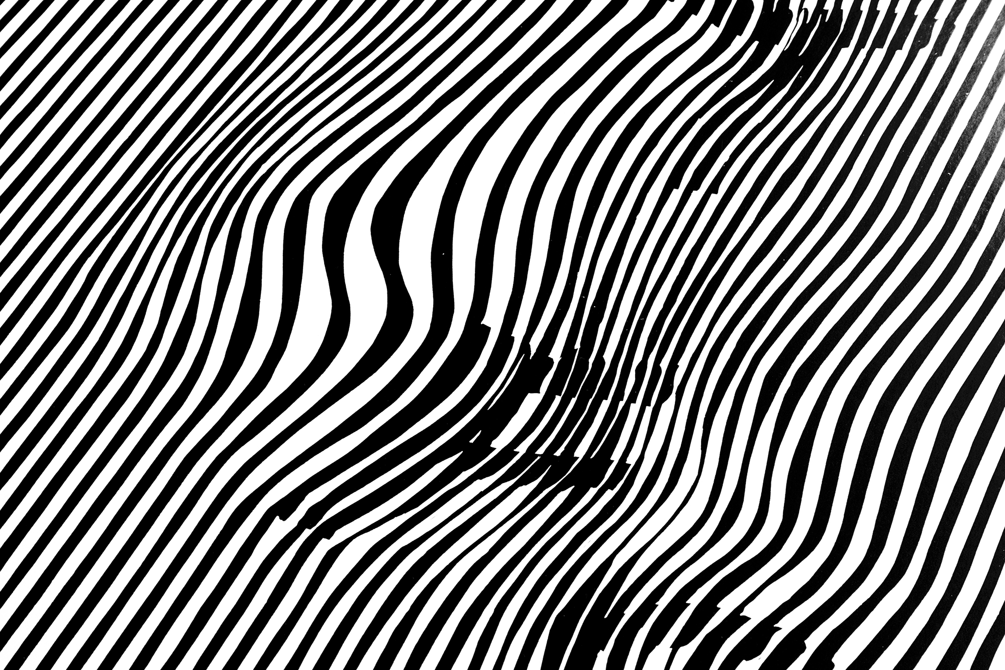
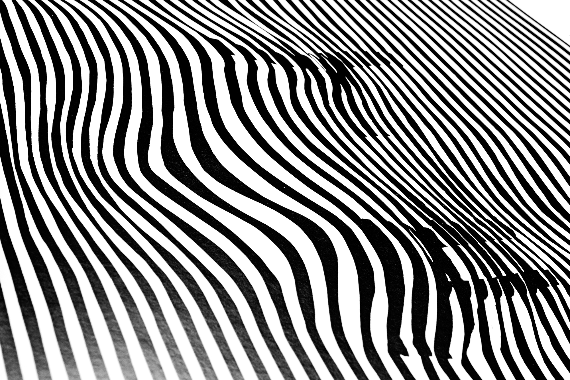
WTF? (large)
New and much larger edition of a smaller old motif from 2014 developed during my residency at The Arm, NYC. Redesigned to 70×100cm and hand-cut from linoleum in 2021. Mesmerizing lines printed on extra glossy stock: I promise it will make your eyes dizzy and keep you awake at night: WTF?
Client: self-initiated
Format: 70×100cm
Paper: Splendorlux, 275g/m2
Edition: 100 posters on a Grafix GX4N
September 2021
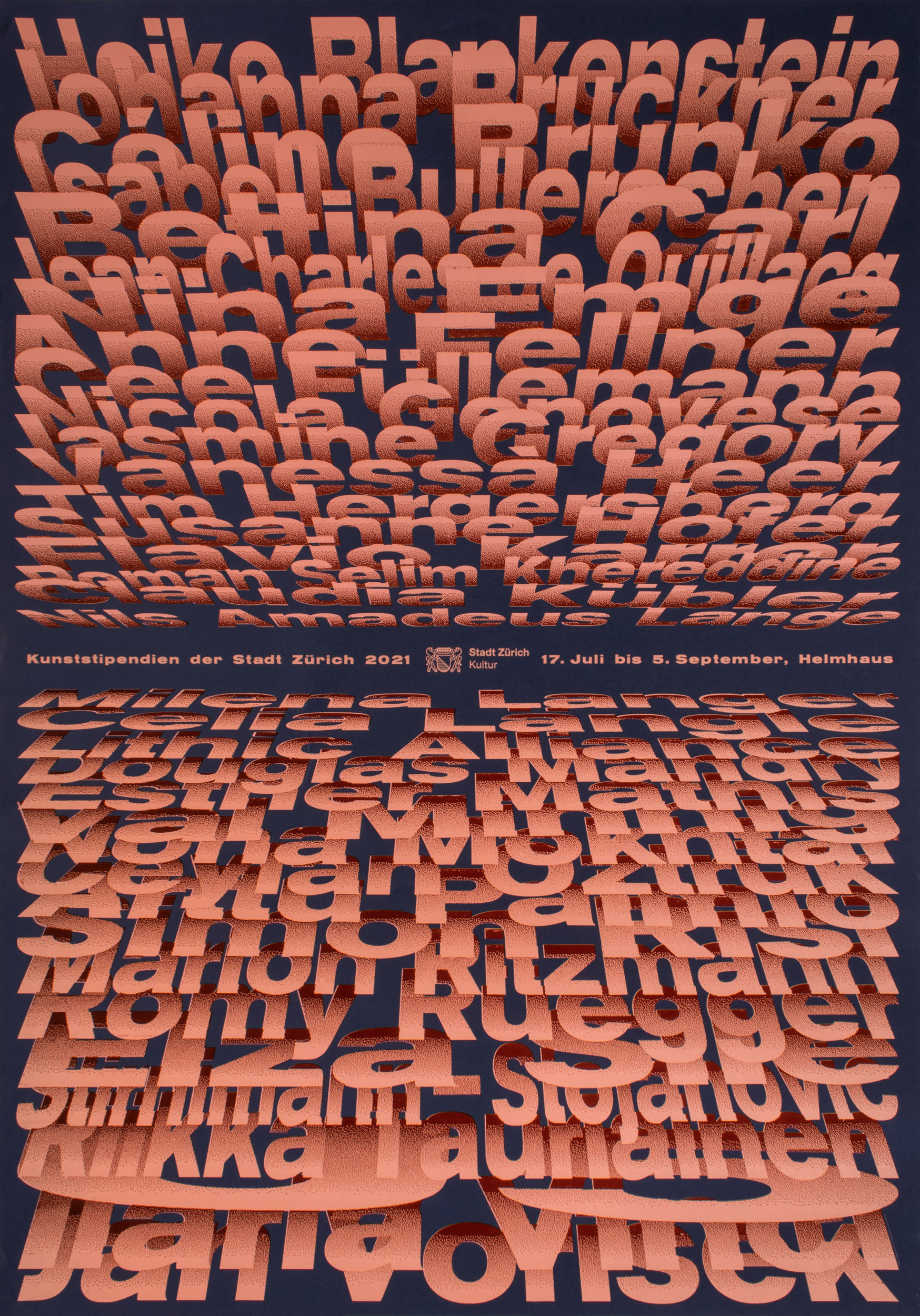
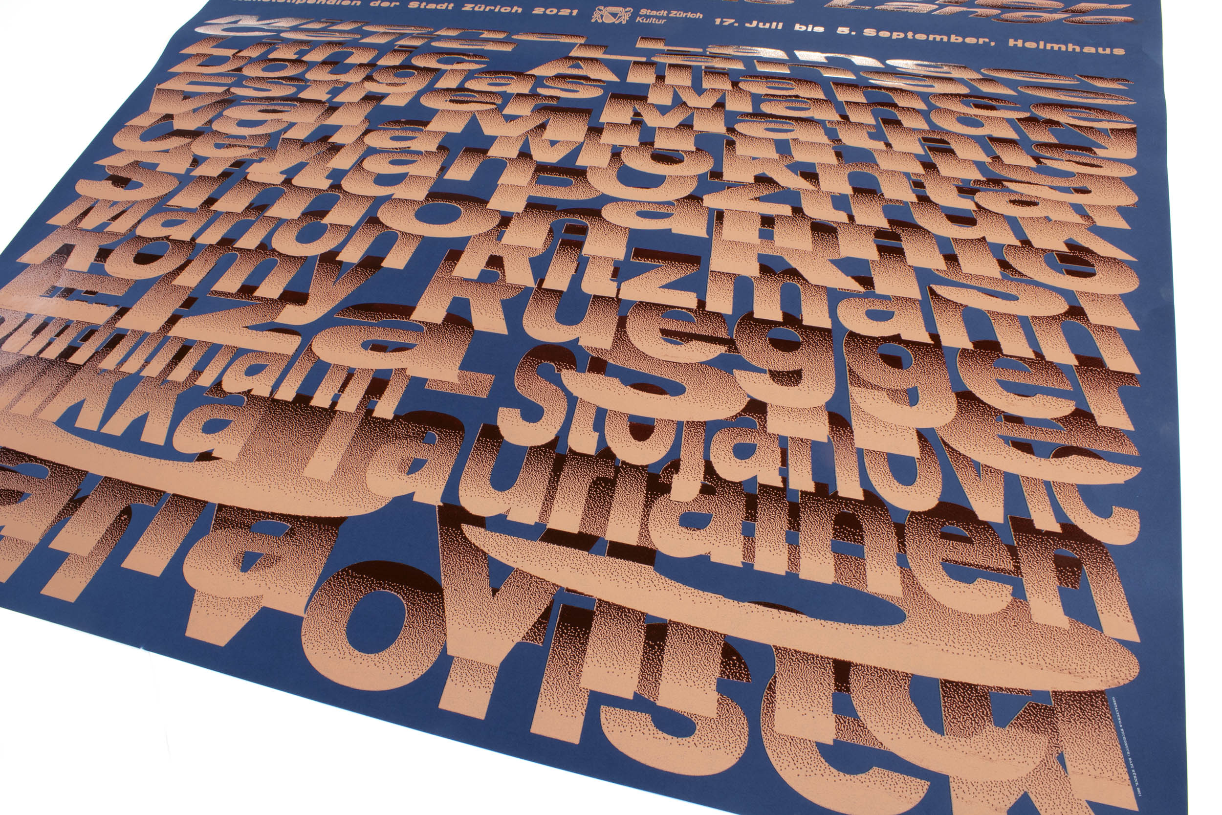
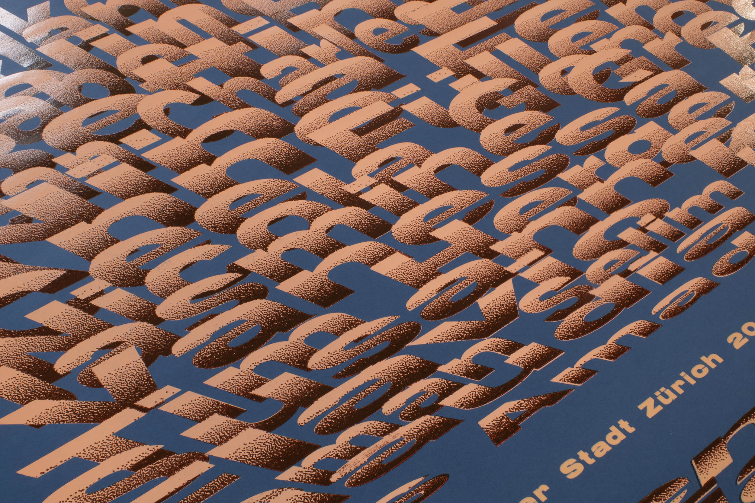
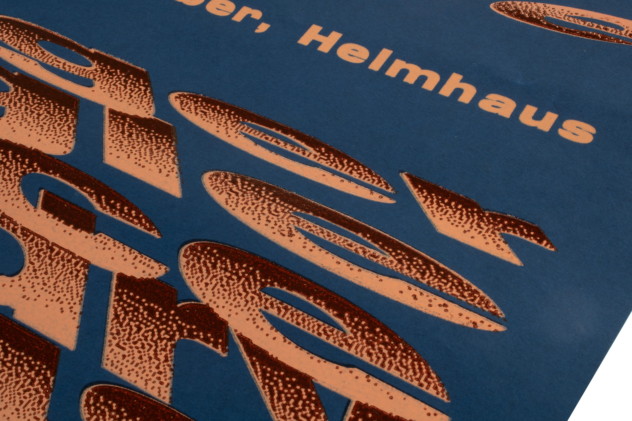
Kunststipendien der Stadt Zürich
Poster for Kunststipendien der Stadt Zürich (Art Stipends for the City of Zurich). How do you fit 36 names on a poster? Make them big!
Printed in a total of 23 print runs (yes, this was crazy!) with many helpers in my studio. Mainly laser-cut MDF and a bit of metal type. Thanks to everybody who joined me for full 7 days of printing fun.
Client: Helmaus Zürich
Format: 89.5×128cm
Paper: Surbalin, schwarzblau, 115g/m2
Edition: 300 posters on a Grafix GX4N
June 2021
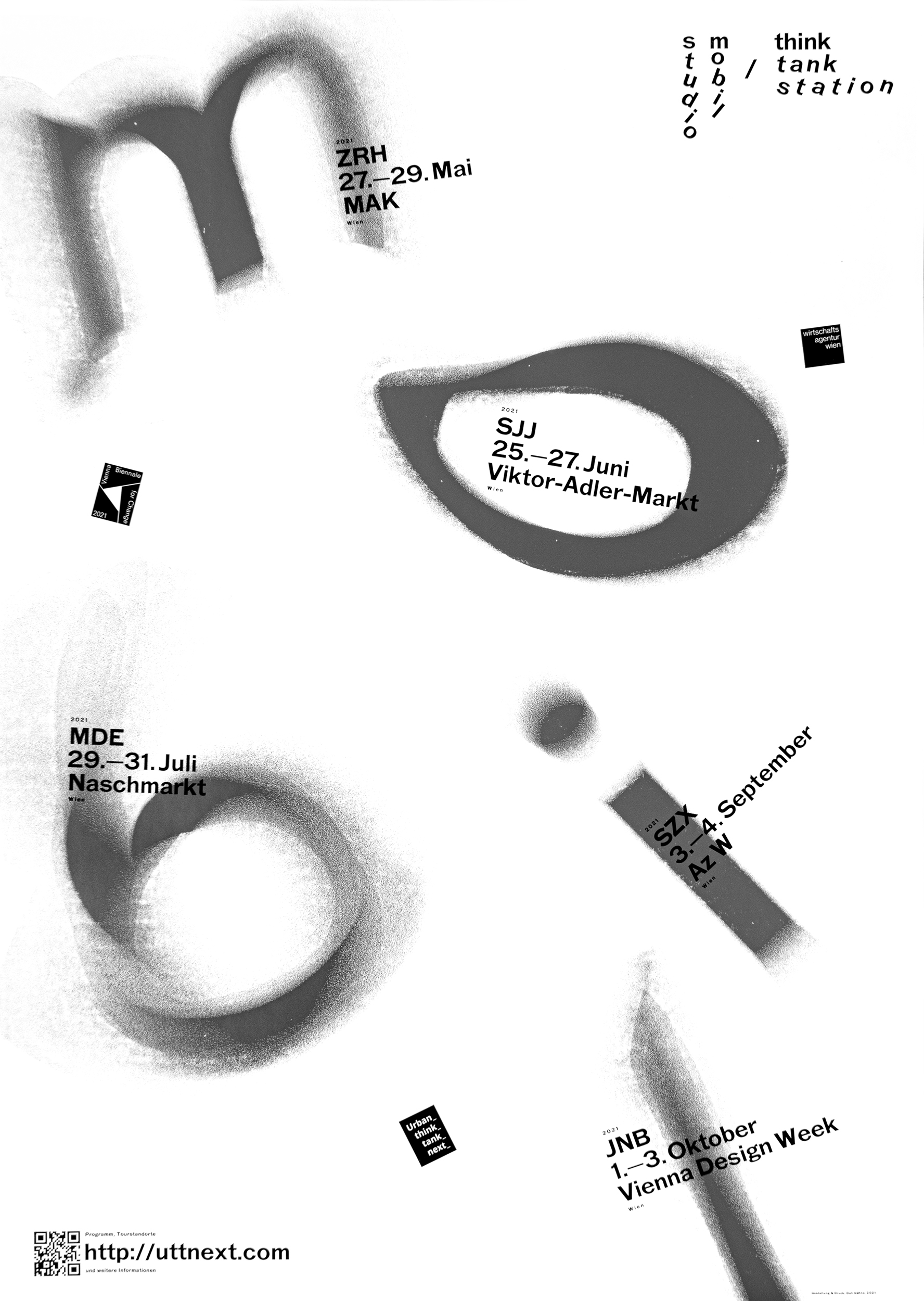
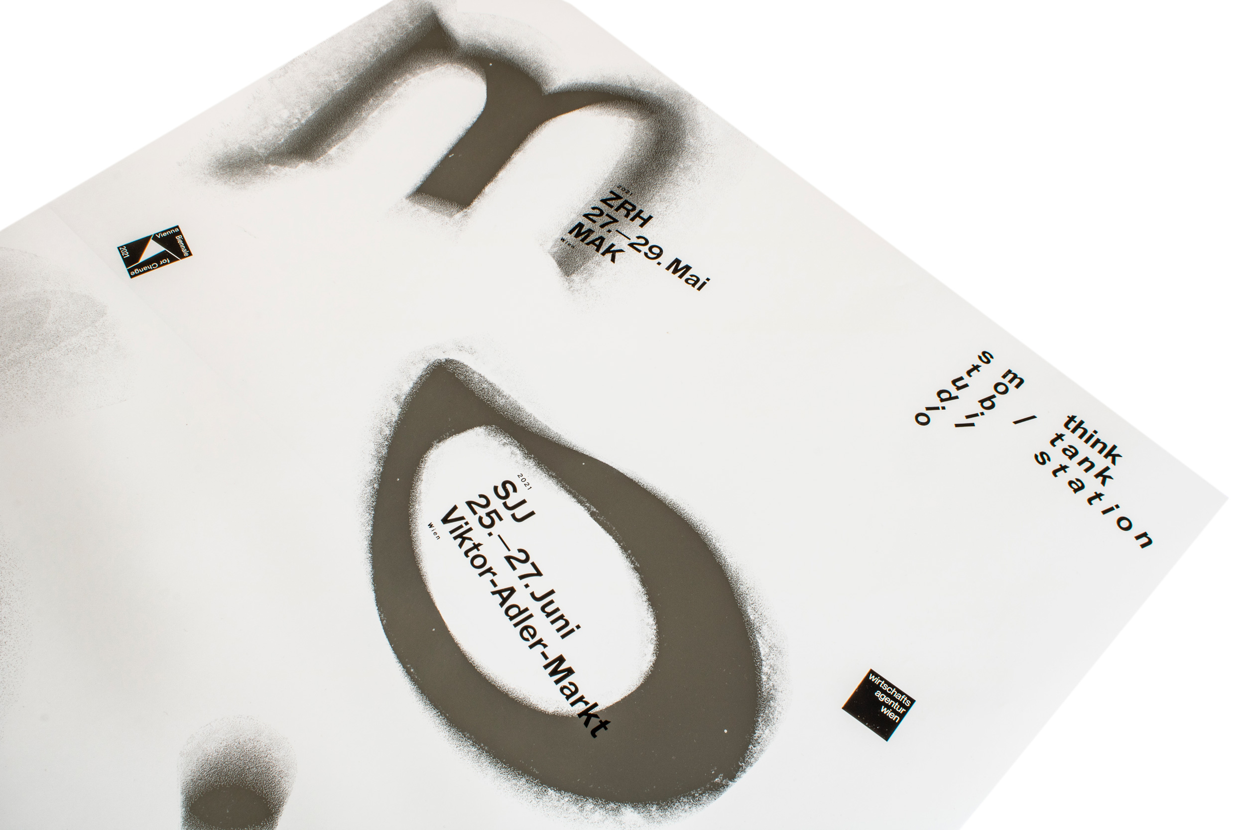
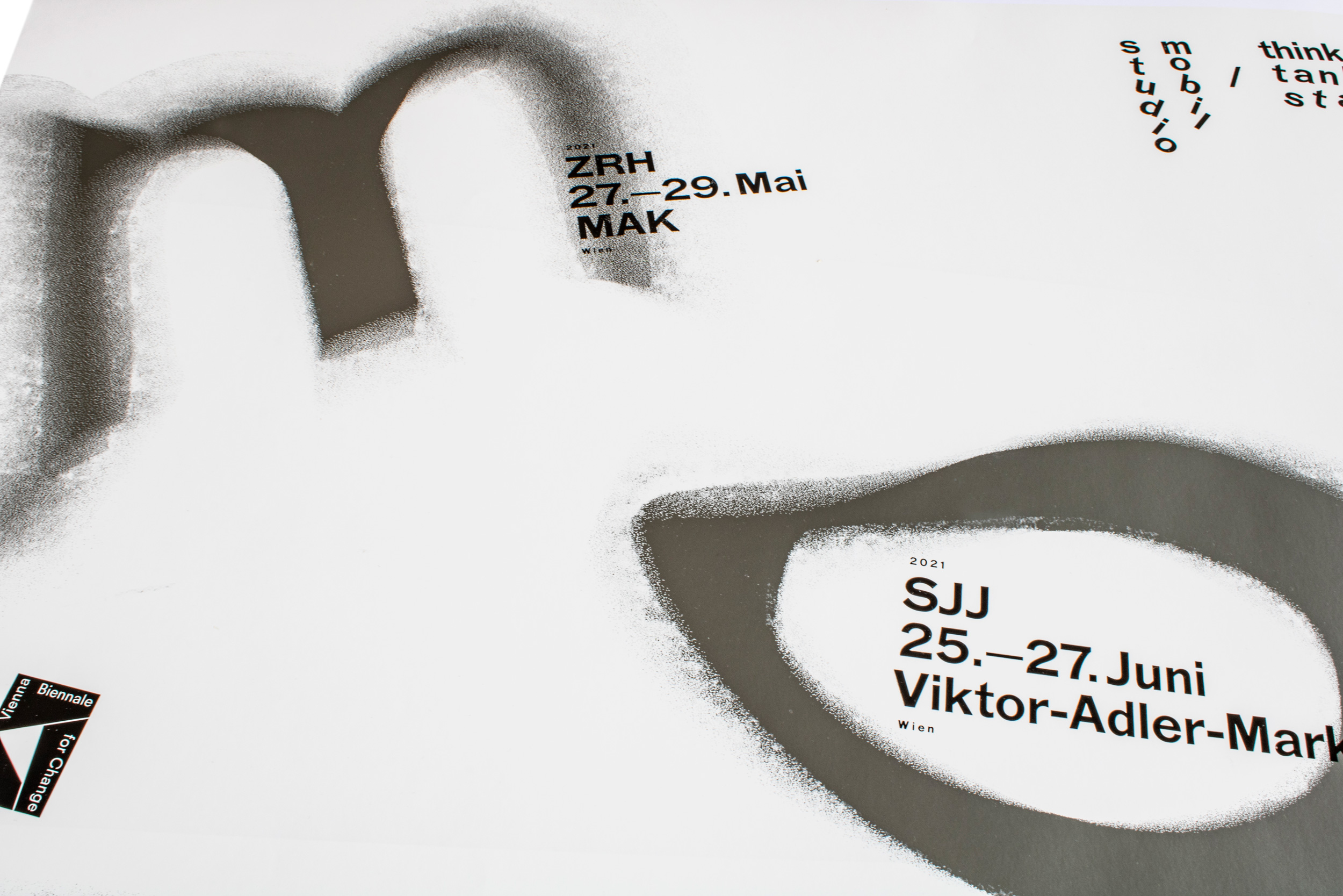
Studio Mobil / Urban Think Tank
Poster for a mobile studio in Vienna, Austria by Urban Think Tank. Printed with laser-cut MDF and cast Ludow slugs.
Client: Urban Think Tank, Zürich
Format: 70×100cm
Paper: Splendorlux 80g/m2
Edition: 65 posters on a Grafix GX4N
May 2021
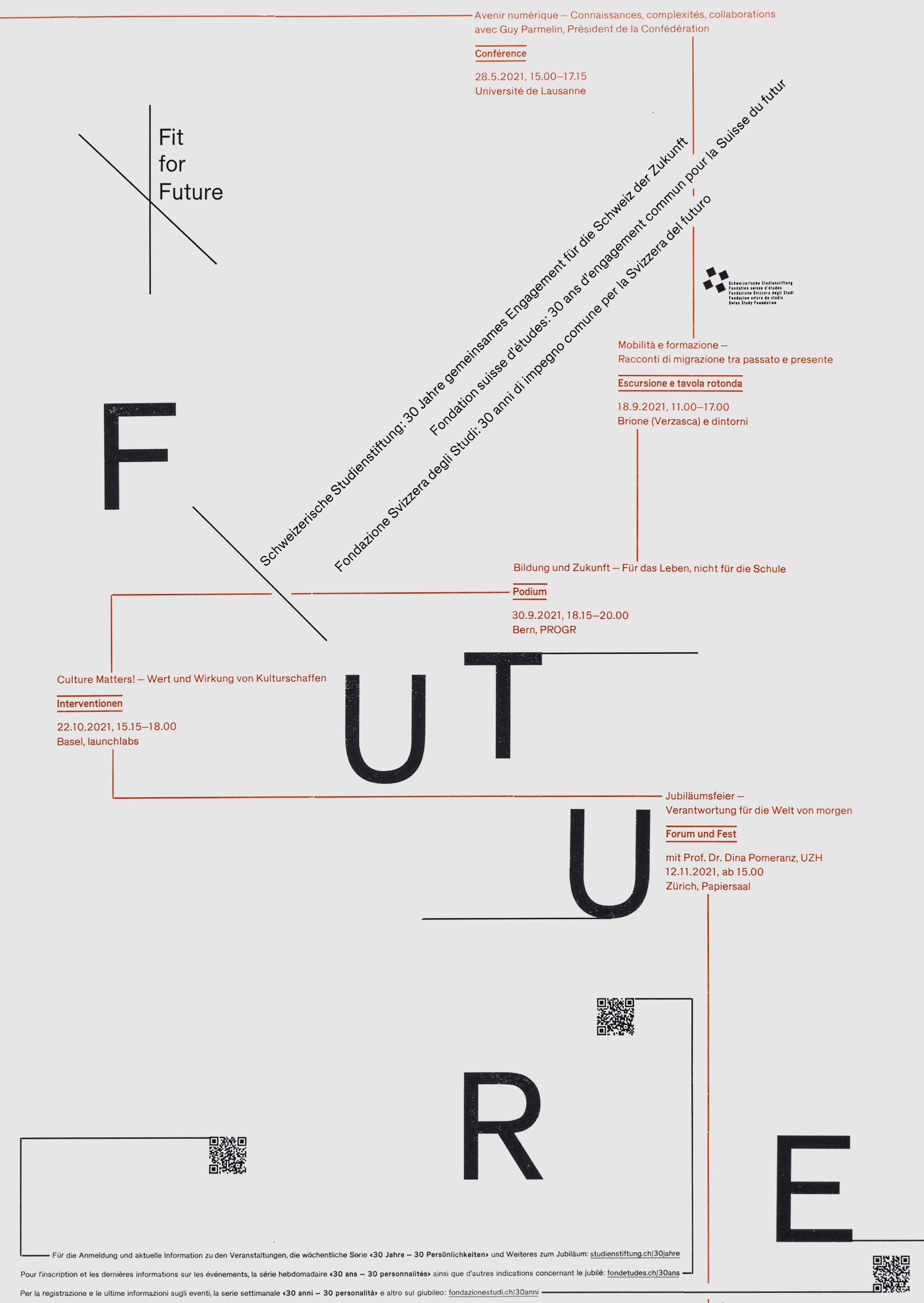
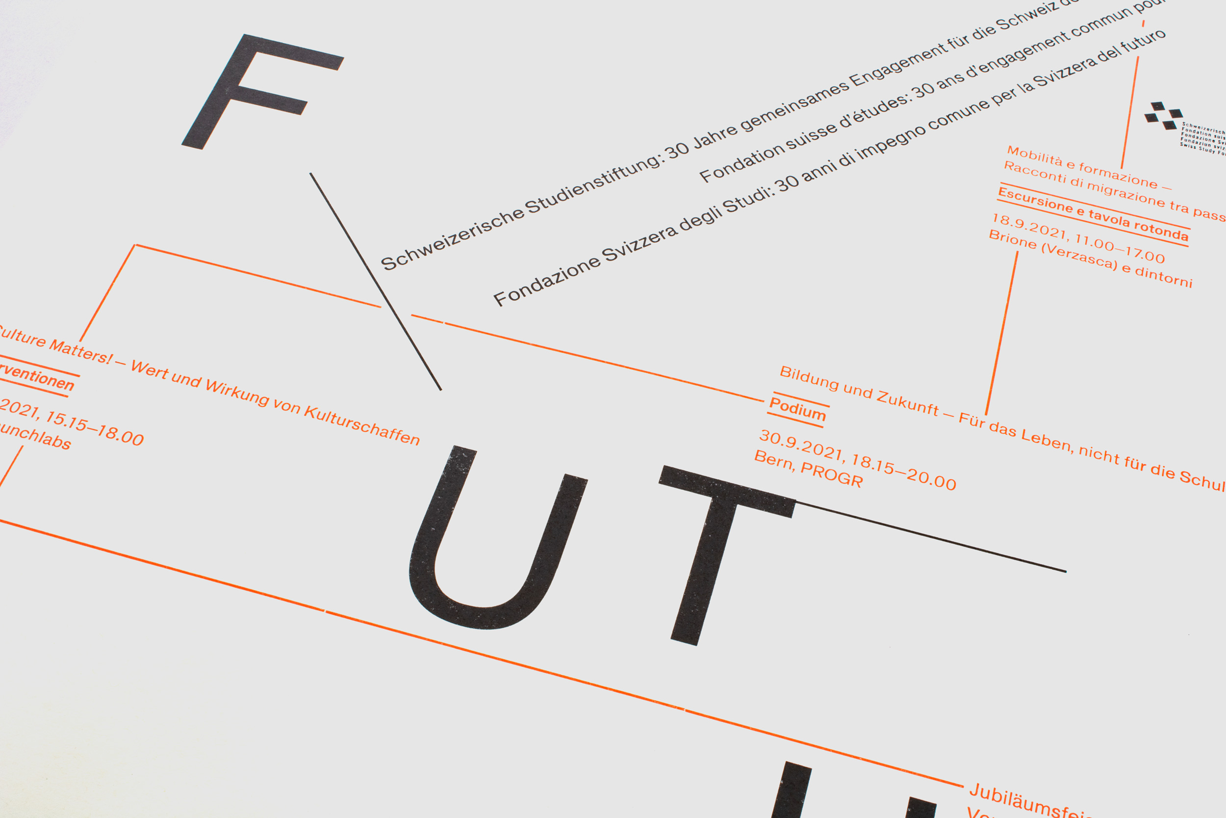
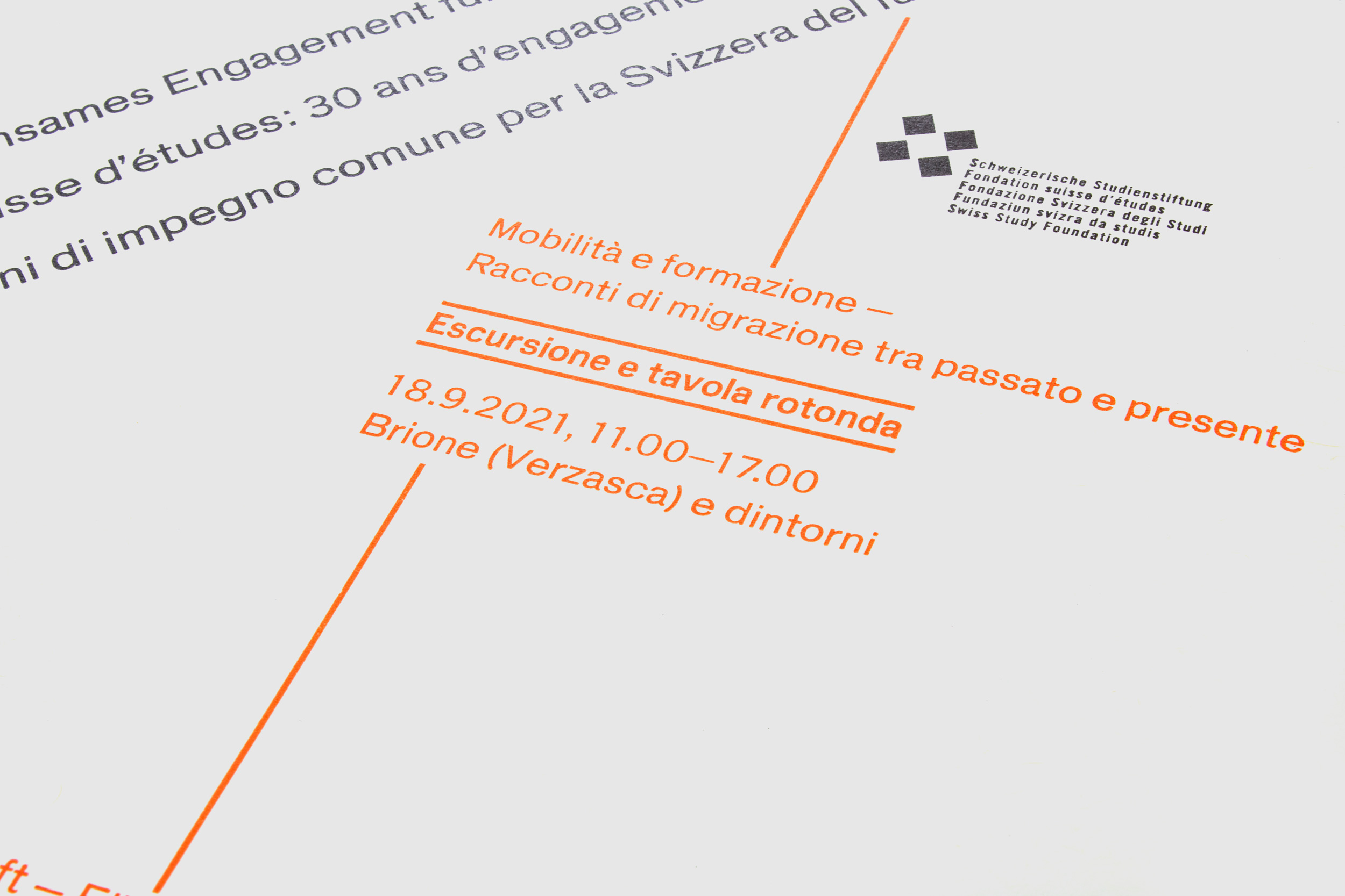
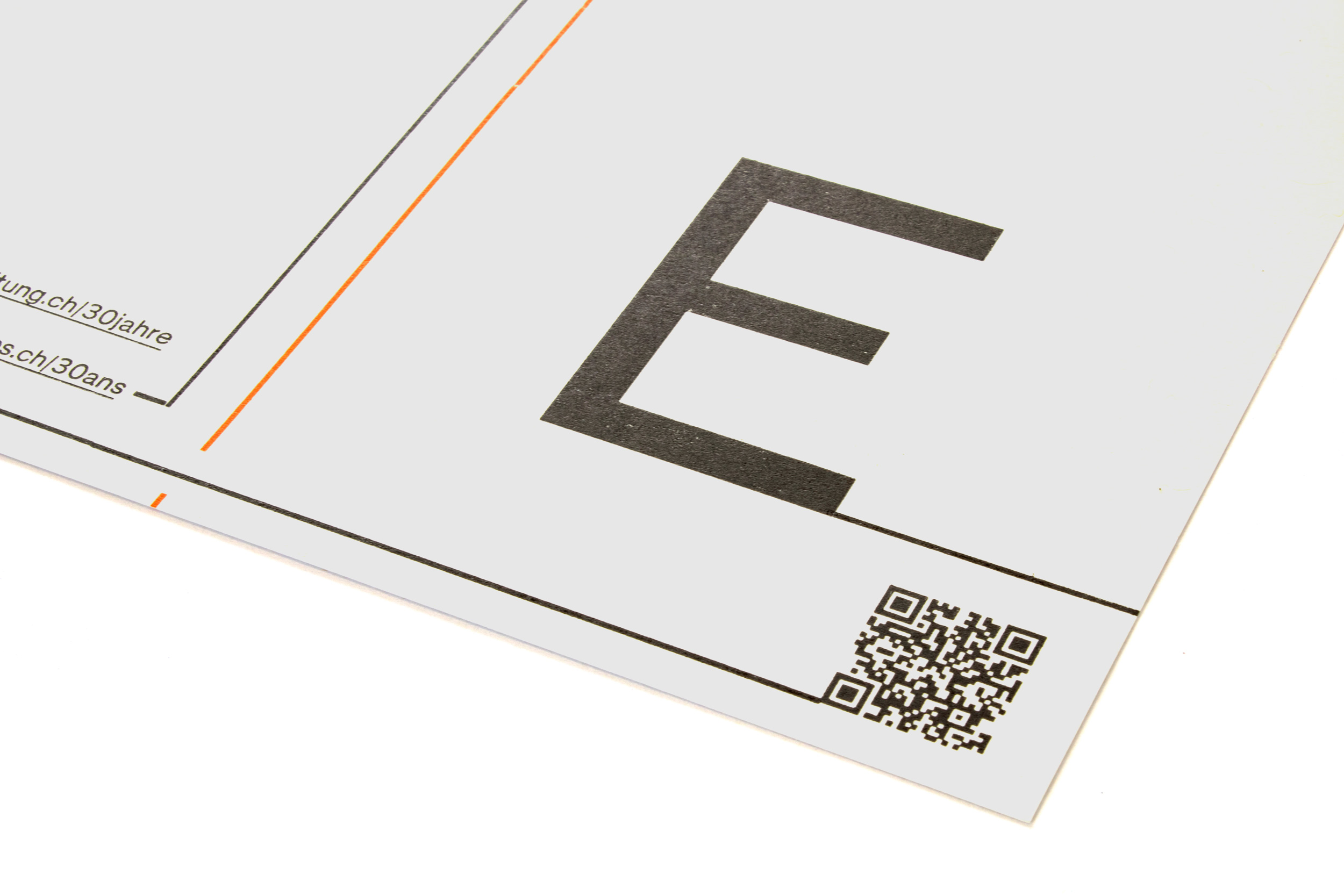
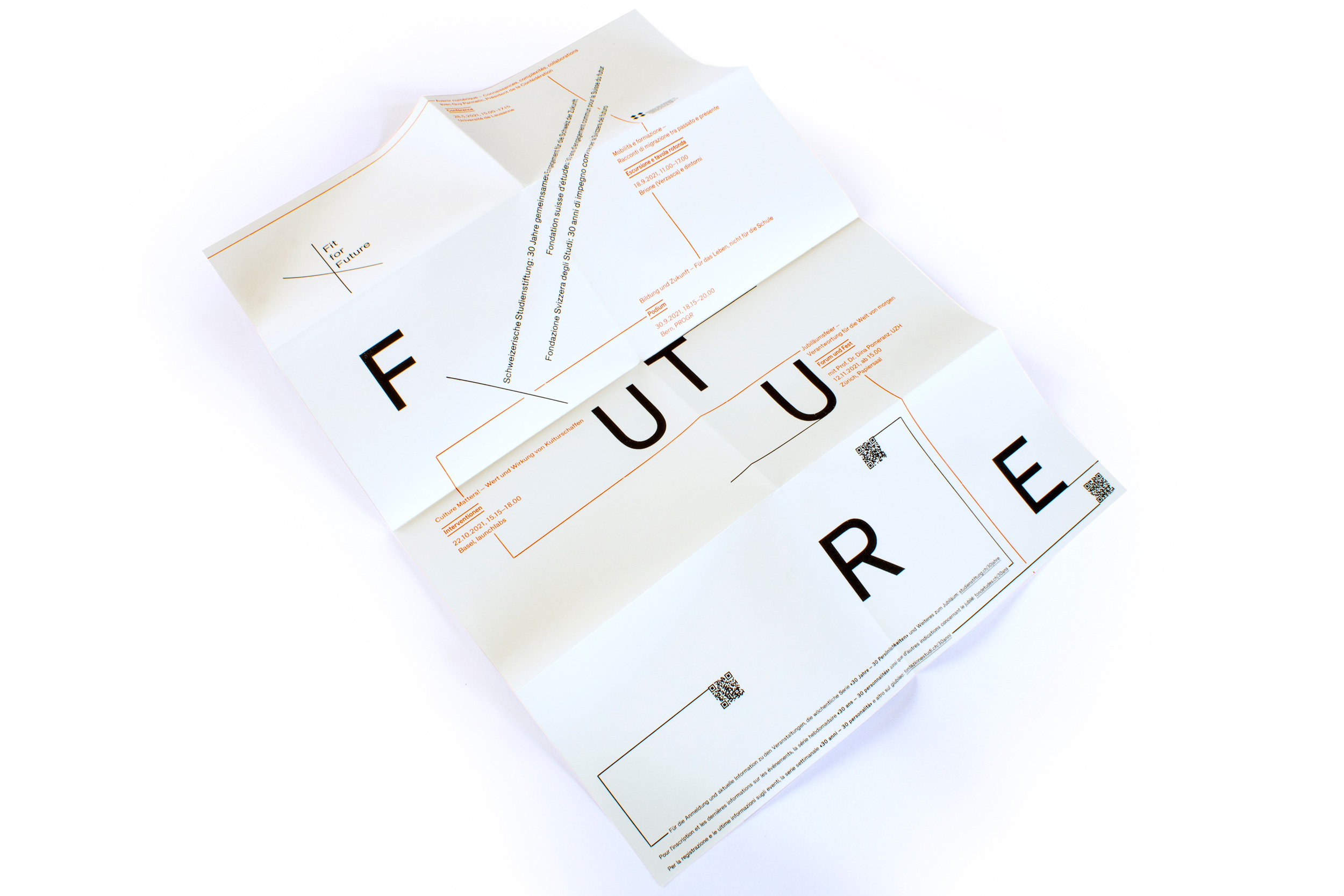
F-u-t-u-r-e
Letterpress printed poster for Swiss Study Foundation. Printed from cast Ludlow hot metal slugs and laser-cut plexiglass poster type. See the complex work-and-turn forme for the black print run. Watch the video!
Client: Swiss Study Foundation, Zürich, Switzerland
Format: 44×62cm
Paper: Environment Natural, 118g/m2
Edition: 2’200 posters on a FAG Control 900
April 2021
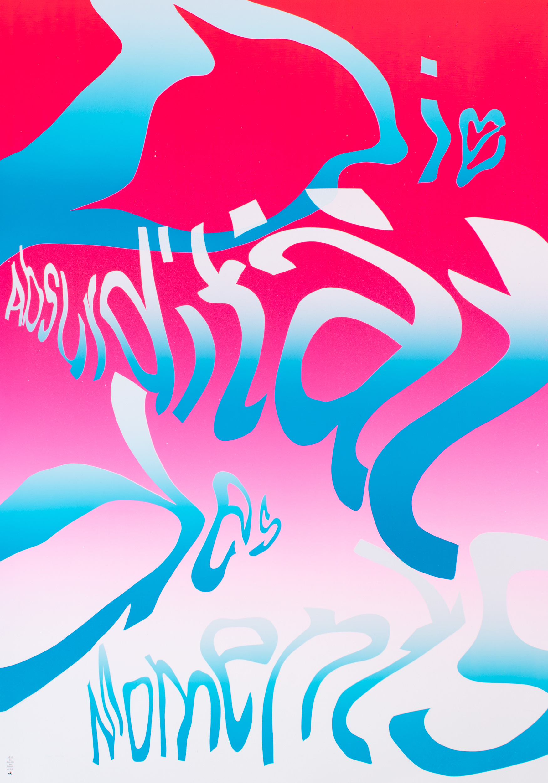
Die Absurdität des Moments
Poster from the series «The absurdity of the moment». Exhibition at Museum für Gestaltung Zürich, Switzerland from April 22–August 1, 2021.
Full series of all 10 posters available upon request.
Format: 70×100cm
Paper: Magno Star 300g/m2
First edition: 47 posters, signed and numbered
April 2021
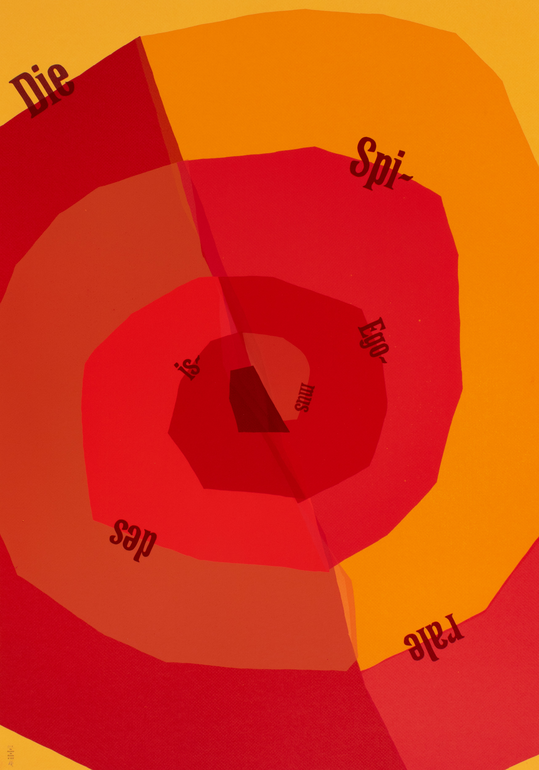
Die Spirale des Egoismus
[The spiral of egoism]
Poster from the series «The absurdity of the moment». Exhibition at Museum für Gestaltung Zürich, Switzerland from April 22–August 1, 2021.
Full series of all 10 posters available upon request.
Format: 70×100cm
Paper: Tintoretto Curry 250g/m2
First edition: 37 posters, signed and numbered
April 2021
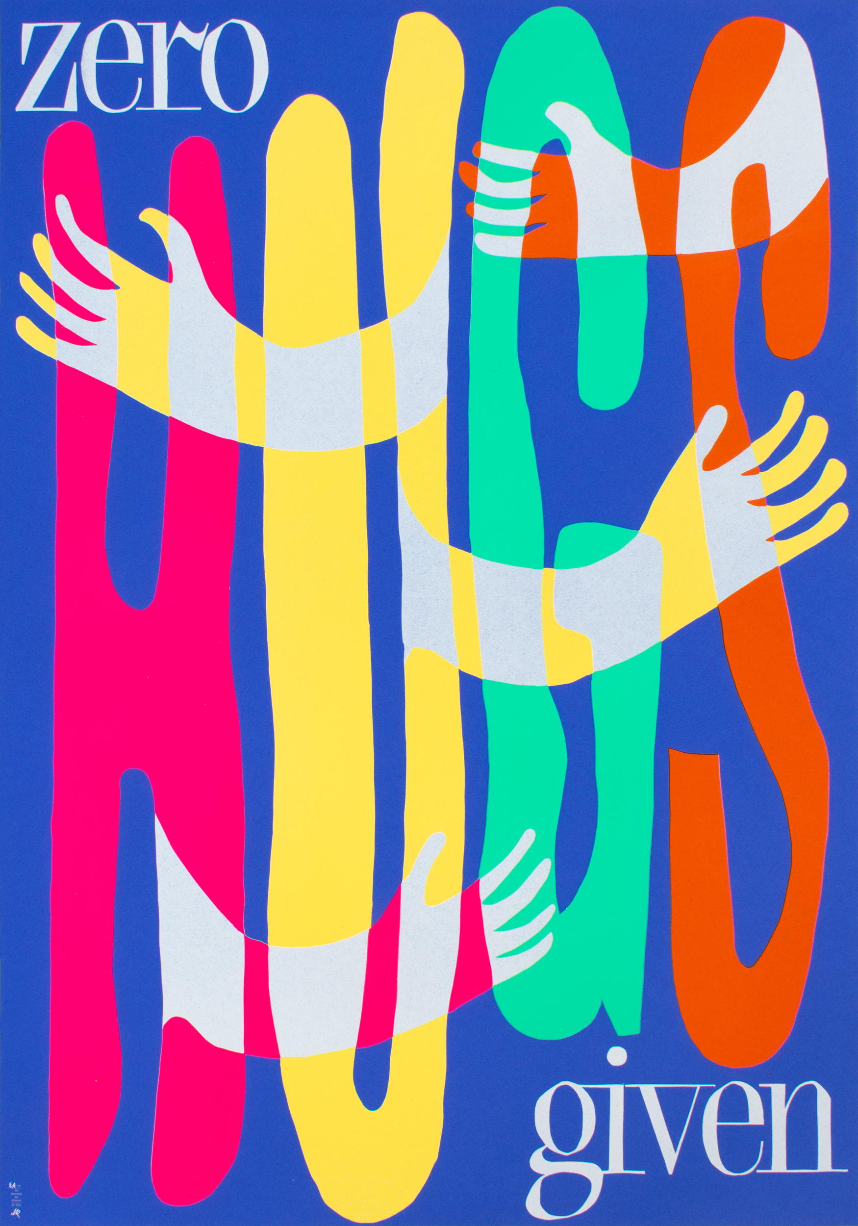
Zero hugs given
Poster from the series «The absurdity of the moment». Exhibition at Museum für Gestaltung Zürich, Switzerland from April 22–August 1, 2021.
This print is currently sold out, send me an email if you are interested in a second edition of it!
Full series of all 10 posters available upon request.
Format: 70×100cm
Paper: Forever Color ultramarine 210g/m2
First edition: 39 posters, signed and numbered
April 2021
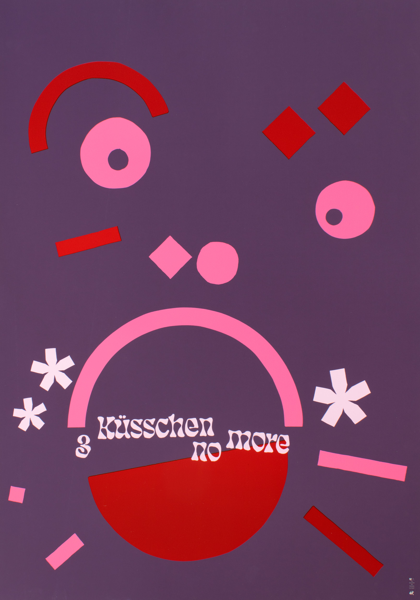
3 Küsschen no more
Poster from the series «The absurdity of the moment». Exhibition at Museum für Gestaltung Zürich, Switzerland from April 22–August 1, 2021.
Full series of all 10 posters available upon request.
Format: 70×100cm
Paper: Plike, purple, 330g/m2
First edition: 43 posters, signed and numbered
April 2021
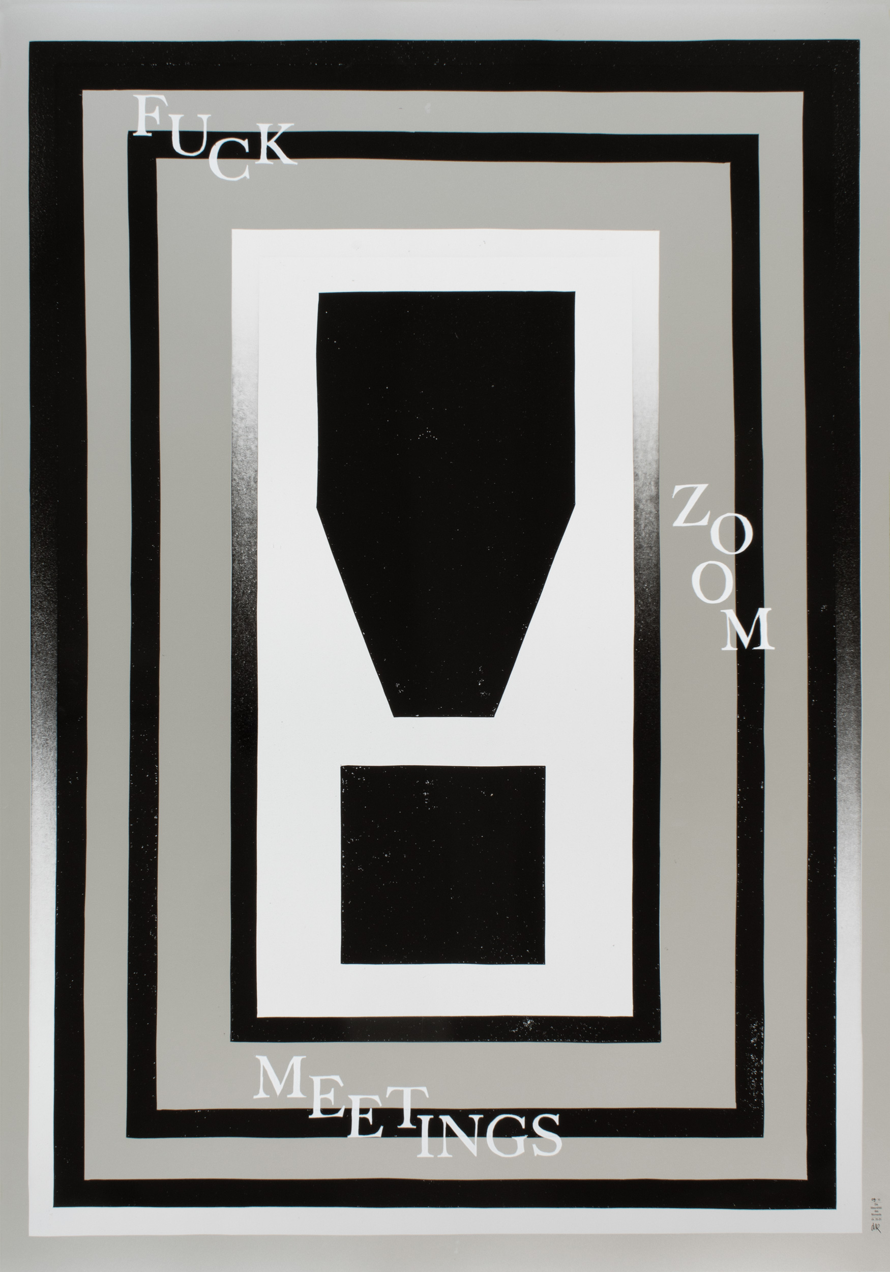
Fuck Zoom meetings
Poster from the series «The absurdity of the moment». Exhibition at Museum für Gestaltung Zürich, Switzerland from April 22–August 1, 2021.
Full series of all 10 posters available upon request.
Format: 70×100cm
Paper: Splendorlux Pearl silber 250g/m2
First edition: 50 posters, signed and numbered
April 2021
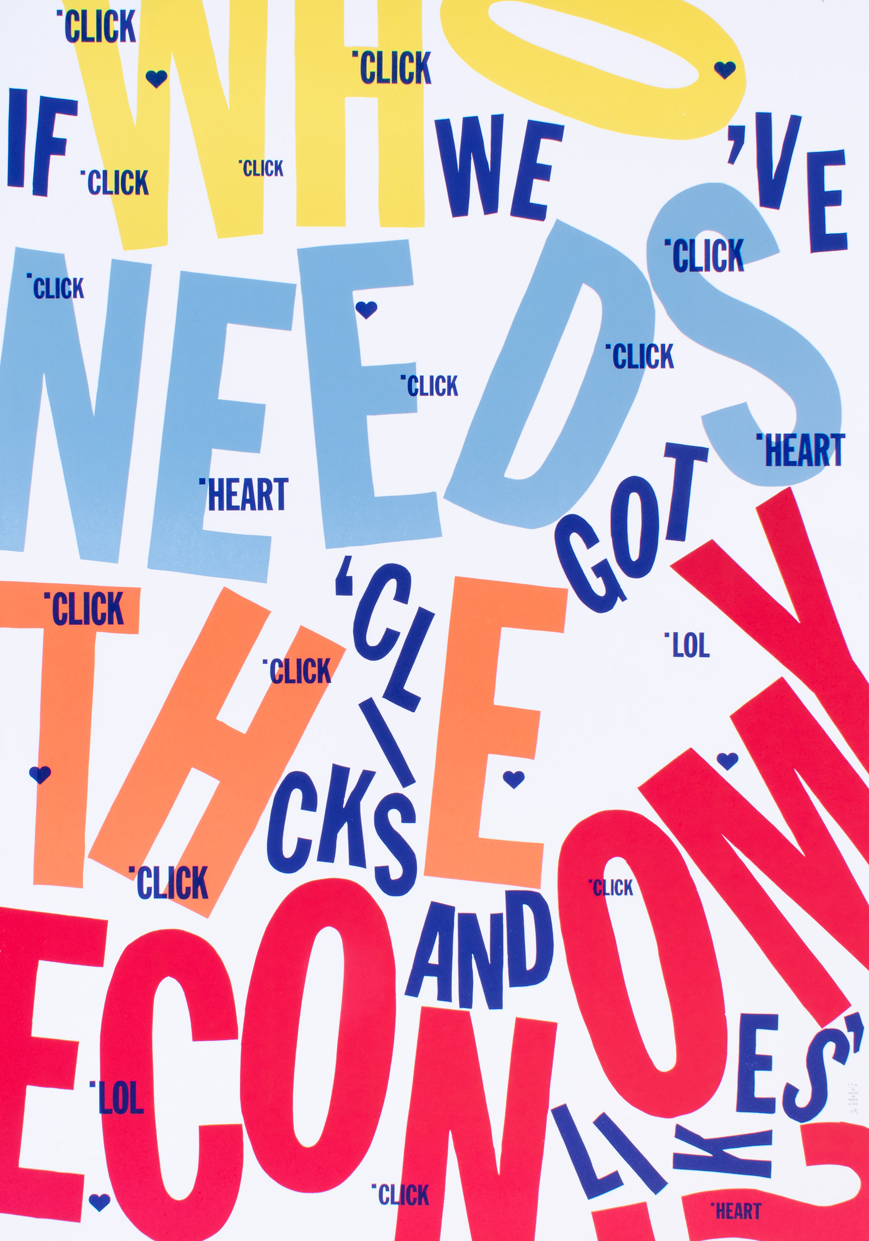
Who needs the economy…
…if we’ve got ‘clicks and likes’.
Poster from the series «The absurdity of the moment». Exhibition at Museum für Gestaltung Zürich, Switzerland from April 22–August 1, 2021.
Full series of all 10 posters available upon request.
Format: 70×100cm
Paper: Munken Polar Rough Weiss, 300g/m2
First edition: 43 posters, signed and numbered
April 2021
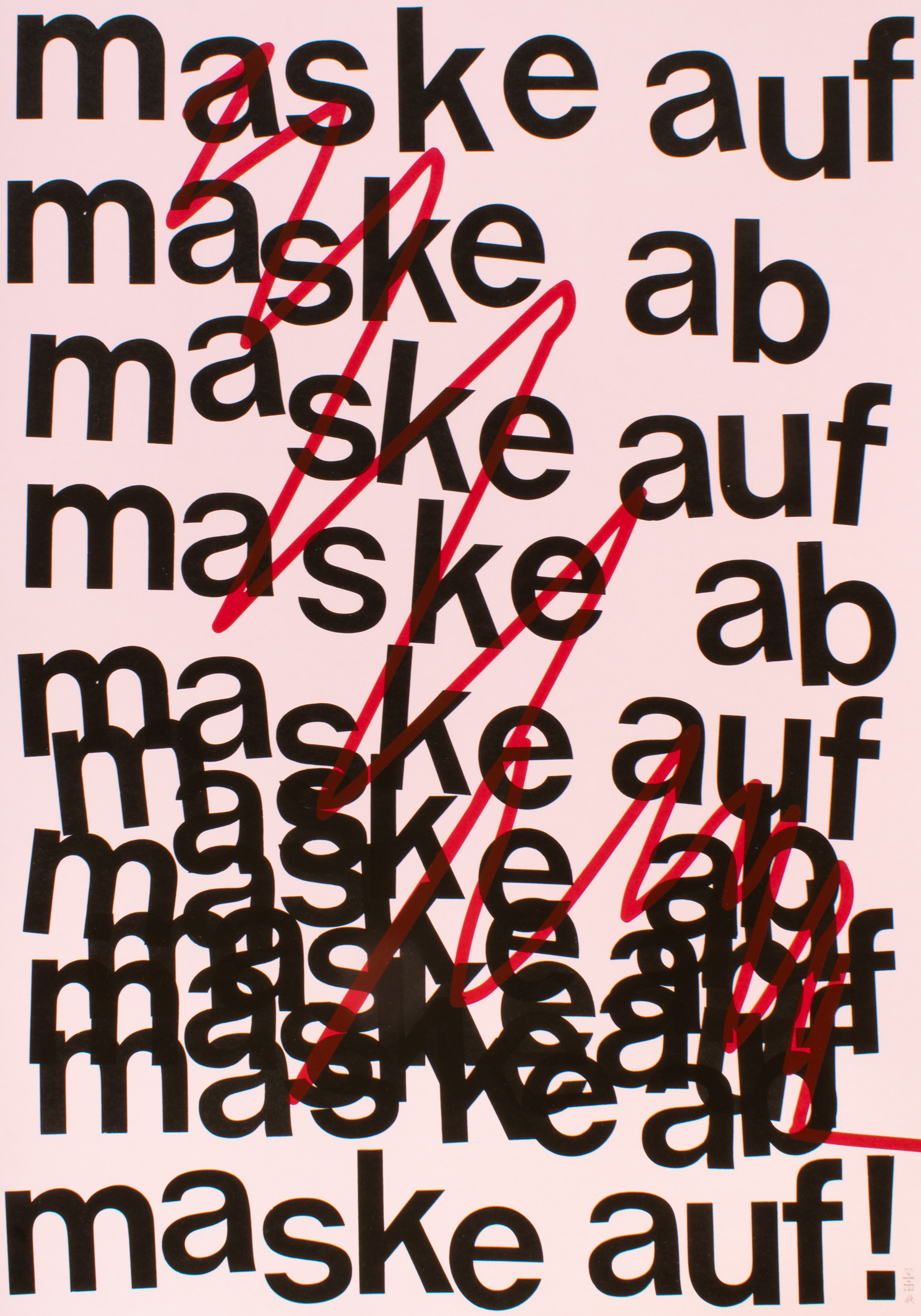
Maske auf, Maske ab
Poster from the series «The absurdity of the moment». Exhibition at Museum für Gestaltung Zürich, Switzerland from April 22–August 1, 2021.
Full series of all 10 posters available upon request.
Format: 70×100cm
Paper: Sirio Pearl Misty Rose 300g/m2
First edition: 37 posters, signed and numbered
April 2021
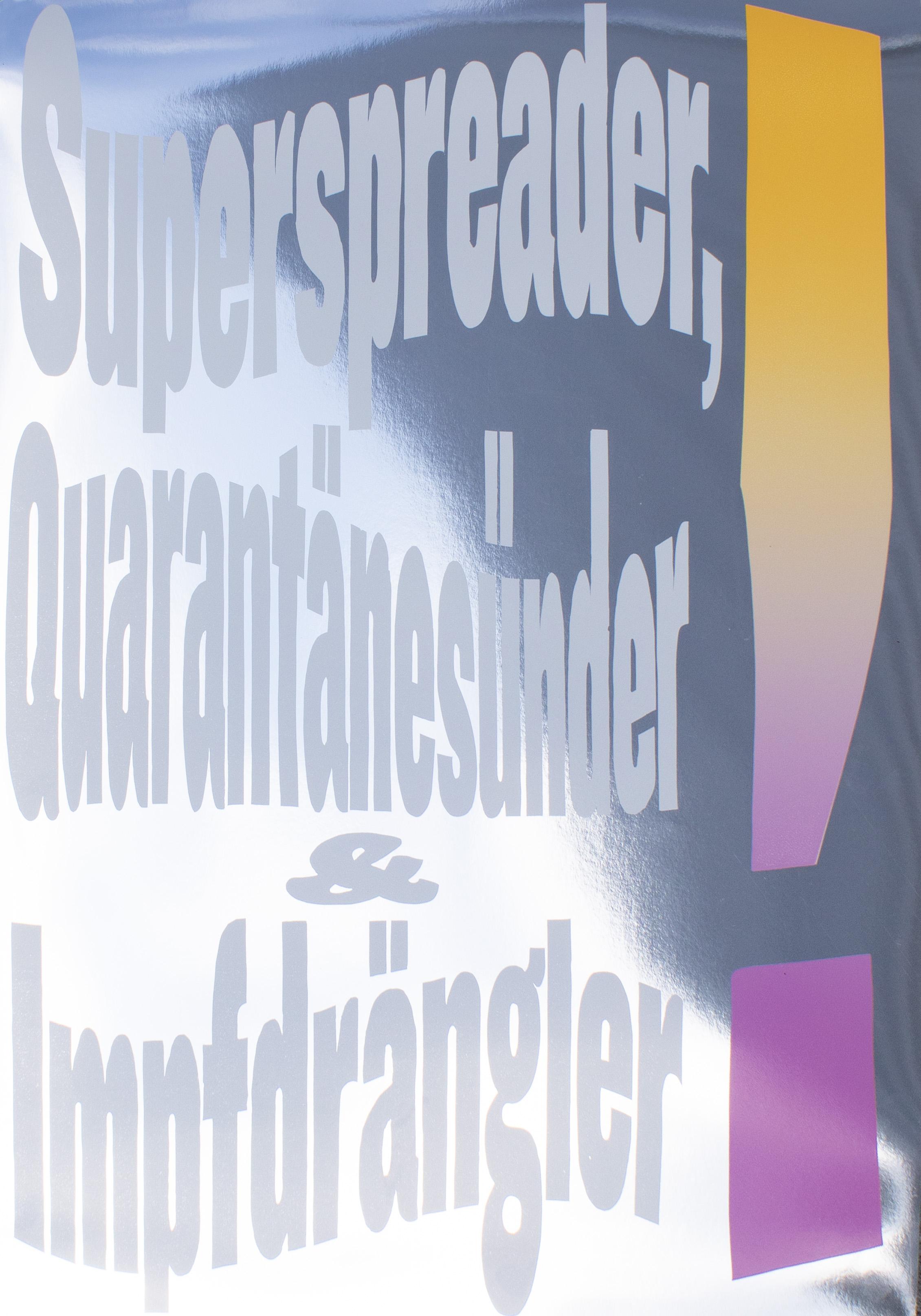
Superspreader, Quarantänesünder & Impfdrängler
[Superspreader, quarantine sinner & vaccine-line-cutter]
Poster from the series «The absurdity of the moment». Exhibition at Museum für Gestaltung Zürich, Switzerland from April 22–August 1, 2021.
Full series of all 10 posters available upon request.
Format: 70×100cm
Paper: Splendorlux Mirror silber 320g/m2
First edition: 39 posters, signed and numbered
April 2021
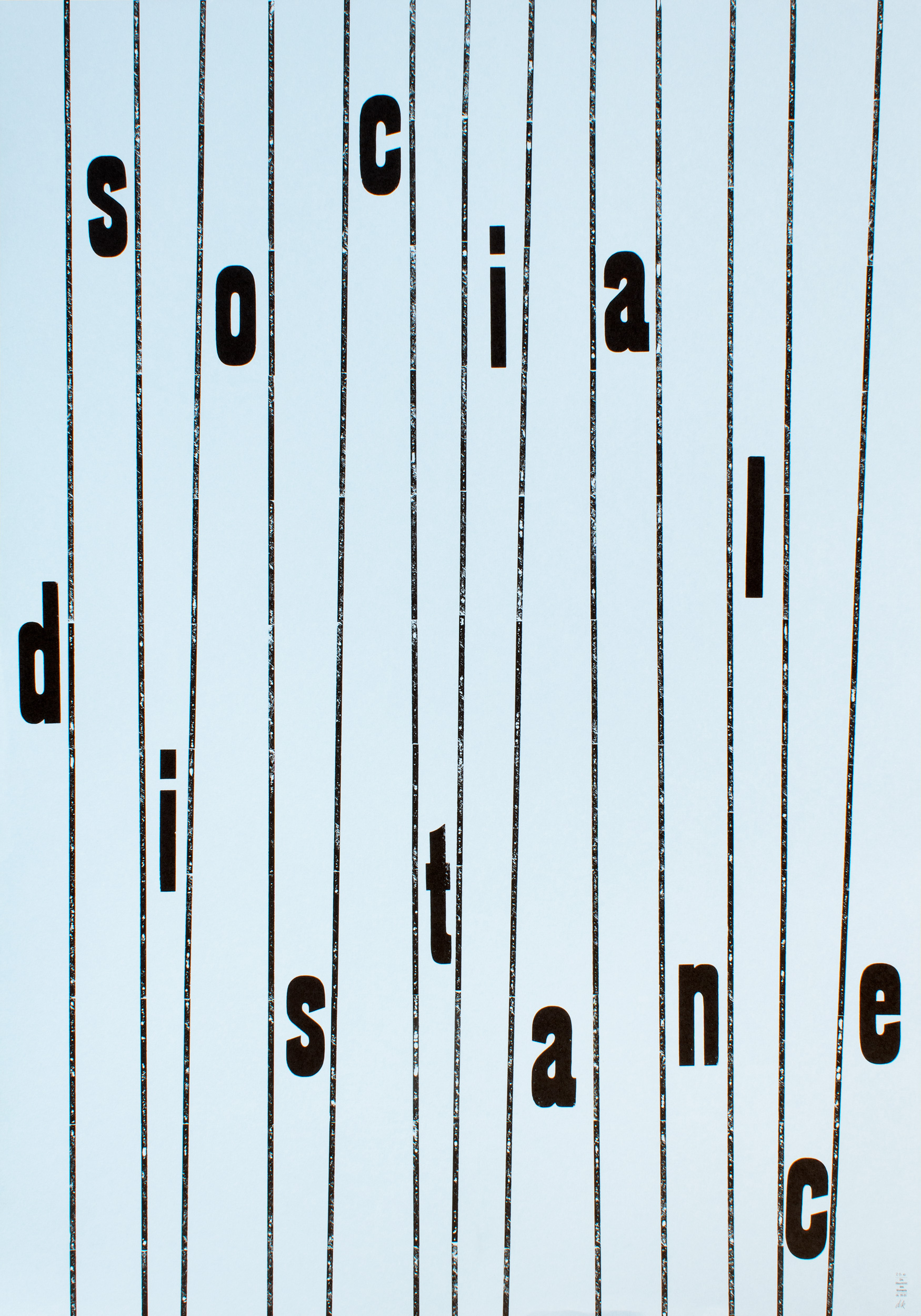
Social Distance
Poster from the series «The absurdity of the moment». Exhibition at Museum für Gestaltung Zürich, Switzerland from April 22–August 1, 2021.
Full series of all 10 posters available upon request.
Format: 70×100cm
Paper: Gmund Color Matt 01, 200g/m2
First edition: 40 posters, signed and numbered
April 2021
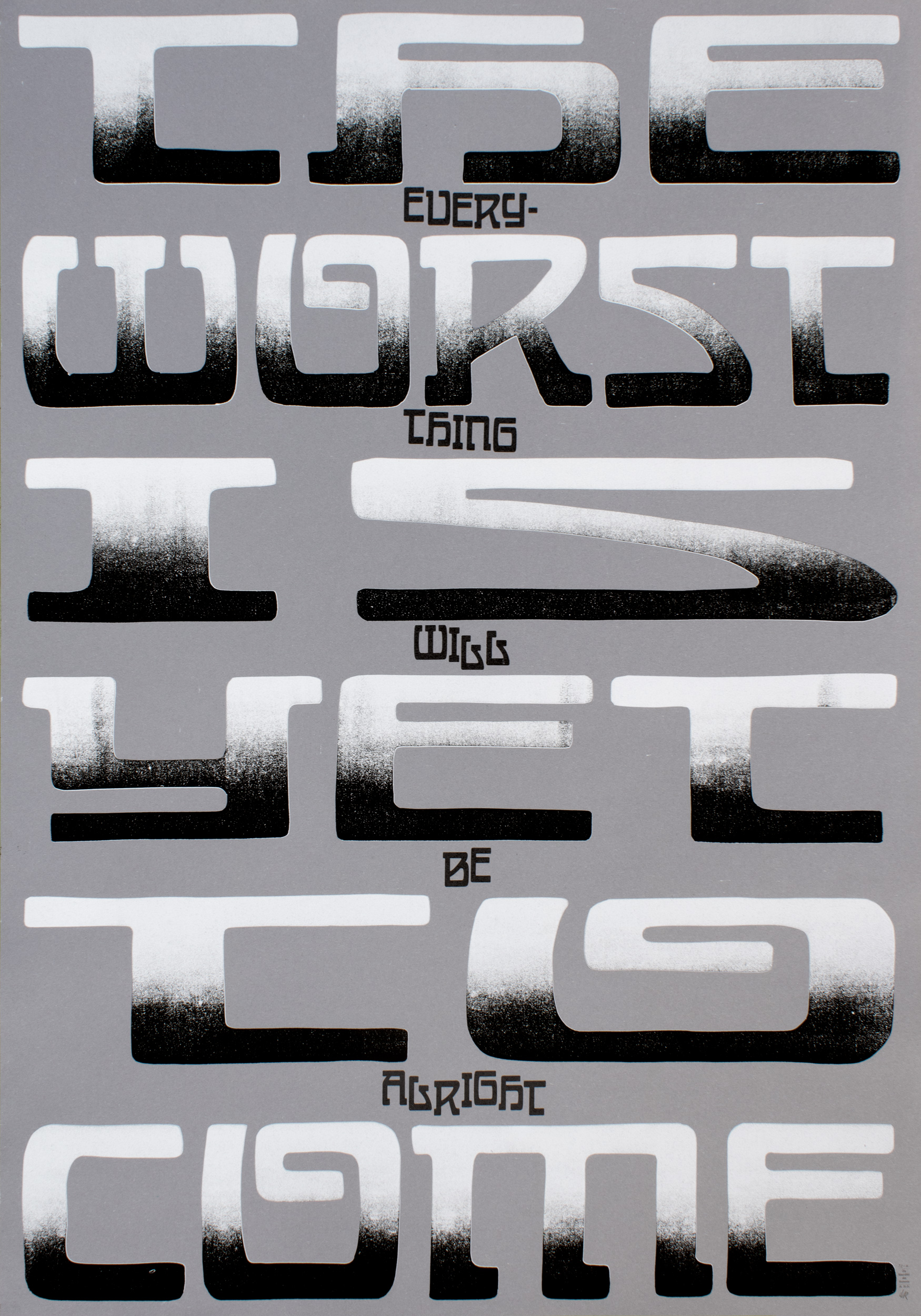
The worst is yet to come
Poster from the series «The absurdity of the moment». Exhibition at Museum für Gestaltung Zürich, Switzerland from April 22–August 1, 2021.
Full series of all 10 posters available upon request.
Format: 70×100cm
Paper: Forever Color steingrau 210g/m2
First edition: 33 posters, signed and numbered
April 2021
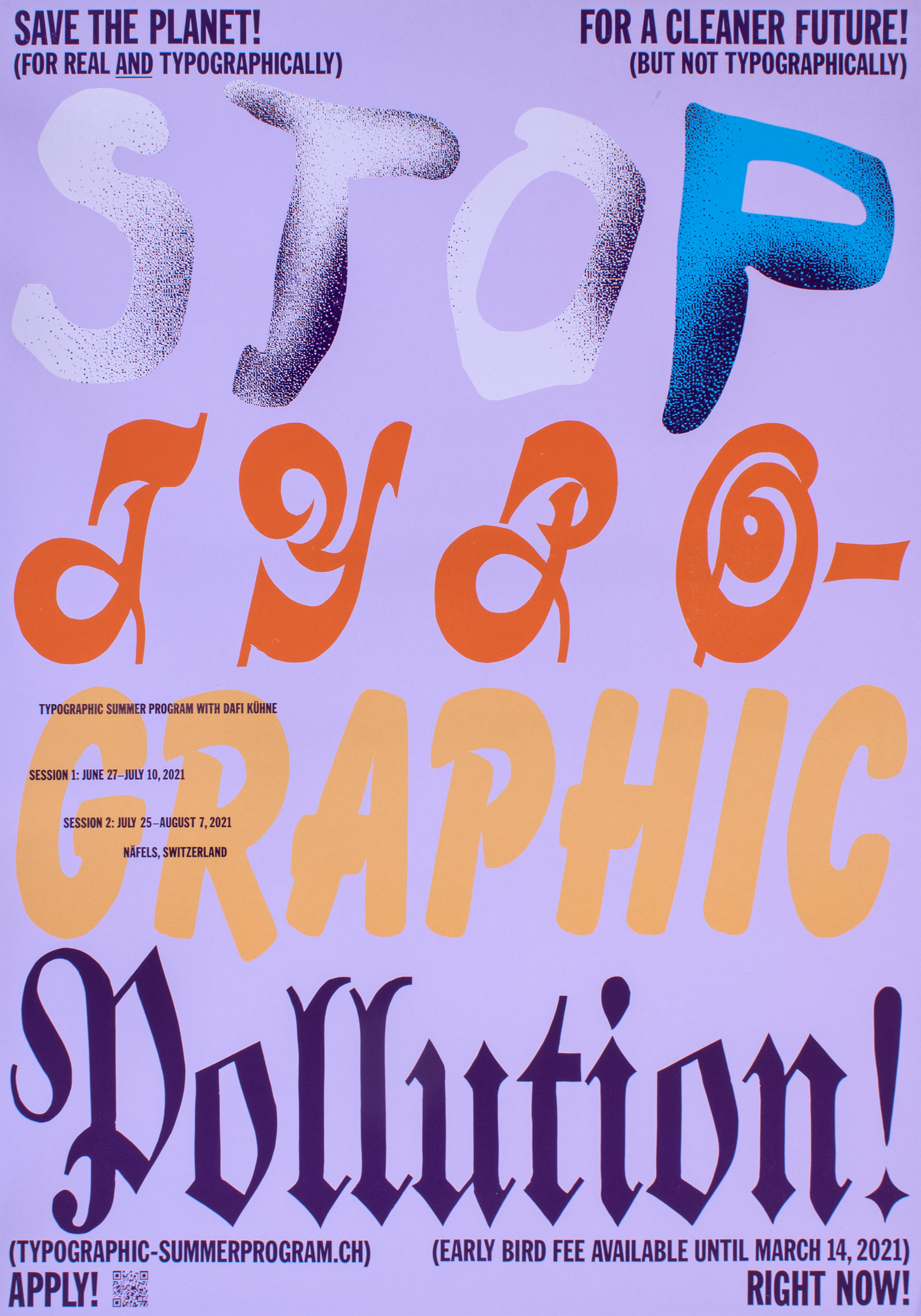
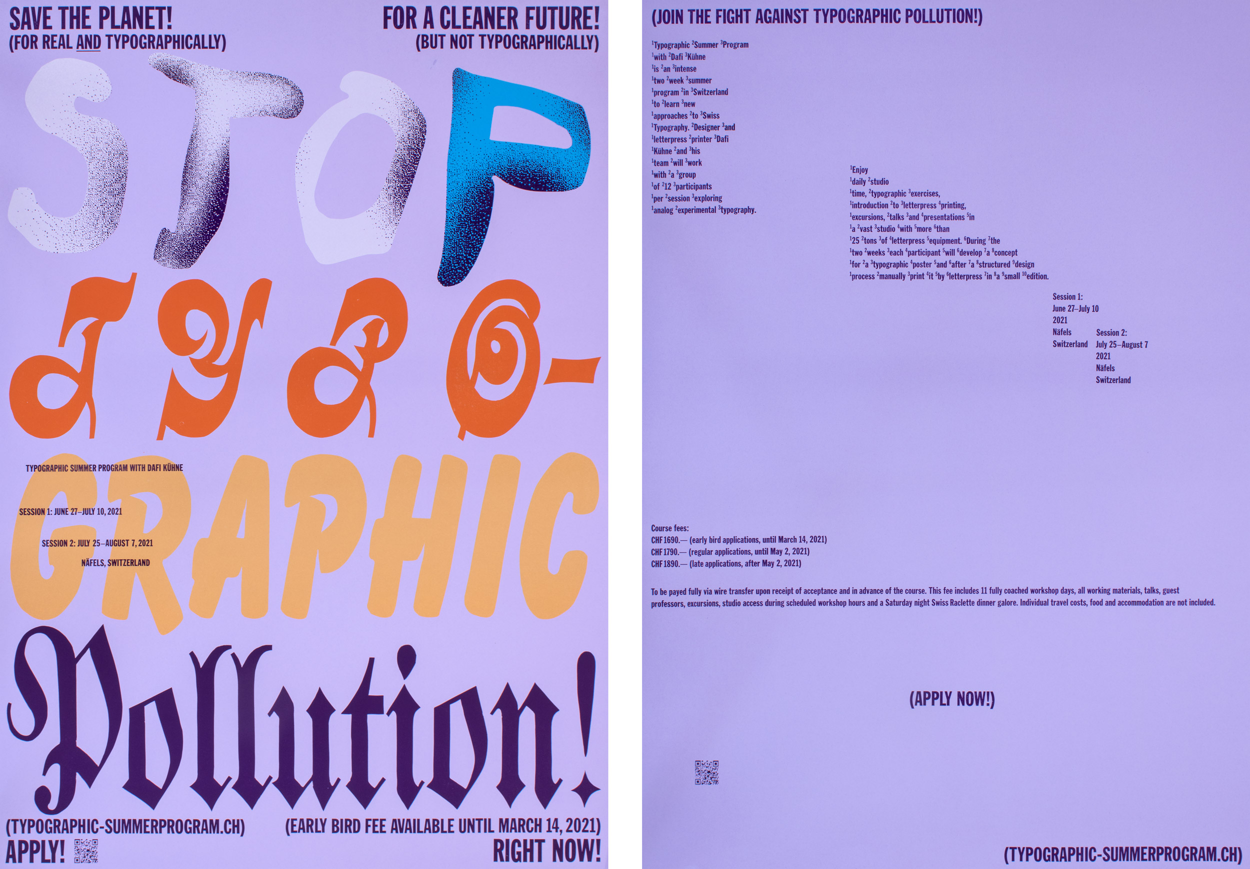
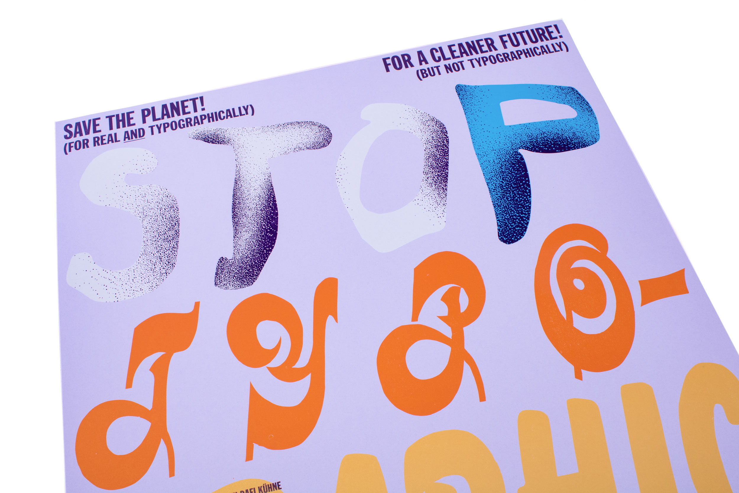
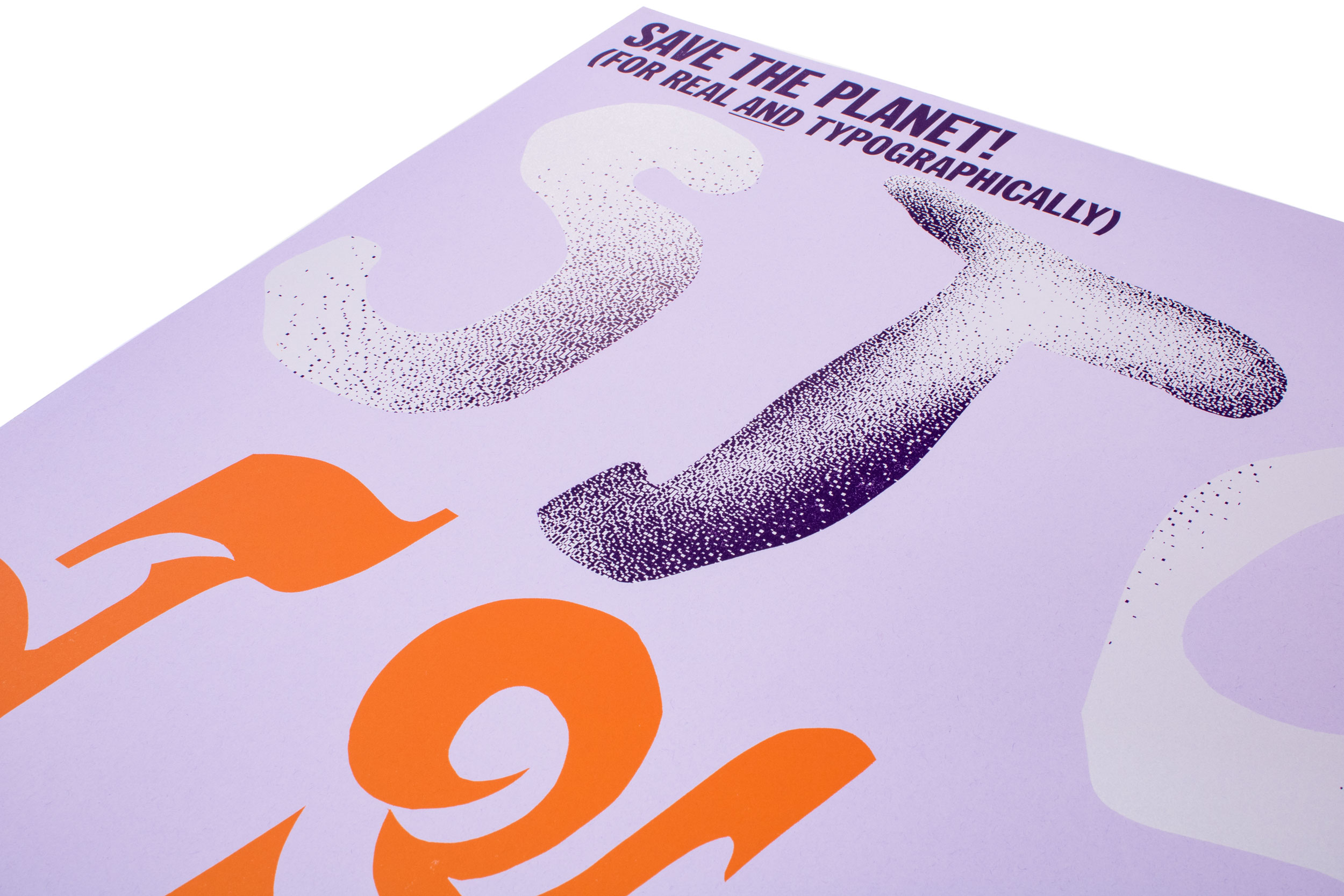
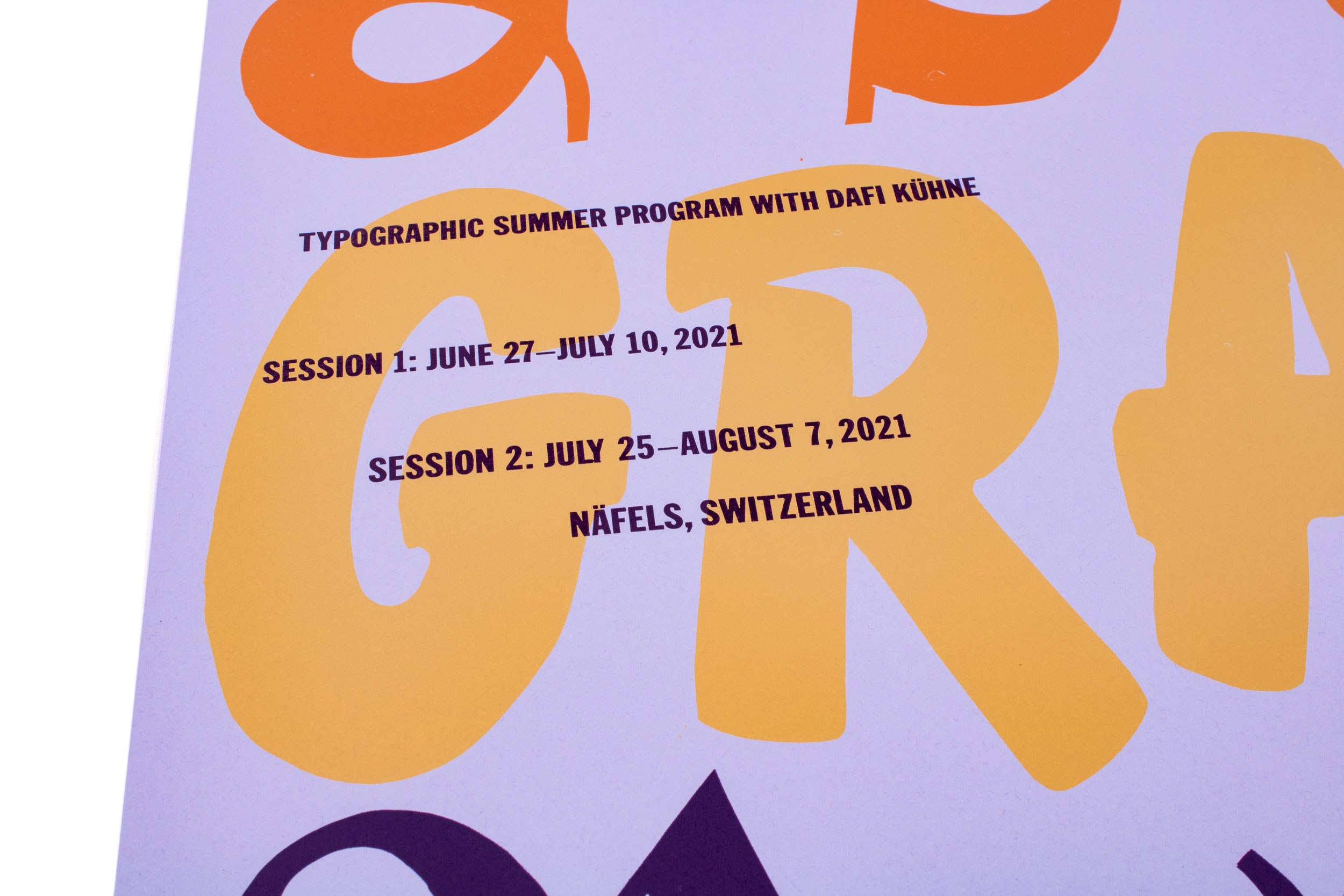
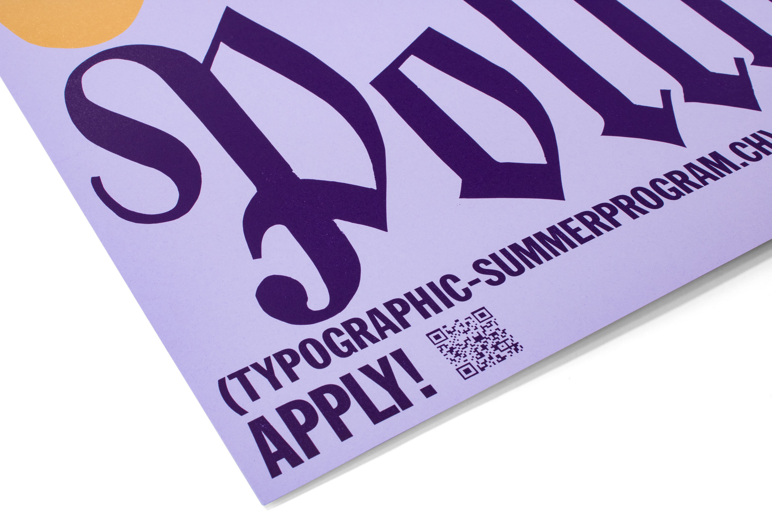
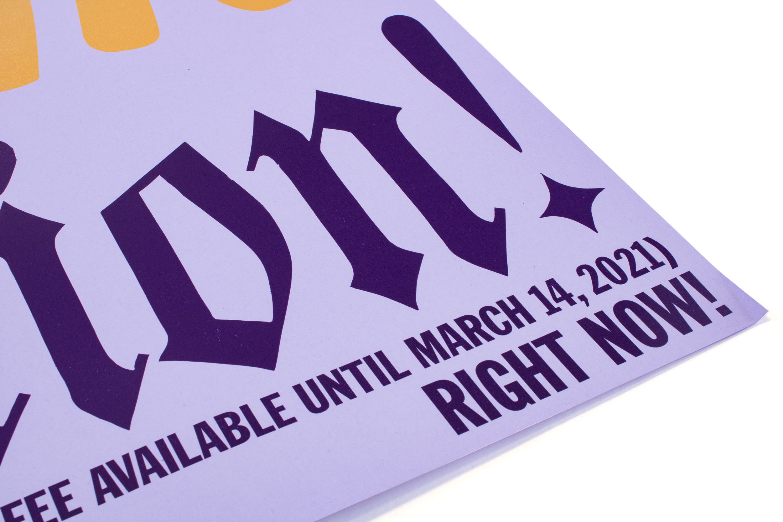
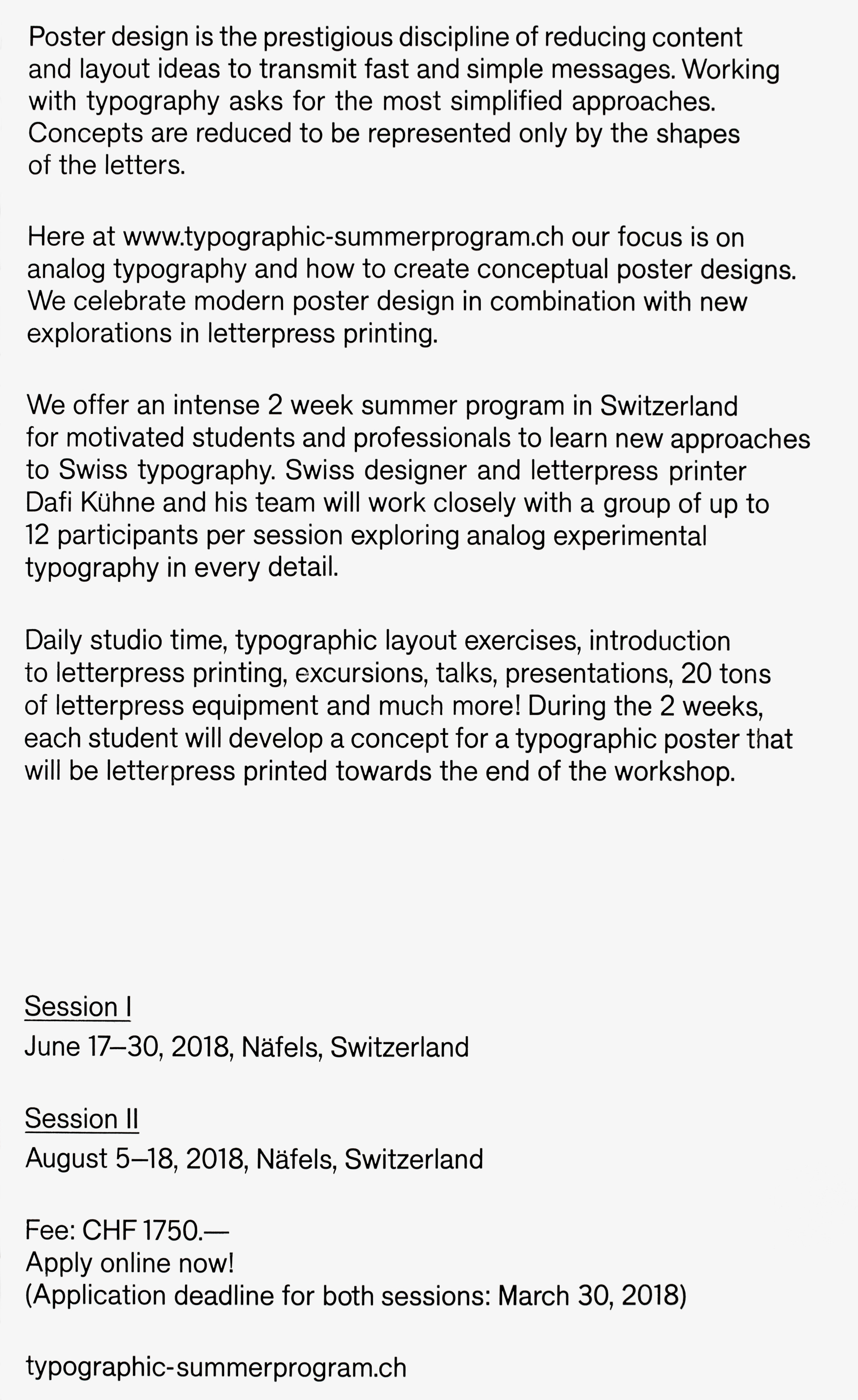
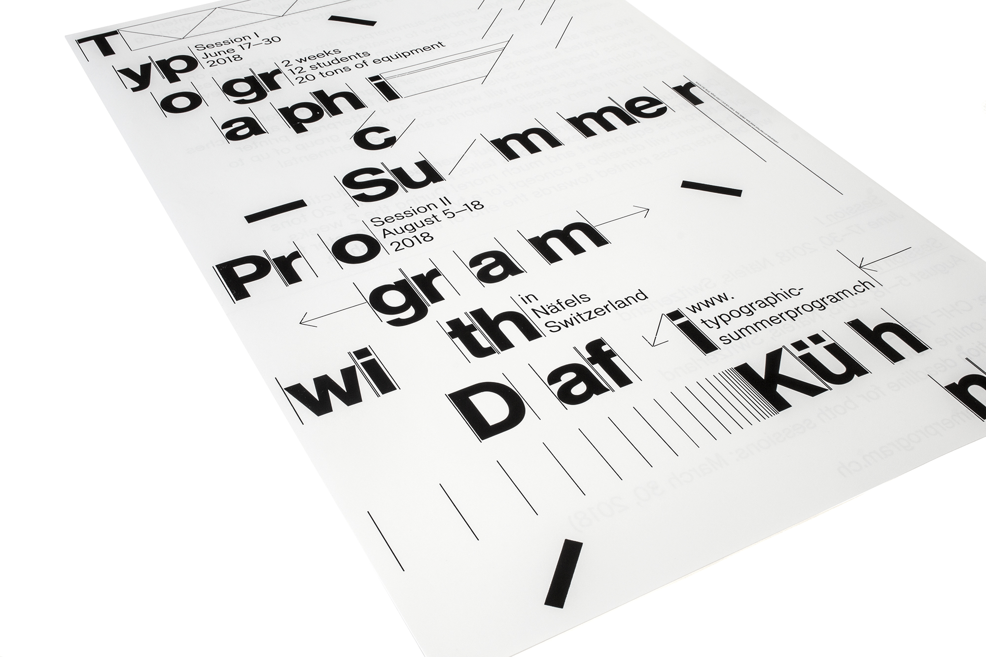
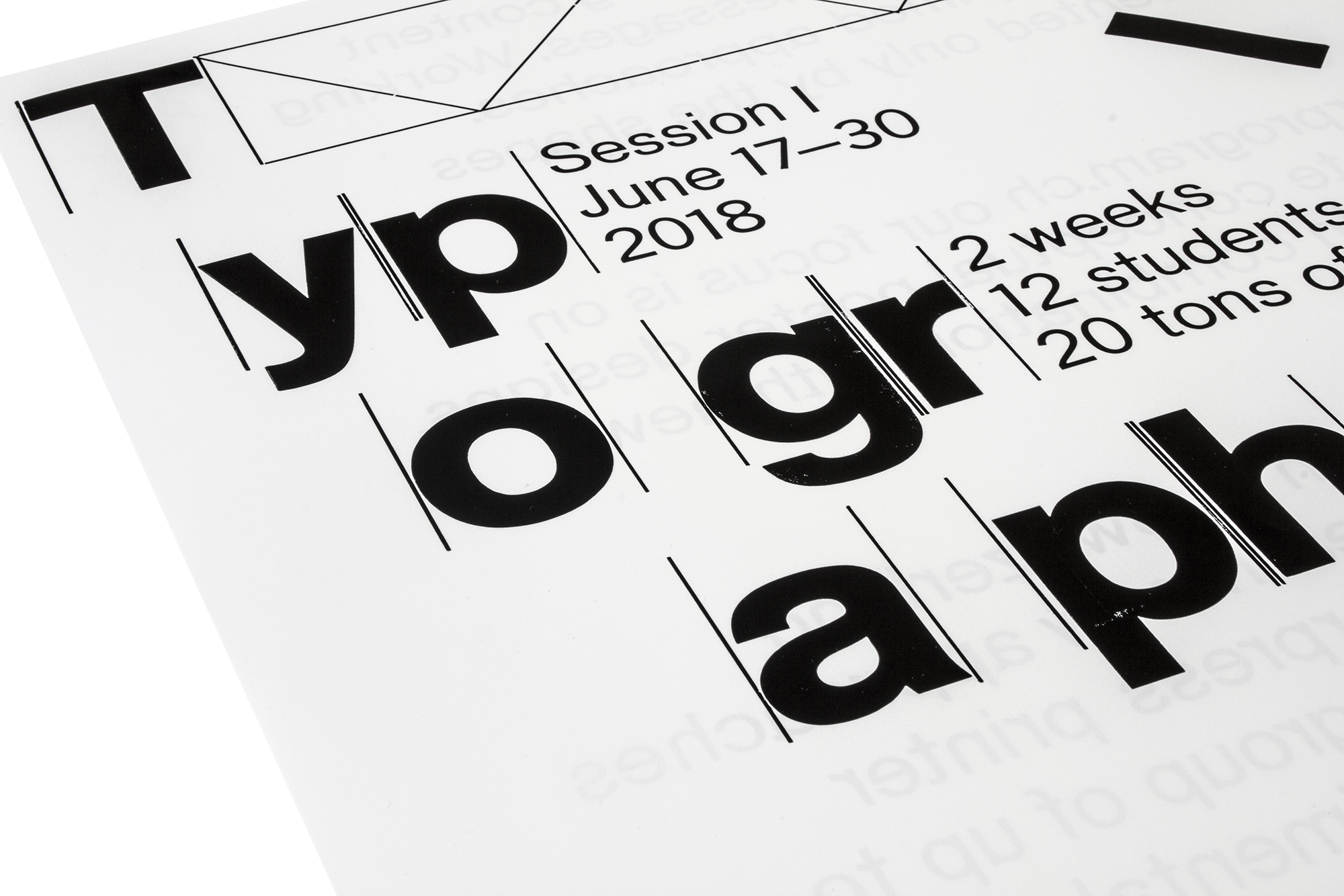
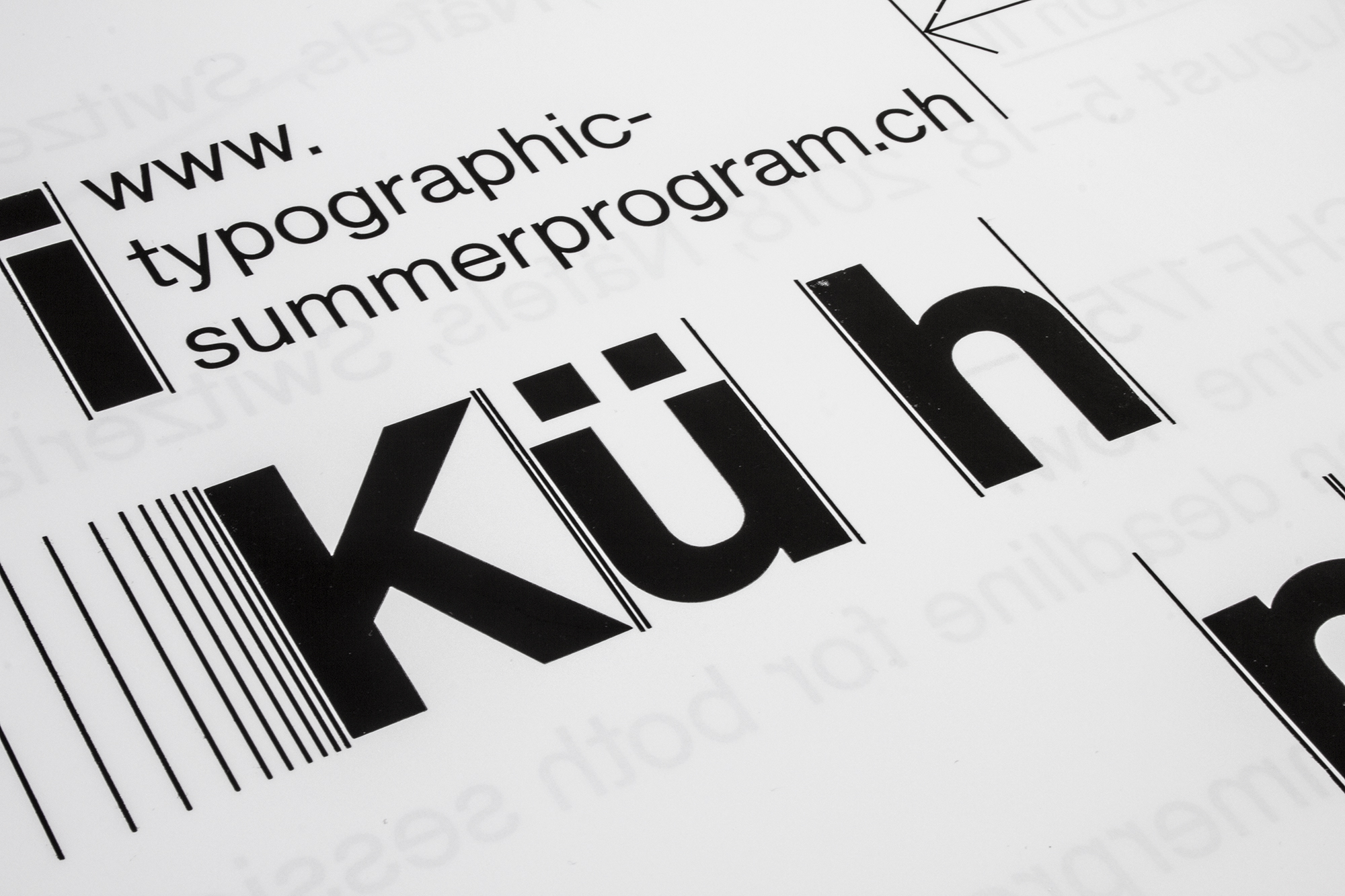
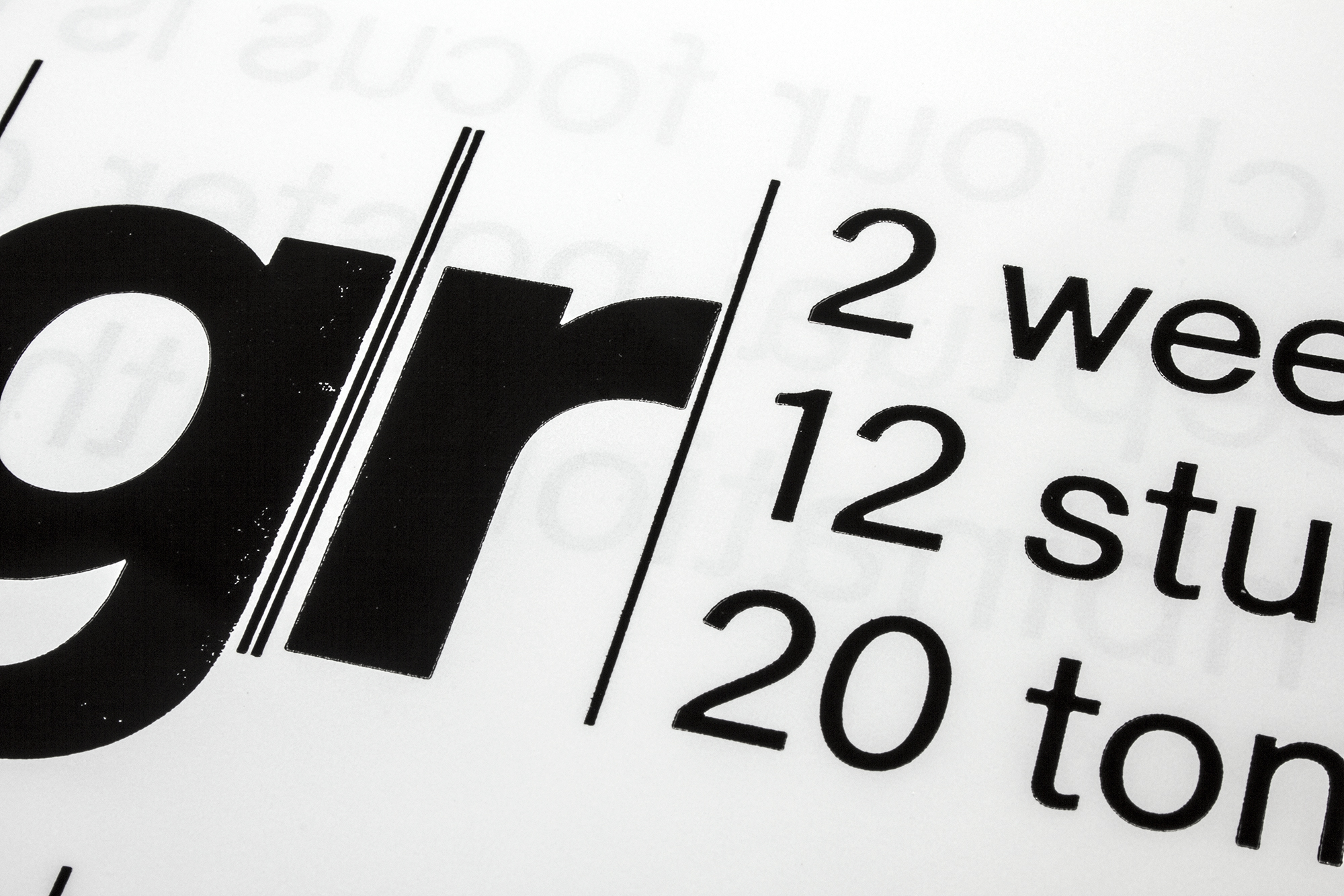
Stop Typographic Pollution
Double-sided promotional poster for www.typographic-summerprogram.ch . Printed in 10 print runs from hand-cut and laser-cut linoleum and Ludlow slugs.
Client: Typographic Summer Program, Näfels
Format: 70×100cm
Paper: Coloraction Tundra/Lavendel, 120g/m2
Edition: 300 posters on a Grafix GX4N
January 2021
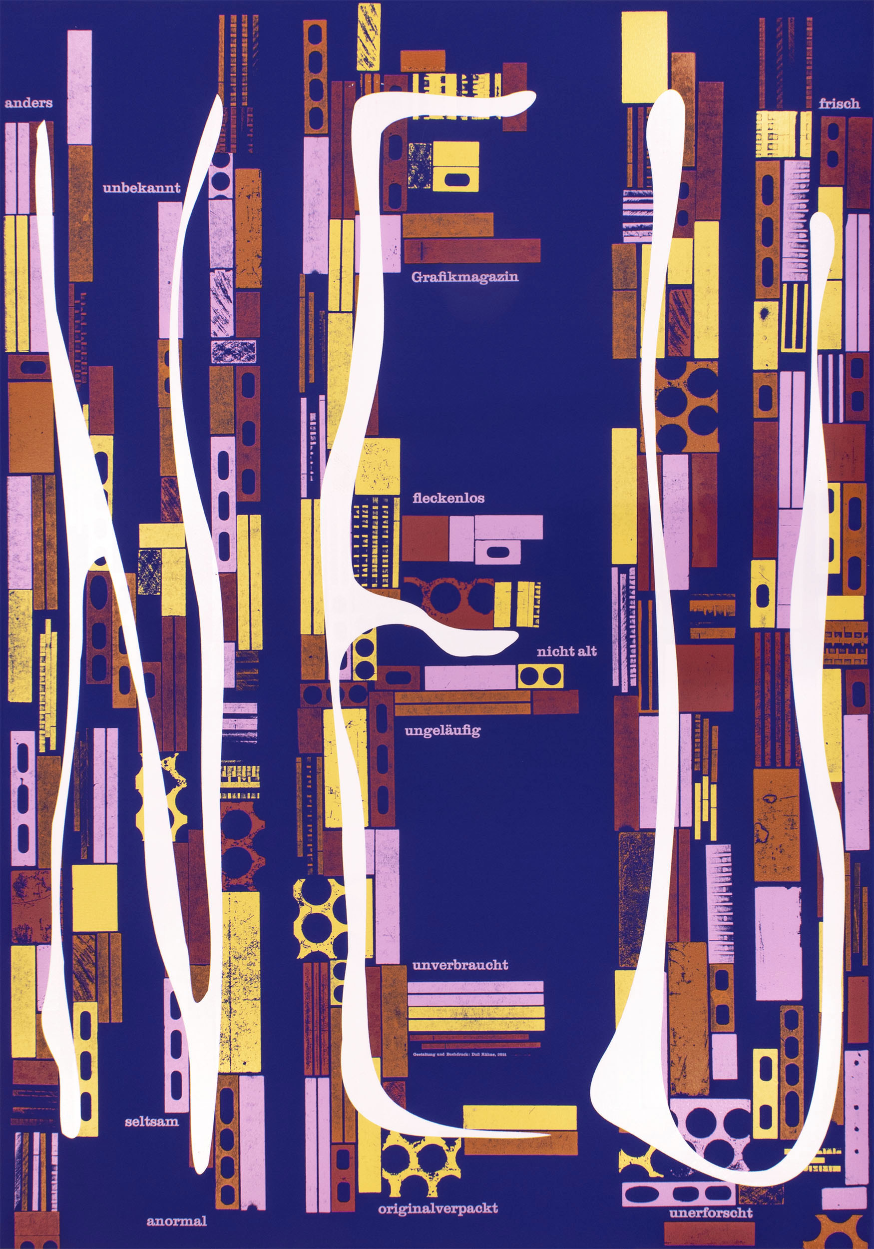
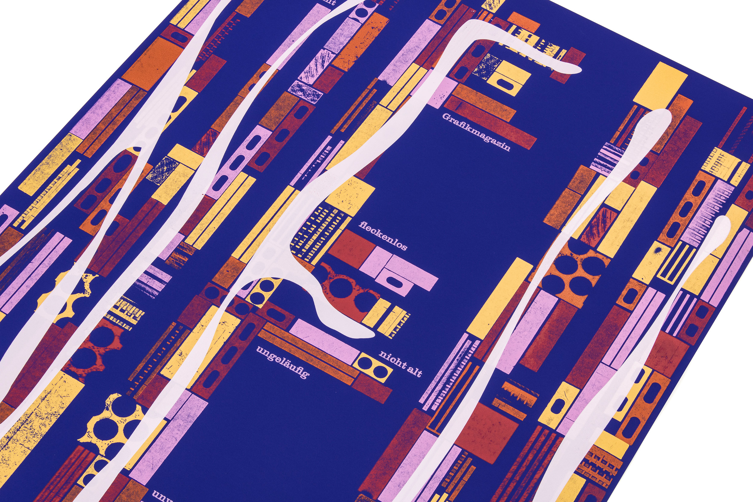
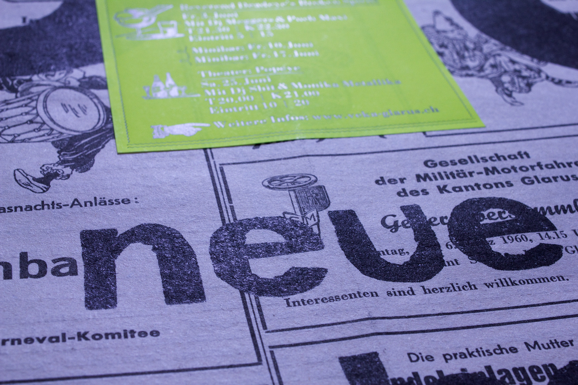
NEU
Poster for Grafikmagazin—that has also been used on the very first issue of Grafikmagazin No. 01. Printed in 15 (!) print runs. I know, I know, you only see 5 colors. But hey: it’s all in the opacity!
Client: Grafikmagazin, Munich, D
Format: 70×100cm
Paper: Curious Matter, Adiron Blue, 270g/m2
Edition: 150 posters on a Grafix GX4
January 2021
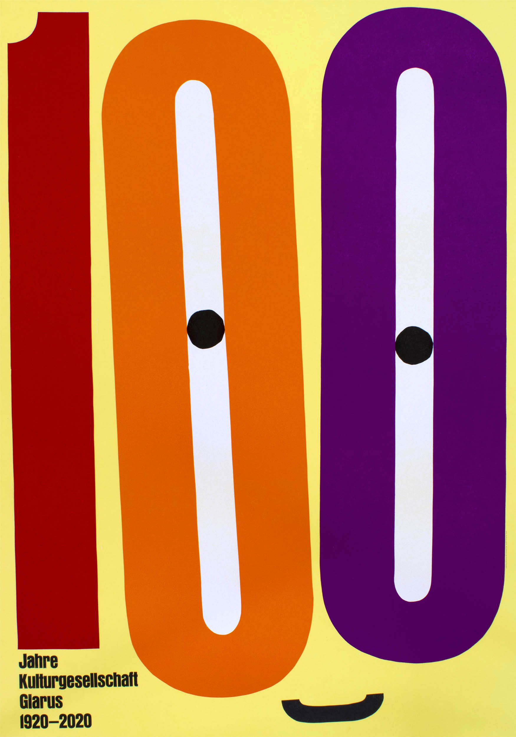
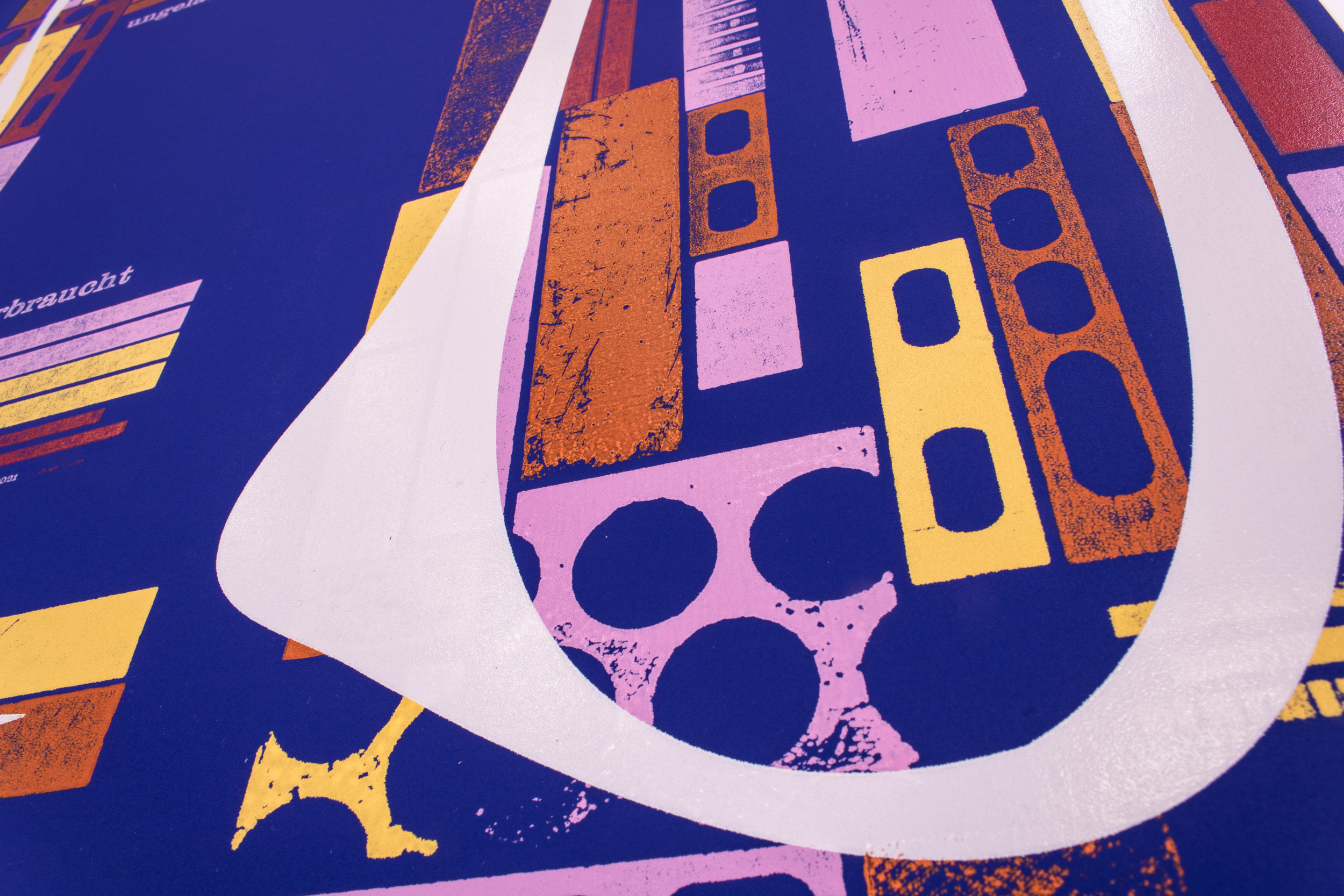
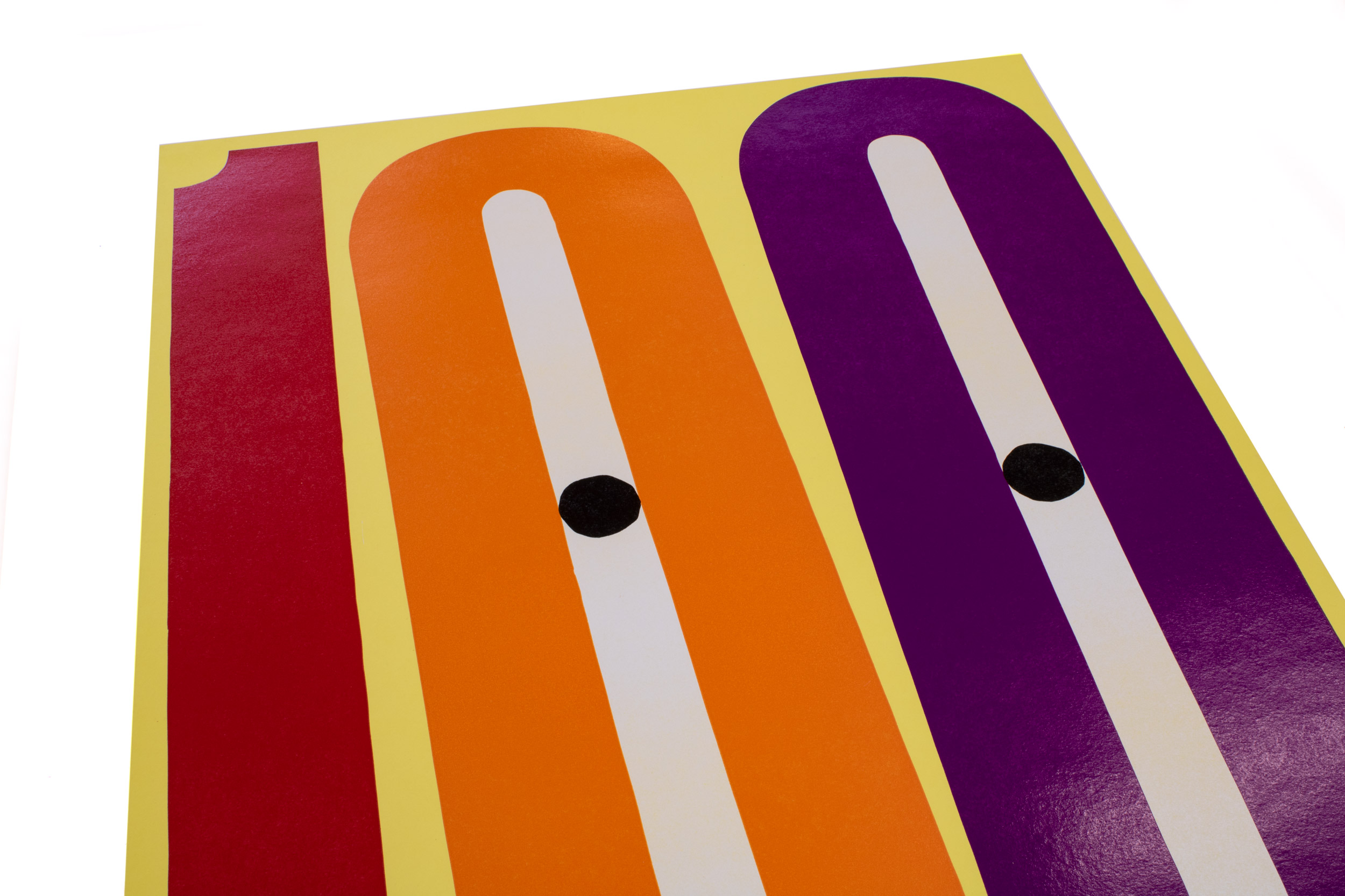
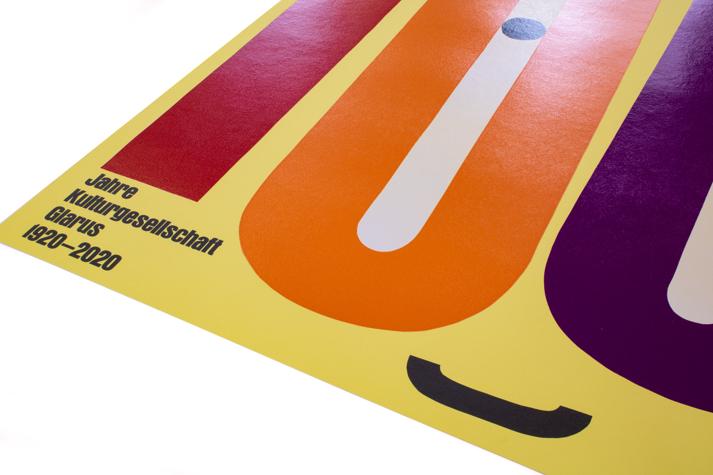
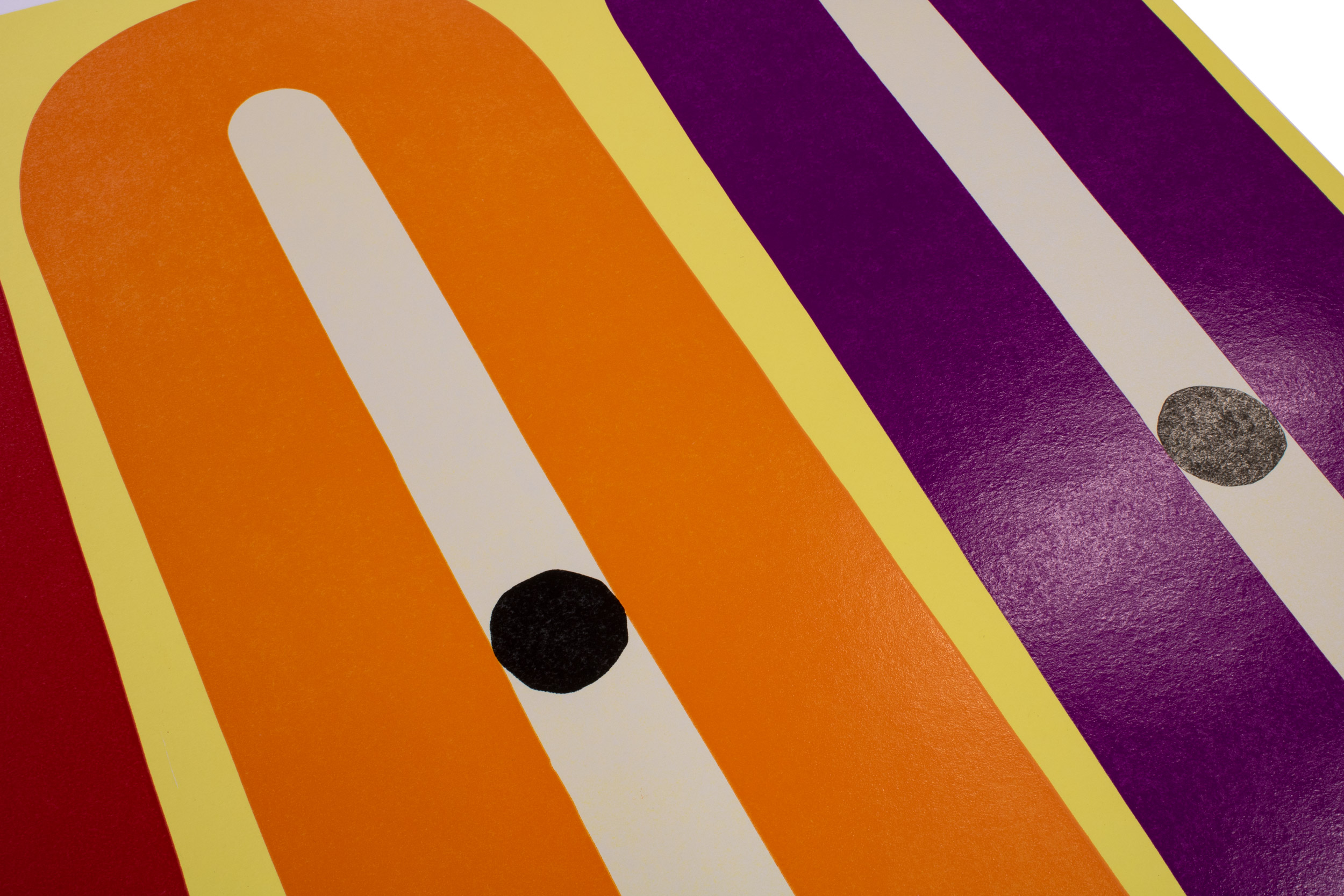
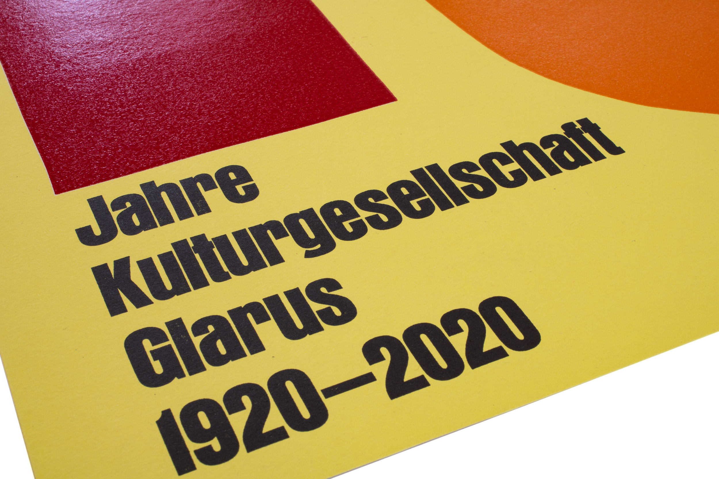
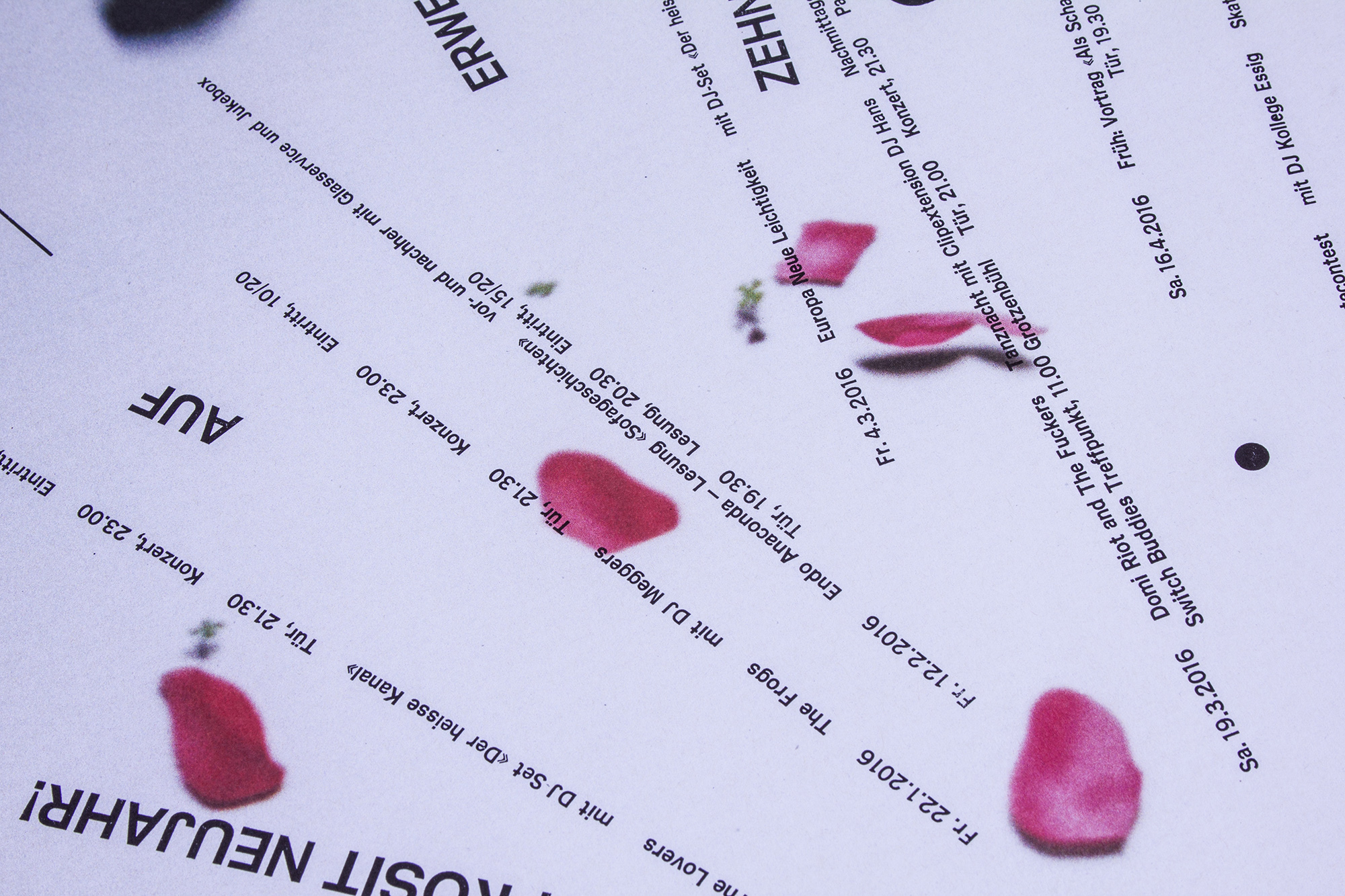
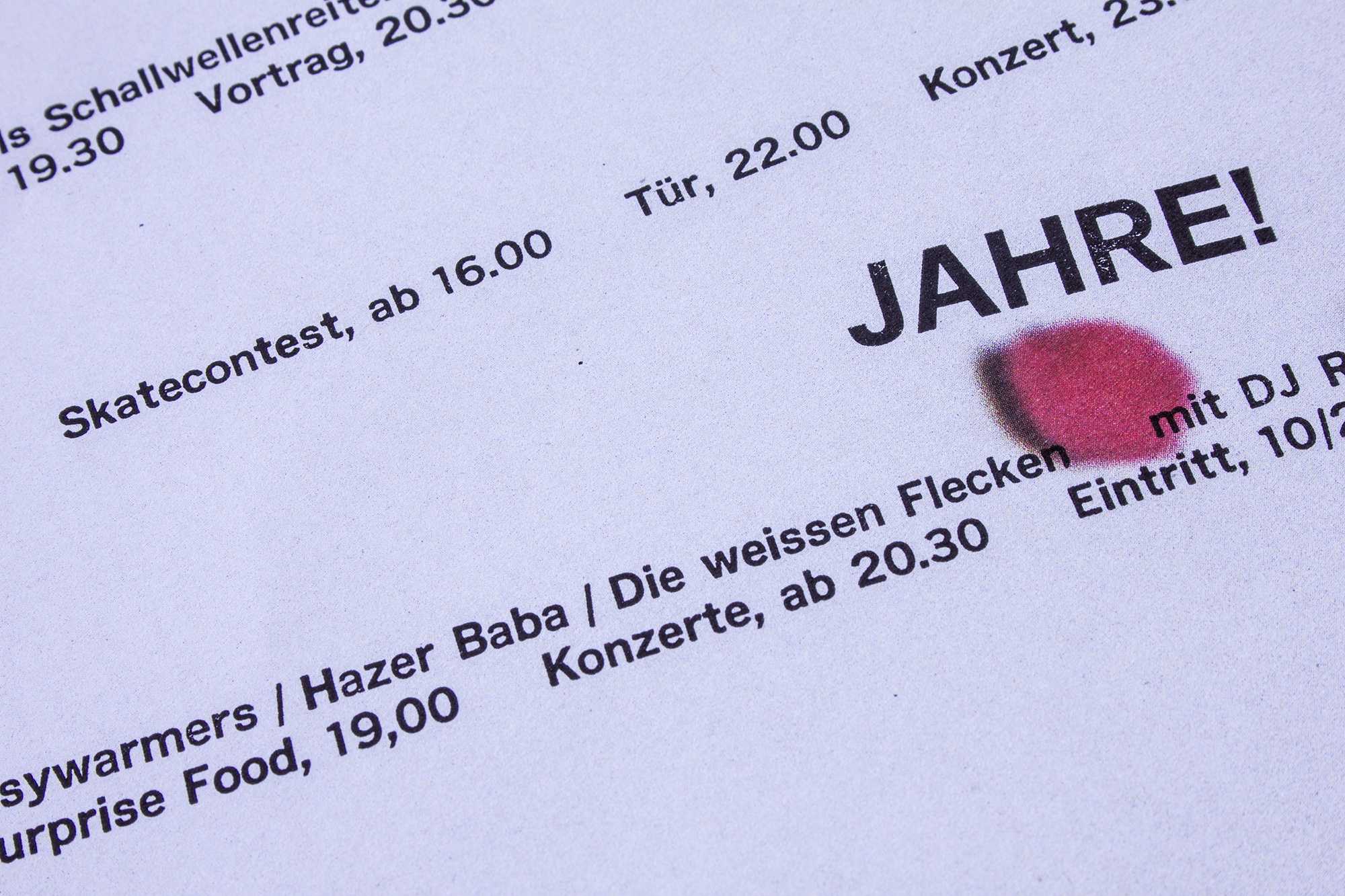
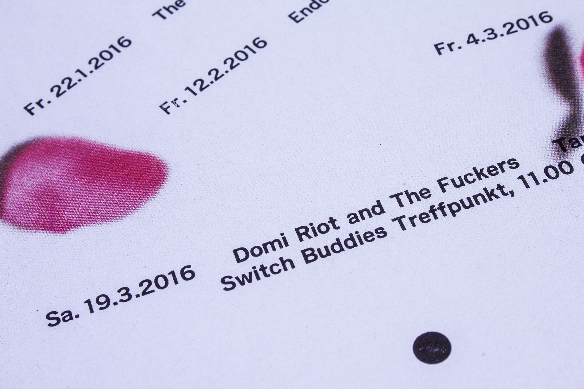
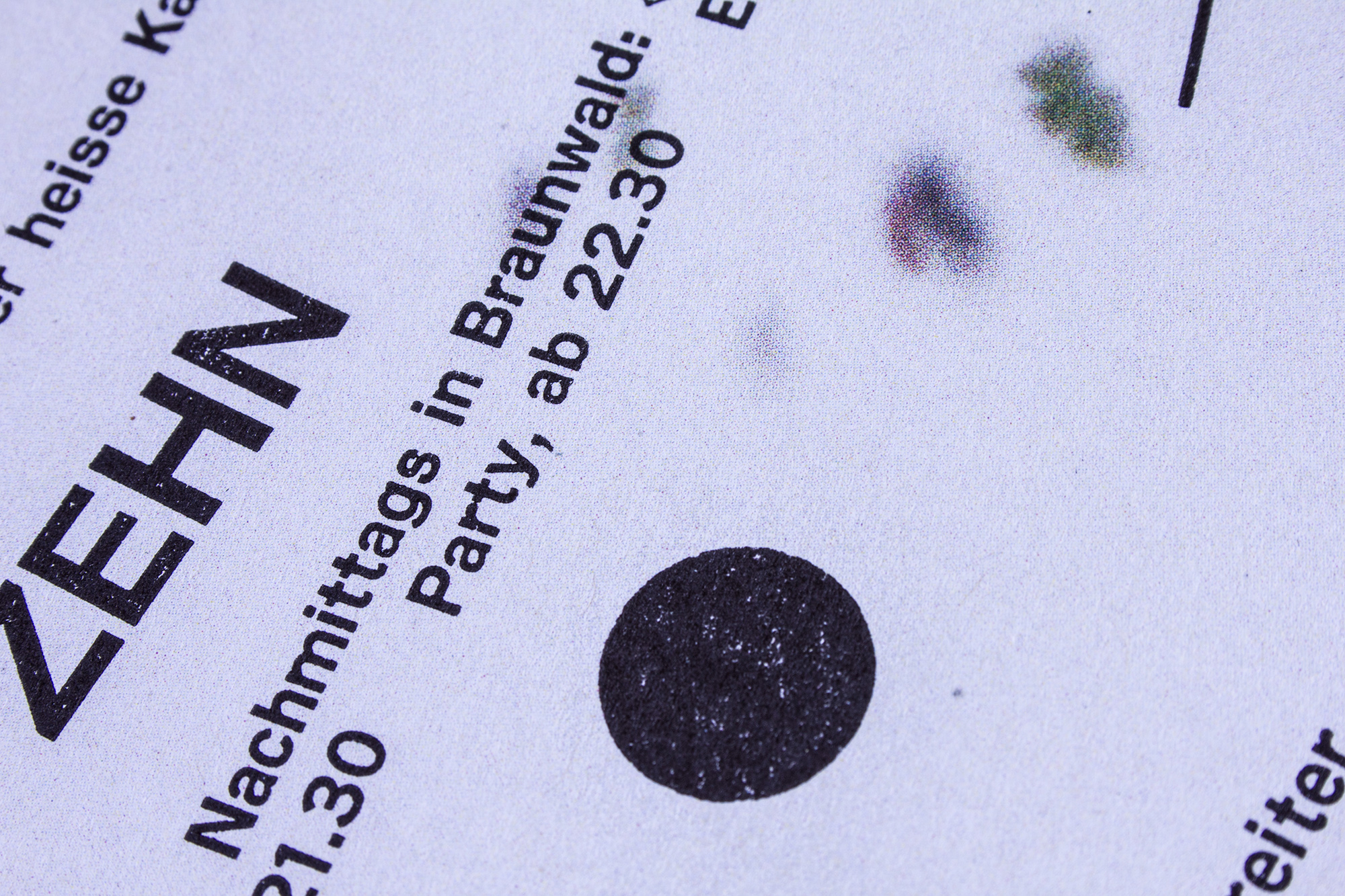
100 Jahre Kulturgesellschaft Glarus
100 year anniversary poster for Kulturgesellschaft Glarus. Printed in 10 print runs from hand-cut linoleum and hand-set metal type. Party-party!
Client: Kulturgesellschaft, Glarus
Format: 70×100cm
Paper: Forever Gelb, 200g/m2
Edition: 450 posters on a Grafix GX4
September 2020
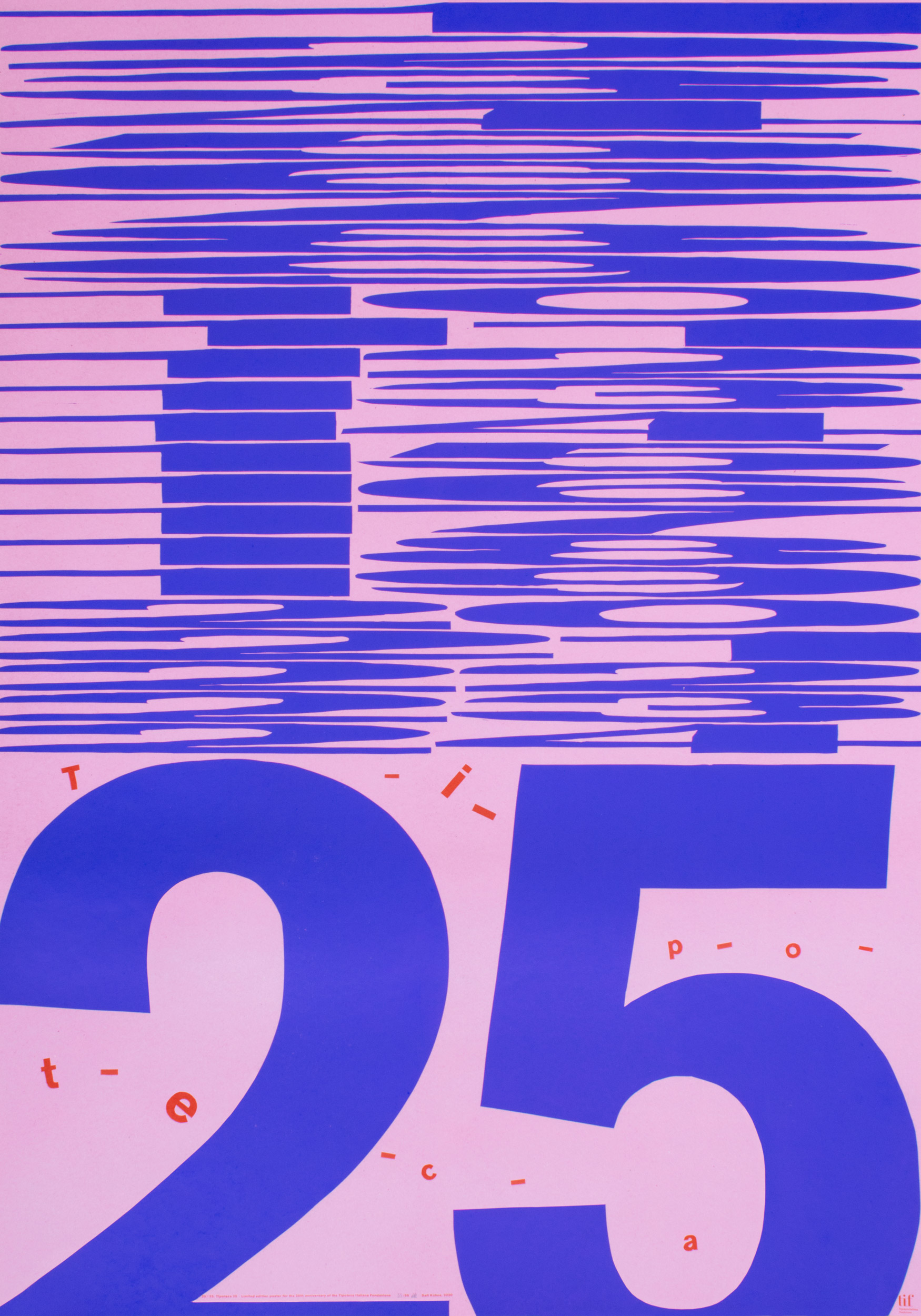
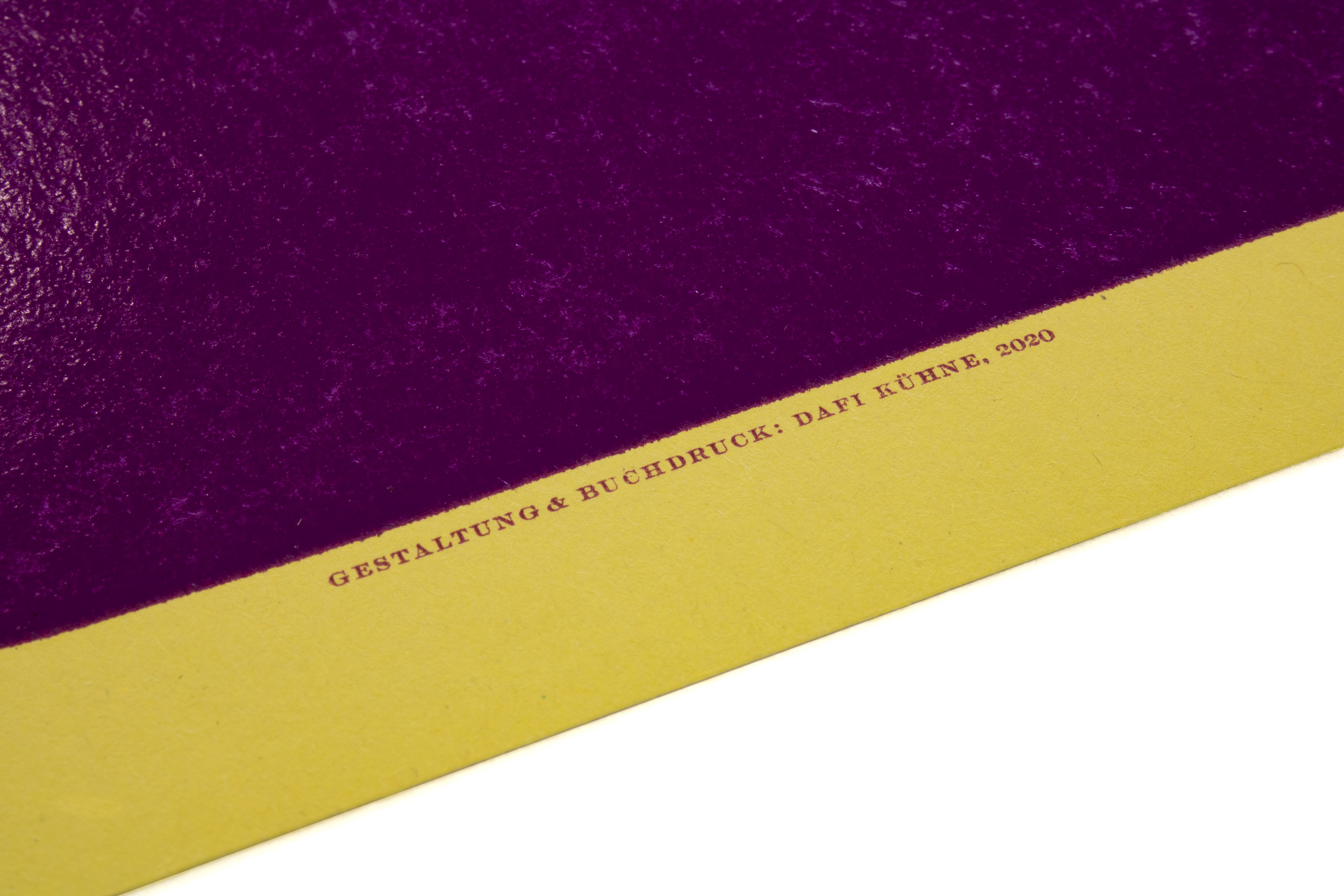
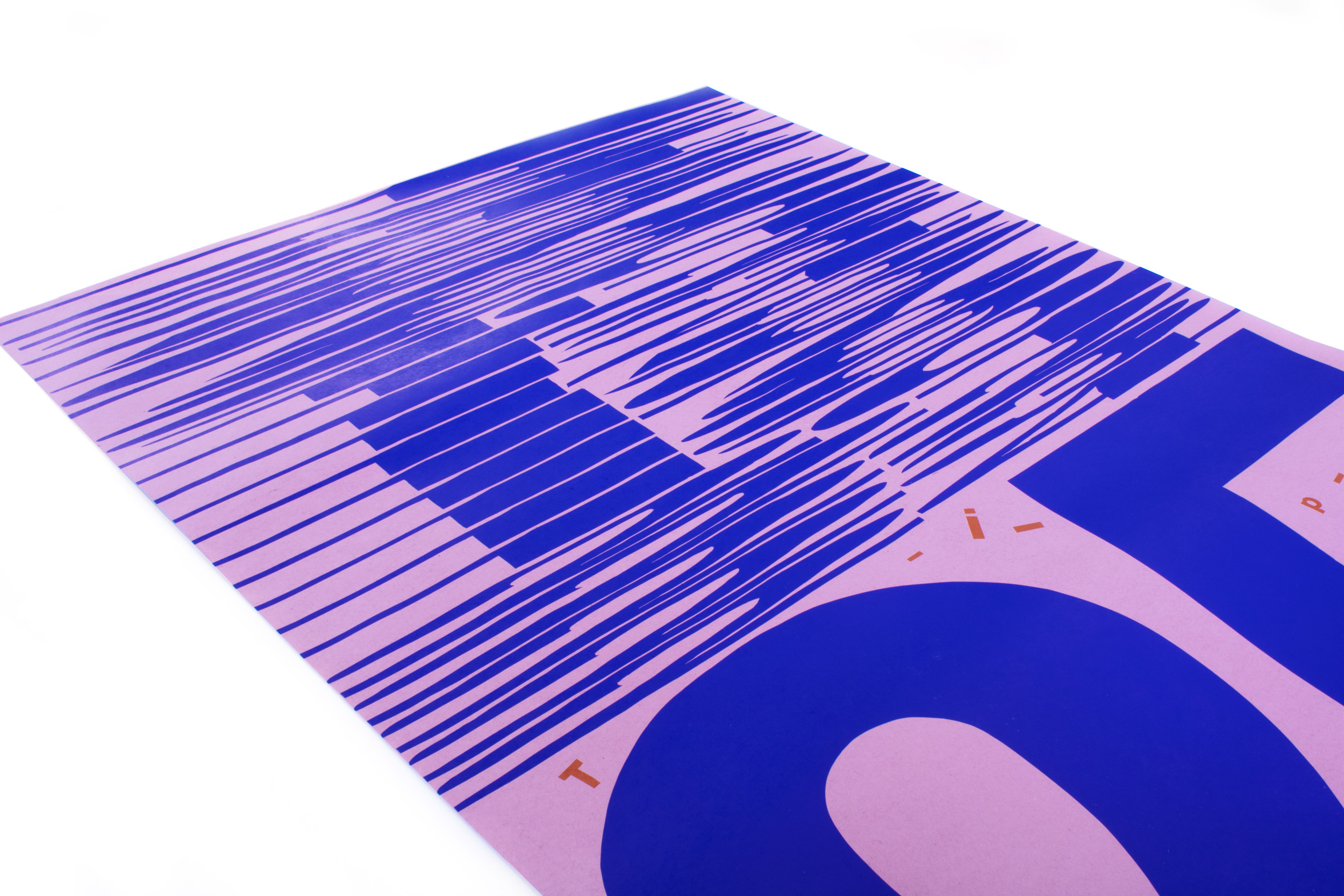
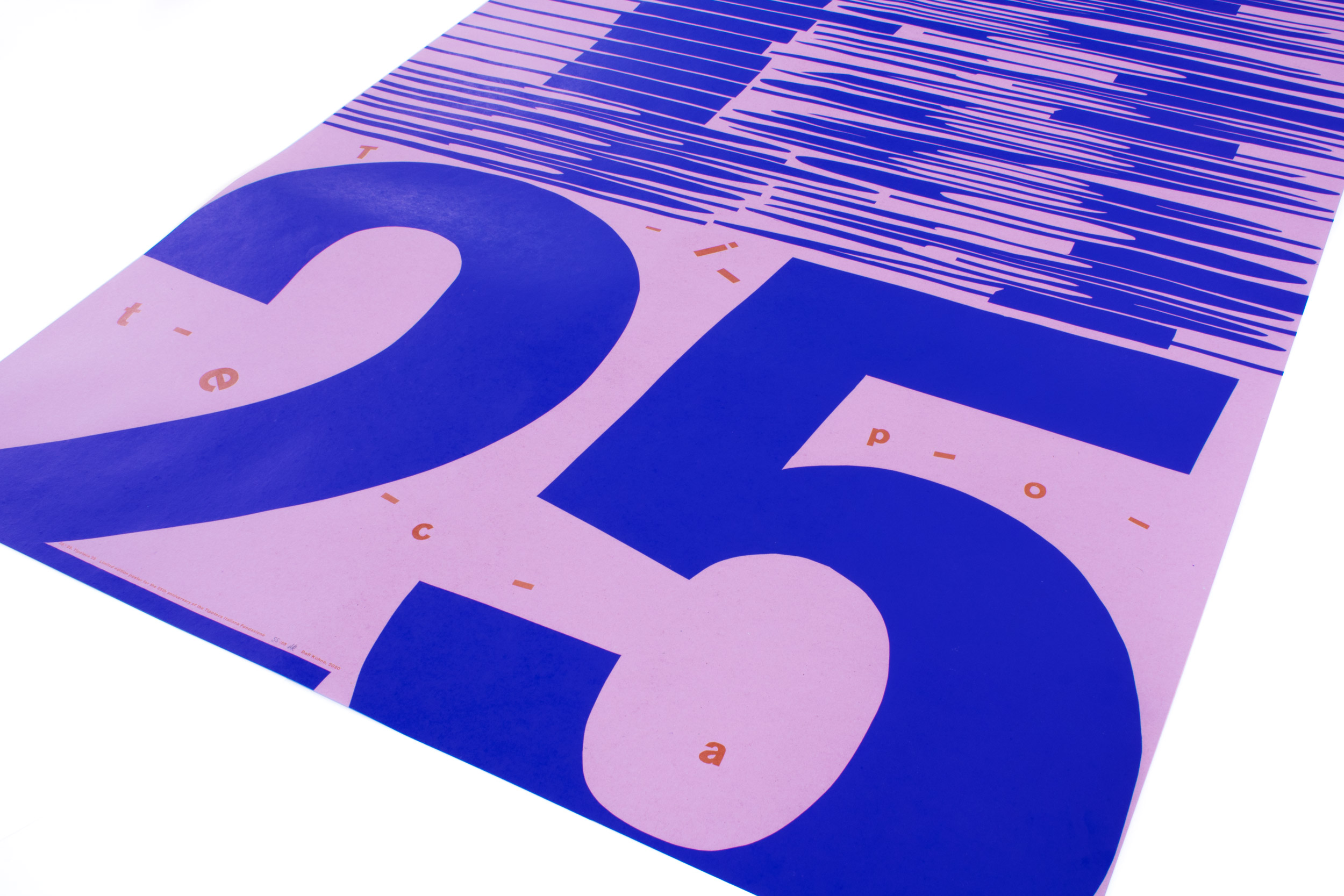
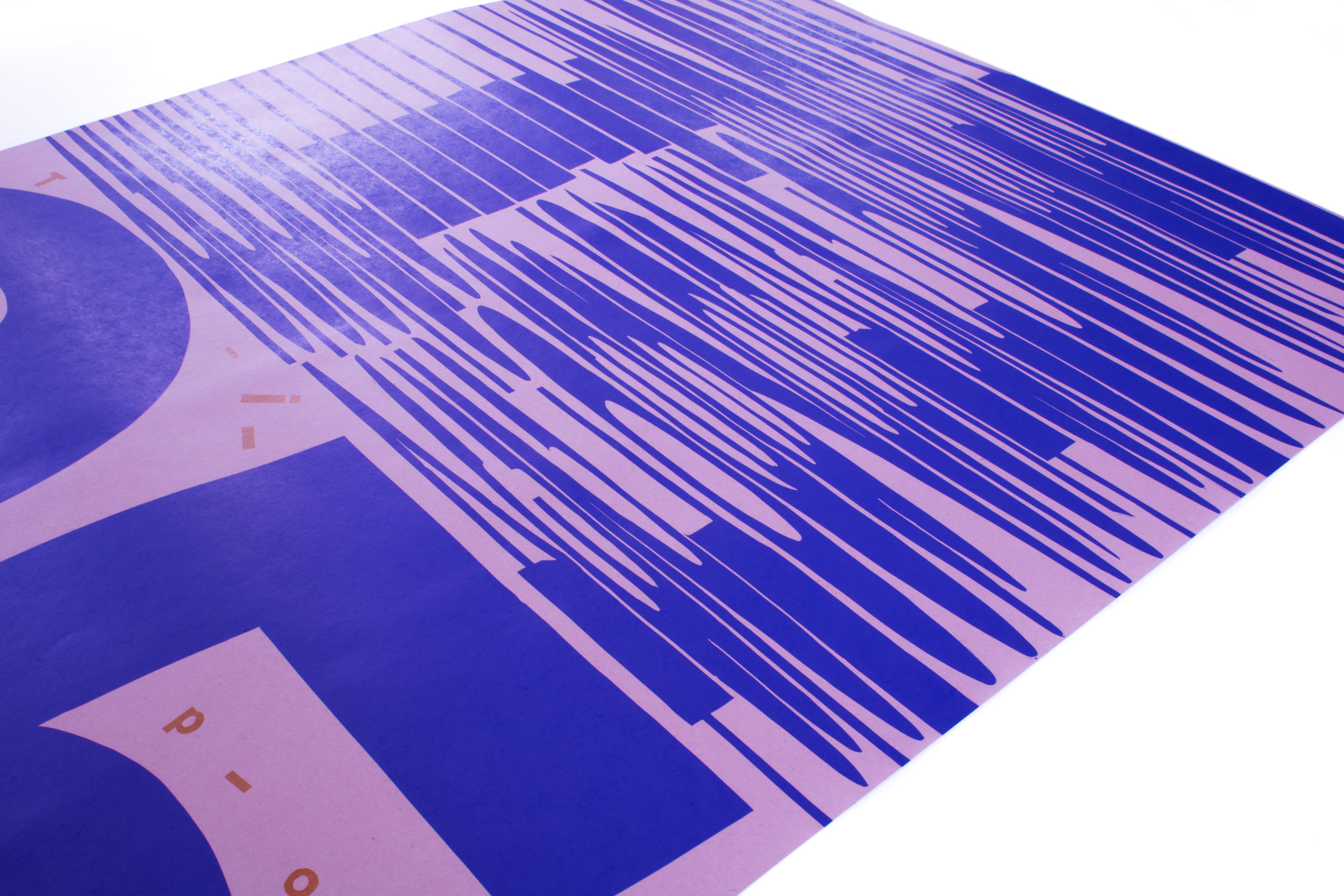
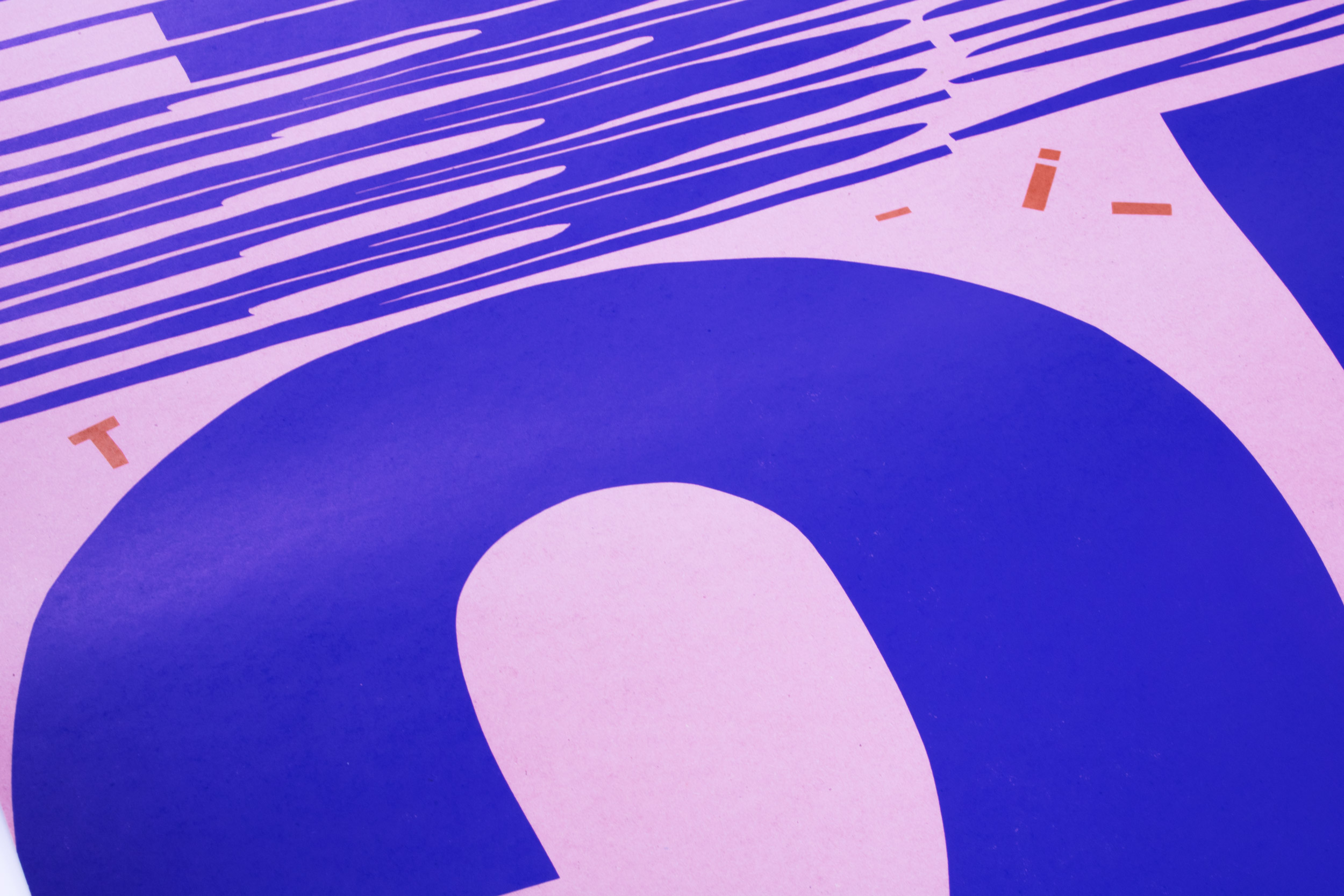
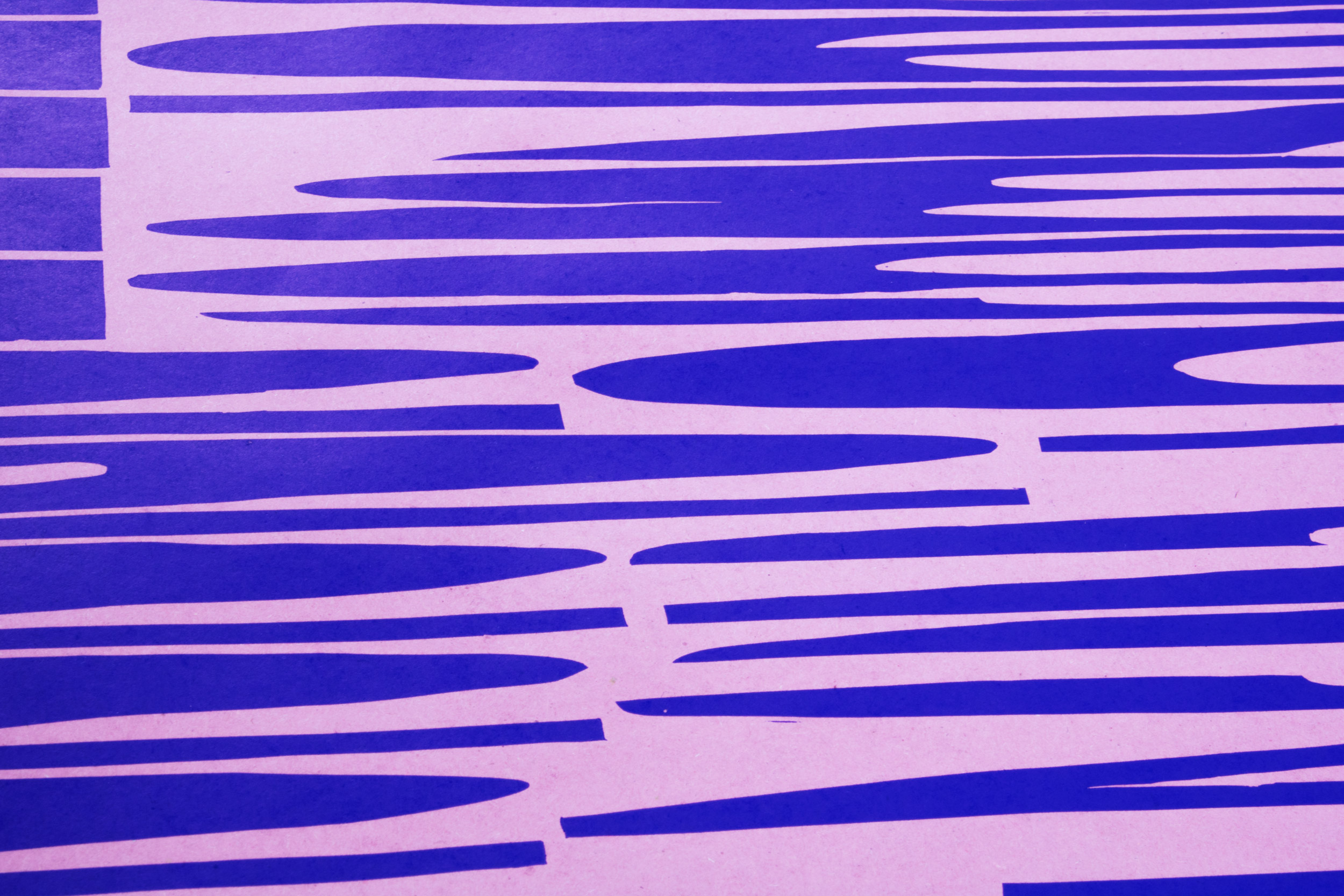
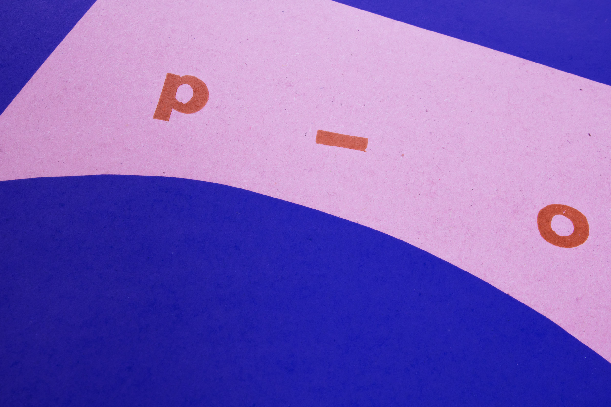
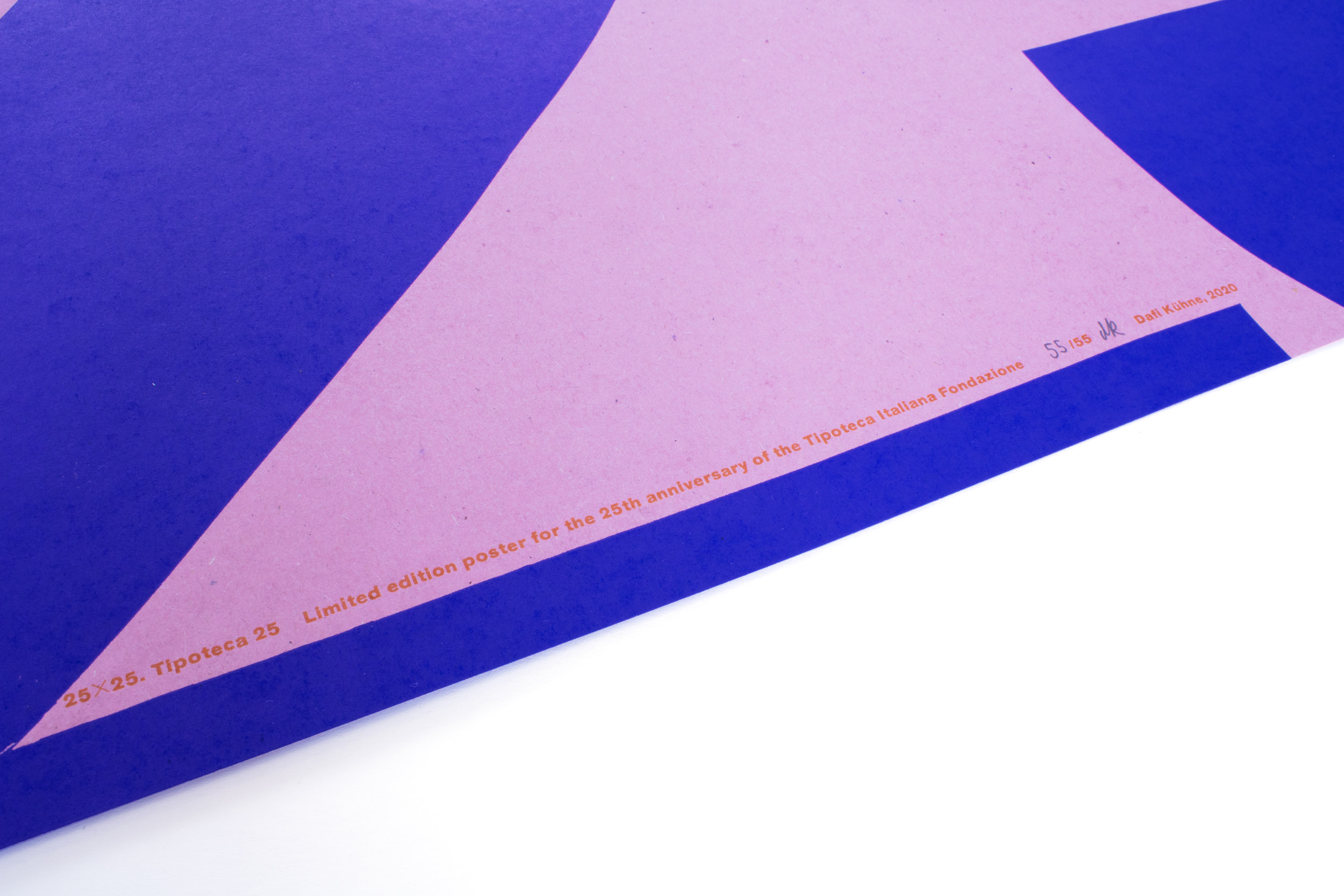
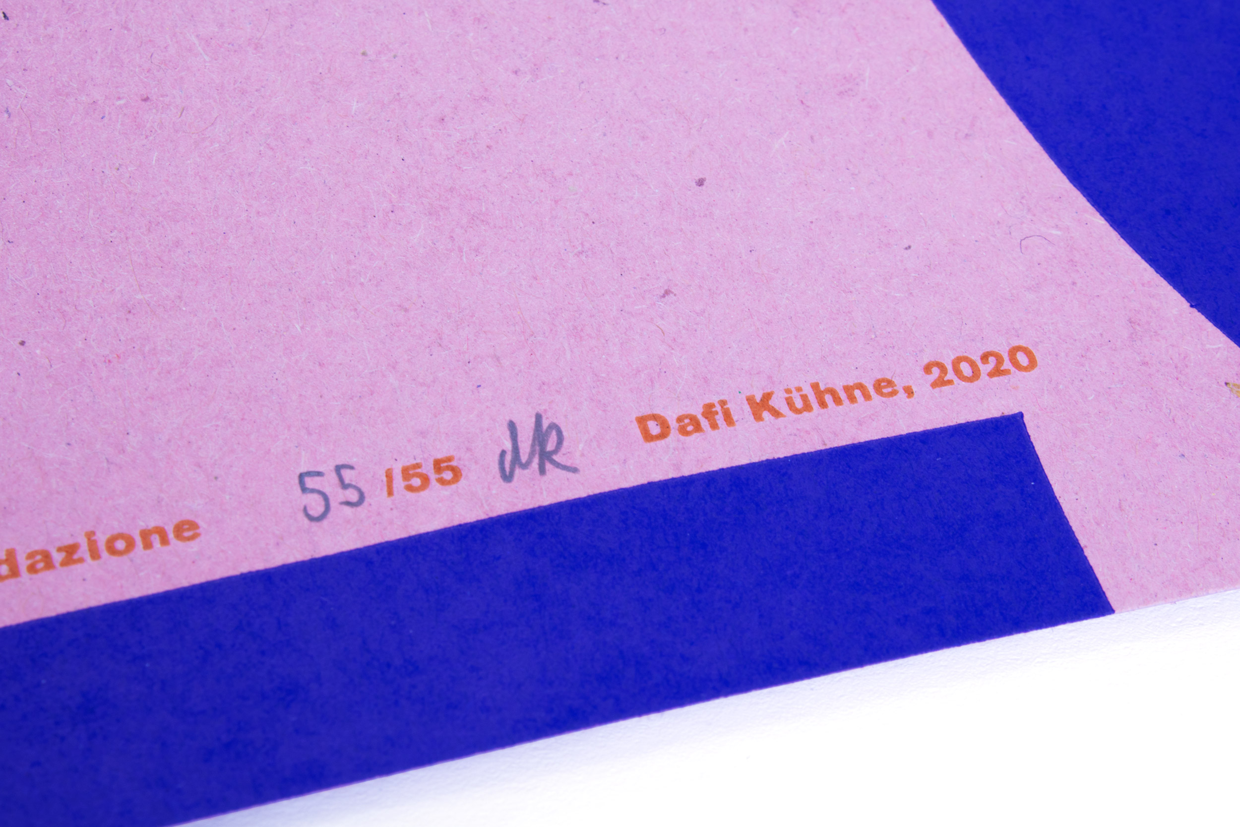
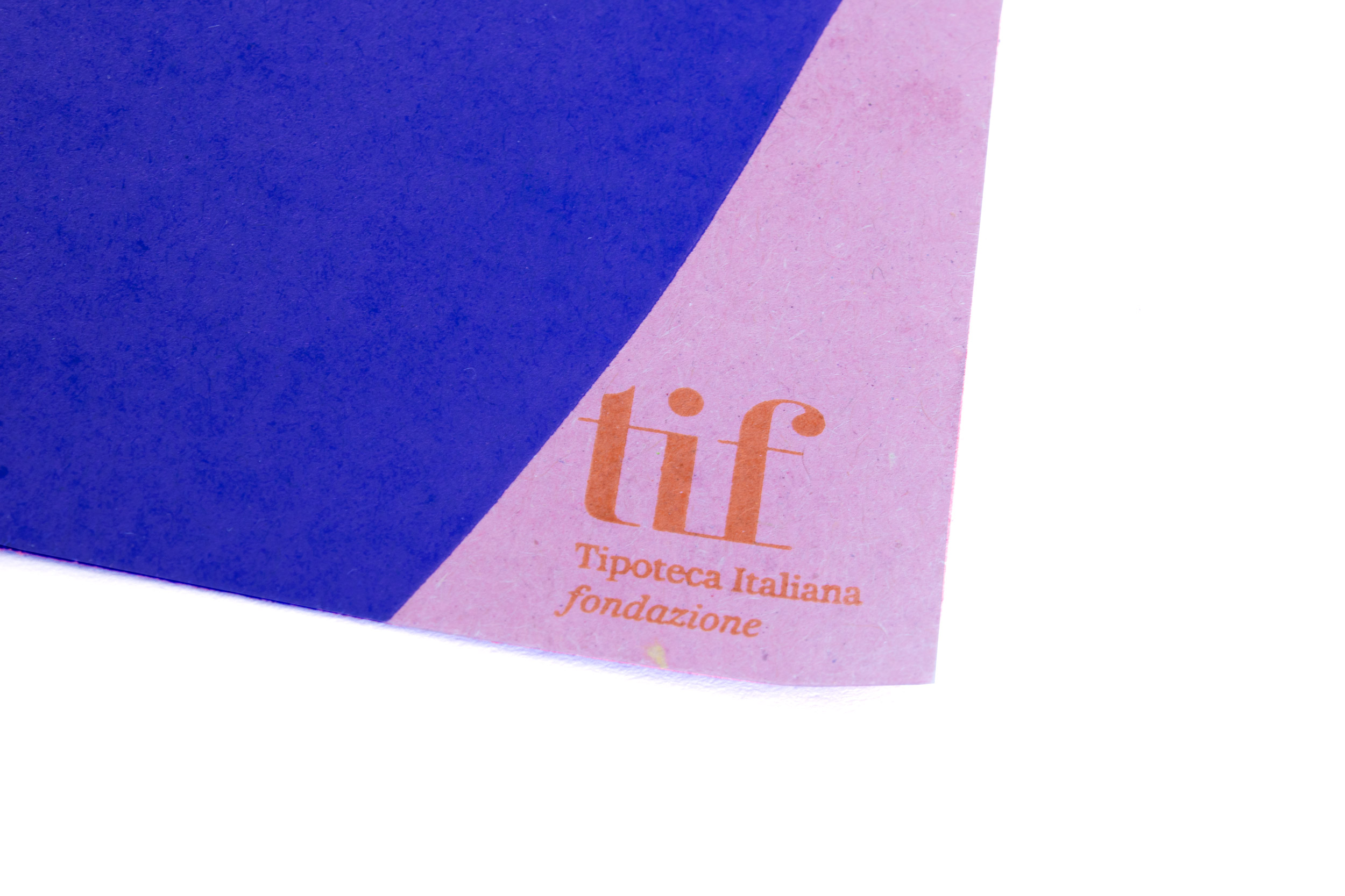
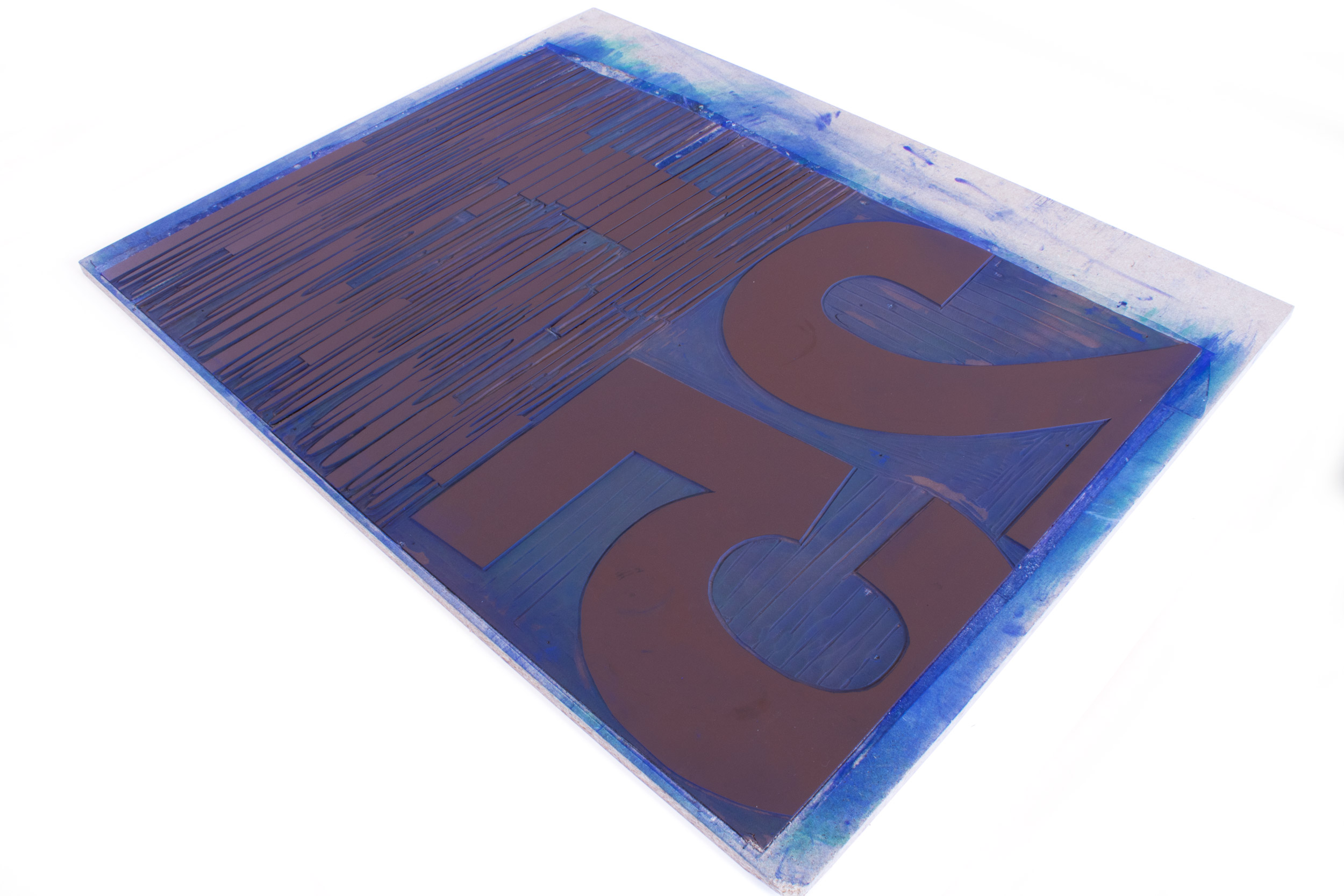
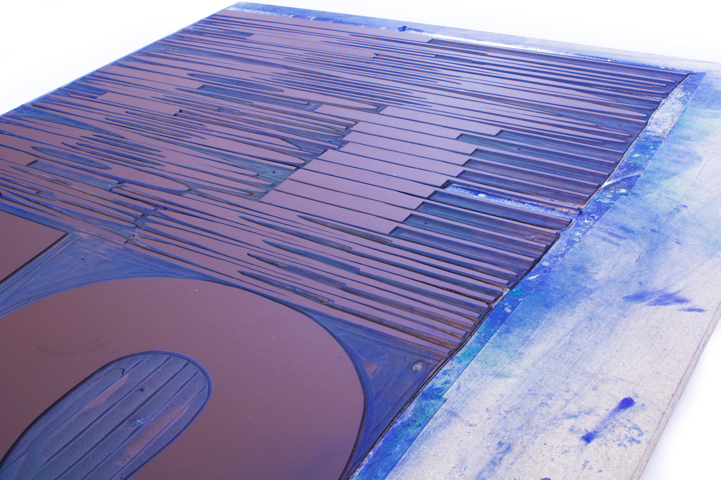
Tipoteca 1–25
1–2–3–4…24 and 25! Poster celebrating the 25th anniversary of Tipoteca!
Printed from hand cut linoleum and a small line of metal type.
Client: Tipoteca, Cornuda, Italy
Format: 70×100cm
Paper: Packtauen, rot, 100g/m2
Edition: 55 posters on a Grafix GX4
May 2020
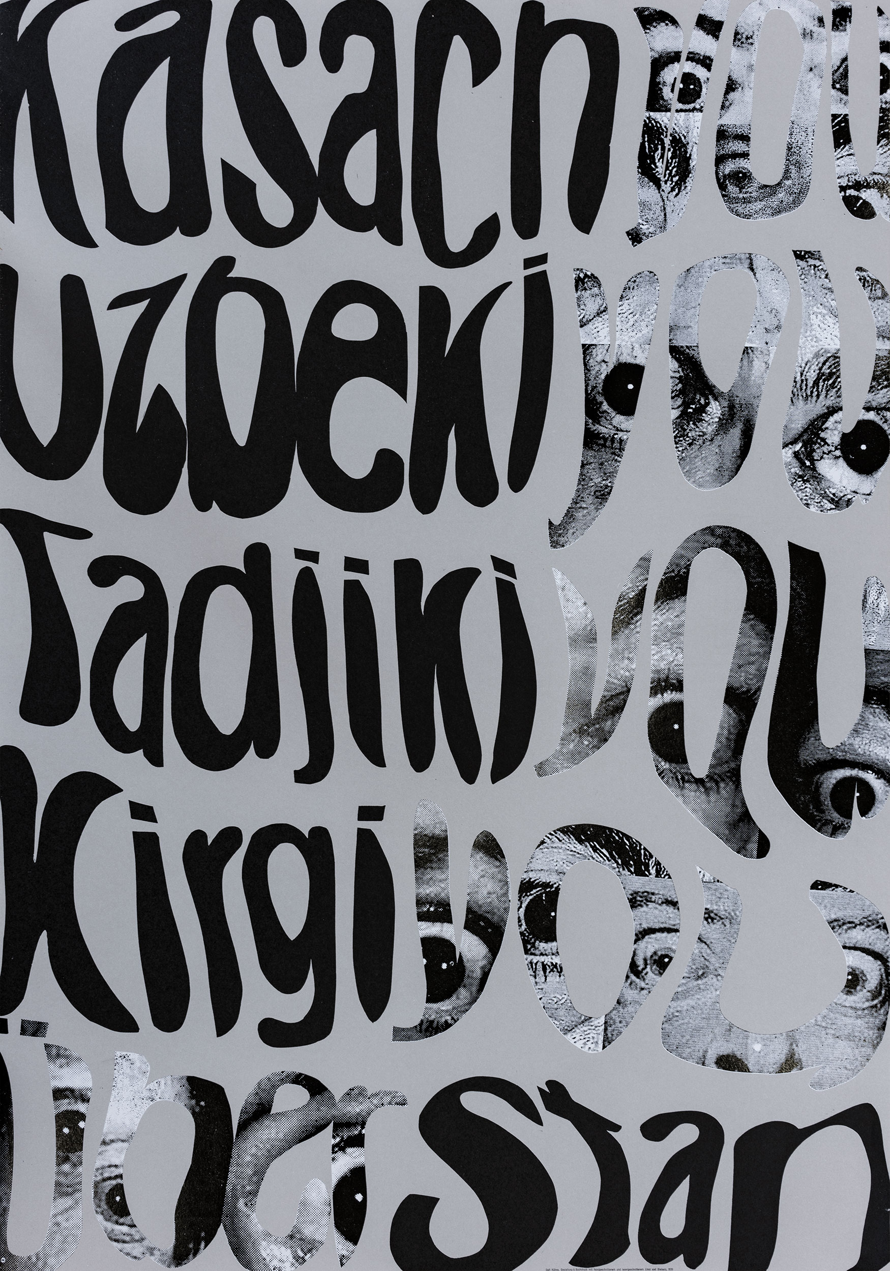
Überstan
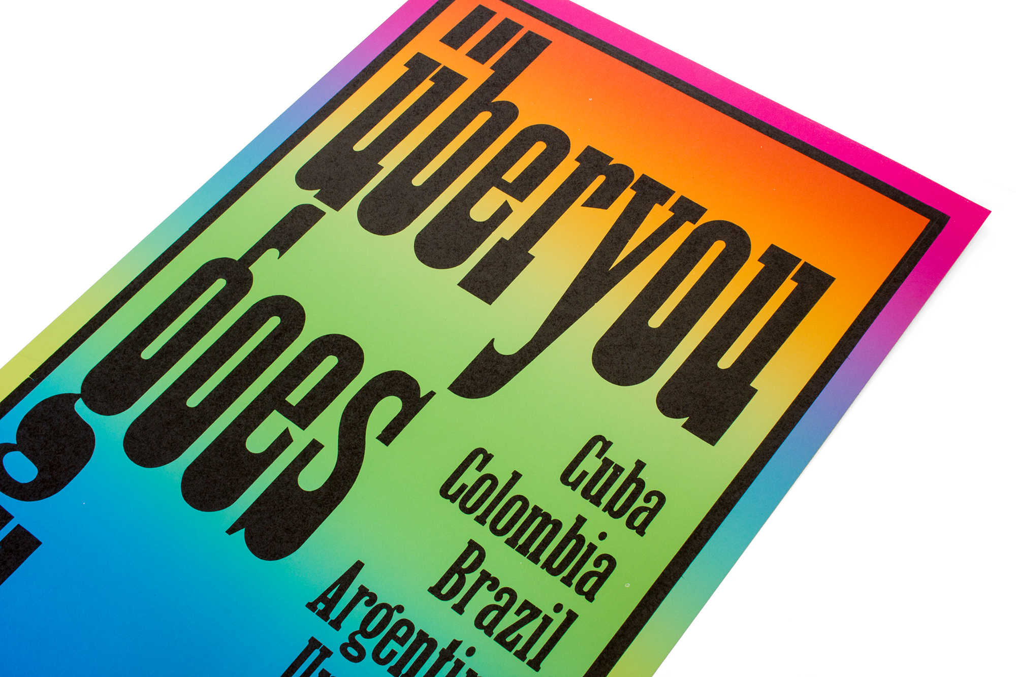
A tour going through Kasachstan, Uzbekistan, Tajikistan and Kirgistan!? Wow! The Swiss punk rock band Überyou really made it! Though the tour has been cancelled due to the COVID-19 crisis. But at least we made the poster!
Printed hand cut linoleum (large letters), then laser engraved linoleum (halftones).
Client: Überyou (Band), Zürich
Format: 70×100cm
Paper: Materica Clay 120g/m2
Edition: 80 posters on a Grafix GX4
April 2020
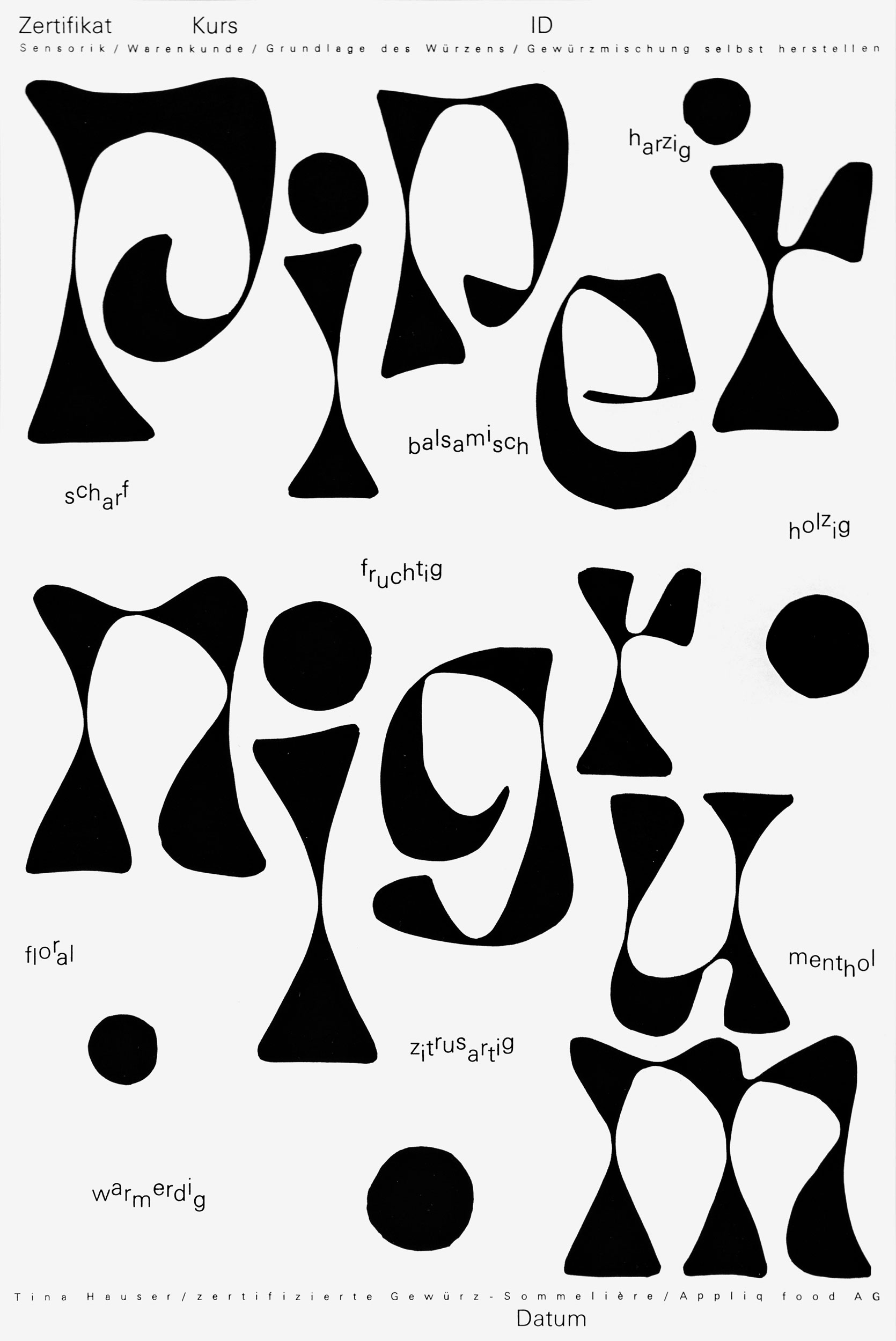
Piper Nigrum
Poster and certificate for a spice workshop.
Client: Appliq food AG, Mühlehorn
Format: 33.3×50cm
Paper: Sirio Black White 240g/m2
Edition: 120 posters on a FAG Control 405
March 2020
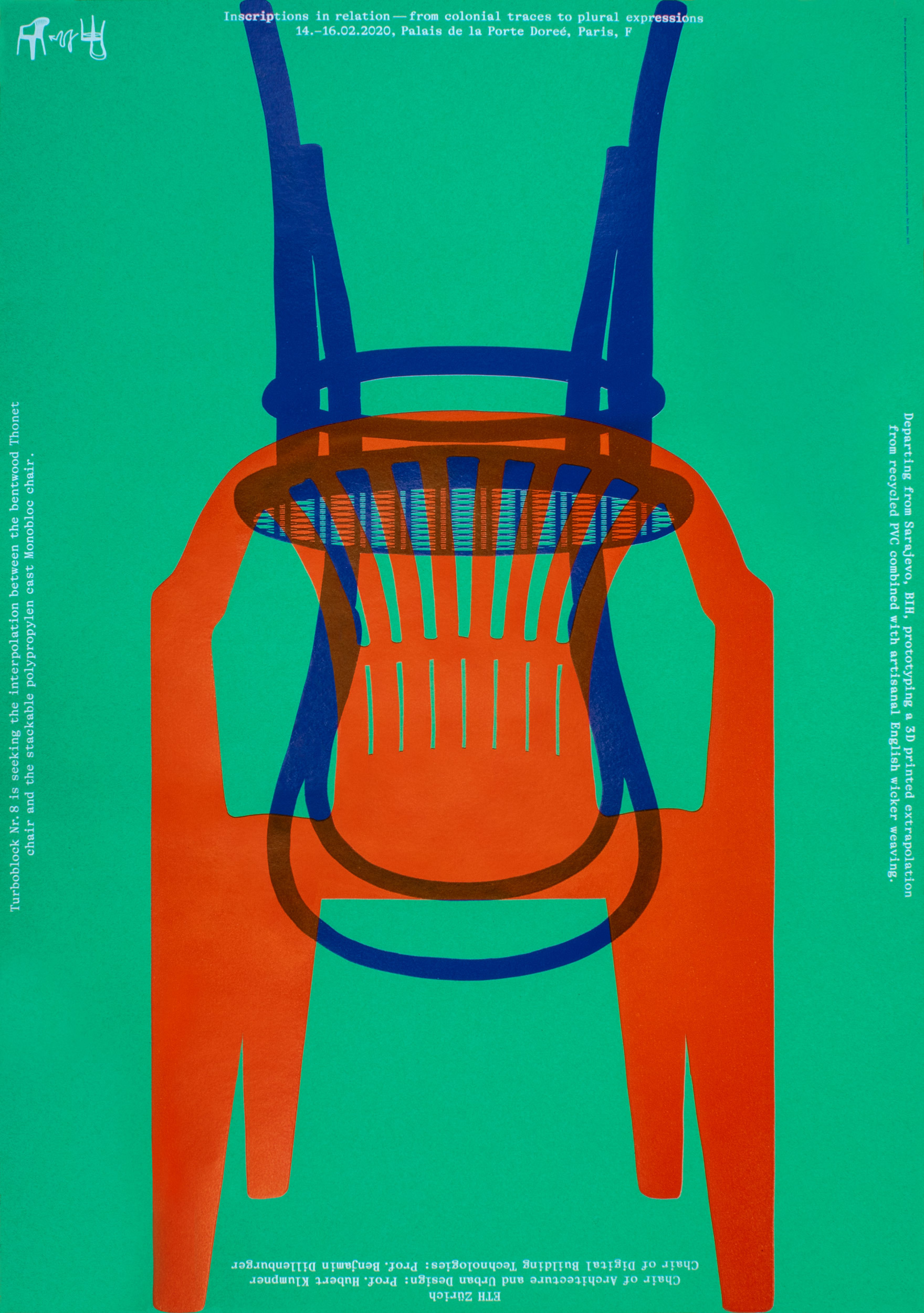
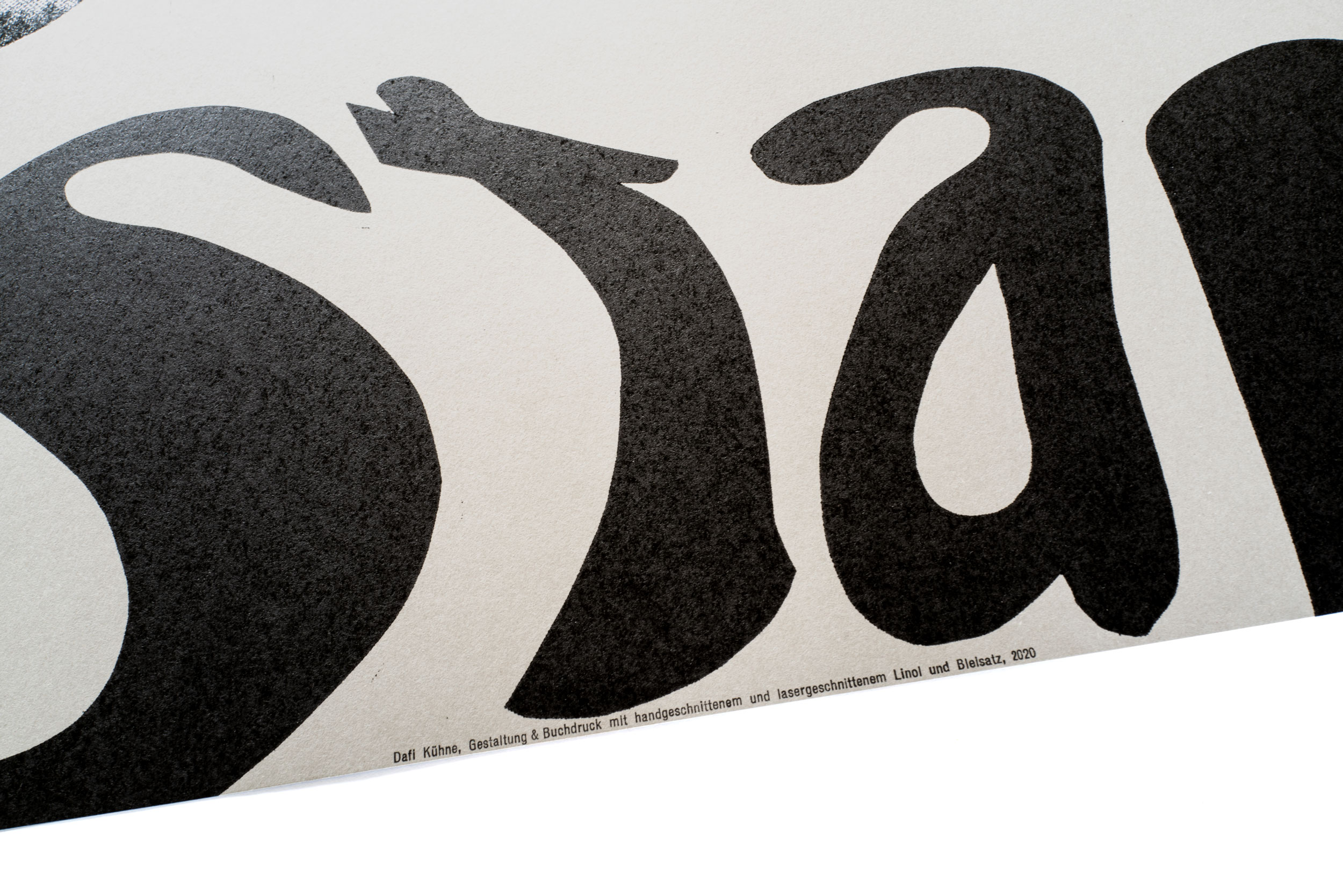
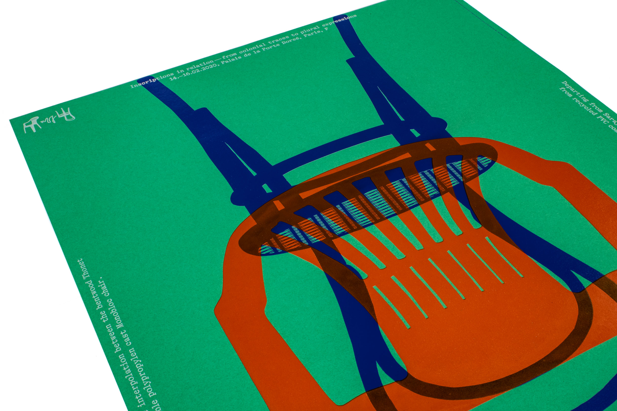
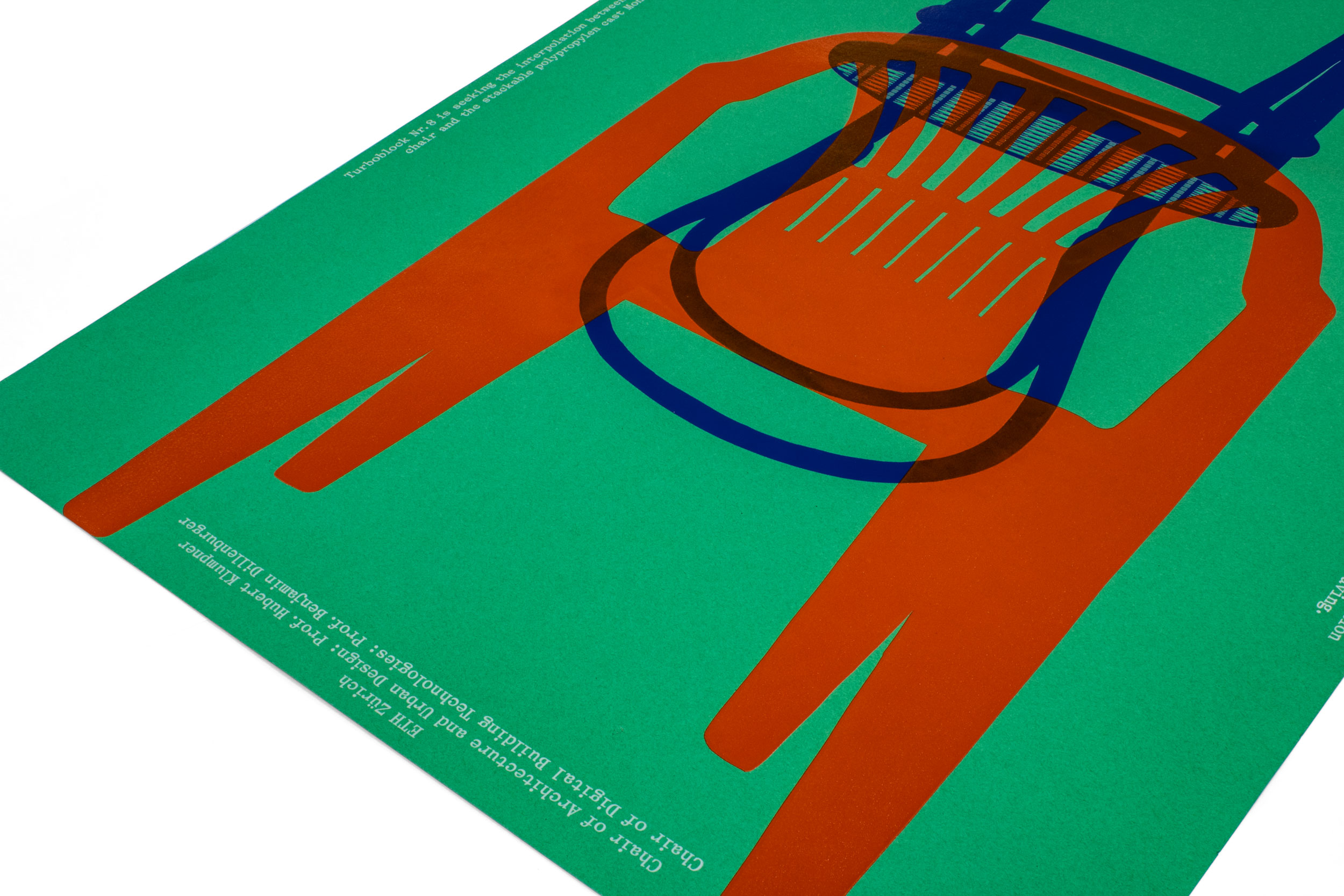
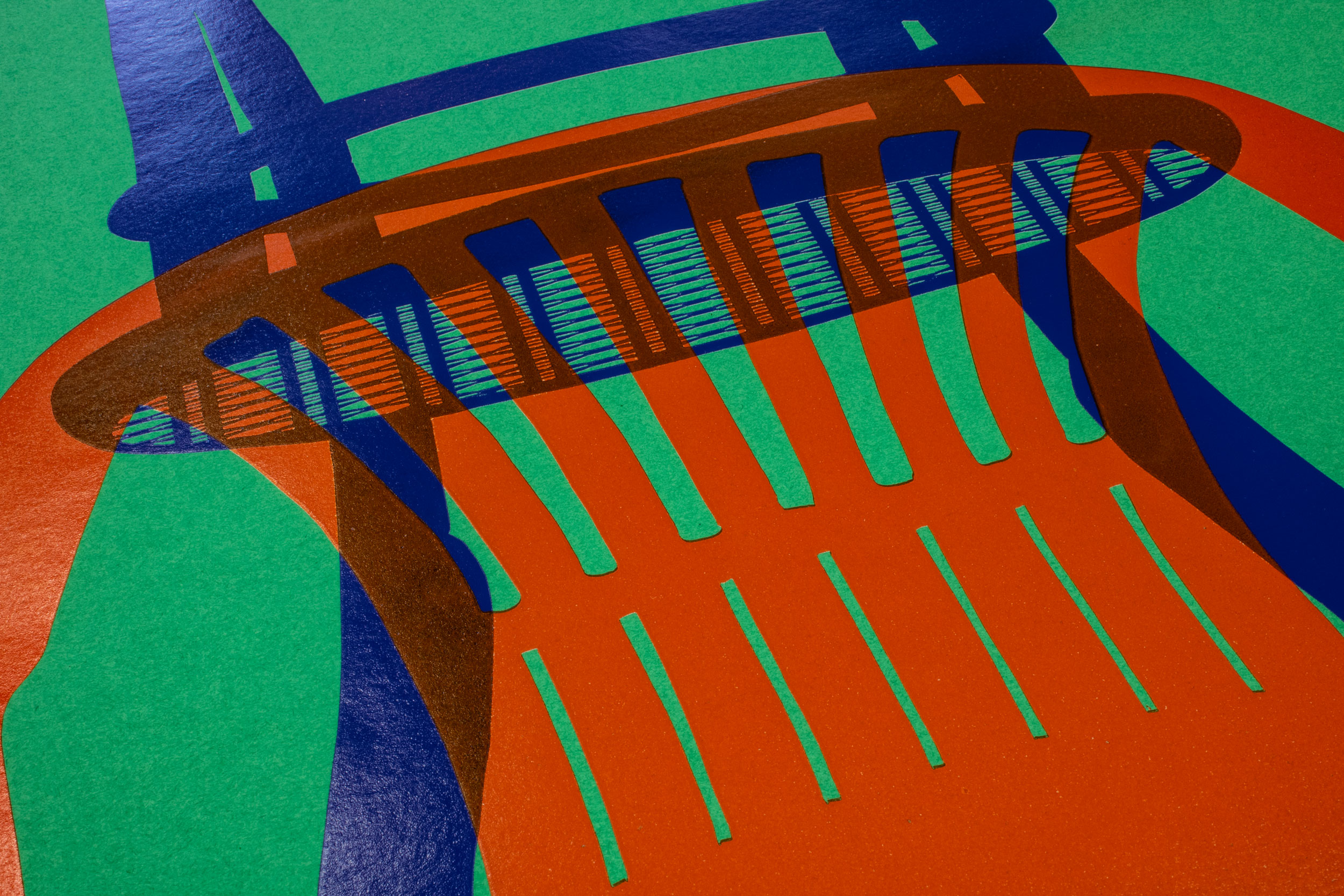
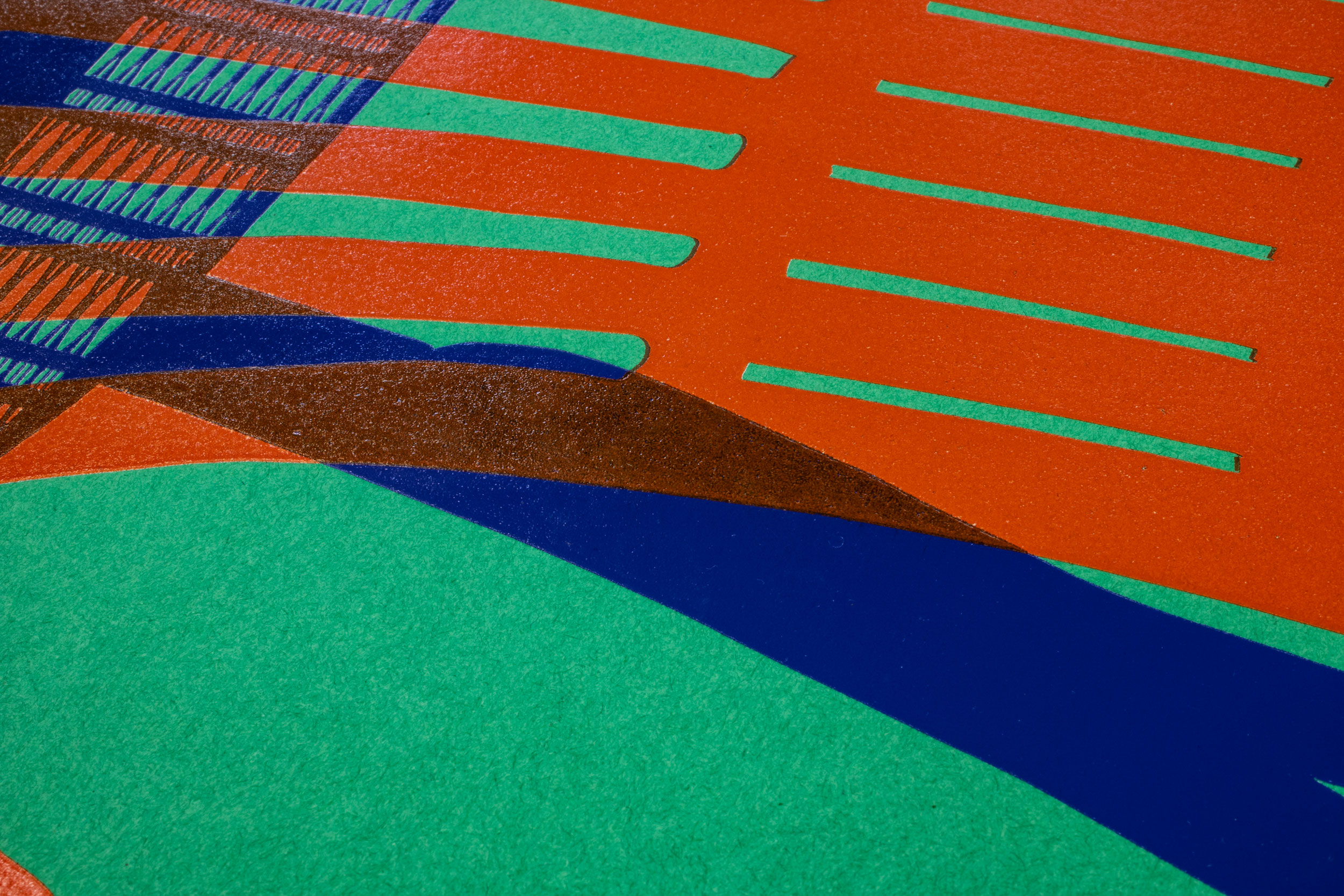
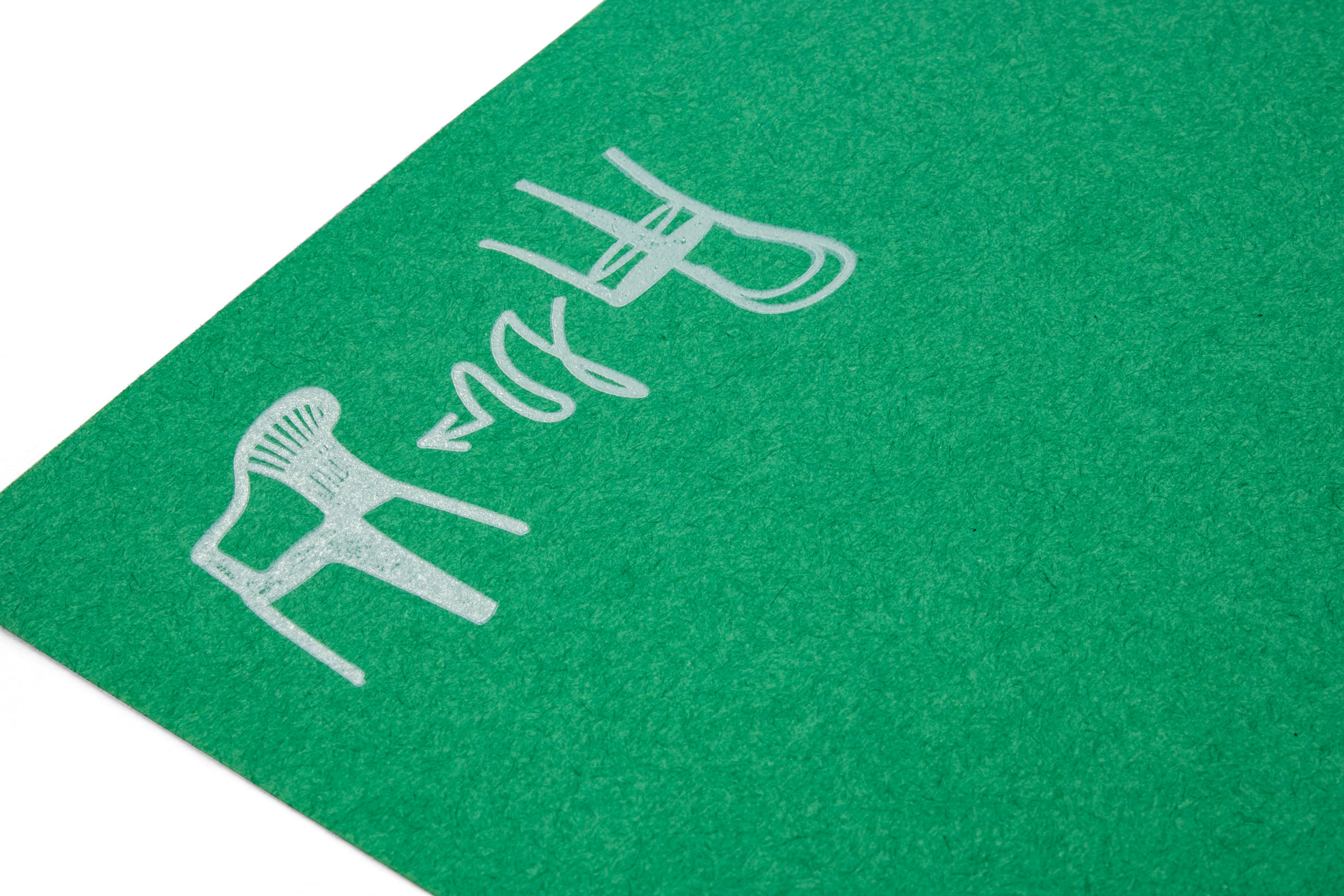
Turboblock Nr. 8
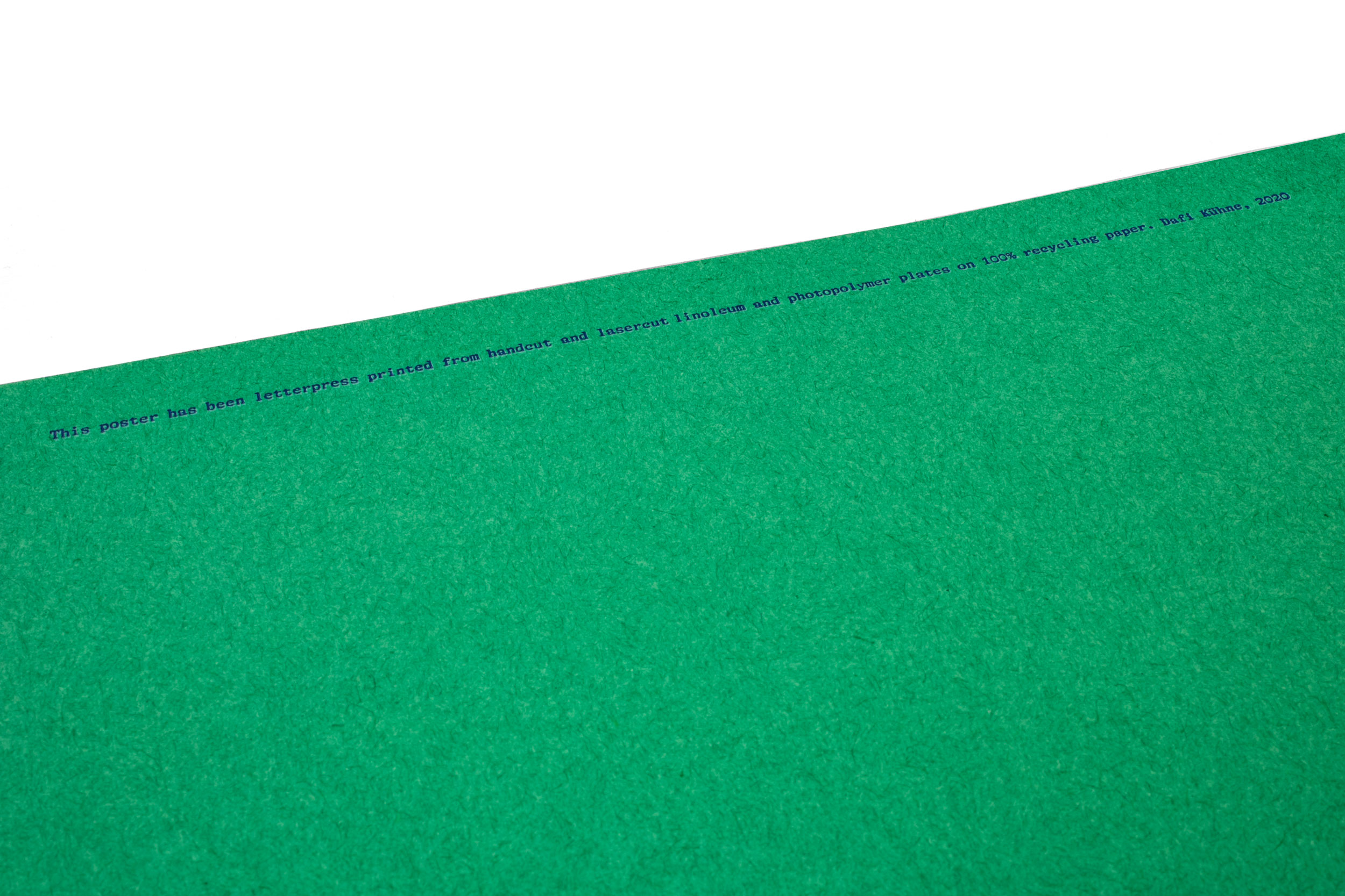
Exhibition poster interpolating and extrapolating the two most sold chairs of all time: the Thonet bentwood chair and the Monobloc chair. Poster printed in a total of 14 print runs, to get full saturation and coverage on the green recycling paper.
This poster was selected with the 100 Beste Plakate from Germany, Switzerland and Austria 2020.
Client: Prof. Hubert Klumpner, ETH Zürich
Format: 70×100cm
Paper: Forever, smaragdgrün, 210g/m2
Edition: 60 posters on a Grafix GX 4N
February 2020
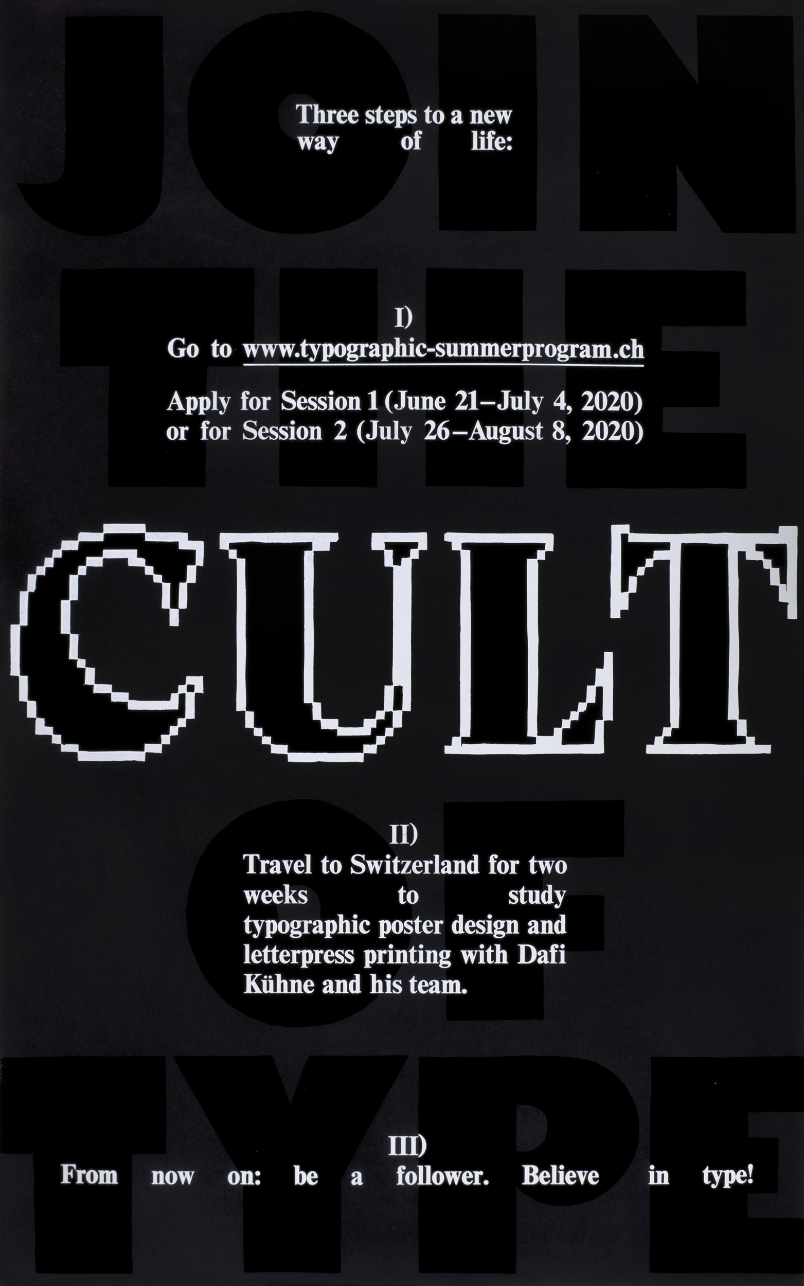
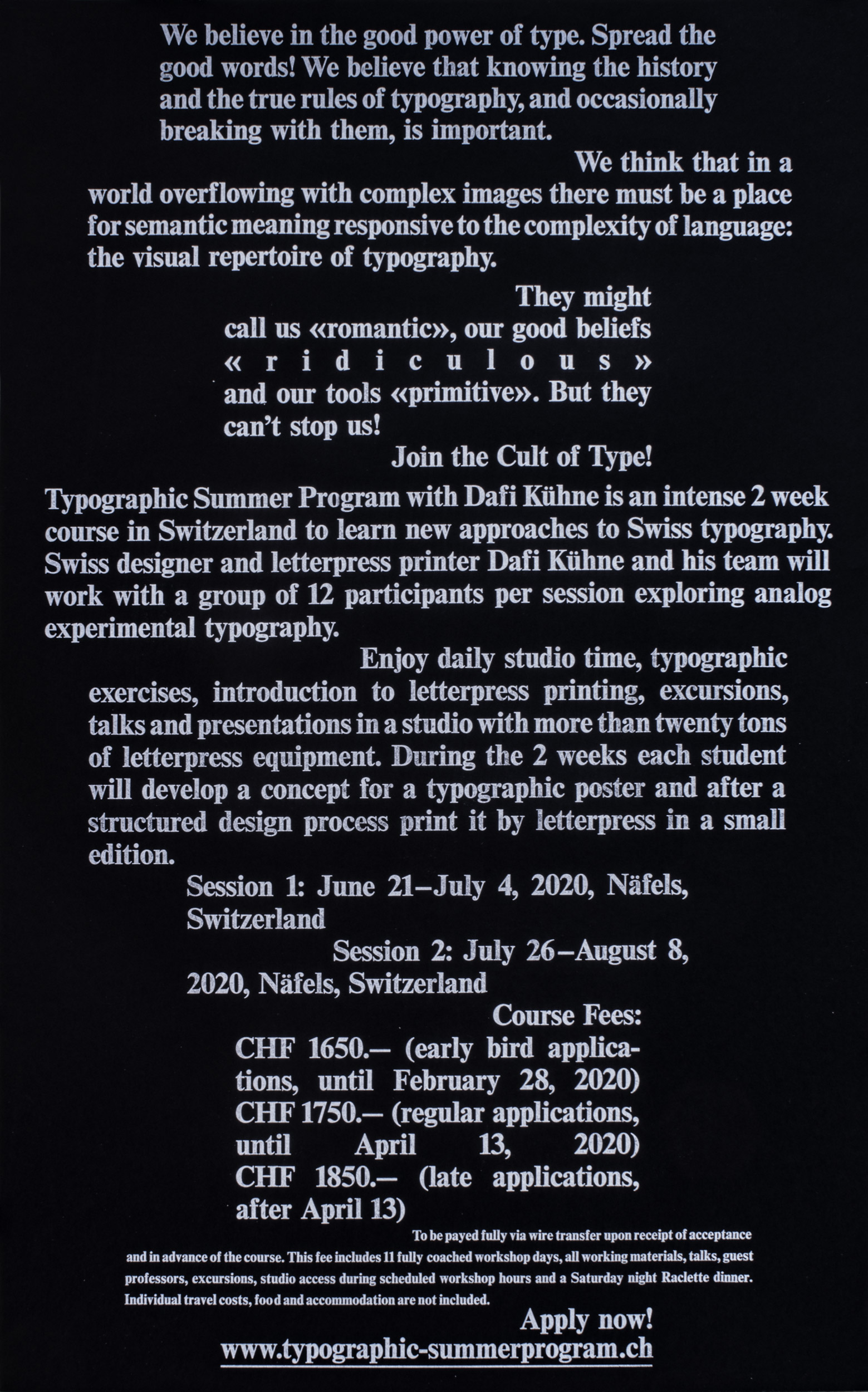
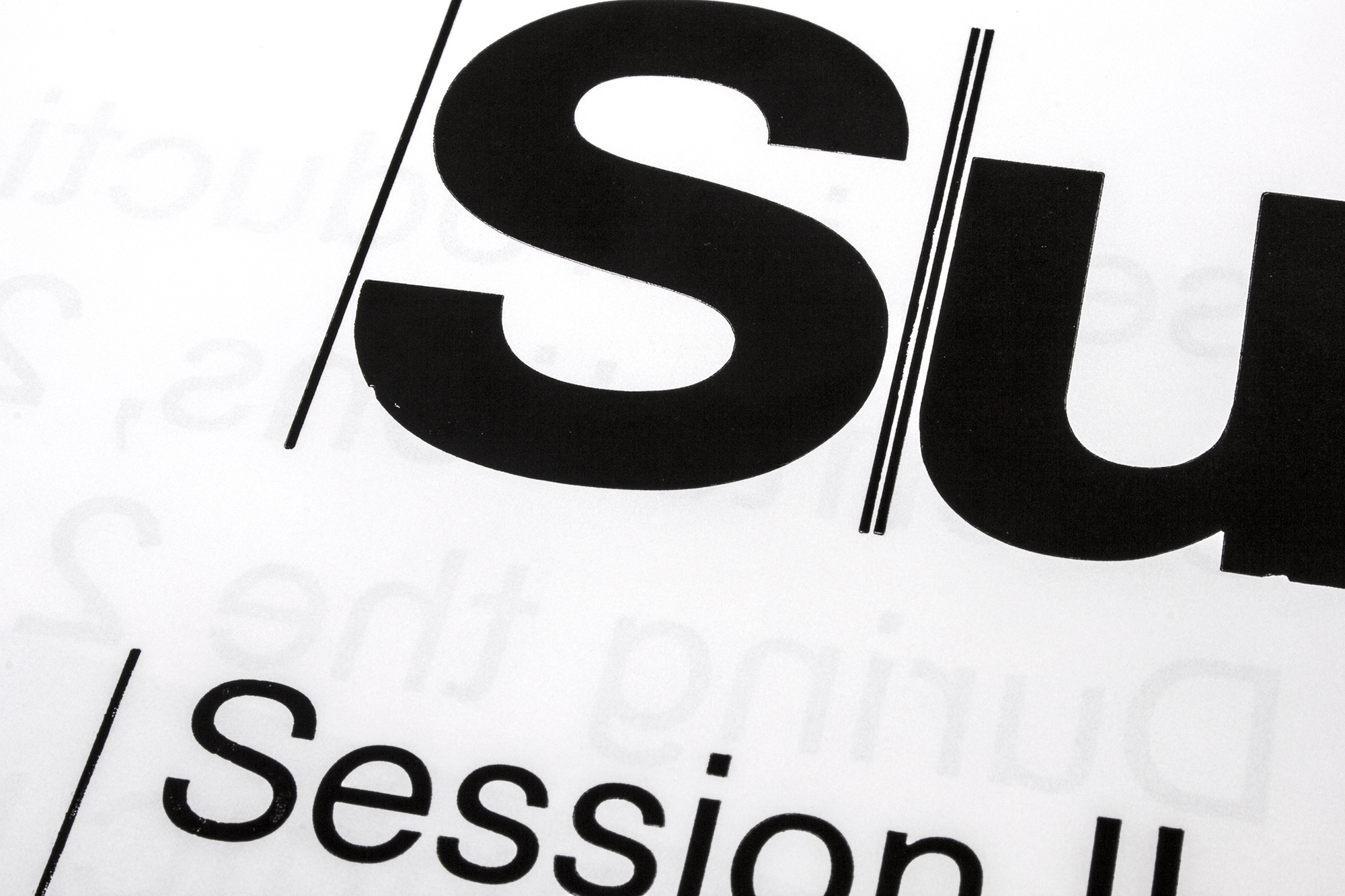
Join the Cult of Type
Double-sided promotional poster for www.typographic-summerprogram.ch . Printed in 7 print runs from hand cut linoleum and Ludlow slugs.
This poster won a TDC Award of Typographic Excellence in 2020.
Client: Typographic Summer Program, Näfels
Format: 55×88cm
Paper: Sirio Ultra Black, 115g/m2
Edition: 350 posters on a FAG Control 900
January 2020
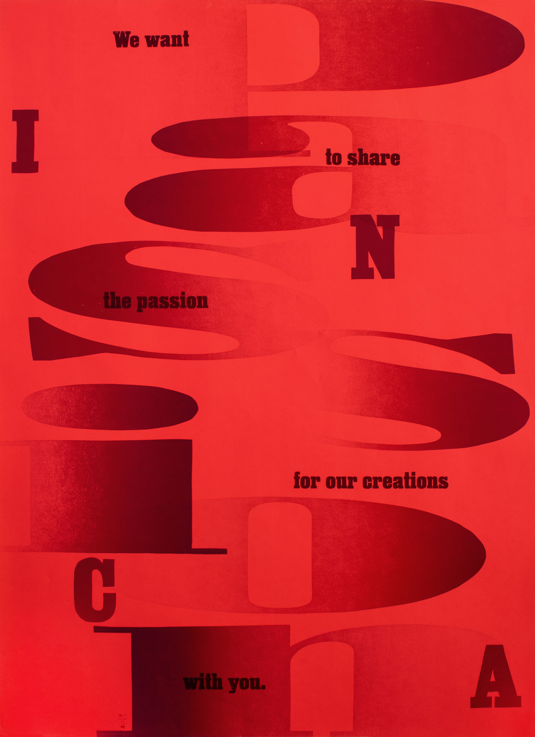
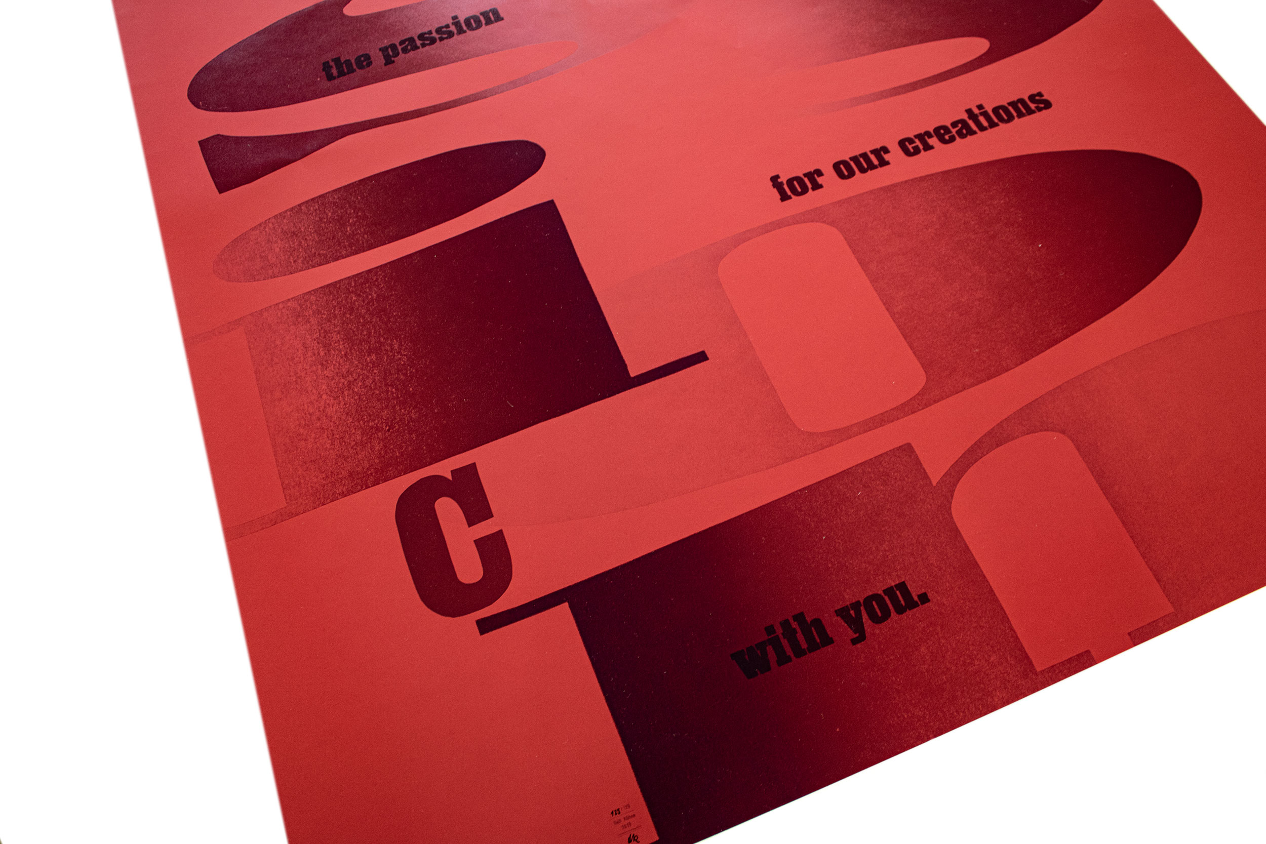
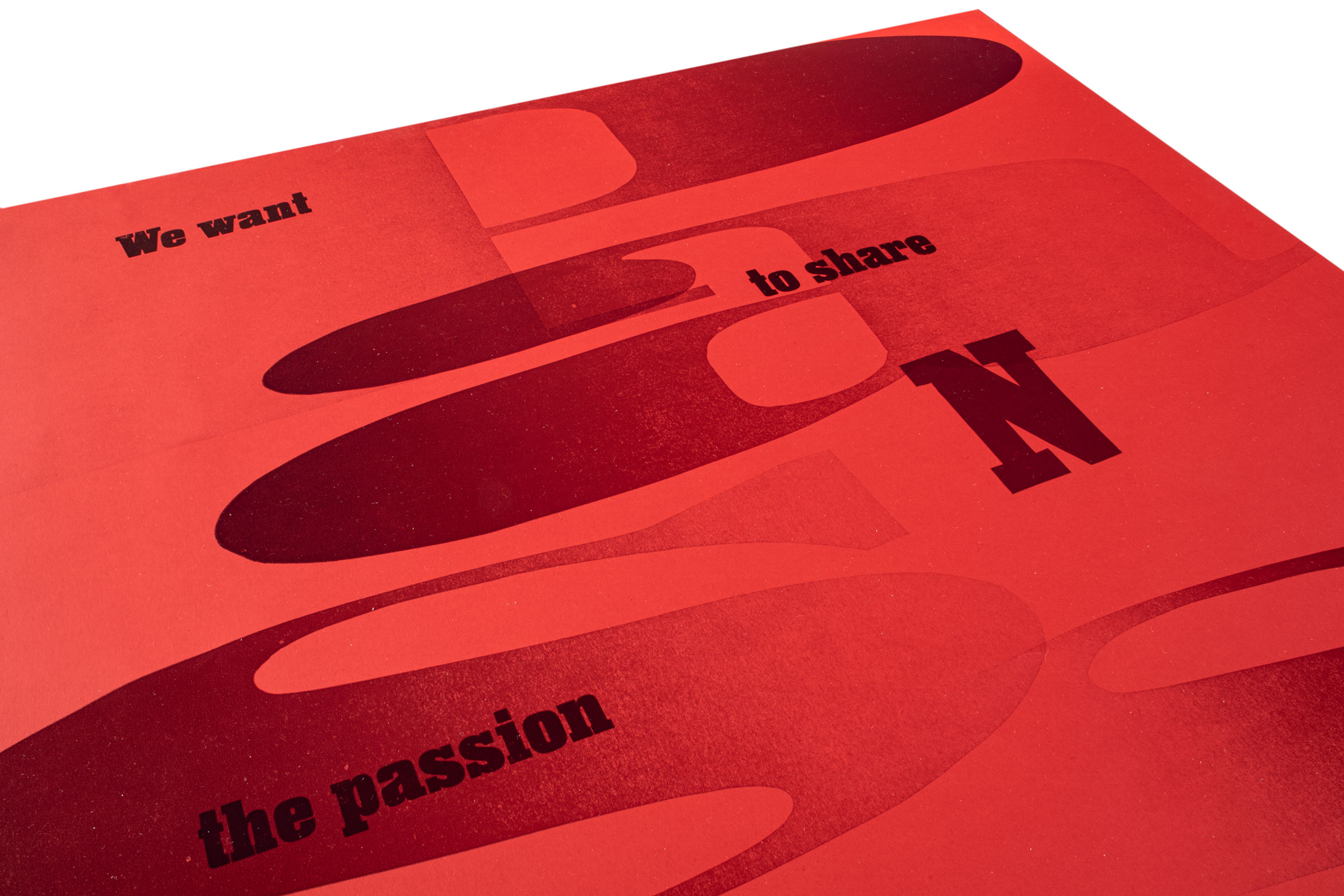
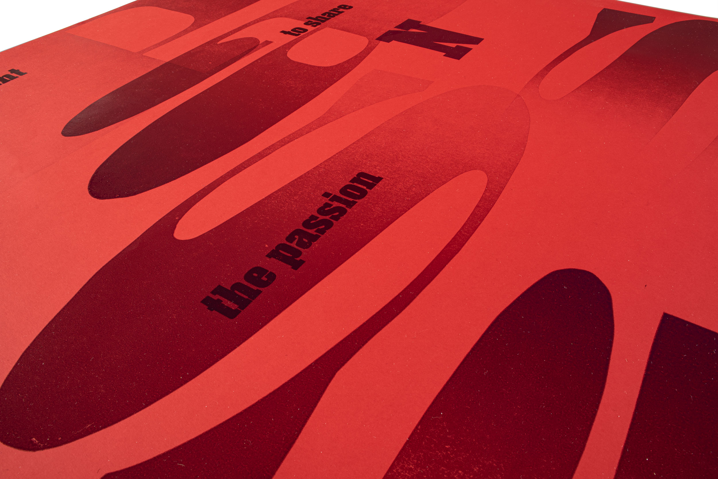
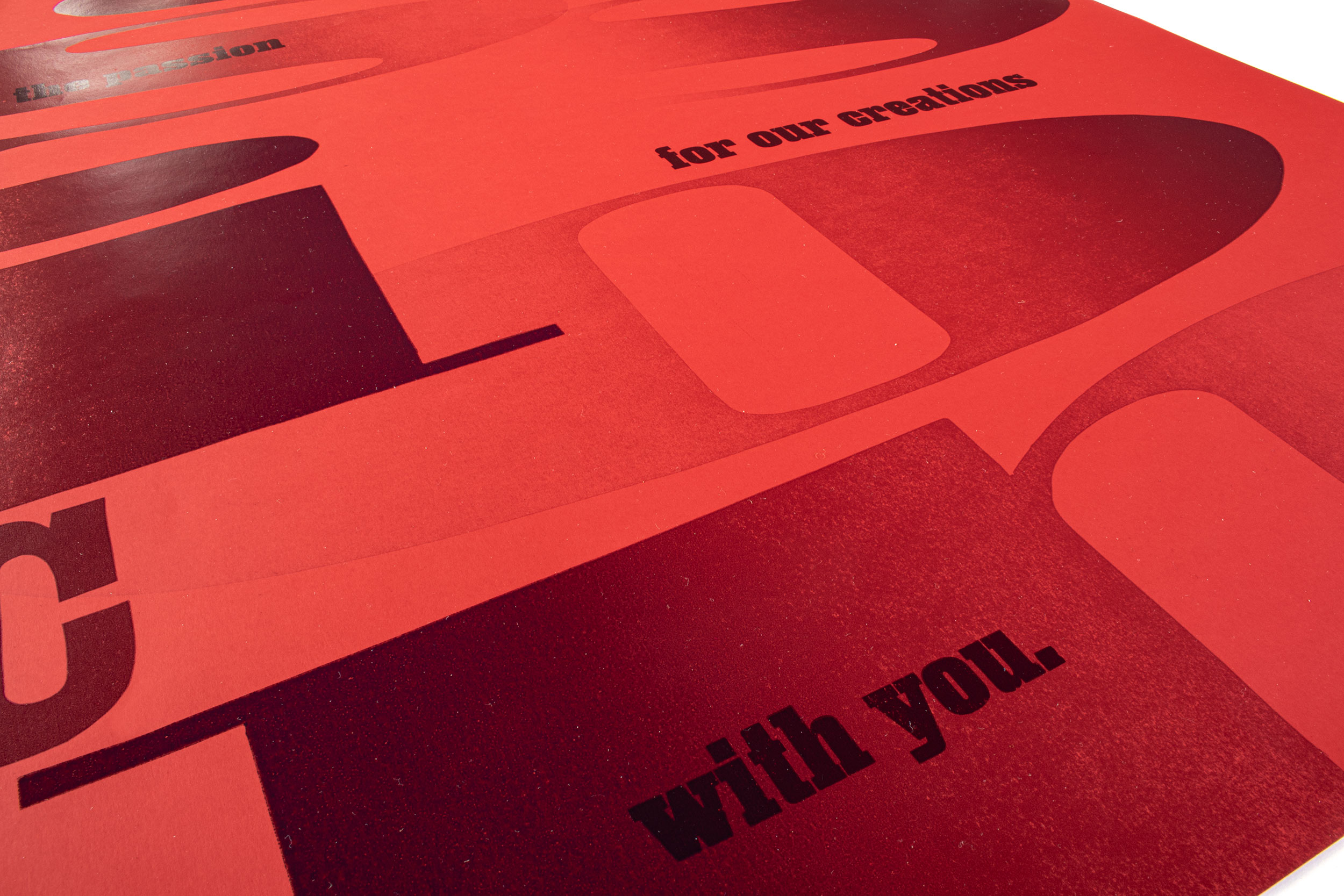
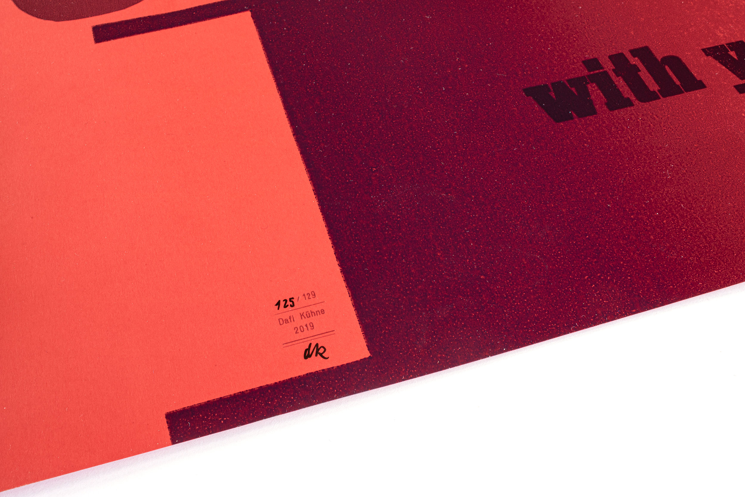
Passion
Letterpress printed poster for INCA Architectes from Grenoble, France with the topic «Passion».
Client: INCA Architectes, Grenoble, F
Format: 64×88cm
Paper: Ispira Passione Rosso, 120g/m2
Edition: 129 posters on a FAG Control 900
December 2019
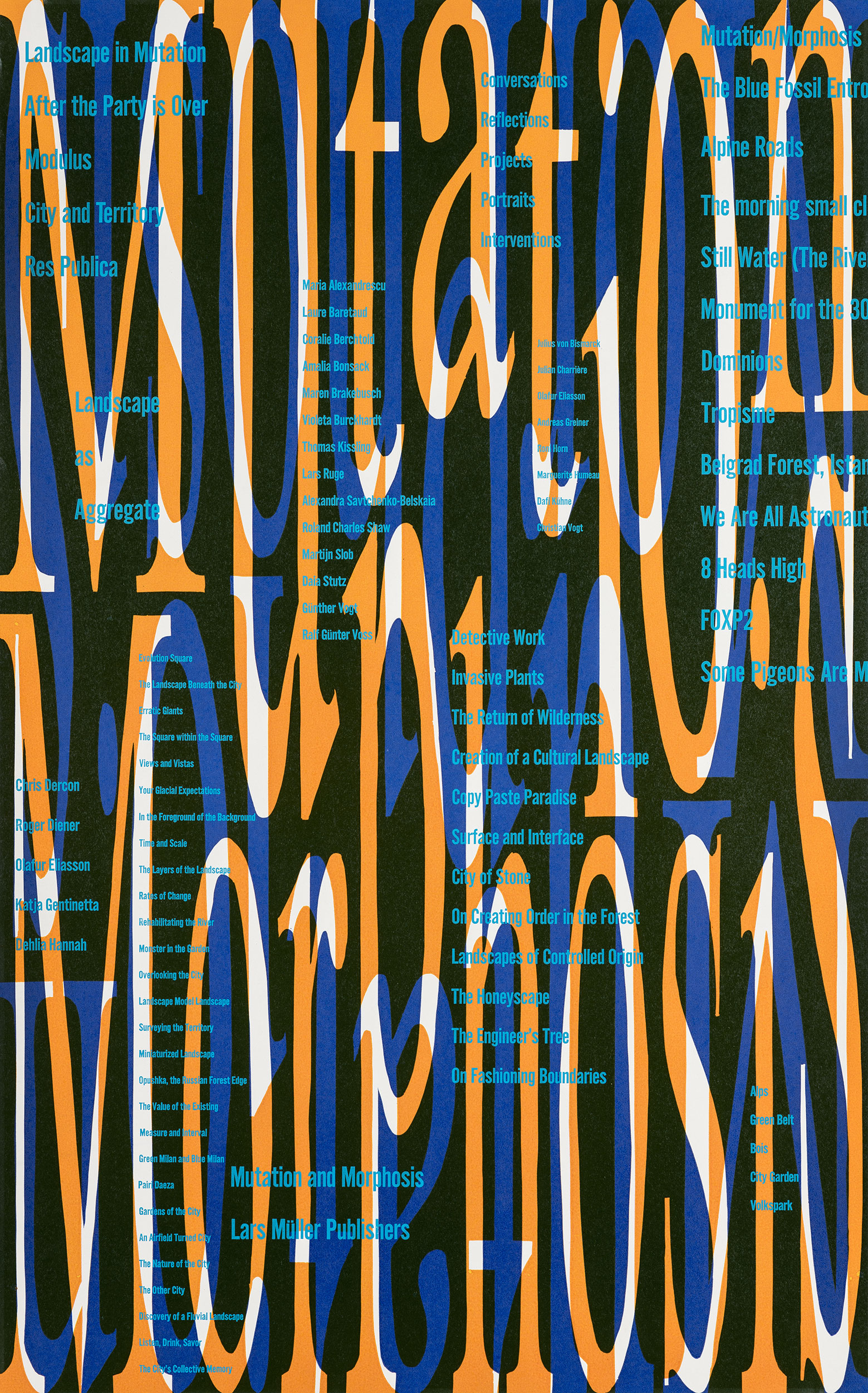
Mutation/Morphosis
Letterpress printed posters for the special edition of «Mutation and Morphosis» a publication by Günther Vogt and Lars Müller Publishers.
Client: VOGT Landscape Architects, Zürich
and: Lars Müller Publishers, Zürich
Format: 55×88cm
Paper: Lettura 72 blauer Engel +, 100g/m2
Edition: 250 posters on a FAG Control 900
November 2019
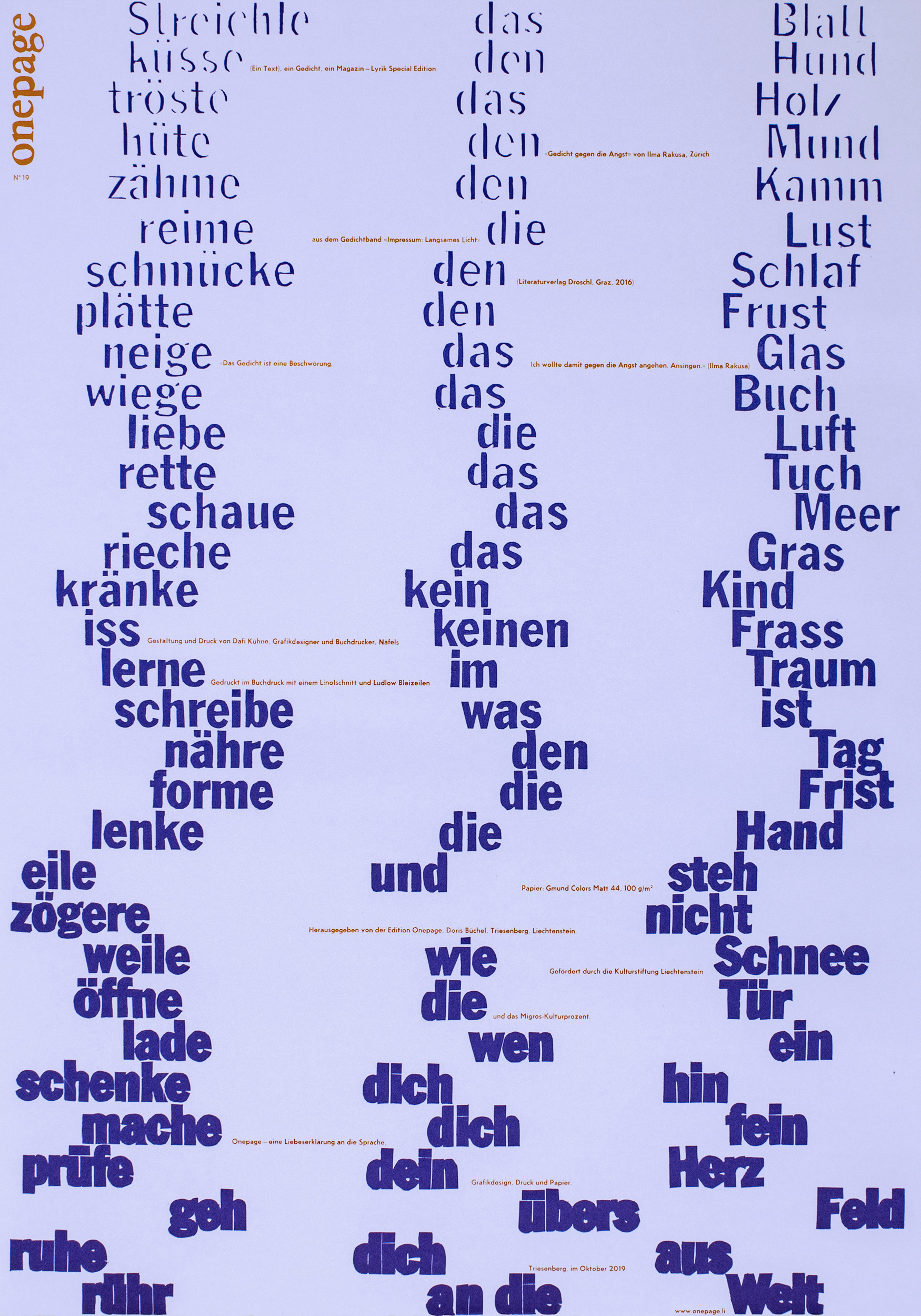
Edition Onepage No. 19
Special poetry edition of Edition Onepage. Poem by Ilma Rakusa, Zürich. Hand-cut linoleum and Ludlow Slugs.
Client: Edition Onepage, Liechtenstein
Format: 59.4×84cm
Paper: Gmund Colors Matt 44, 100g/m2 and 200g/m2
Edition: 450 posters on a FAG Control 900
October 2019
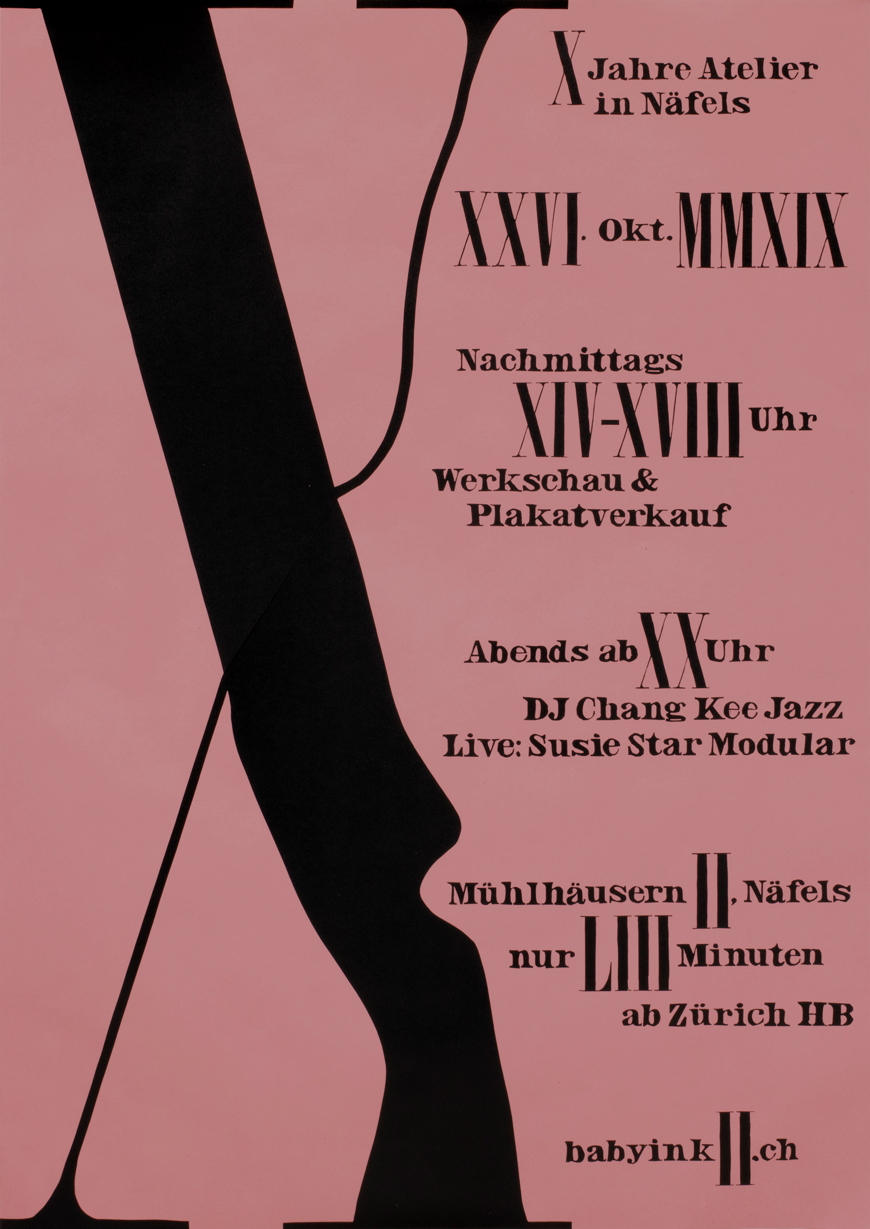
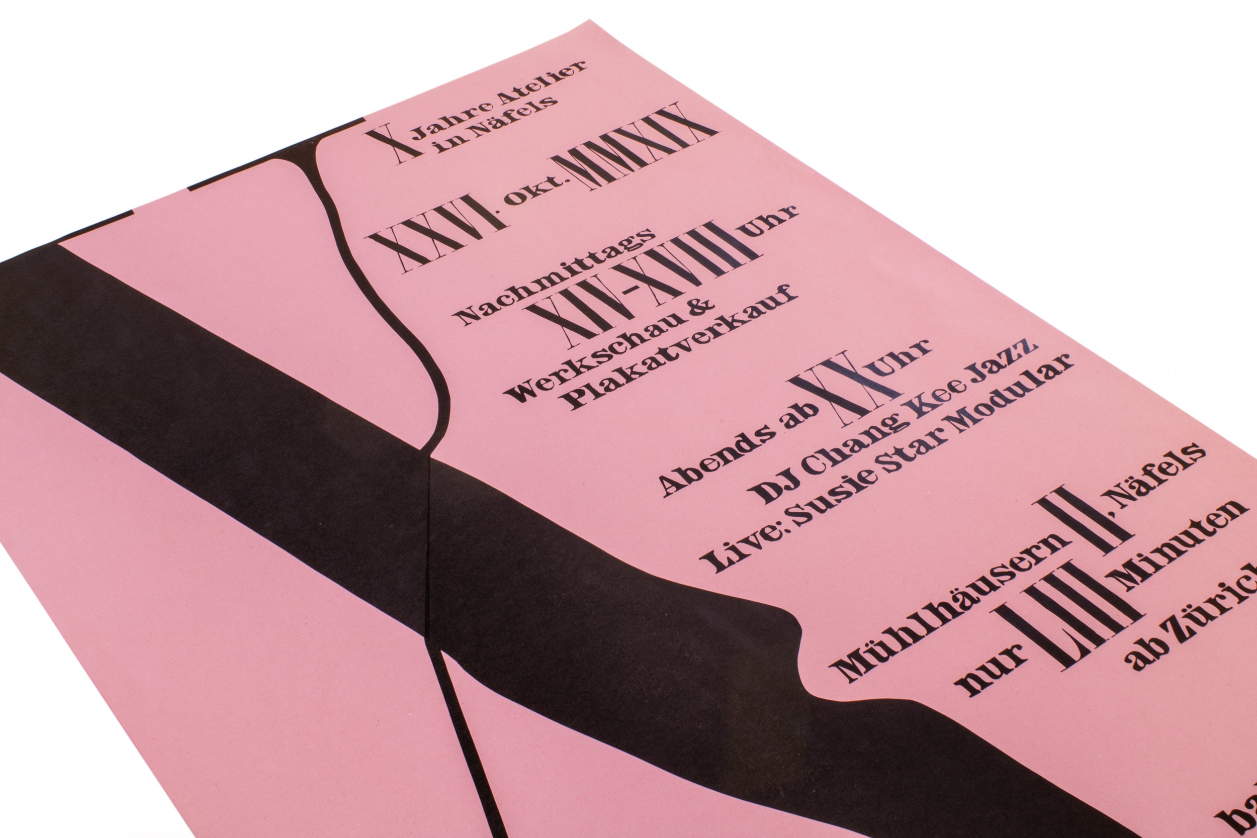
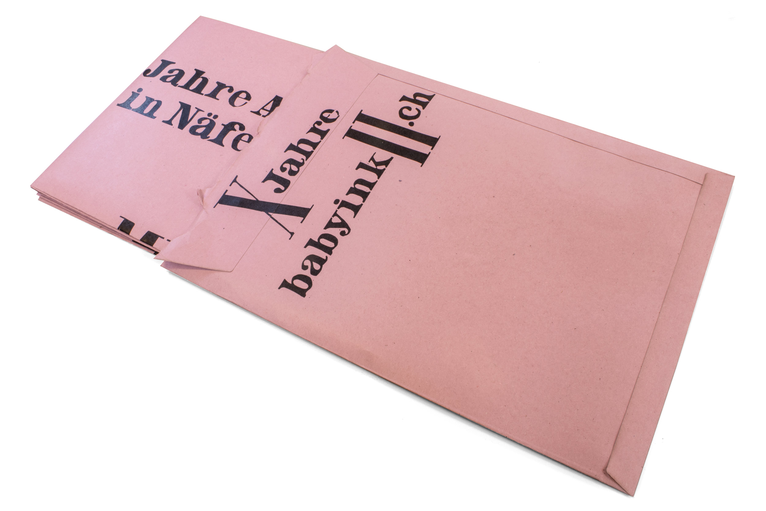
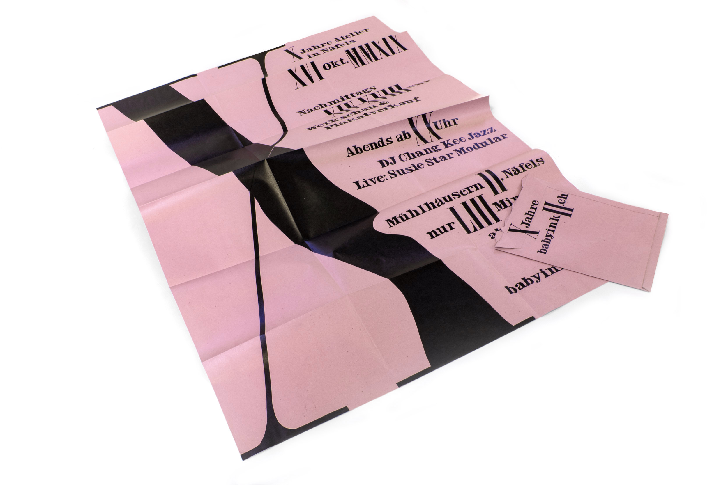
X Jahre Atelier
Invitation poster for the 10 year anniversary and open days at my studio. Printed in 2 print runs from hand cut linoleum. X years babyinkII. Yeah.
This poster won a TDC Award of Typographic Excellence in 2020.
Client: Self-initiated
Format: 89.5×128cm
Paper: Packtauen, rot, 100g/m2
Edition: 250 posters on a Grafix GX4N
October 2019
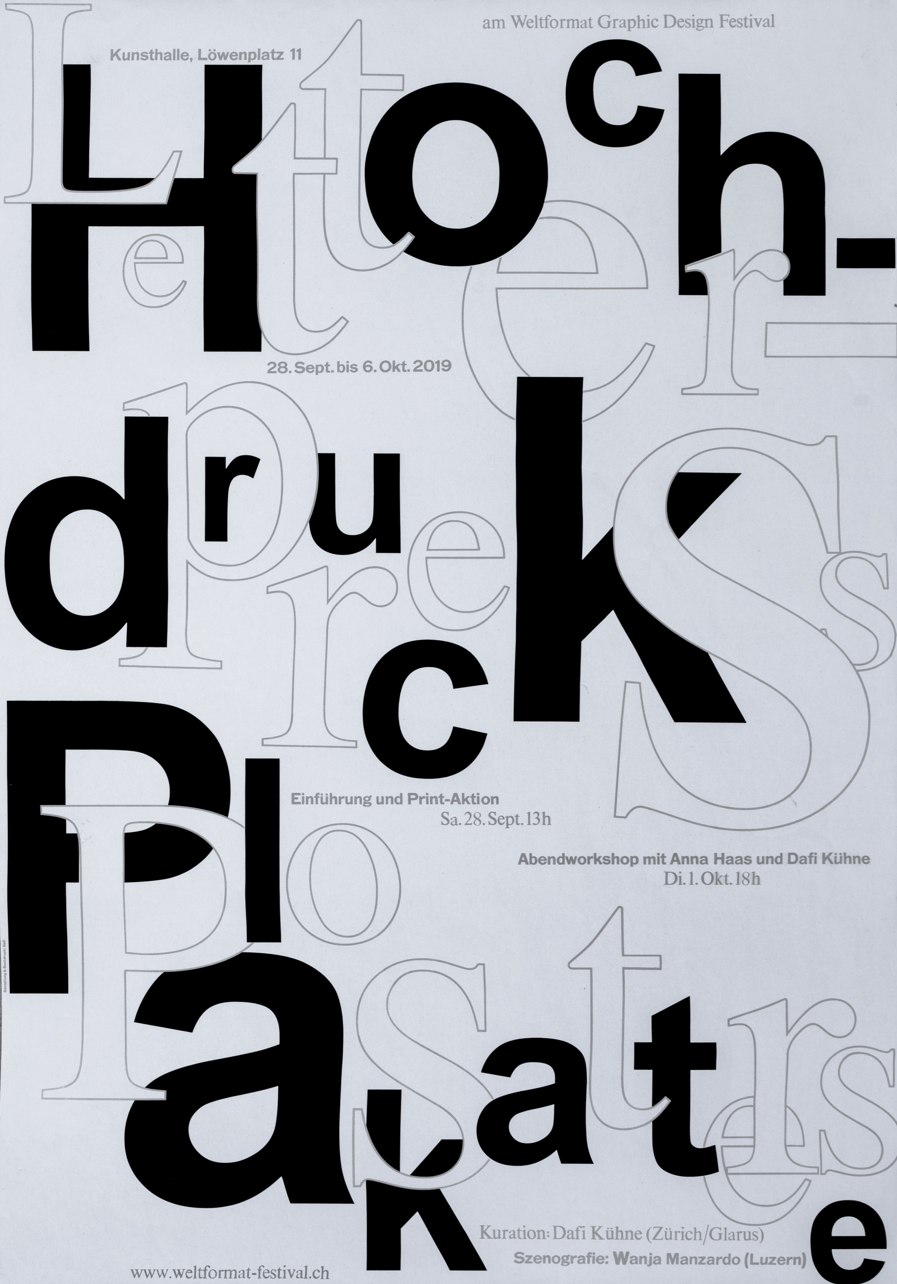
Hochdruck Plakate/Letterpress Posters
Poster for a letterpress poster exhibition at the Weltformat Festival in Lucerne. The posters have been wheat-pasted in the city of Lucerne.
Client: Weltformat, Graphic Design Festival, Luzern
Format: 89.5×128cm
Paper: Newsprint, 64g/m2
Edition: 30 posters on a Grafix GX4N
September 2019
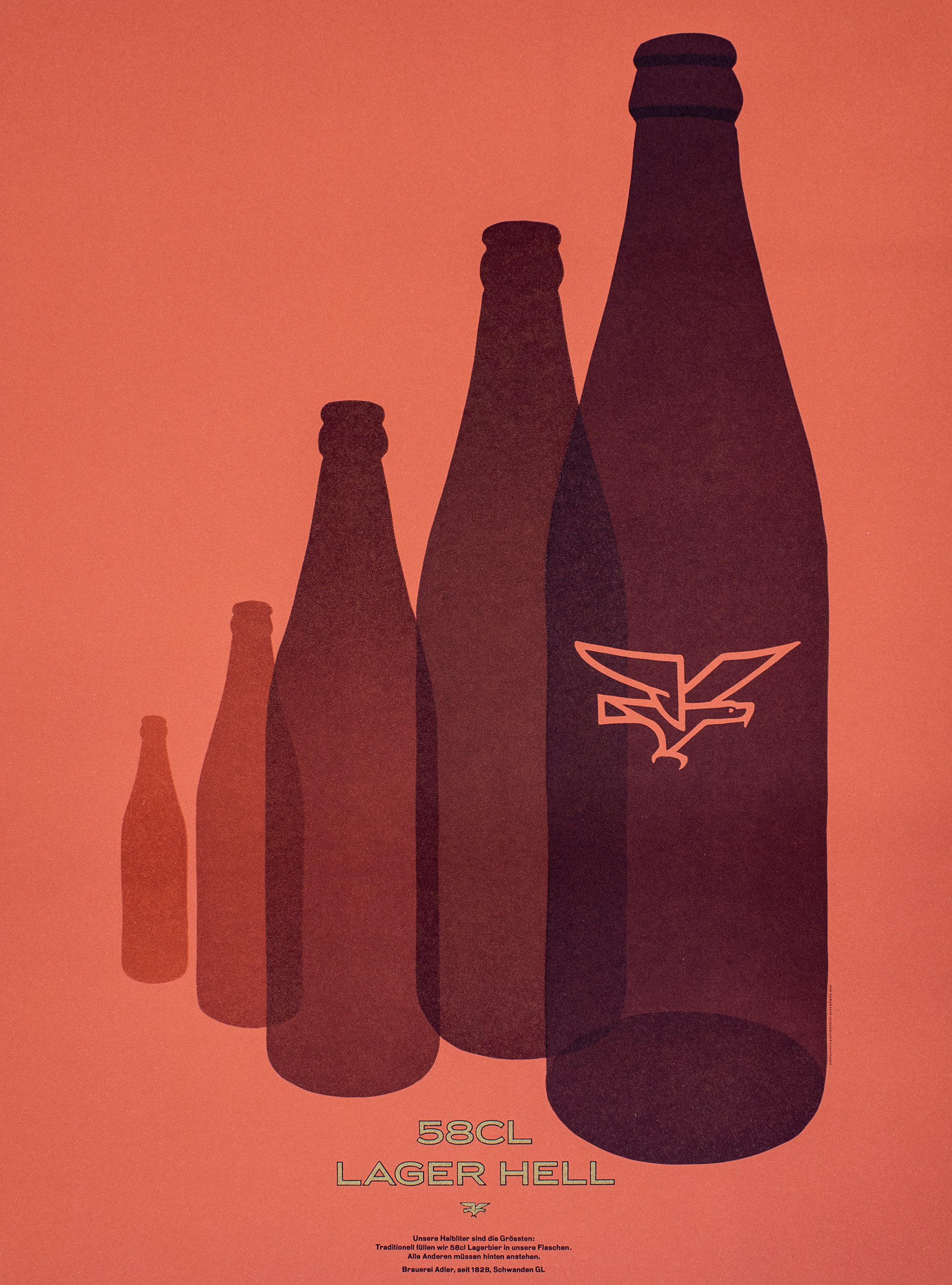
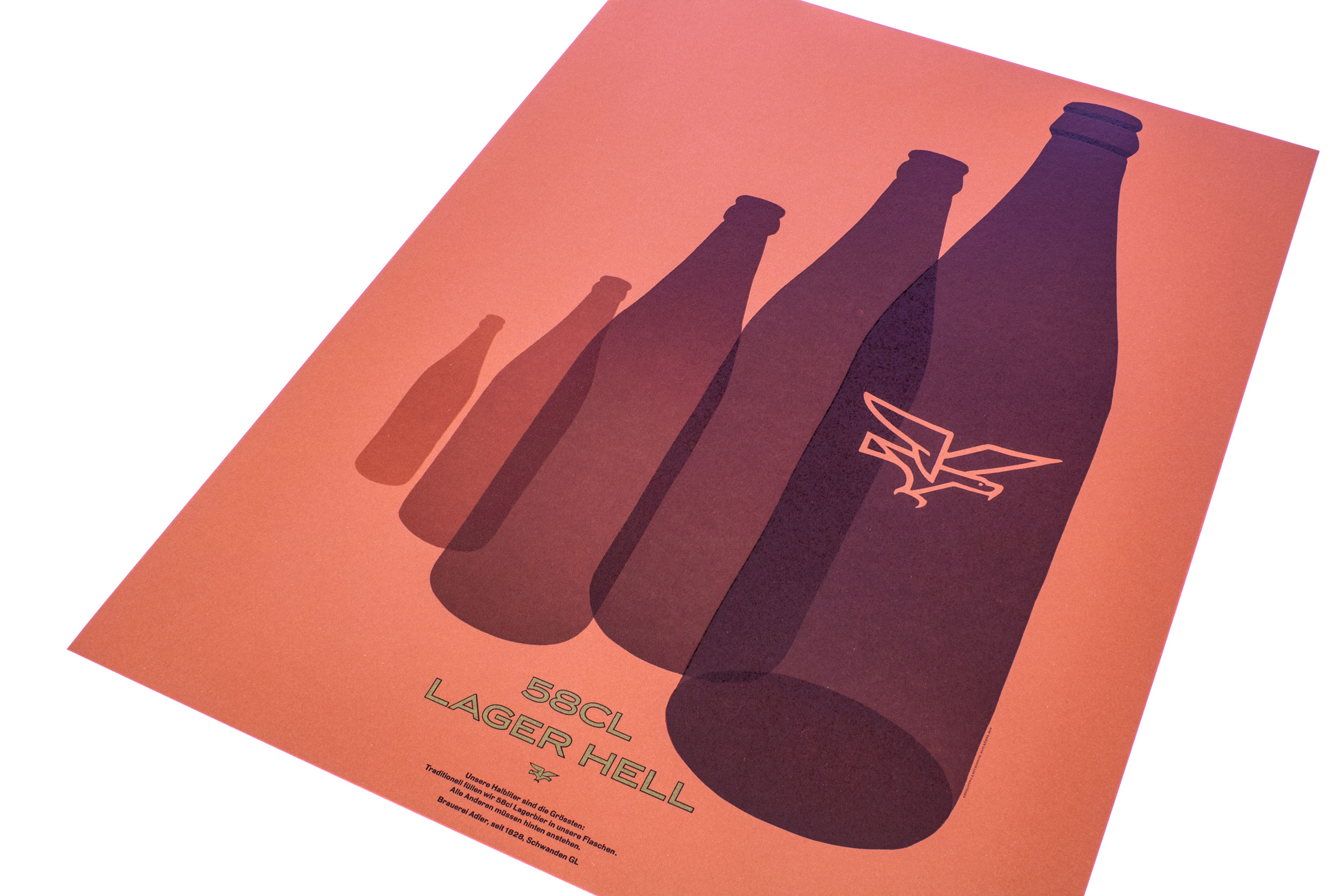
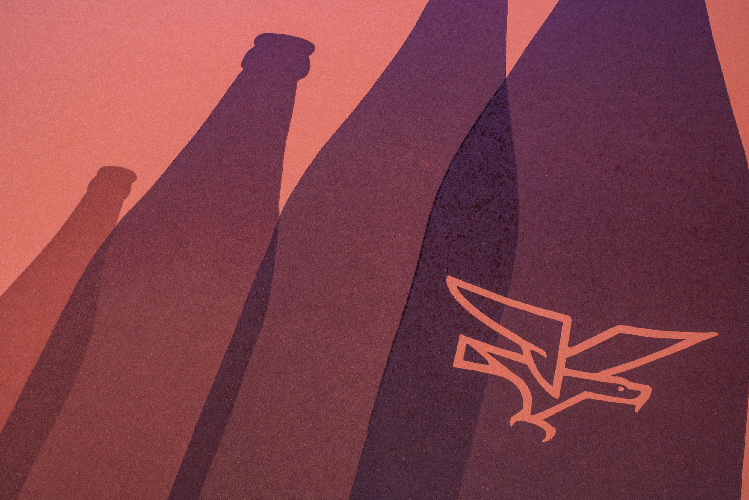
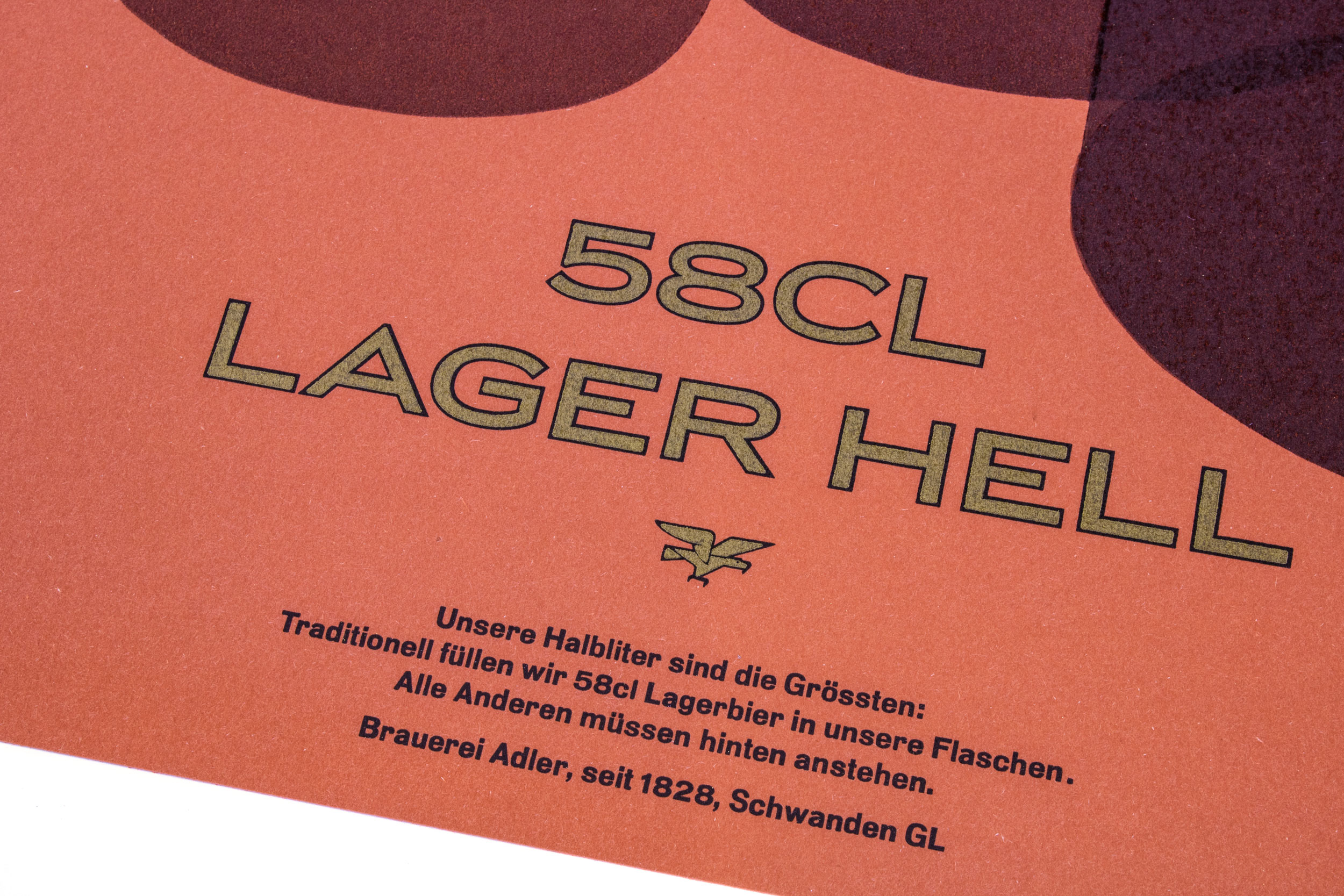
Adler Lager Hell
Third letterpress printed poster for Brauerei Adler. (See the first one here and the second one here). This one is celebrating their 58cl bottle.
The poster has been printed in a total of 11 printruns from hand cut linocuts, some metal type and photopolymer plates.
Client: Brauerei Adler, Schwanden
Format: 60×80cm
Paper: Materica Terra Rossa 360g/m2
Edition: 100 posters on a FAG Control 900
June 2019
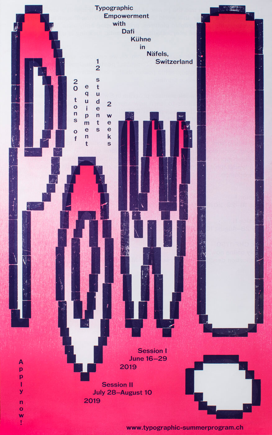
Pow!
Double-sided promotional poster for www.typographic-summerprogram.ch . Printed in 6 print runs from laser cut MDF, bumped up furniture and Ludlow slugs.
This poster was selected with the 100 Beste Plakate from Germany, Switzerland and Austria 2019.
Client: Typographic Summer Program, Näfels
Format: 55×88cm
Paper: Blocker+, 80g/m2
Edition: 350 posters on a FAG Control 900
January 2019
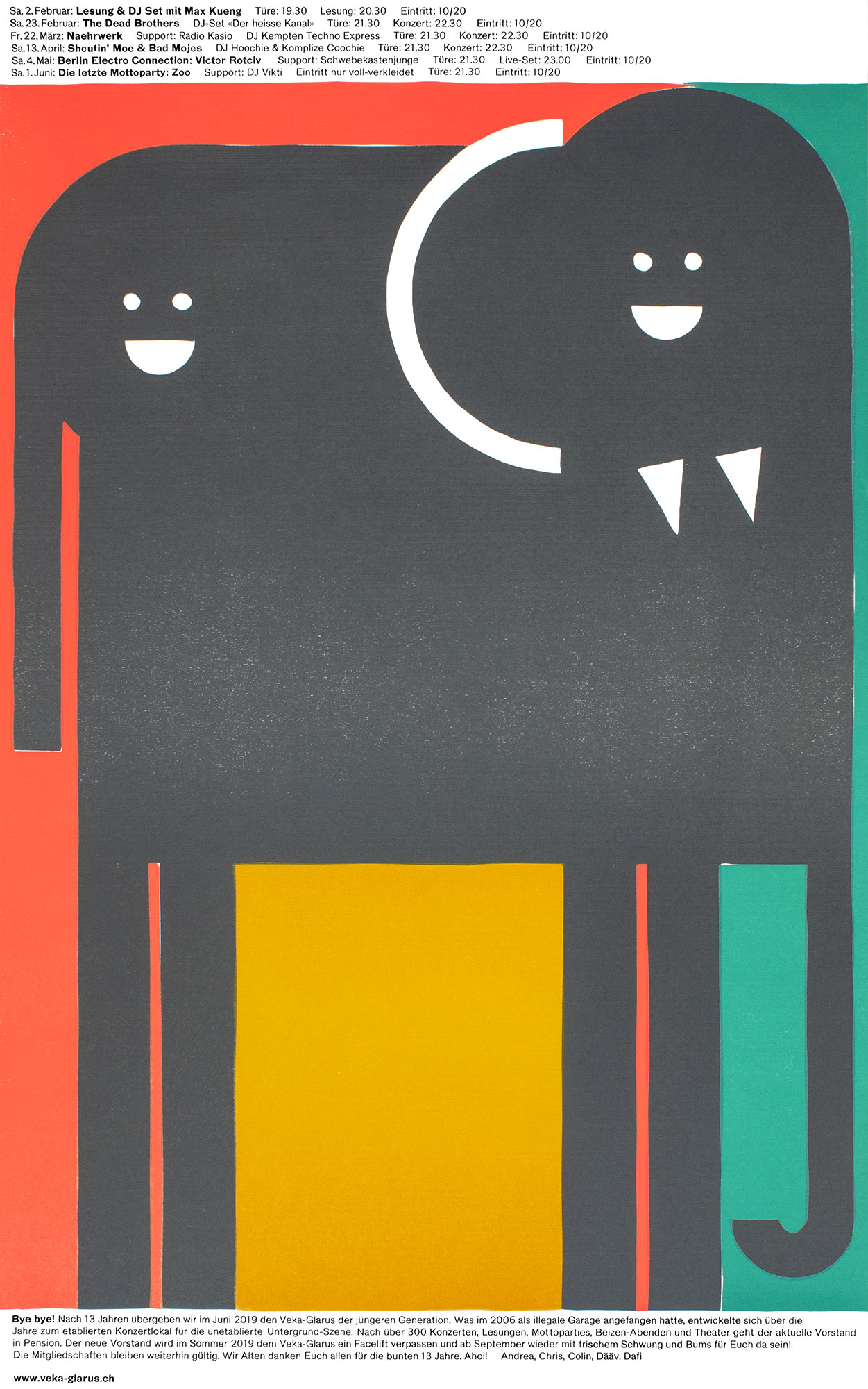
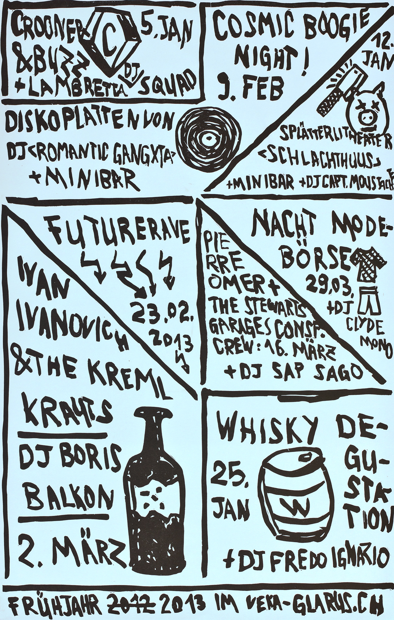
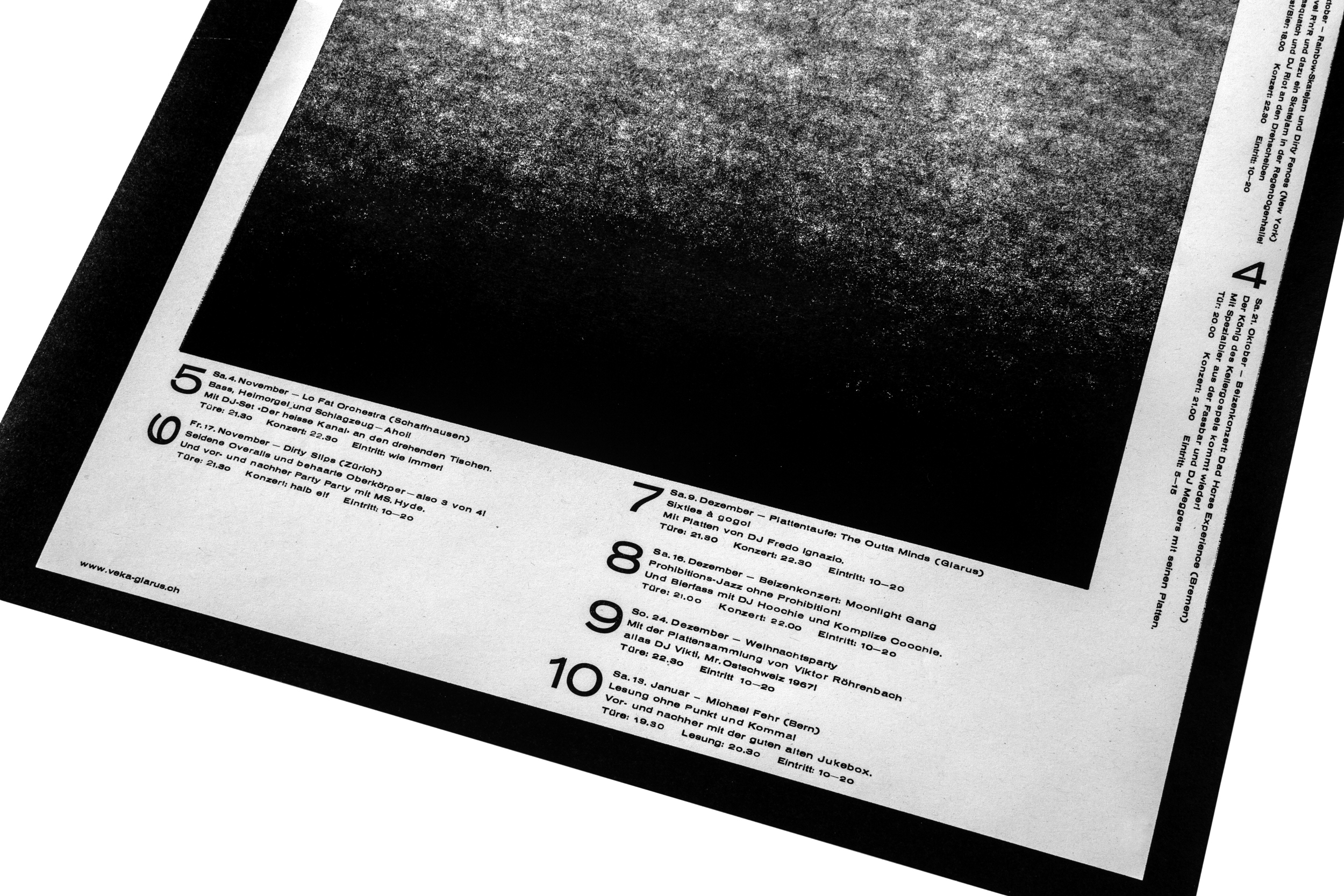
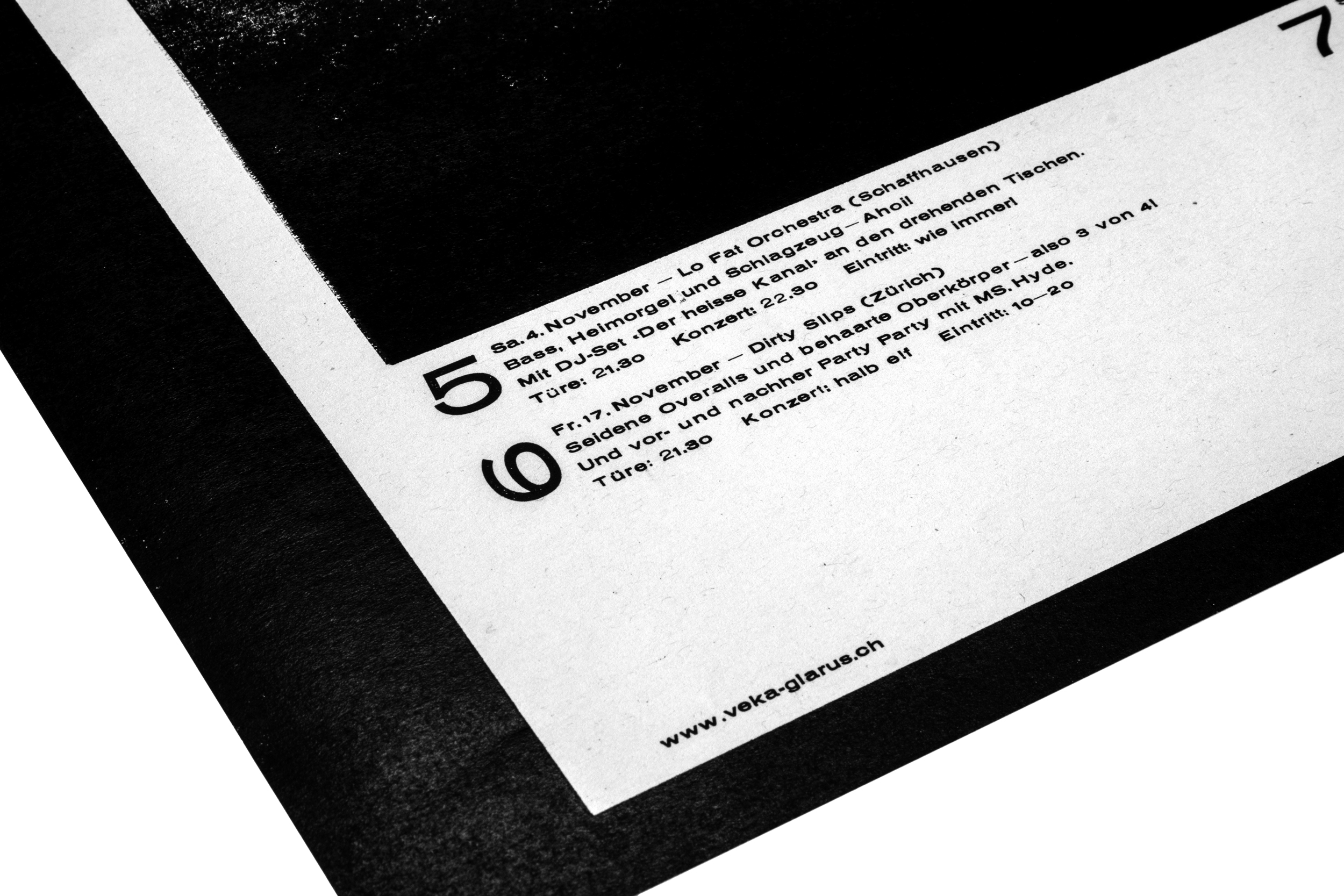
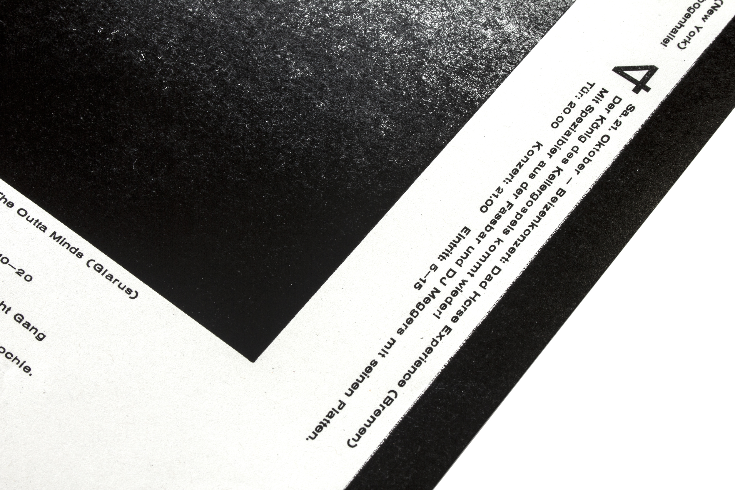
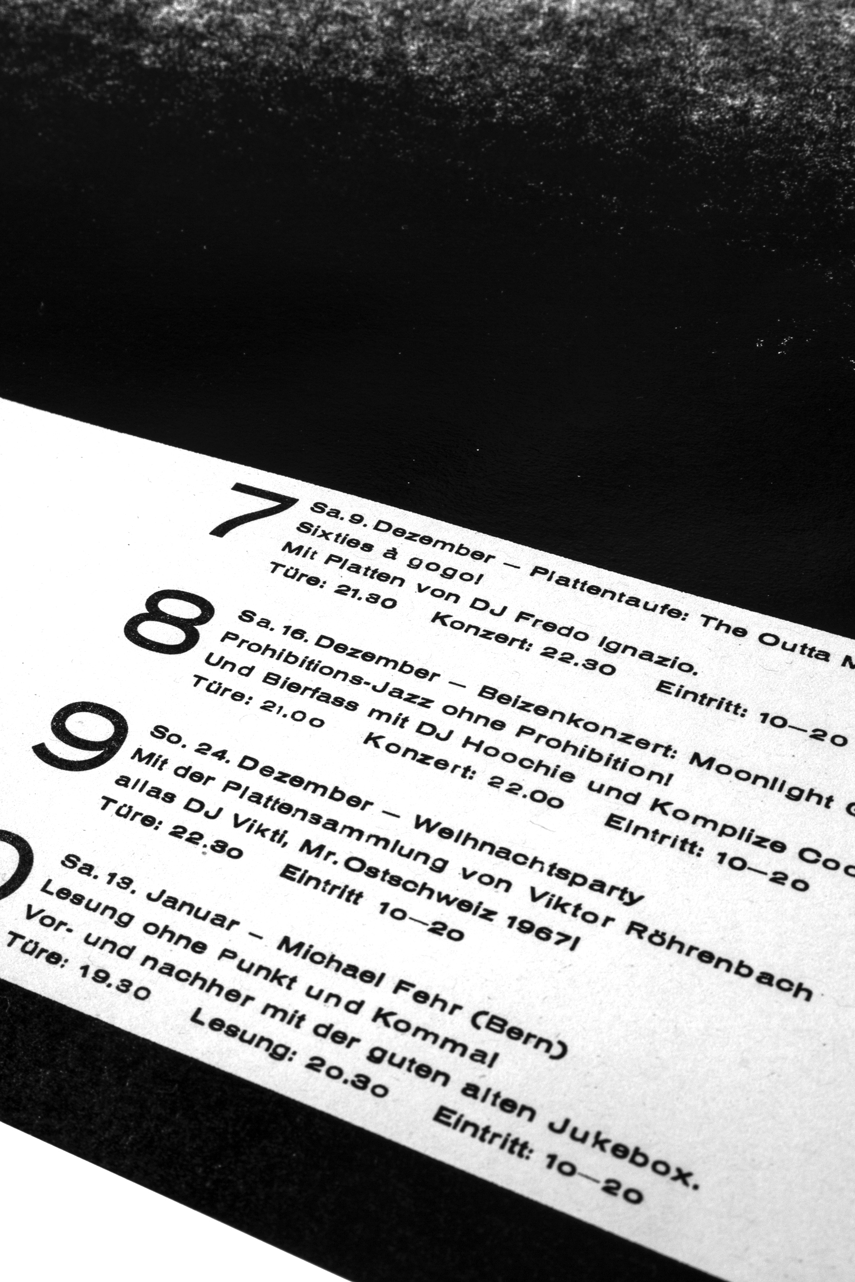
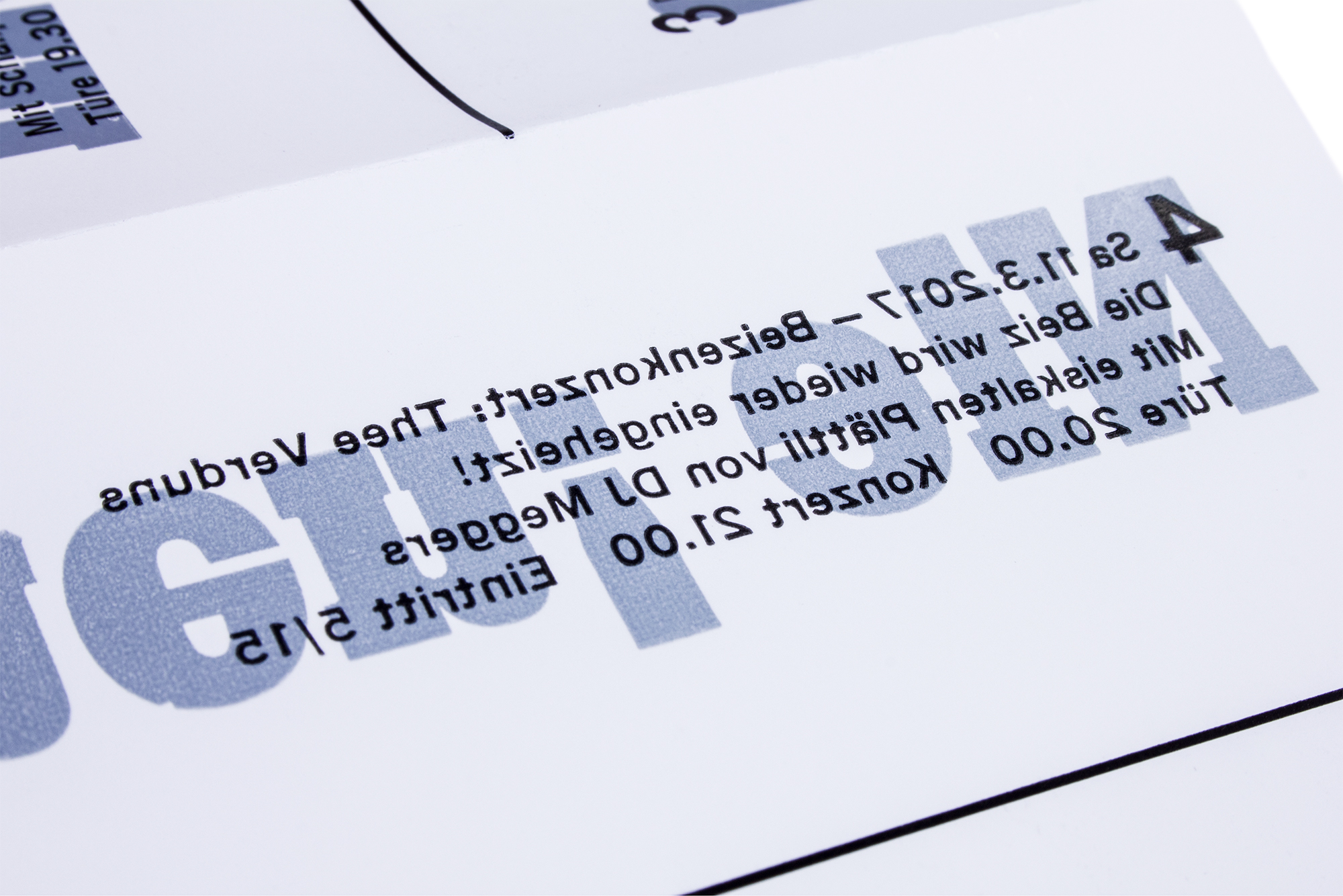
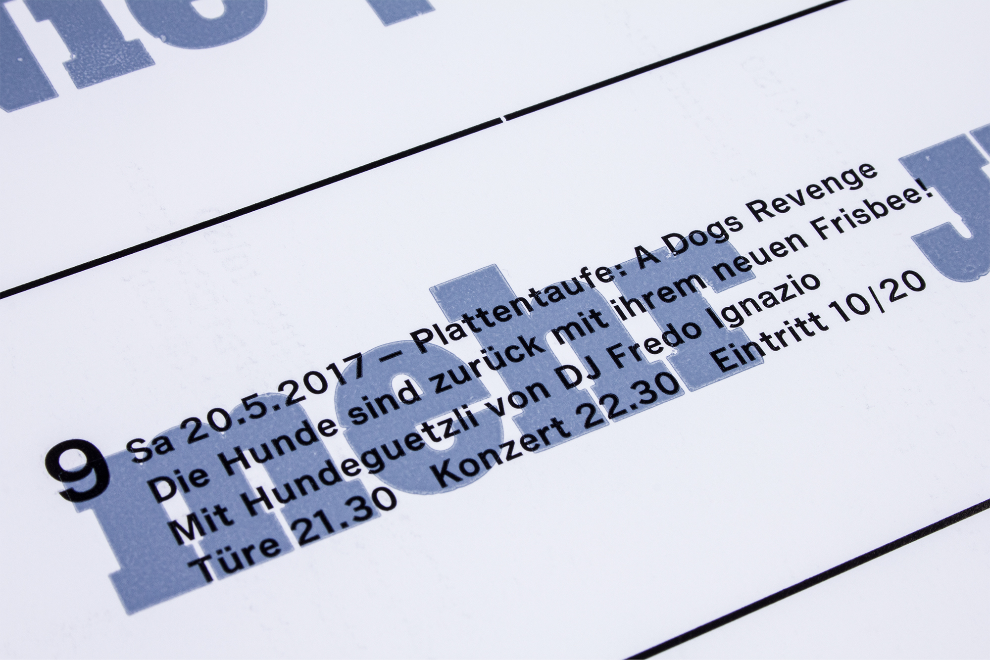
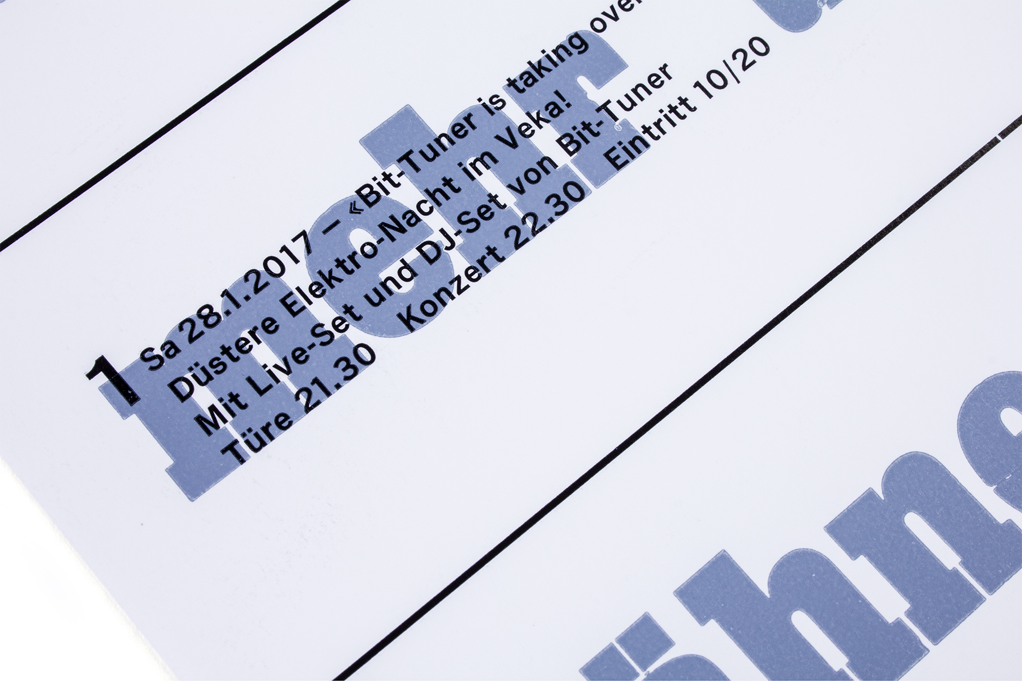
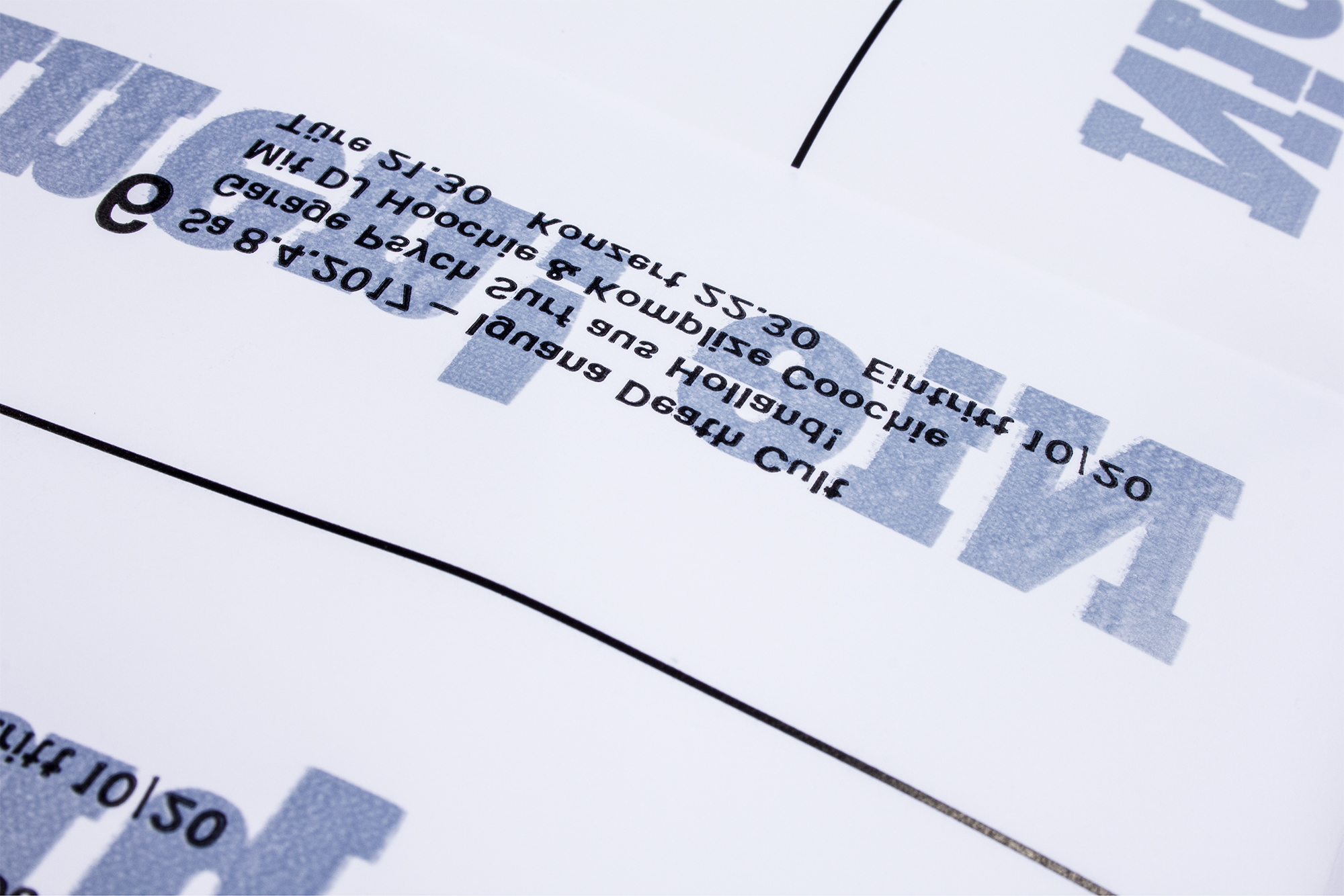
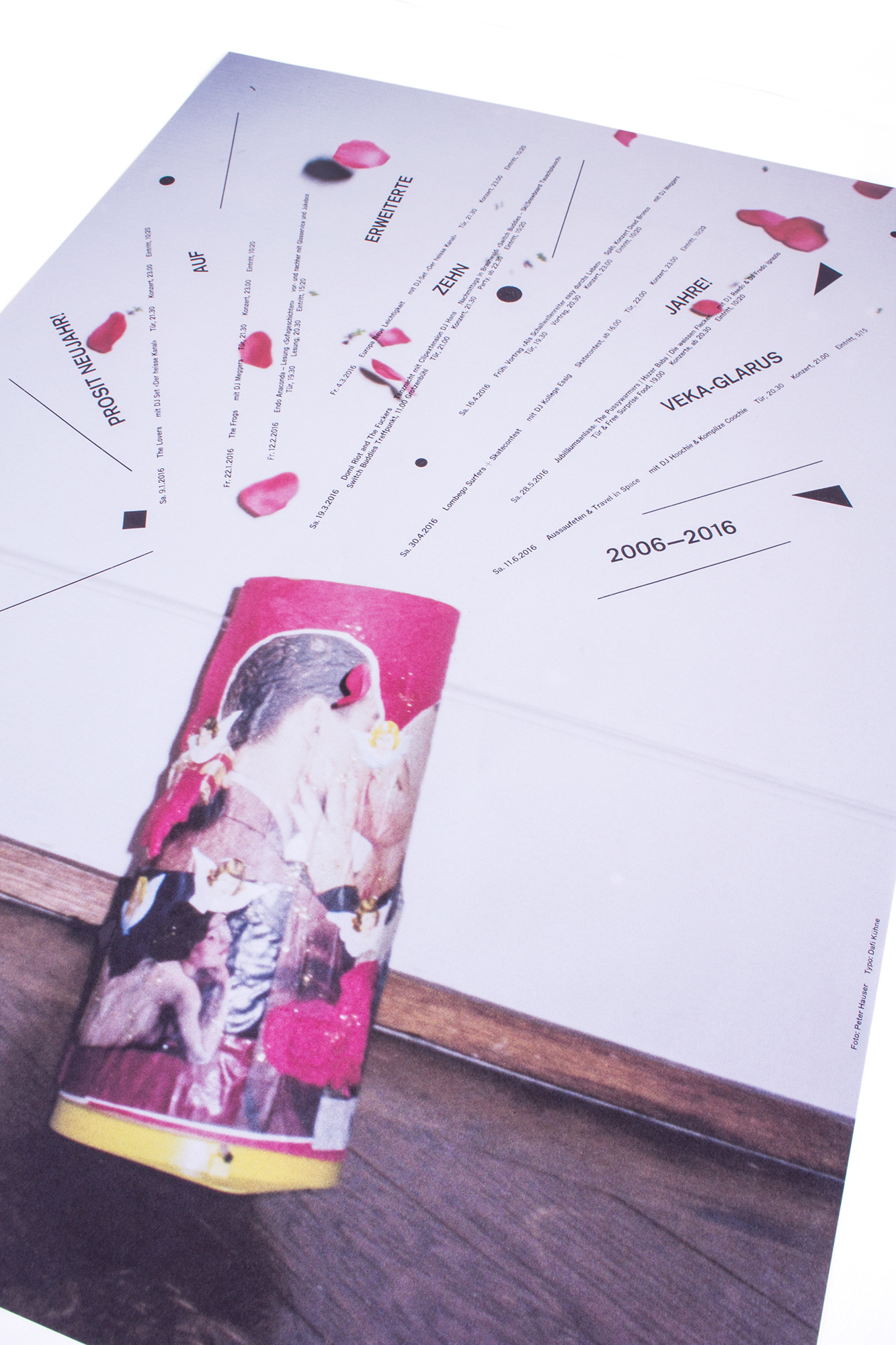
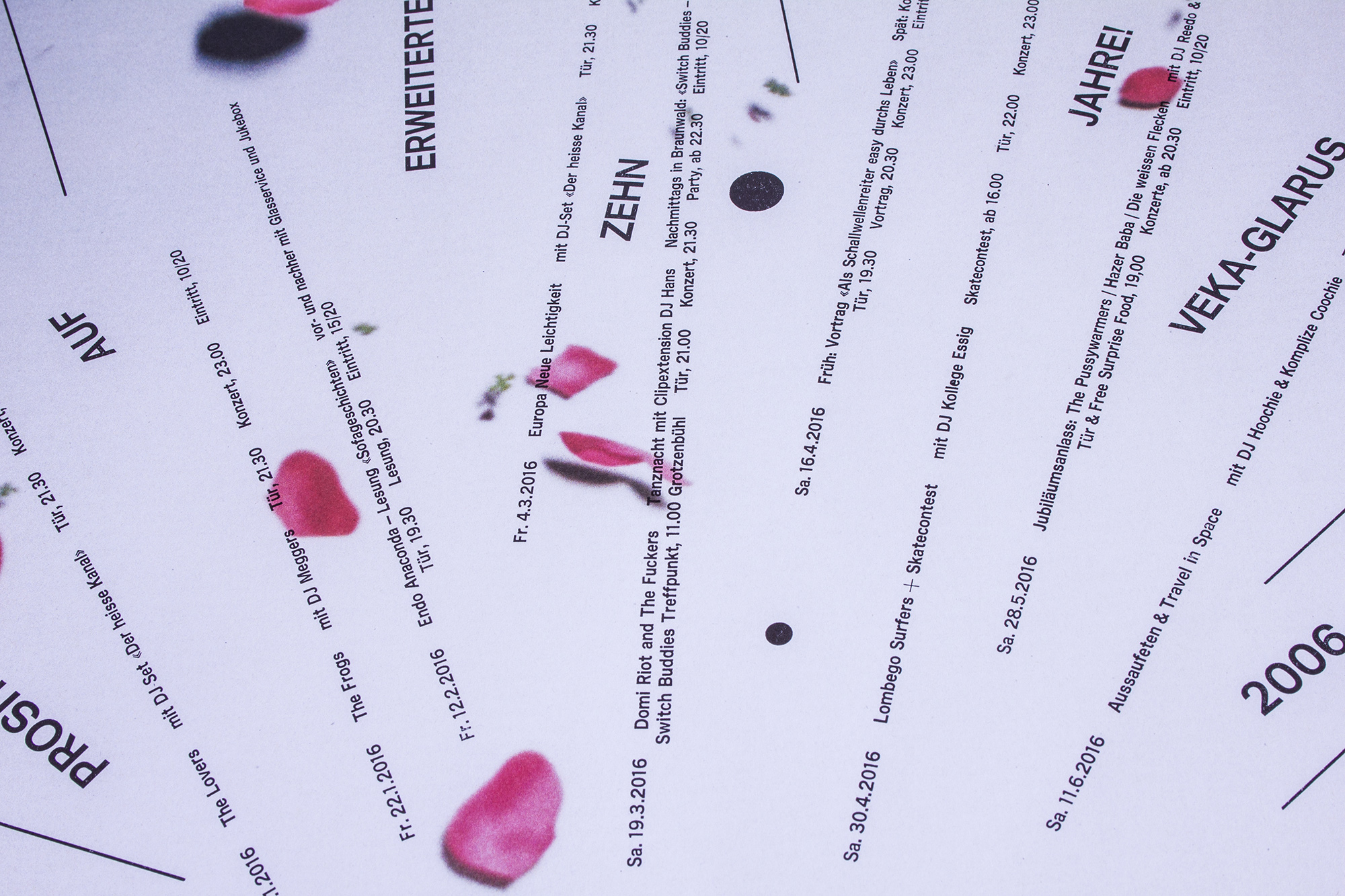
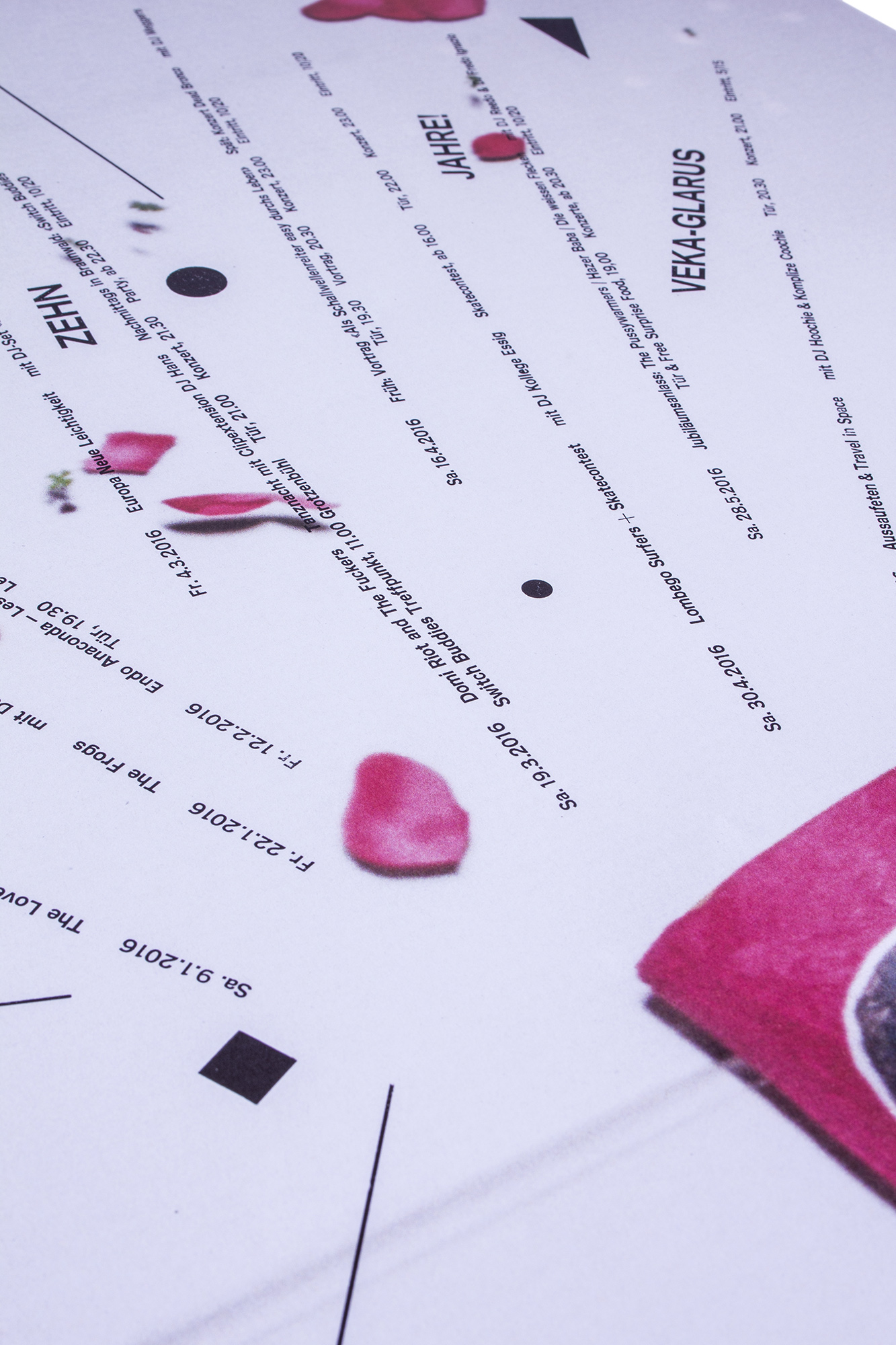
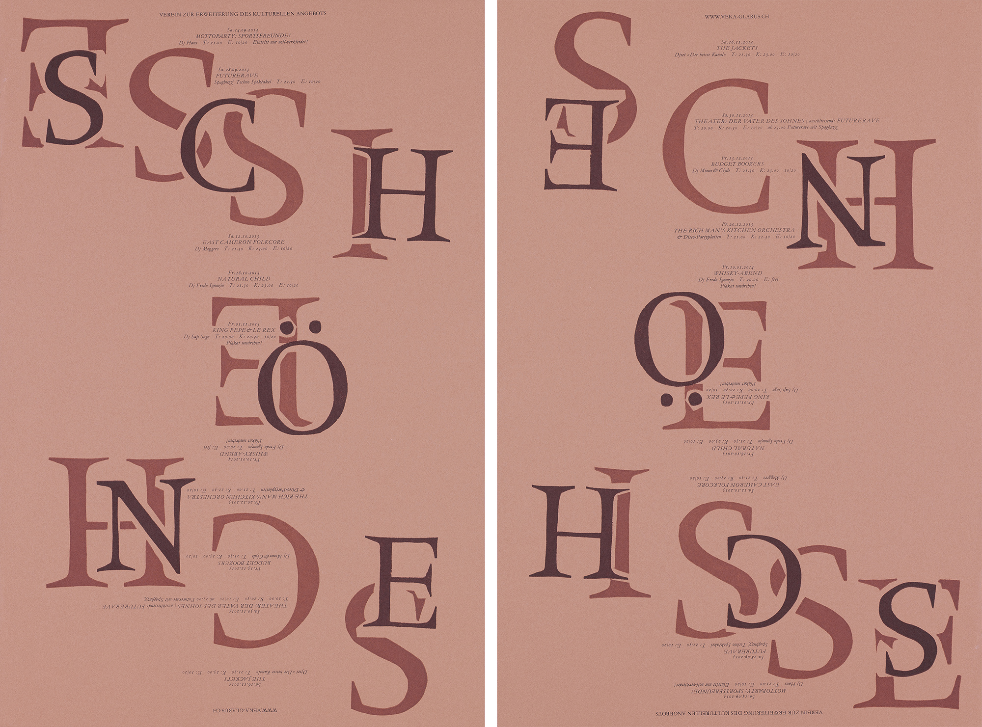
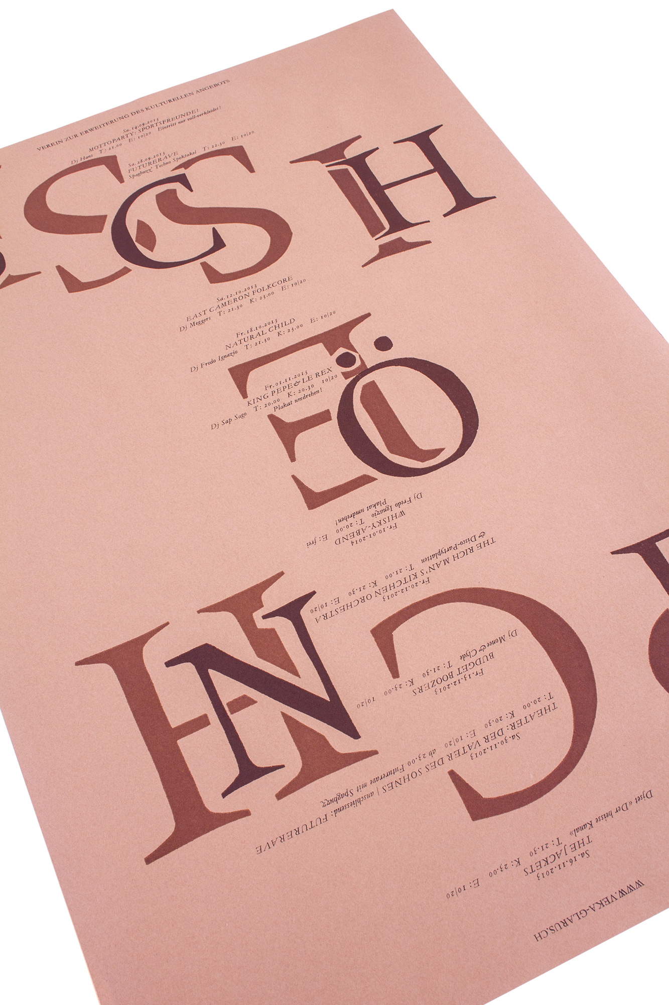
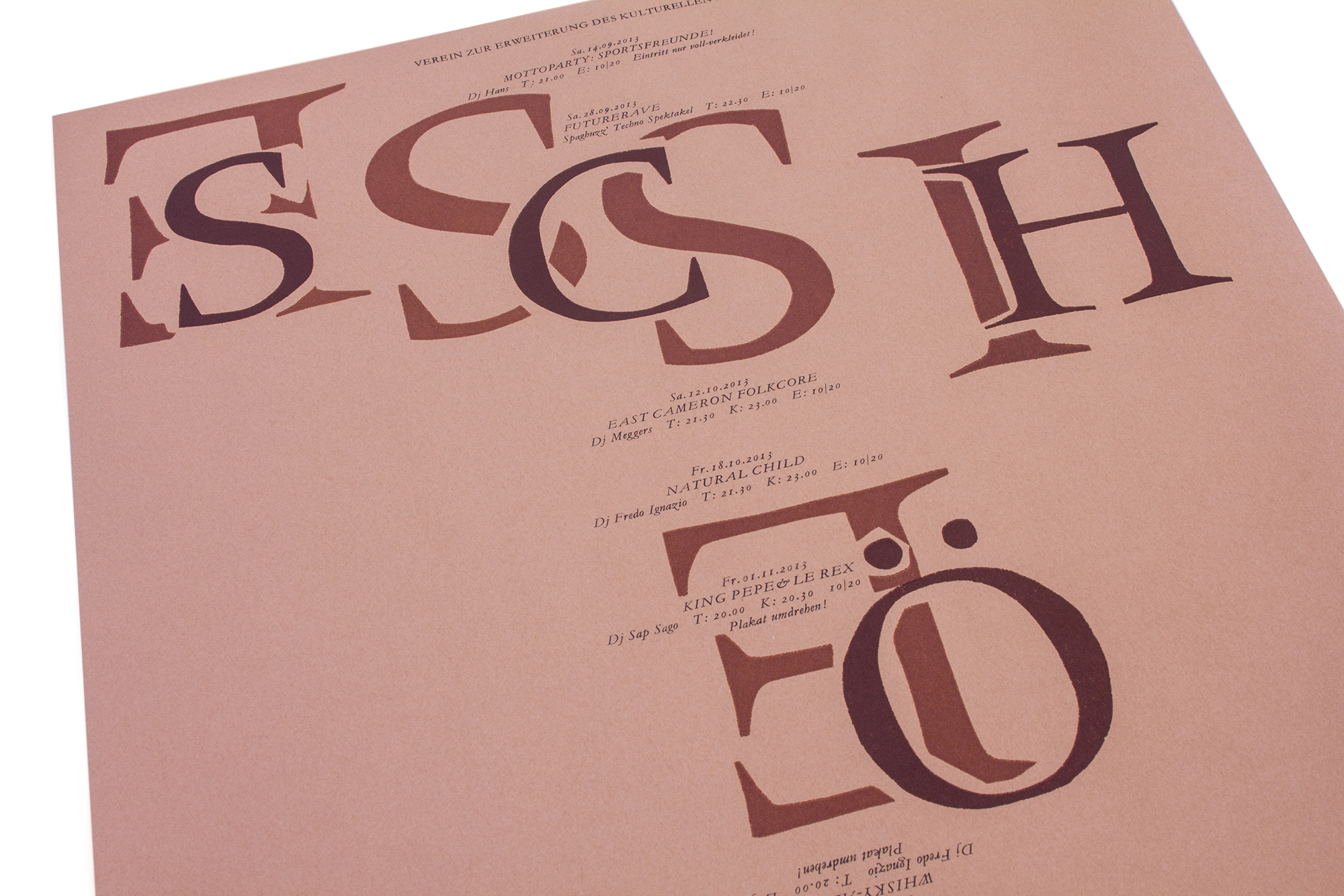
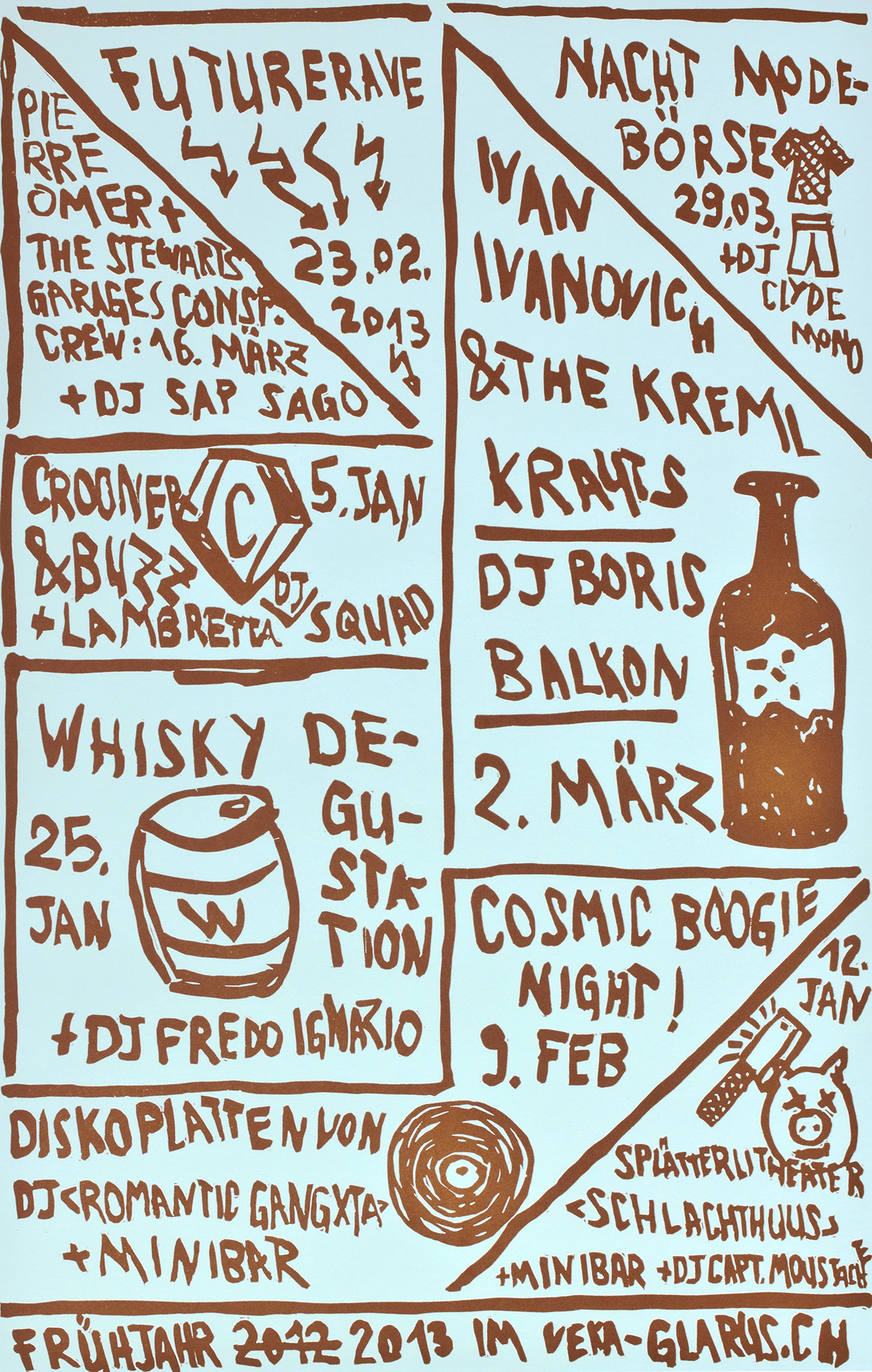
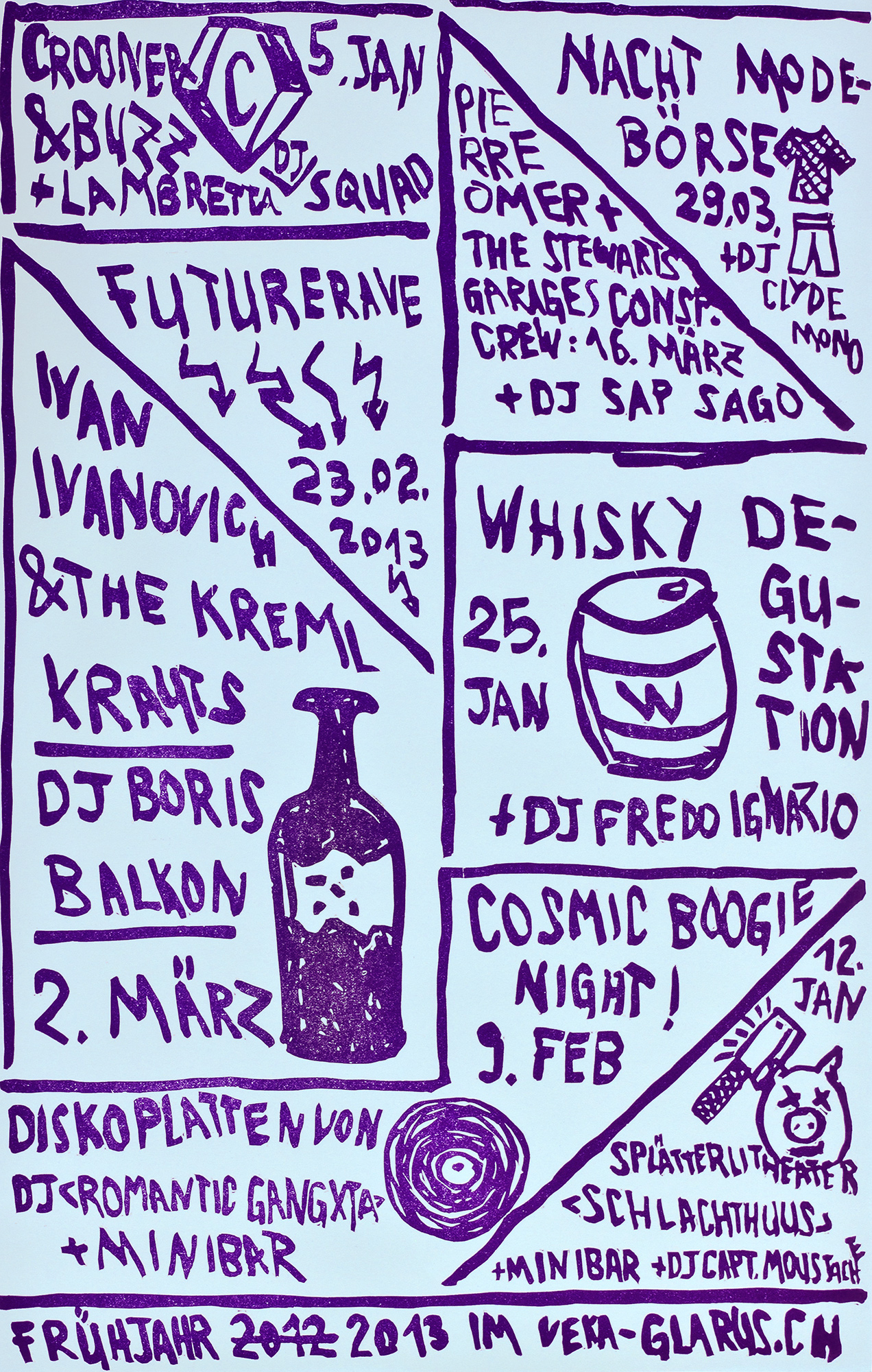
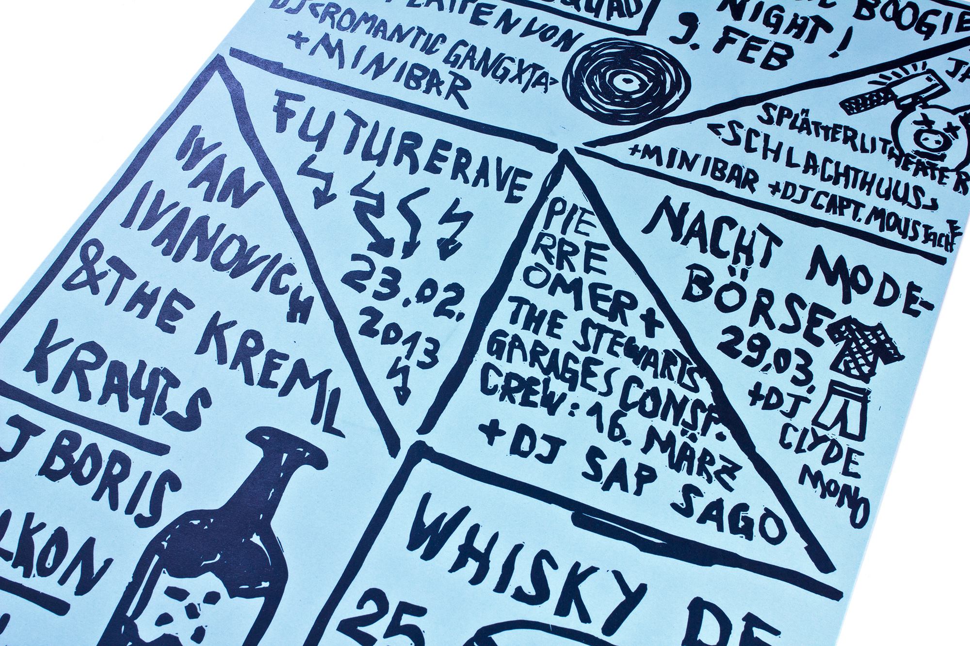
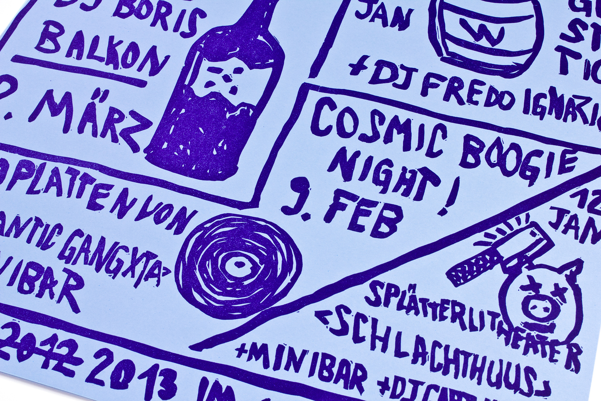
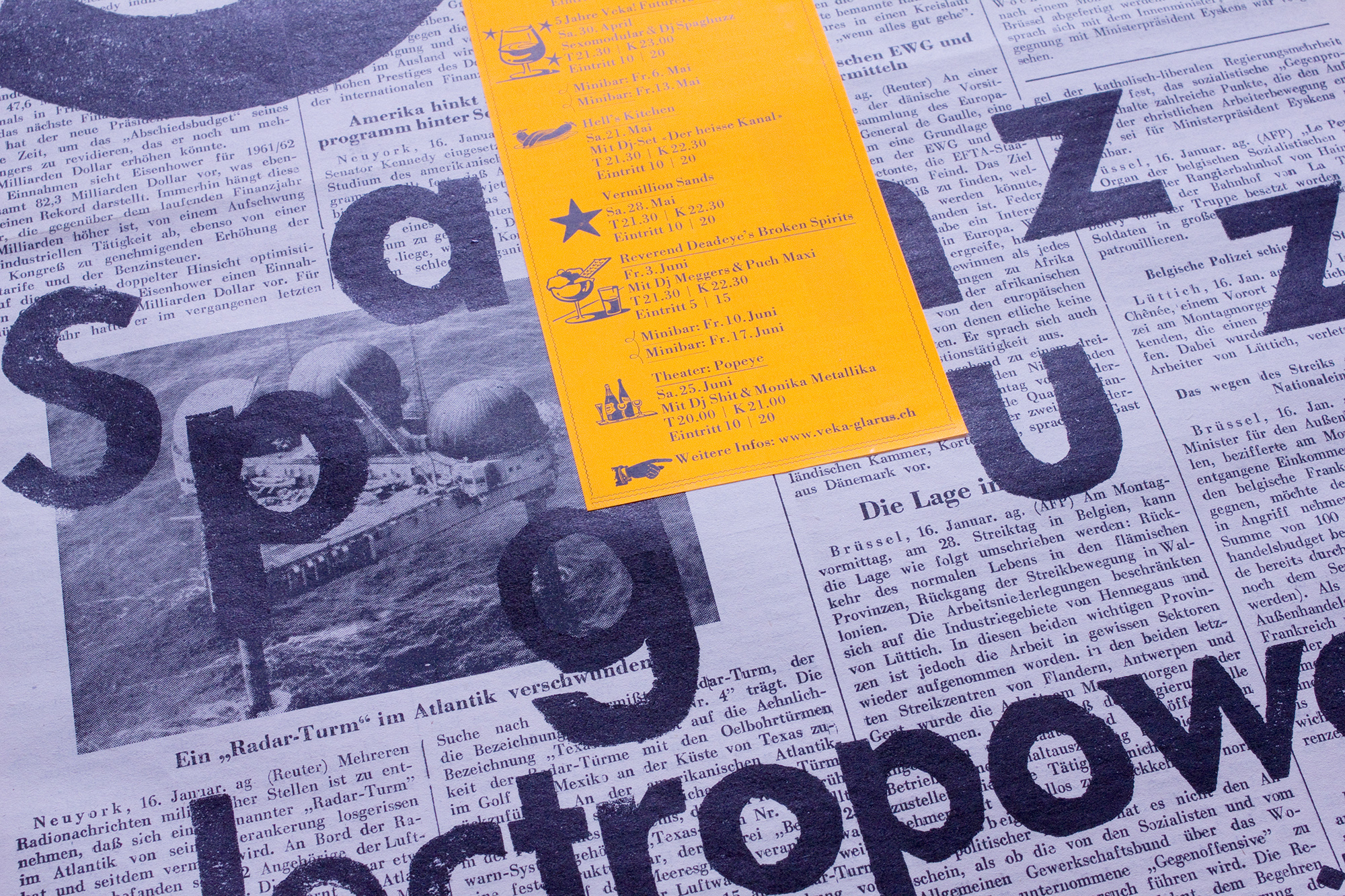
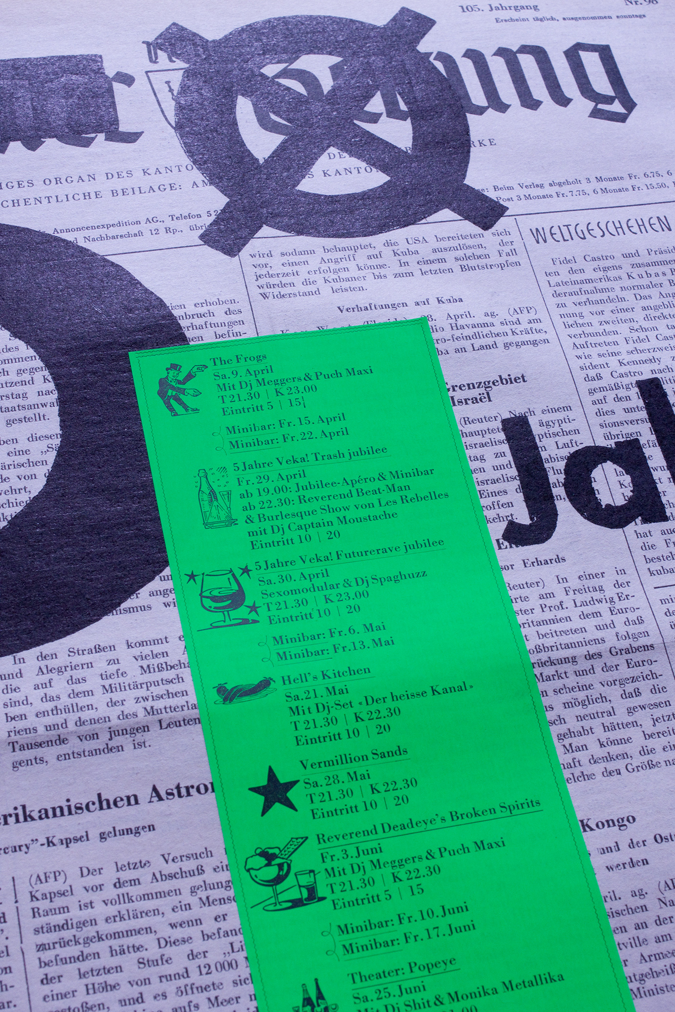
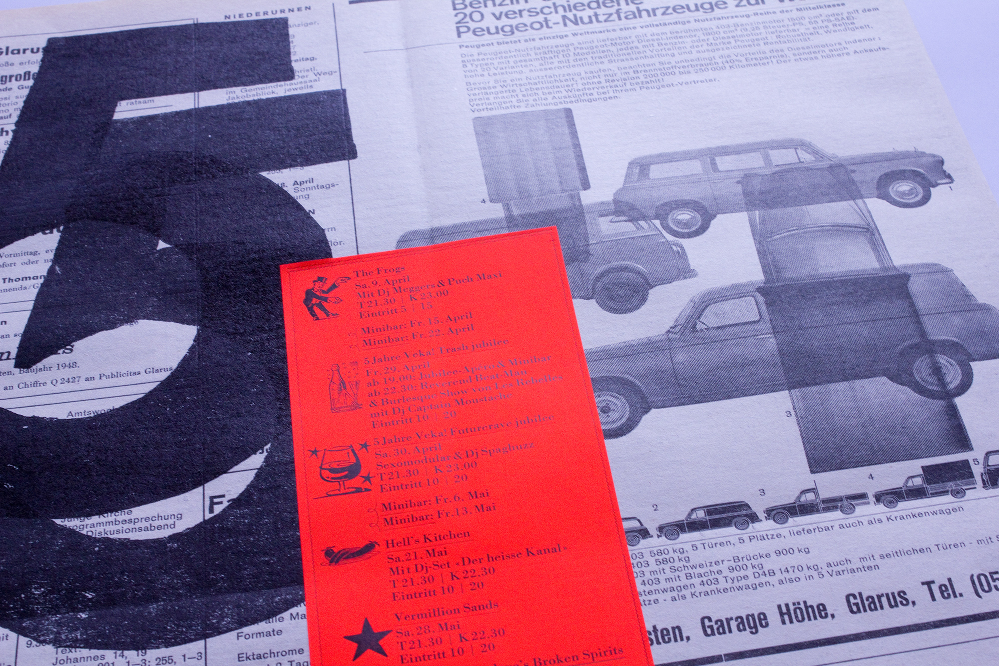
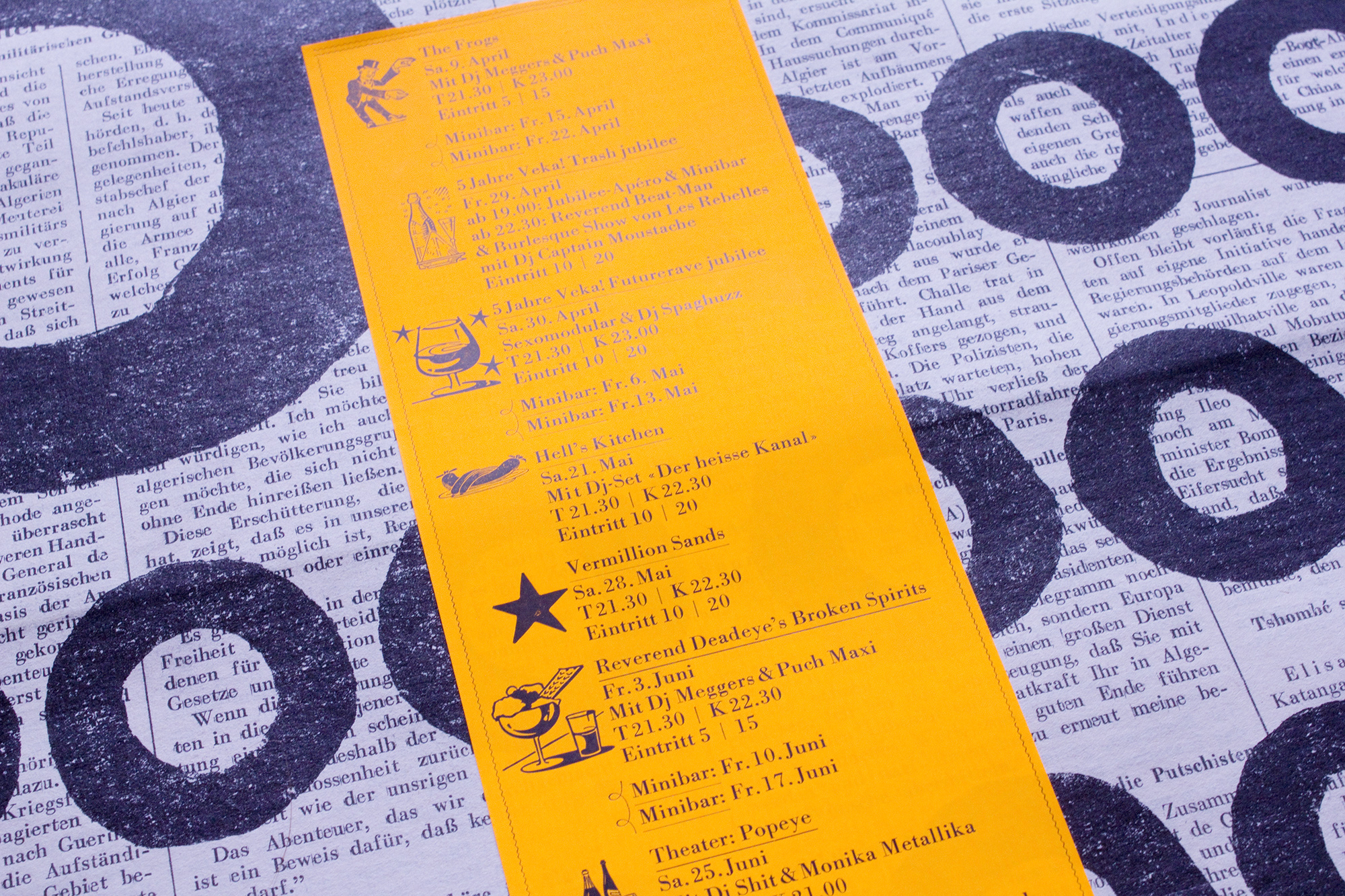
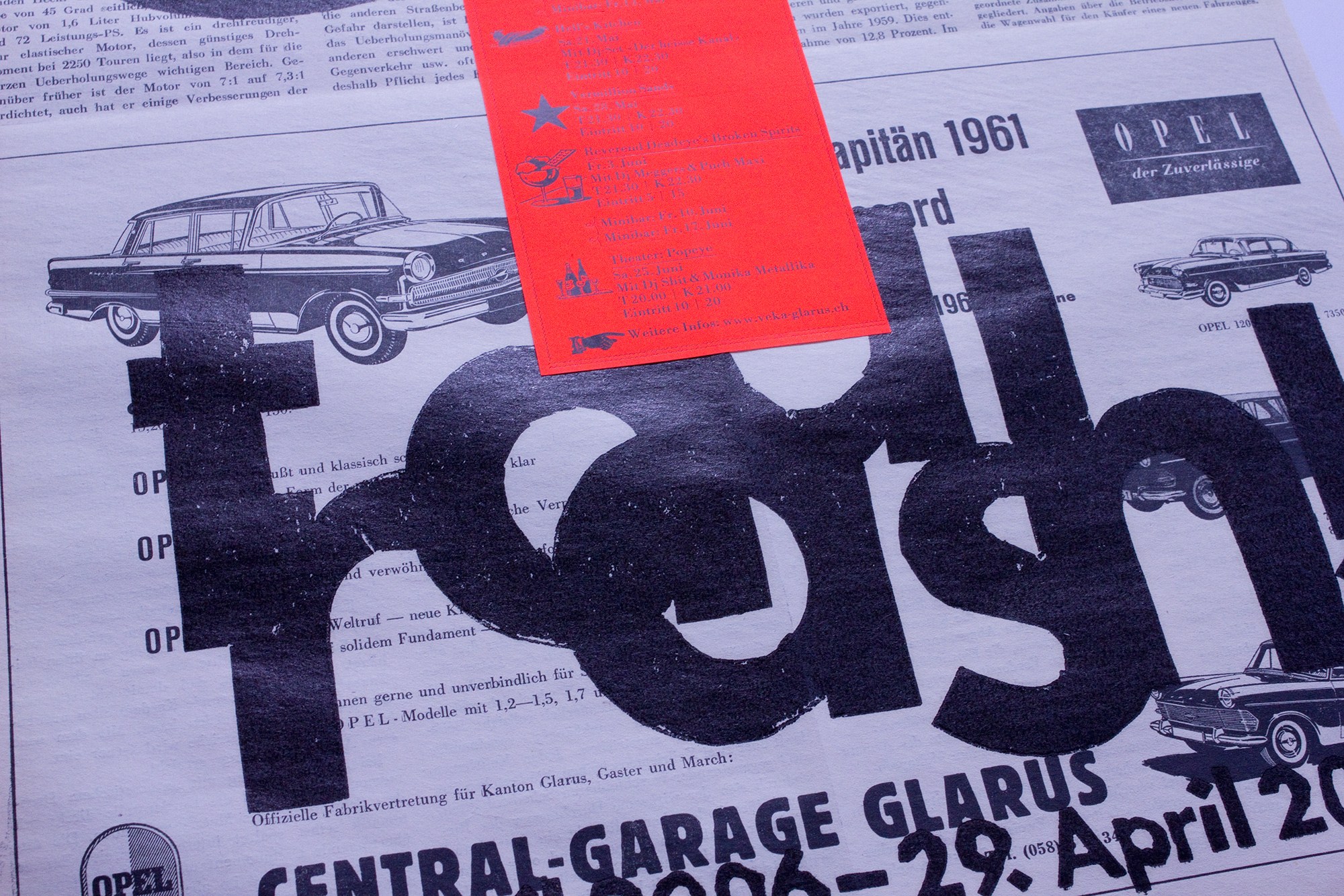
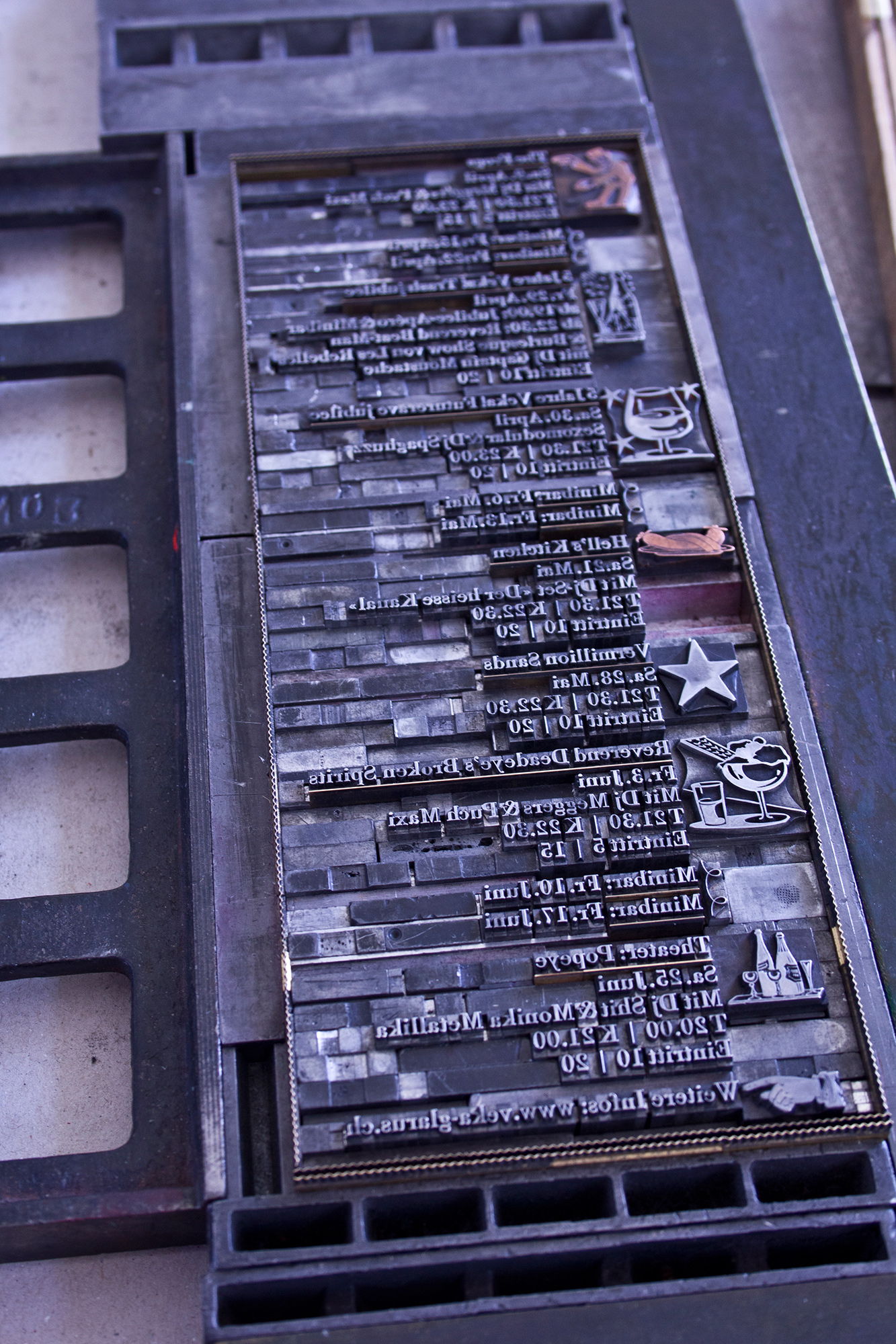
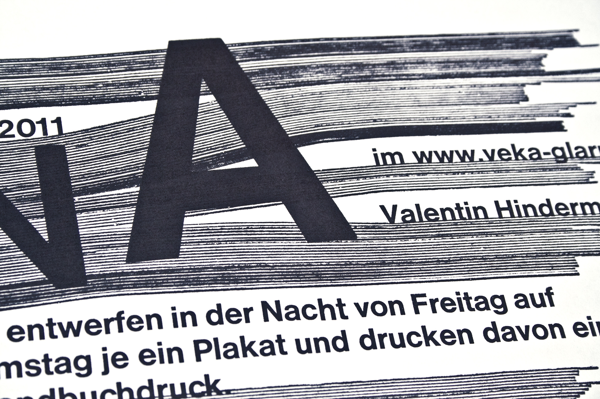
Elephant
Season program for Veka-Glarus.ch printed in 5 print runs from hand cut linoleum and Ludlow slugs.
Two persons dressed up as an elephant!
This poster was selected with the STA-100 by Society of Typographic Arts, Chicago.
Client: Veka-Glarus, Glarus
Format: 43.2×69.6cm
Paper: Nettuno Bianco, 100g/m2
Edition: 550 posters on a FAG Control 900
January 2019
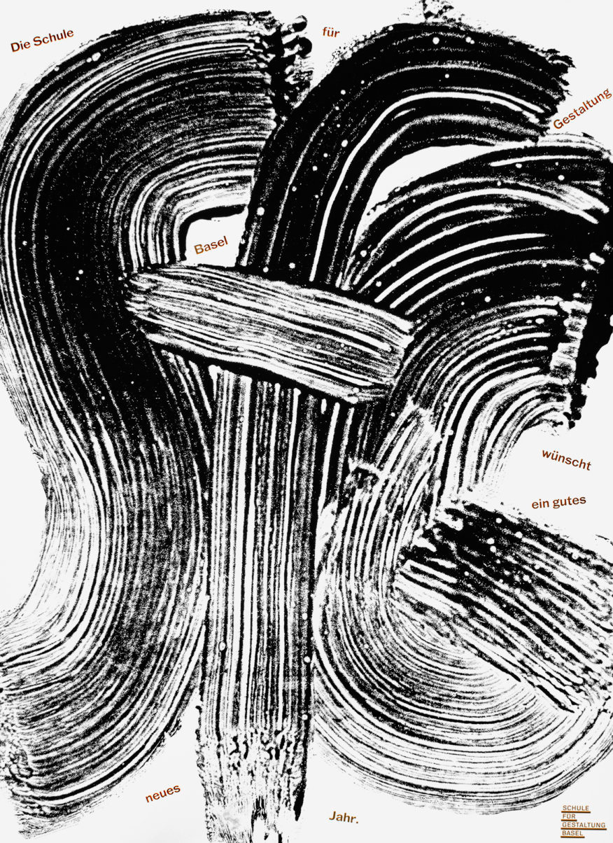
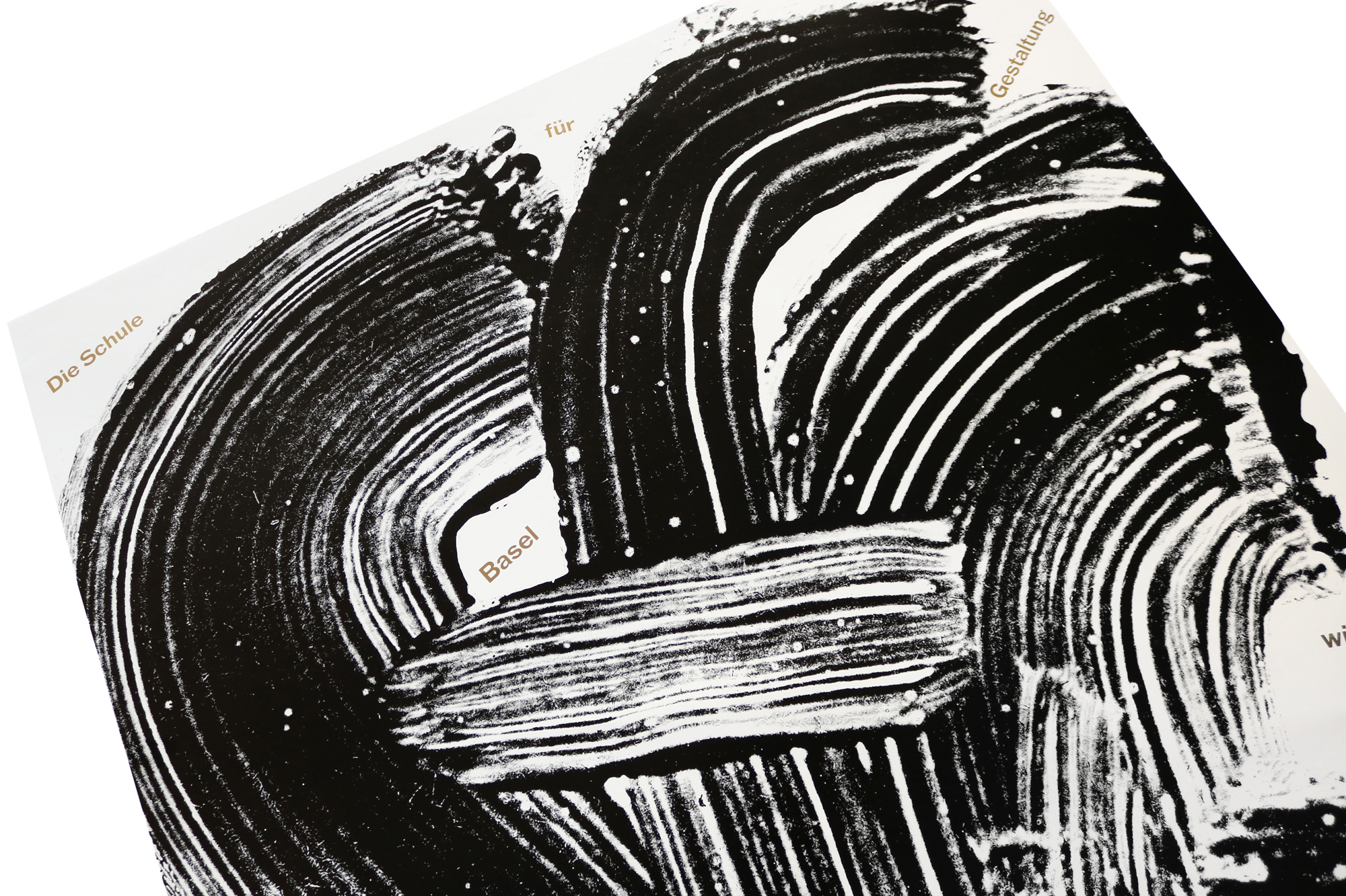
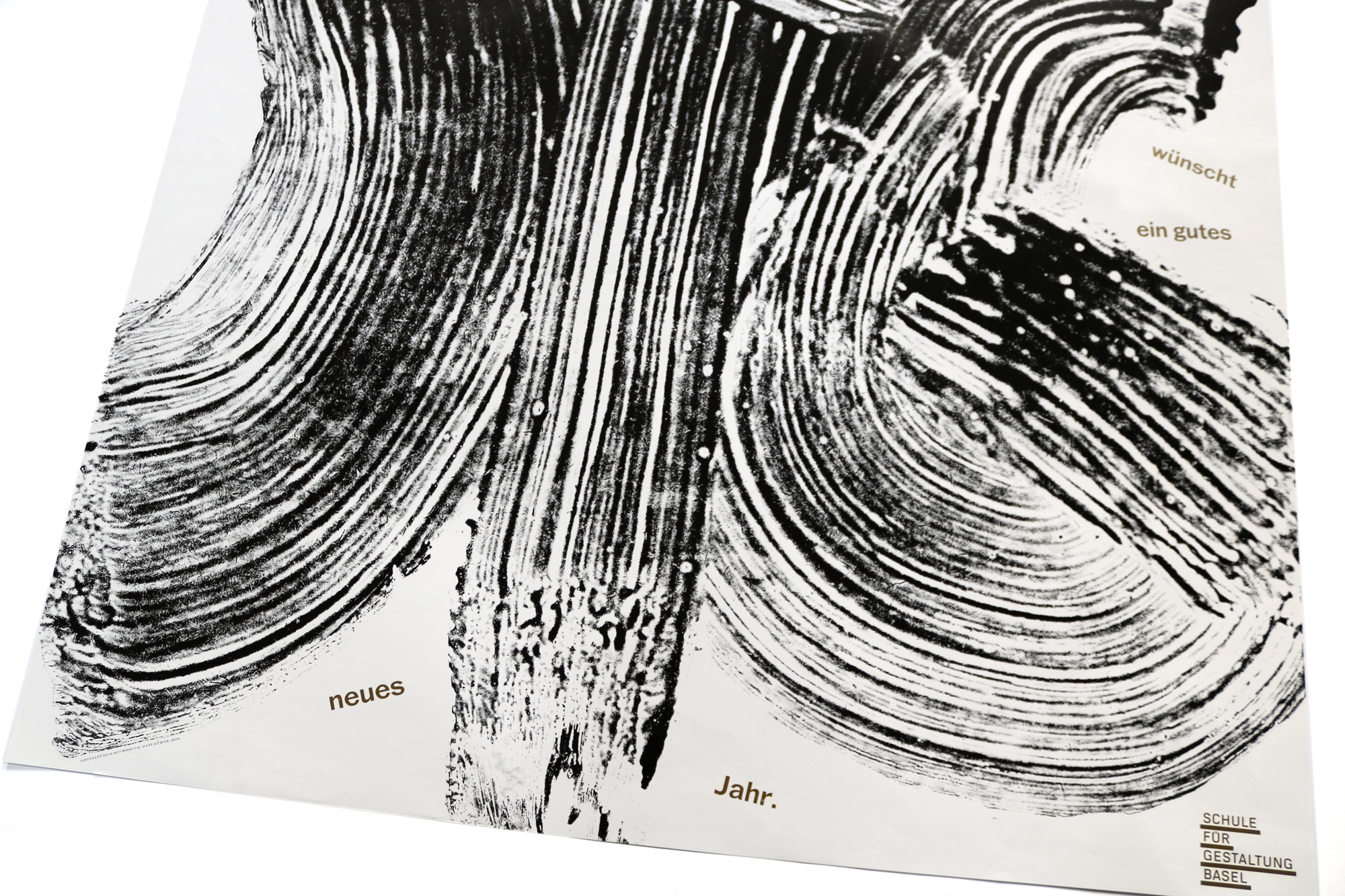
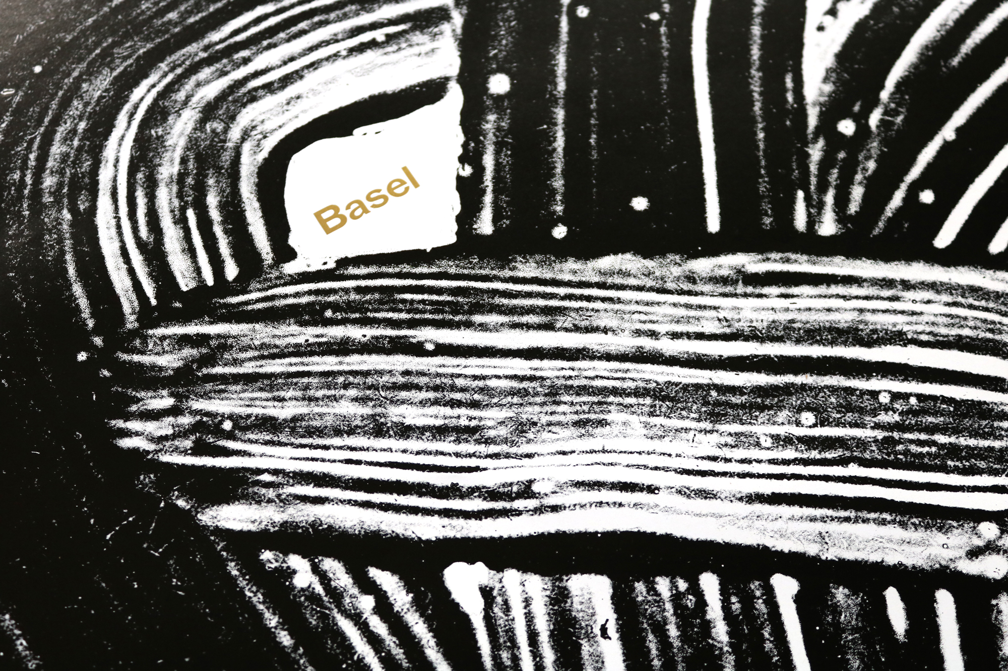
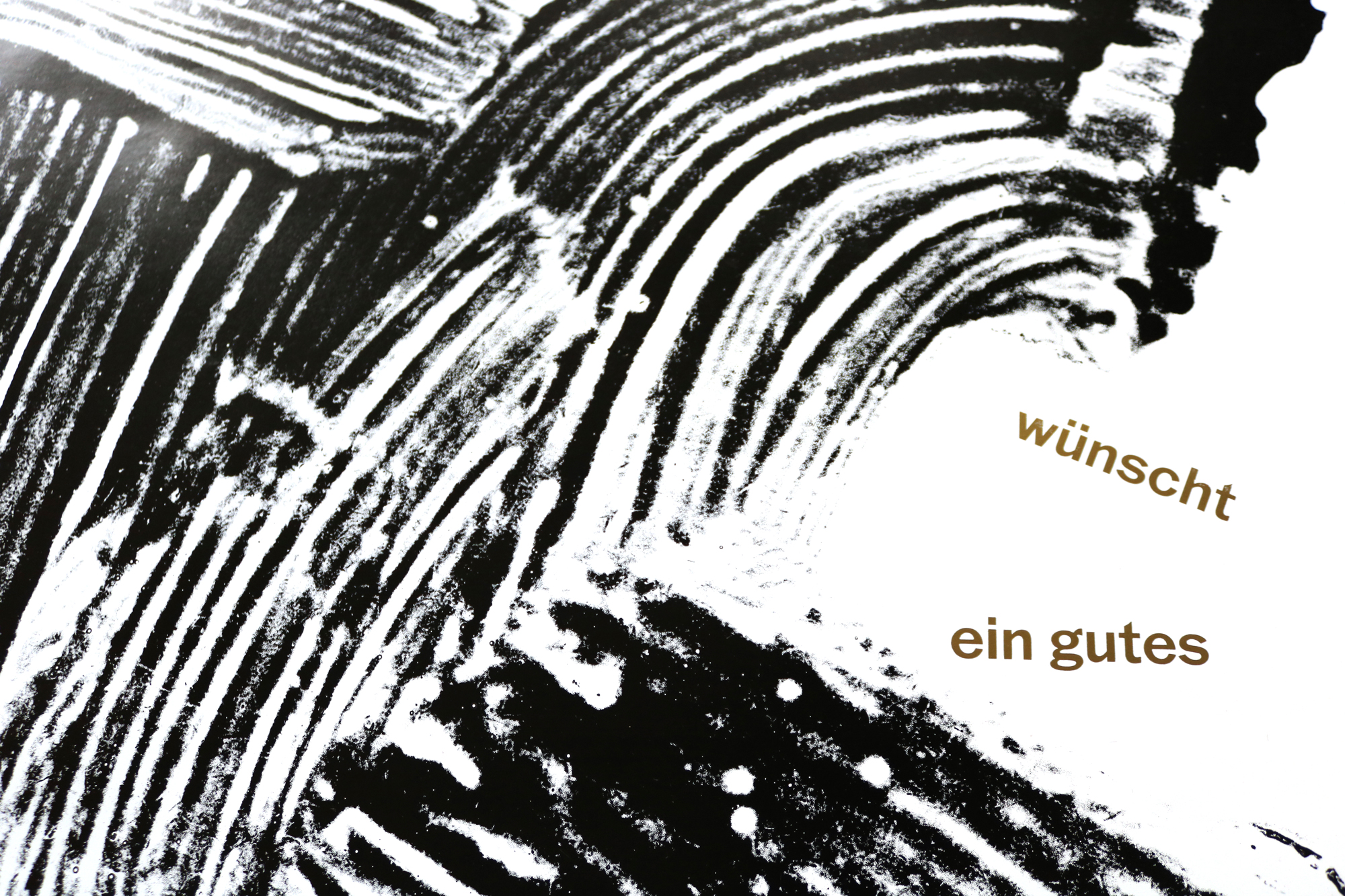
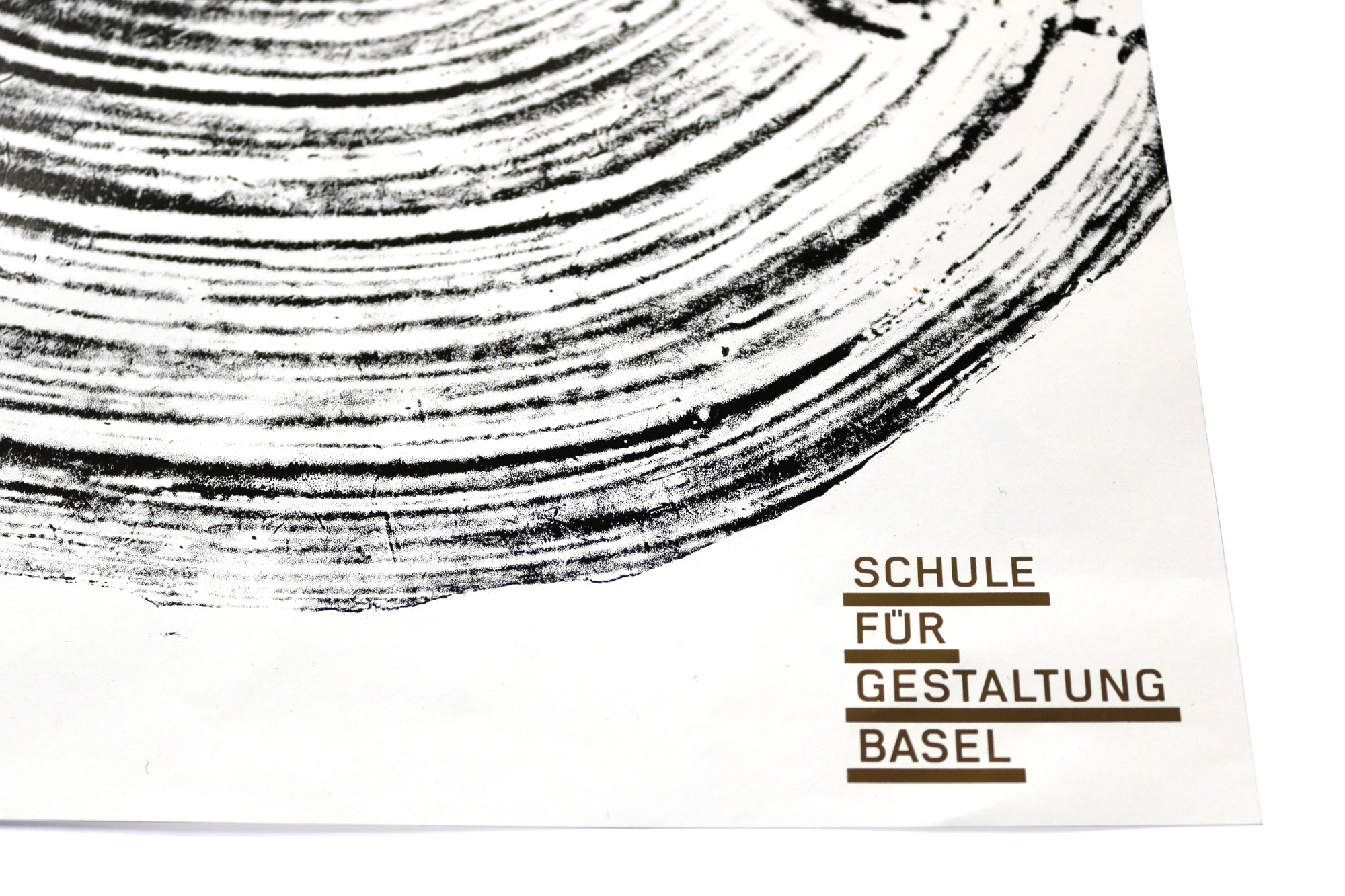
SfG Basel
New year poster for «Schule für Gestaltung Basel». The idea of the process of designing is reflected in the bold and rough brush stroke. Painted with a fat brush and some white glue on a MDF board. Watch the video!
Client: Schule für Gestaltung, Basel
Format: 64×88cm
Paper: Bavaria Gloss, 90g/m2
Edition: 800 posters on a FAG Control 900
December 2018
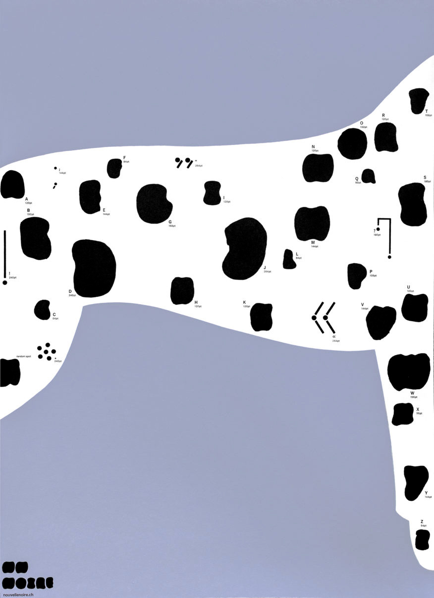
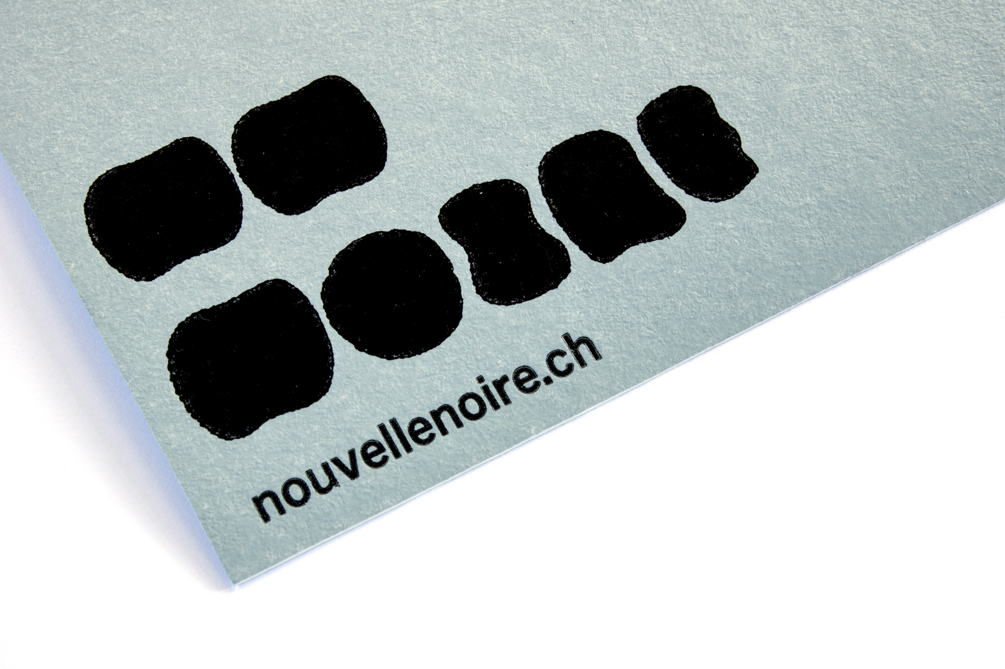
NN-Noire
What do you do if a typefoundry approaches you with the task of making a specimen poster for a typeface that looks like spots? Well, you make them nice spots. Dalmatian-nice spots!
Printed in 3 print runs from hand cut linoleum, laser cut MDF and Ludlow slugs.
This poster is sold out with me: but try Nouvelle Noire to see if they still have copies available. And while there, make sure you buy a typeface!
This poster was selected with the STA-100 by Society of Typographic Arts, Chicago.
Client: Nouvelle Noire, Basel
Format: 50×70cm
Paper: Les Naturals, 325g/m2
Edition: 121 posters on a FAG Control 900
October 2018
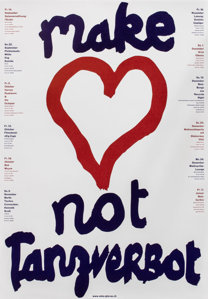
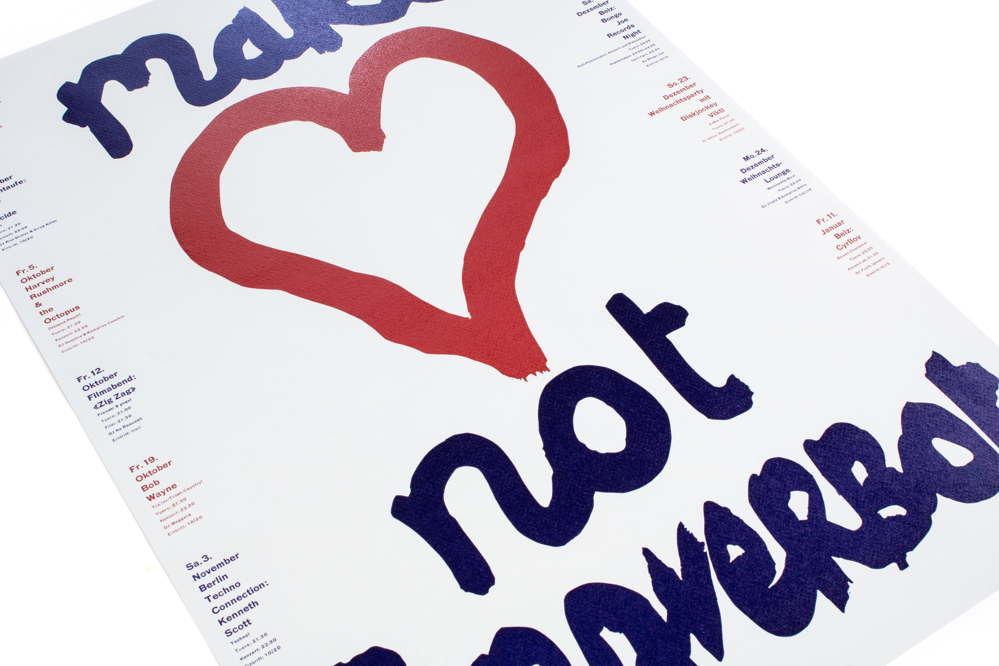
Make 🖤 Not Tanzverbot
Season program for Veka-Glarus.ch printed in 4 print runs from hand cut linoleum and Ludlow slugs.
A protest poster for the local «Tanzverbot» a political discussion on dance-prohibition. Yes you heard it right: dance-prohibition!
Client: Veka-Glarus, Glarus
Format: 44.5×64cm
Paper: Freelife Merida weiss, 100g/m2
Edition: 400 posters on a FAG Control 900
August 2018
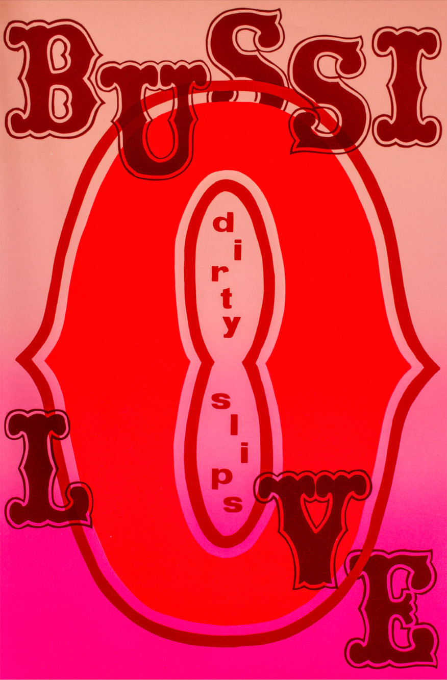
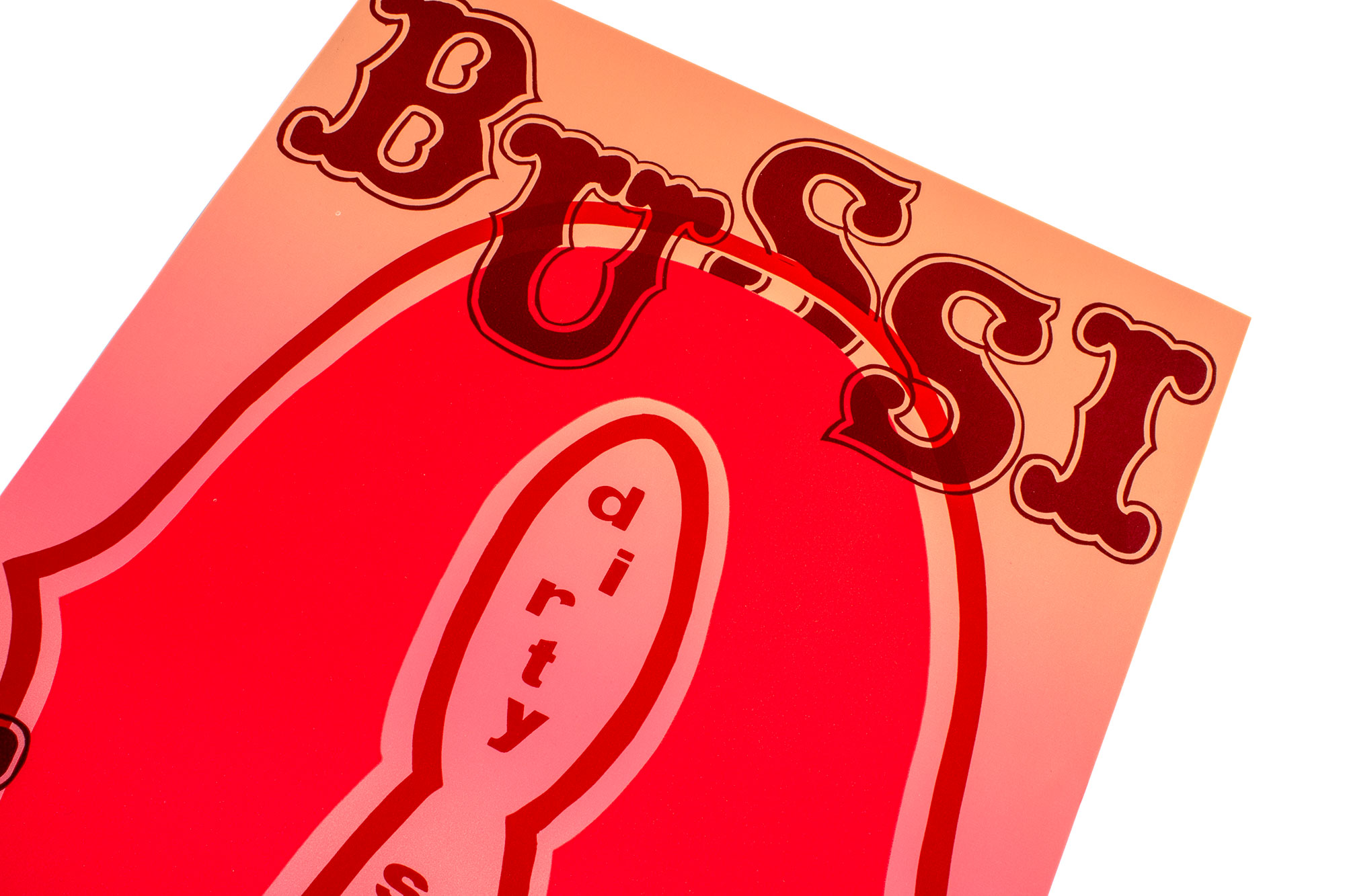
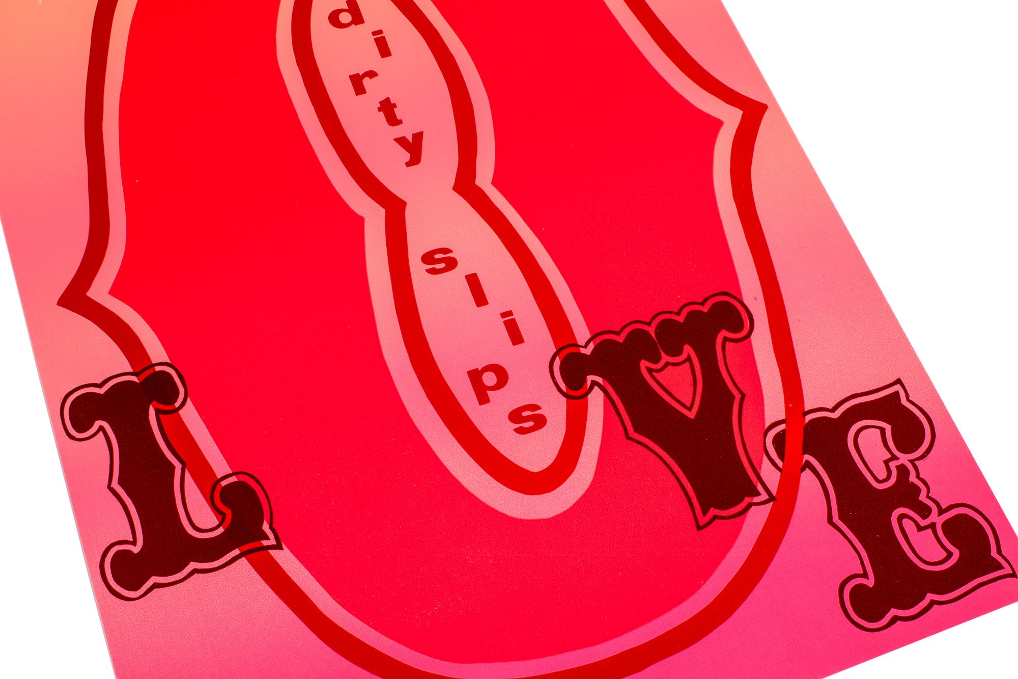
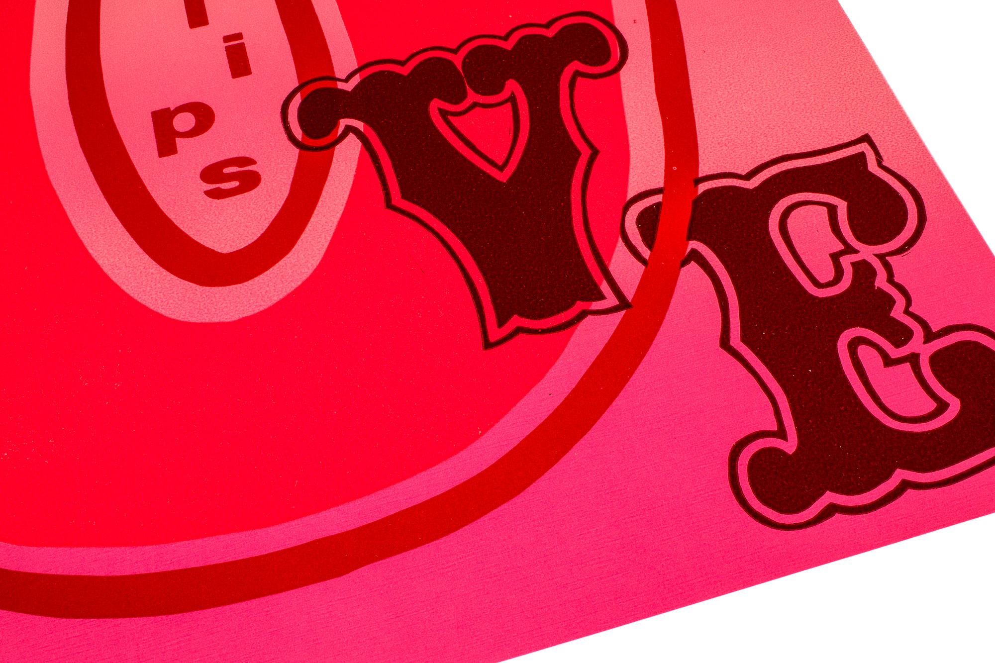
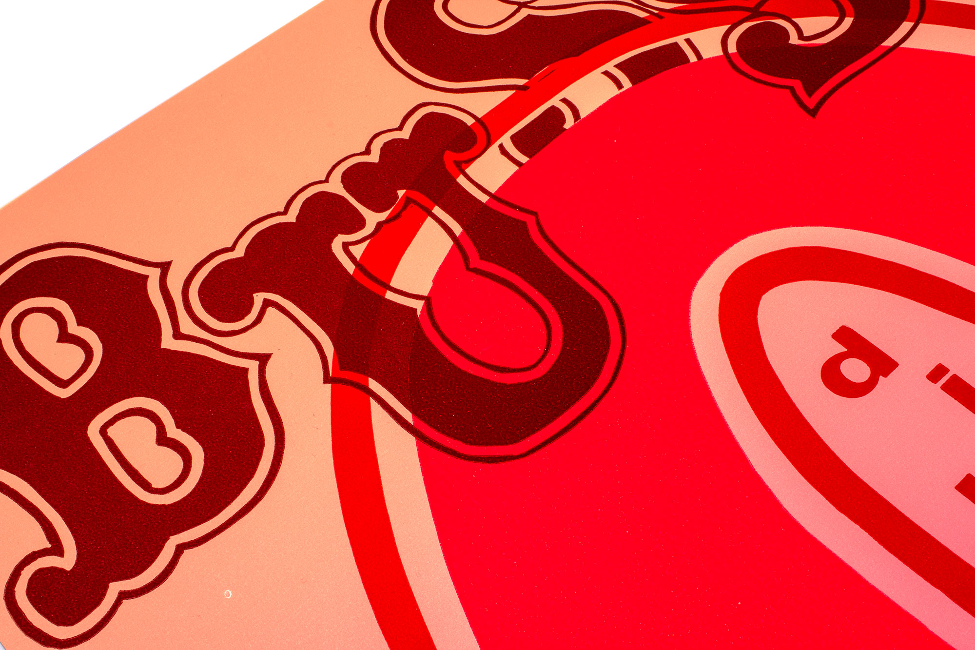
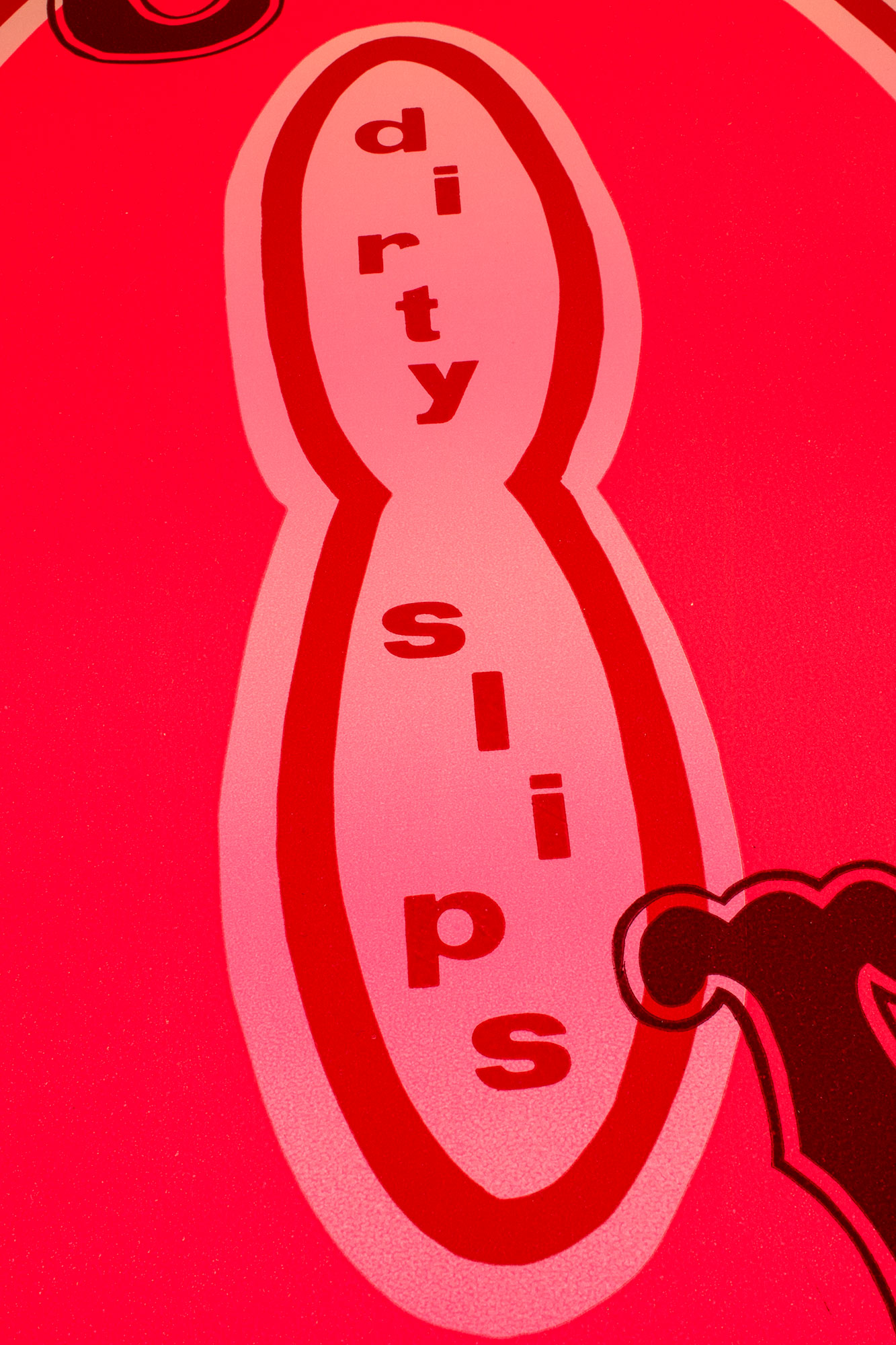
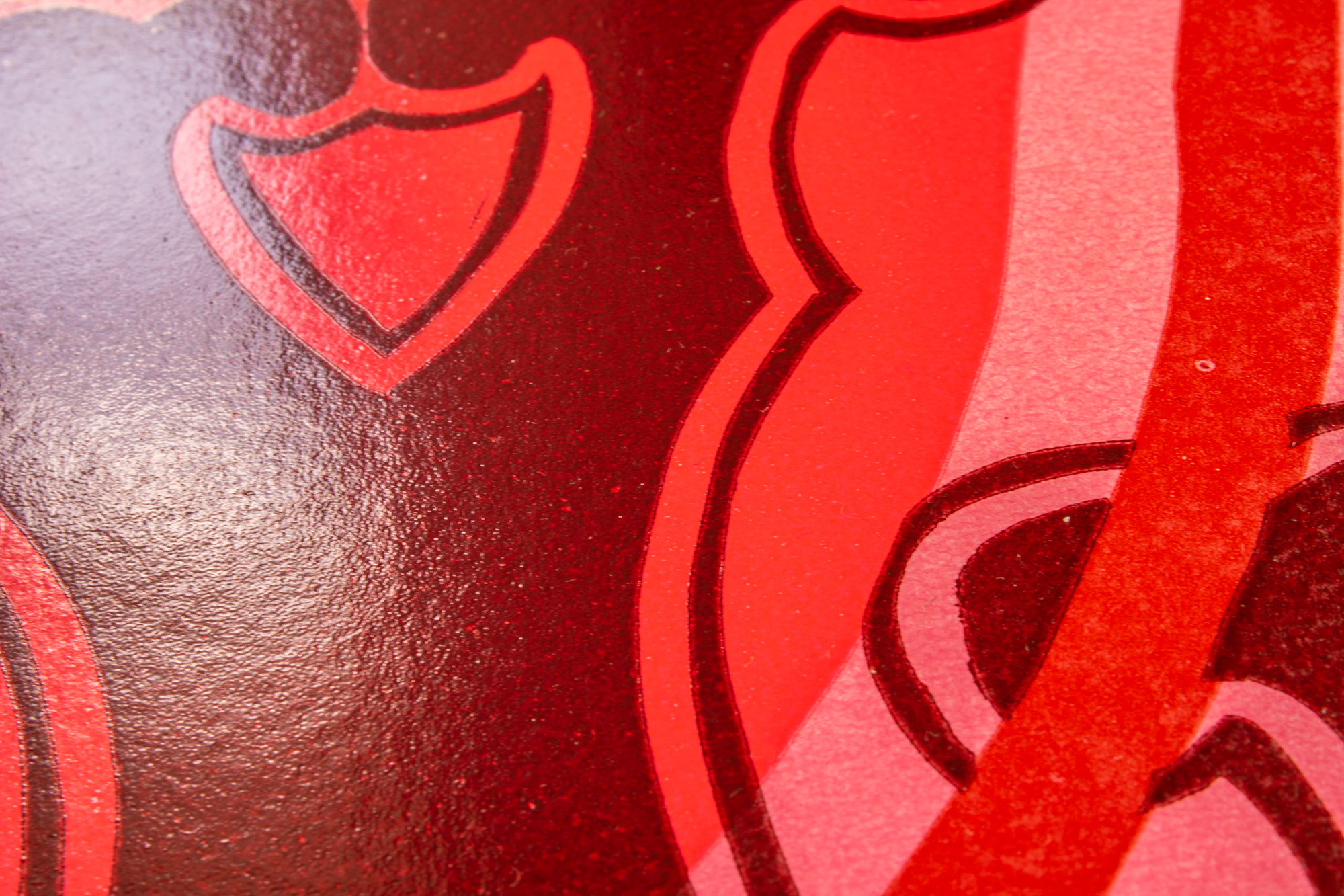
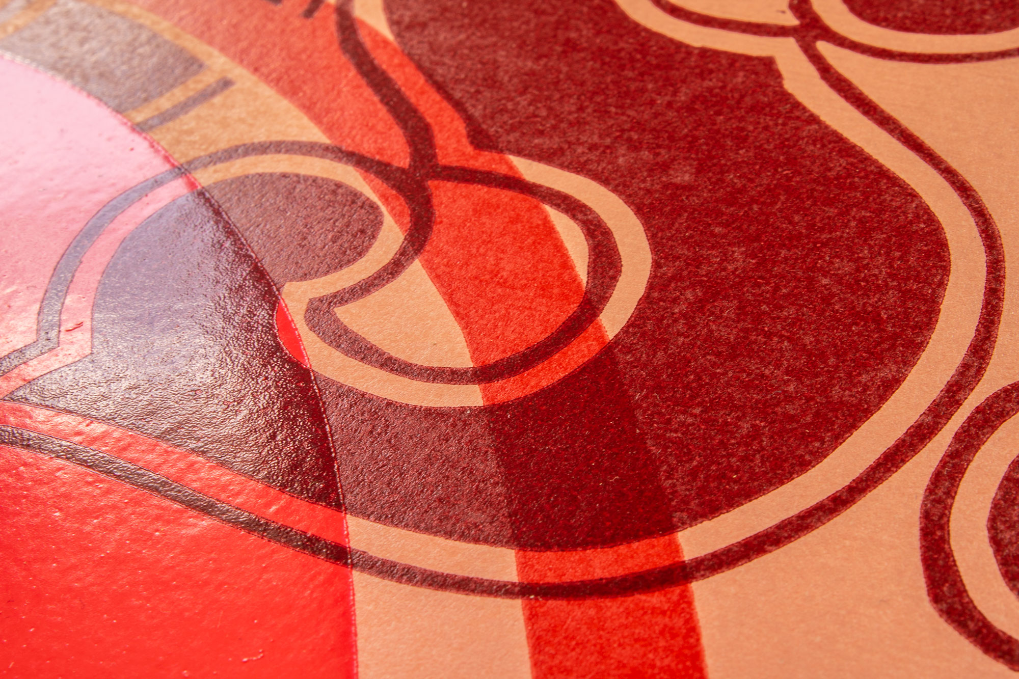
Bussi Love
Poster for a song called Bussi Love by the band Dirty Slips. Bussi is the Austrian word for kiss. The kissing red lipstick mouth is symbolized with a lino cut «O» from a Wells & Webb specimen from 1949. In glossy day glow ink.
Is it a provocation? Well, c’mon it is an «O» and nothing more.
Client: Dirty Slips, Zürich
Format: 45.6×70cm
Paper: Lessebo Rough Natural, 150g/m2
Edition: 70 posters on a FAG Control 900
April 2018
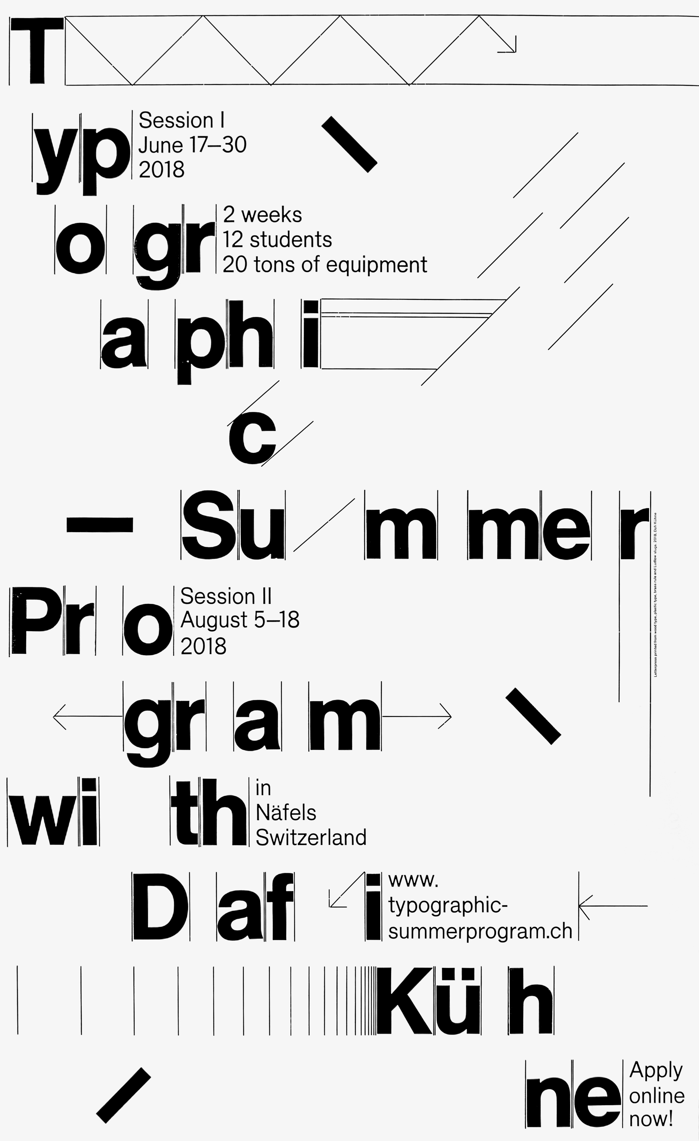
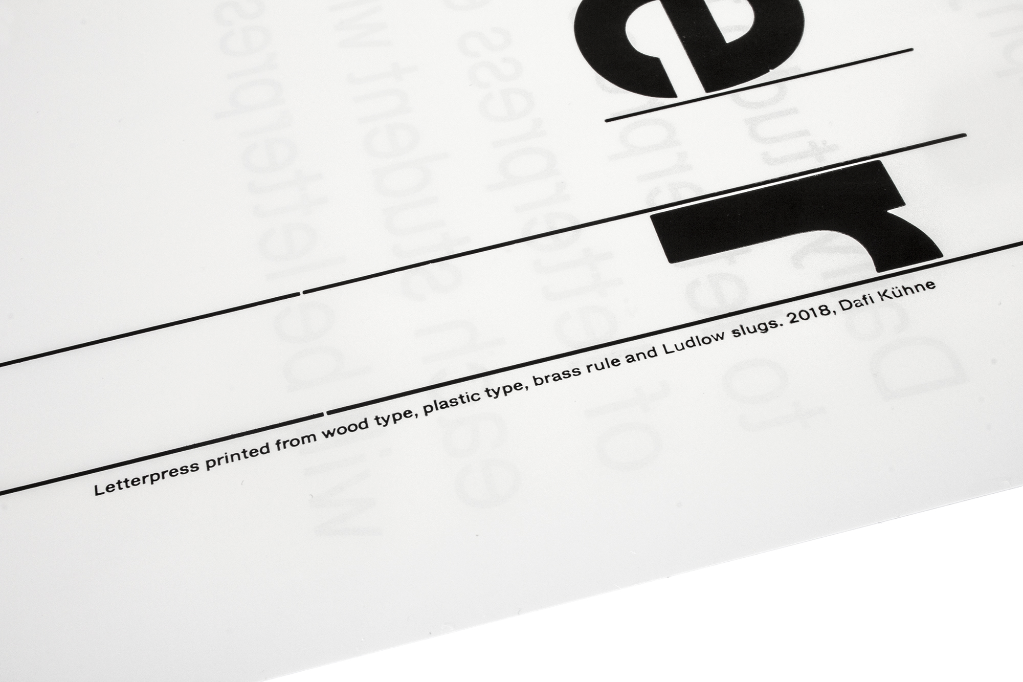
Typographic Summer Program
Double-sided promotional poster for www.typographic-summerprogram.ch . Printed in 3 print runs from wood type, plastic type, brass rule and Ludlow slugs.
In 2018, this poster was selected with the 100 Beste Plakate from Germany, Switzerland and Austria and with the STA-100 by Society of Typographic Arts, Chicago.
Client: Typographic Summer Program, Näfels
Format: 55×88cm
Paper: Chromolux, 100g/m2
Edition: 250 posters on a FAG Control 900
February 2018
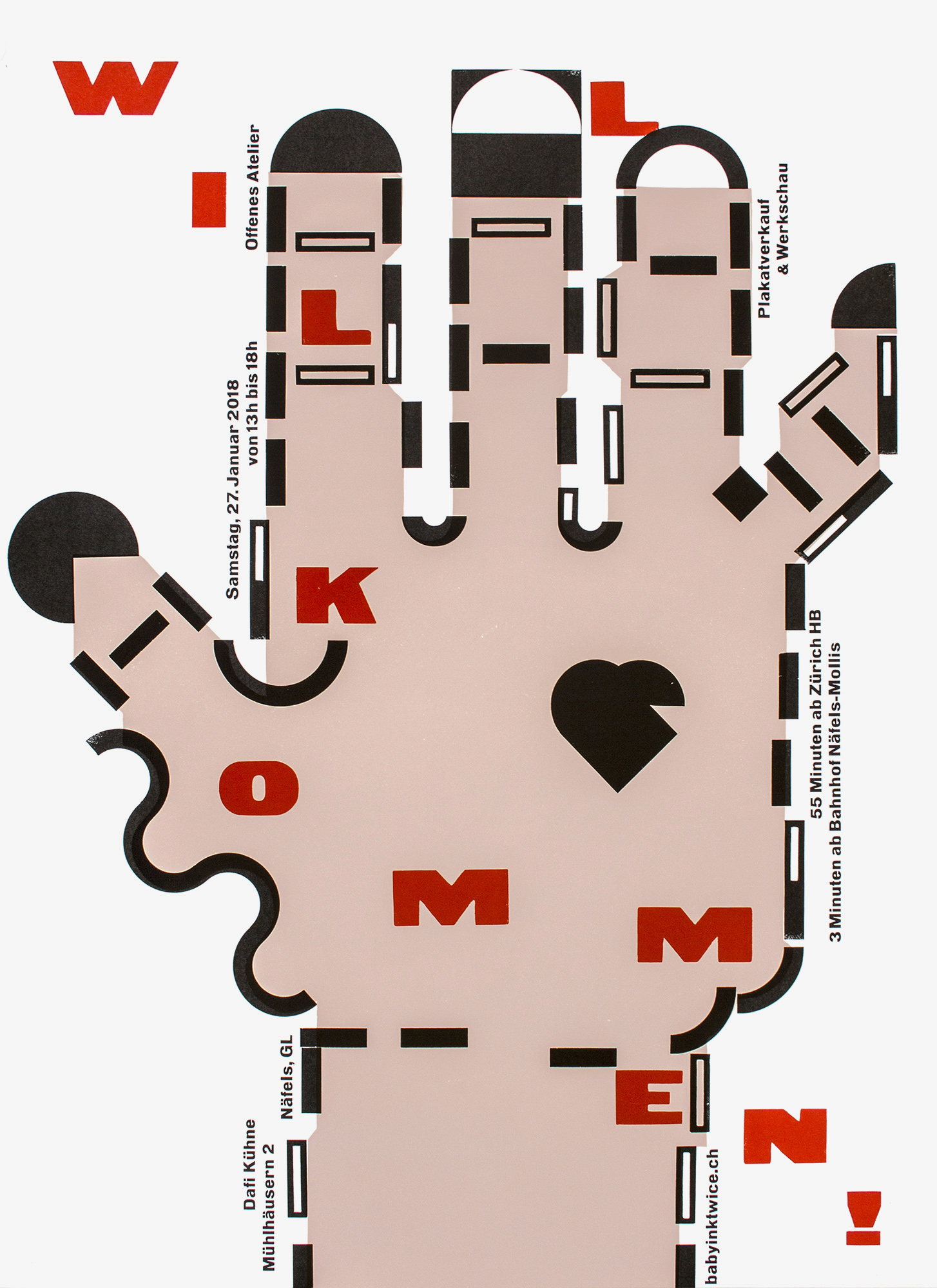
Welcome!
Invitation poster for open days at my studio. Printed in 4 print runs from hand cut linoleum, pantograph cut wood elements, pantograph cut plastic type and some metal type. Welcome!
This poster was awarded with the Franzl Design Award in 2018.
Client: Self initiated
Format: 64×88cm
Paper: Environment, 90g/m2
Edition: 280 posters on a FAG Control 900
January 2018
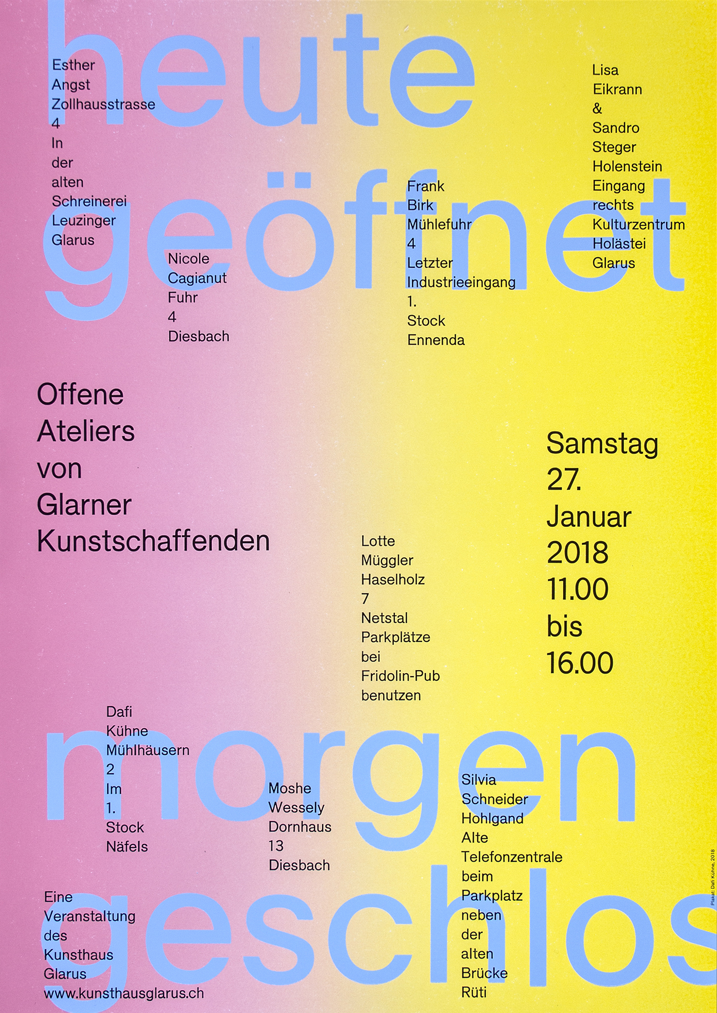
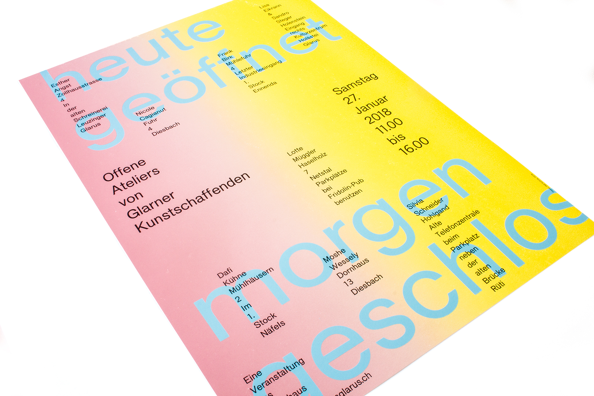
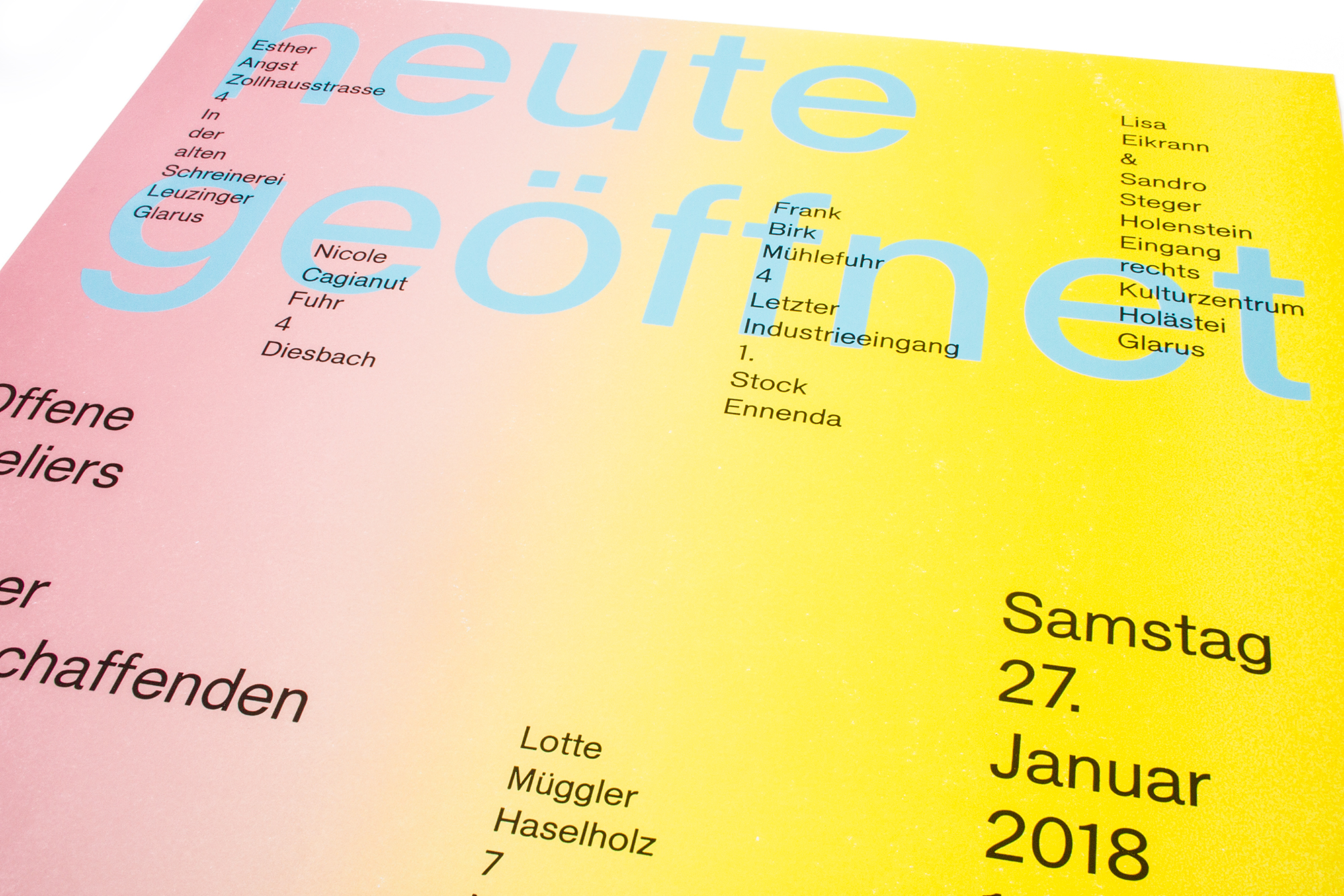
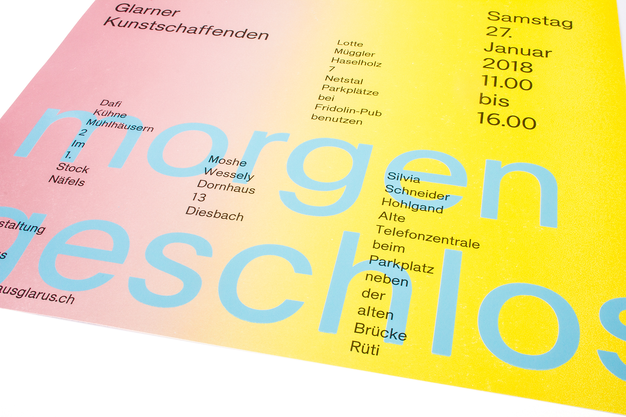
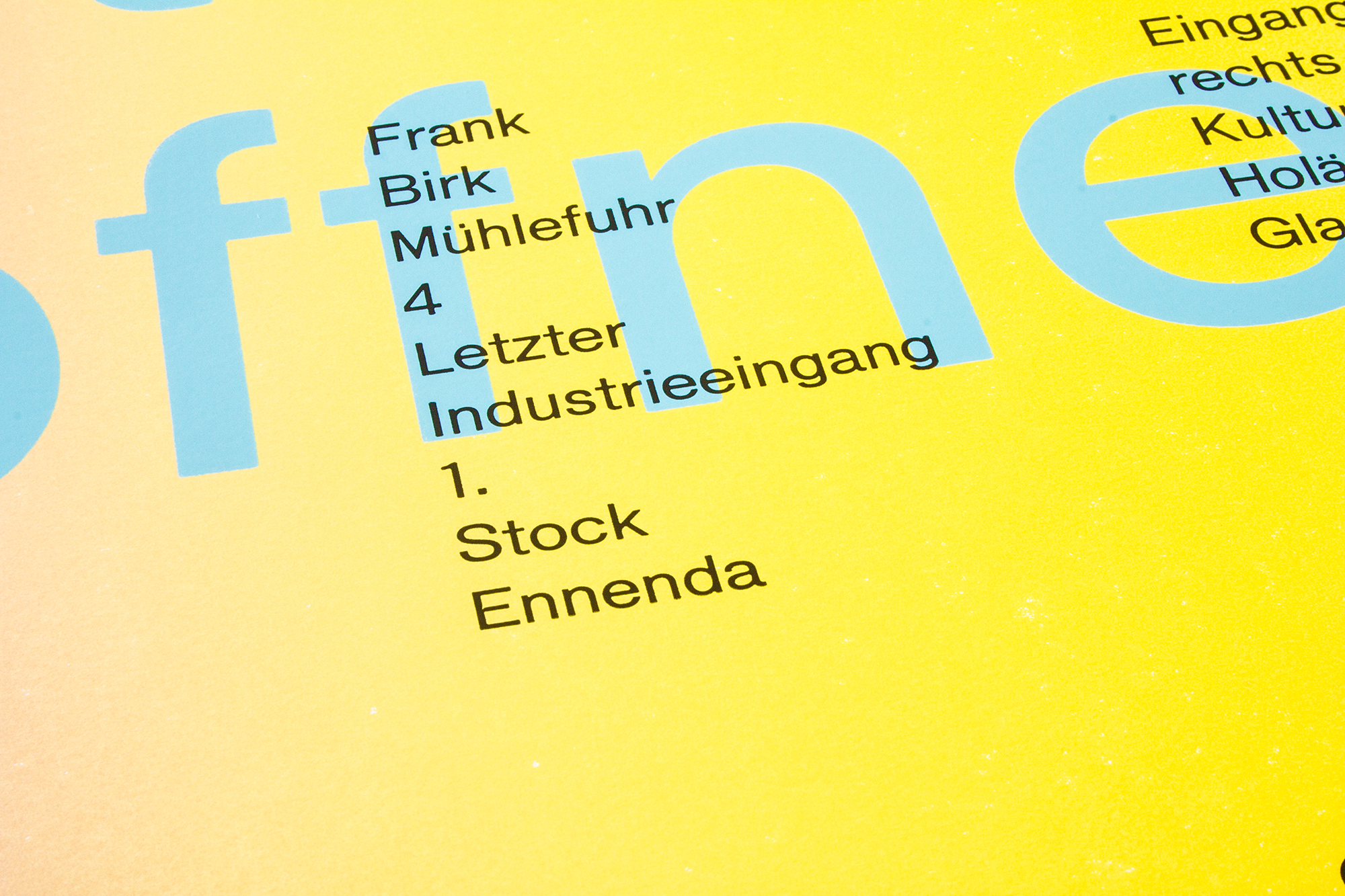
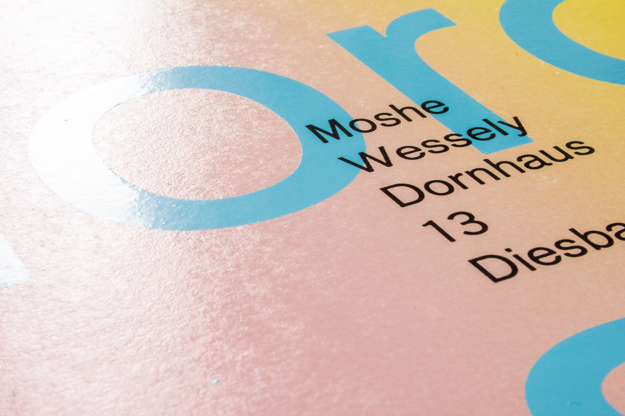
heute geöffnet / morgen geschlossen
Invitation poster for open studios of local artists organized by Kunsthaus Glarus. Printed with a wood block, some lasercut type and some ludlow slugs.
Client: Kunsthaus Glarus
Format: 42×59.4cm
Paper: Plano Art, 130g/m2
Edition: 100 posters on a FAG Control 900
January 2018
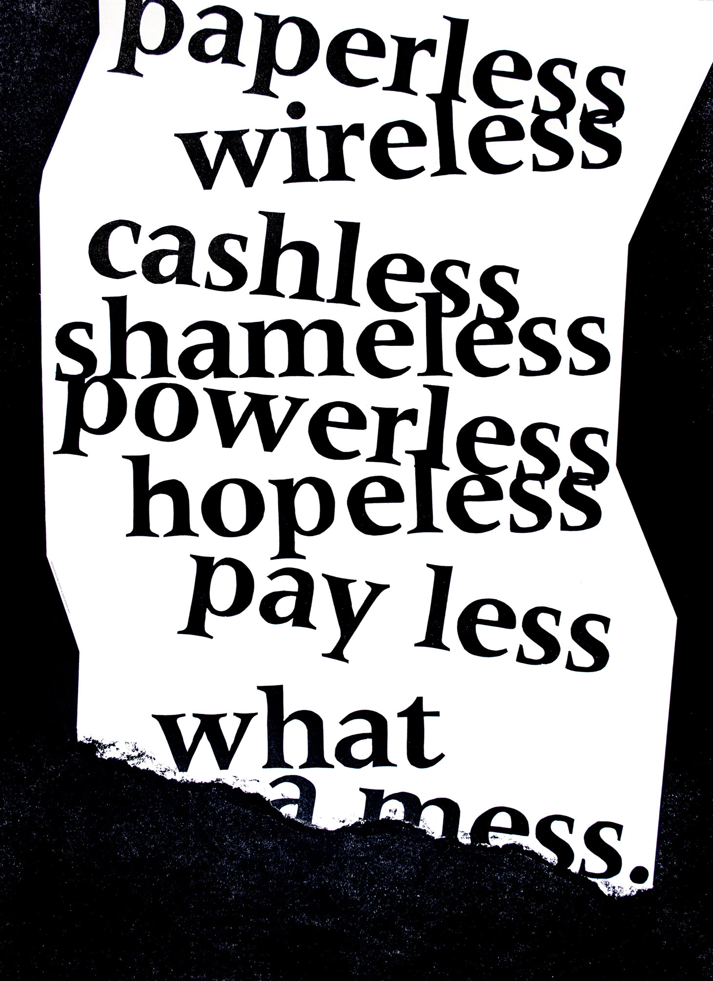
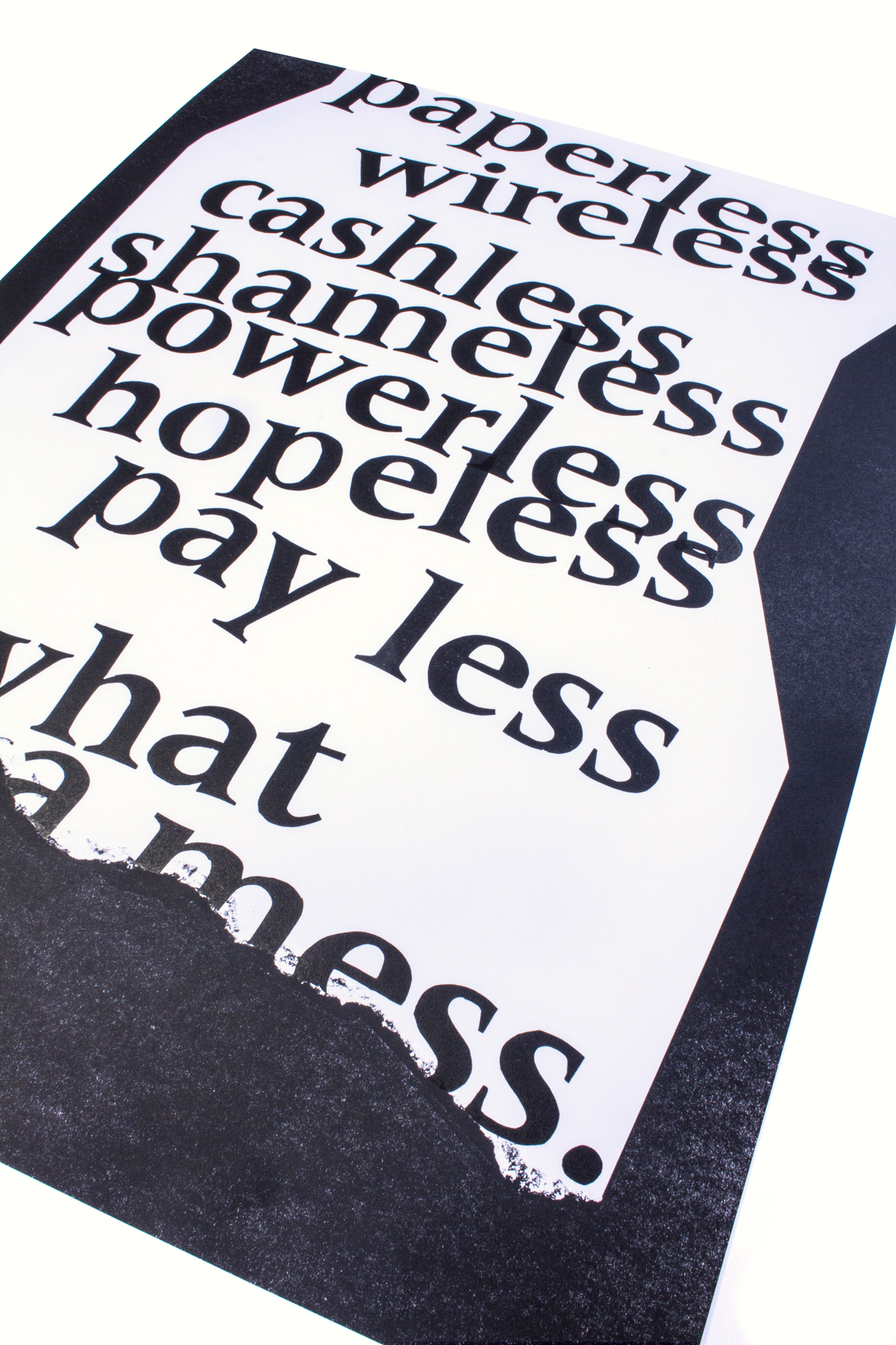
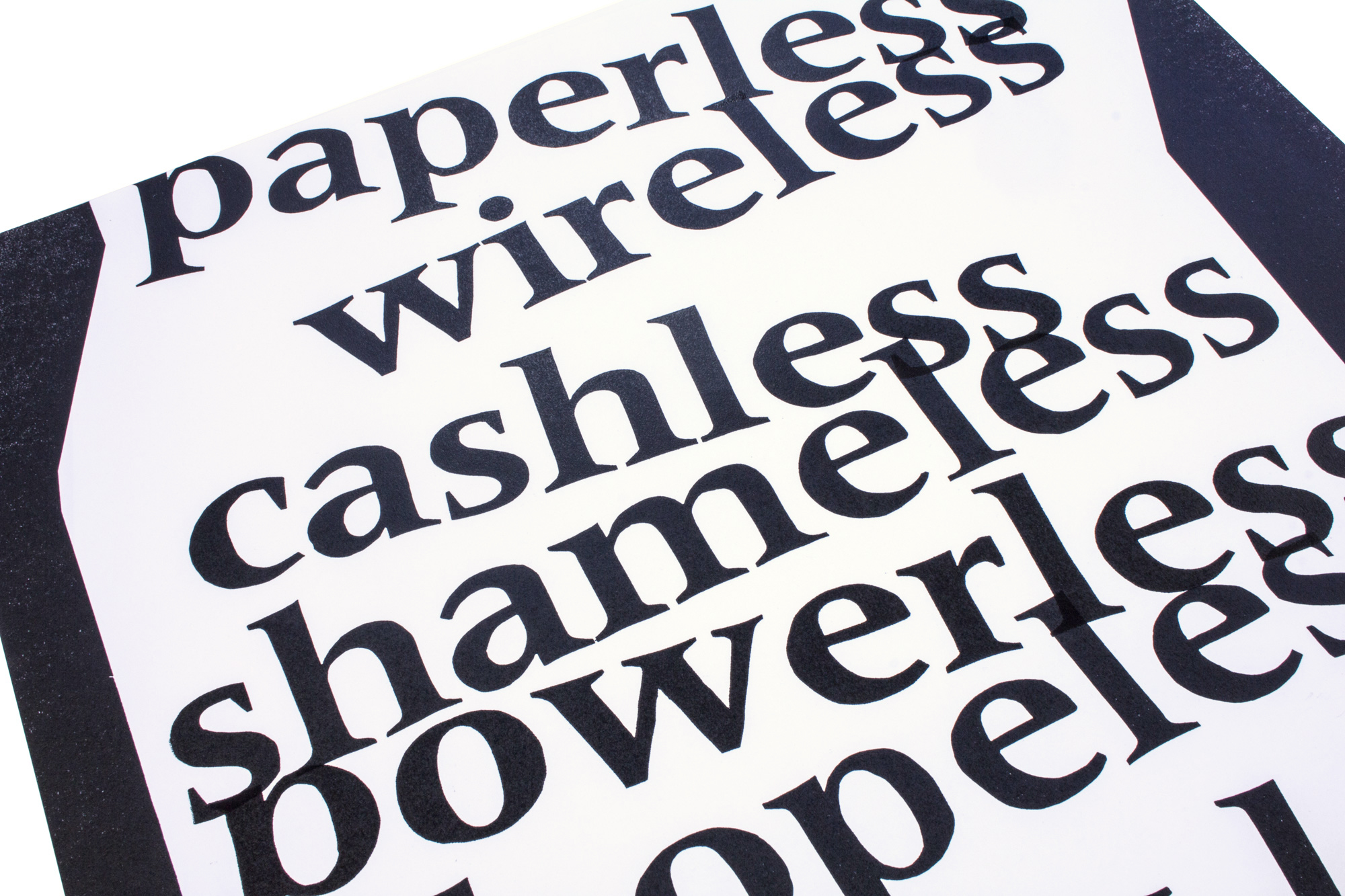
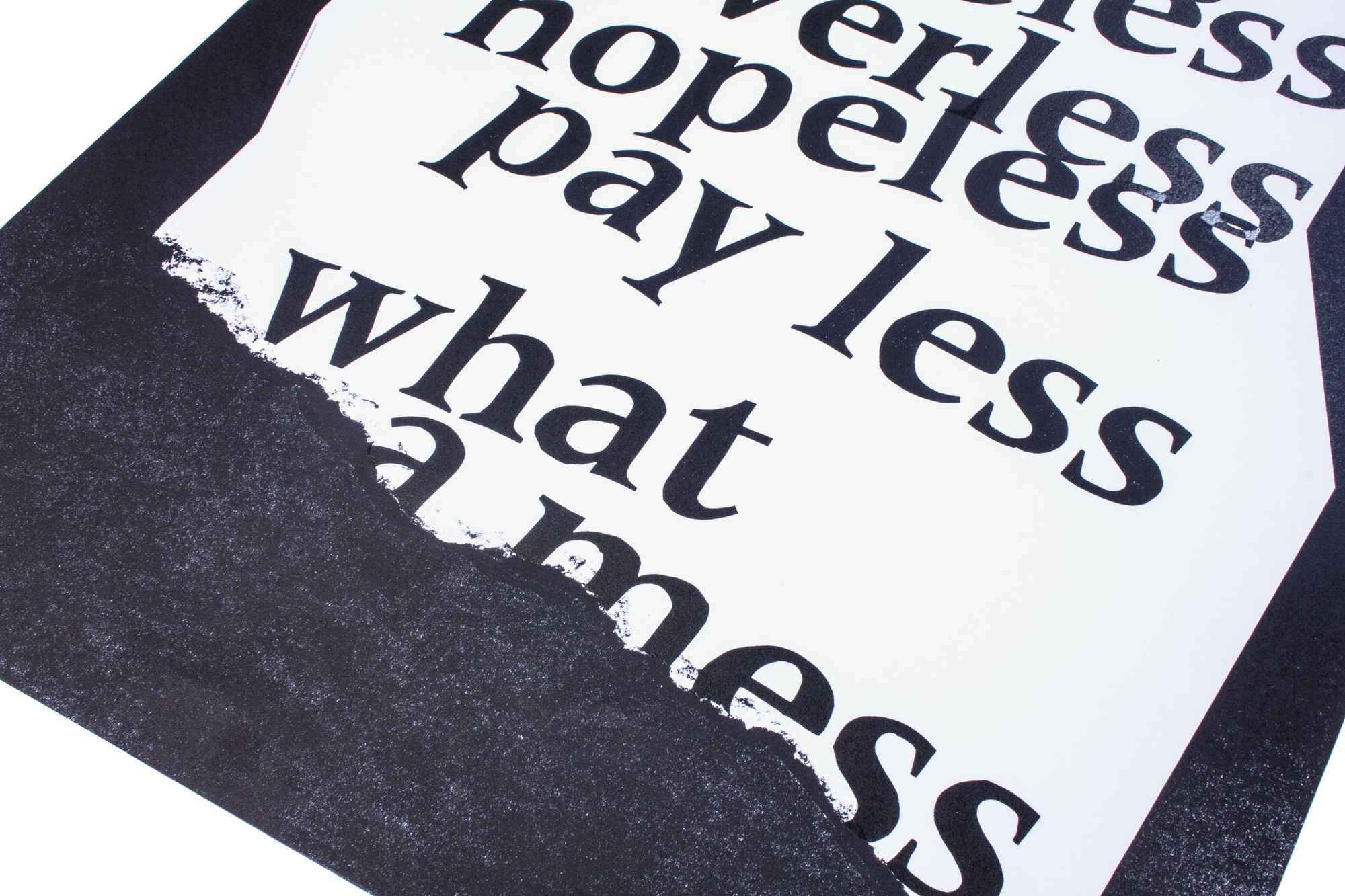
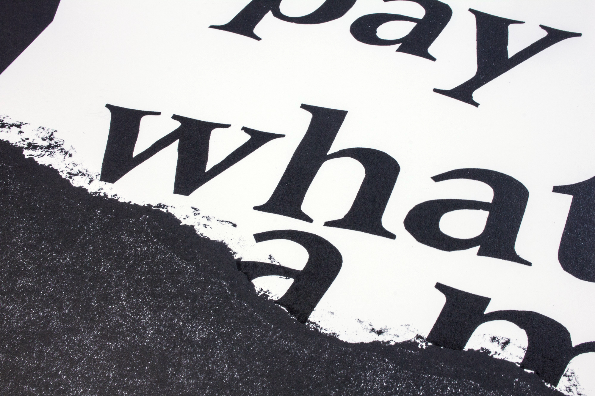
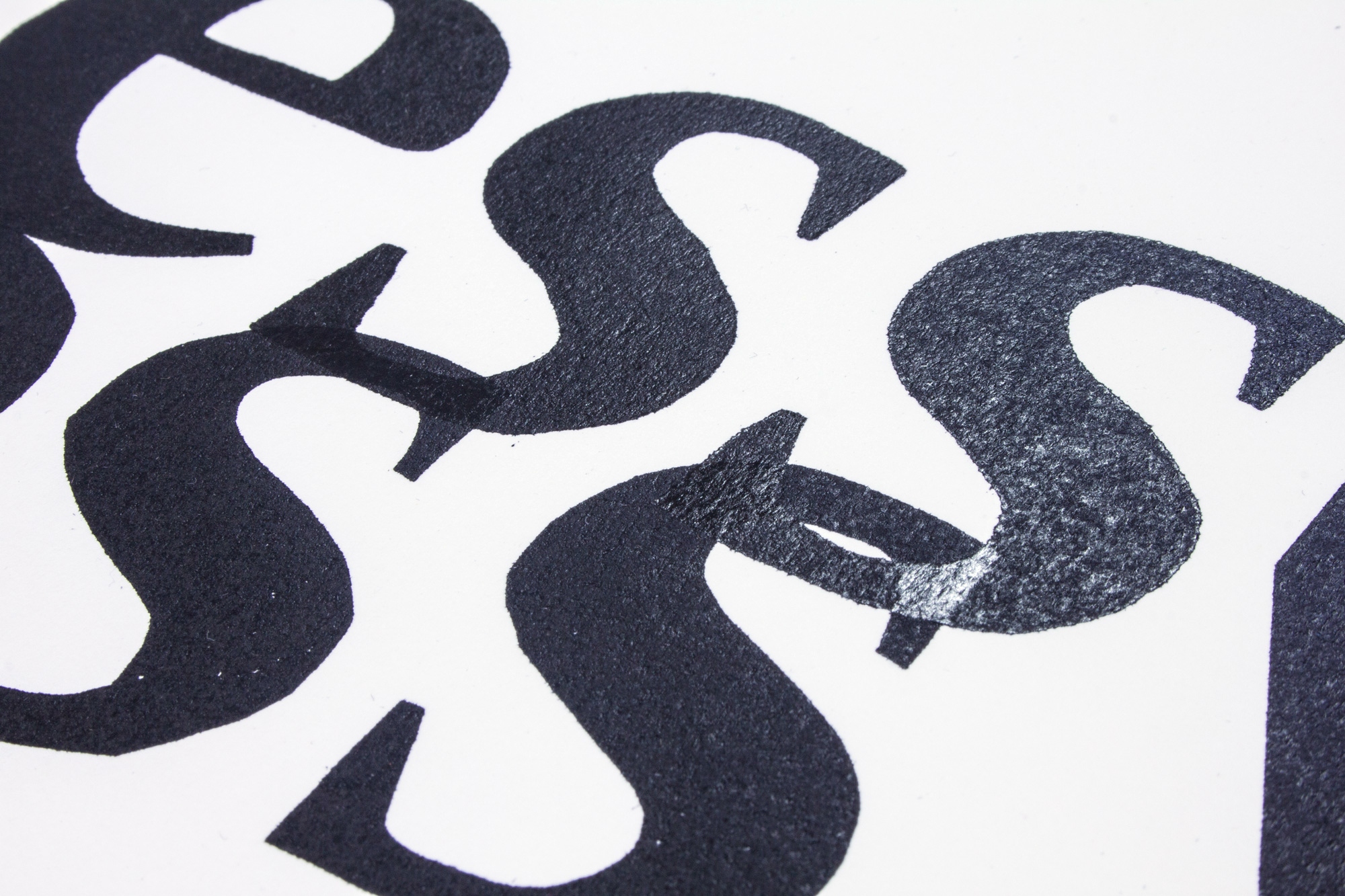
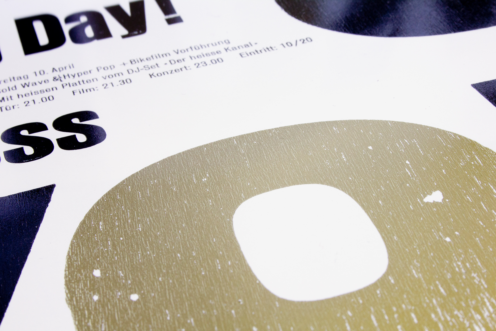
What a mess.
New year’s card/poster/big sheet of paper for Puls AG from Basel. The plan was to send out a very big piece of paper with the message «paperless»… While «paperless» has been proclaimed for the last 20 years, it still hasn’t completely fulfilled yet. So we phrased a social critical and a bit ironic poster for them.
The torn piece of paper has been simulated with a hand torn piece of MDF. Check out the video to see the process.
Client: Puls AG, Health Communication, Basel
Format: 64×88cm
Paper: Materica Gesso, 120g/m2
Edition: 1500 posters on a FAG Control 900
December 2017
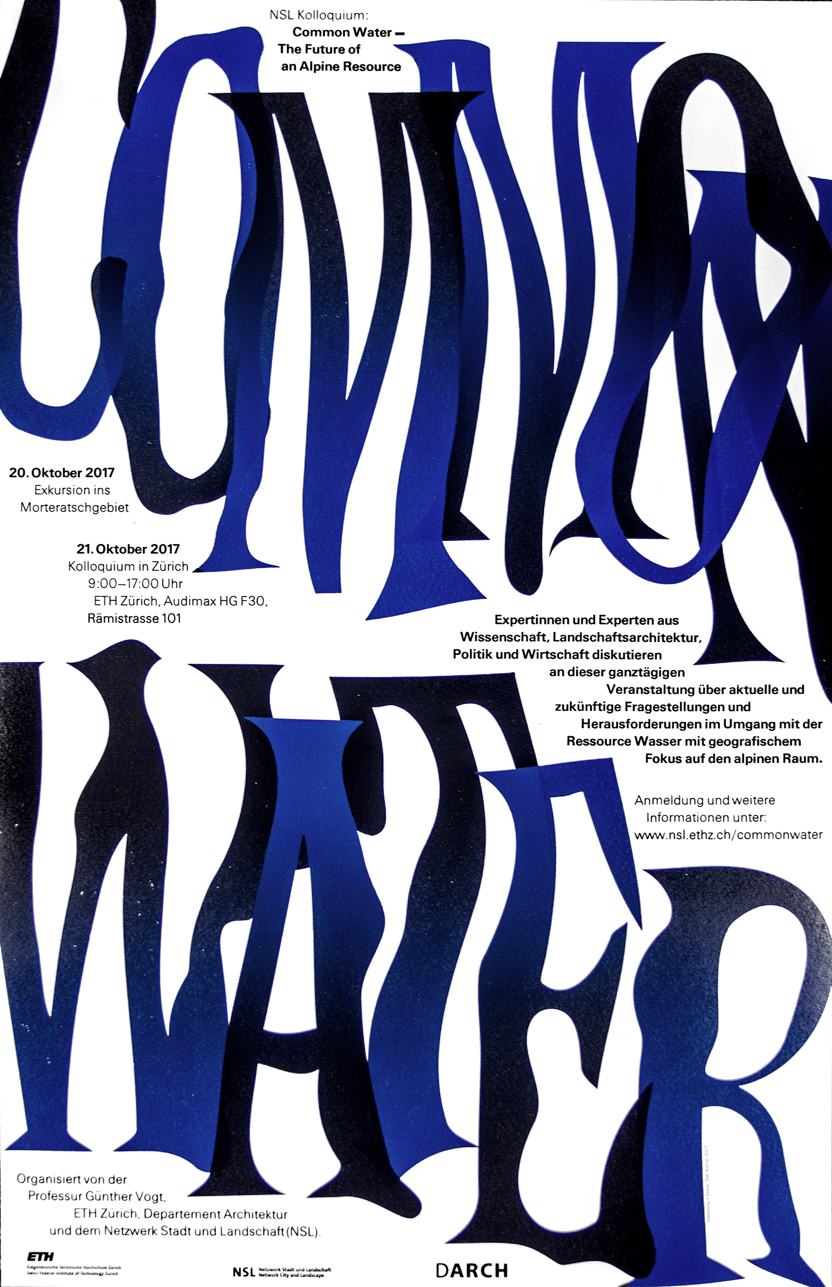
Common Water
Poster for a one day architectural conference in Zürich. Printed from lasercut chipboard and hand set metal type.
Client: VOGT Landscape Architects, ETH Zürich
Format: 44×68cm
Paper: Plano Art, 120g/m2
Edition: 120 posters on a FAG Control 900
October 2017
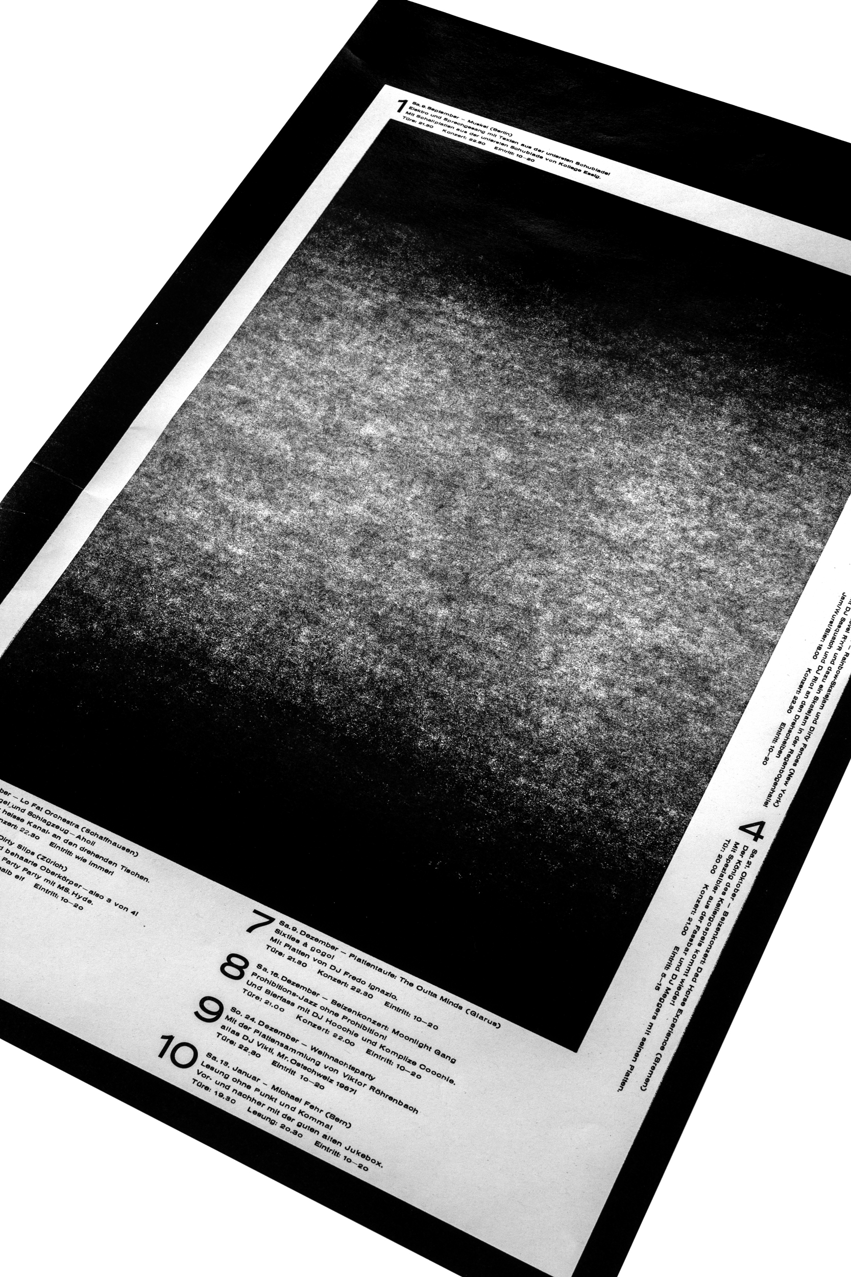
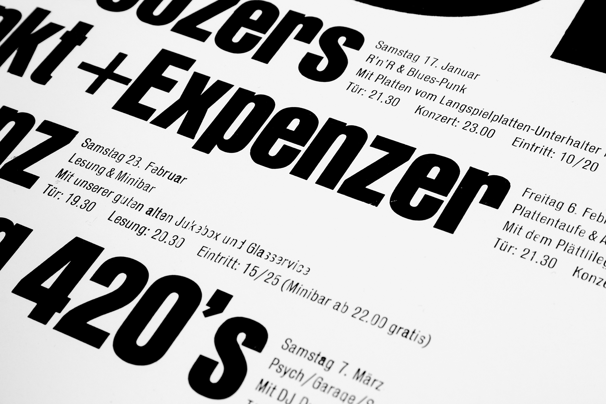
Light at the end of the tunnel
Concert program for Veka-Glarus.ch printed in 3 print runs from laser cut MDF and some handset 6pt and 36pt metal type.
A dark one, with a little light at the end of the tunnel. Printed on some very thin newsprint.
Client: Veka-Glarus, Glarus
Format: 35×52.5cm
Paper: Lettura 72, 60g/m2
Edition: 450 posters on a FAG Control 405
September 2017
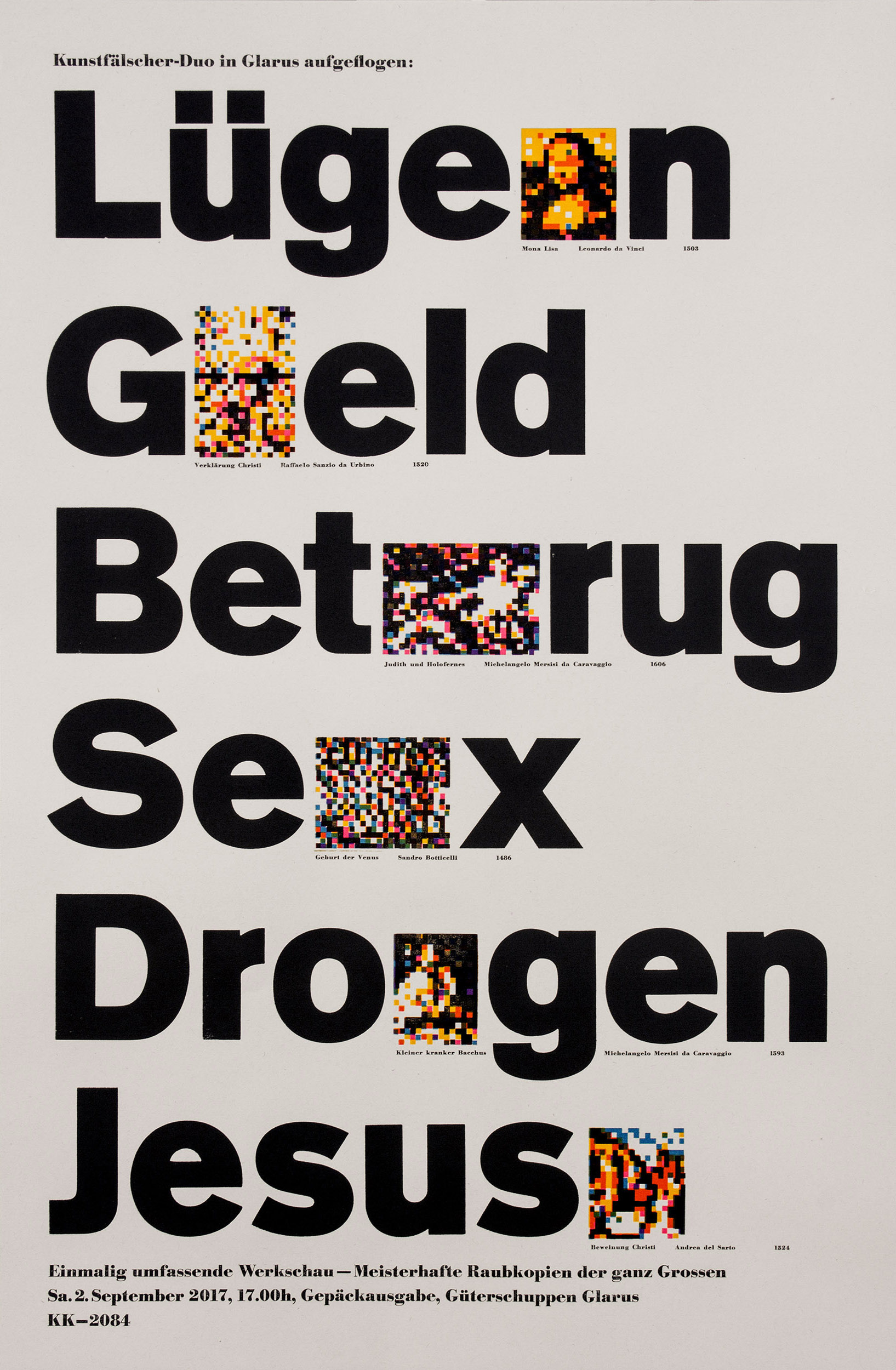
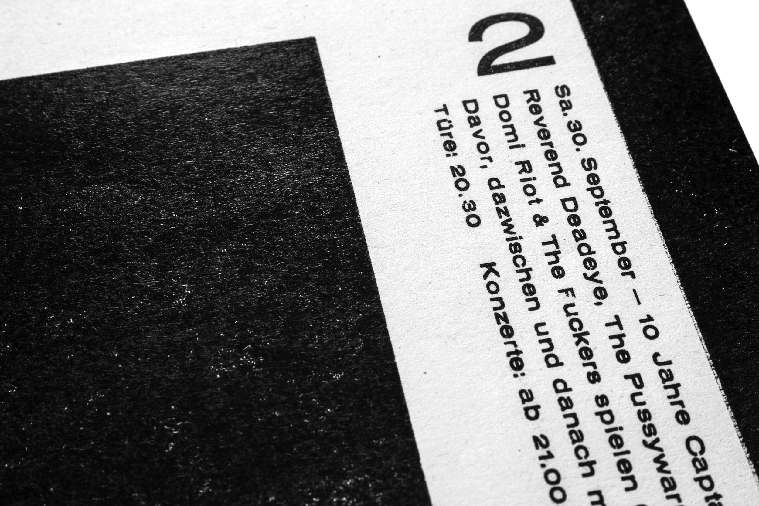
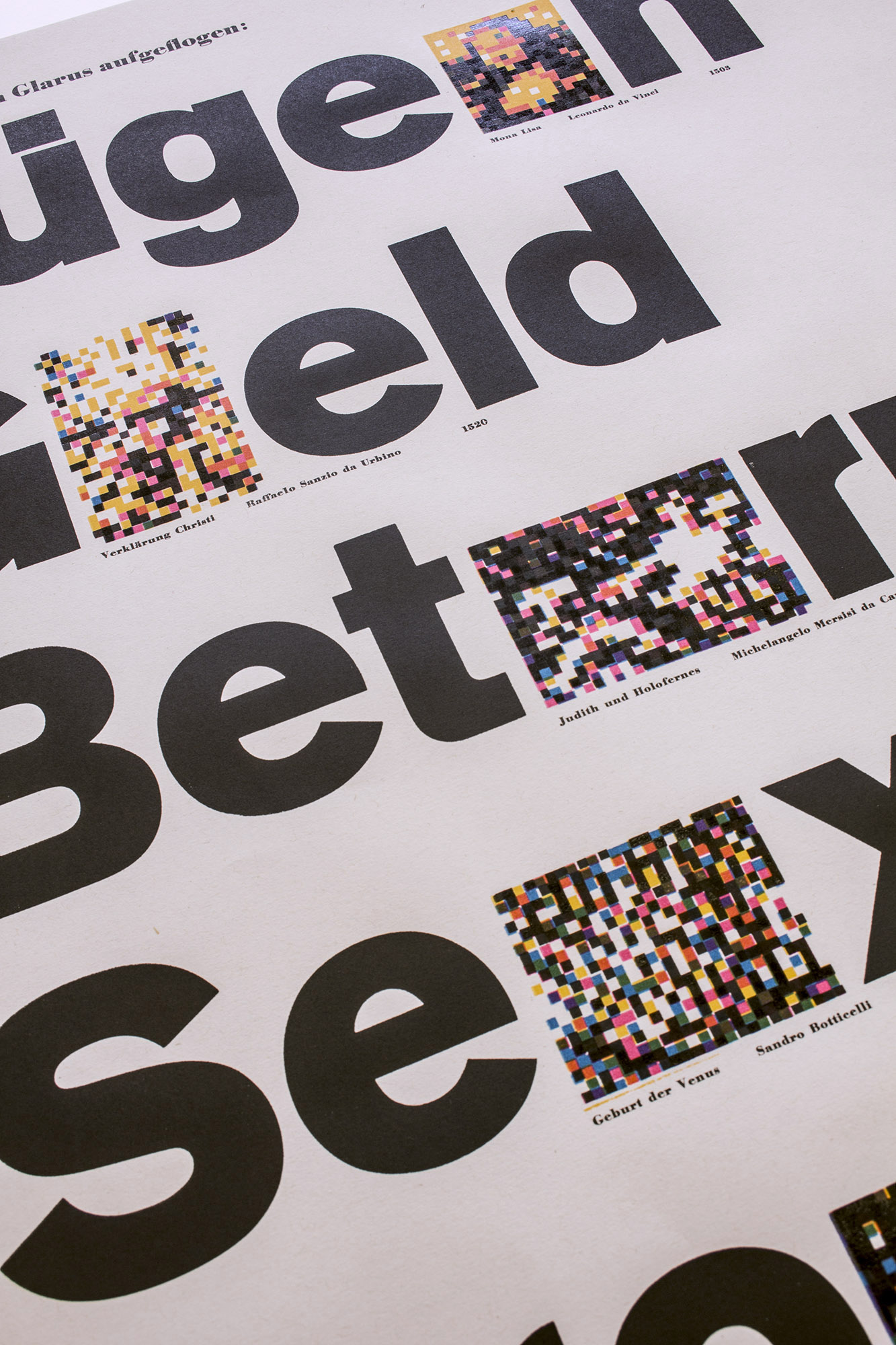
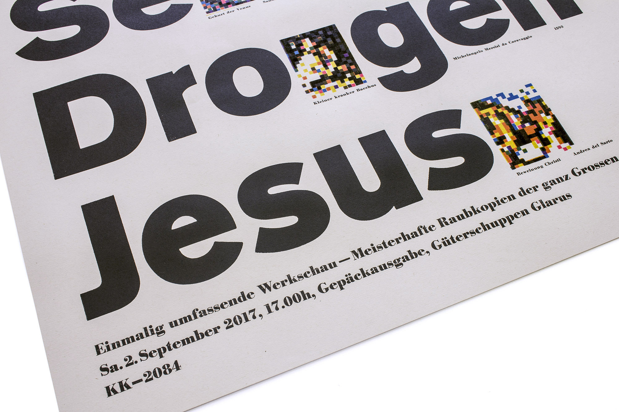
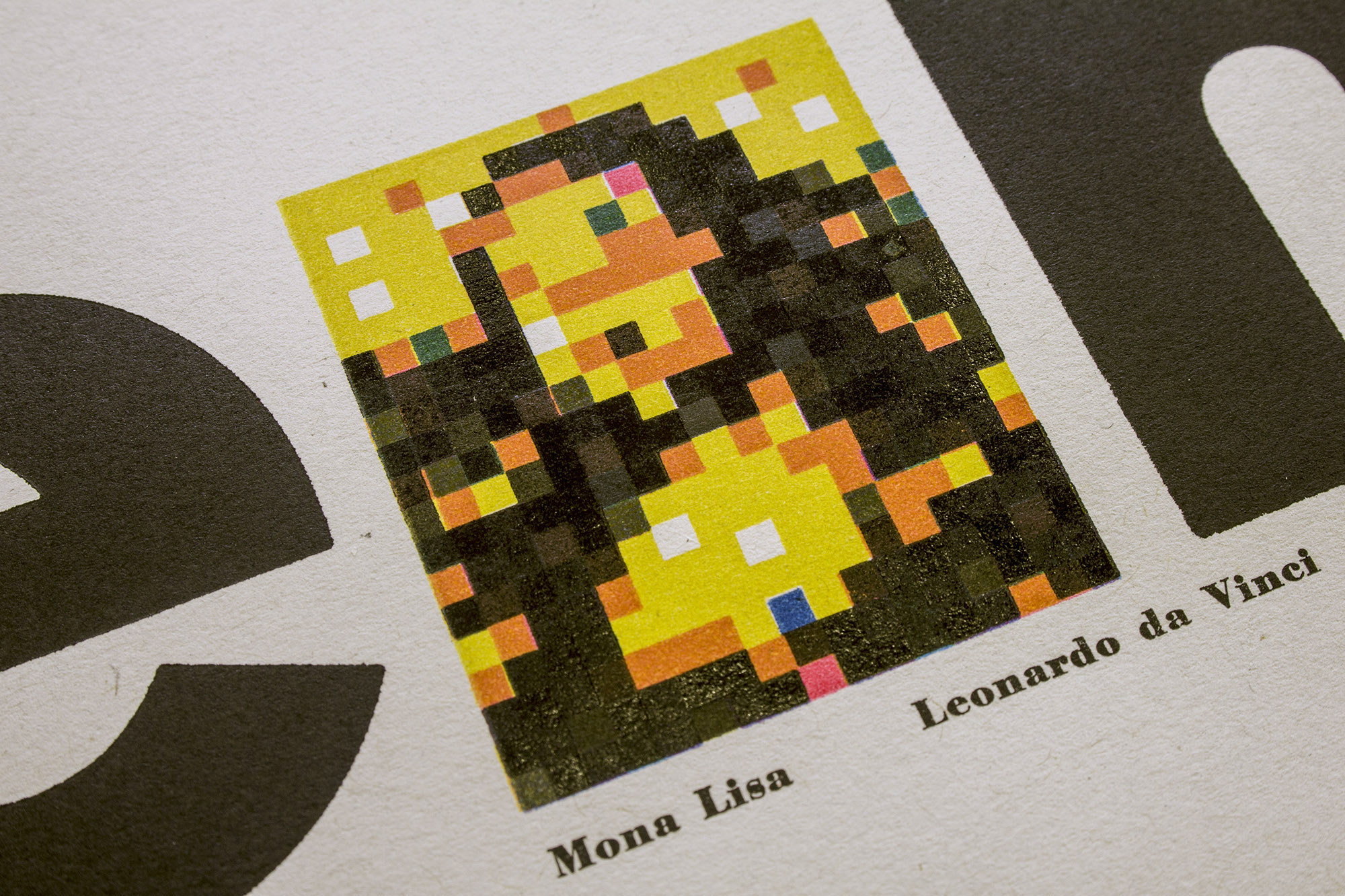
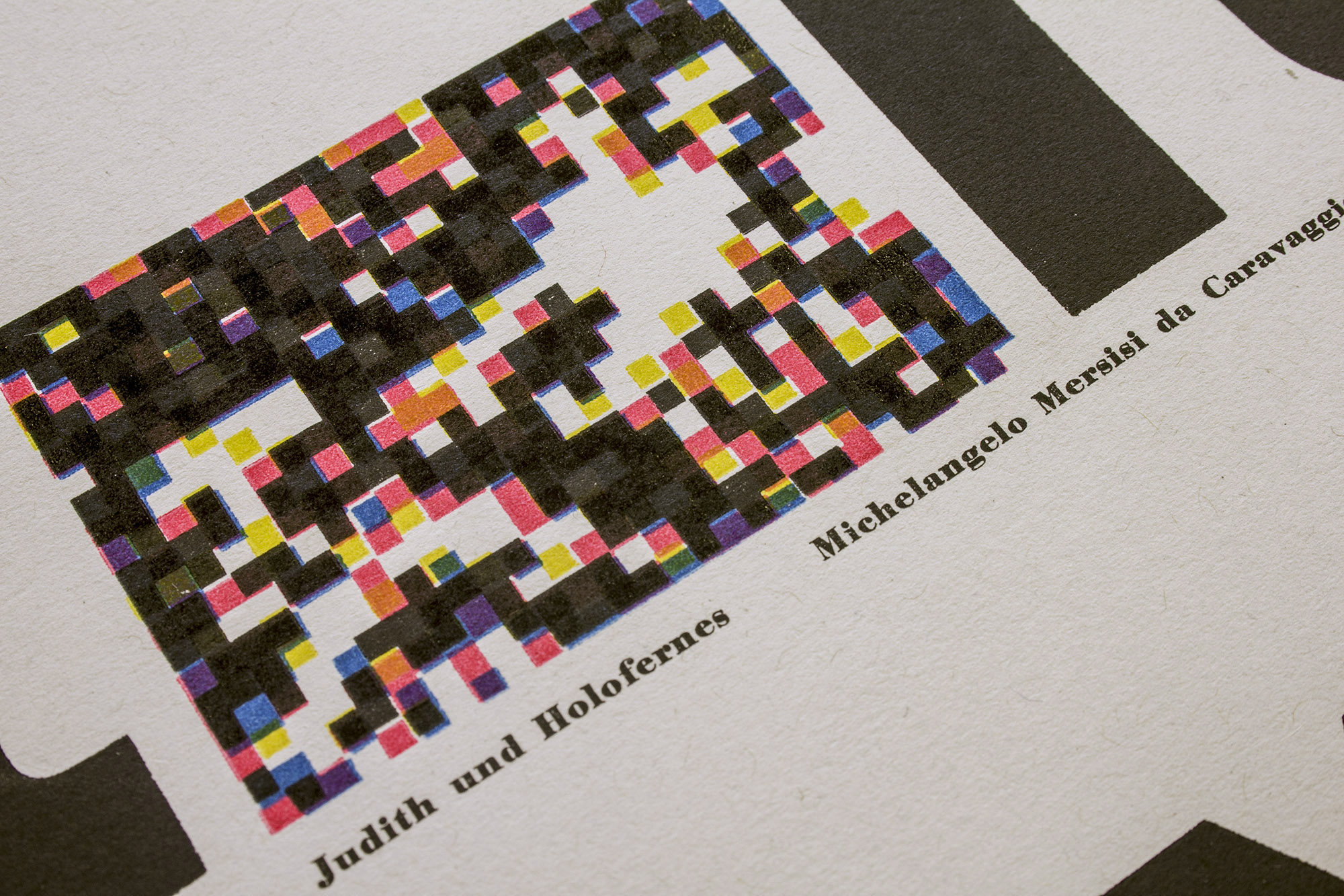
Lies, Money, Fraud, Sex, Drugs, Jesus
Letterpress printed poster for an art exhibition dealing with the process of illegal reproduction of famous paintings and the scandals that go together with it.
Printed in 6 print runs from lasercut wood blocks, traditional plastic poster type and metal type.
Client: Gepäckausgabe, Glarus
Format: 41.8×63.7cm
Paper: Puna 100g/m2
Edition: 250 posters on a FAG Control 900
August 2017
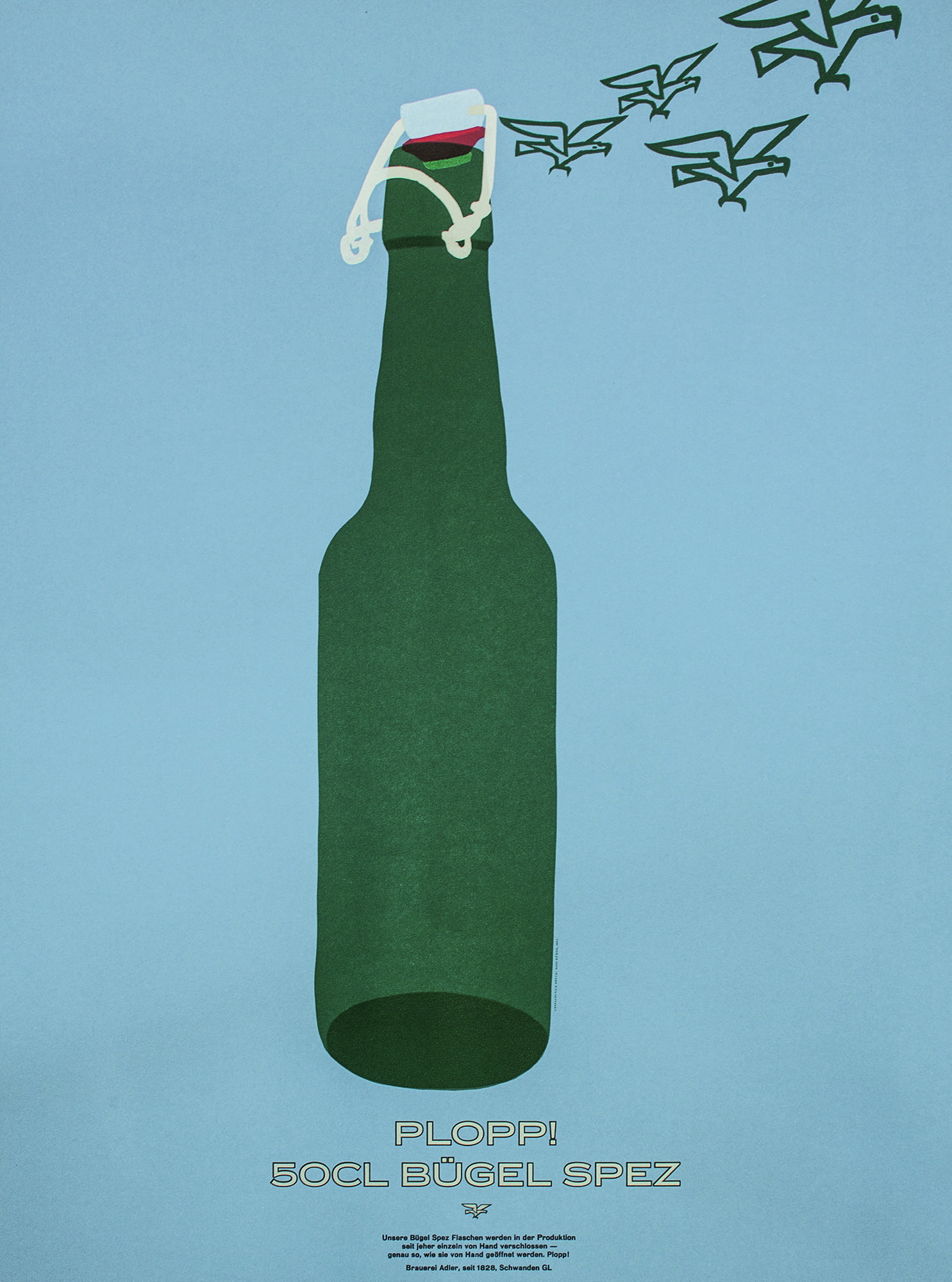
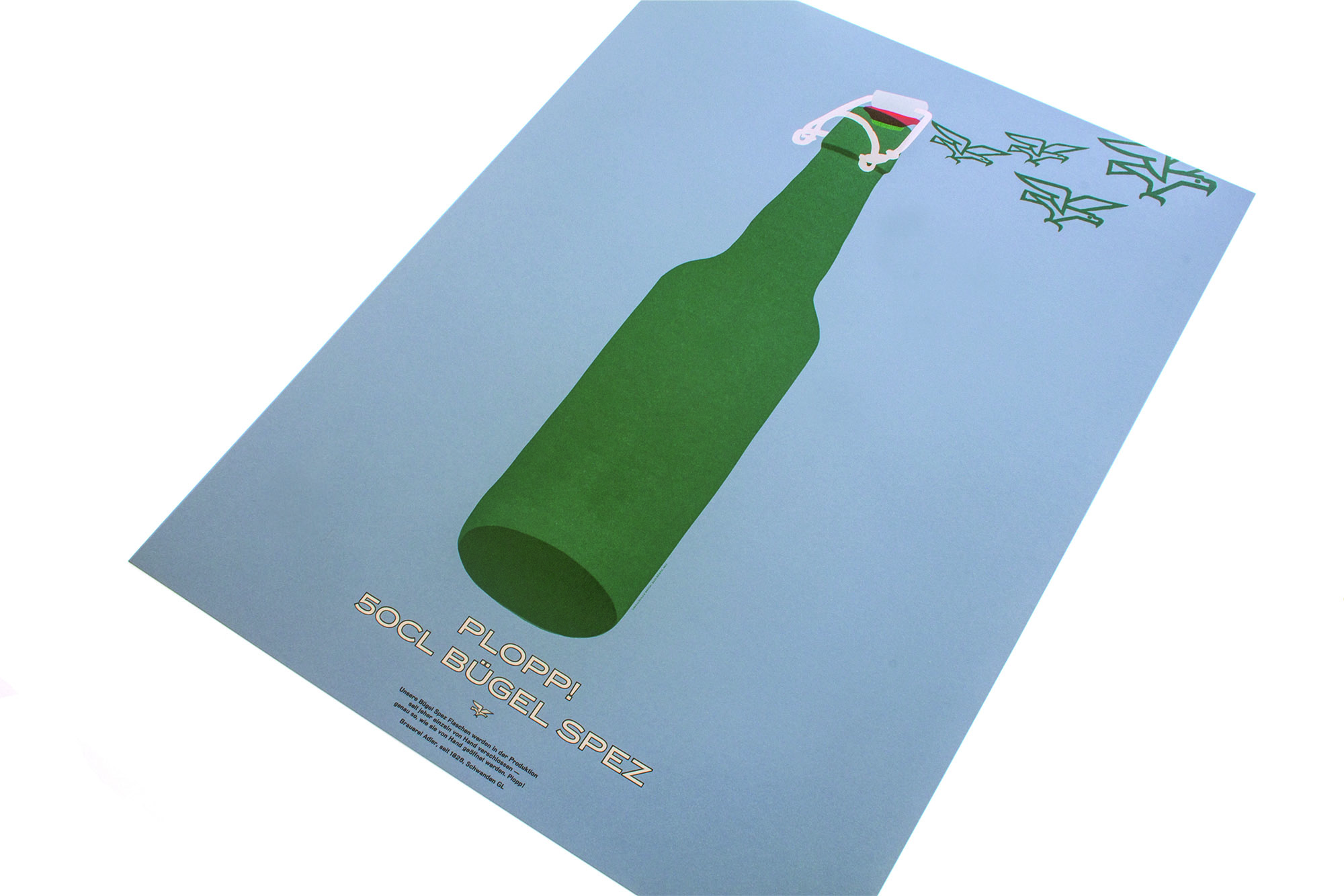
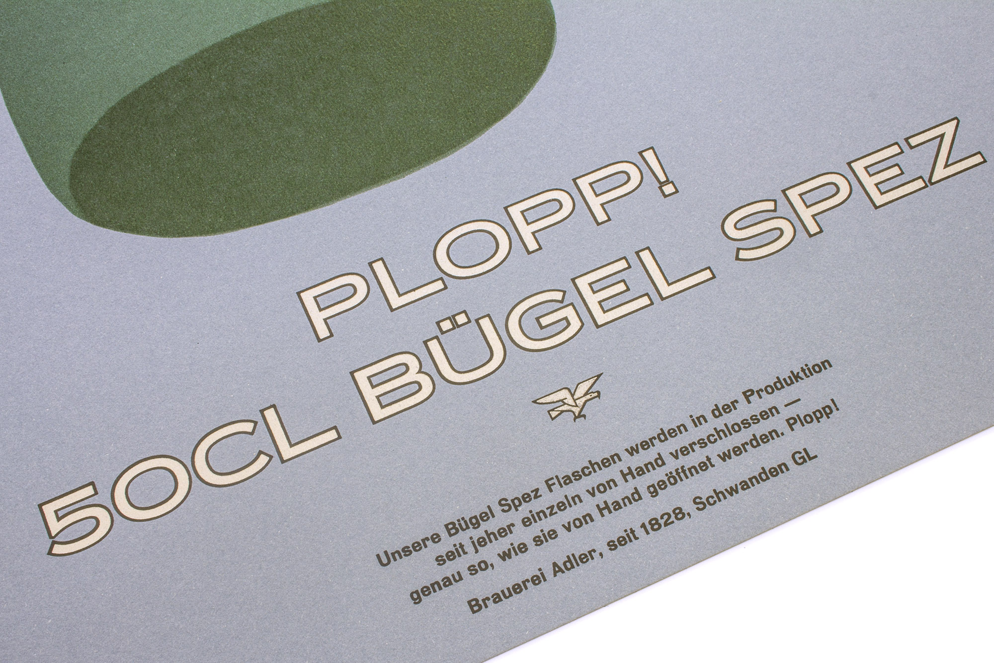
Bügel Spez
Second letterpress printed poster for Brauerei Adler. (See the first one here and the third one here). This one is celebrating their half liter flip top bottle.
The poster has been printed in a total of 9 printruns from hand cut linocuts, some metal type and photopolymer plates.
Client: Brauerei Adler, Schwanden
Format: 60×80cm
Paper: Materica Acqua 360g/m2
Edition: 100 posters on a FAG Control 900
July 2017
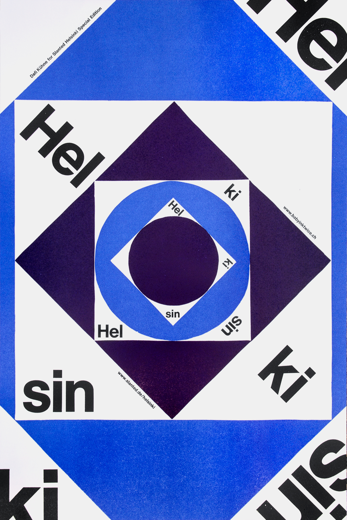
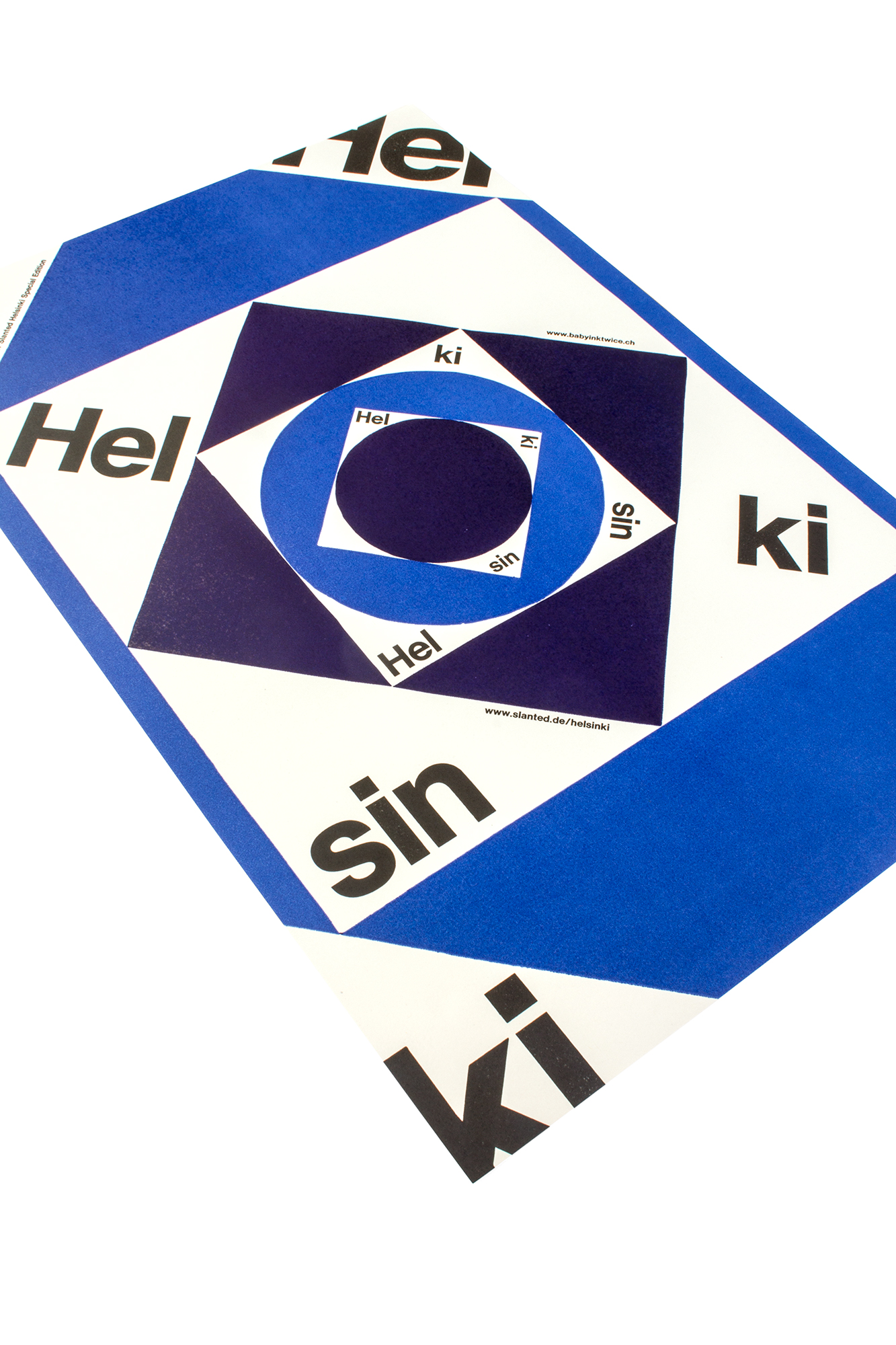
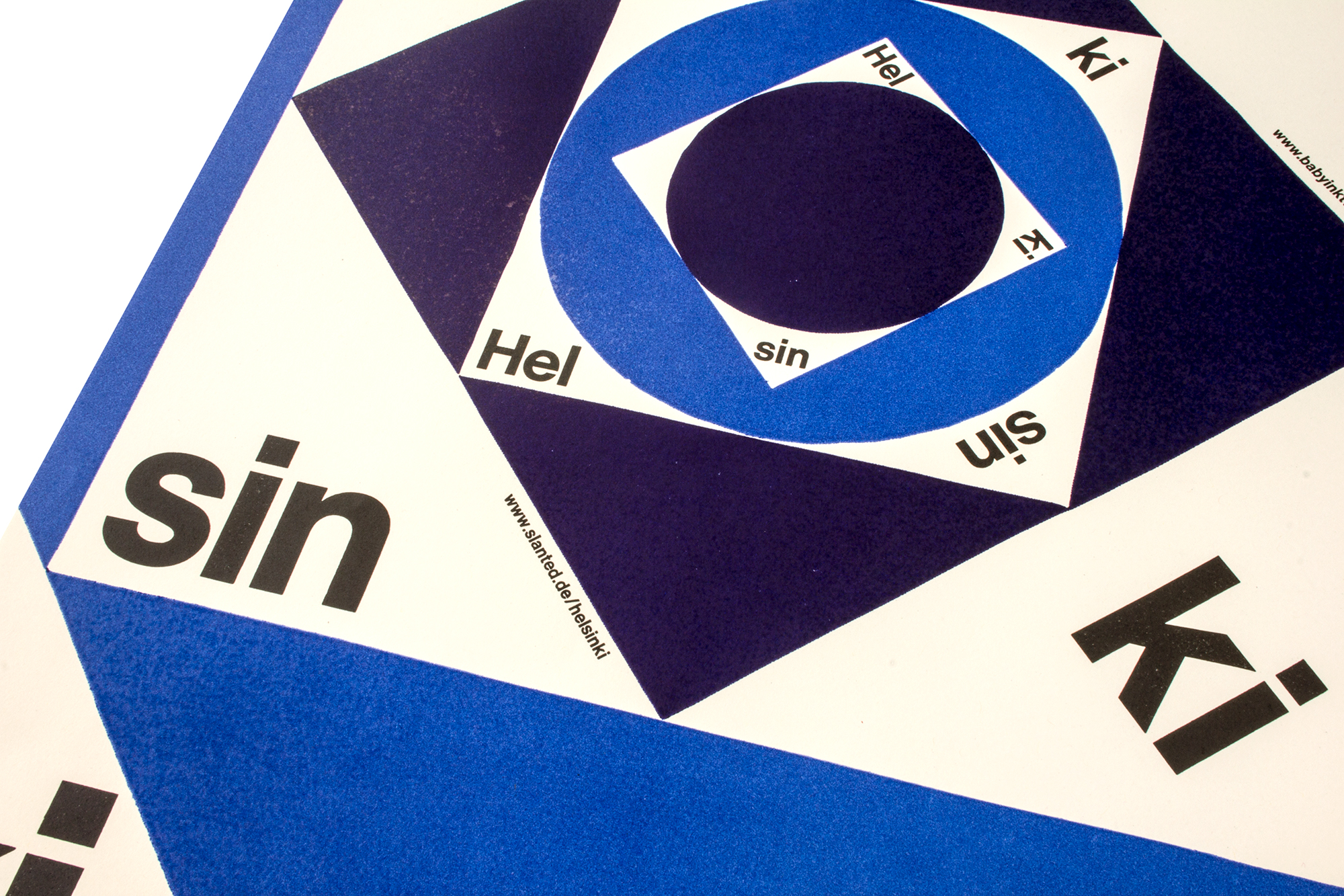
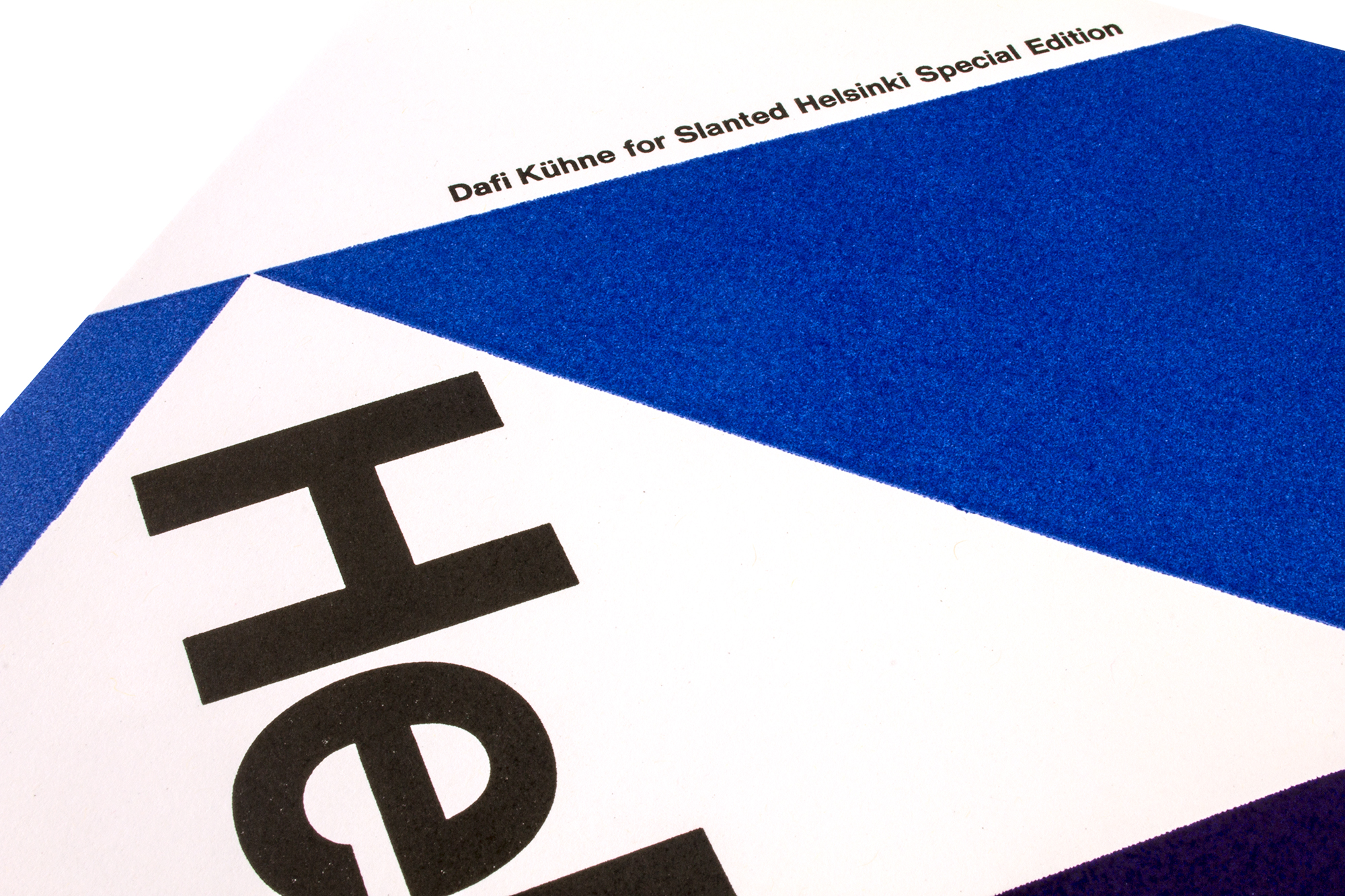
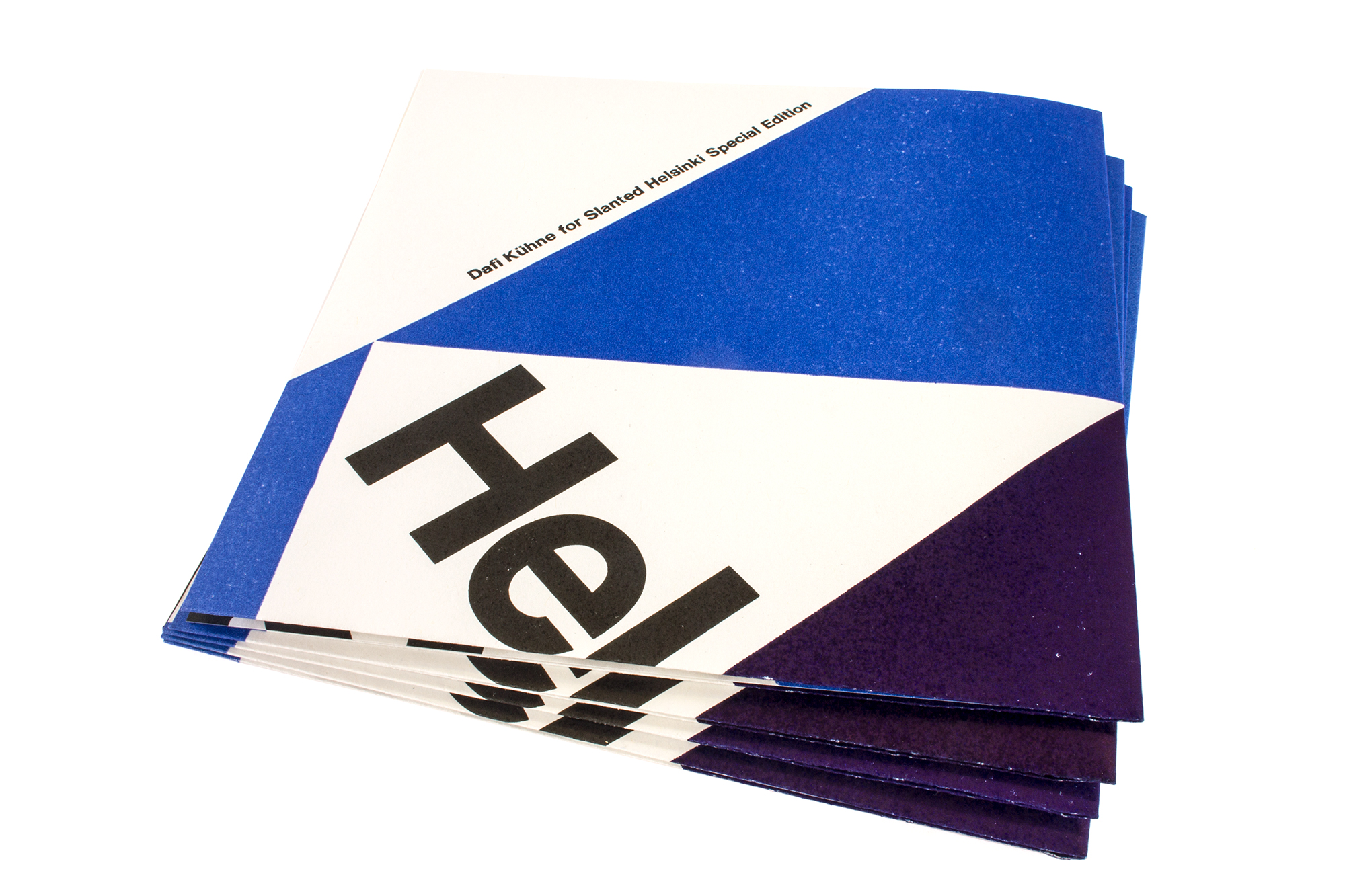
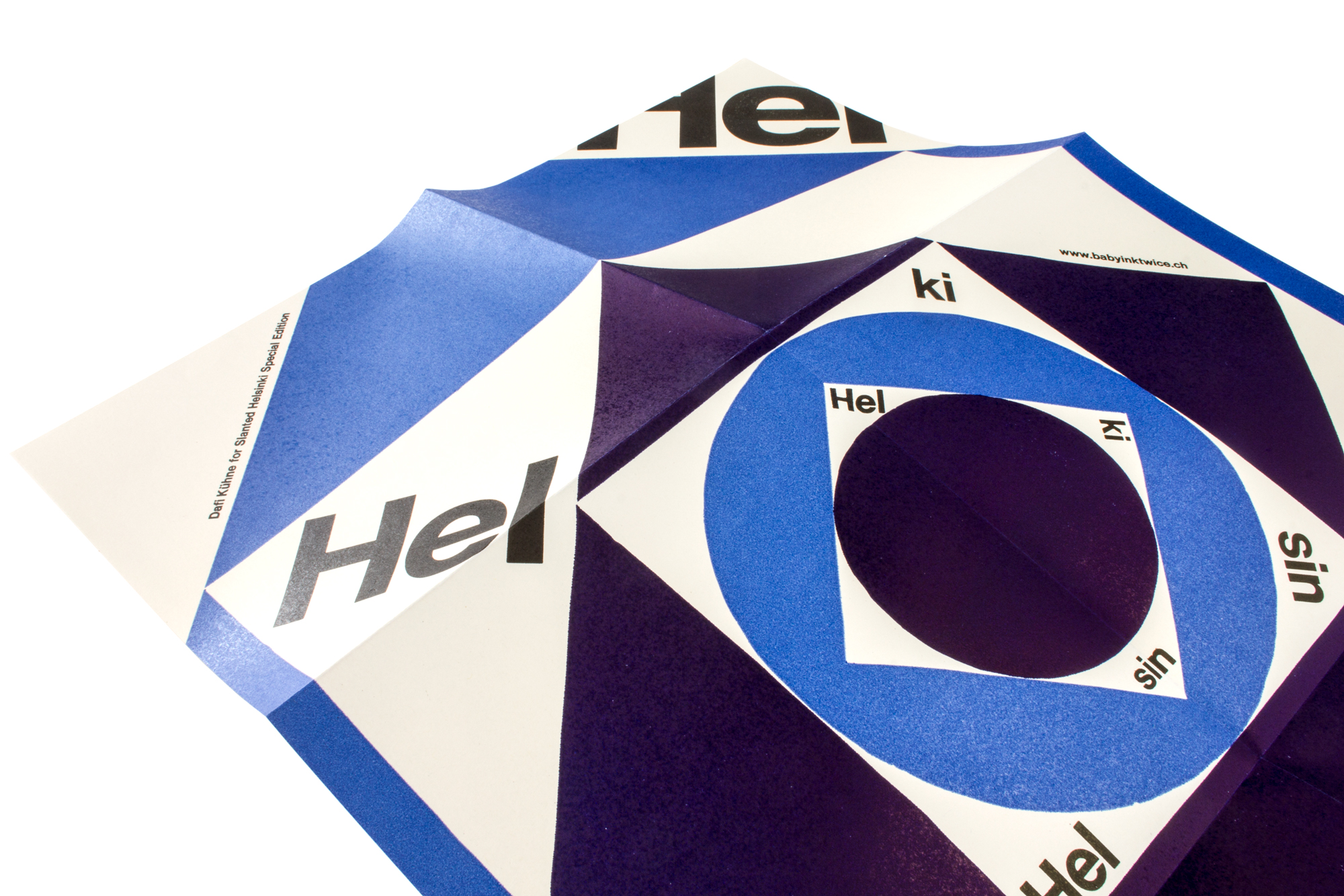
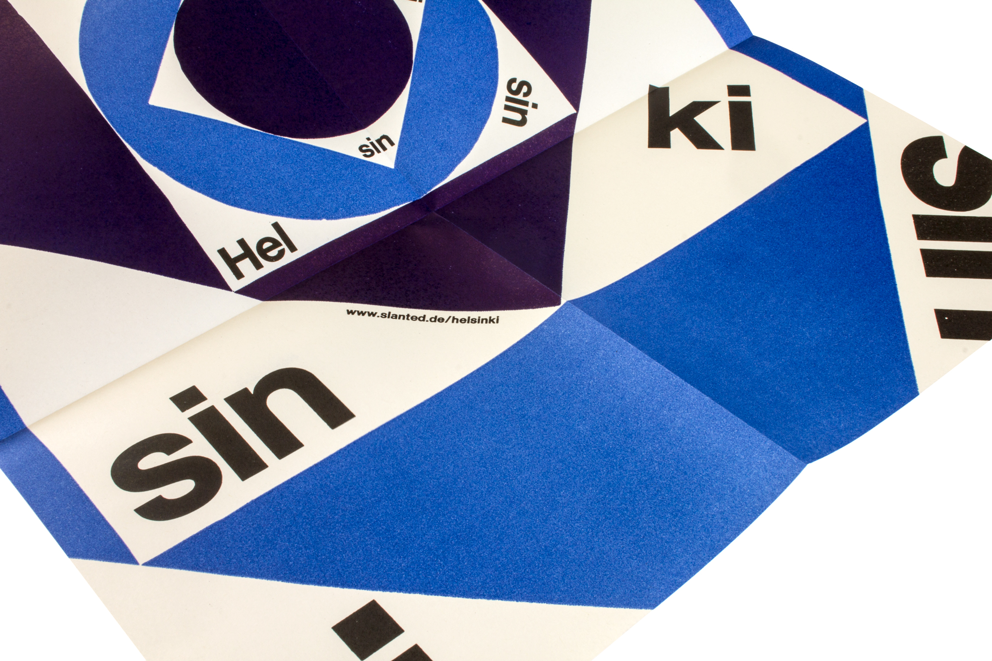
Slanted Helsinki
Folded poster for Slanted Magazine Helsinki Limited Edition. The poster has been printed in 4 print runs from hand cut linoleum, traditional plastic poster type, pantograph cut new wood type and traditional metal type.
Client: Slanted Magazine, Karlsruhe
Format: 35×52.5cm
Paper: Recystar 100g/m2
Edition: 250 posters on a FAG Control 405
March 2017
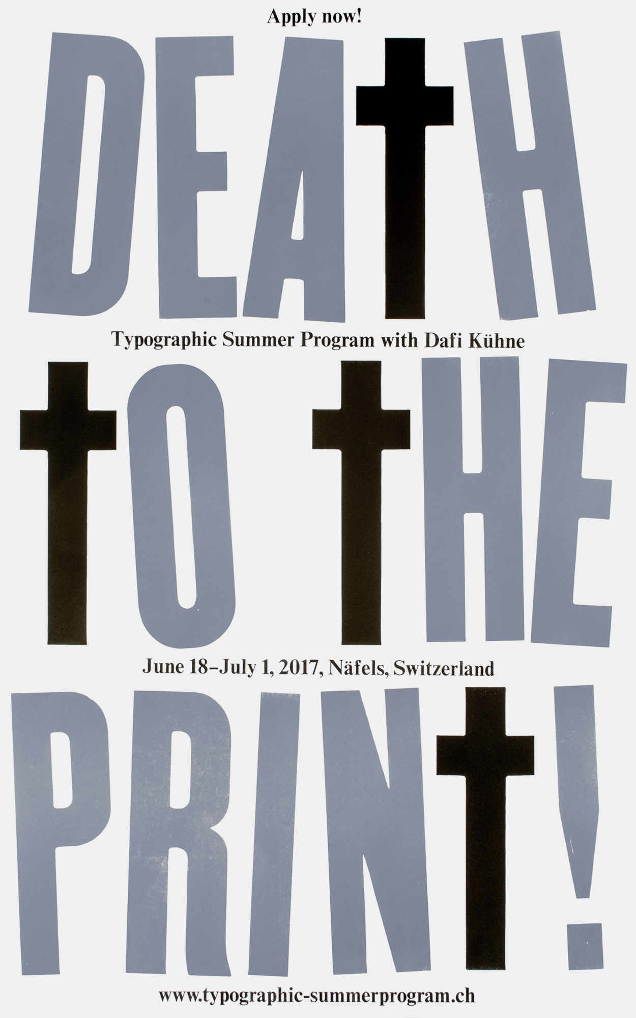
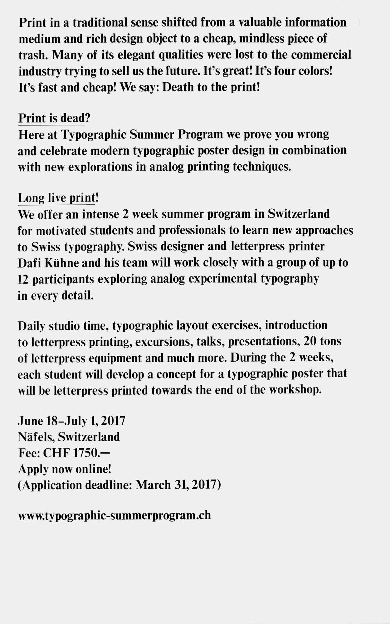
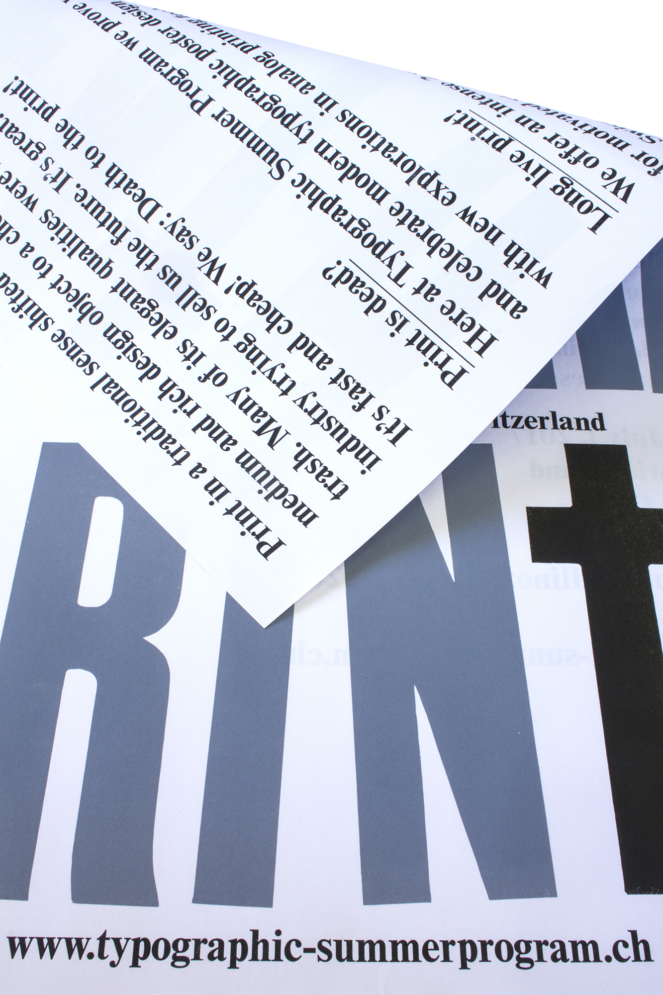
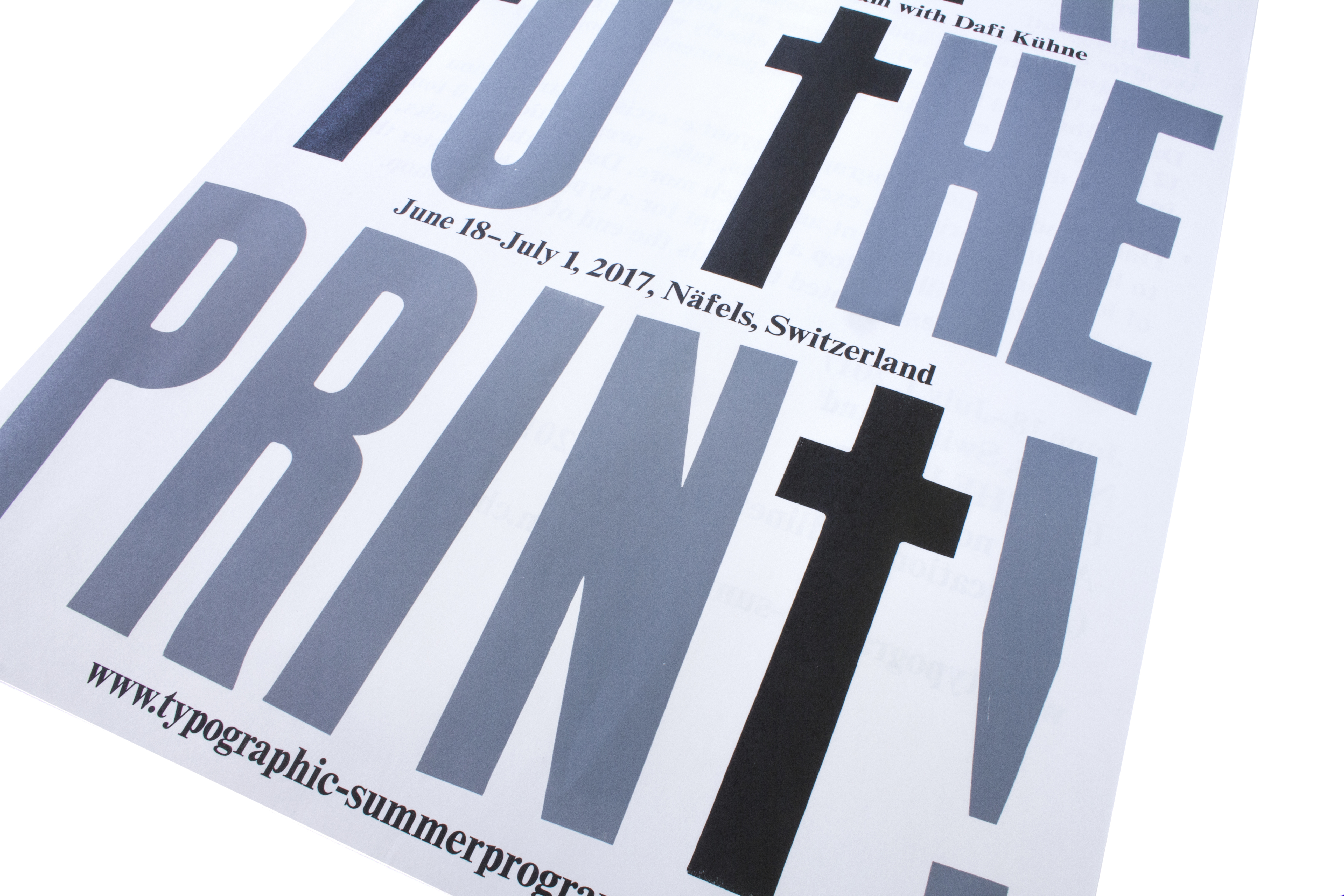
Death to the print
2-sided promotional poster for www.typographic-summerprogram.ch printed in 4 print runs from pantograph cut wood type and metal type.
The lower case t’s or crucifixes have been traced from up upper case T’s, but just while tracing I moved the crossbar down. The posters have been printed on thin 70g/m2 paper, then folded and sent out as a promotion of the program.
Client: Typographic Summer Program, Näfels
Format: 55×88cm
Paper: Holmen Trend, 2.0, 70g/m2
Edition: 250 posters on a FAG Control 900
February 2017
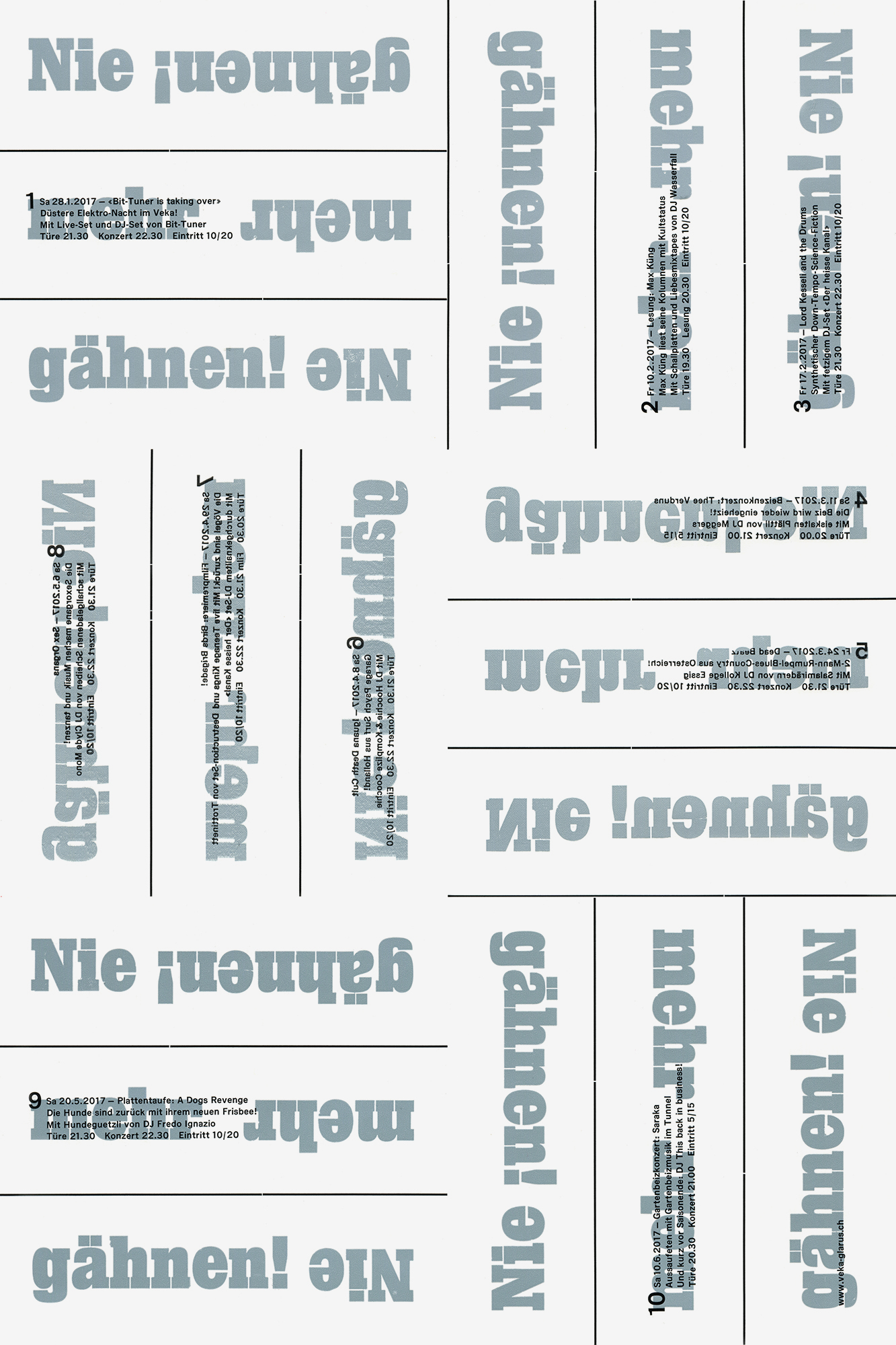
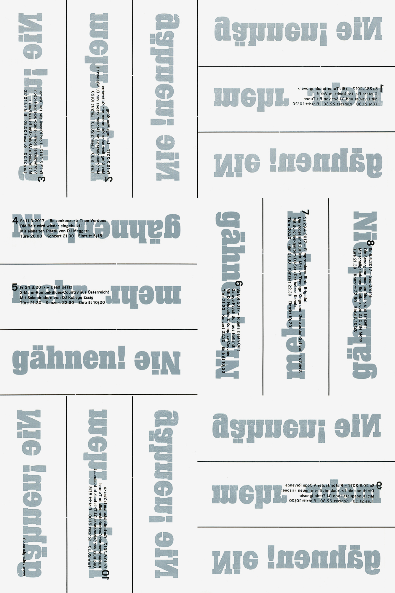
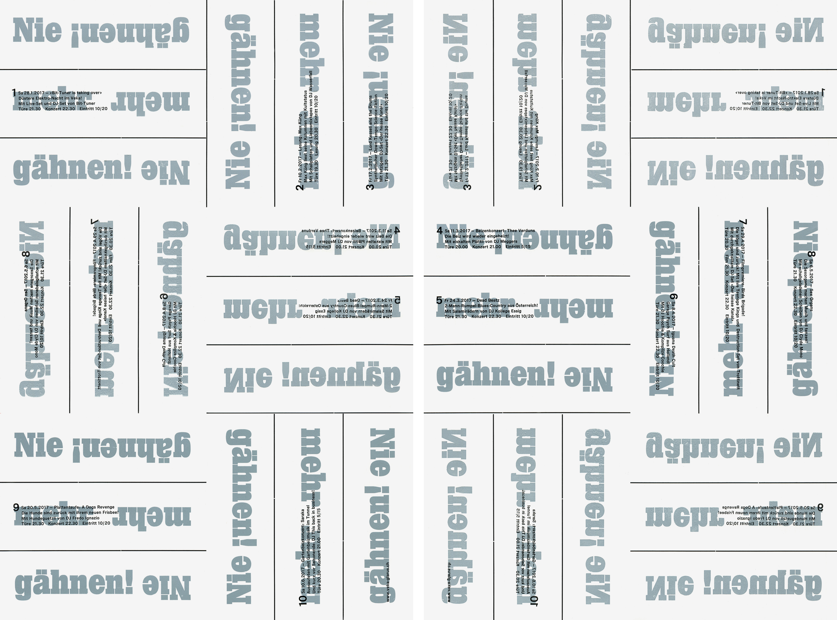
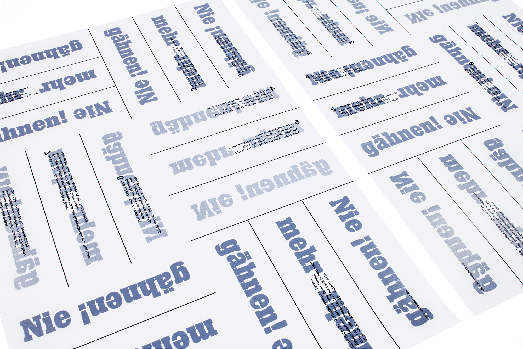
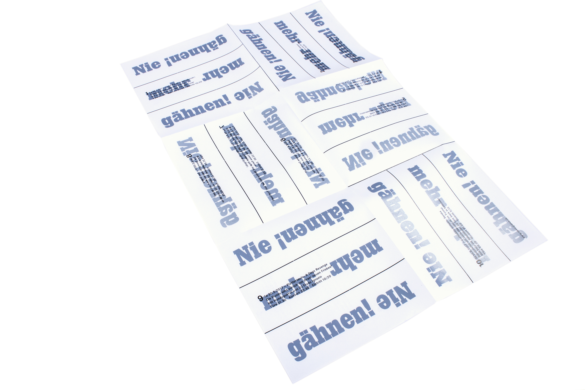
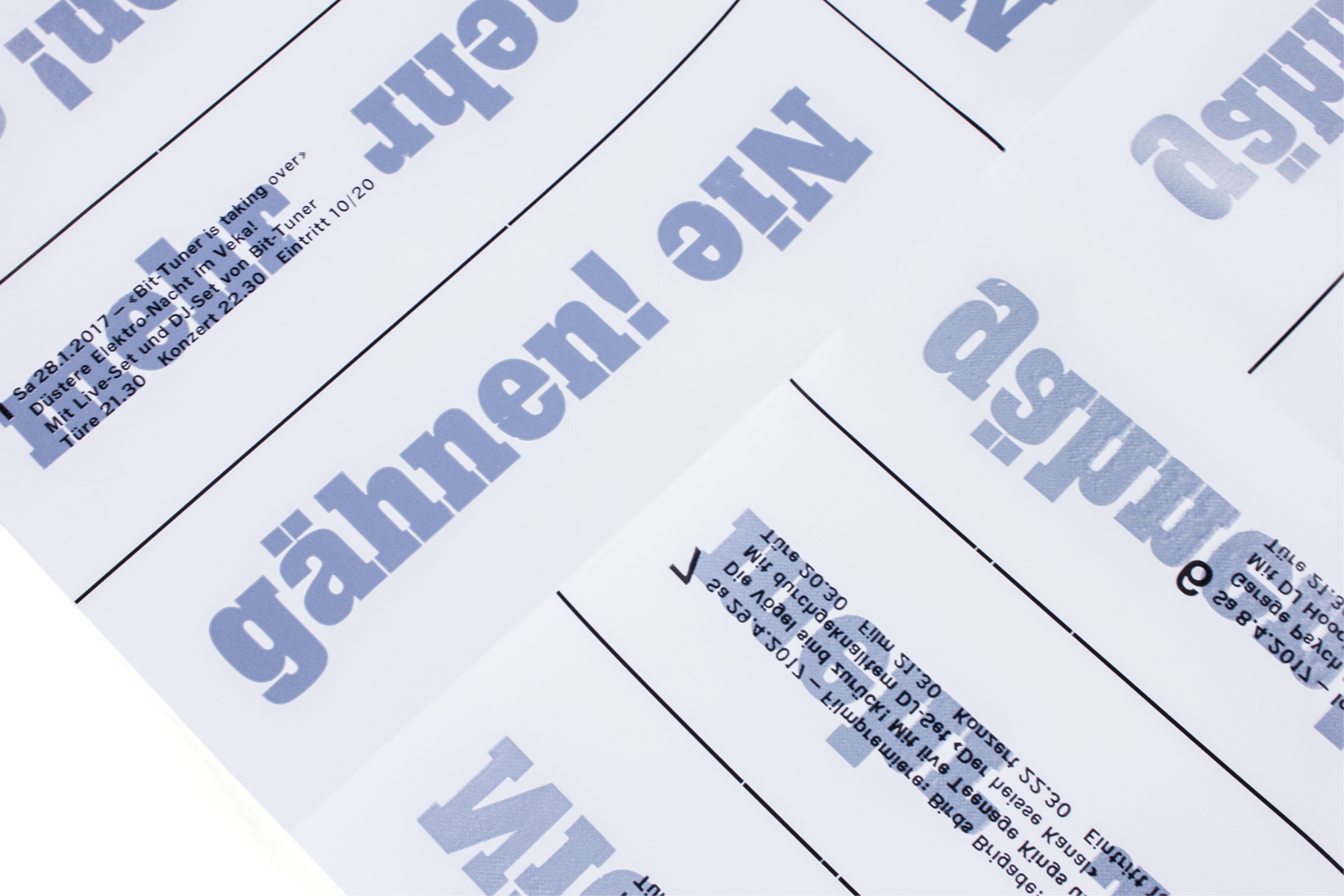
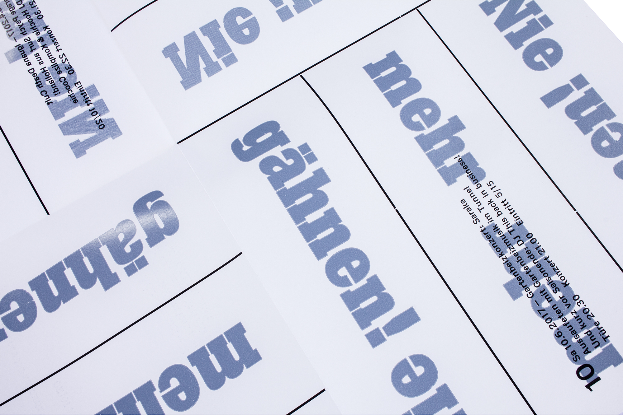
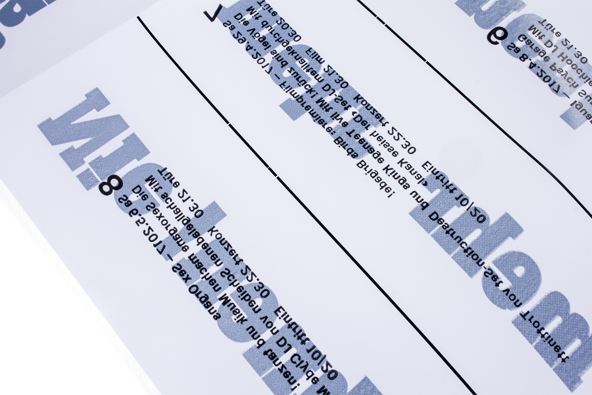
Mirror Maze
Concert program for Veka-Glarus.ch printed in 6 print runs from metal type and Ludlow slugs.
For this poster, I had the message «nie mehr gähnen» which means «no more yawning», but it could also be understood as «never yawn more». I wanted this poster to look like a mirror maze. So some parts of the poster are reversed, others are side correct. So I developed a technique to print a side correct image on the front and a flipped version of that same image on the back – simultaneously!
Check out the video to see the process of how I modified the press to produce this poster.
Client: Veka-Glarus, Glarus
Format: 35×52.5cm
Paper: Tatami Natural, 115g/m2
Edition: 500 posters on a FAG Control 405
Januar 2017
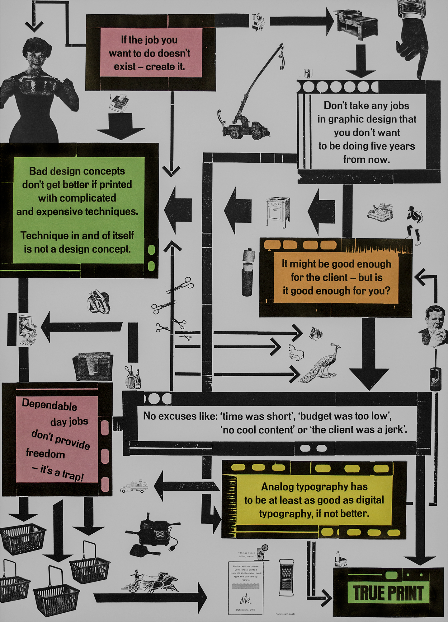
Things I keep telling myself
Personal manifesto for the limited edition my book «True Print». I tried to visualize my personal work policy as a piece of unreadable but yet understandable information graphic. This poster is only available with the Limited Edition of «True Print».
The whole diagram has been printed from 1 cicero lead reglets. The graphics are all from my studio archive of existing photo plates. All the large type has been hand cast from resin – watch the video!
Client: Lars Müller Publishers, Zürich
Format: 59.4×84.1cm (A1)
Paper: Puna, 100g/m2
Edition: 300 posters on a FAG Control 900
October 2016
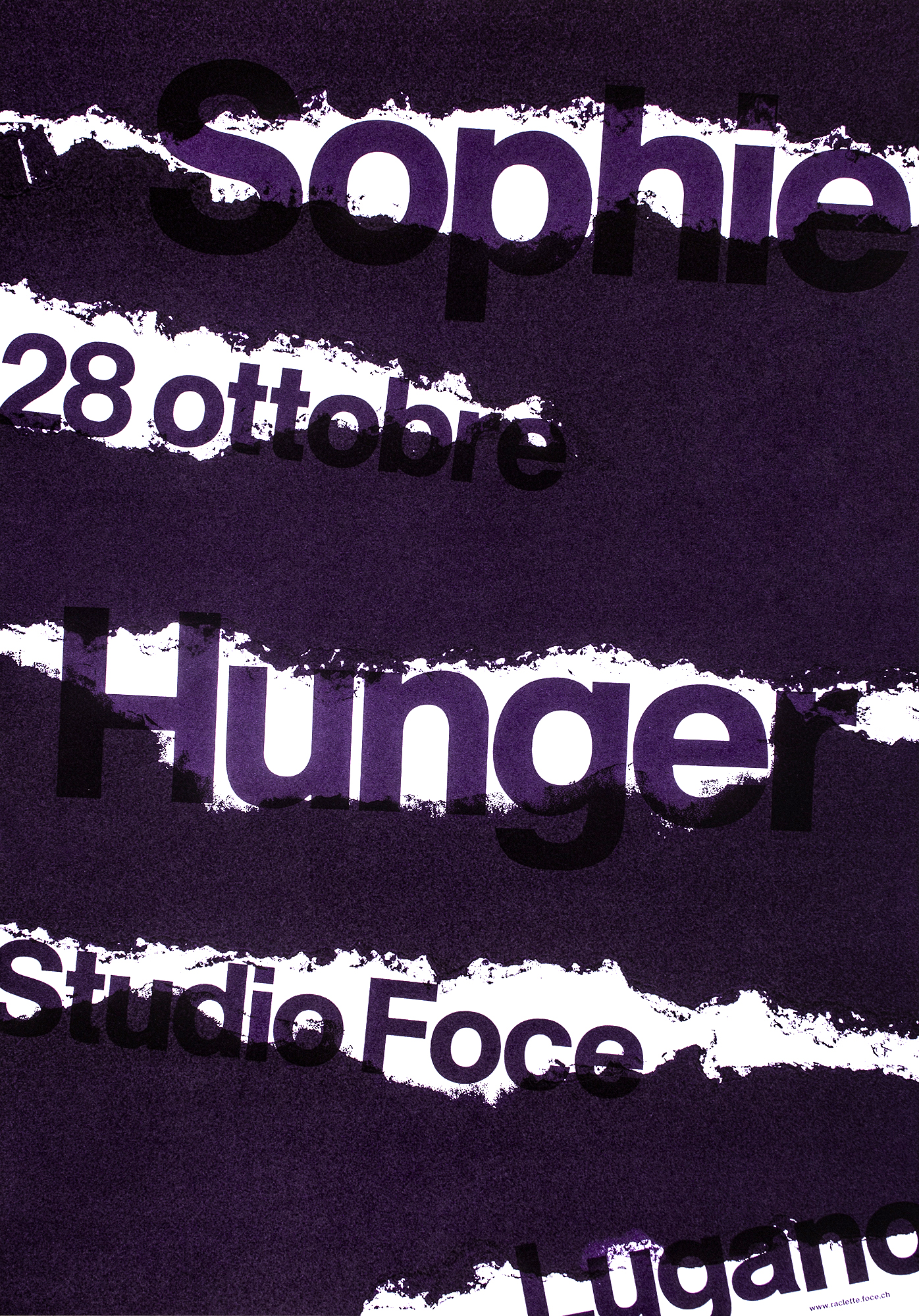
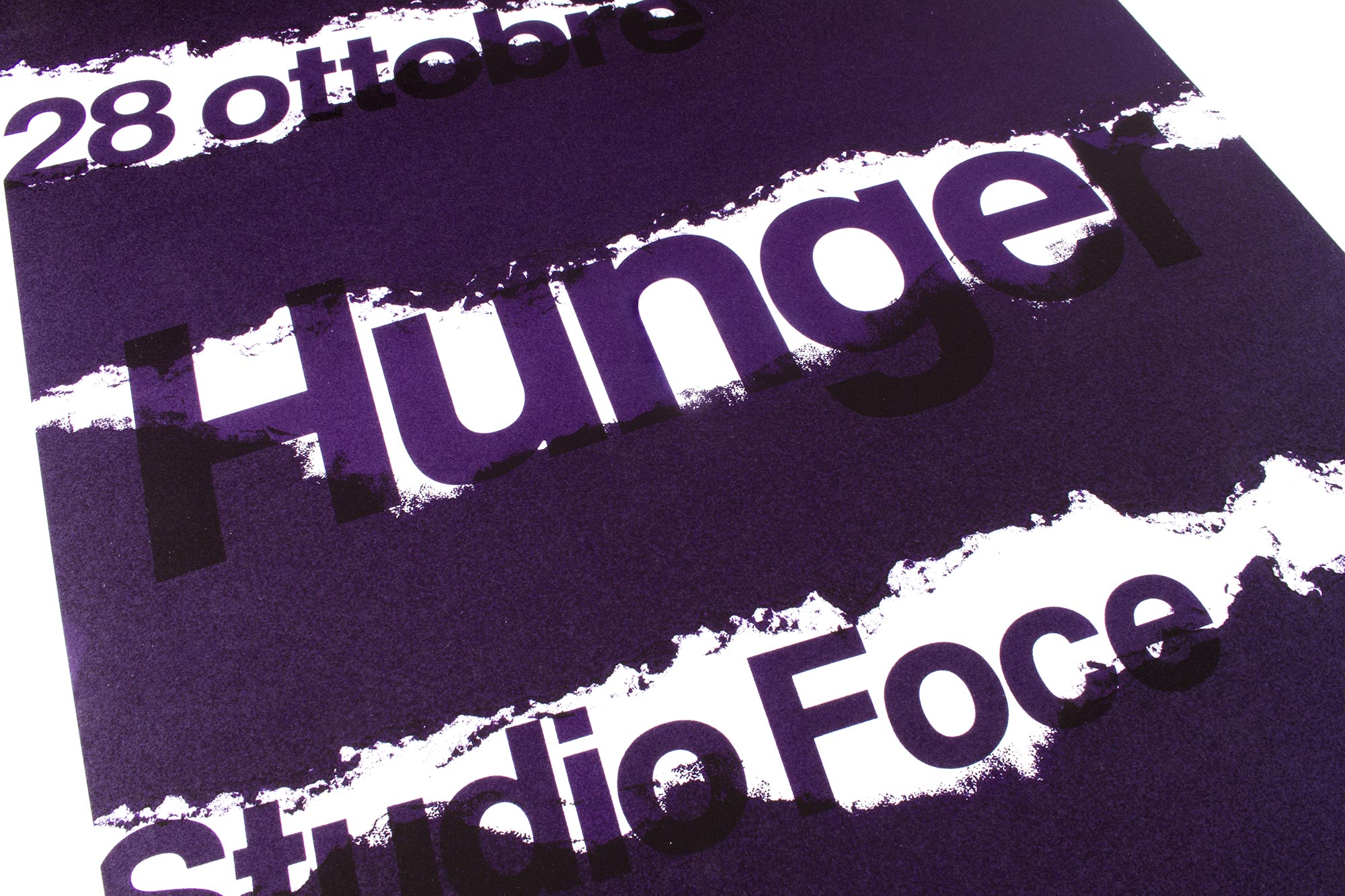
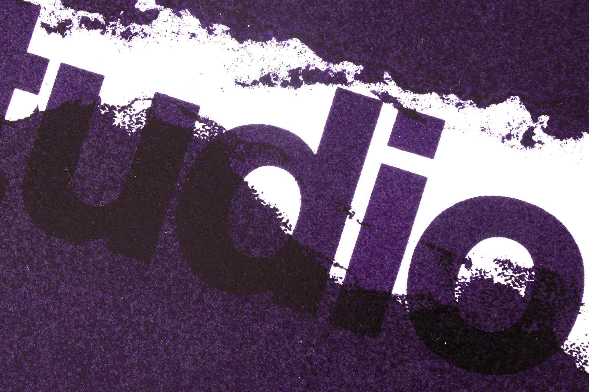
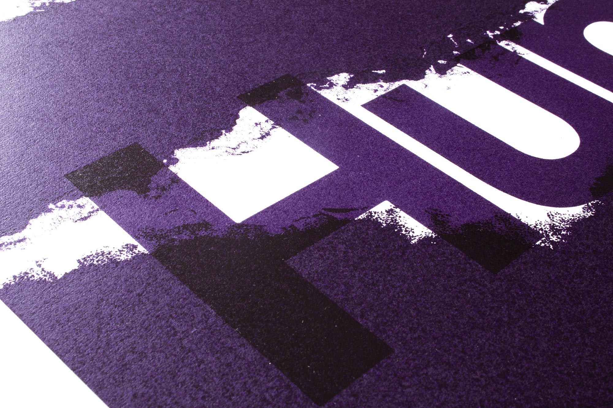
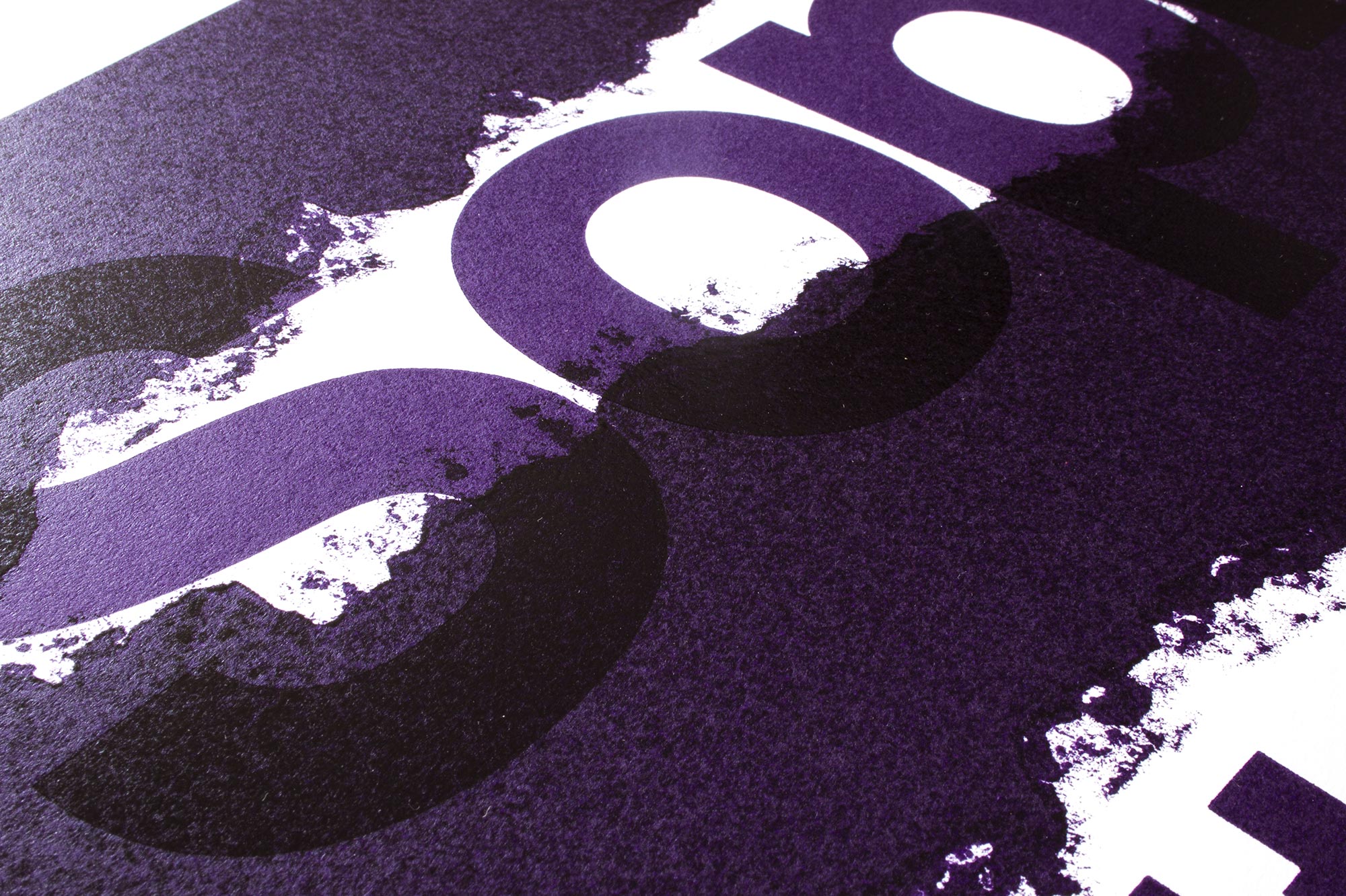
Sophie Hunger
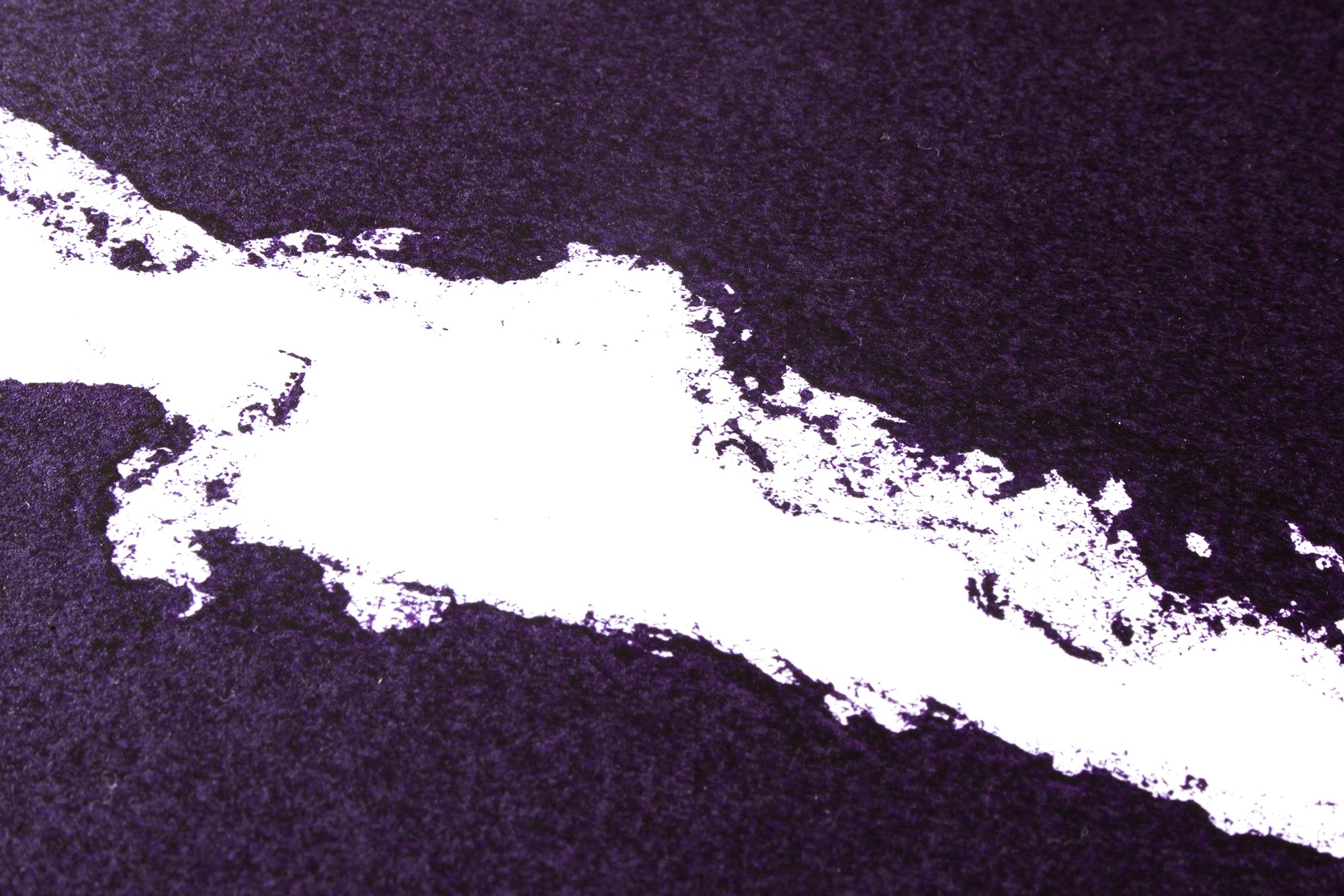
Concert poster for a concert of Swiss artist Sophie Hunger in Lugano, Switzerland. The poster was printed with torn pieces of chipboard.
The so simulated rips in the paper should give the feeling of a poster that has been torn into pieces on a poster wall. The information below could be from a previous concert poster that is now revealed.
Client: Studio Foce, Lugano
Format: 49.9×71.5cm
Paper: Materica Gesso, 250g/m2
Edition: 93 posters on a FAG Control 900
October 2016
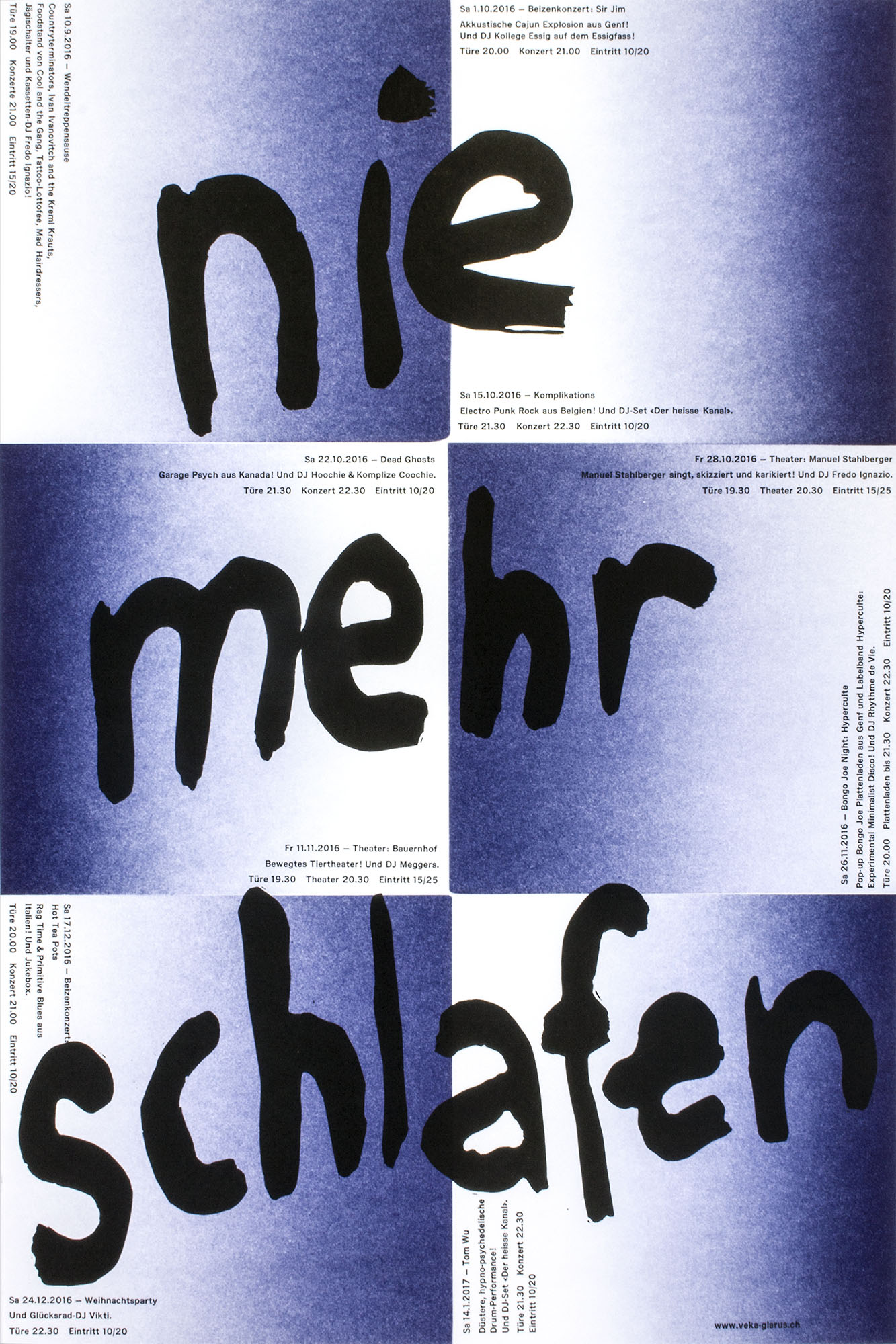
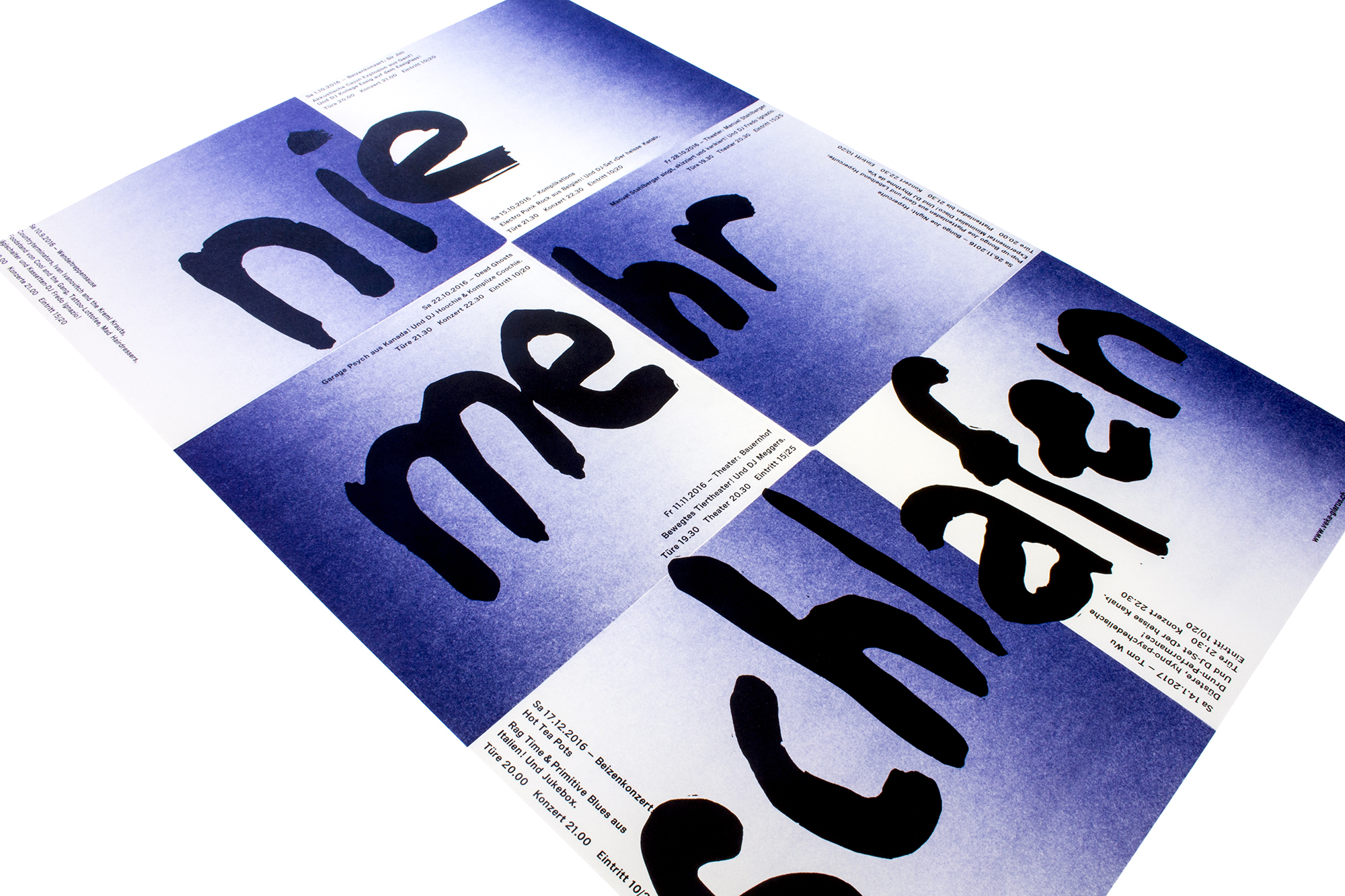
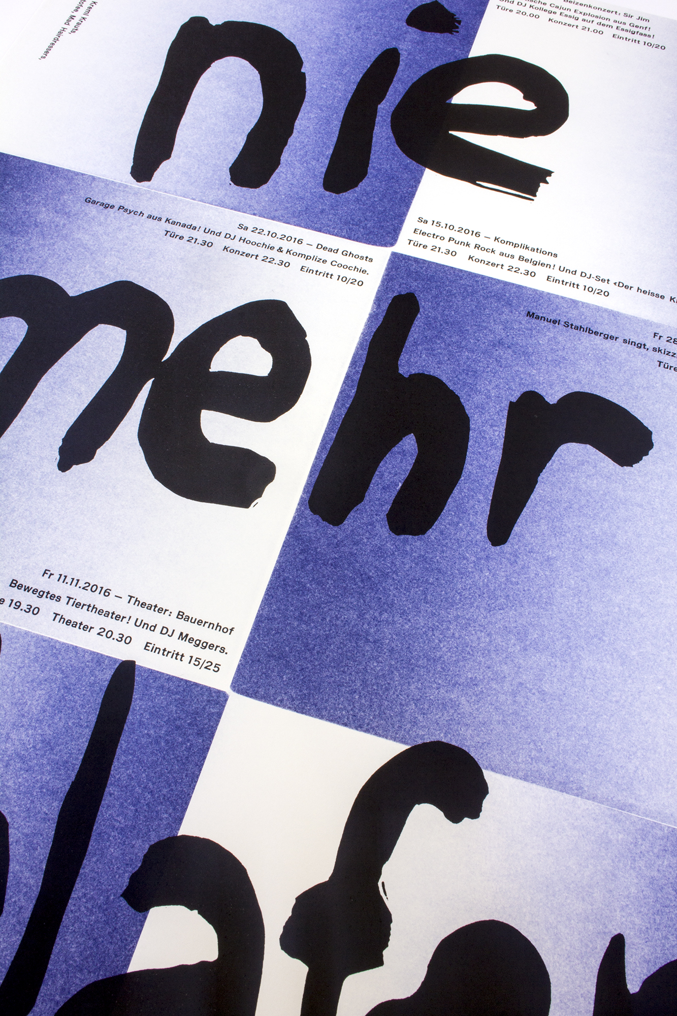
Nie mehr schlafen
Concert program for Veka-Glarus.ch printed in 4 print runs. «Nie mehr schlafen» means «never sleep again» but it could also be translated as «never sleep more».
I wanted that poster to look light, dreamy, hovering like clouds. Printed from solid plastic blocks, hand cut linoleum and Ludlow slugs. Check out the video.
Client: Veka-Glarus, Glarus
Format: 35×52.5cm
Paper: Munken Lynx Rough, 120g/m2
Edition: 450 posters on a FAG Control 405
August 2016
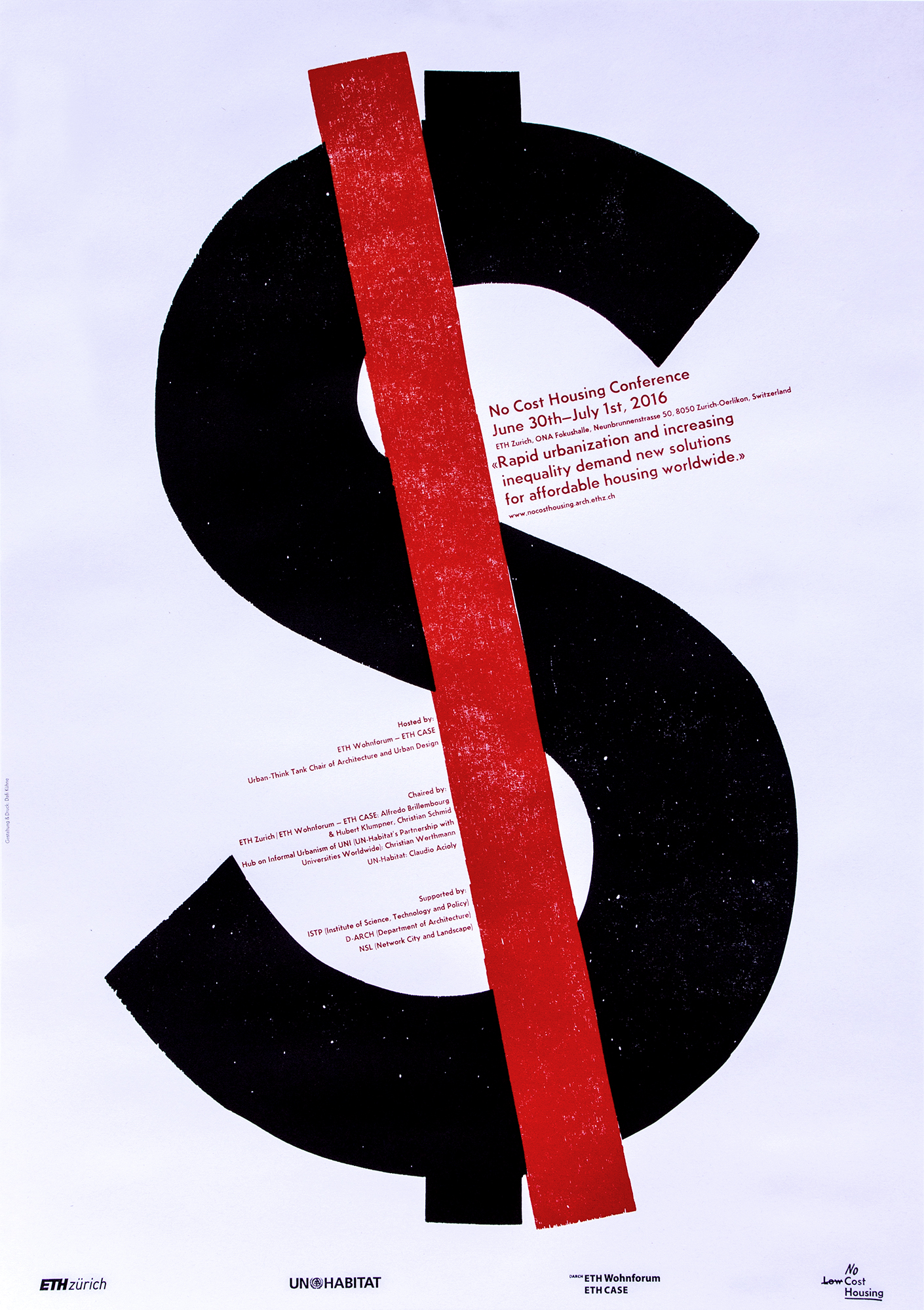
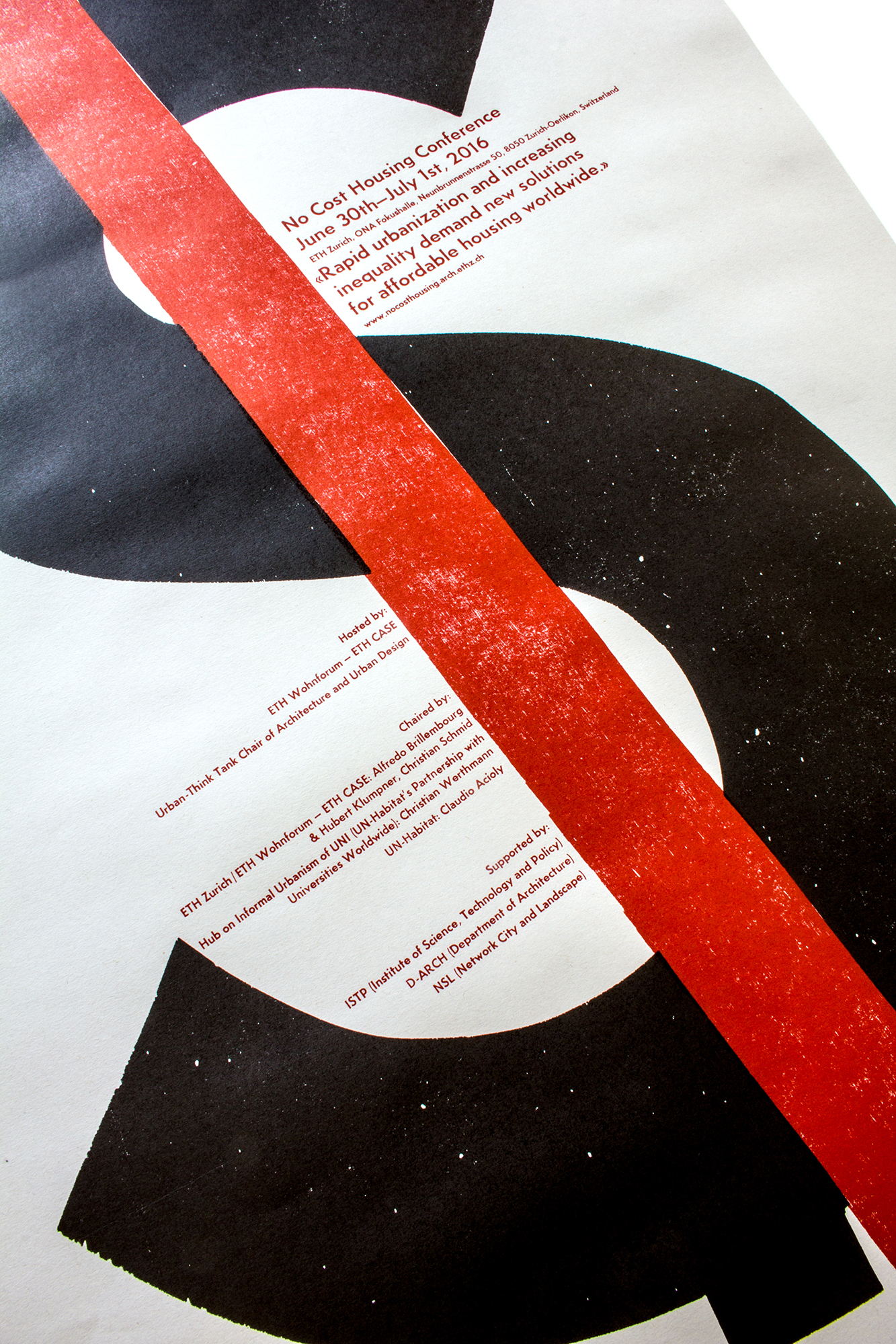
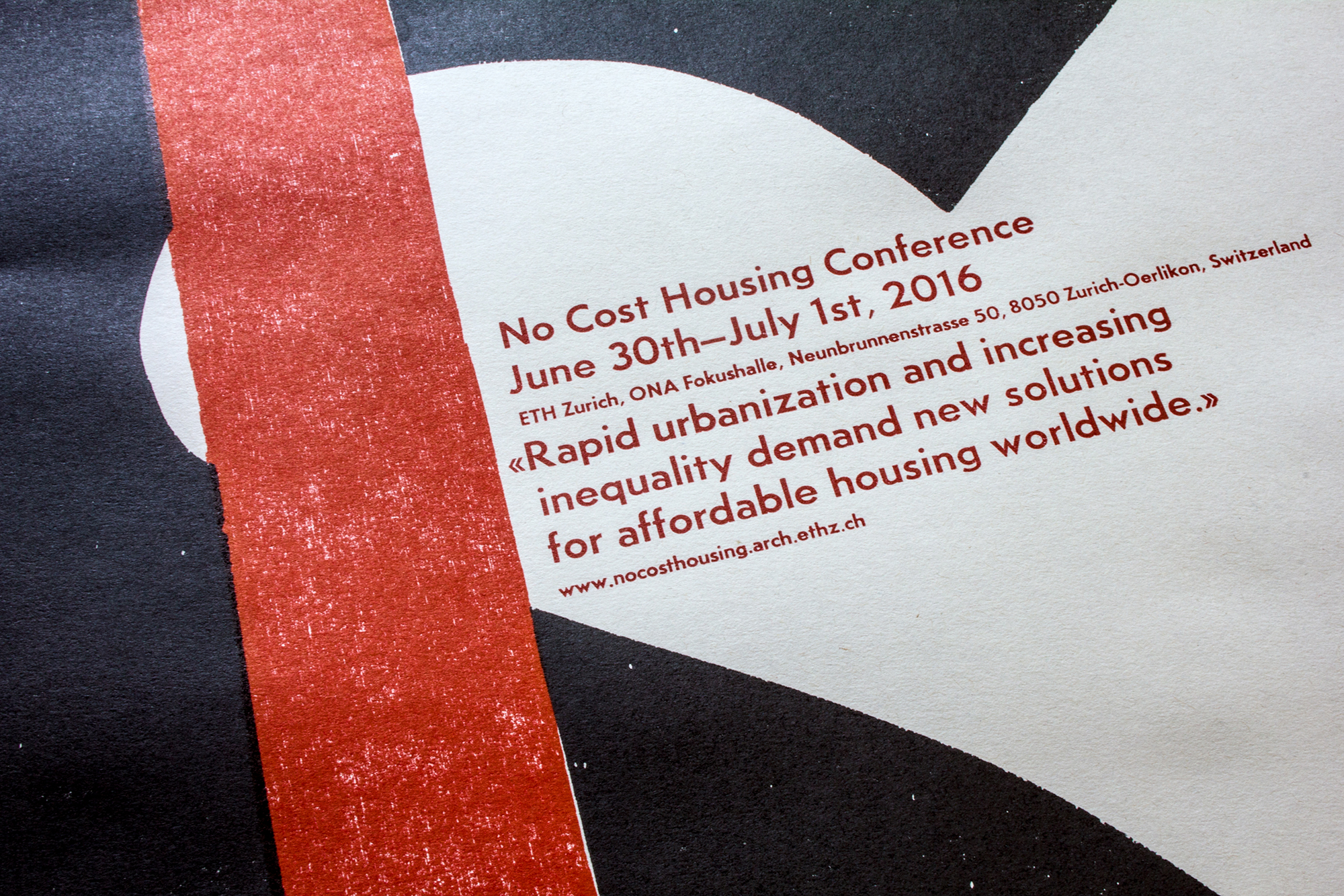
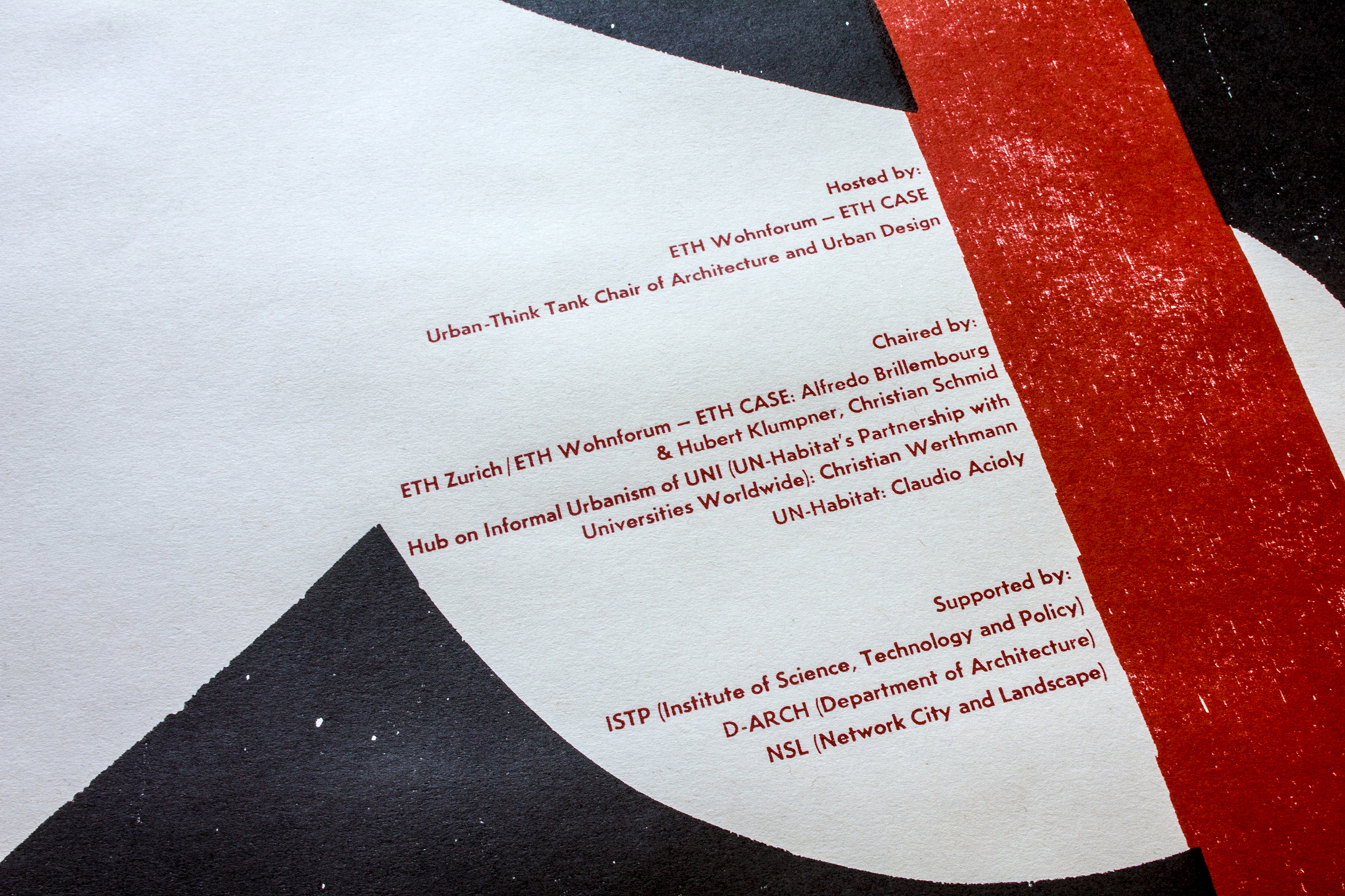
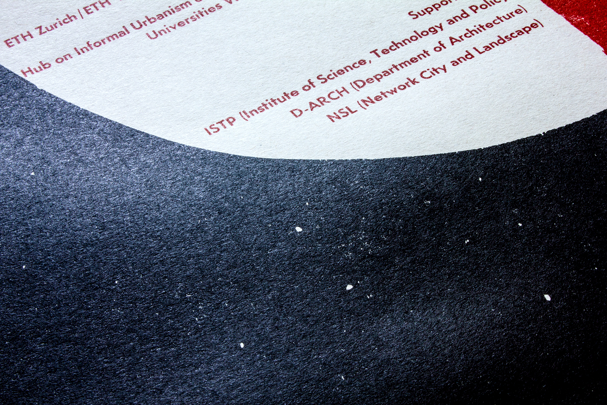
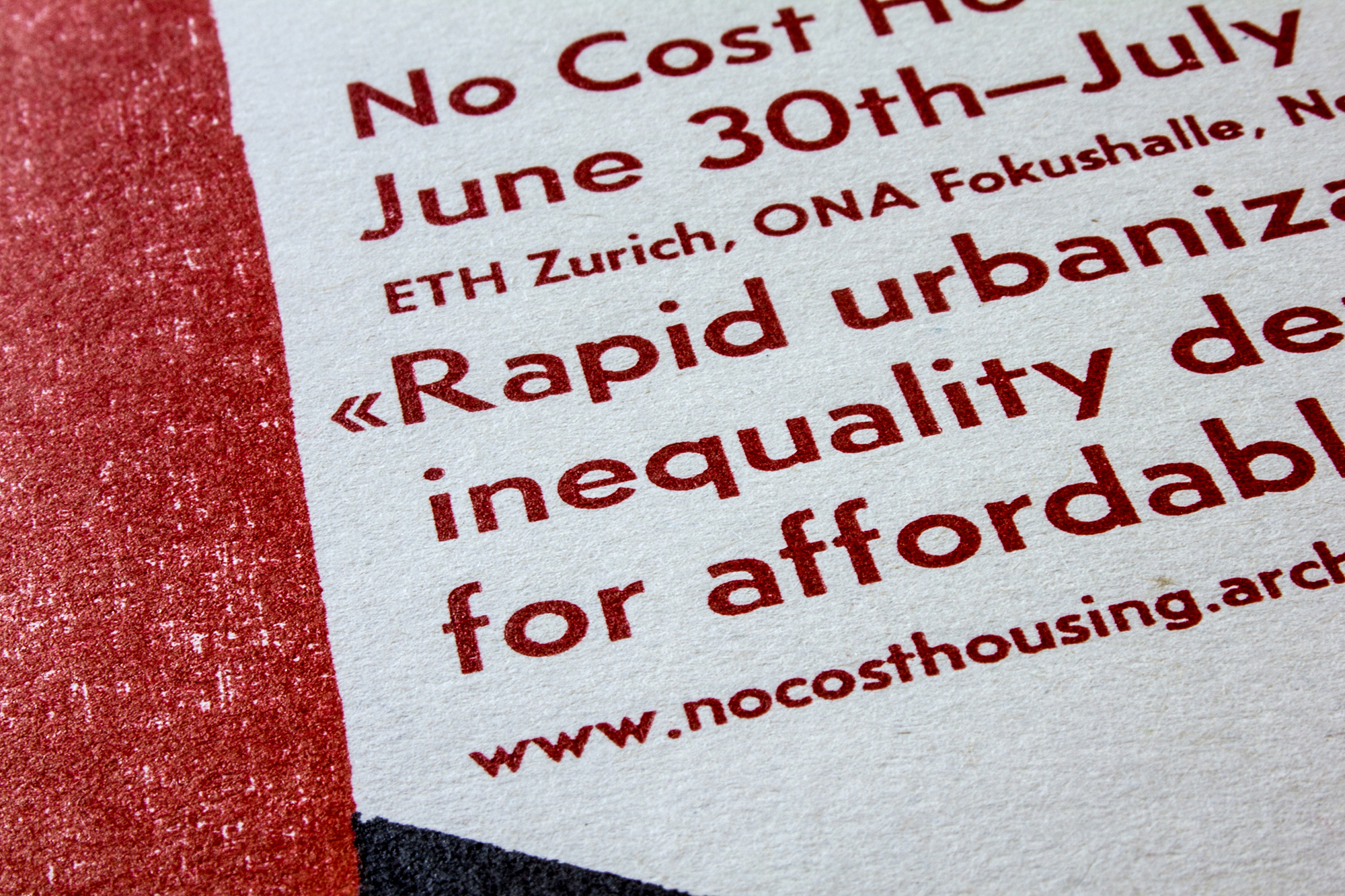
No Cost Housing Conference
Letterpress printed poster for an architecture conference with the topic ‹No Cost Housing Conference›. The idea of cheap materials to build houses hast been reproduced with hand cut plywood.
The type used on this poster has been cast on the Ludlow type caster.
Client: ETH Wohnforum, ETH CASE, Zürich, Switzerland
Format: 48×68cm
Paper: Puna, 100g/m2
Edition: 550 posters on a FAG Control 900
Other size: 20 Posters, F4 Format
August 2016
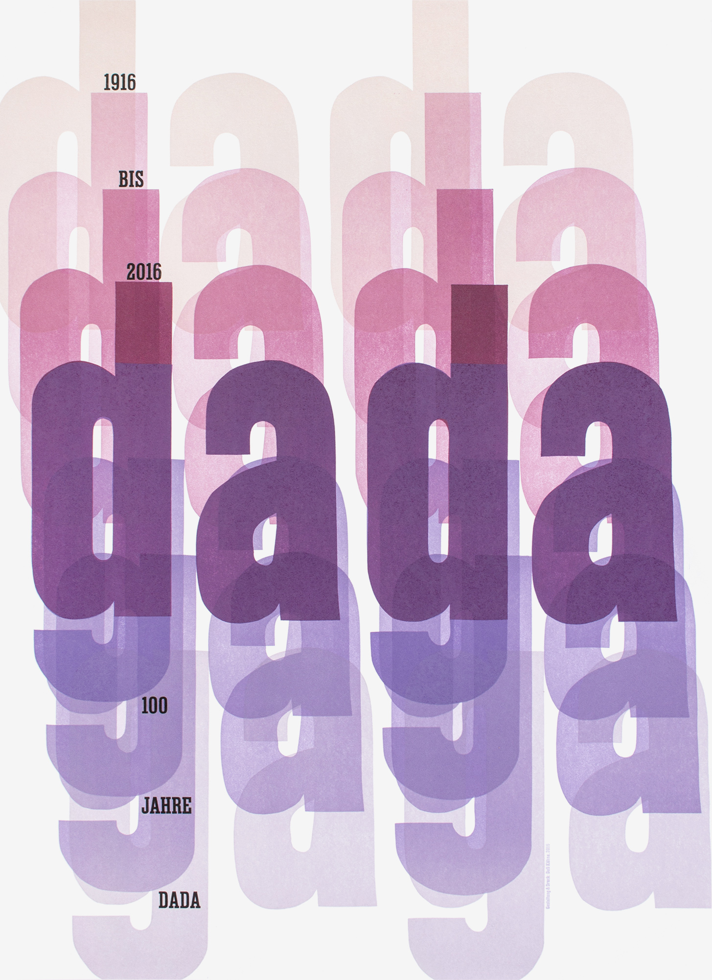
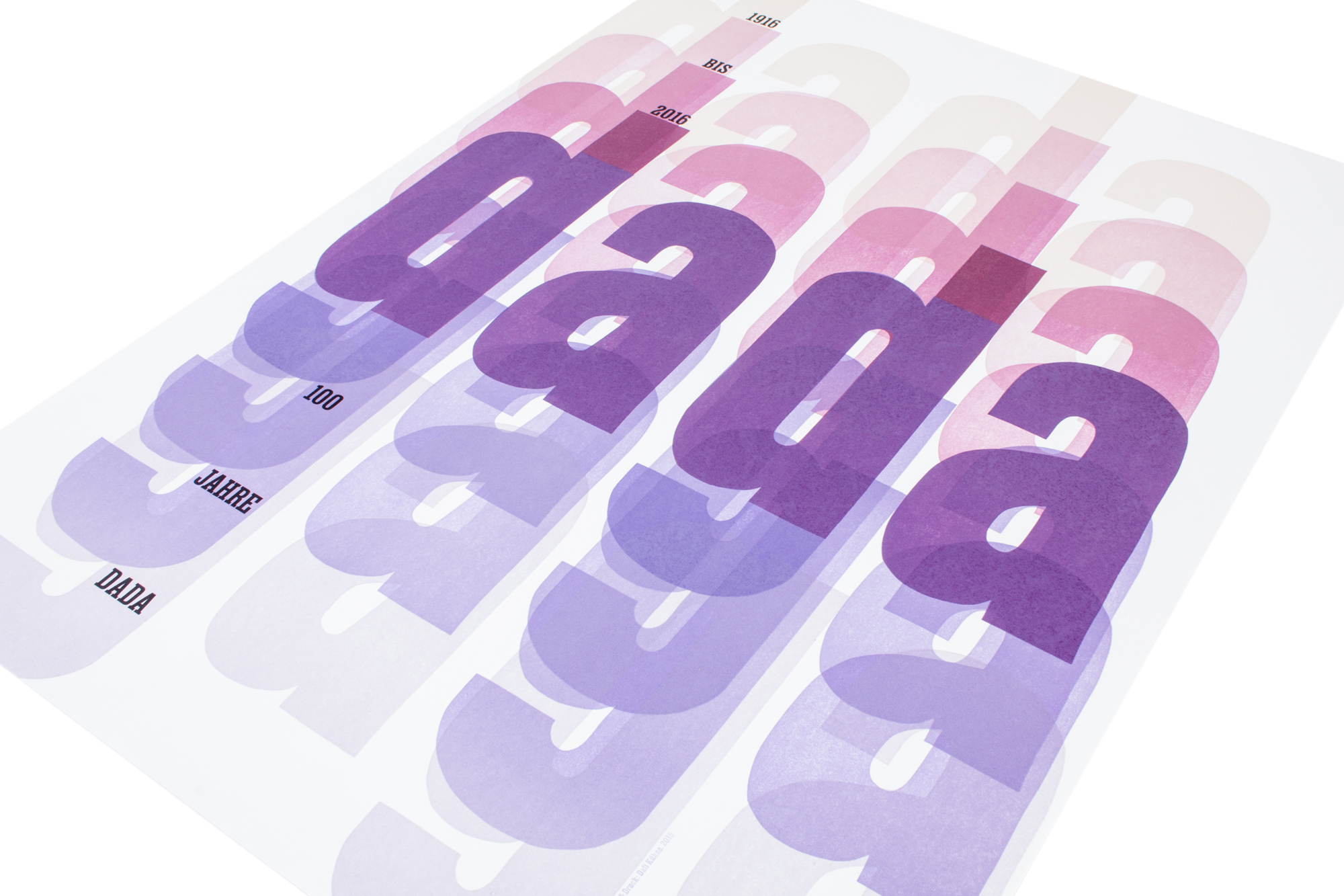
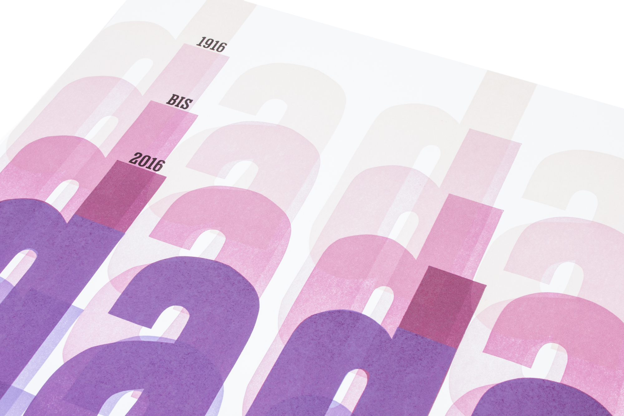
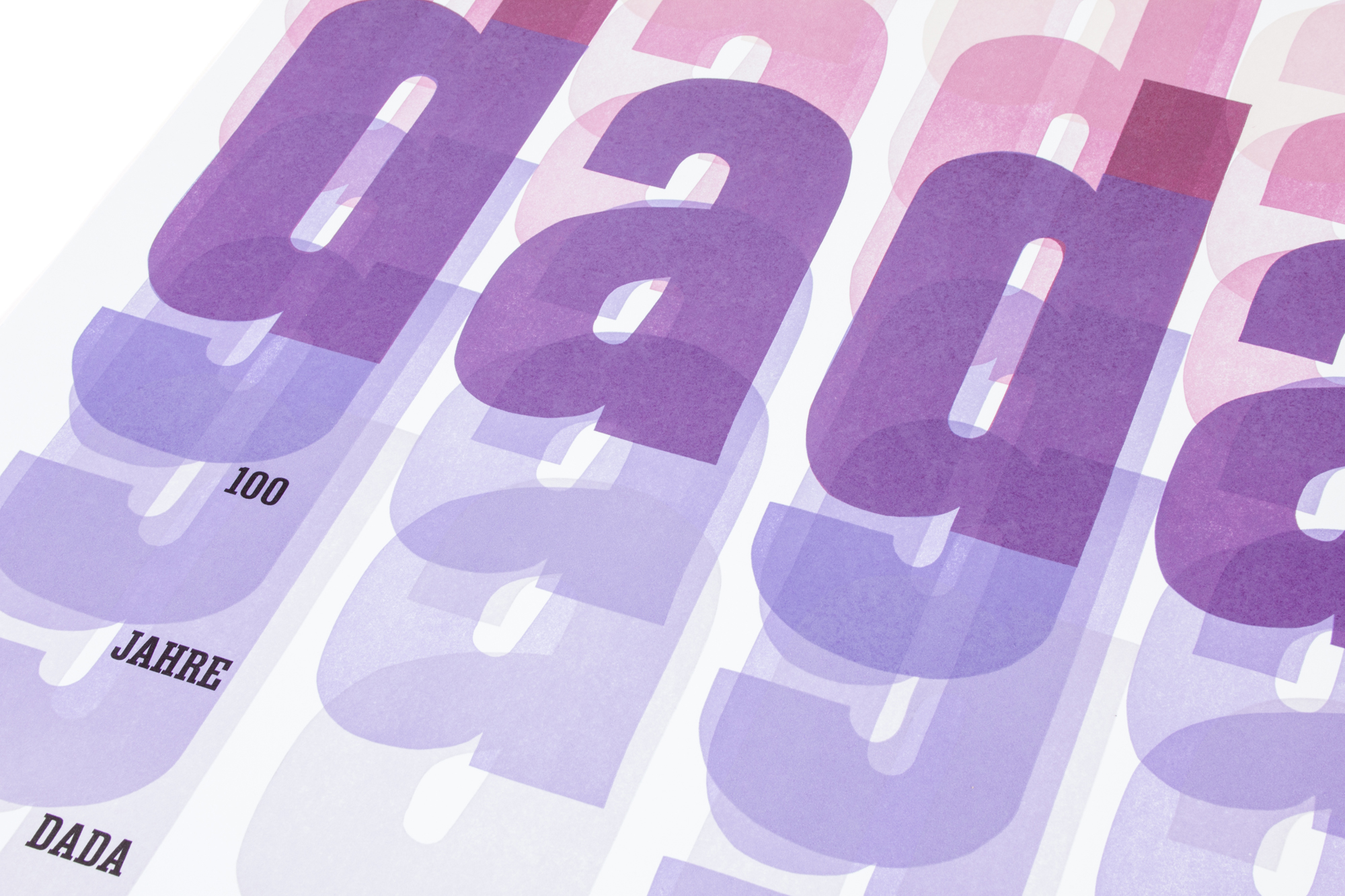
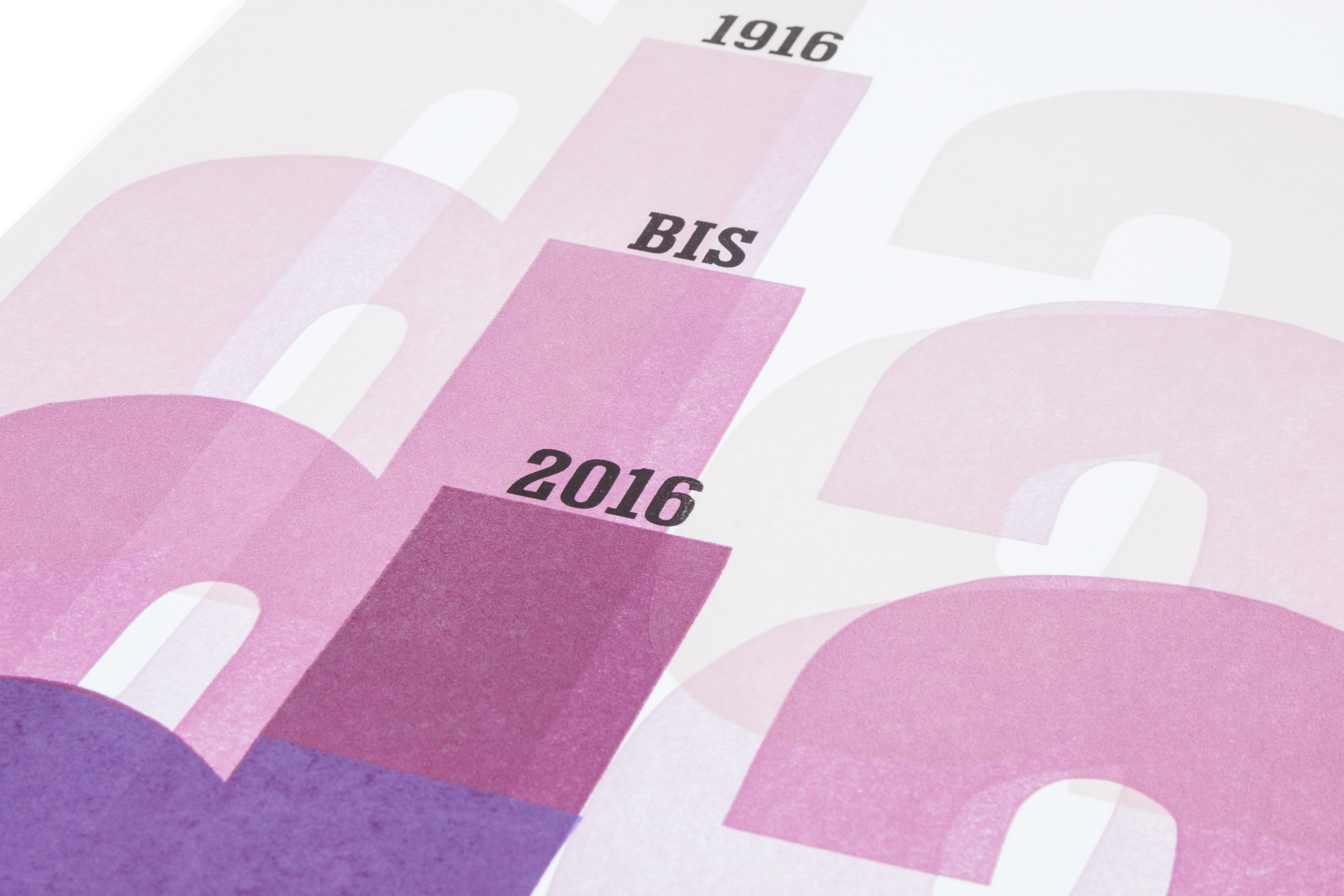
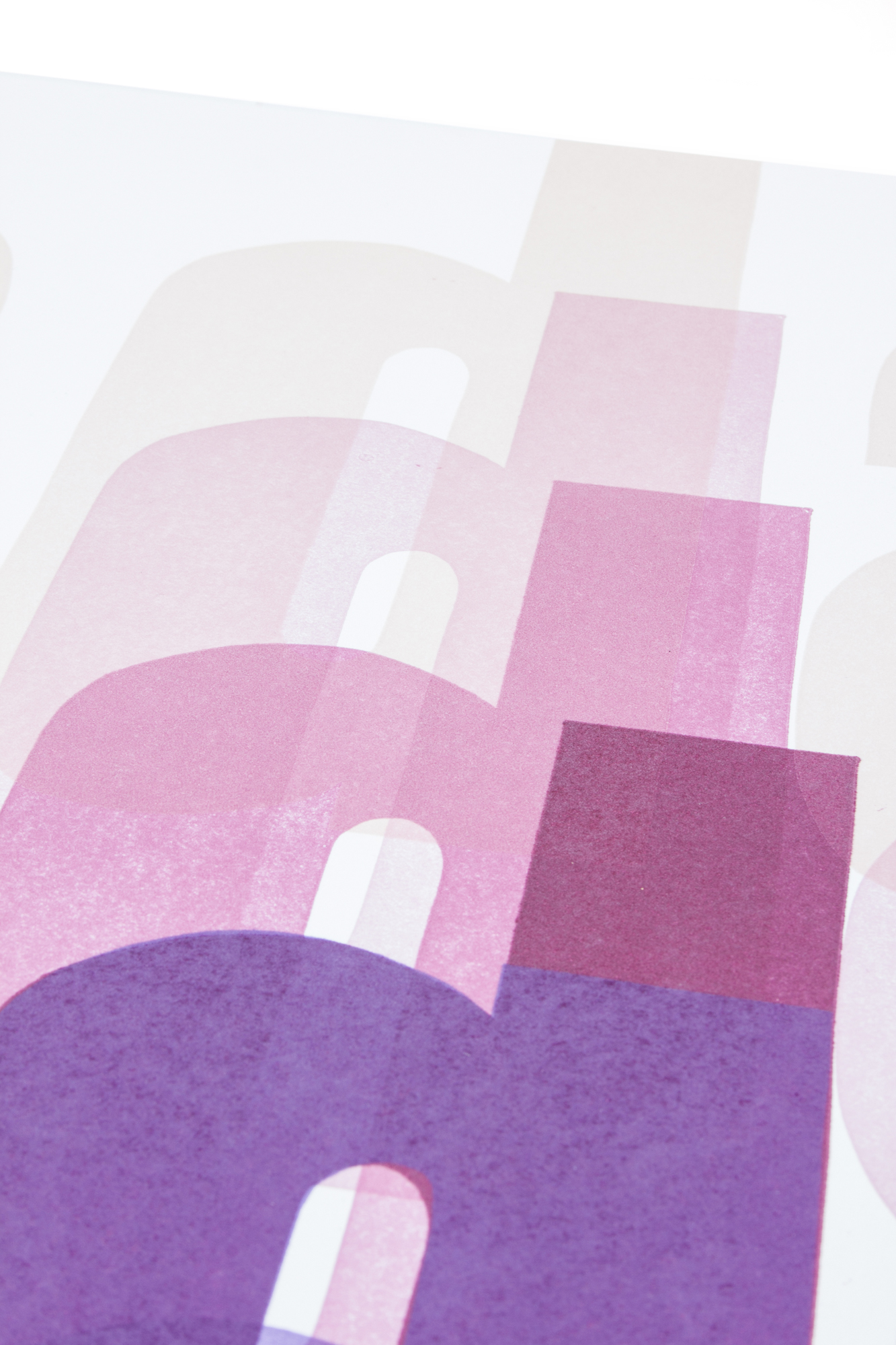
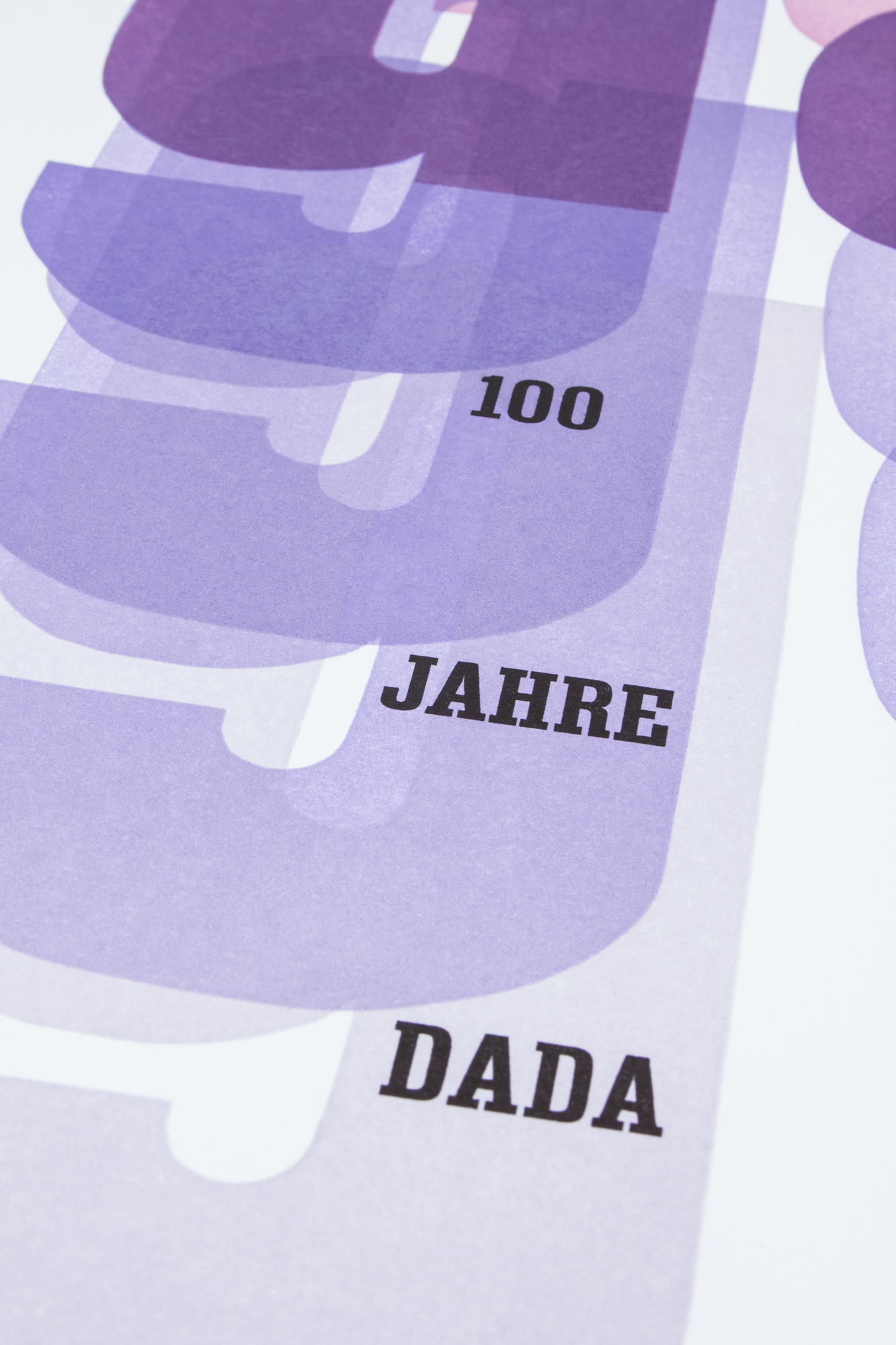
Dada–Gaga
Poster celebrating the 100 years anniversary of Dada. Printed in a total of 10 print runs from hand cut linoleum and lead type. Is it still Dada or gaga already?
The used typeface is a scan of an existing set of wood type. I scaled it up an handcut it from linoleum. I also modified the “d” and the “g” so they would register perfectly. Dada melts into gaga. Haha.
Client: Self initiated
Format: 64×88cm
Paper: Gmund Cotton, Linen Cream 300g/m2
Edition: 22 posters / 2nd Edition of 50 posters on a FAG Control 900
March 2016, April 2018
Party bomb
Concert program for Veka-Glarus.ch letterpress printed in one black print run on preprinted 4c offset prints.
The whole typographic layout has been hand cast on a Ludlow typecaster, then composed and locked up in this spread out layout. This lock up was crazy. The used typeface is Record Gothic, a typeface that only exists on the Ludlow casting system.
Client: Veka-Glarus, Glarus
Format: 48×68cm
Paper: Cyclus preprint weiss, 80g/m2
Offset: R+A Print, 4c offset preprinted
Edition: 1300 posters on a FAG Control 900,
Photography: Peter Hauser
January 2016
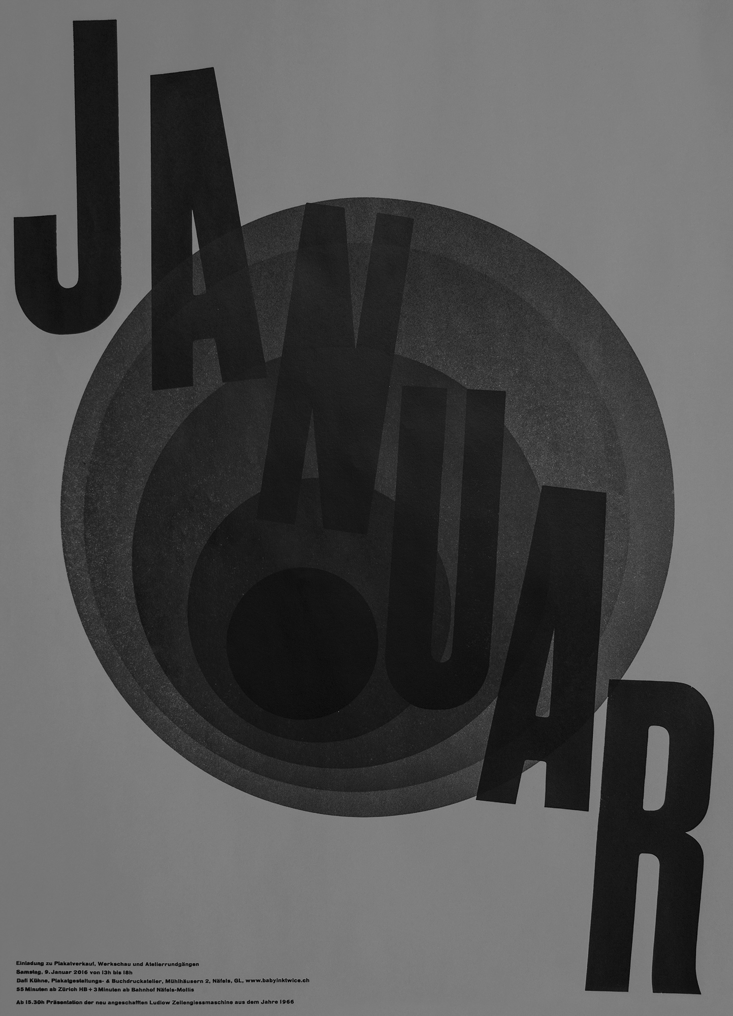
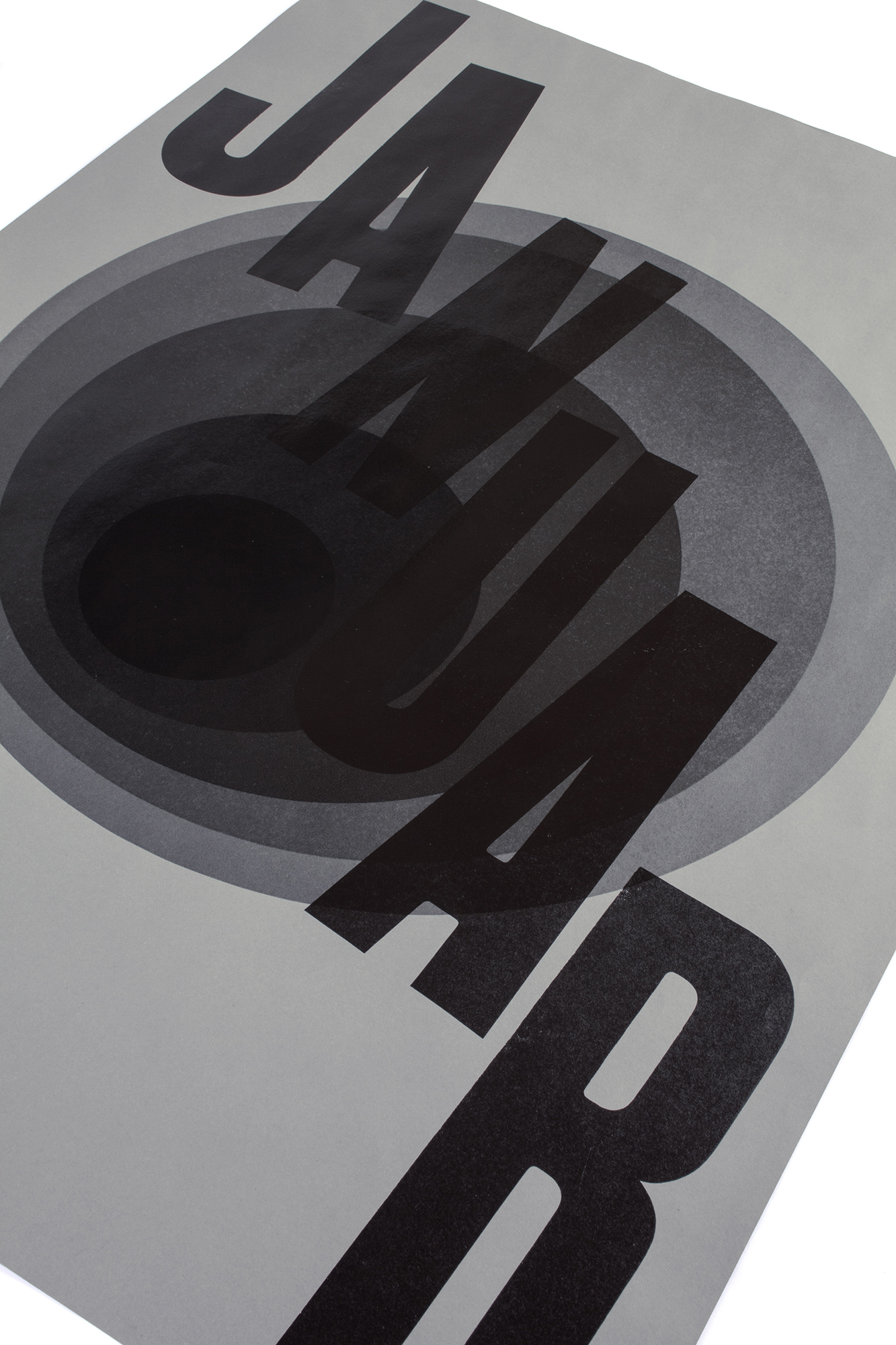
Januarloch
Invitation for a postersale event and open house at my printstudio in Näfels, GL. The German expression ‹Januar Loch› = ‹January Hole› describes the situation of being broke in January after the Holiday Season.
The circle shape printing block has been produced as a reduction lasercut. After each print I took the block and cut it smaller. After 5 hits with black, I overprinted the circleshape with some of my biggest 60 cicero (=65line) wood type.
Client: Self initiated
Format: 64×88cm
Paper: Tonzeichenpapier, Steingrau 120g/m2
Edition: 300 posters on a FAG Control 900
Dezember 2015
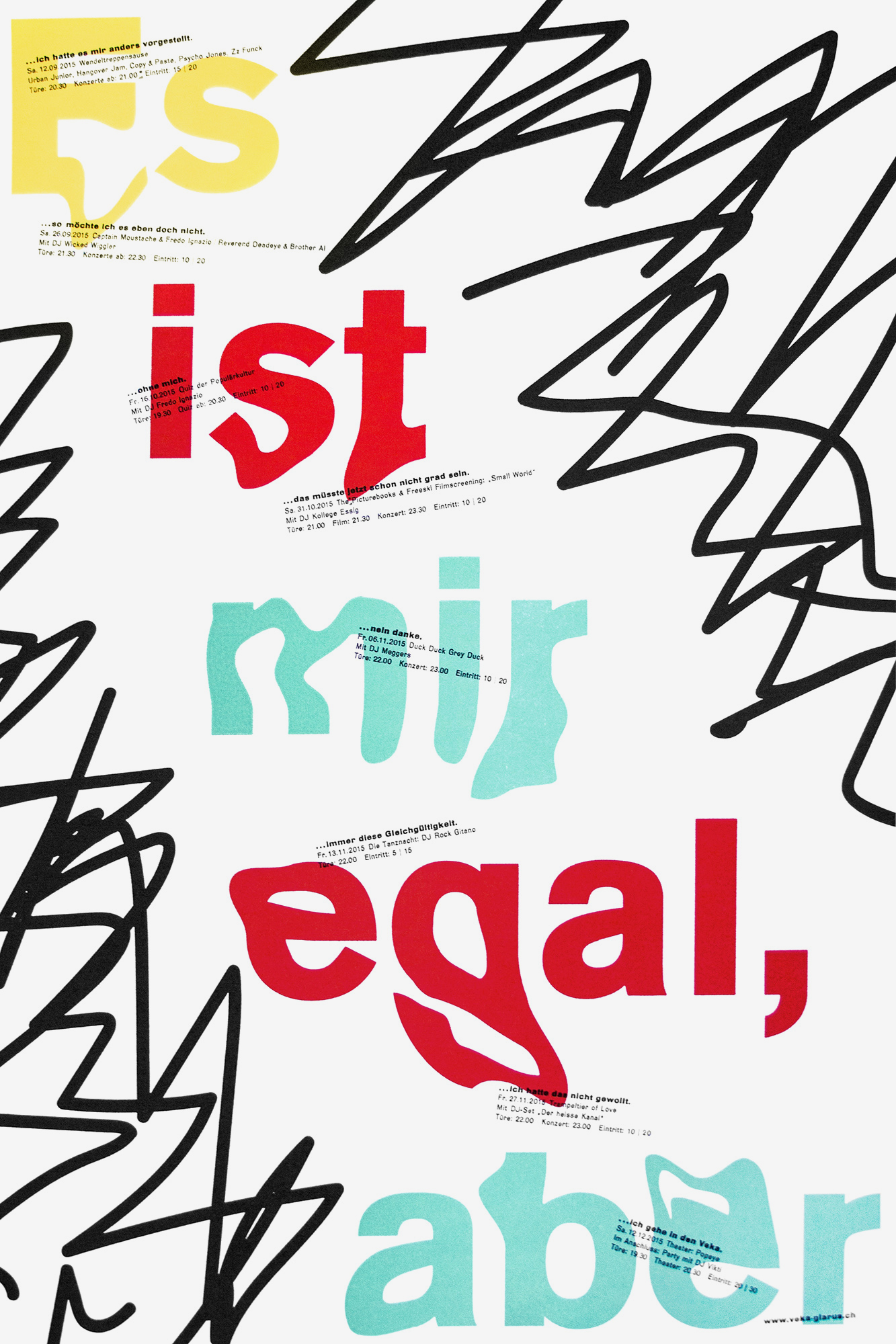
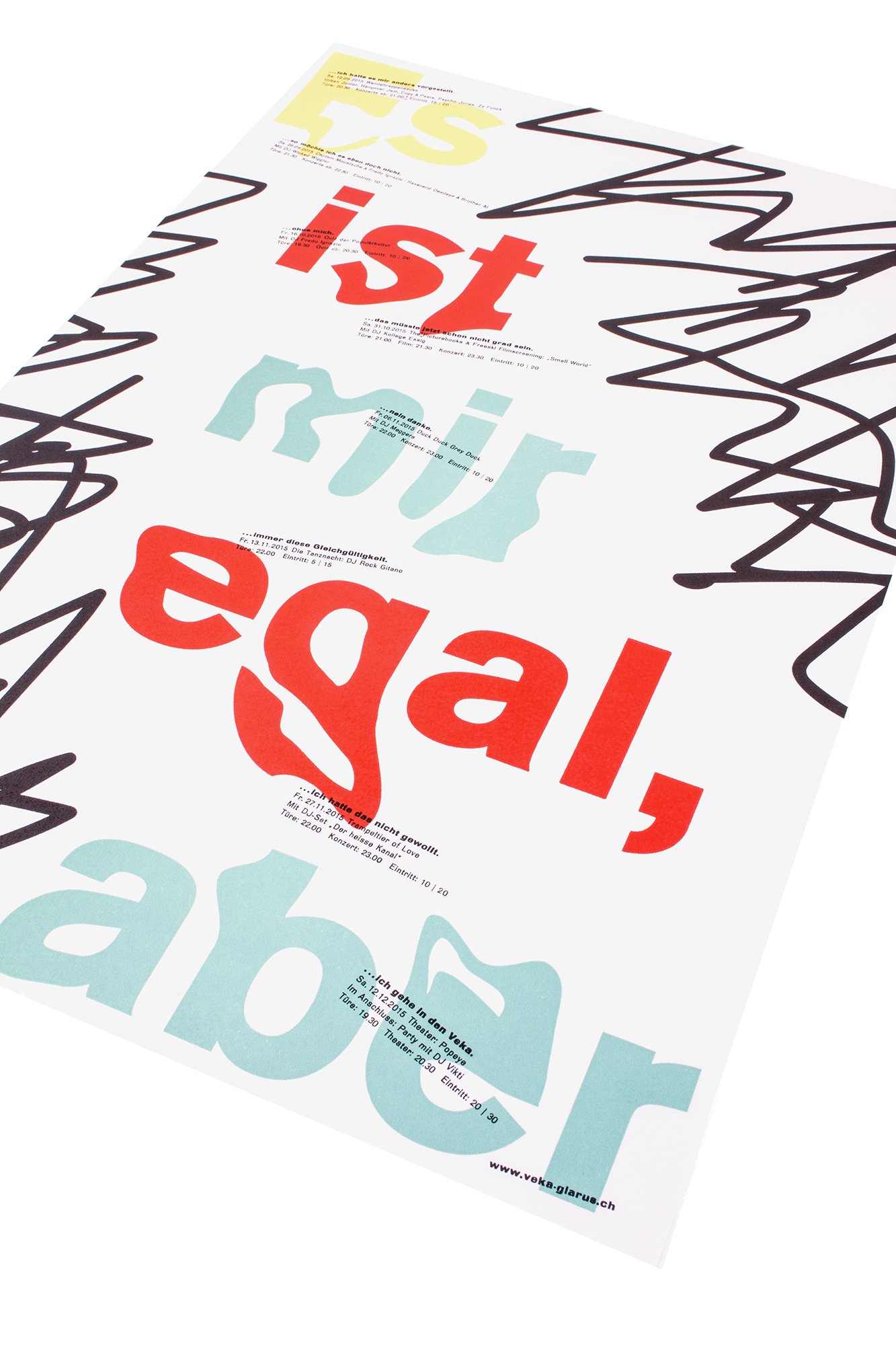
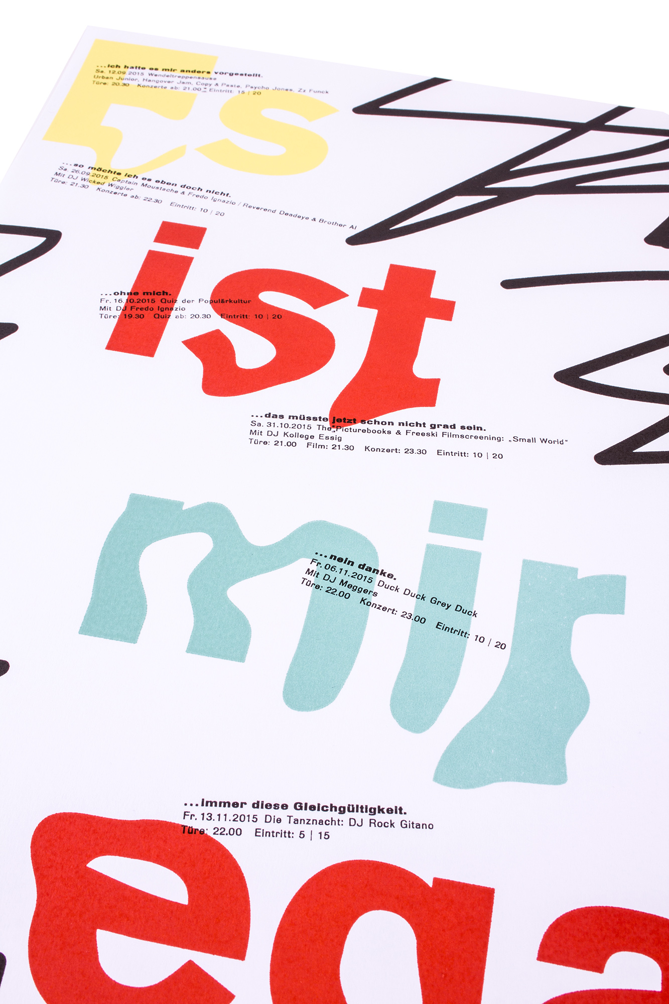
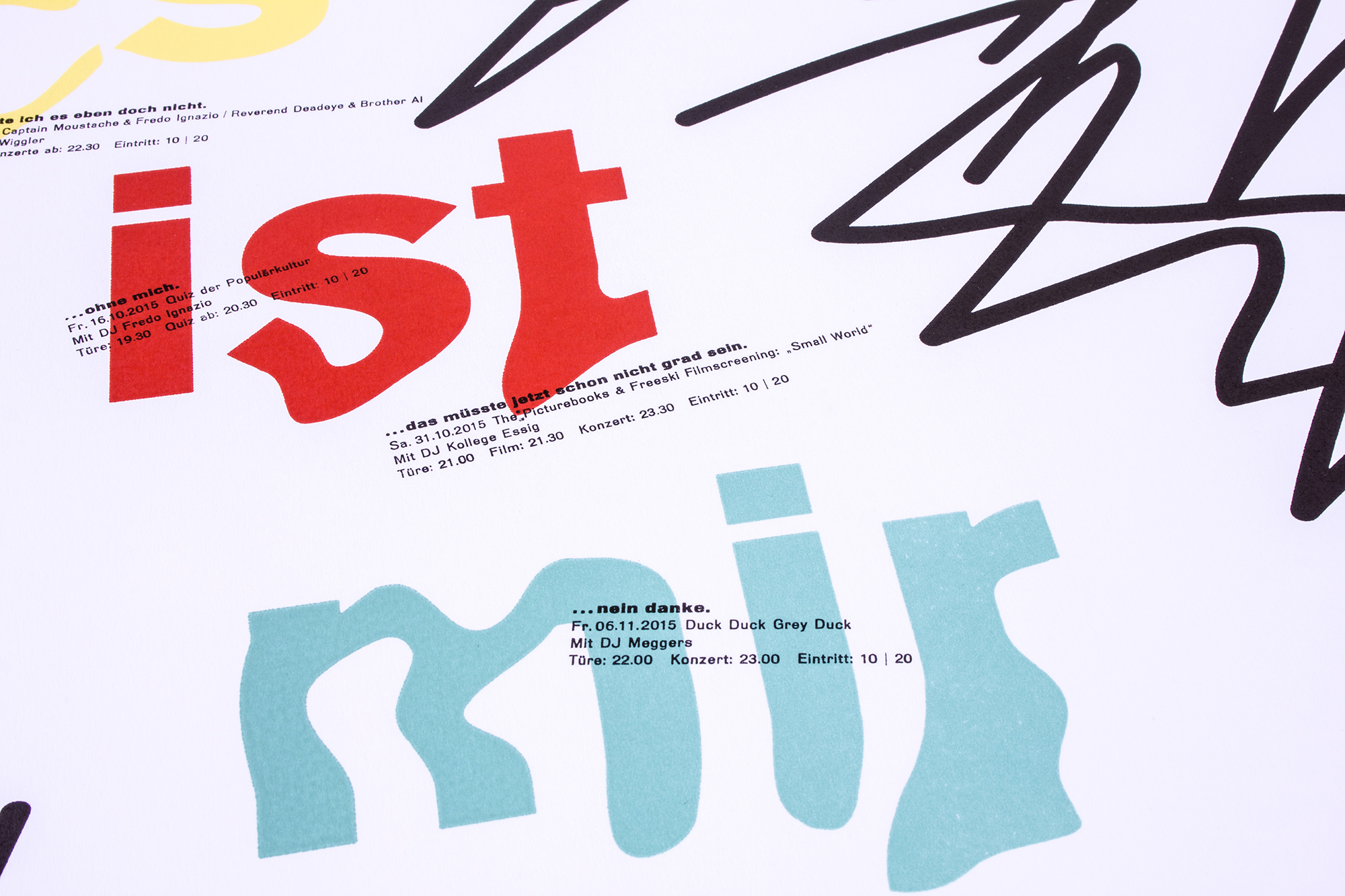
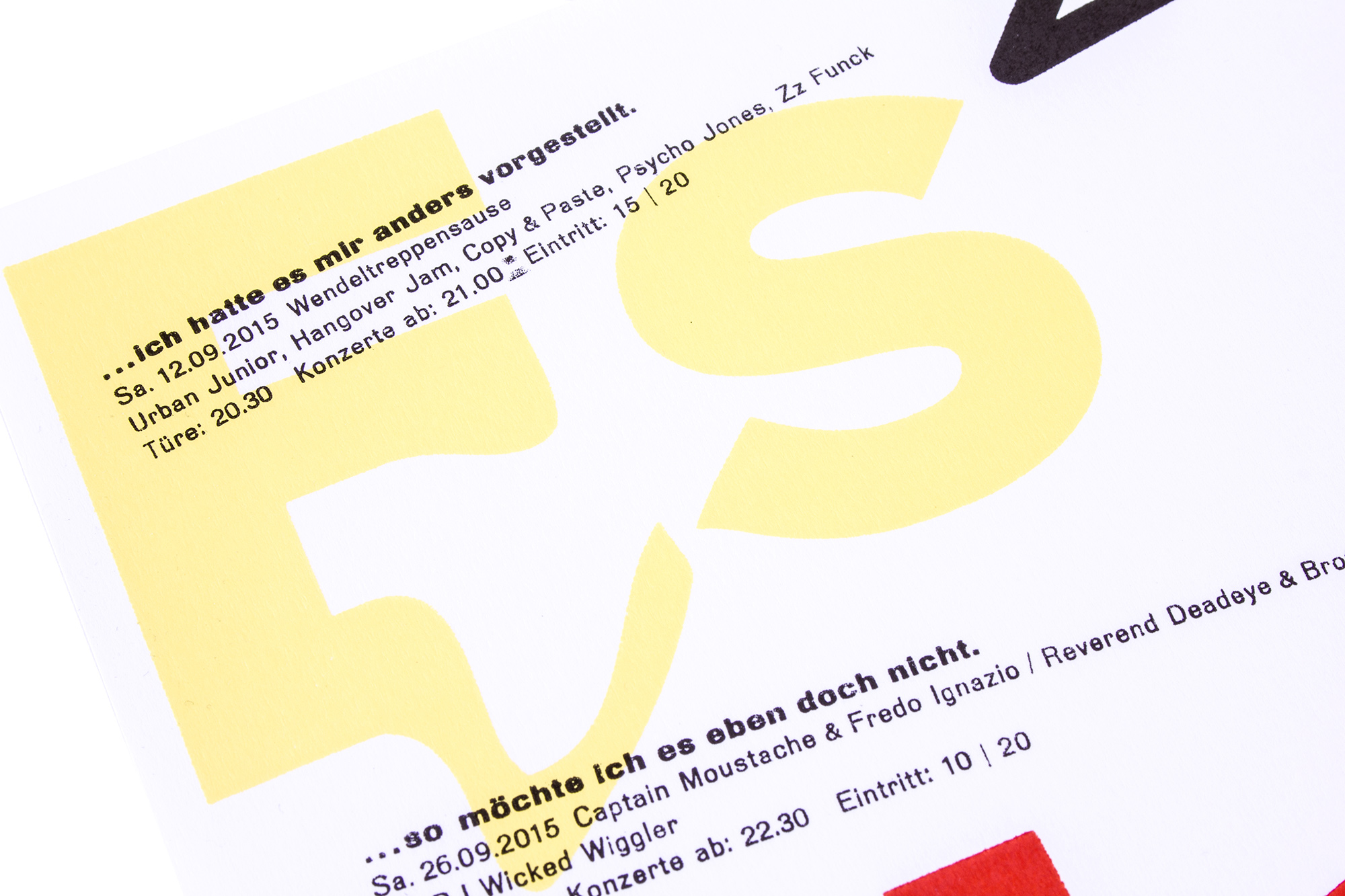
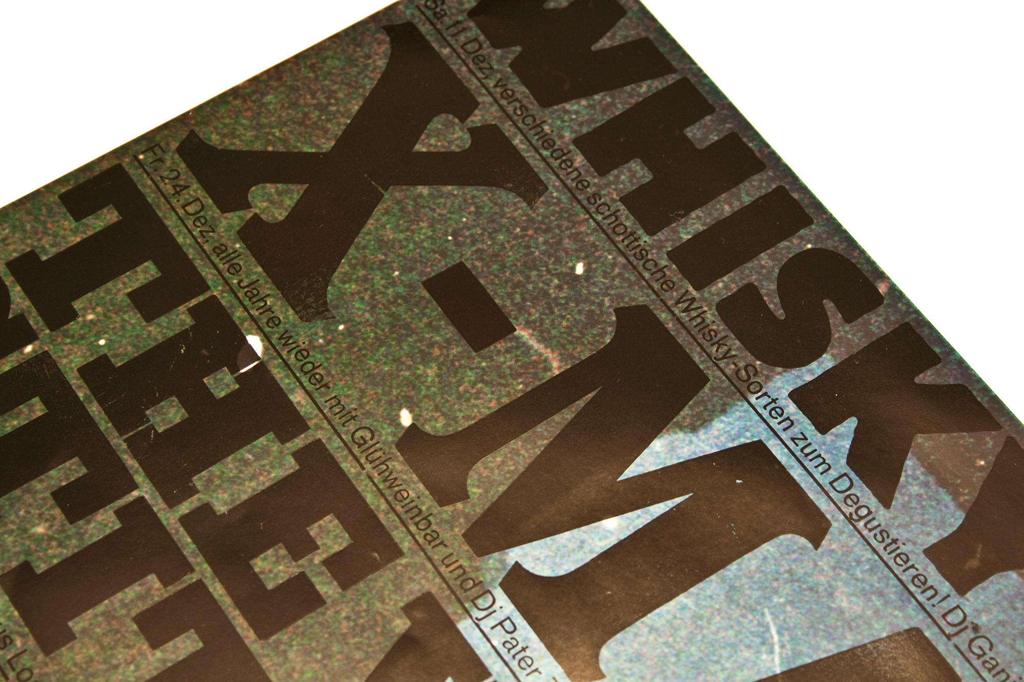
Es ist mir egal, aber…
Concert program for Veka-Glarus.ch printed from lasercut MDF boards and lead type. ‹Es ist mir egal, aber…› means ‹I don’t care, but…›. There is always something to criticize…
Each event has a title that says something like ‹…that’s not how I wanted it.› or ‹…thought it would be different.›. Then the specific concert information.
Client: Veka-Glarus, Glarus
Format: 35×52.5cm
Paper: Olin Rough, high white 120g/m2
Edition: 450 posters on a FAG Control 405
September 2015
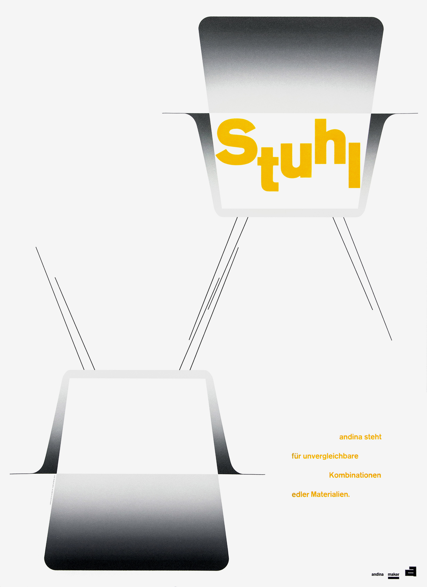
Stuhl, Tisch, Regal
Poster series Stuhl (Chair), Tisch (Table), Regal (Shelf) for a young Swiss furniture maker. Three related posters corresponding to three of his main objects.
These three posters have been some of the most complicated production process I ever had for a poster project. Each poster took me 9–11 passes that had to be exactly in register and with exactly the same width and nuances of the splitfountains. The posters have been printed from lasercut MDF, traditional wood type and some lead type.
Client: Andina, Maker, Bellinzona
Format: 64×88cm
Paper: Materica Gesso 180g/m2
Edition: 50 posters each on a FAG Control 900
November 2015
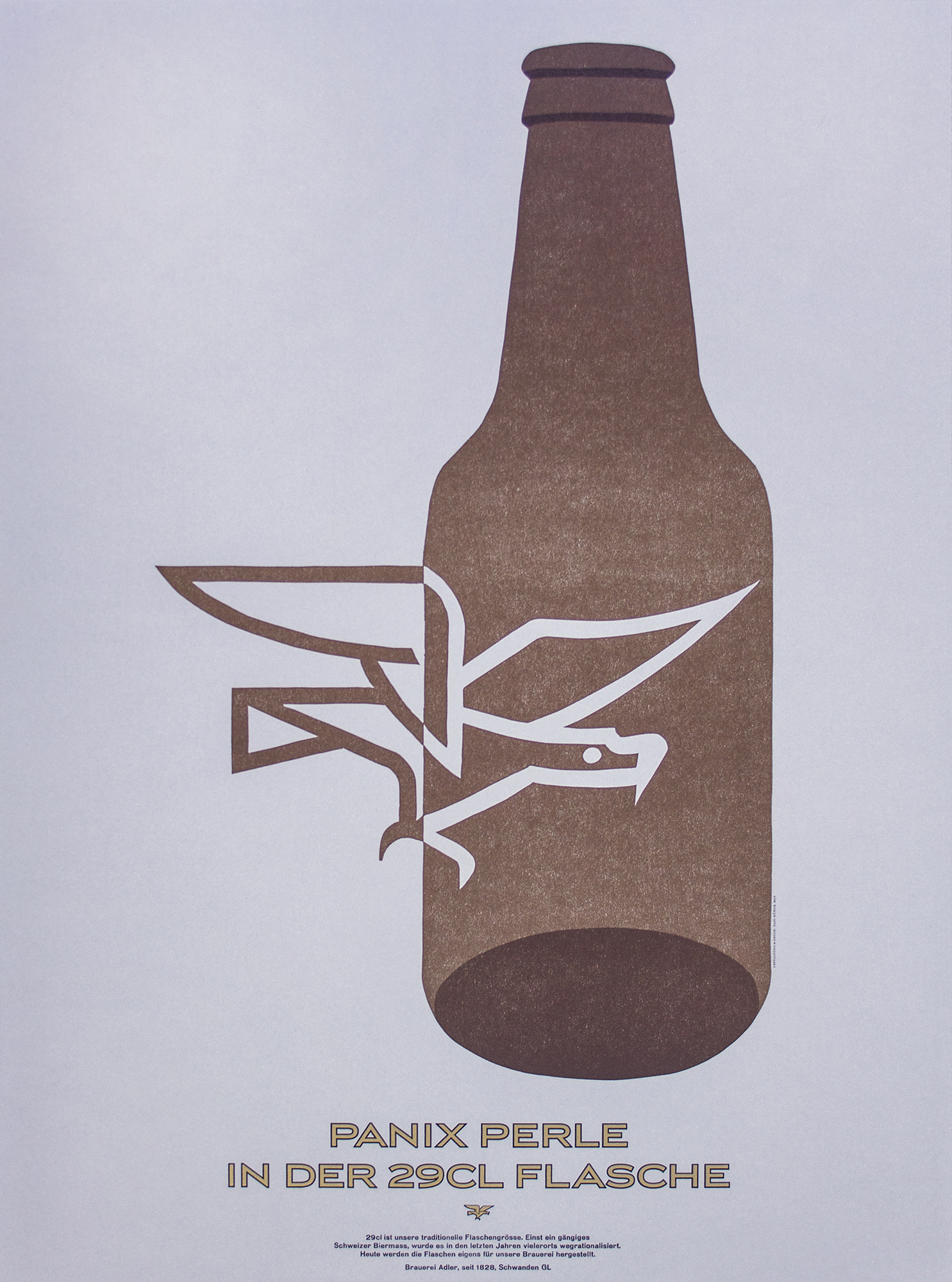
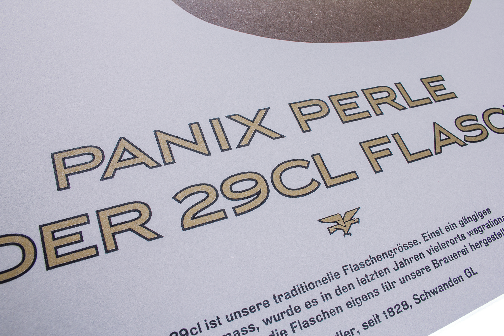
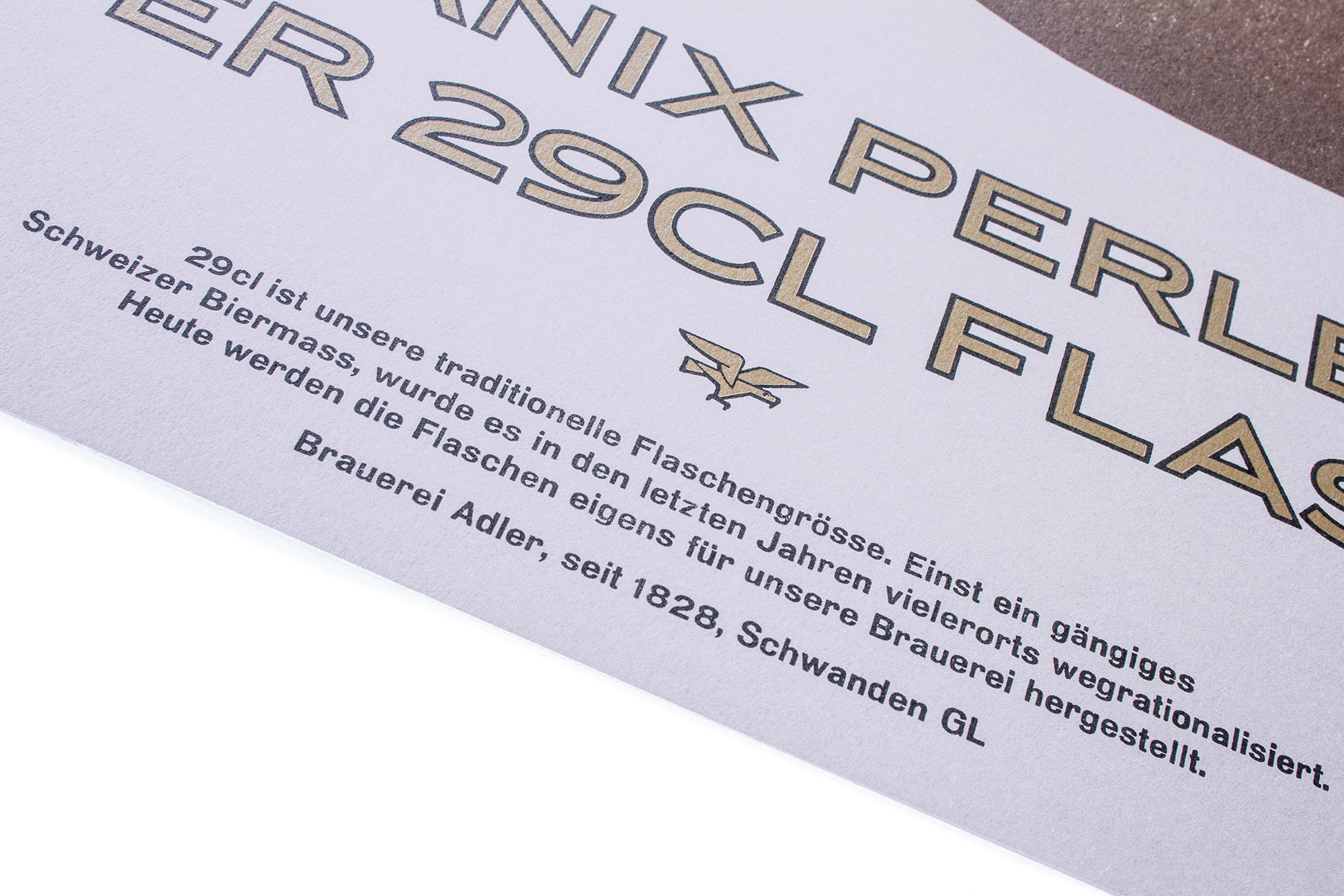
Panix Perle
Letterpress printed poster celebrating a traditional Swiss beer bottle format. Although the 29cl bottle has been abandoned by many other breweries, Brauerei Adler a local and family owned brewery is still holding on to this format.
The posters have been printed in a total of 8 printruns from a hand cut linocut, some lead type and photopolymer plates. (See the second one of this series here and the third one here)
Client: Brauerei Adler, Schwanden
Format: 60×80cm
Paper: Materica Clay 360g/m2
Edition: 100 posters each on a FAG Control 900
August 2015
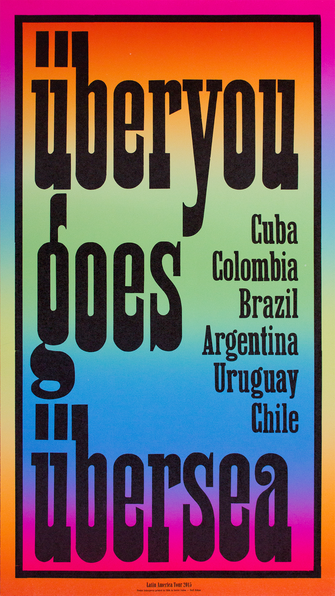
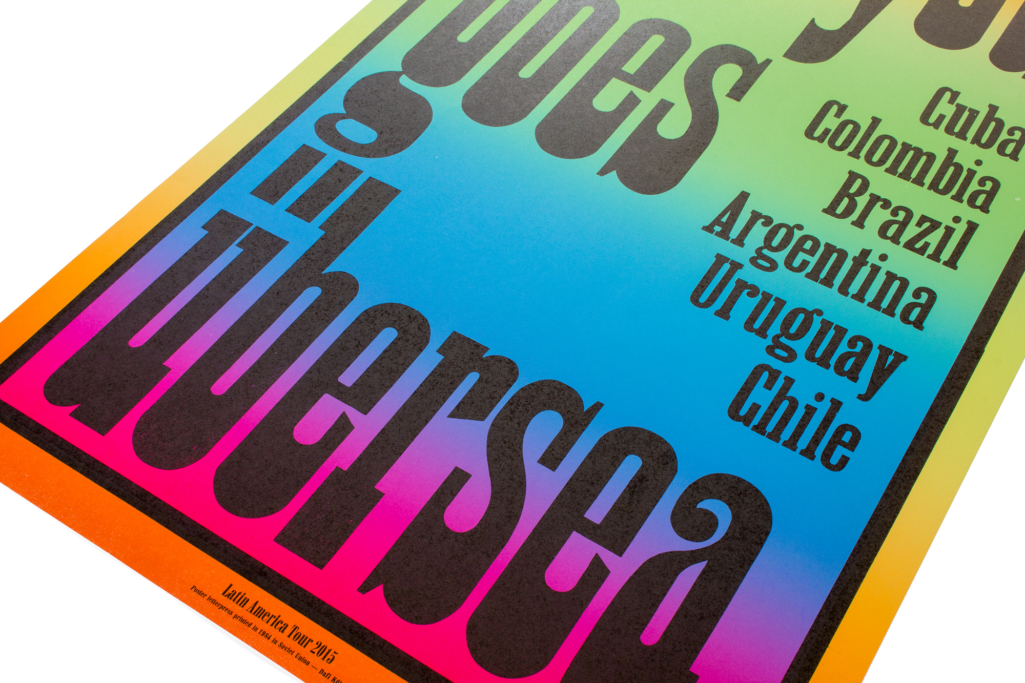
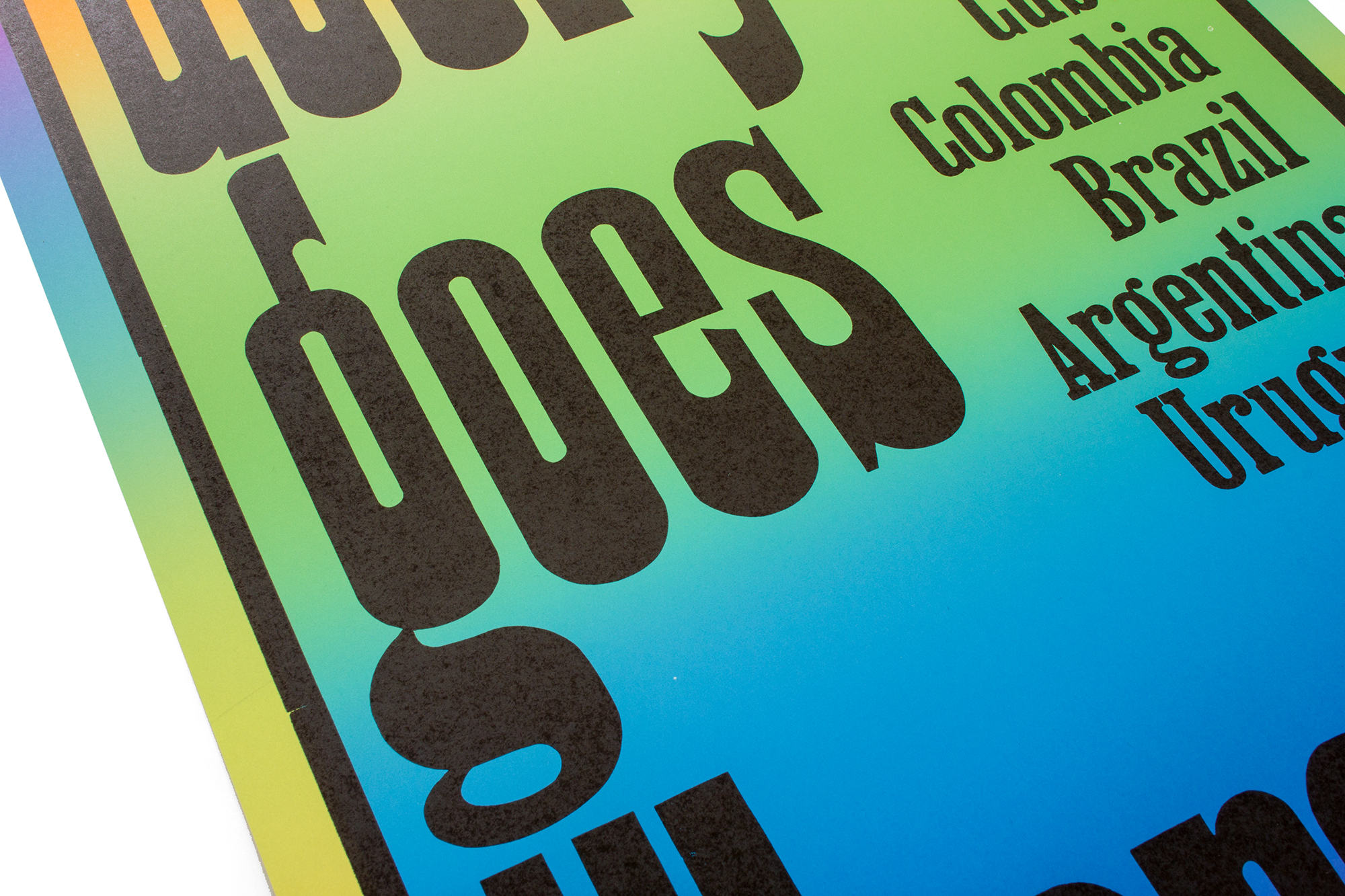
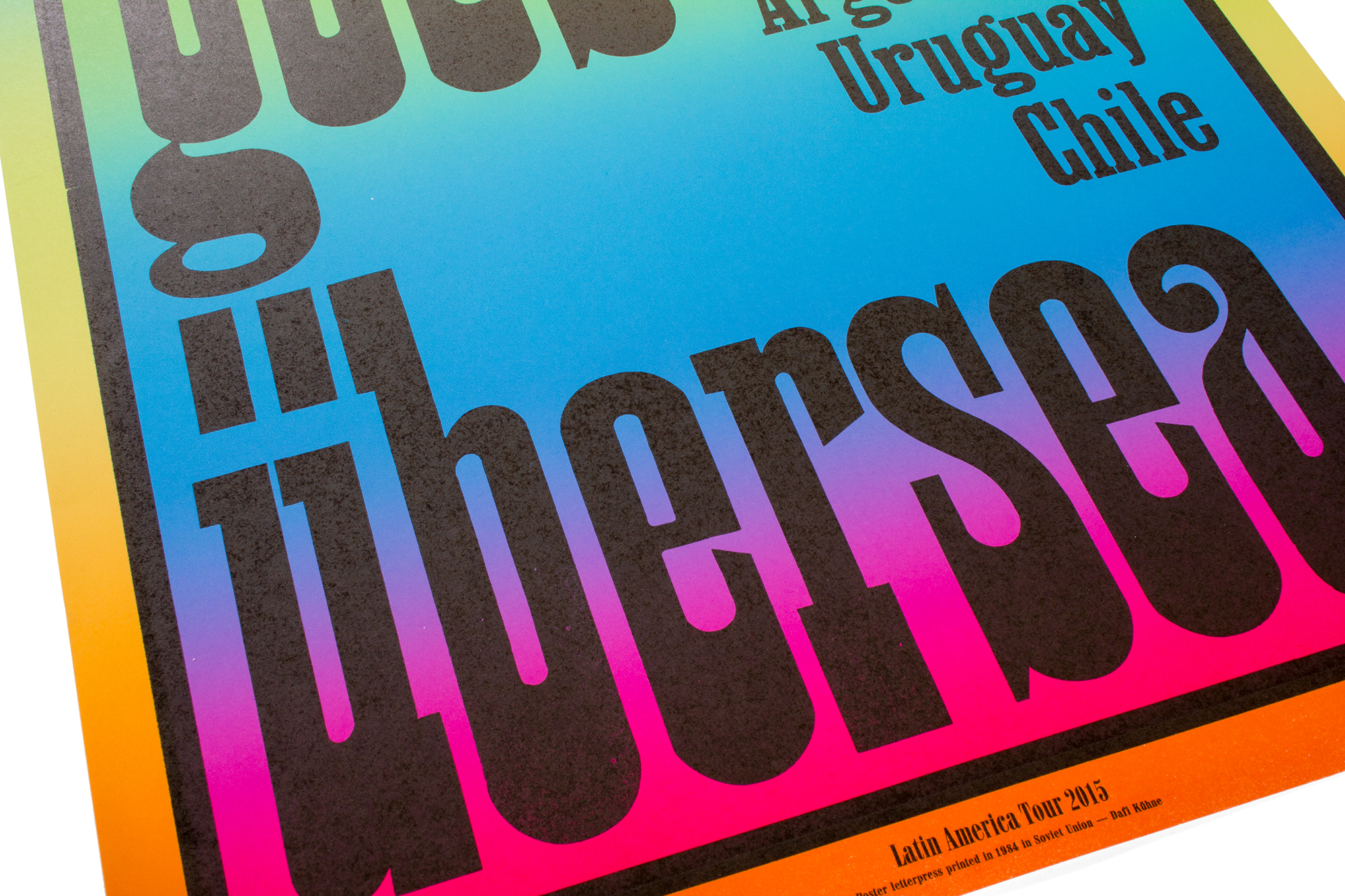
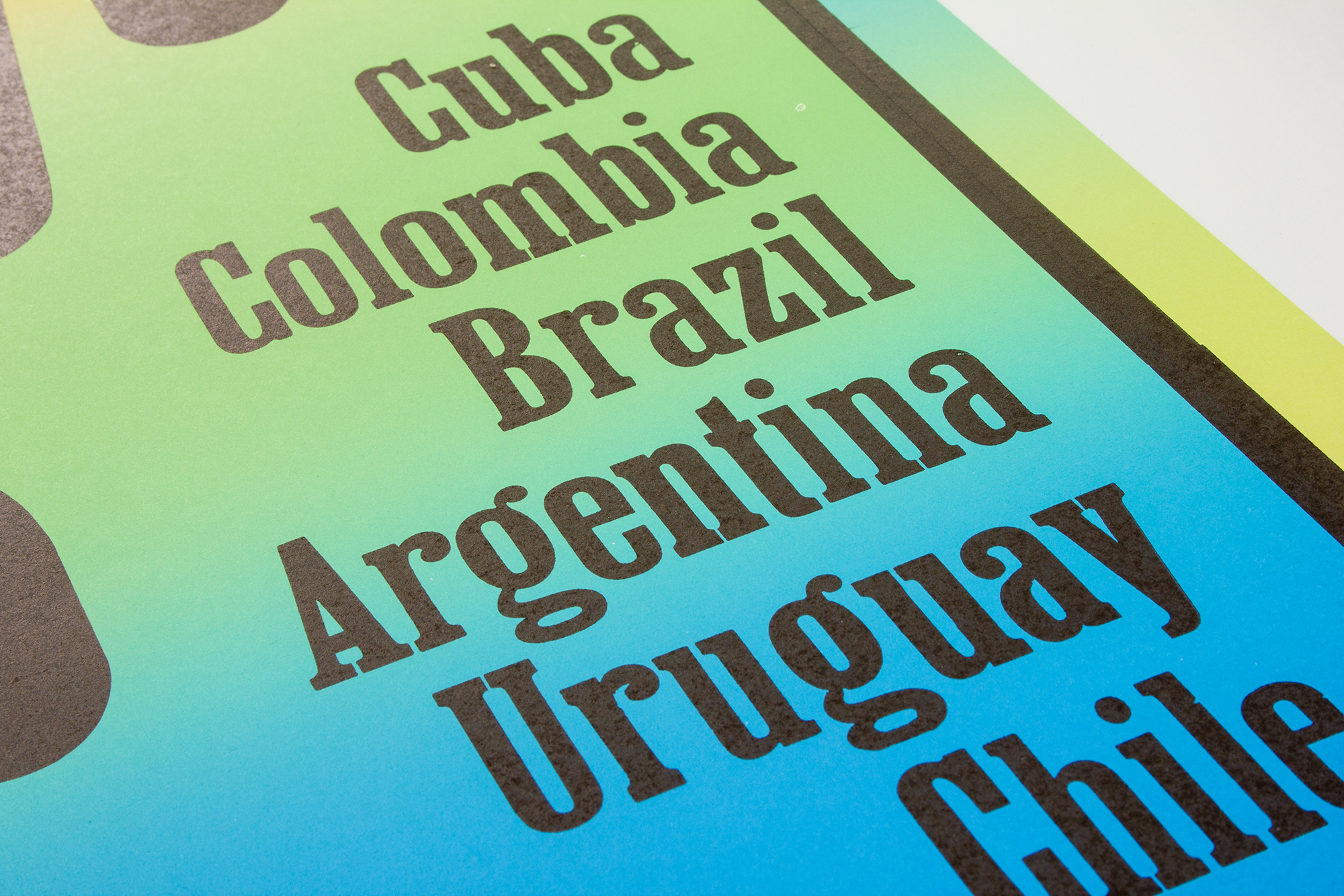
Überyou
Poster announcing a Latin America Tour of a Swiss punkband. Printed from freshly pantograph-cut pear wood type. Watch the video!
The bandname ‹Überyou› is a weird language mix between German and English. The German word ‹Über› means ‹over›. So basically the poster could be translated as ‹Überyou goes overseas›.
Client: Überyou (Band), Zürich
Format: 49.2×87.5cm
Paper: Munken Print Cream 150g/m2
Edition: 70 posters on a FAG Control 900
July 2015
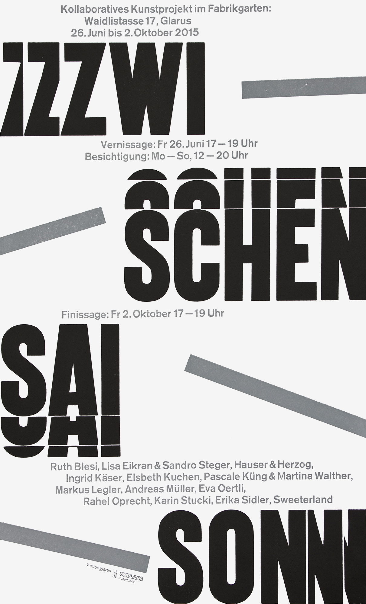
Zwischensaison
A small poster for a local open air art collaboration/exhibition, printed with traditional old wood type, metal type and some freshly cut wood type fragments.
‹Zwischensaison› could maybe be literally translated as ‹between the seasons›, so basically the program that runs during the summer break. The collaborative exhibition was meant to fill the gap between one season and the other. So typographically I worked with letter fragments that would border the space between. All the small fragments have been pantograph cut from steamed pearwood, using the original wood type as patterns to follow with the tracer.
Client: Zwischensaison, Glarus
Format: 28×48.5cm
Paper: Munken Lynx Rough 115g/m2
Edition: 250 posters on a FAG Control 405
June 2015
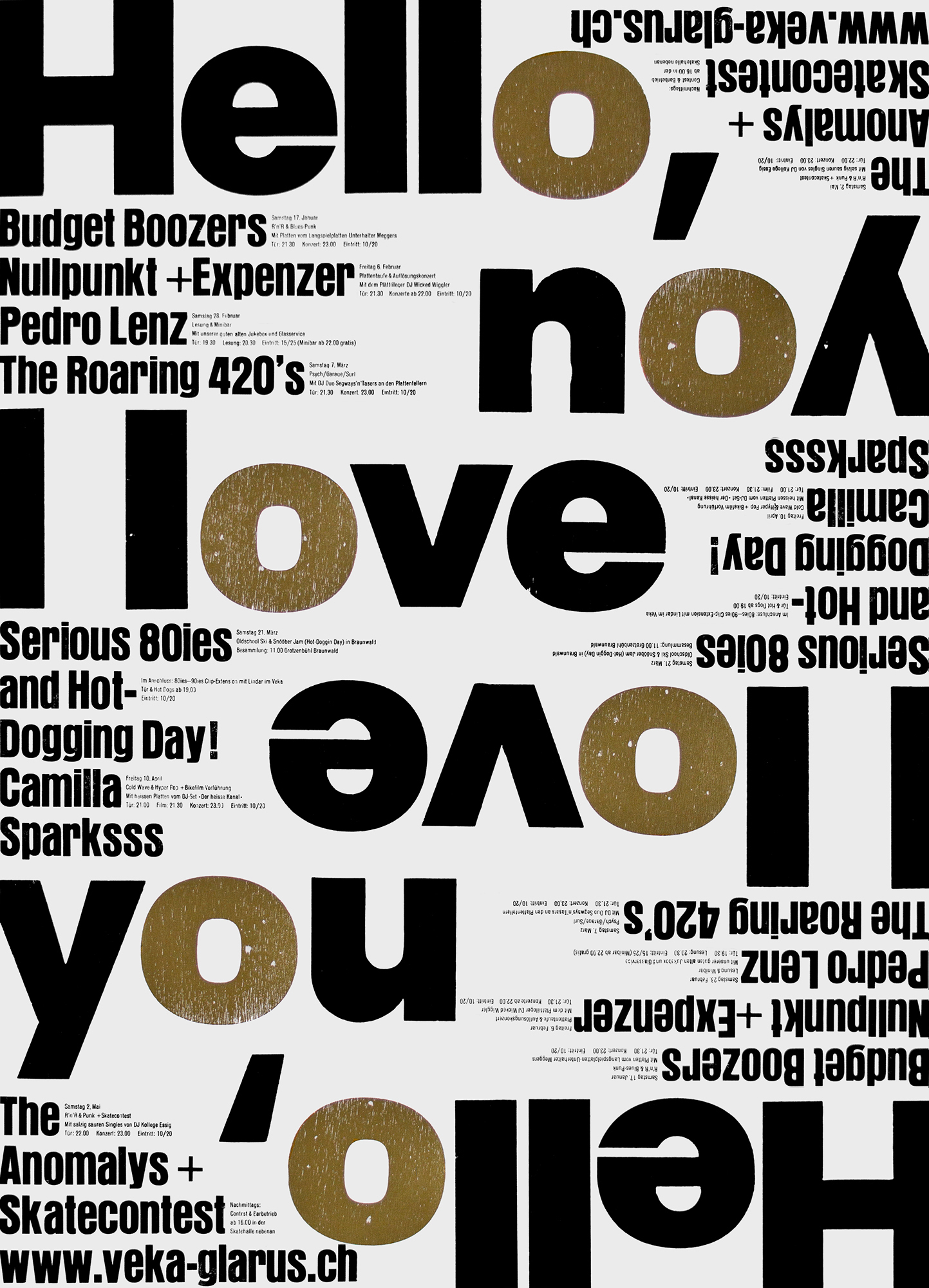
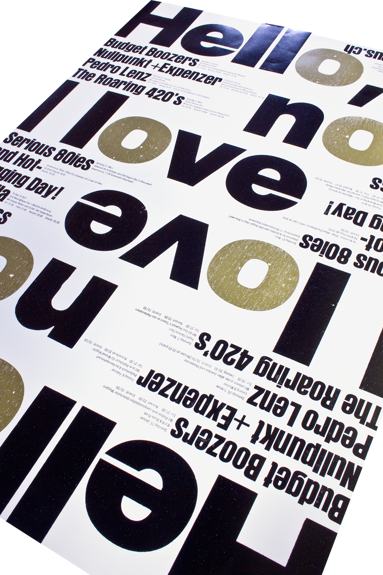
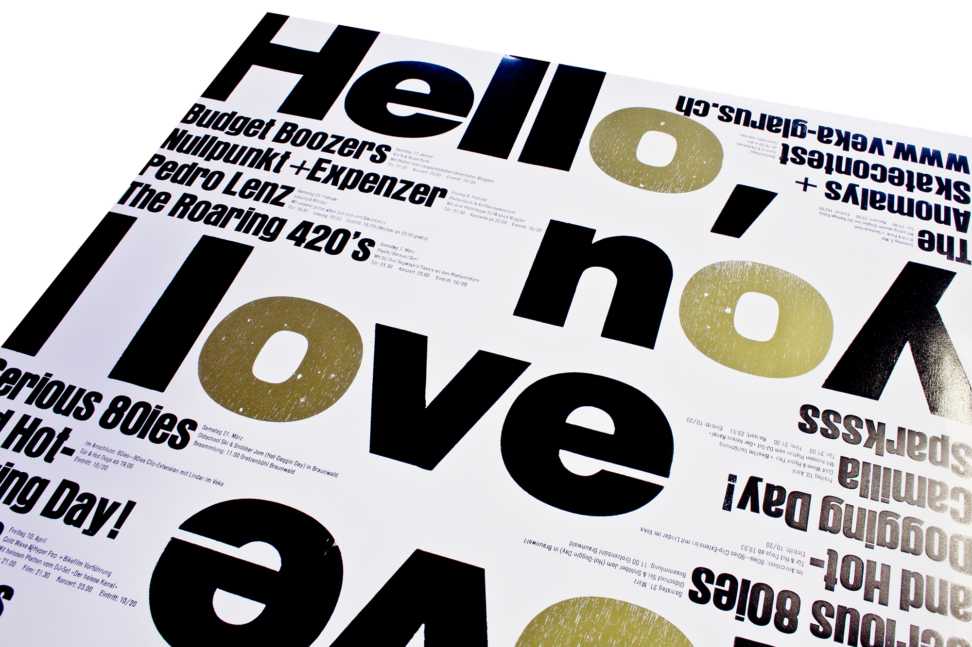
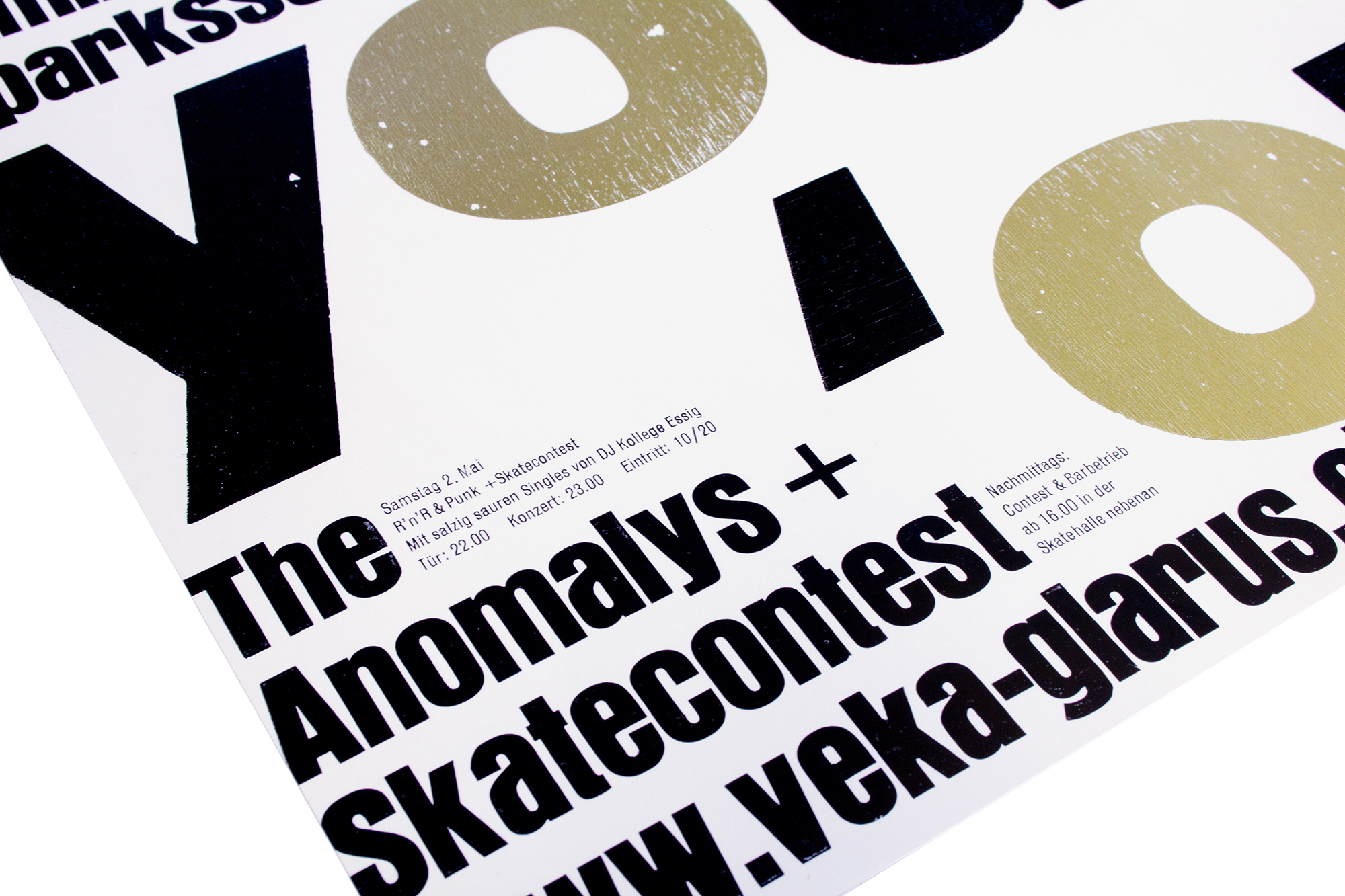
Hello, I love you
Program poster for the concert venue Veka-Glarus. This poster has all been hand composed with wood type and lead type. It is printed in 19 hours (at a stretch) in 4 printruns in a row. It almost killed me. Haha.
I wanted to make a layout, that is flipped by 180° and would fill out the whole sheet as good as possible, but still keeping a good rhythm of filled an blank space. Since I only worked with handset physical type, I had to tweak that layout quite a bit so all the forms would be printable.
Client: Veka-Glarus, Glarus
Format: 47.6×66cm
Paper: Magno Star Gloss, 135g/m2
Edition: 500 posters on a FAG Control 900
January 2015
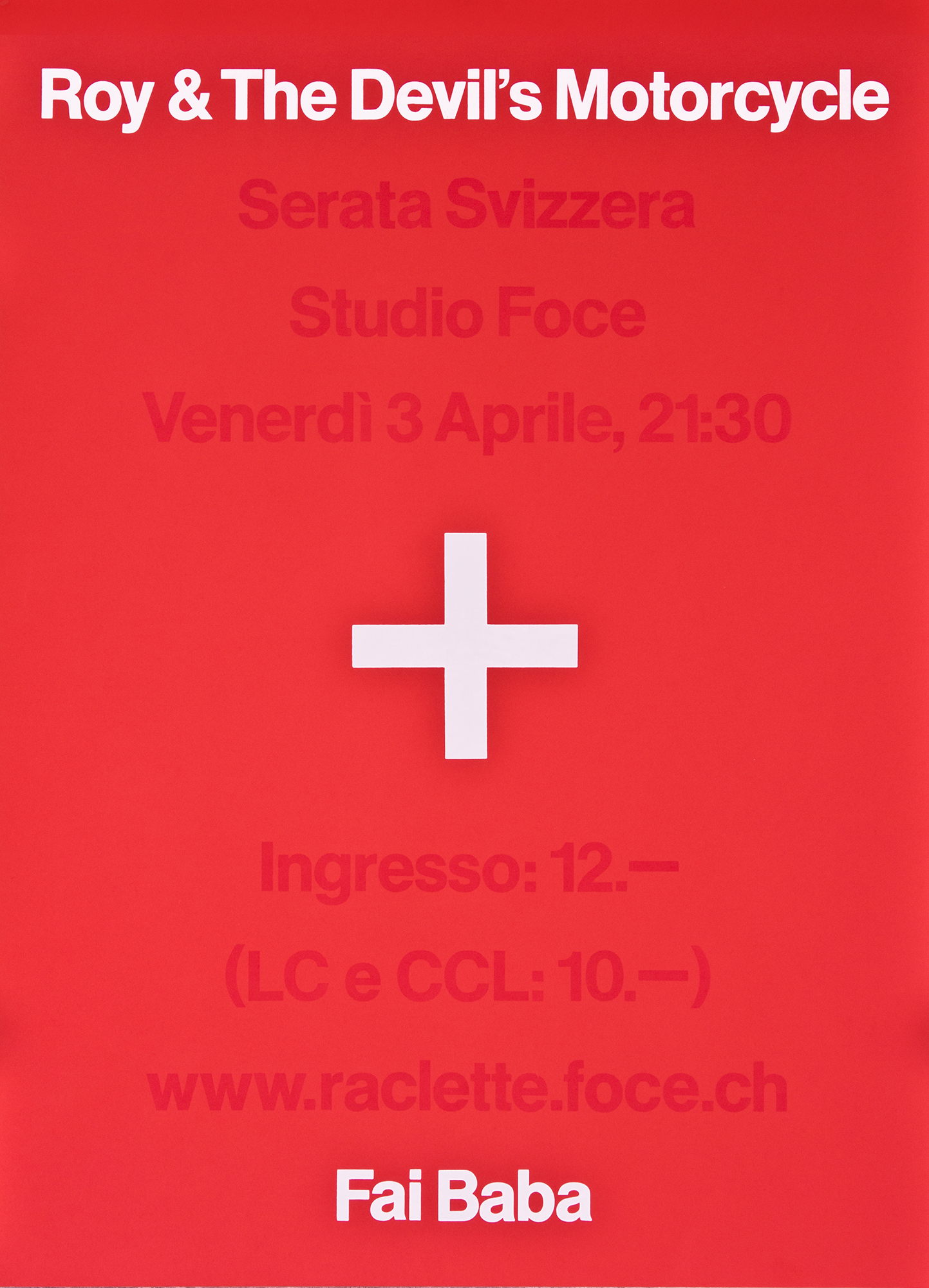
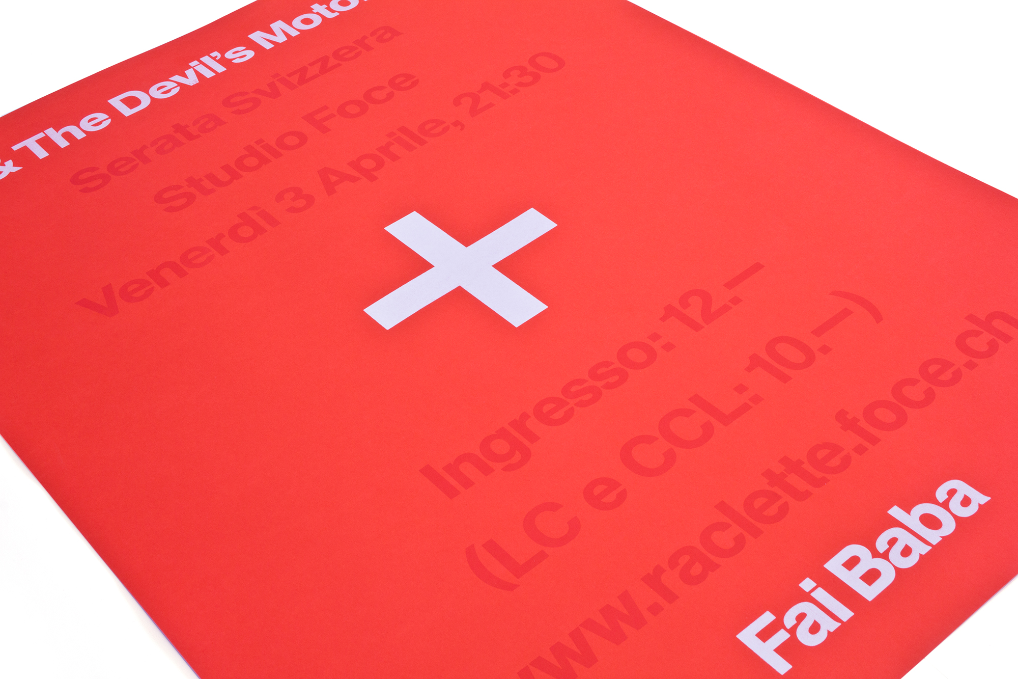
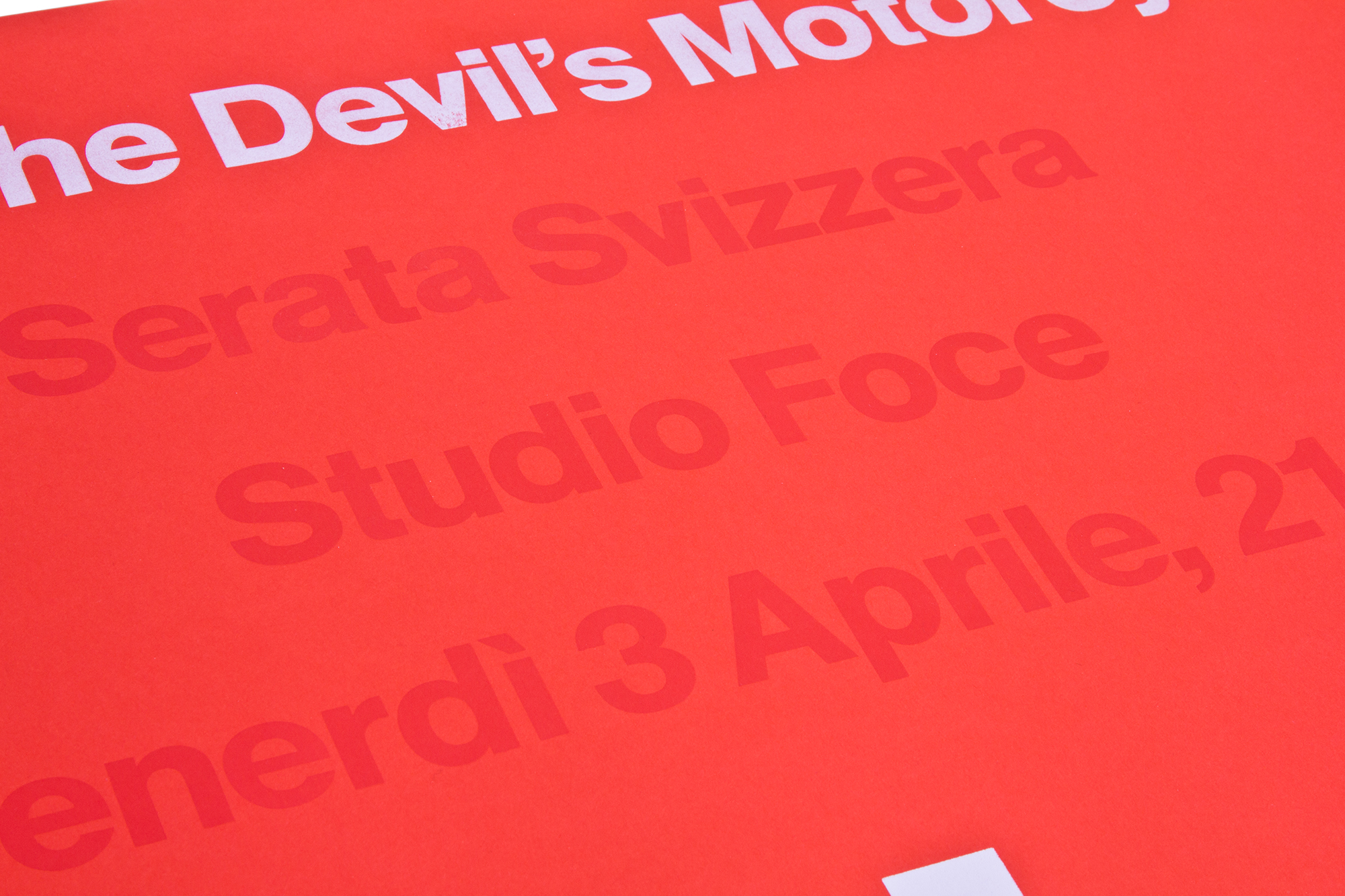
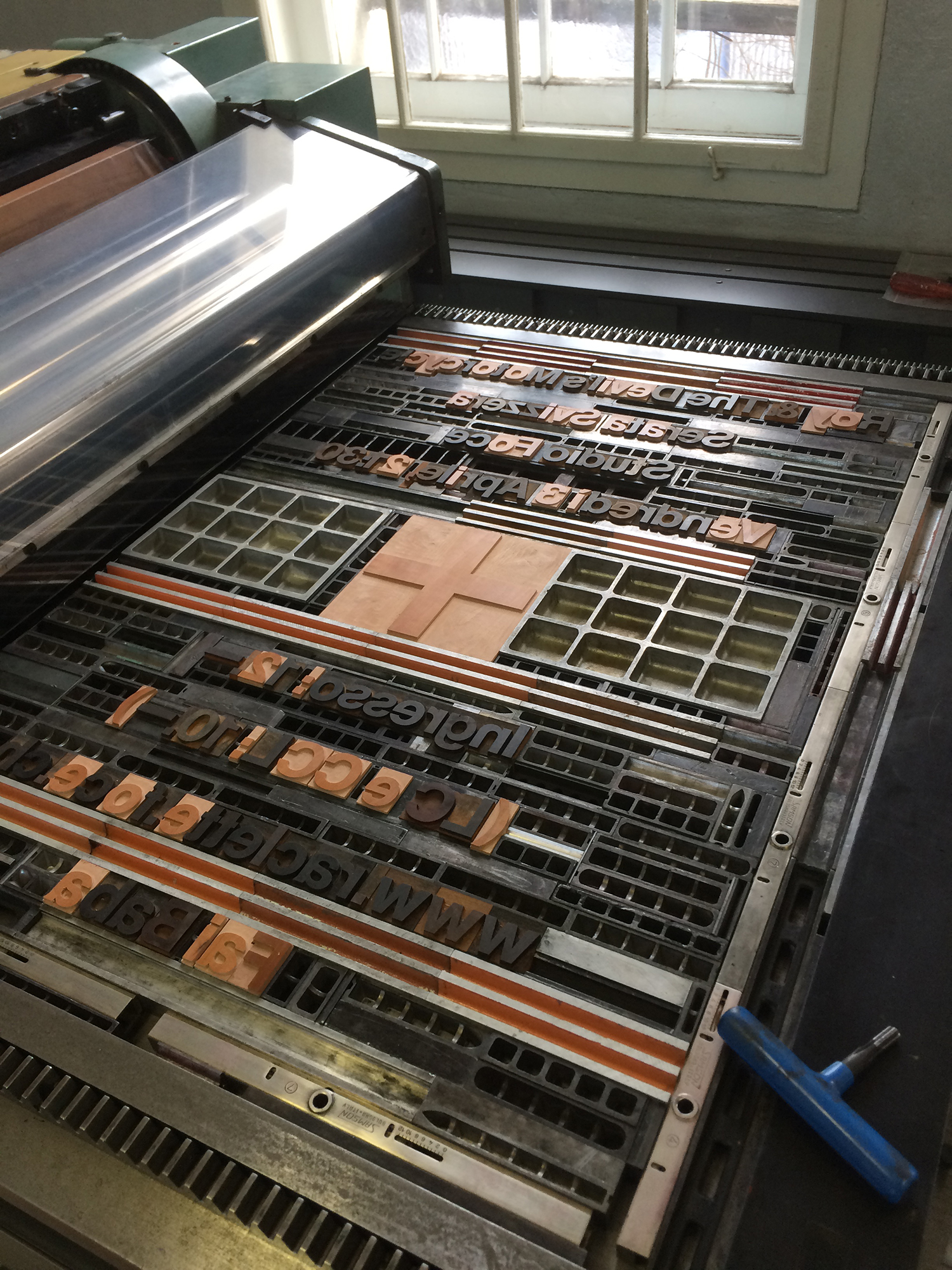
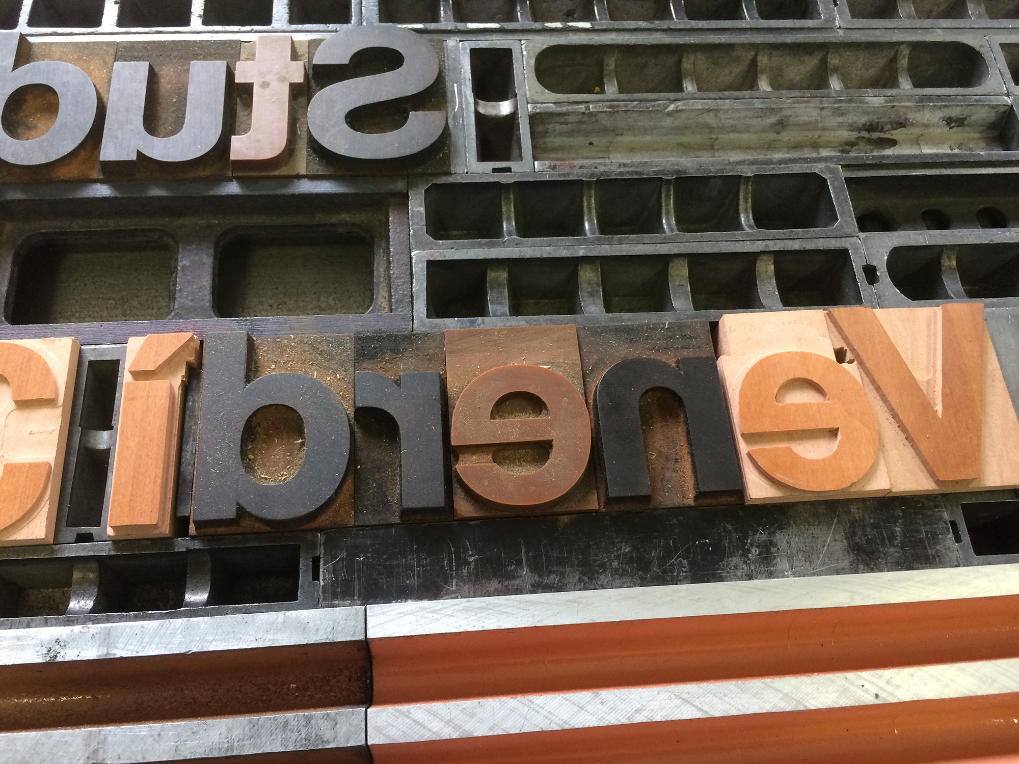
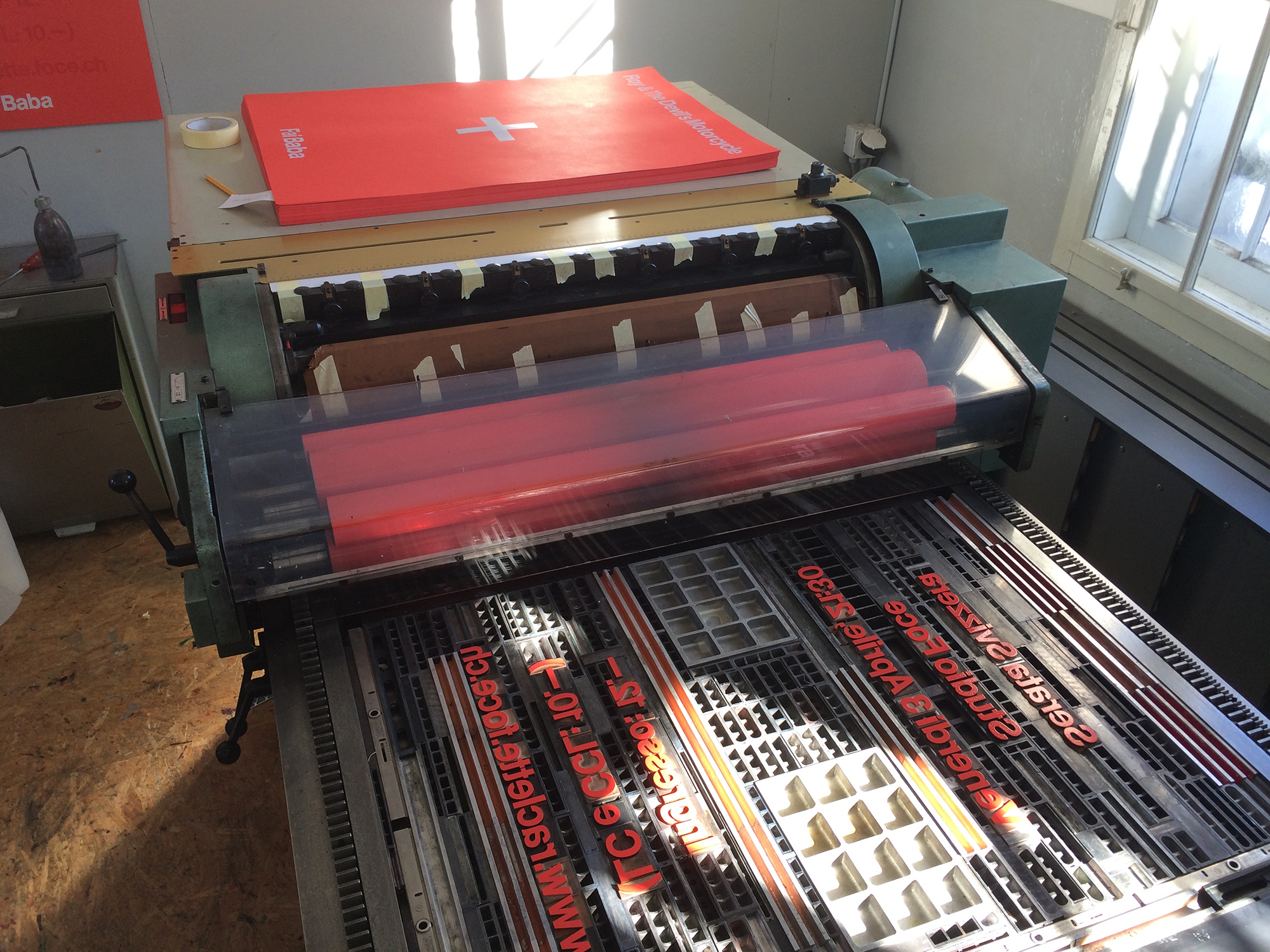
Serata Svizzera
For this concert poster, the client wanted something ironically Swiss—since both bands are Swiss but their blues R’n’R music is so not. We called that evening Swiss Night: ‹Serata Svizzera›. The plus symbol that stands in the center of the poster symbolises the Swiss flag.
The whole poster has been printed from Helvetica wood type. Printed with 3 hits of opaque white in perfect registration, then one hit of red and a fourth hit was the black numbering of the edition on the back… Can you take so much Swissness?
Client: Studio Foce, Lugano
Format: 64×88cm
Paper: Kaskad Korallenrot, 225g/m2
Edition: 96 posters on a FAG Control 900
March 2015
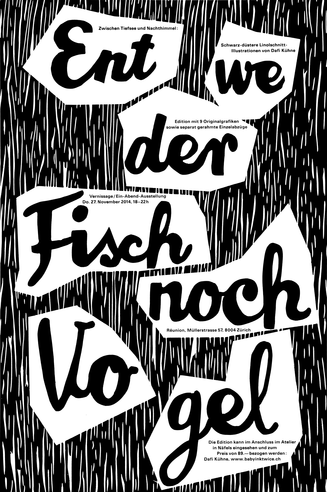
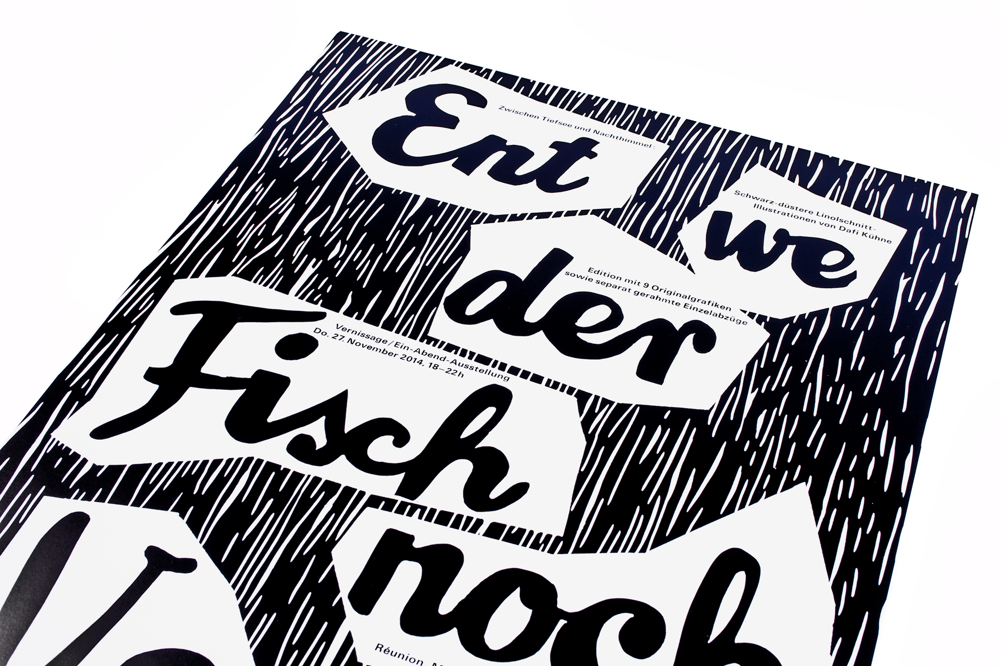
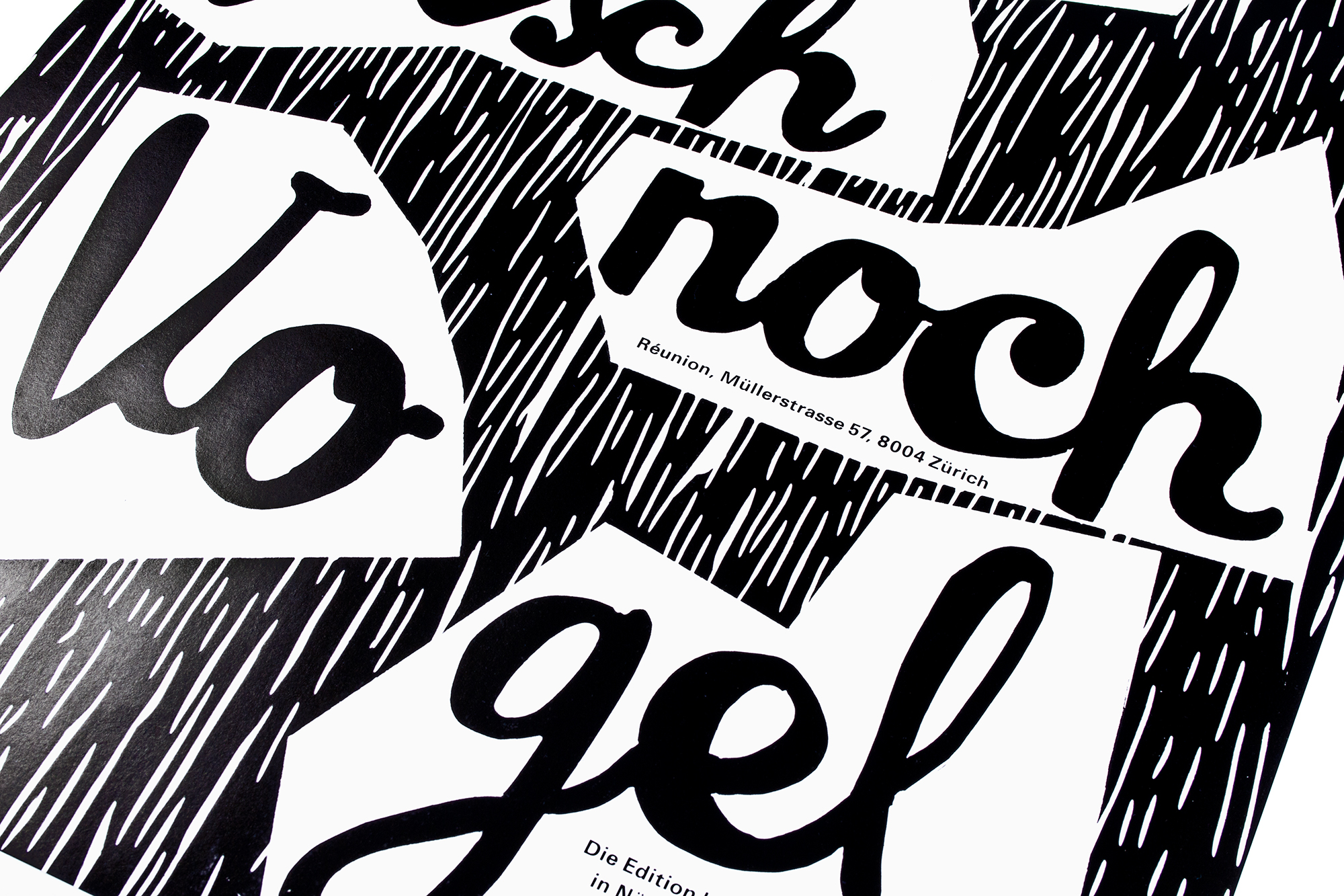
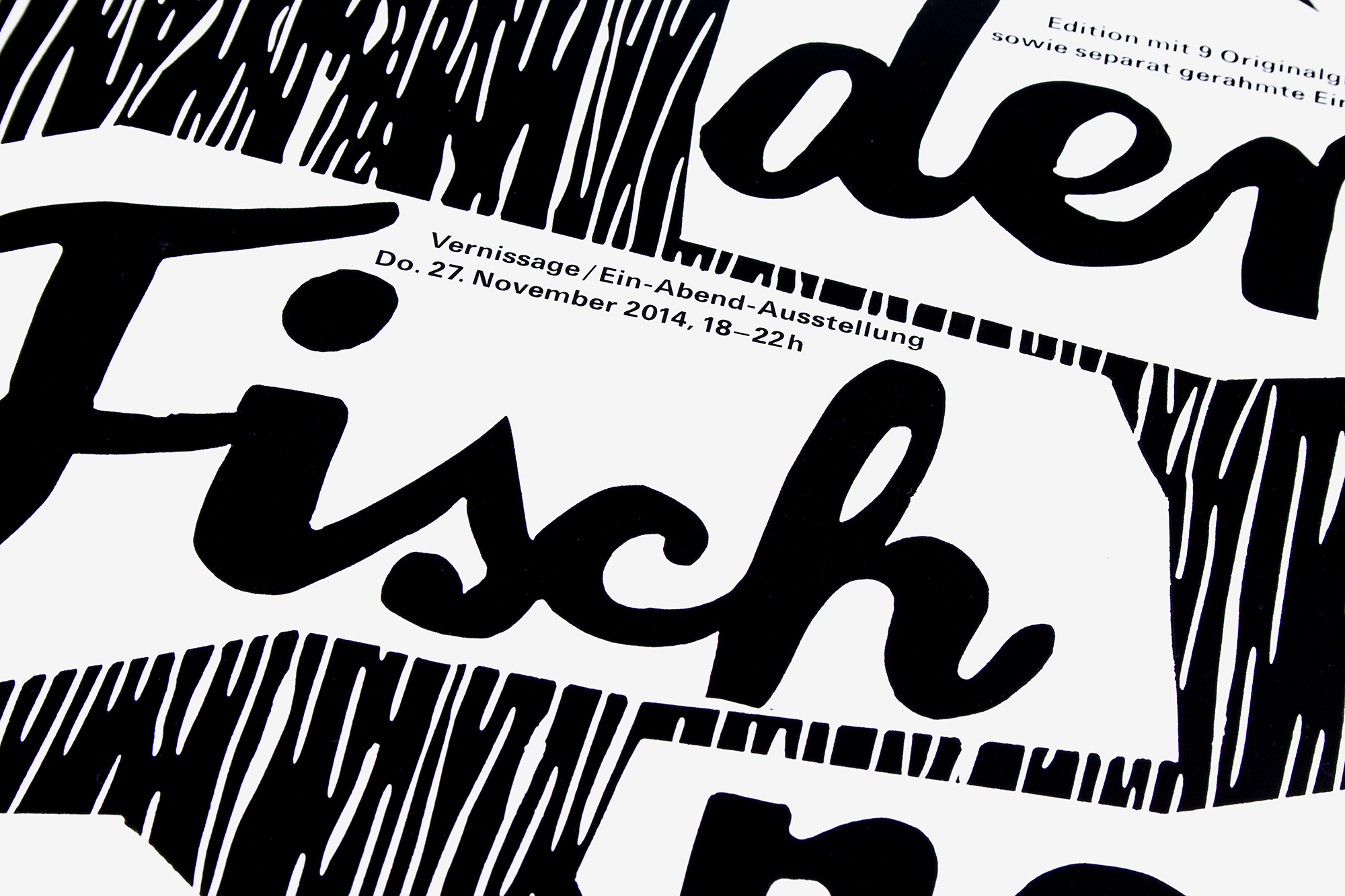
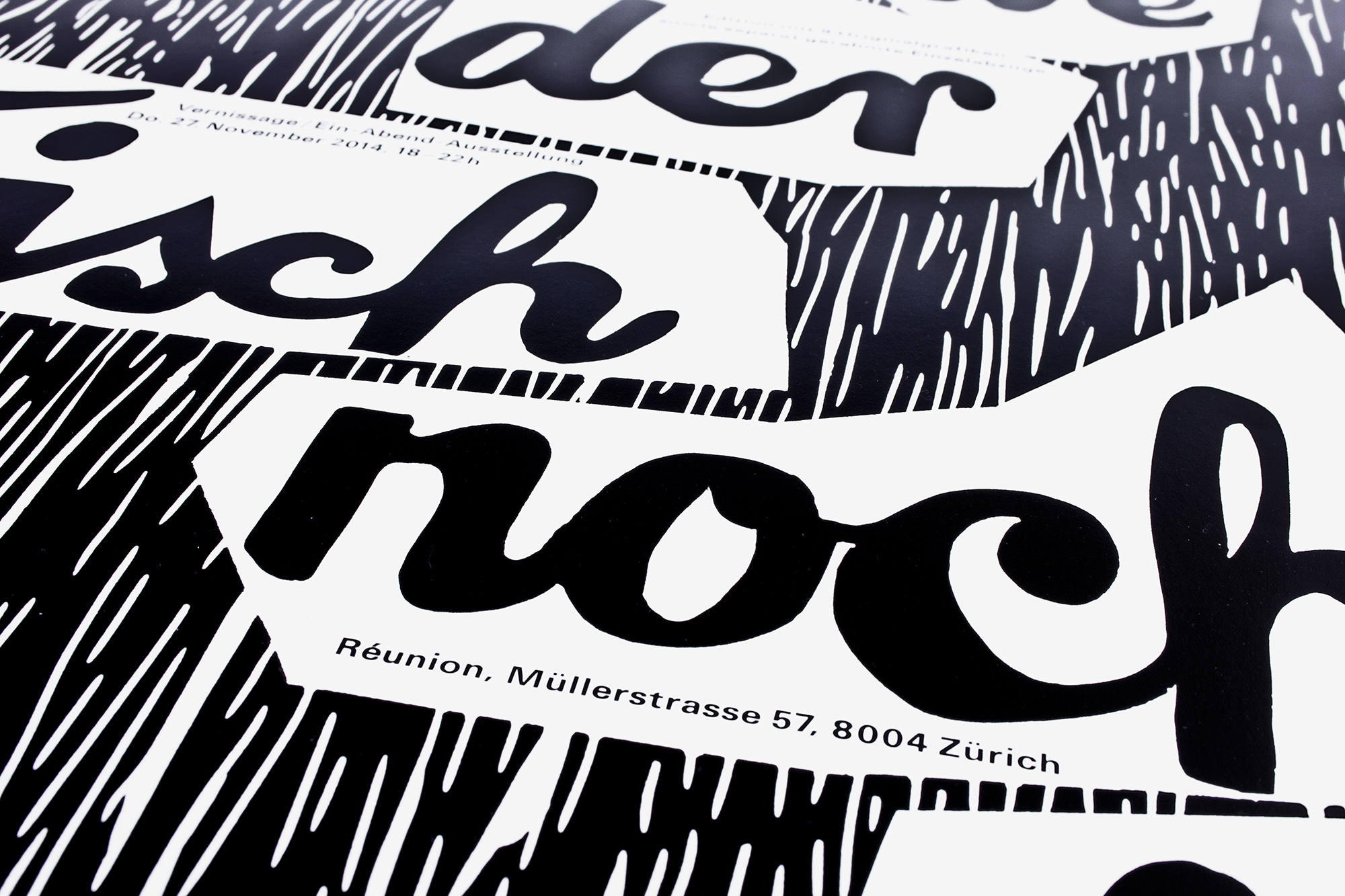
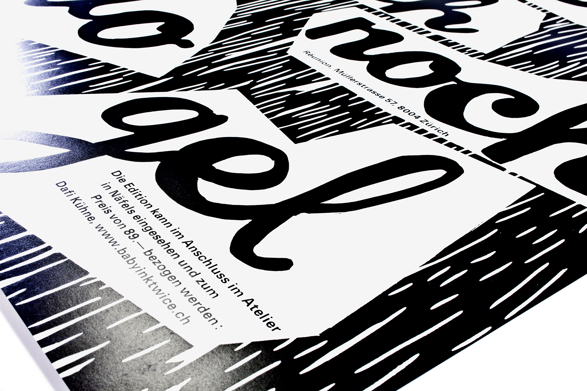
Neither fish nor fowl
Invitation poster for the vernissage and one evening exhibition ‹Entweder Fisch noch Vogel› at Réunion gallery space in Zurich. Printed from a hand cut linocut and some handset lead type.
These posters have been printed on the same stock and in the same intense black quality as the magazines. To protect the surface when folded and mailed these posters have been offset covered with transperency resin after the two black letterpress printruns.
Client: Self initiated
Format: 35×52.5cm
Paper: Phoenixmotion Xantur 115g/m2
Edition: 400 posters on a FAG Control 405
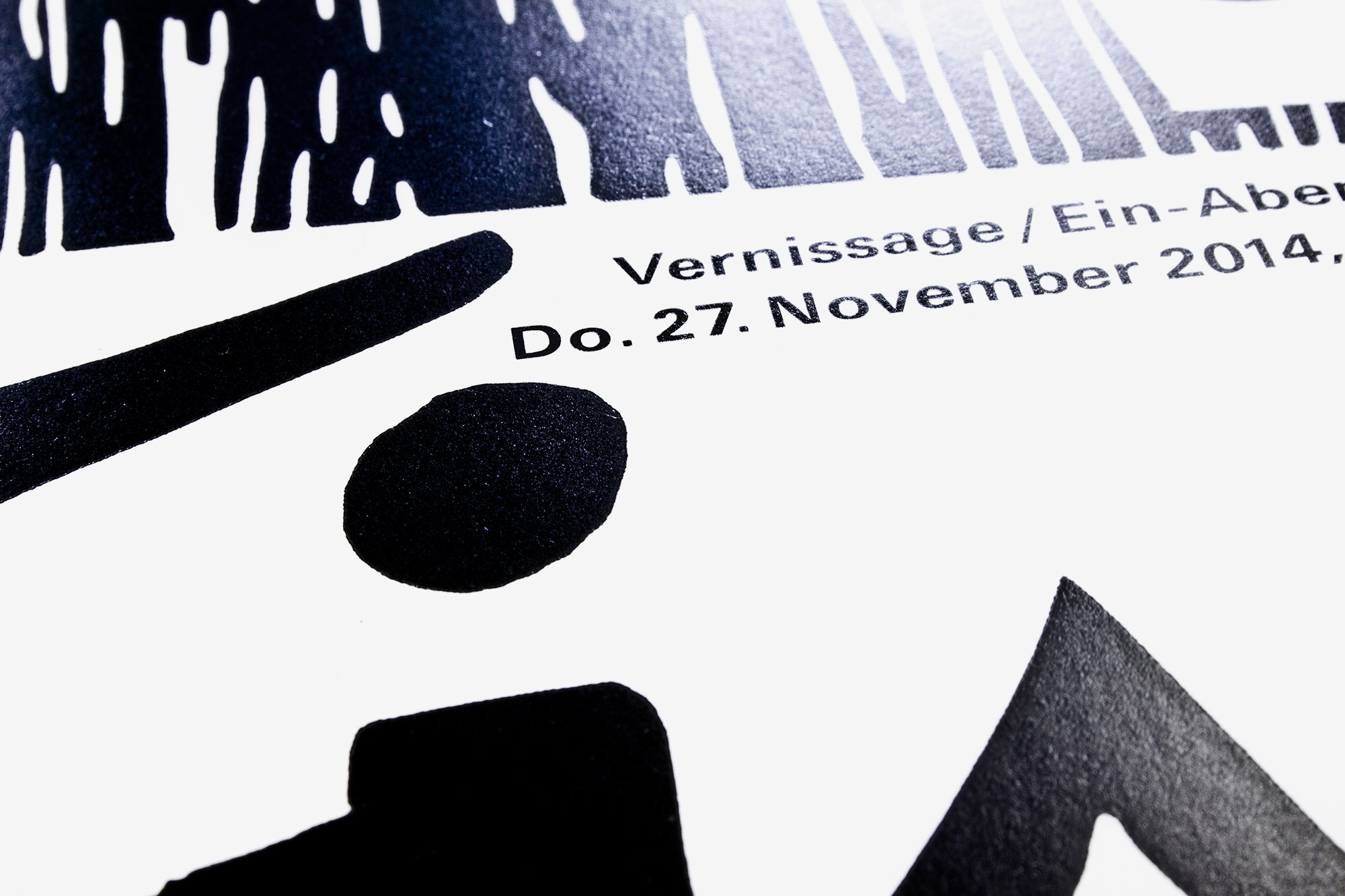
November 2014

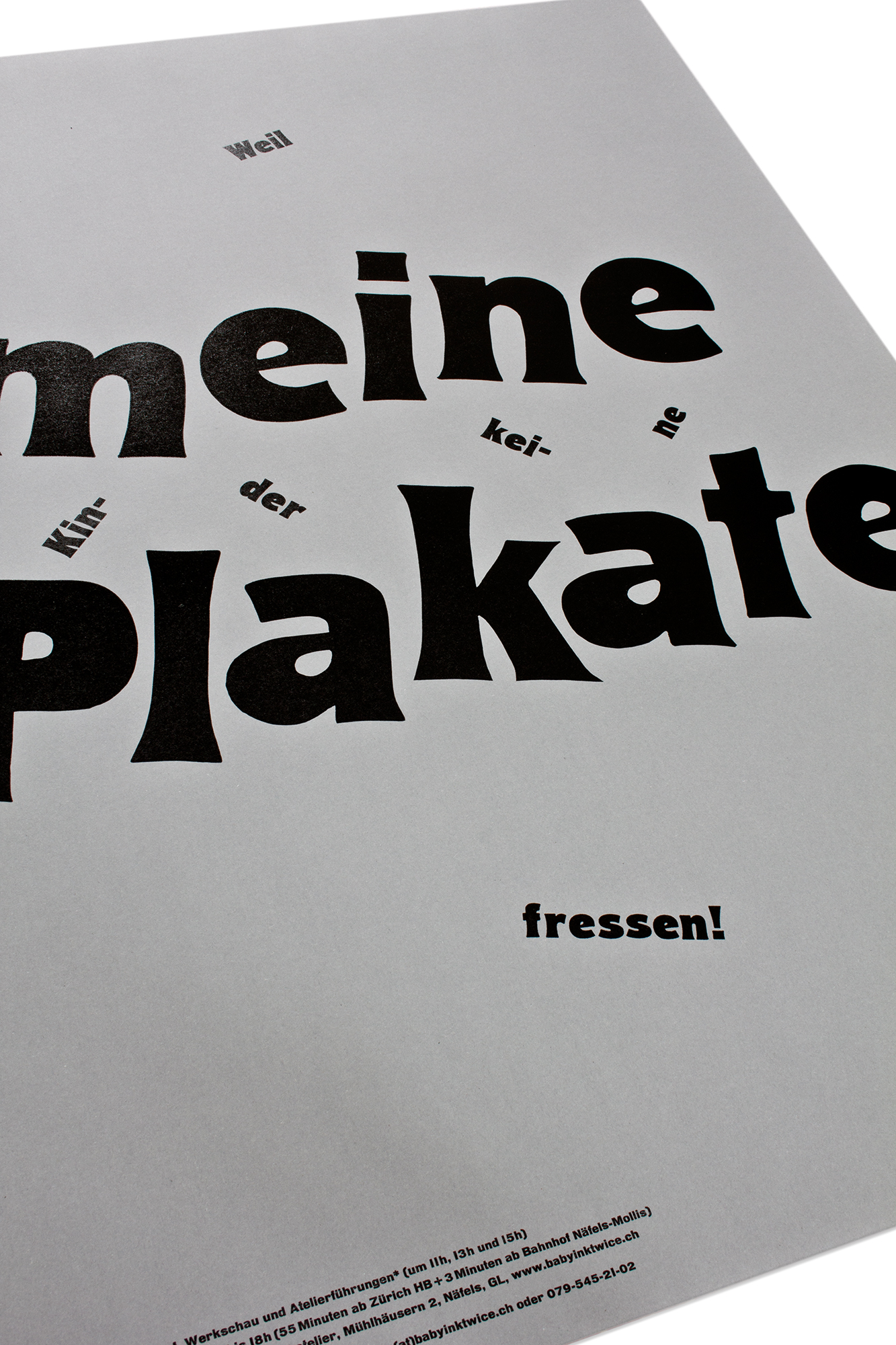
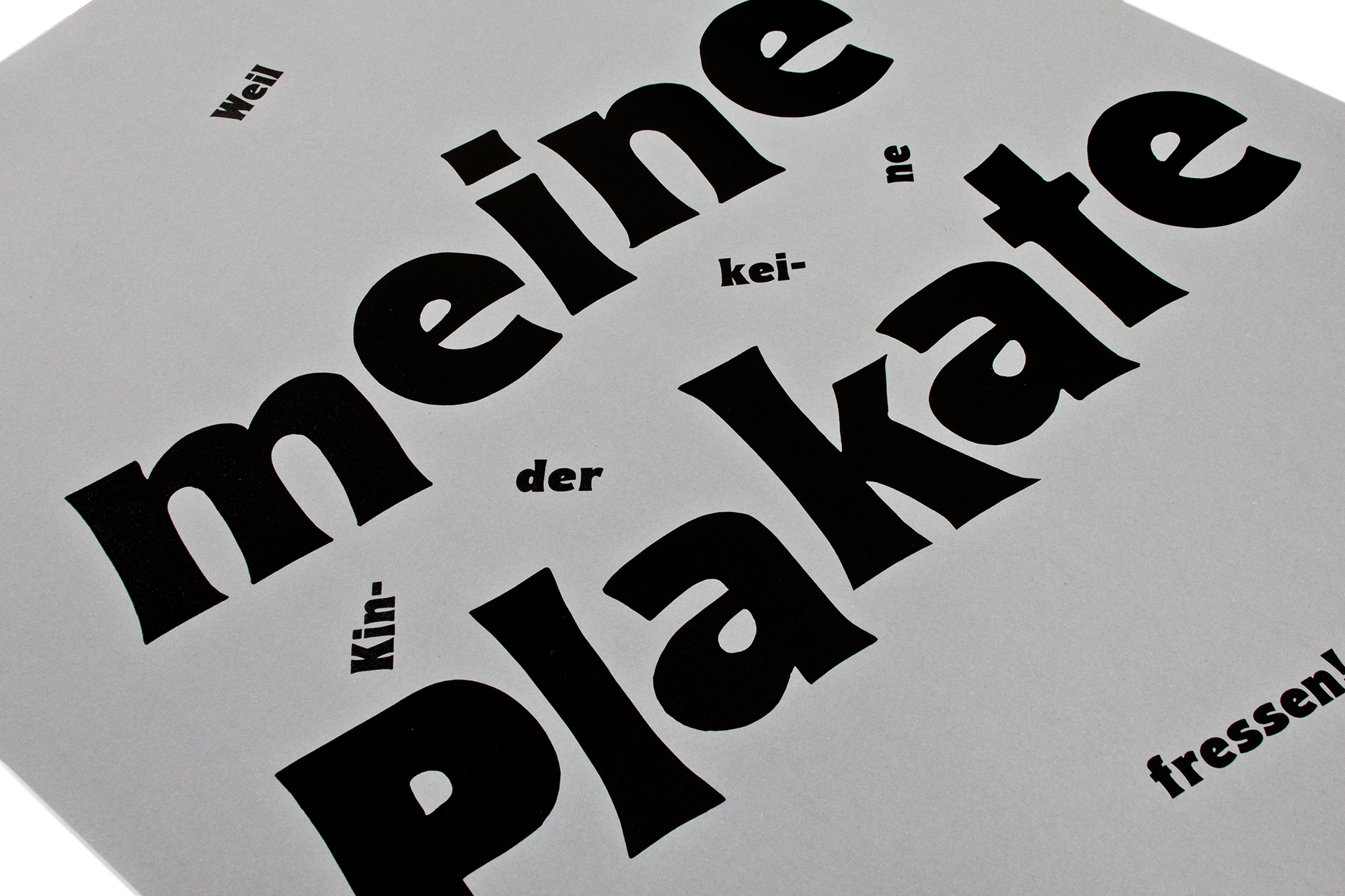
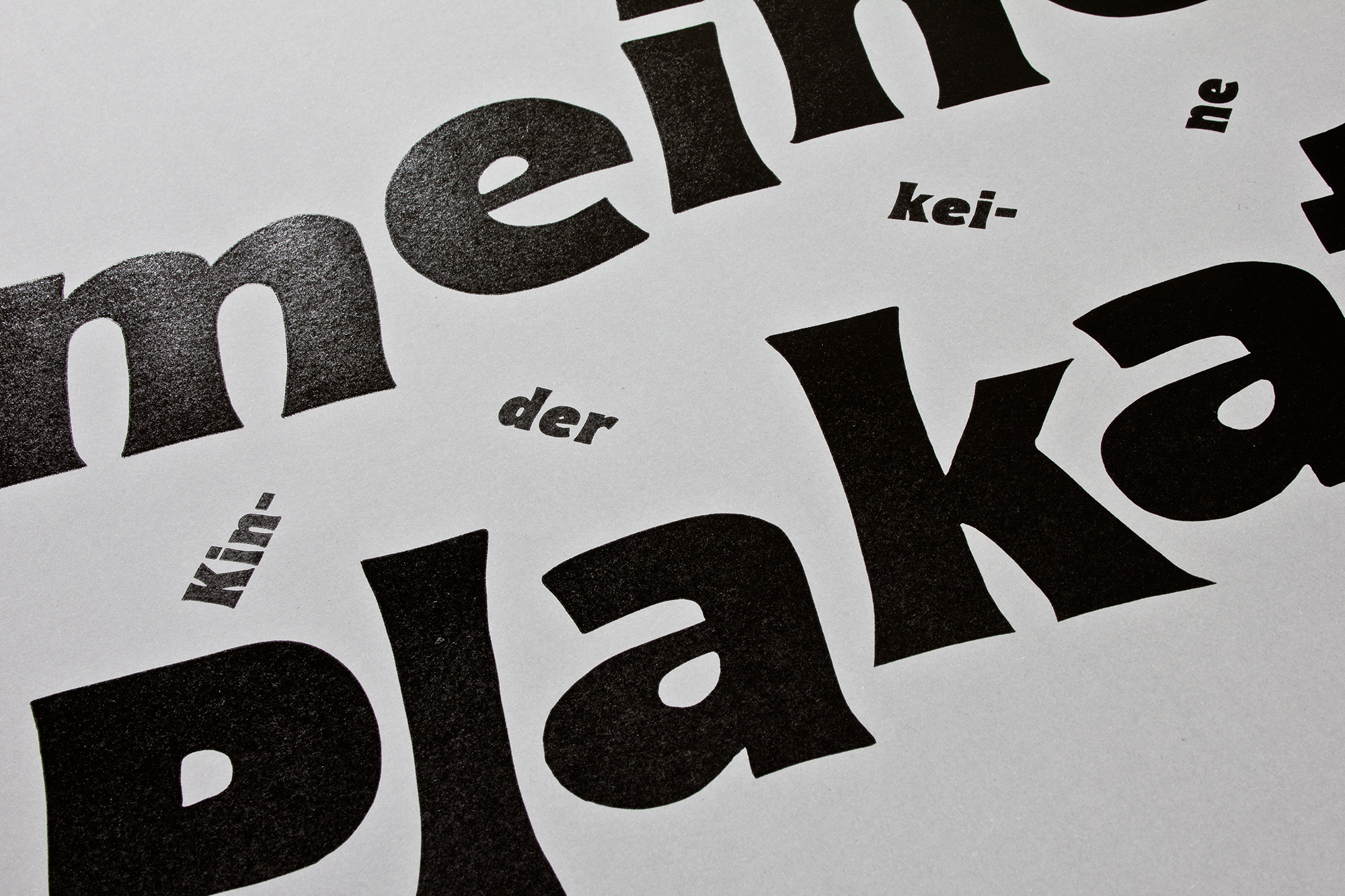
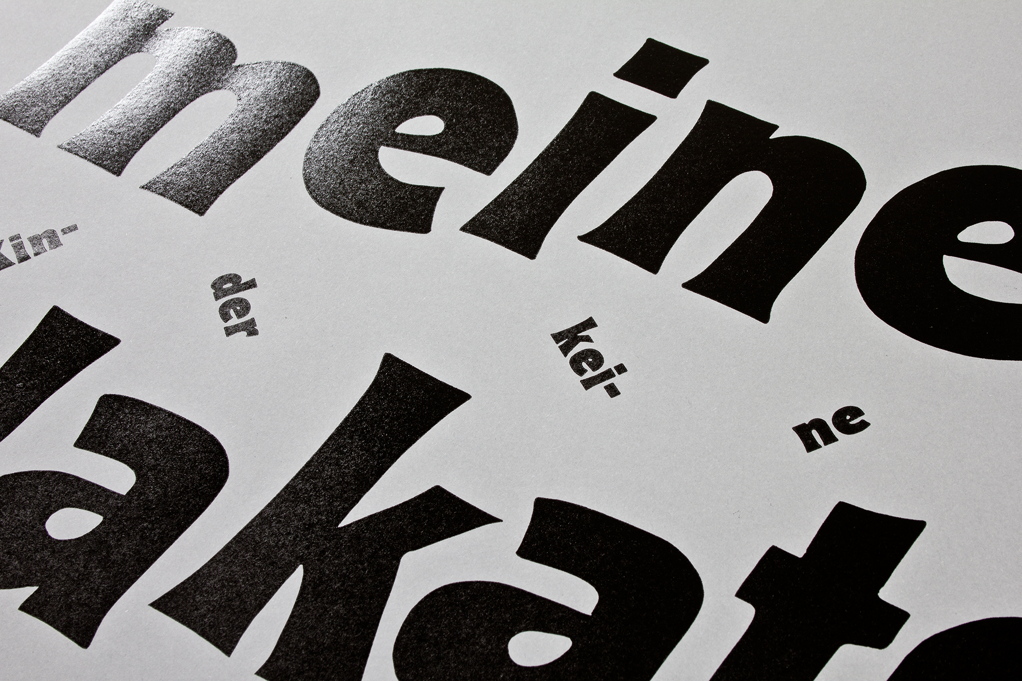
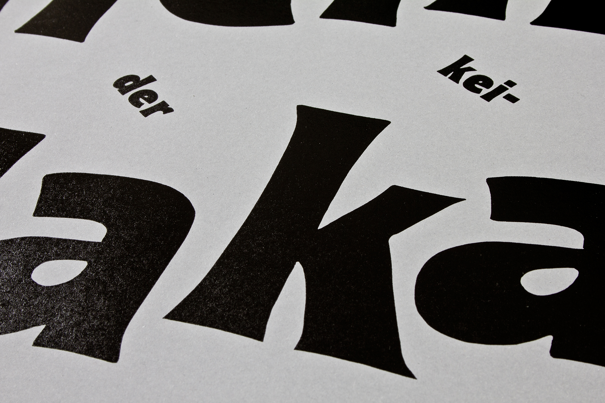
Meine Plakate
‹Weil meine Kinder keine Plakate Fressen!› = ‹Because my kids don’t eat posters!›. Invitation for a postersale event and open house at my printstudio in Näfels, GL.
First thing you see is ‹meine Plakate› = ‹my posters›. When looking closer you can read the second message ‹Weil meine Kinder keine Plakate Fressen!› = ‹Because my kids don’t eat posters!›. So please come by and buy some posters or buy them online before I need to eat them!
Client: Self initiated
Format: 64×88cm
Paper: Tonzeichenpapier Steingrau 120g/m2
Edition: 300 posters on a FAG Control 900
October 2014
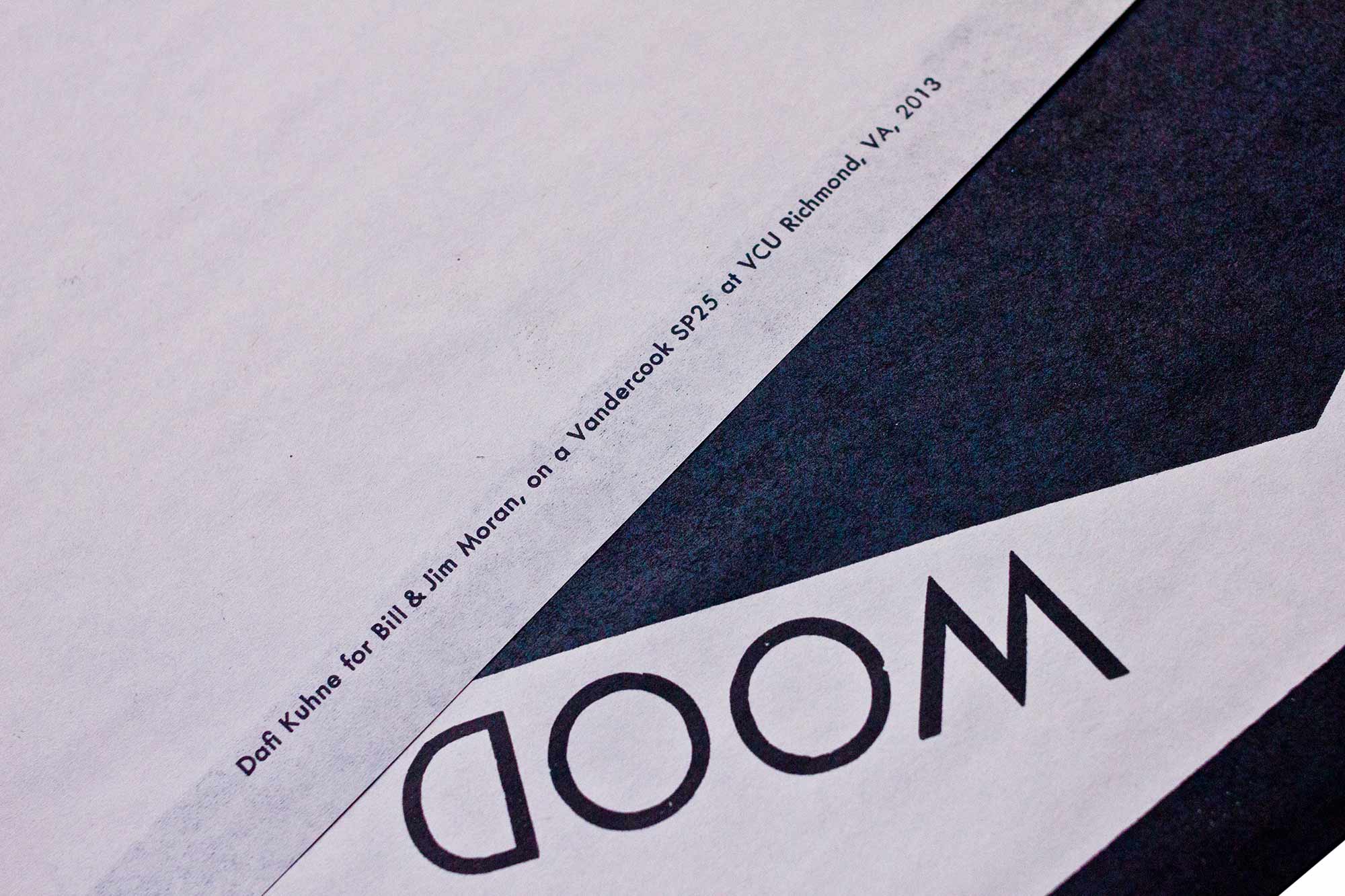
Refrigerator Magnets
Program poster for Veka-Glarus printed in 4 printruns from refrigerator magnets and hand cast Ludlow slugs. I had to visit 7 different Target Stores around Richmond to get a total of 28 sets of refrigerator magnets!
The magnetic letters only come side correct, so I had to find a way to rotate and deal with the reversed letters. We printed the magnets in 3 runs and doubled the some letters up into weird glyphs like the «NNN» on the first line or the triple «O’s» on line 4.
Client: Veka-Glarus, Glarus
Format: 45.7×64.7cm
Paper: Recycling Cream 70g/m2
Edition: 500 posters on a Miller Simplex
(Operated by Paul Morris at Benjamin Franklin Printing, Richmond VA)
May 2014
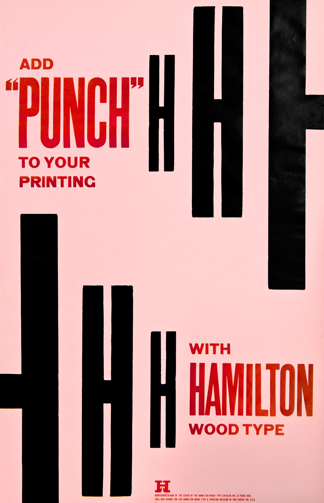
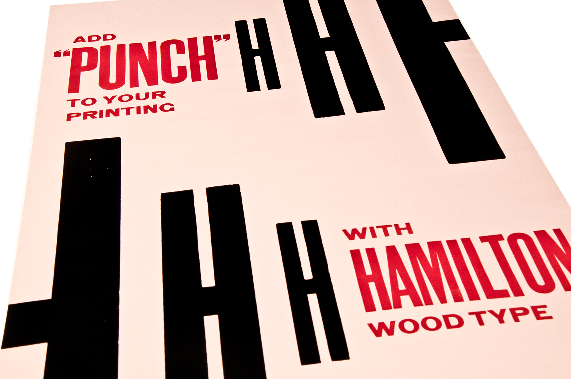
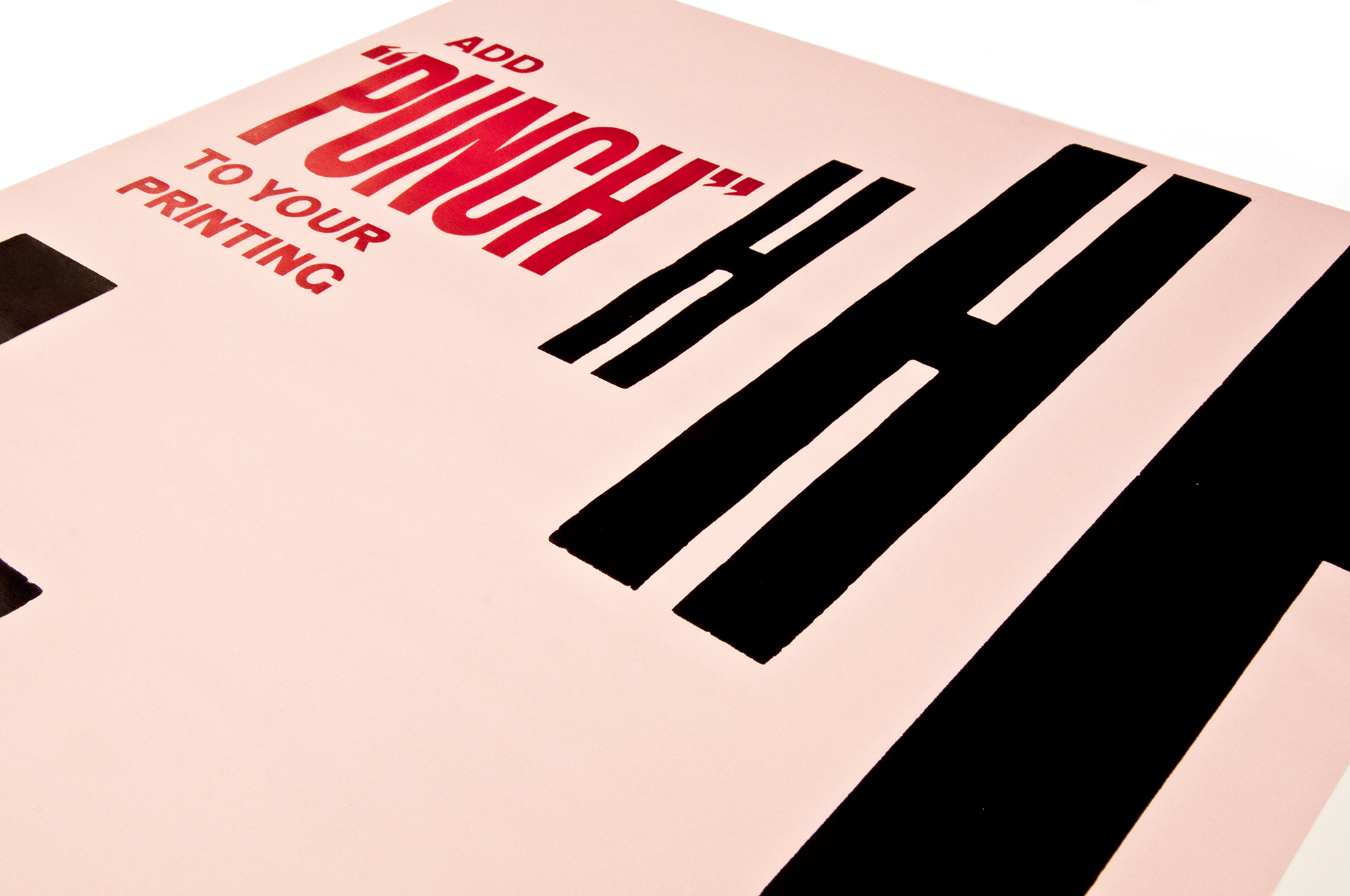
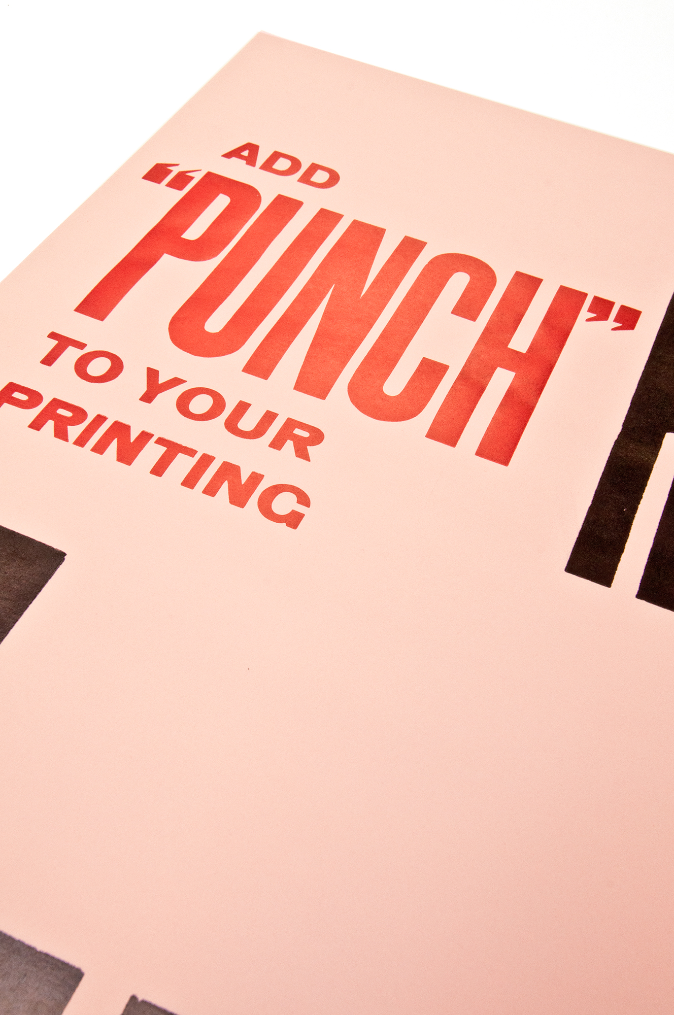
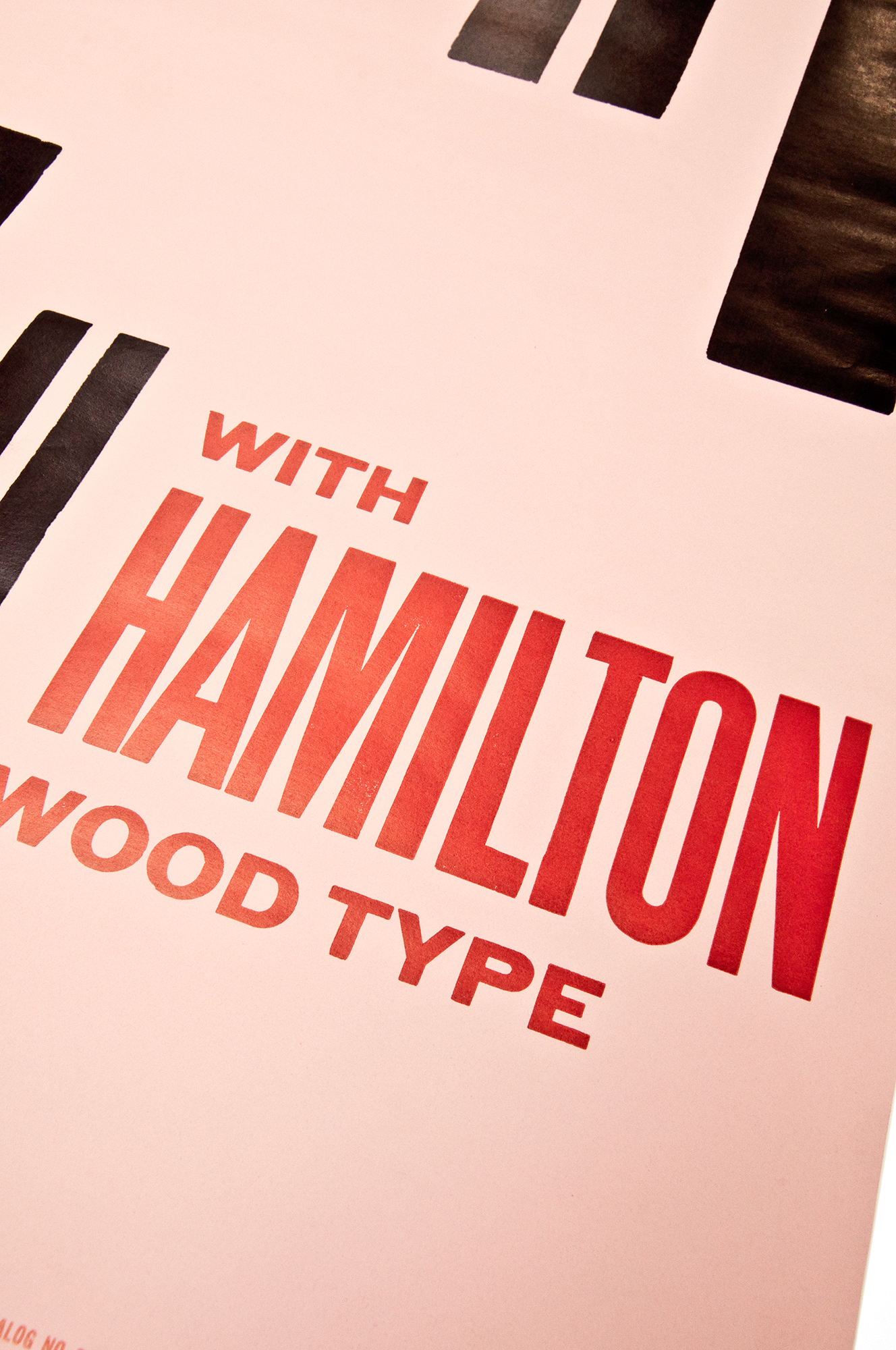
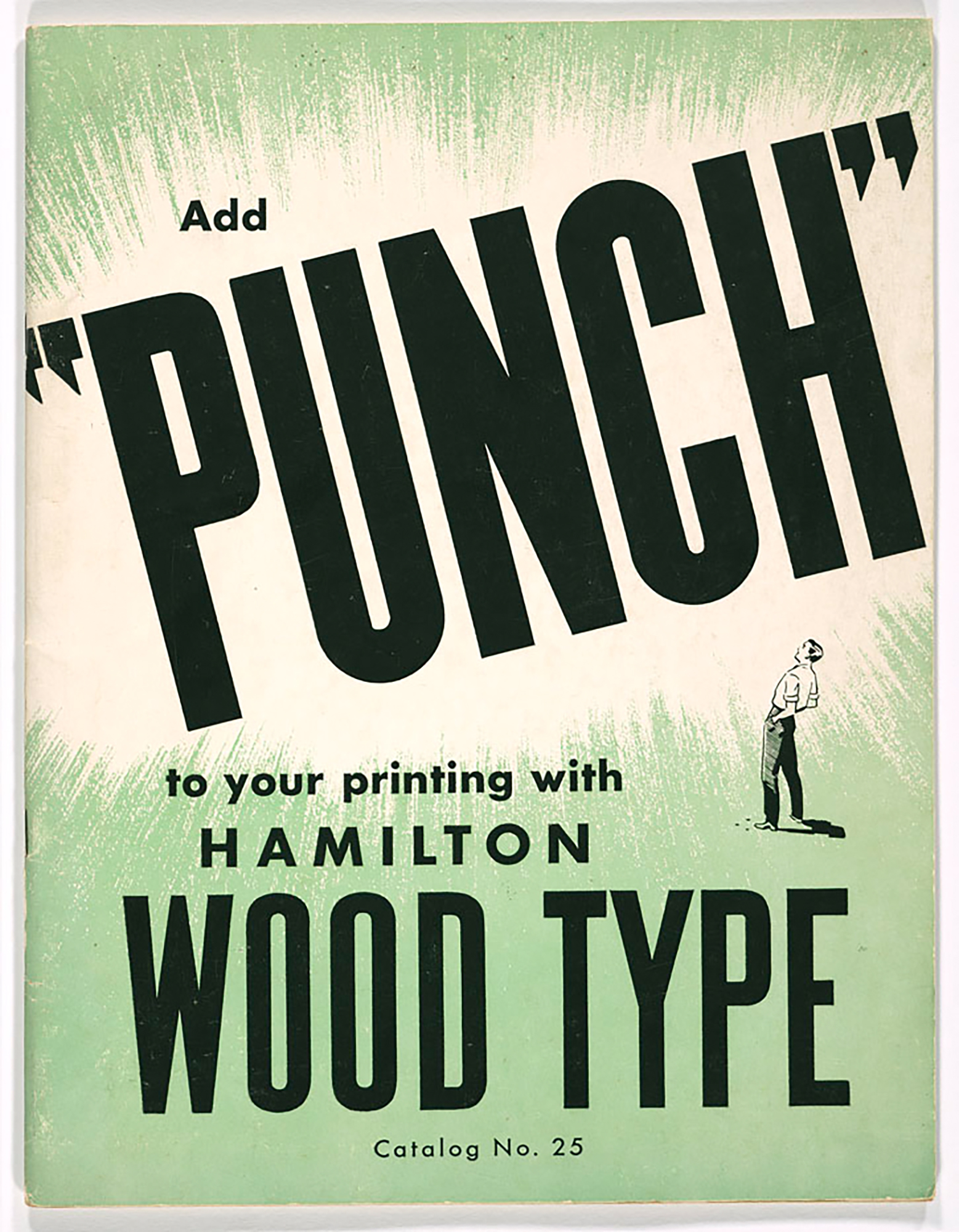
Add “punch” to your printing…
Add “punch” to your printing with Hamilton Wood Type! This poster is a reinterpretation of an old Hamilton Wood Type Catalog from 1949. Printed in an edition of 55 prints at the Hamilton Wood Type and Printing Musem in Two Rivers, WI.
I gave that poster a hard punch from the right and from the left with this huge 120 pica (=1440 DTP points) wood typy H’s. The posters have been printed in 7 colorruns on a showcard press and a Vandercook 320G. All from real physical wood type and metal type – no cuts or plastic shit on that one… Haha.
Client: Hamilton Wood Type and Printing Museum, Two Rivers, WI
Format: 48.3×72.7cm
Paper: Old pinkt paper stock, 70g/m2
Edition: 55 posters on a Vandercook Universal 320G
June 2014
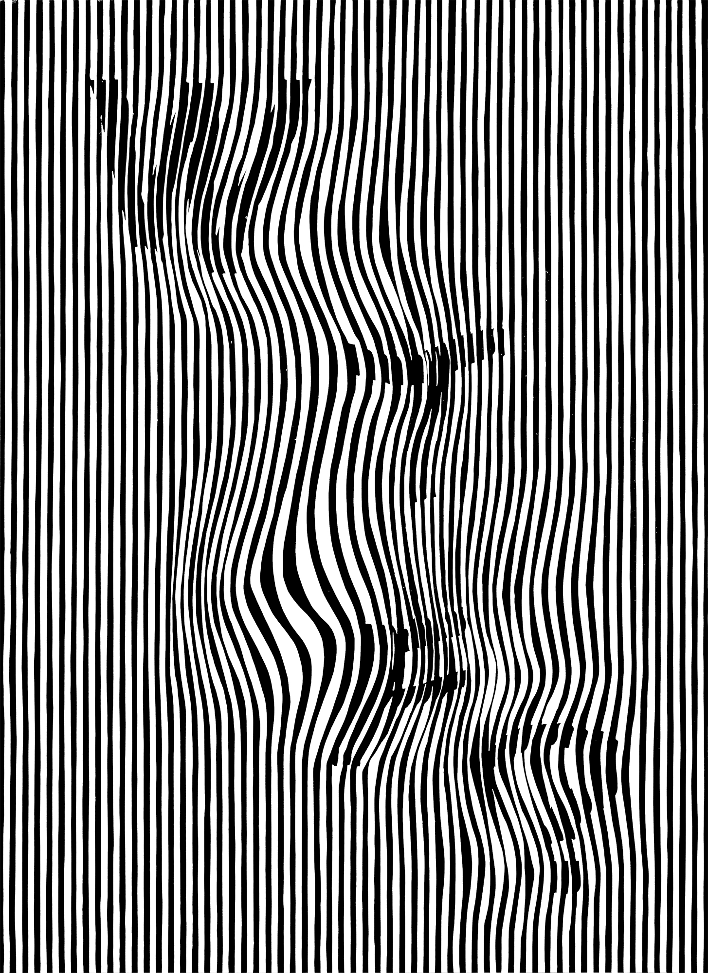
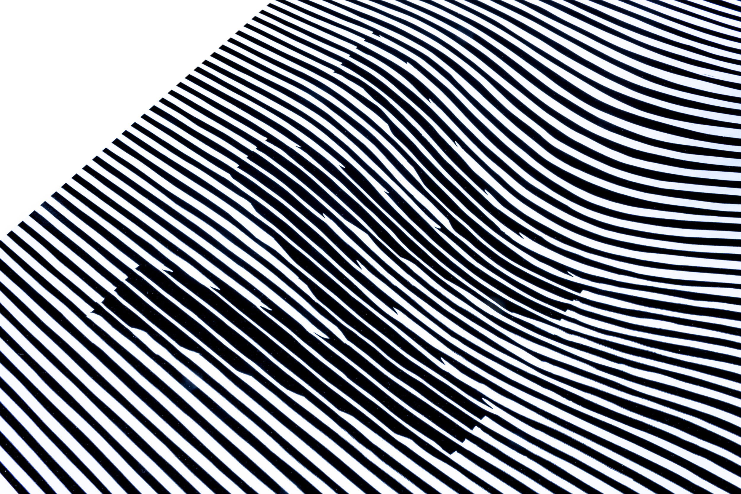
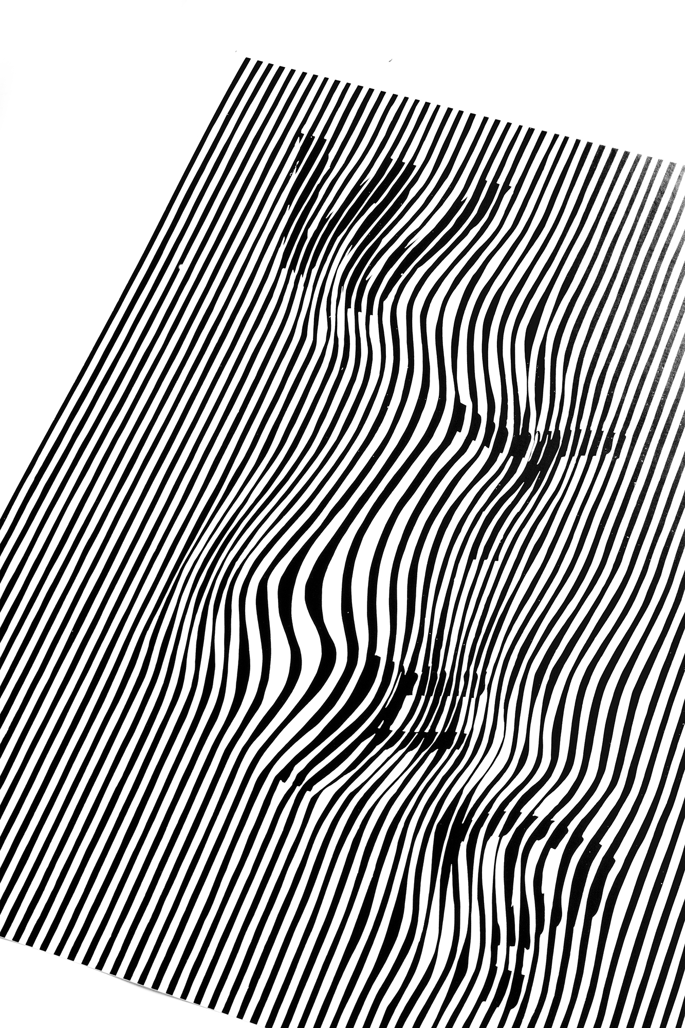
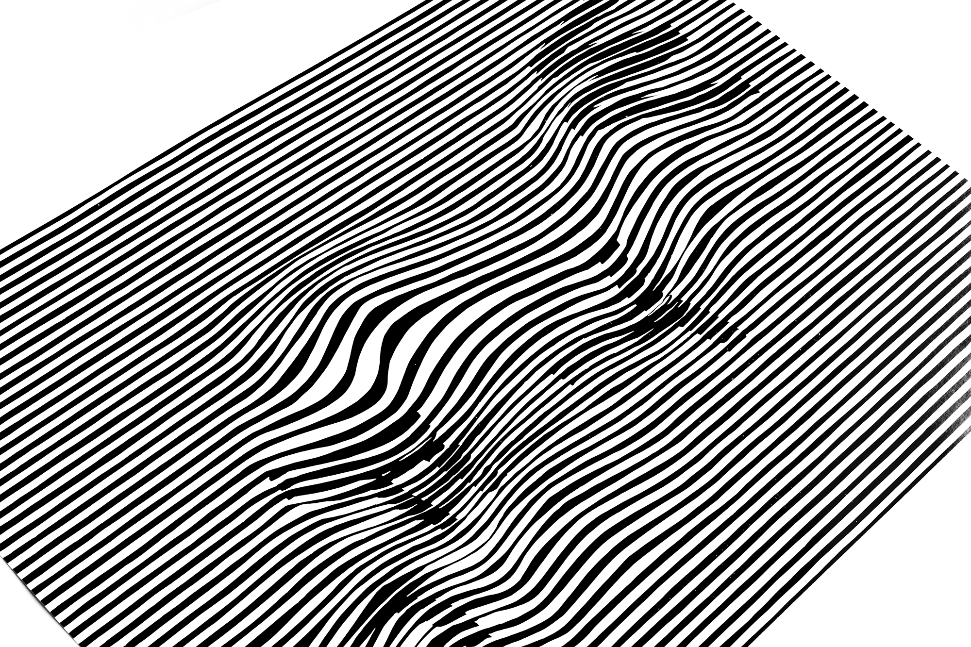
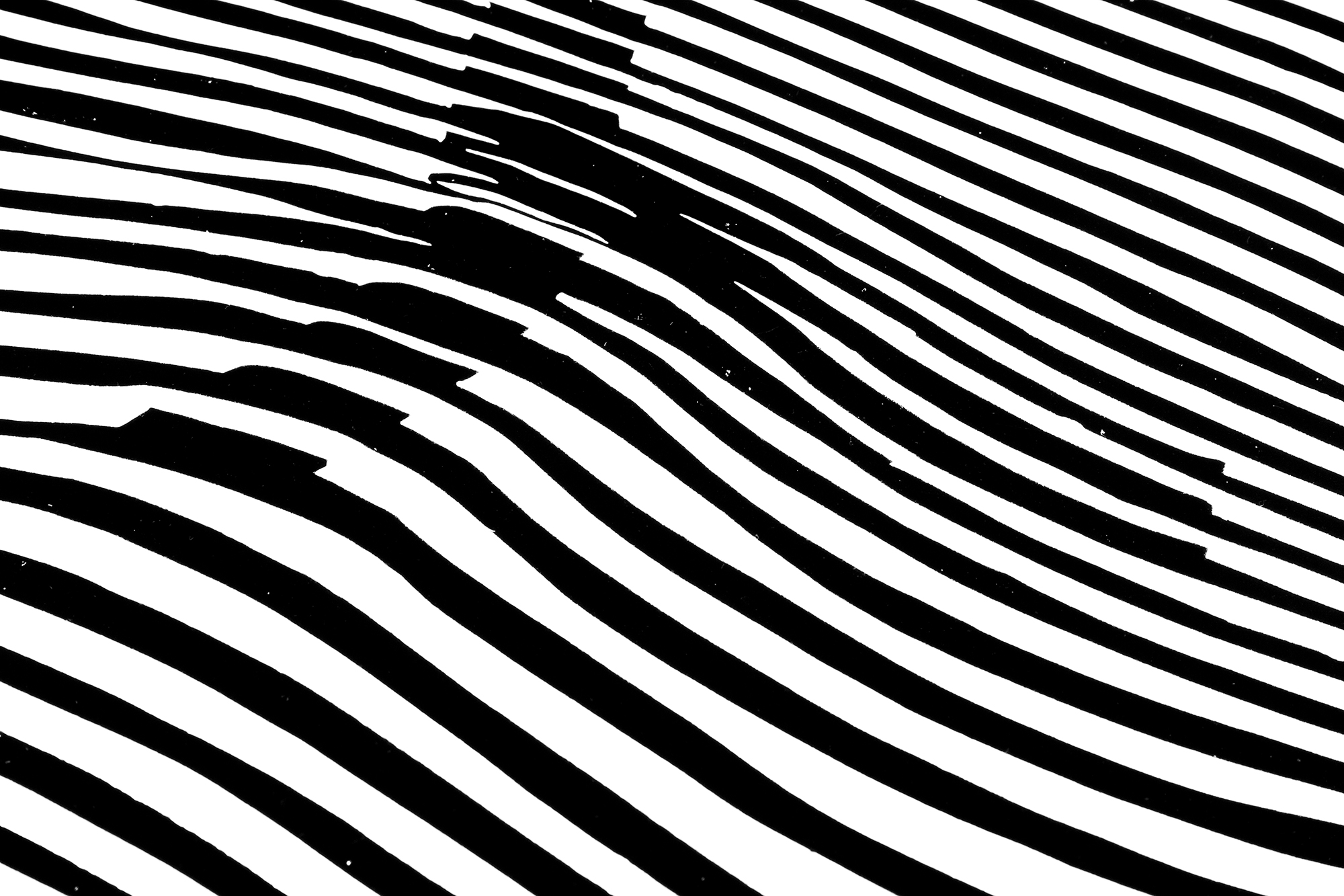
WTF? (small)
During my trip to NYC I had moments where I just had to ask myself: «What the f…?». (Like when my 1984 Oldsmobile got stuck in the Holland Tunnel between Jersey City and Manhattan!).
I wanted to give this poster a lot of vibration. Making your eyes dizzy so you ask yourself «WTF?». I cut this poster from one piece of lino.
(This poster also exists in hypnotizing 70×100cm.)
Client: Self initiated
Format: 44×60.5cm
Paper: Cardstock 250g/m2, 2nd edition on Invercote Albato 270g/m2
Edition: 35 posters on a Vandercook Universal III, May 2014
2nd Edition: 50 Posters on a FAG Control 900, April 2016
3rd Edition: 50 Posters on a FAG Control 900, October 2019
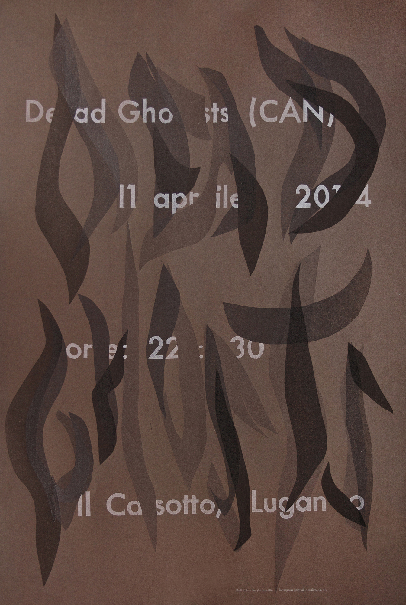
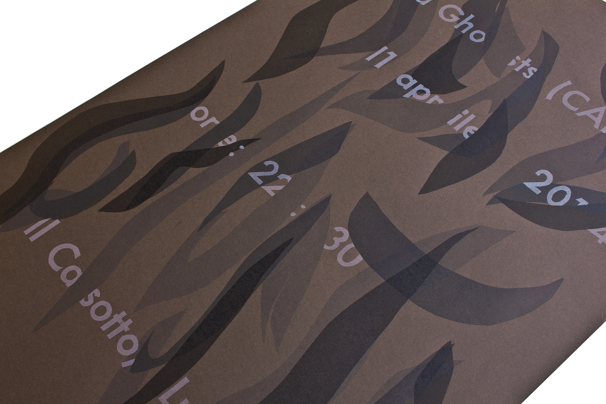
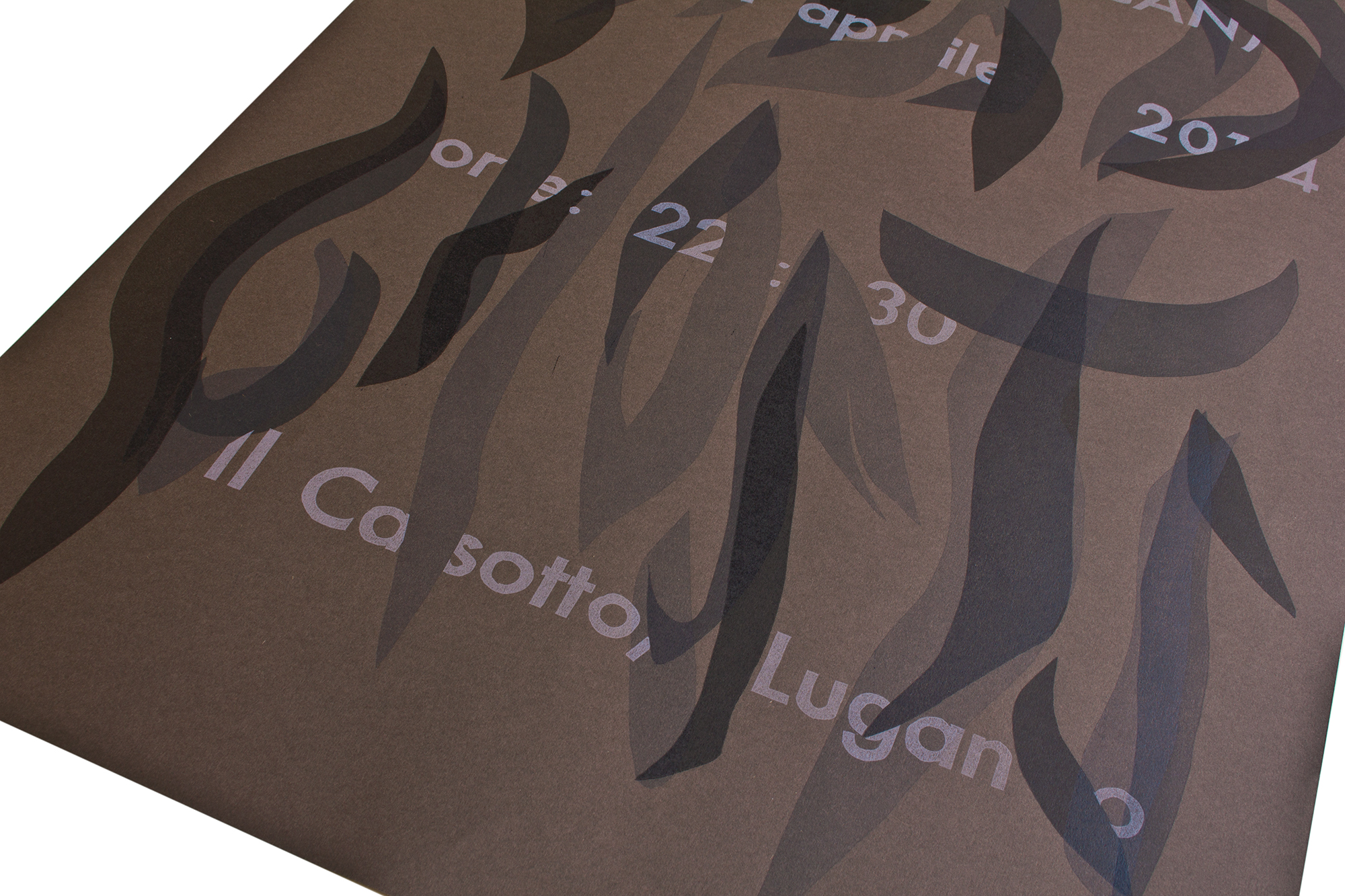
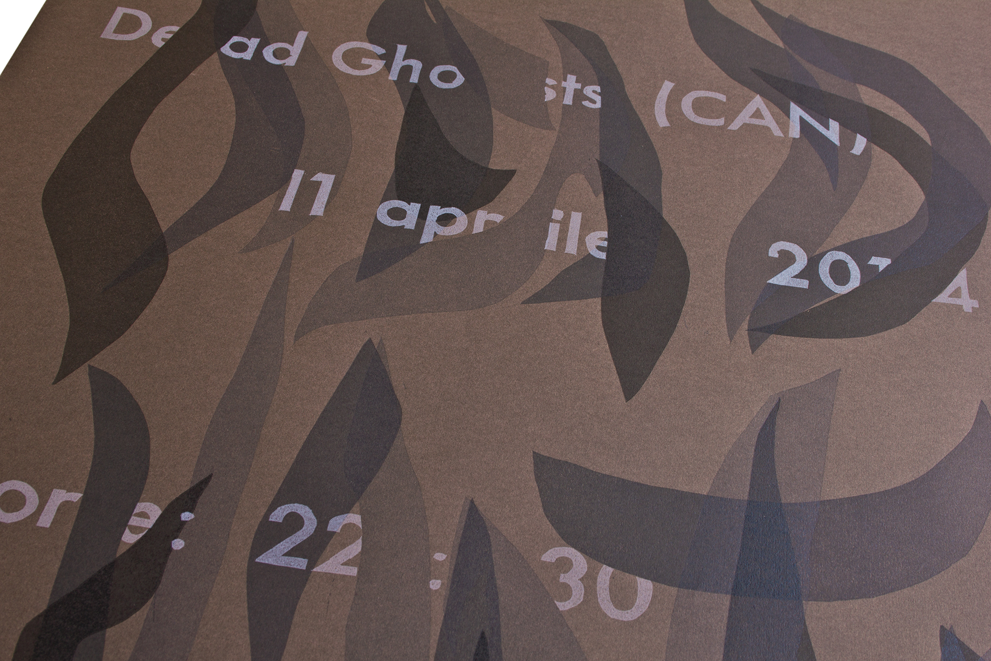
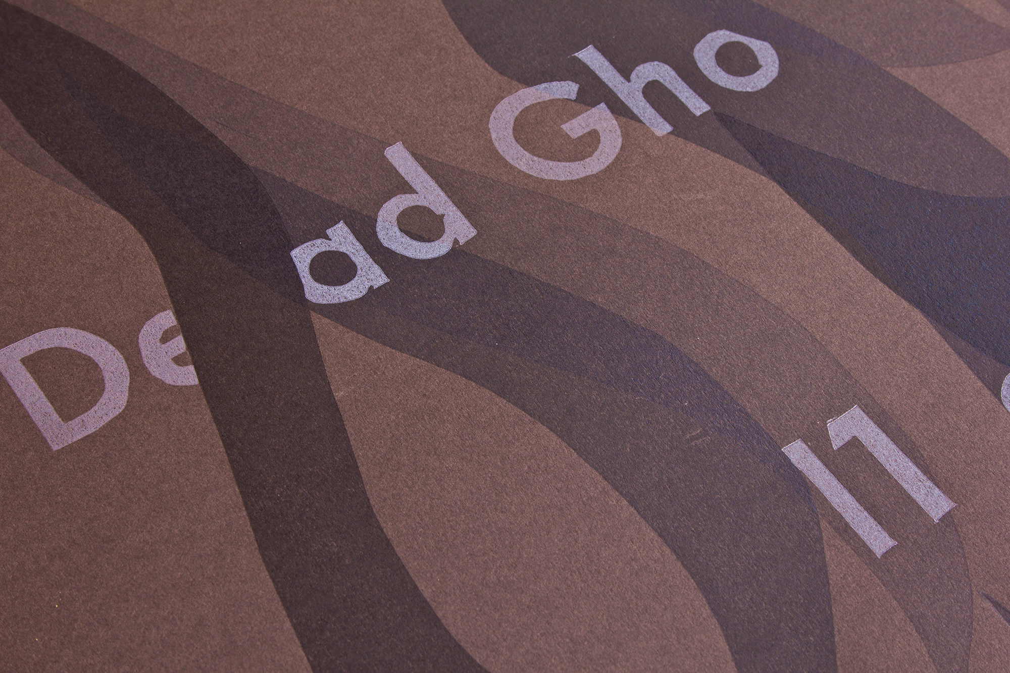
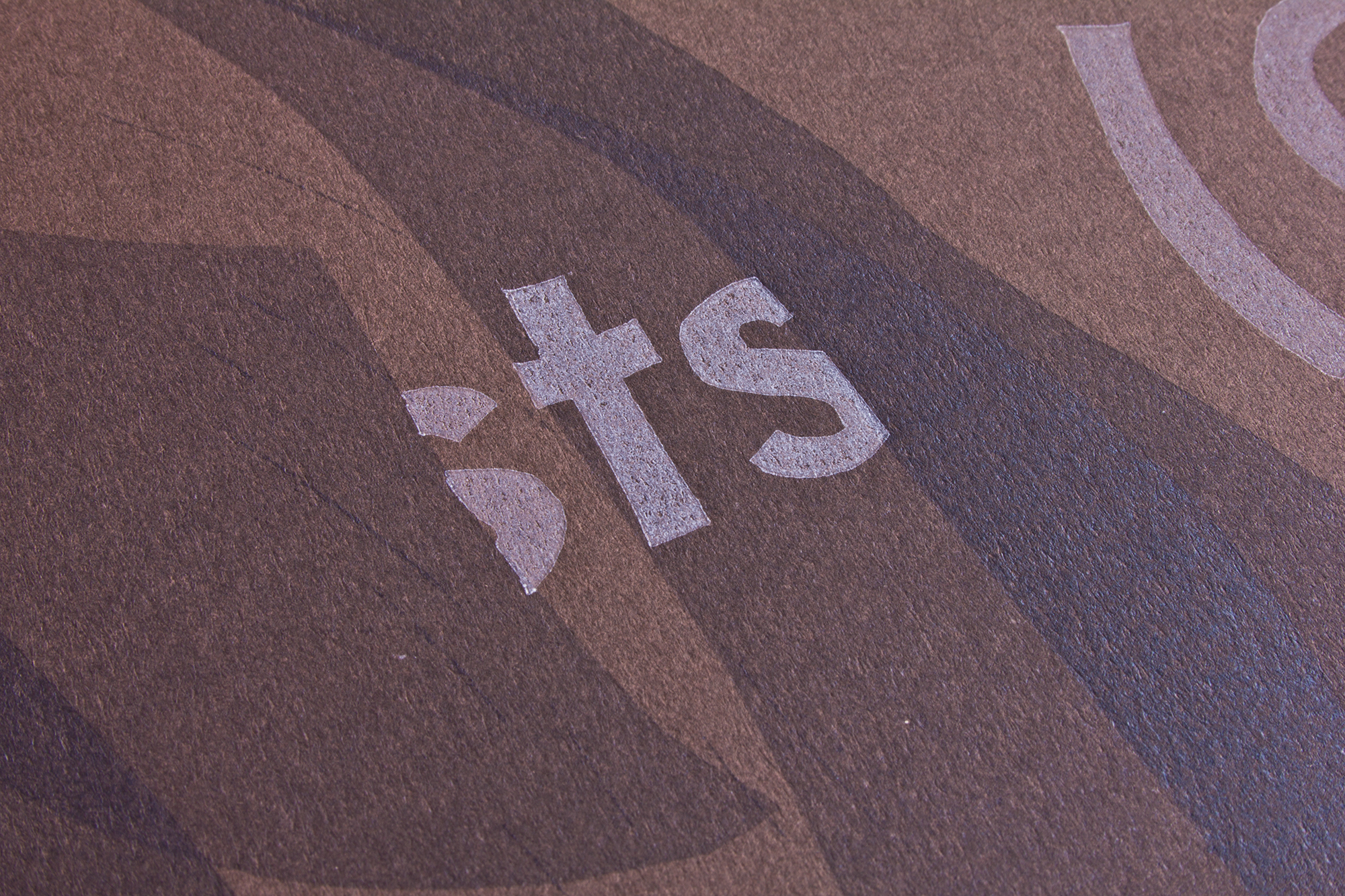
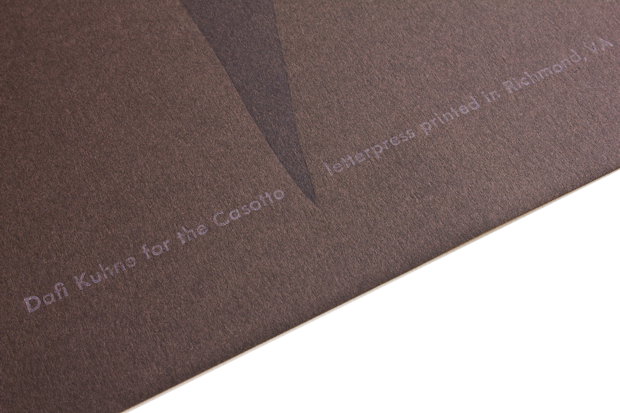
Dead Ghosts
The ghostly smoke/dust typeface was inspired by their actual typeface on their record cover, but has been modified quite a bit. Unfortunately I couldn’t find out who did the artwork on that record cover – so no credits for anonymus you, sorry.
Printed from handcarved linoleum and handset lead type. Printed in the United States – then express sent to Switzerland to be hung up in Lugano!
Client: Casotto, Lugano
Format: 52×77.5cm
Paper: Recycling Brown, 160g/m2
Edition: 87 posters on a Vandercook SP-25
March 2014
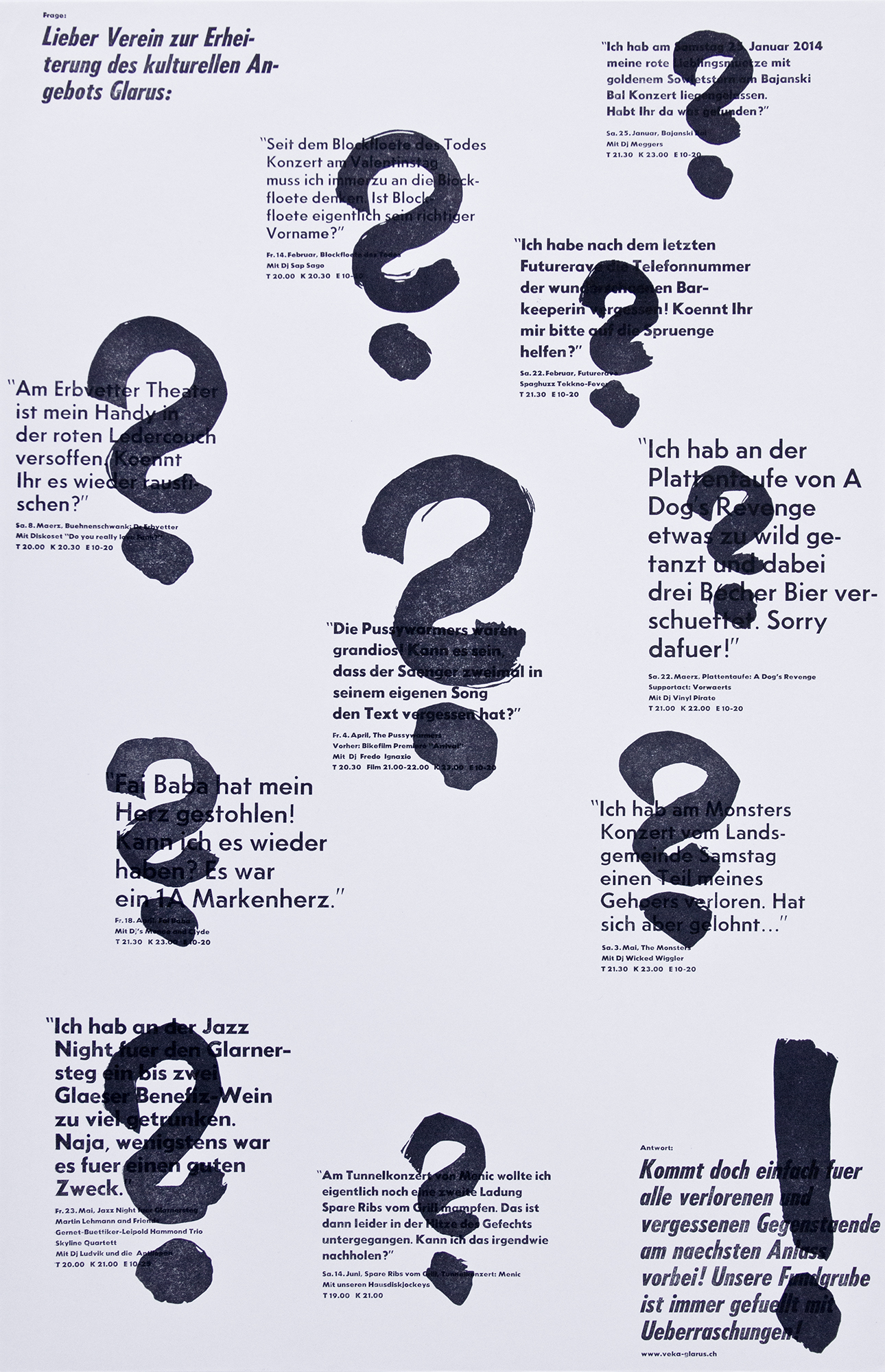
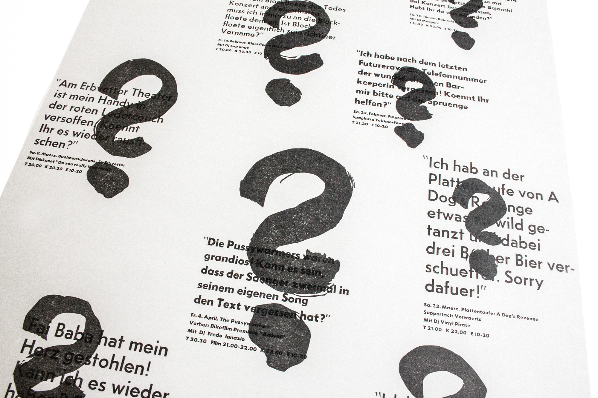
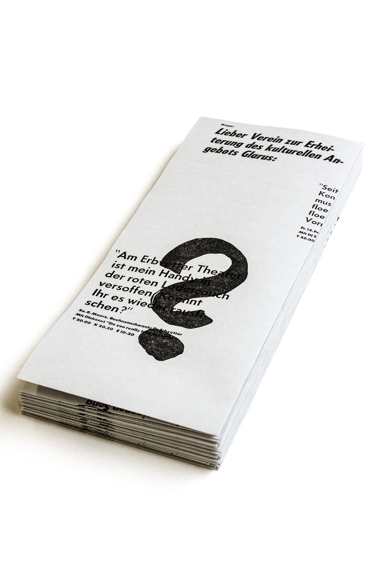
Lost and found
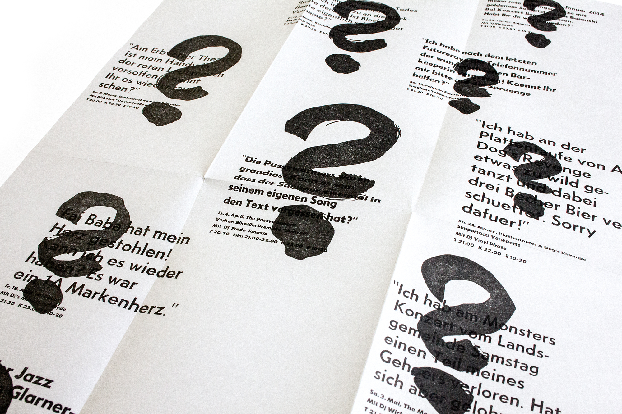
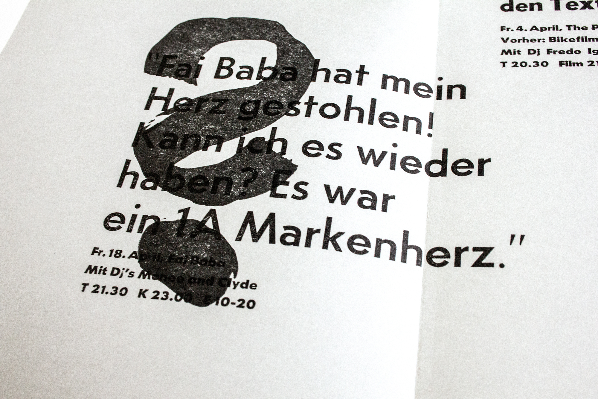
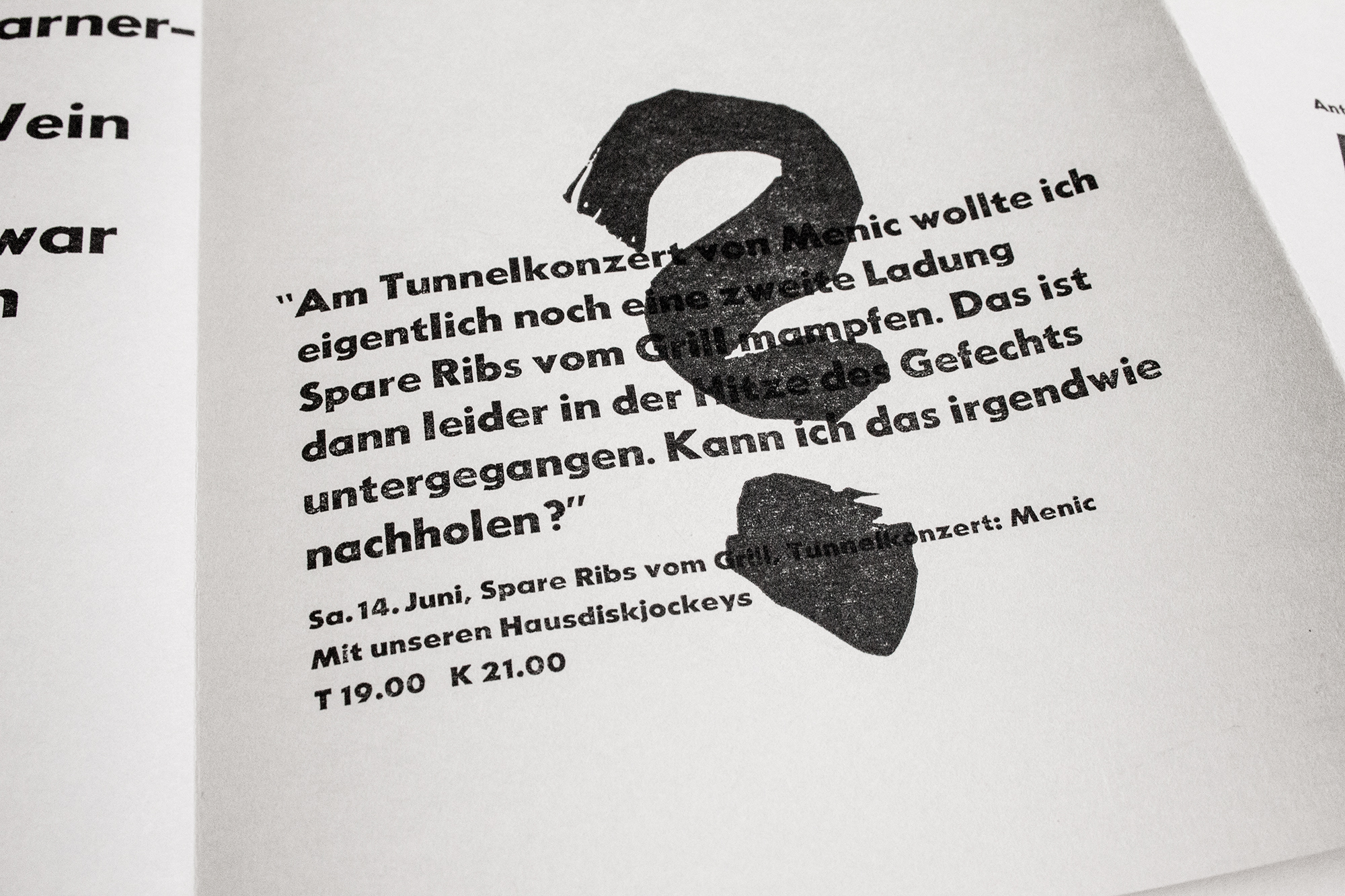
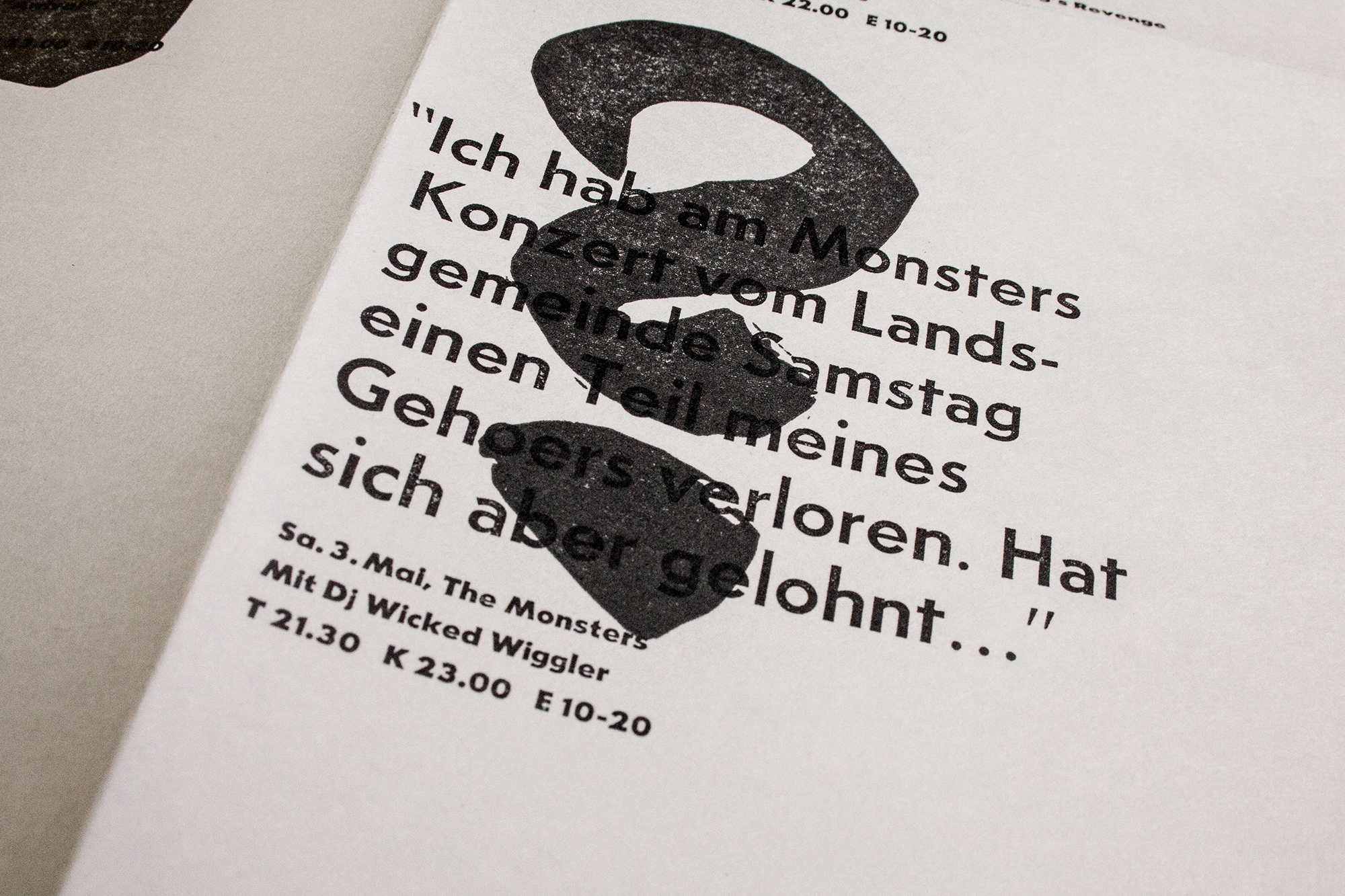
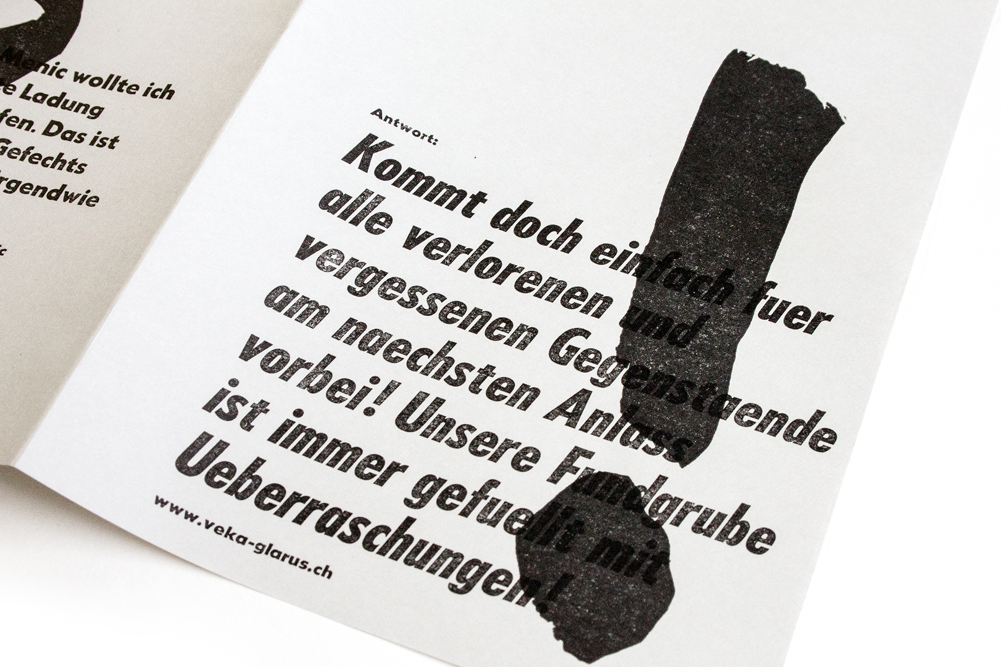
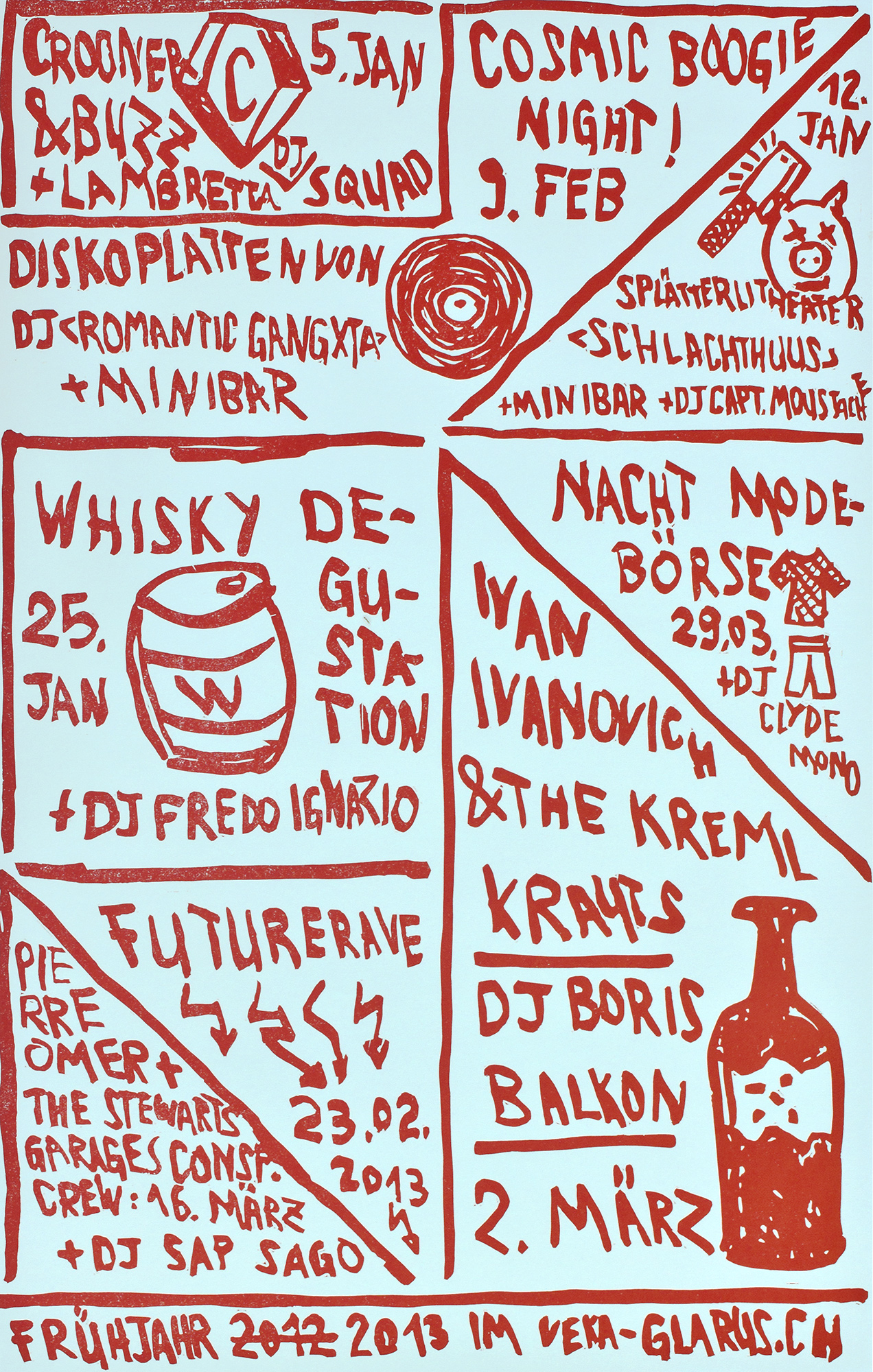
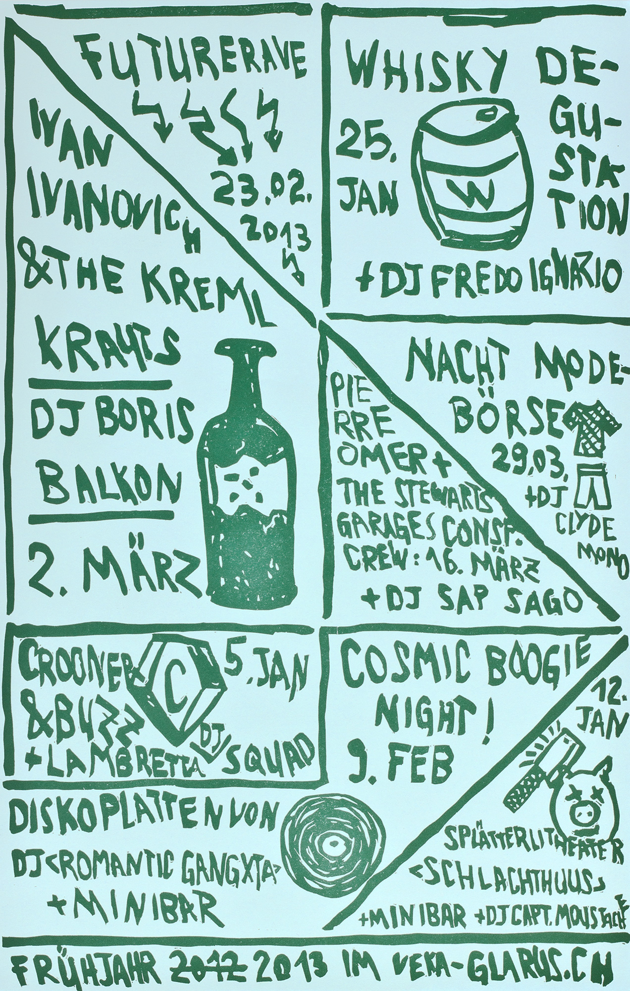
Concert season program for Veka-Glarus, that I worked with the topic of people asking for their lost, left behind and missing things.
Each concert event is sentenced as a question asking about something that got lost at the last –or better upcoming– event. For example: ‹I lost my red cap with a soviet star at the Bajanski Bal concert. Did you find it?› – below the information about the upcoming Bajanski Bal concert. But also more abstract like: ‹After the last Futurerave I forgot the phone number of that very beautiful bartender. Could you please help me out?› or ‹Fai Baba stole my heart! Could I get it back?›.
Client: Veka-Glarus, Glarus
Format: 34.7×53.8cm
Paper: Recycling 70g/m2
Edition: 750 posters on a Miller Simplex Press
(Operated by Paul Morris at Benjamin Franklin Printing, Richmond VA)
January 2014
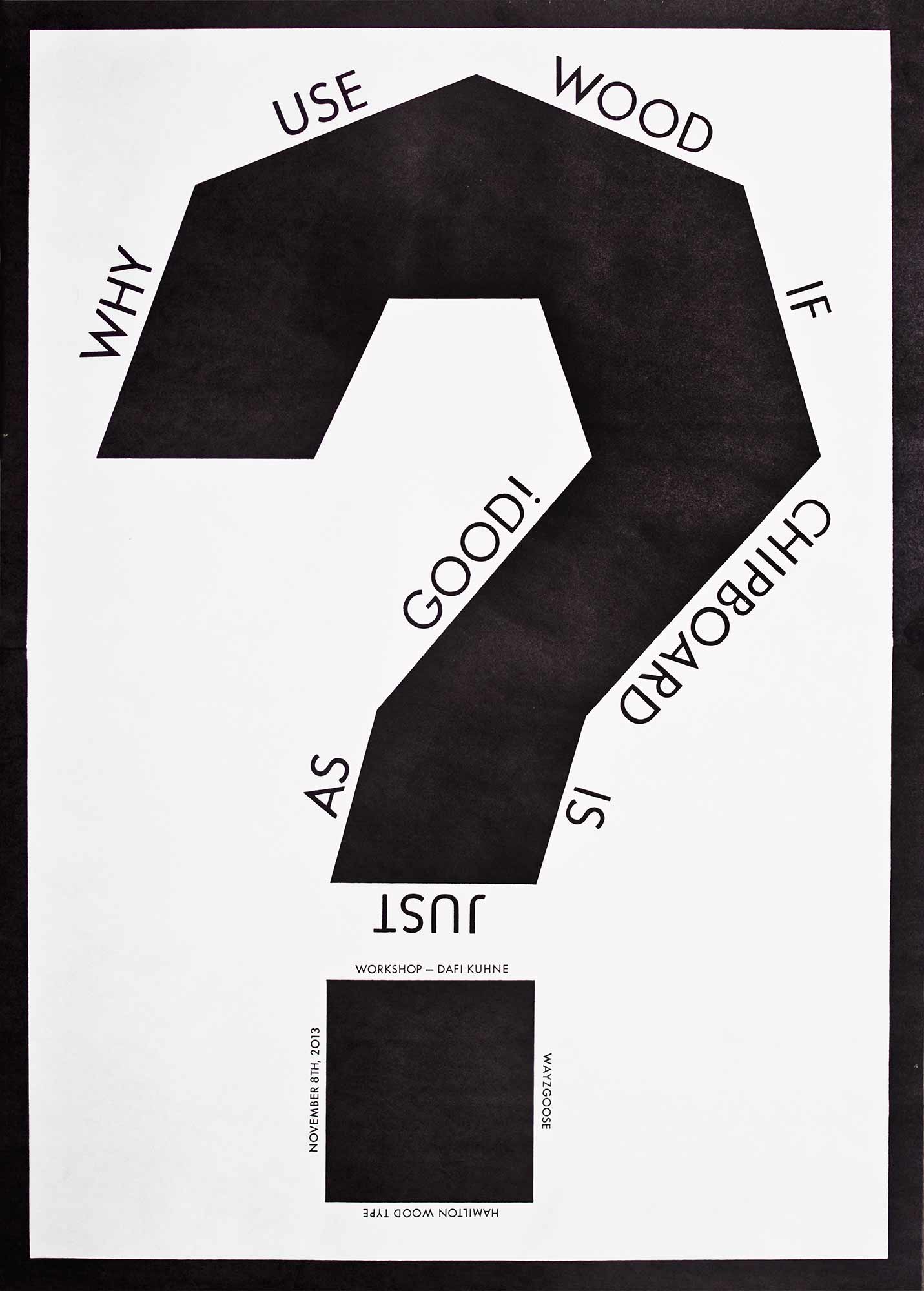
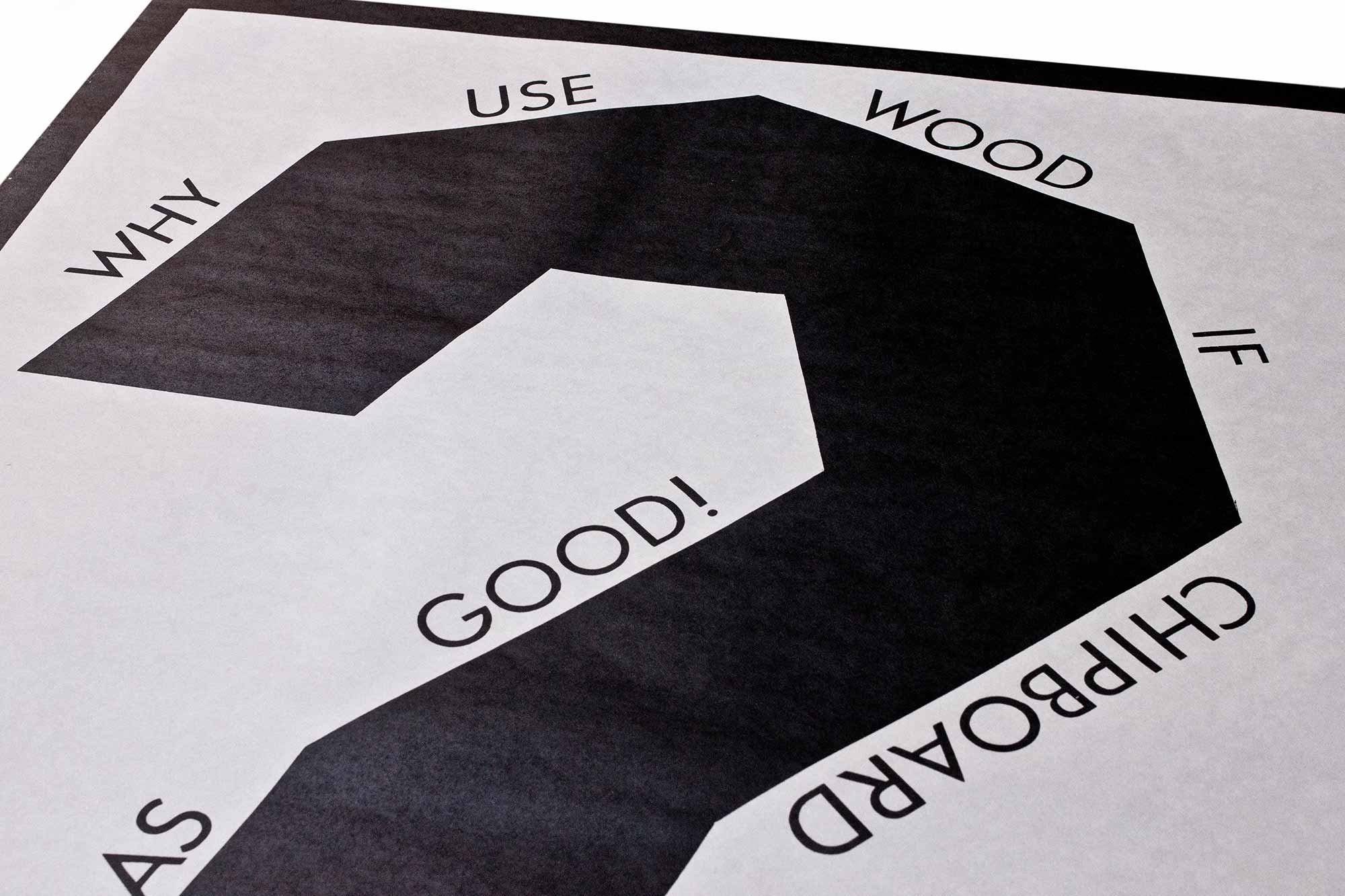
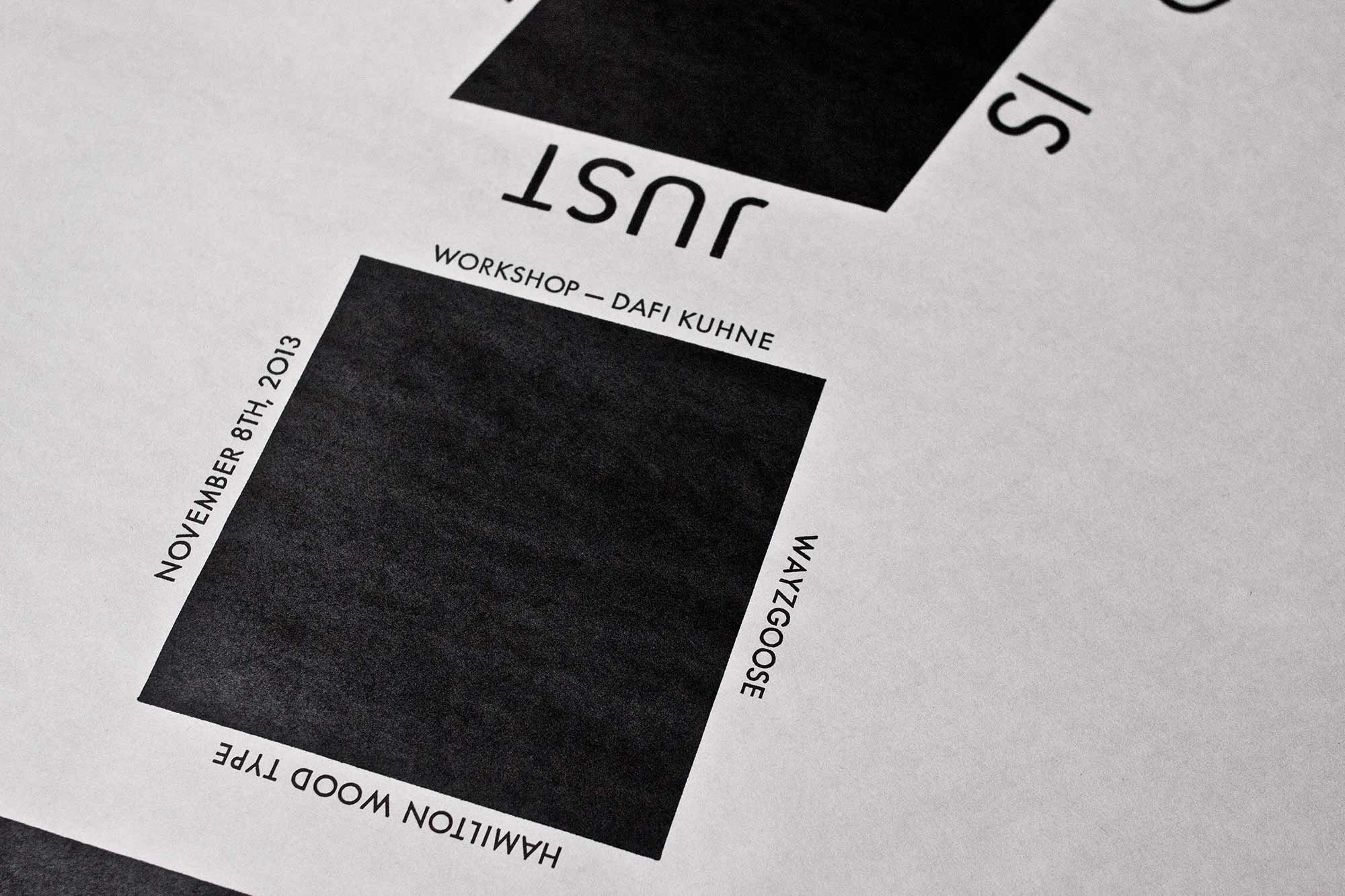
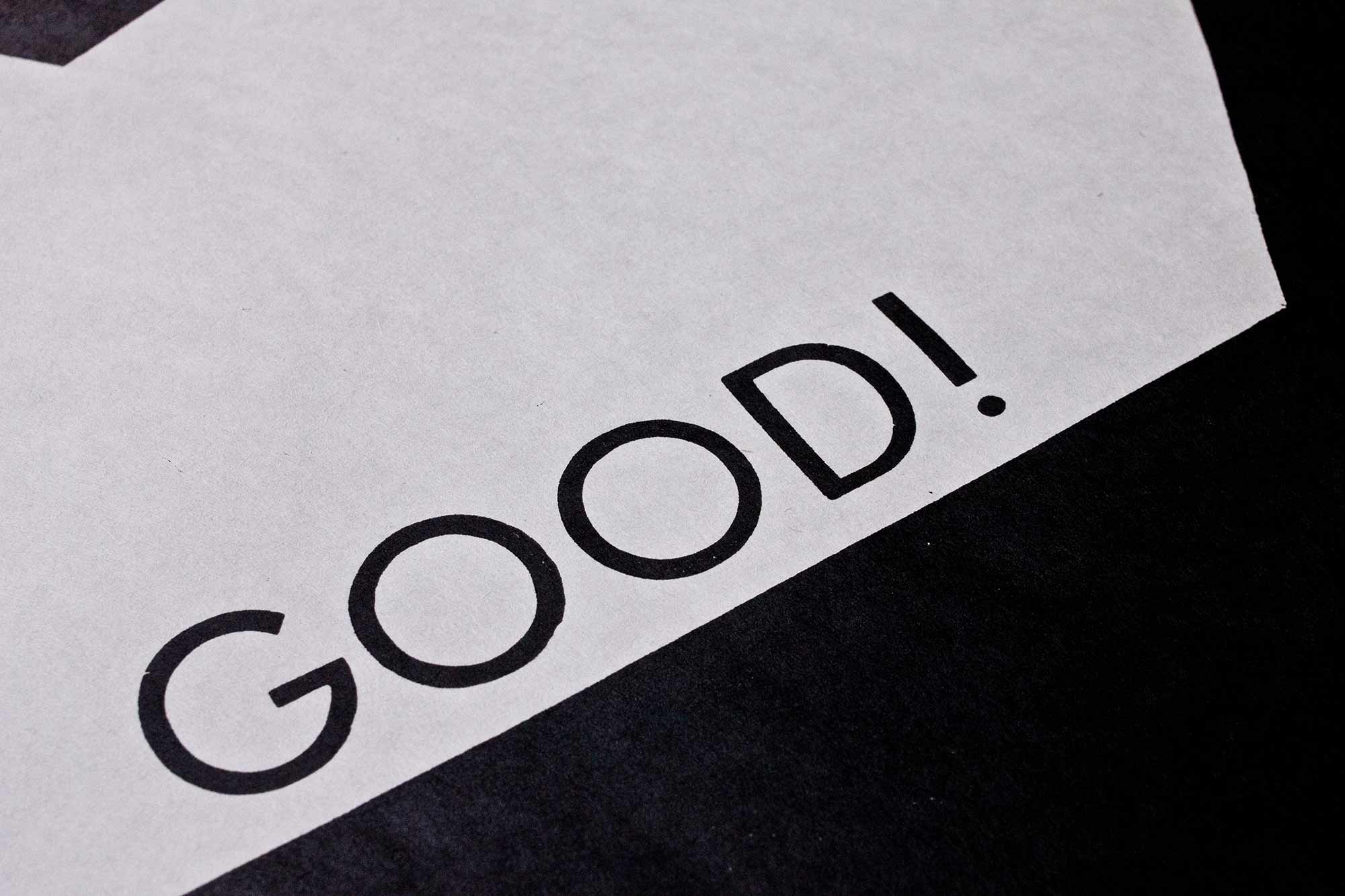
Why use wood…
…if chipboard is just as good? Workshop posters for a talk and two workshops at the Wayzgoose at Hamilton Wood Type Manufactury in Two Rivers, WI.
It’s kind of a provocation if you go to the in former times biggest wood type manufactury in the world and say ‹Why use wood if chipboard is just as good?›. The workshops were concepted to be experiments with chipboard as a cheap alternative to wood cuts or other labour intense materials.
Client: Hamilton Wood Type and Printing Museum, Two Rivers, WI
Format: 55.9.4×83cm
Paper: Newsprint, 62g/m2
Edition: 30 posters on a Vandercook SP-25
October 2013
Schöne Scheisse
Concert poster for Veka-Glarus.ch printed in 3 printruns from hand cut MDF boards and metal type.
When you start reading the poster in the straight-up orientation it reads ‹schöne› (which translates as ‹beautiful›). Then you start reading the small black concert information. About at the fifth paragraph it says ‹rotate the poster by 180 degrees›. Then you start reading the light brown letters say ‹Scheisse› (which translates as ‹shit›). In the Swiss german language this can be read in a positive way as ‹this is the shit!›. Or in a negative way like ‹What a piece of shit!›. Both possible. You decide. Printed in the shittiest brown tones on brown paper… haha.
Client: Veka-Glarus, Glarus
Format: 35×52.5cm
Paper: Sirio Color Bruno 115.m/m2
Edition: 500 posters on a FAG Control 405
August 2013
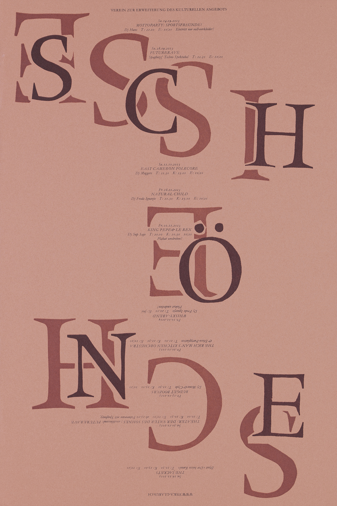
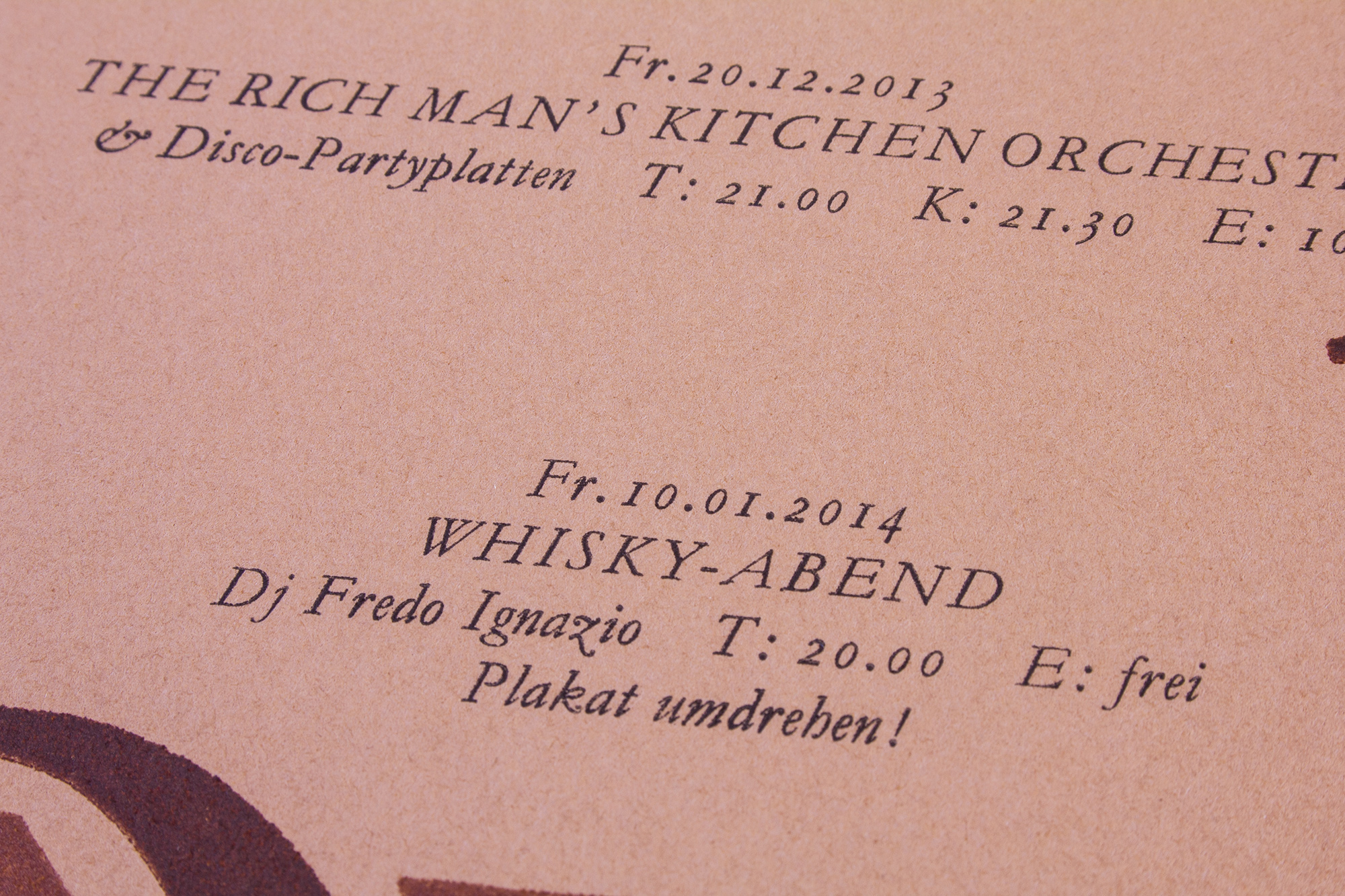
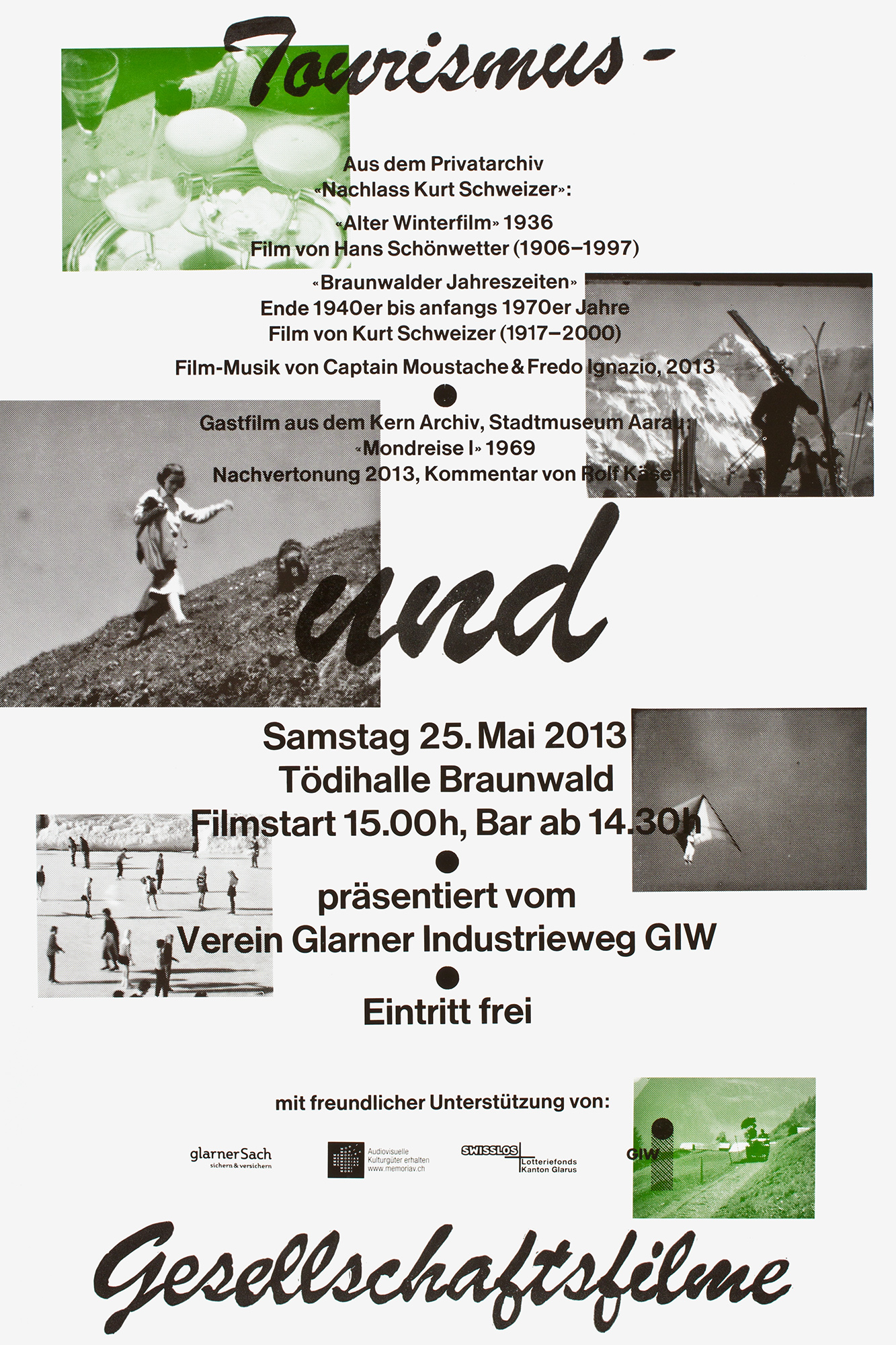
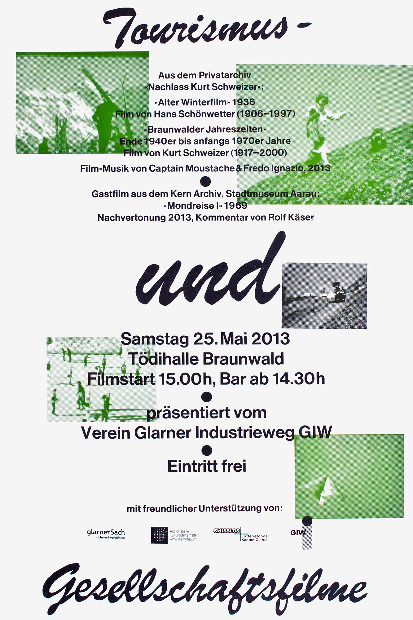
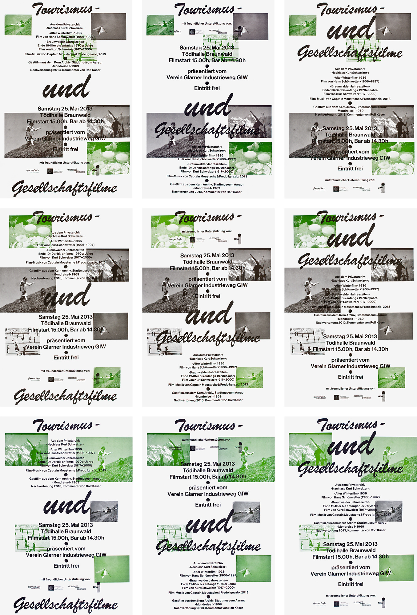
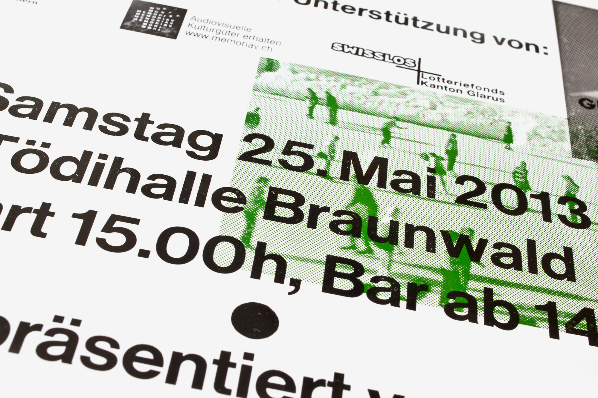
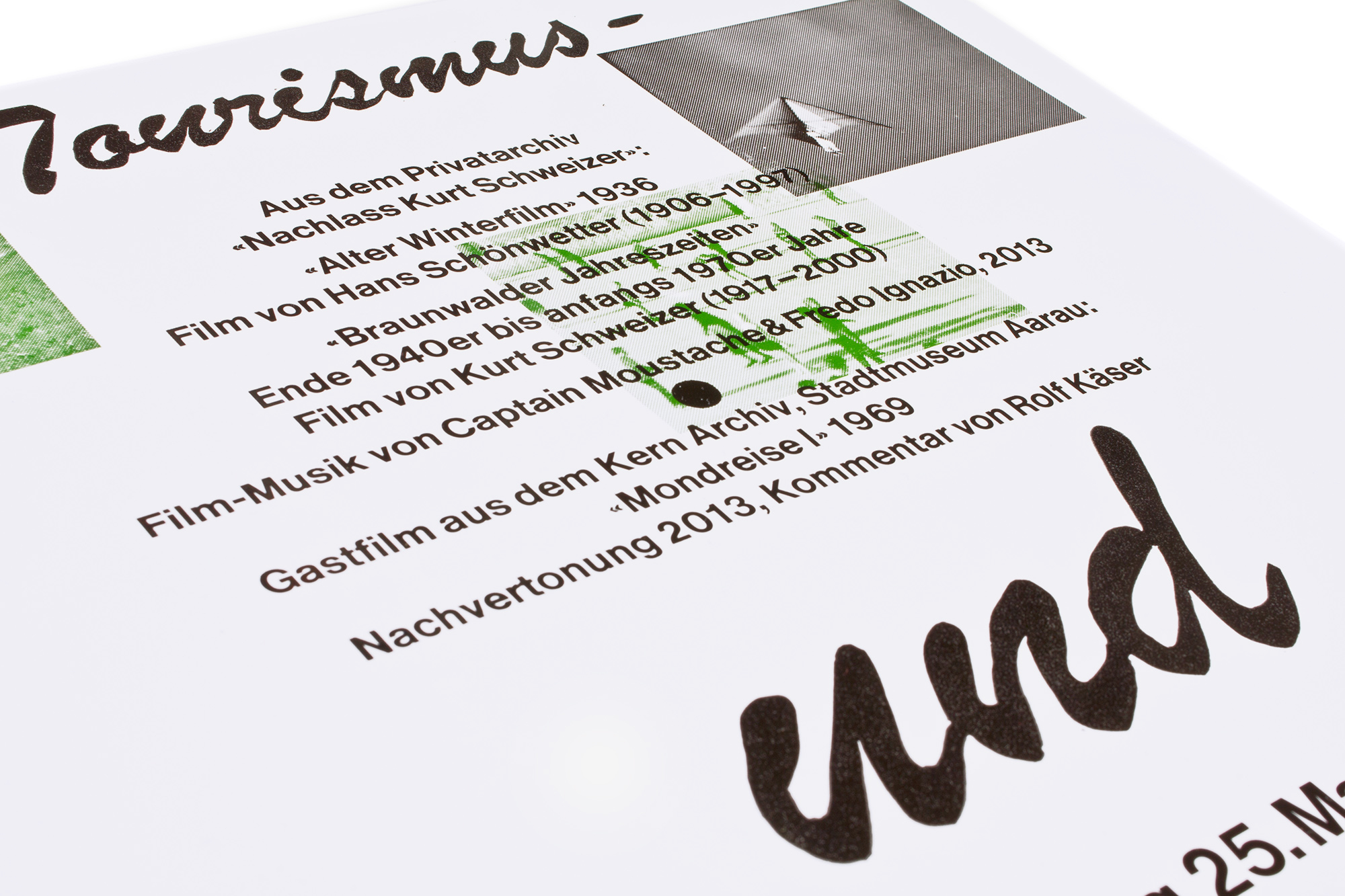
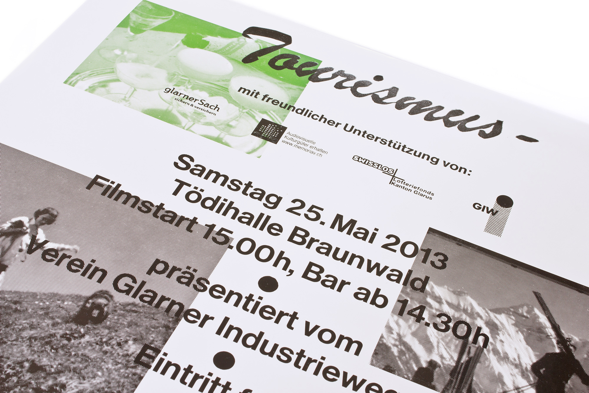
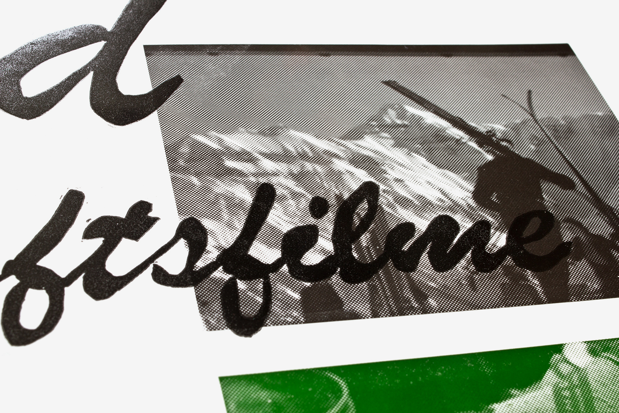
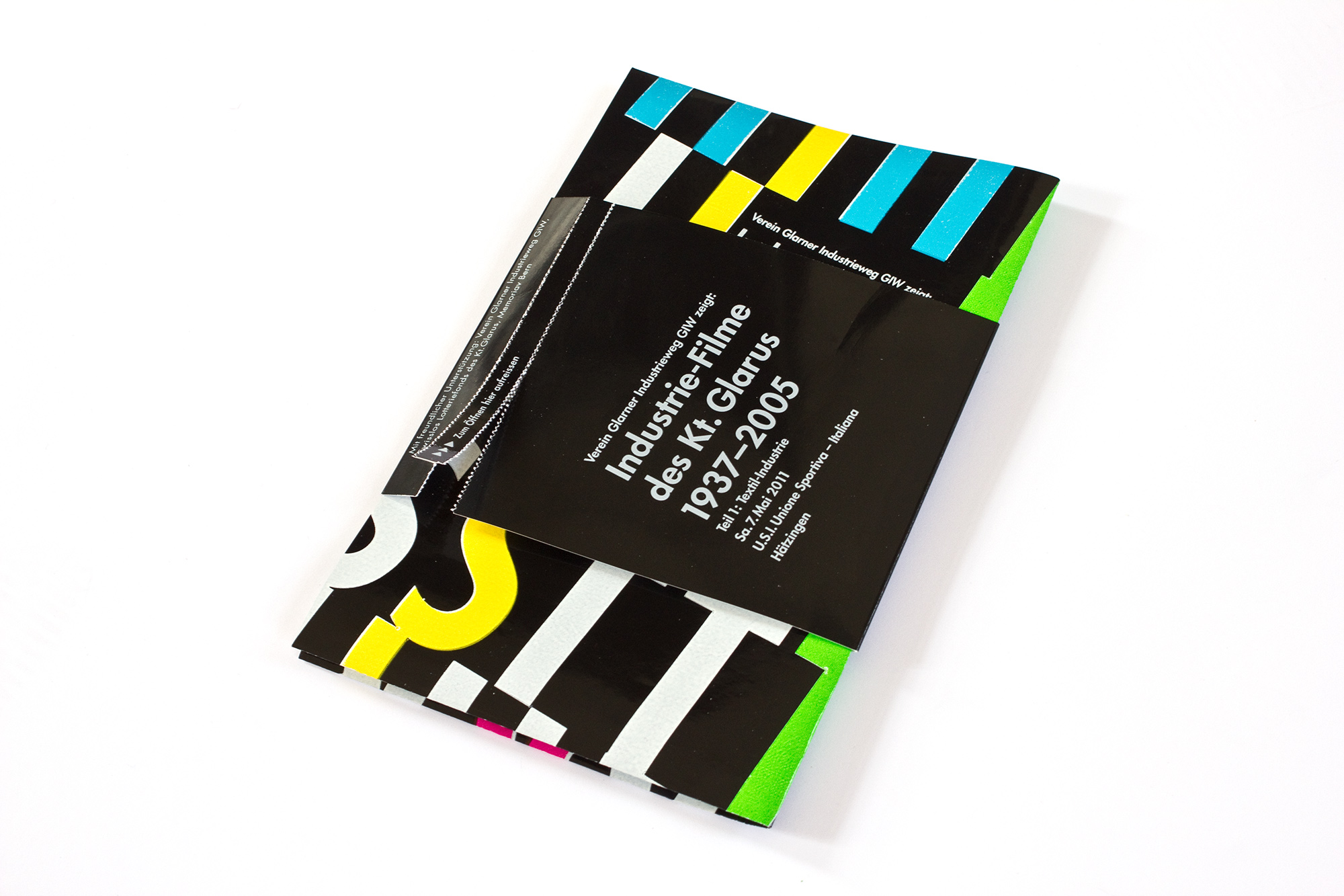
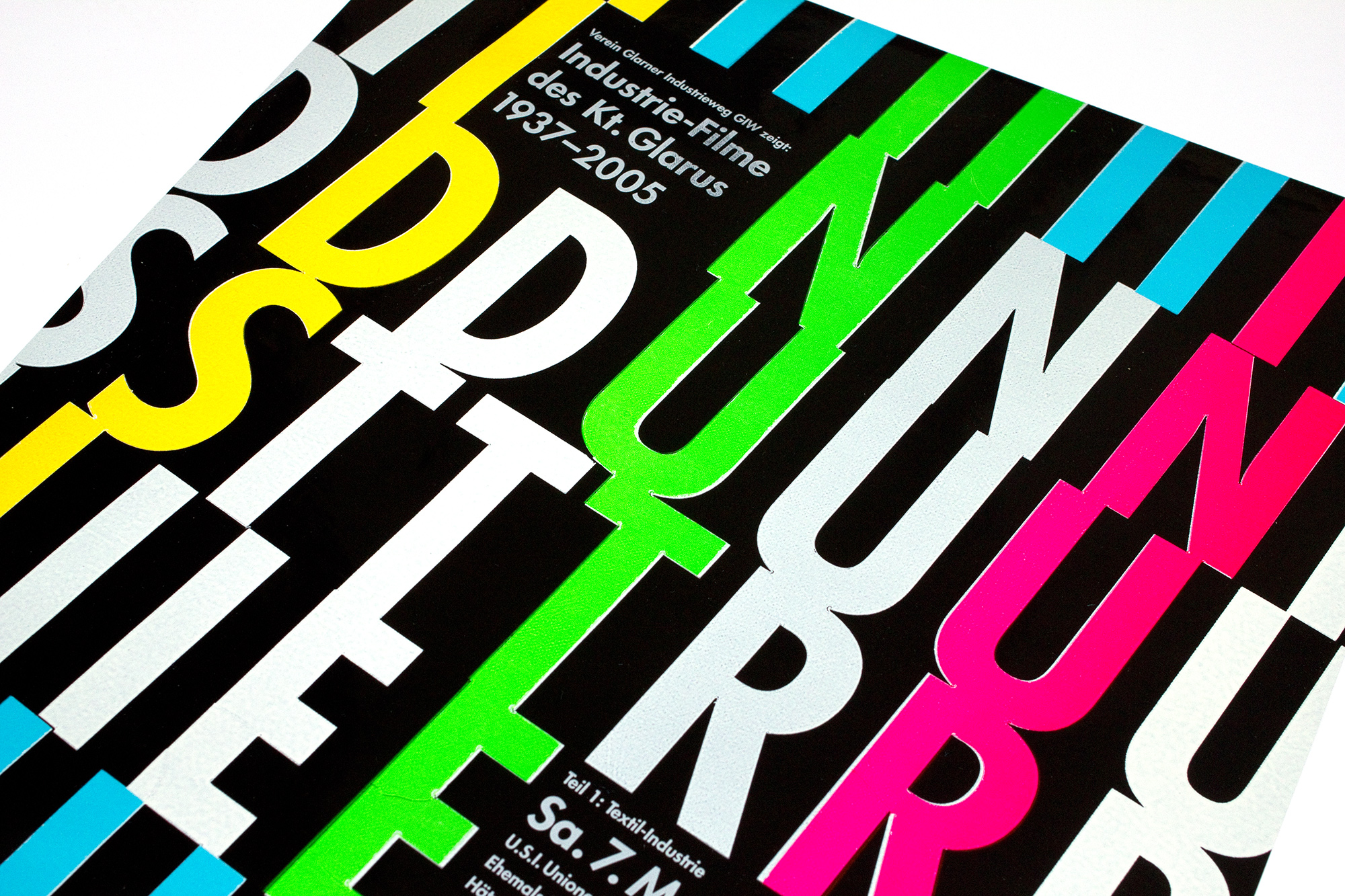
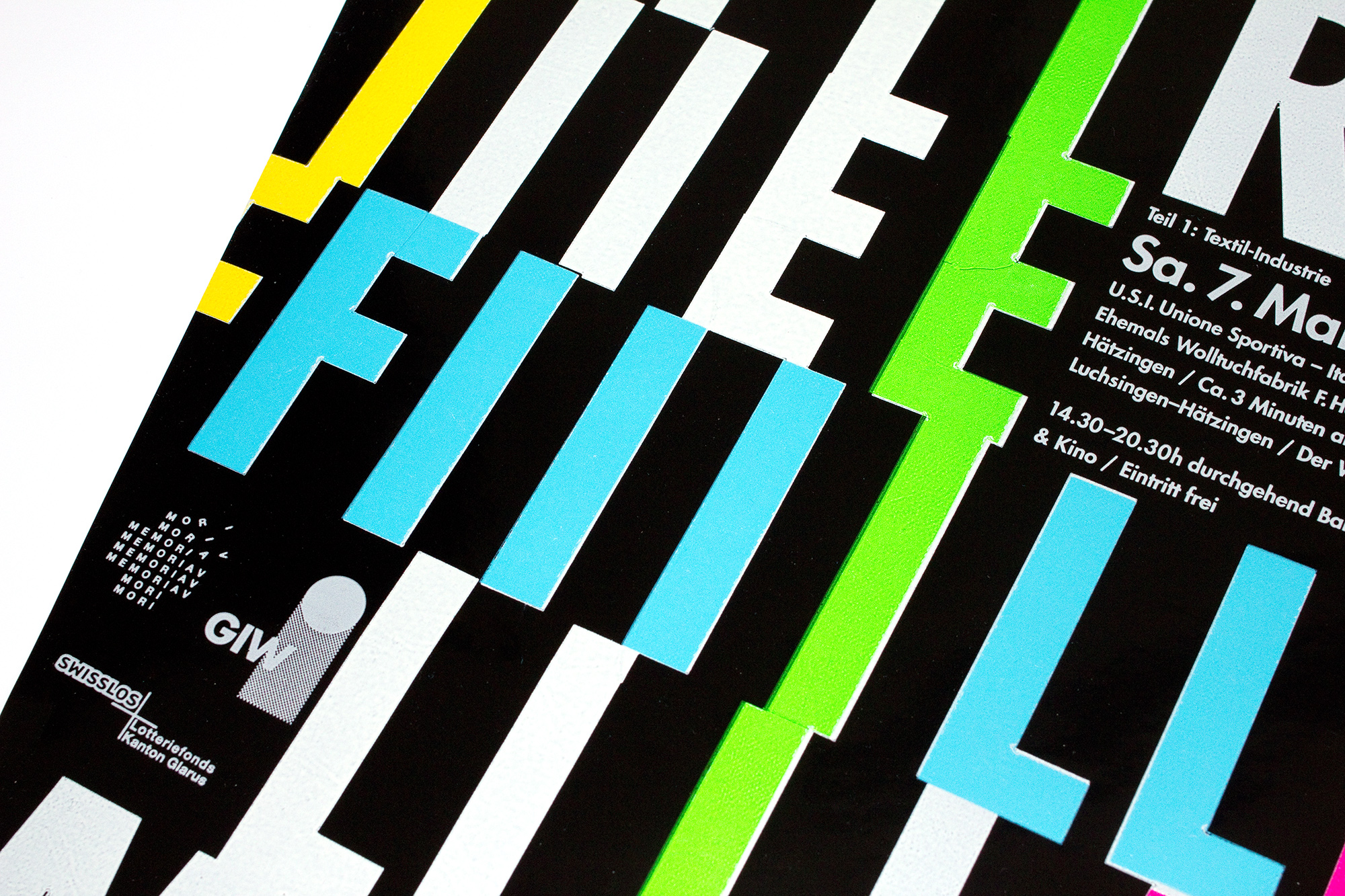
Tourismus- & Gesellschaftsfilme
550 letterpress printed posters for a movie screening of old tourism movies. This was part III of the Industrial movie project from 2012 and 2011. I used screenshots and made a total of 9 different layout versions.
I started with 3 different layout versions for the images. I printed about 180 of each version. Then I made 3 versions of the type block (with handset leadtype, linocuts and photopolymer logos) and I printed all three versions on every of the first three image-layous. 3×3 =9 ! So I could make a total of 9 different posterversions with just varying the positions of the images and the order of the information blocks.
Client: Verein Glarner Industrieweg, Glarus
Format: 35×52.5cm
Paper: Chromolux, 90g/m2
Edition: 550 posters on a FAG Control 405
February 2018
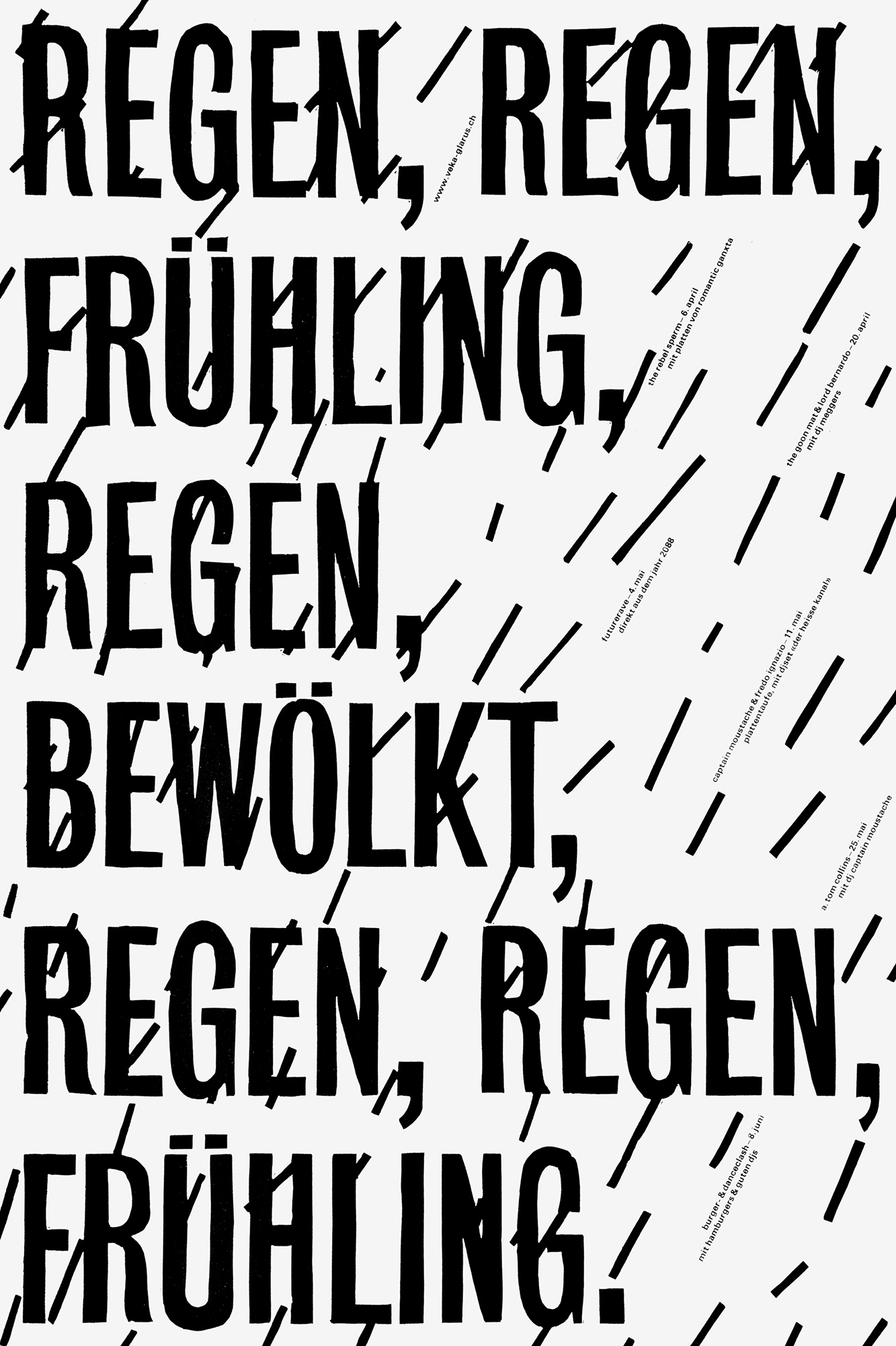
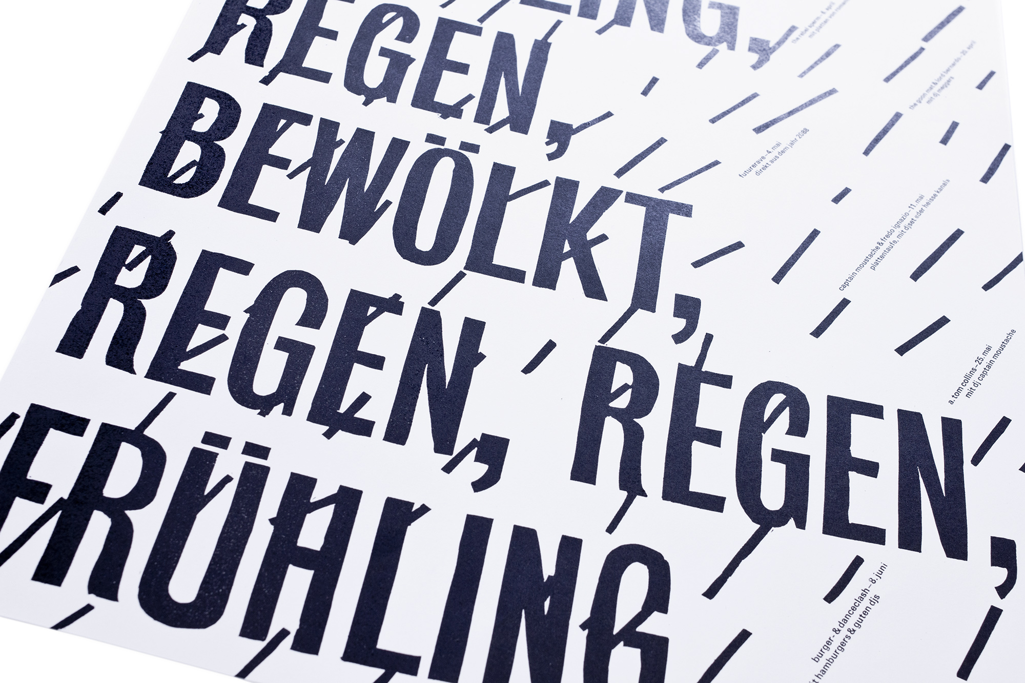
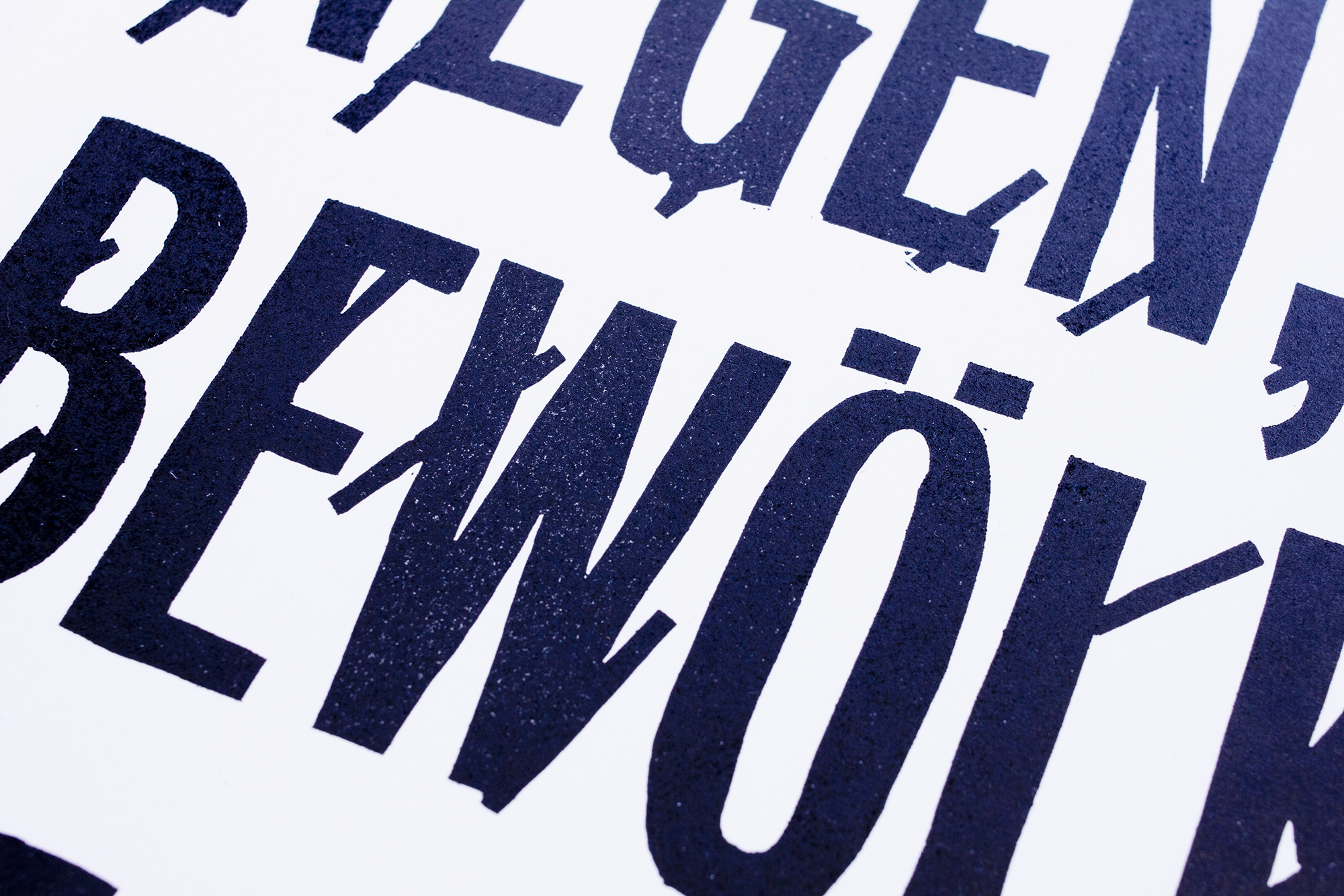
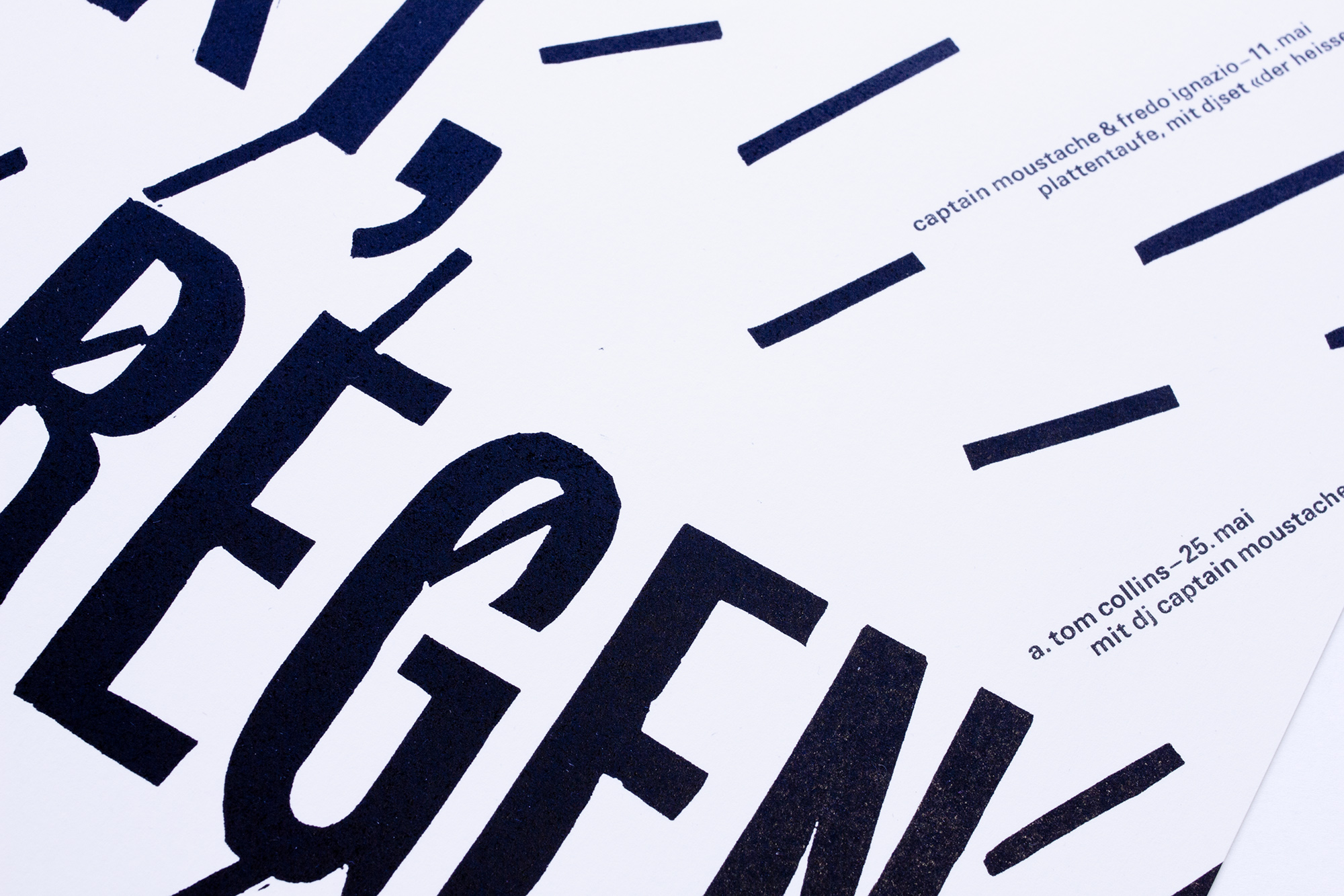
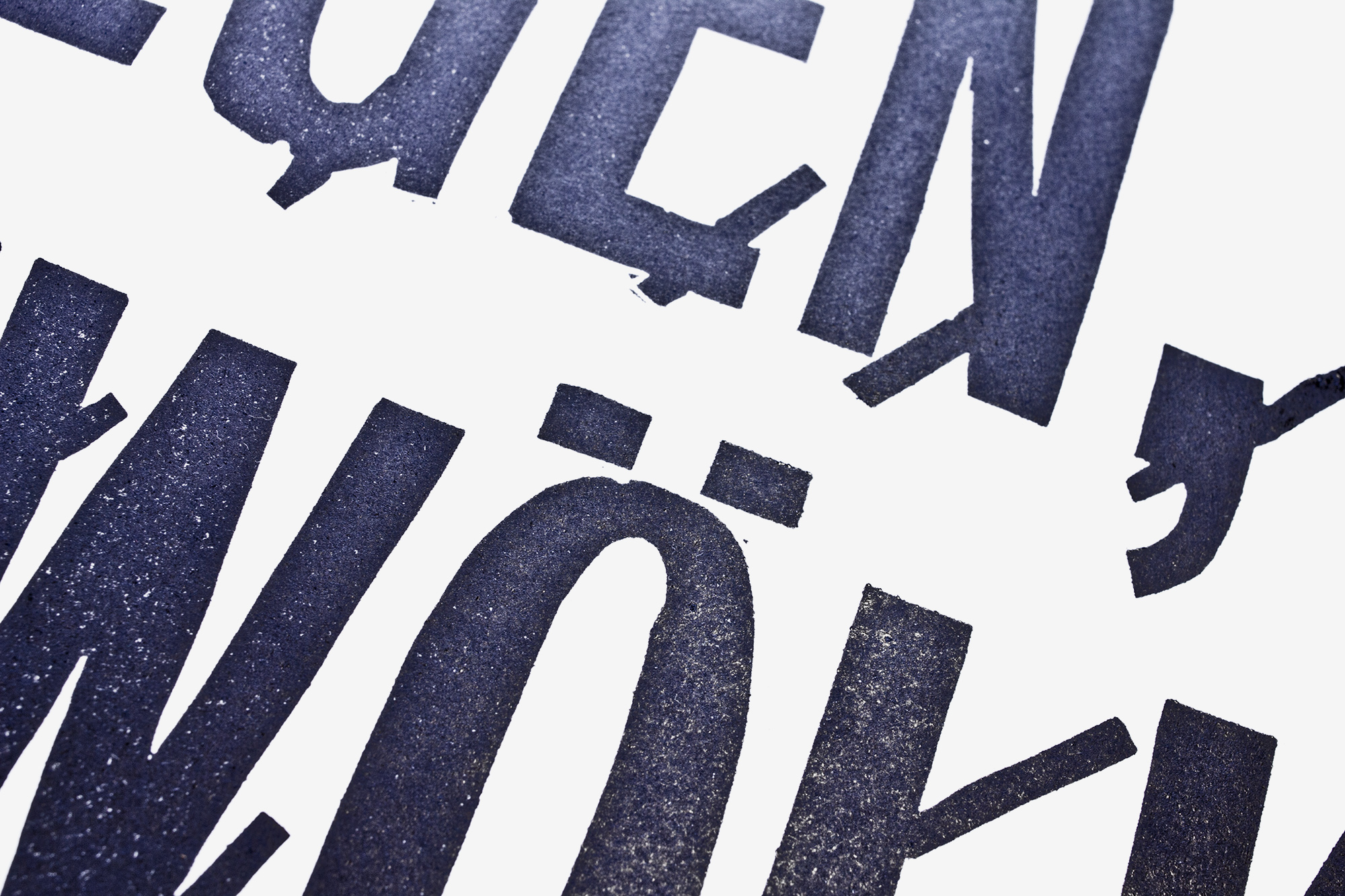
Regen, Regen
550 letterpress printed program posters for Veka-Glarus. Printed in two black coulour runs from lead type and a handcut lino block.
Since the weather is always a good topic to talk about I came out of the closet on my second profession as a weather prophet. haha. I predicted rain, rain spring weather, rain, cloudy rain, rain and spring weather. I proved very successful for this period and bad weather is also a good reason to go out on concerts.
Client: Veka-Glarus, Glarus
Format: 35×52.5cm
Paper: Munken Rough, 100g/m2
Edition: 550 posters on a FAG Control 405
April 2013
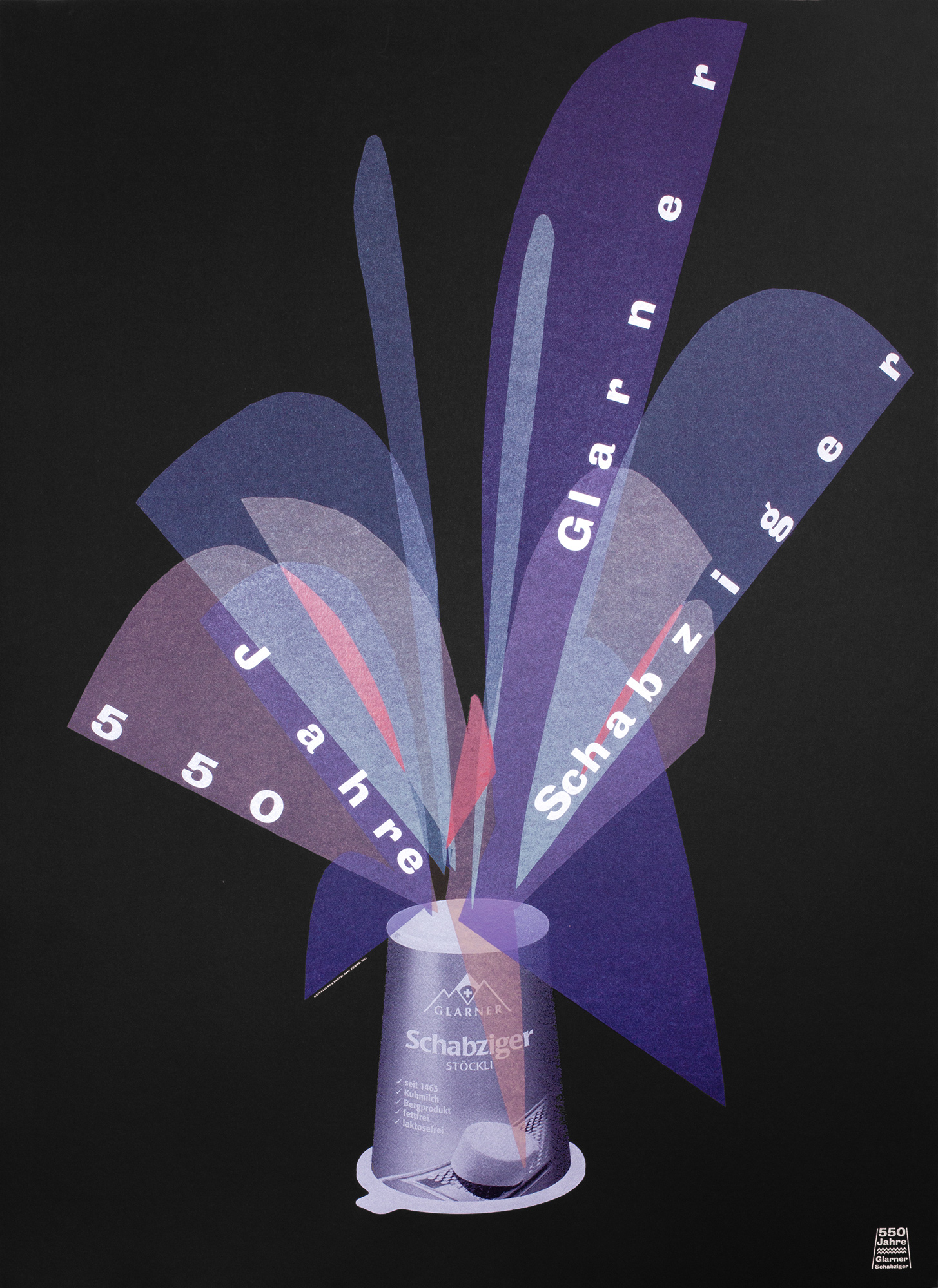
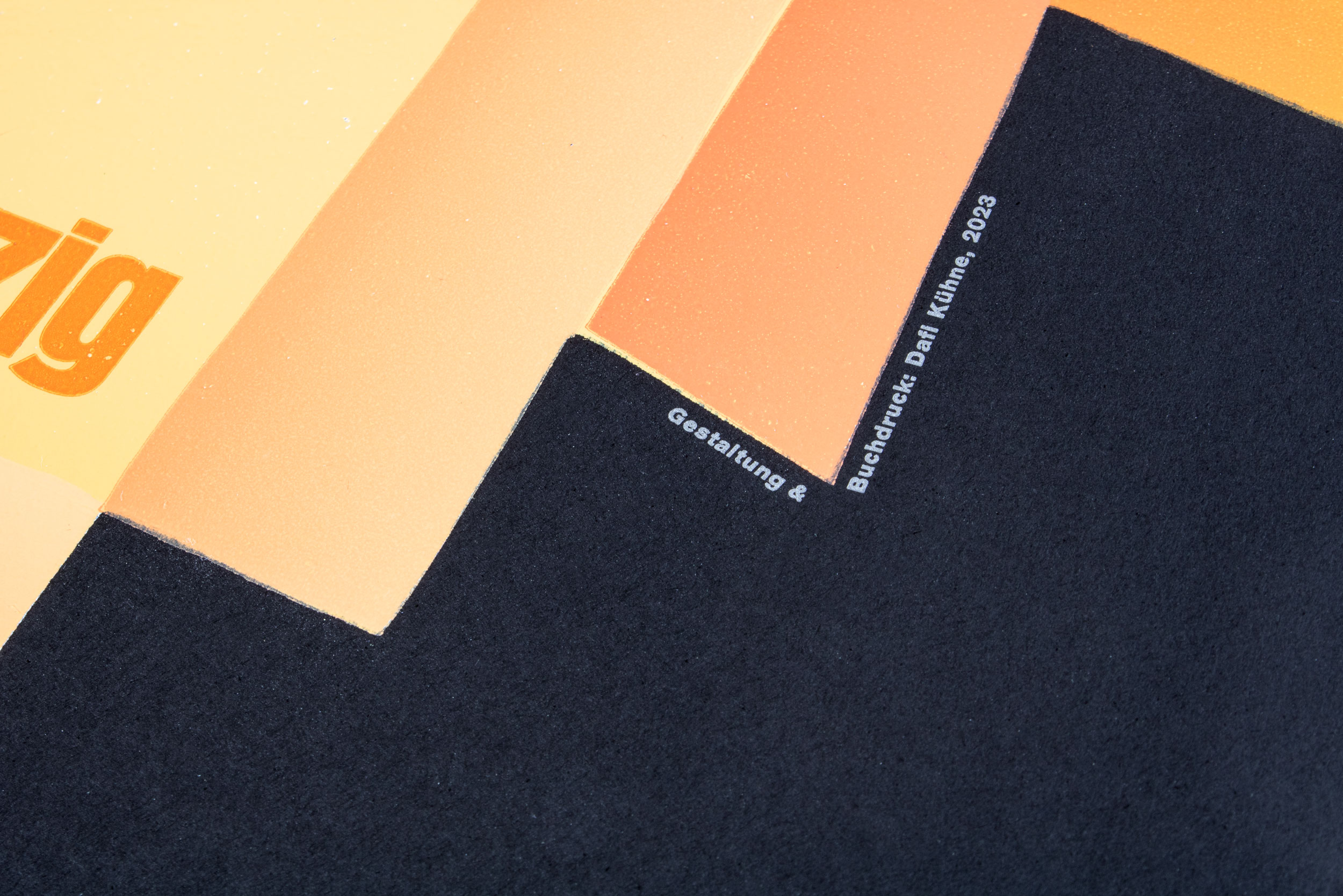
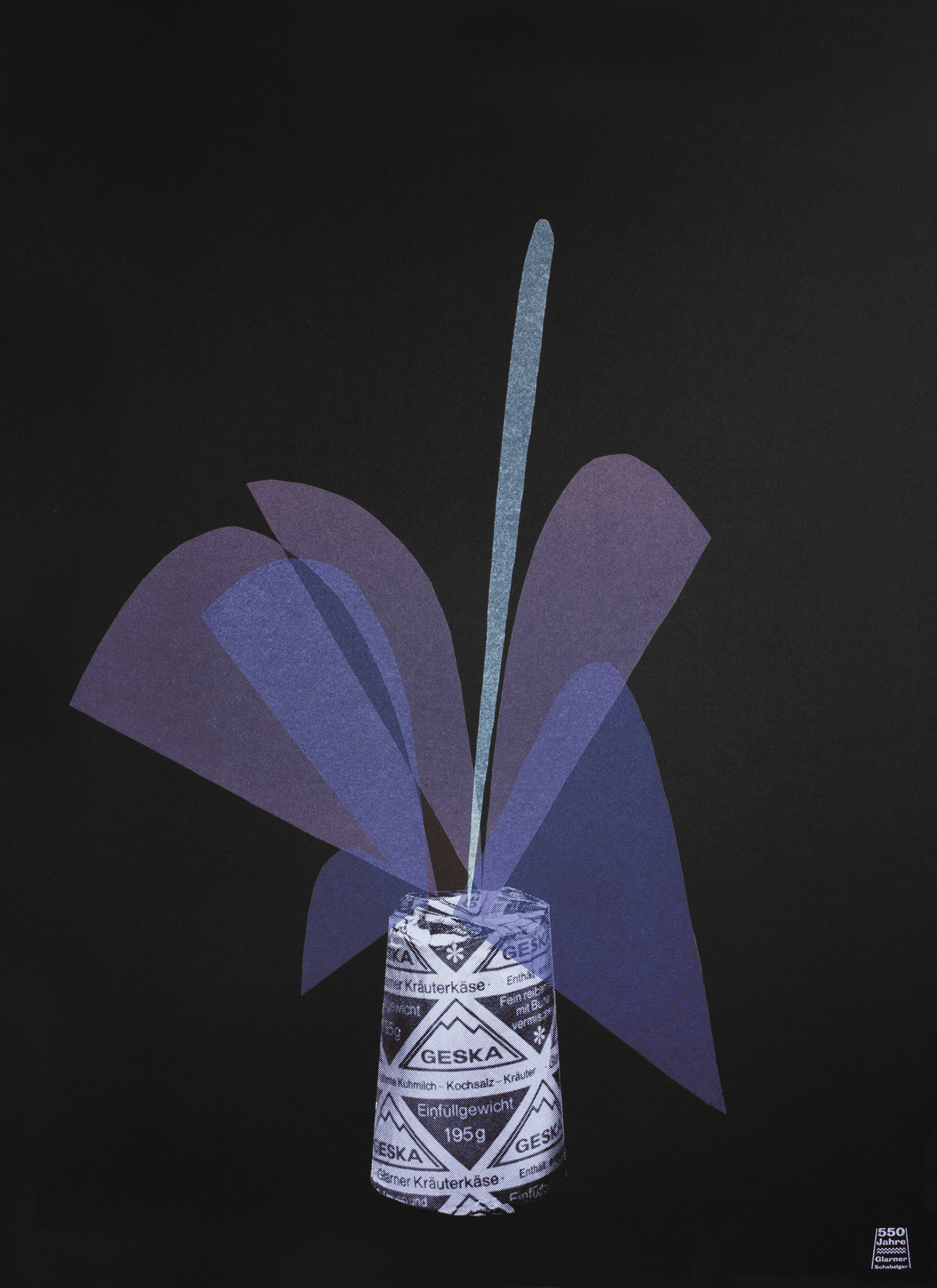
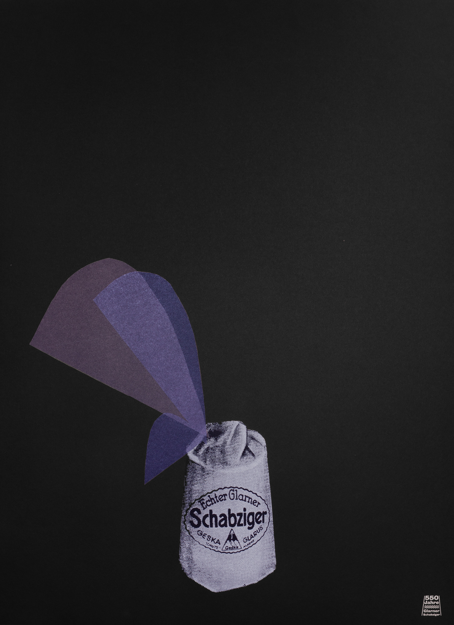
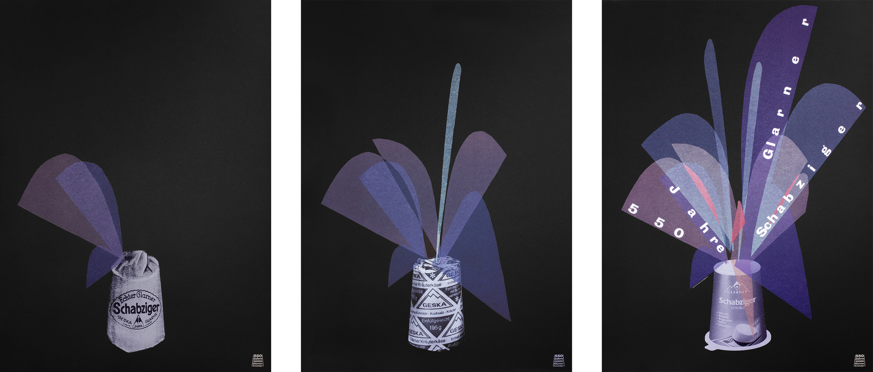
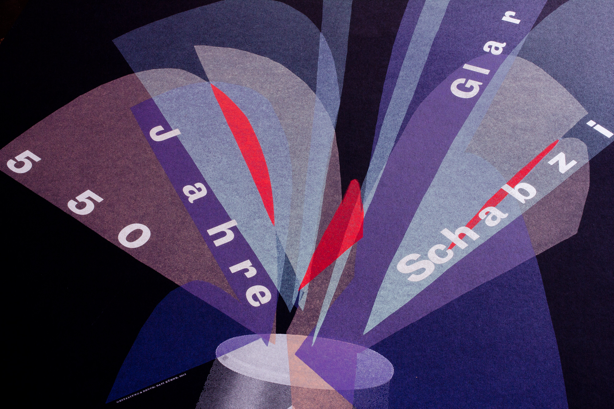
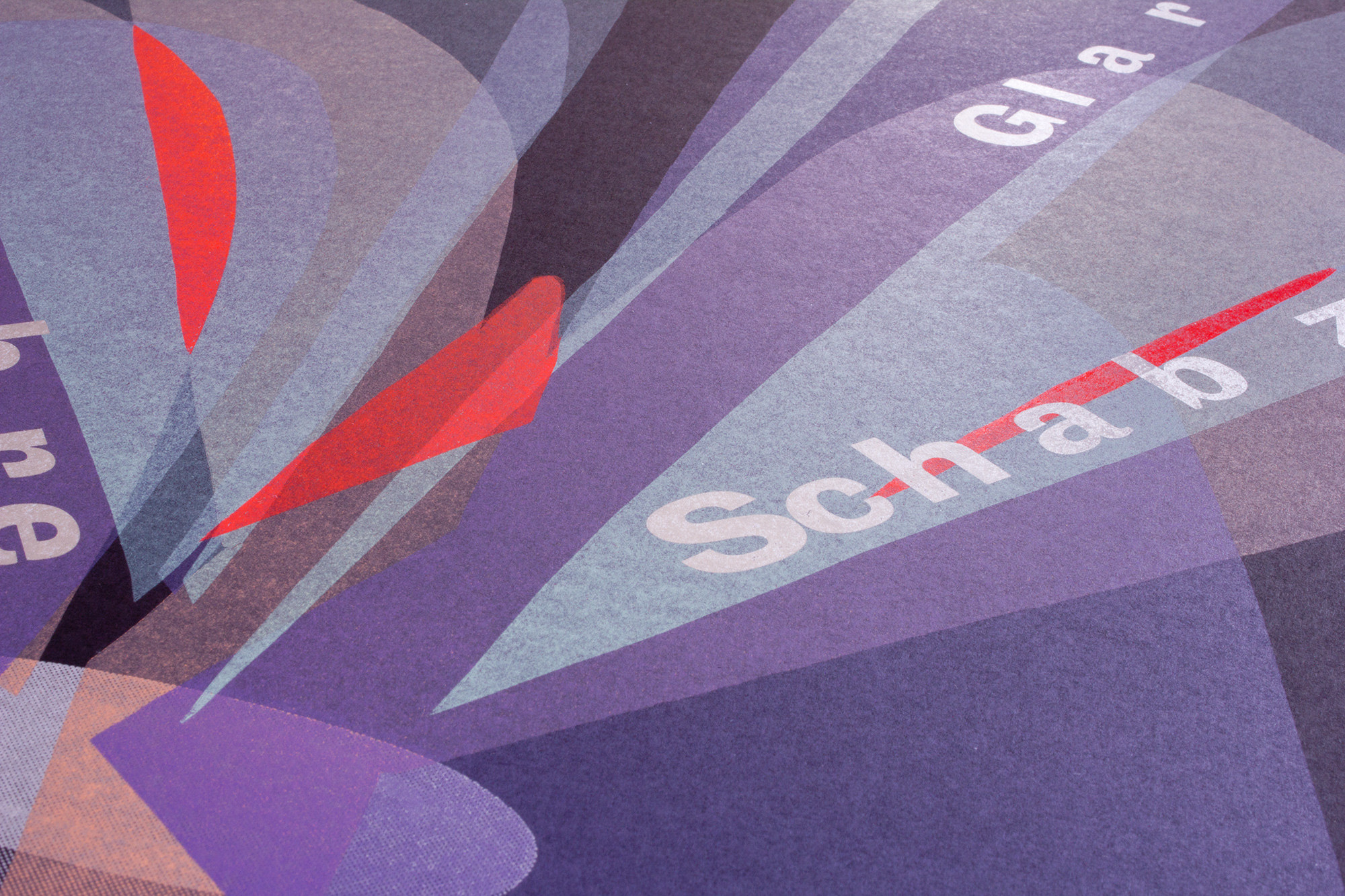
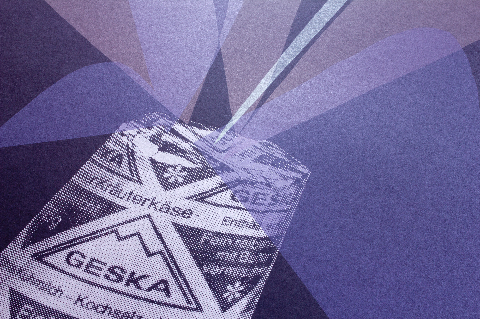
550 Jahre Glarner Schabziger
450 letterpress printed posters for a 550 years jubilee of a very smelly traditional Swiss cheese! You’ll love this cheese or totally hate it—there is not much more between that.
The design process started off by going through their archive of magnesium photoplates of old packagings. Another topic was to bring in the idea of an exposion of flavors. There is also a volcano fireworks in Switzerland, that is often called ‹Zigerstöckli›, like the cheese. So we have the old packaging, the explosion of flavours and the imitation of that volcano fireworks, which all matches perfect to this jubilee!
Client: Geska, Glarus
Format: 64×88cm, series of 3 posters
Paper: Pop’Set Black 240g/m2
Edition: 450 posters on a FAG Control 900
April 2013
Modular Linocut
600 letterpress printed program poster for Veka-Glarus. Nine geometric blocks have been cut and 5 different layout versions have been made with these blocks. Each layout has been printed in a different color.
Client: Veka-Glarus, Glarus
Format: 34.4×55.3cm
Paper: Sirio Color Celeste 115g/m2
Edition: 600 posters on a FAG Control 405
January 2013
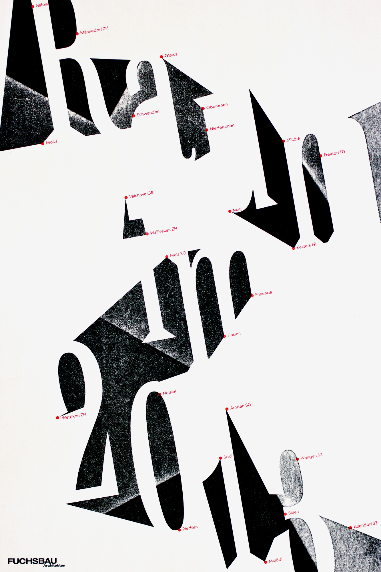
Space in 2013
350 letterpress printed new years posters for some architects. Its all about new forms of spaces and the spots where they gonna build something in 2013.
The whole design process was about creating 3d spaces with simple shapes and grayscale tones. I wanted to use the spaces between the letters – not just fill them with different grayscale tones, but also bring in the appearance of three dimensional spaces in between the letters. The shapes have been lasercut from an MDF block and the grayscale tones have been added by applying a different amount of pressure to the different parts of that printing block (pressure print).
Client: Fuchsbau Architekten, Näfels
Format: 34×51cm
Paper: Munken Pure Rough, 100g/m2
Edition: 350 posters on a FAG Control 405
December 2012
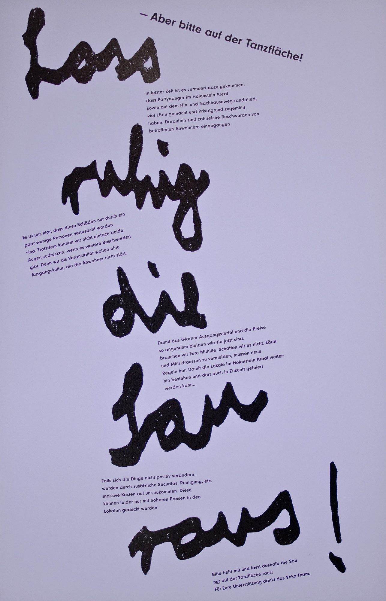
Lass ruhig die Sau raus
30 letterpress printed posters for a local anti vandalism campaign. ‹Lass ruhig die Sau raus!› stands for ‹Come on, get wild!› – but please on the dancefloor…
The large type has been handcut from chipboard to give it some trashy, wild handwritten aestetics with lots of distress. Its printed with to few ink and pressure so you could see the rough surface of the cardboard on that print. Then the clean smaller copy is some much more serious information about the problems with local vandalism.
Client: Veka-Glarus, Glarus
Format: 50×70cm
Paper: Kaskad fliederblau, 160g/m2
Edition: 30 posters on a FAG Control 900
November 2012
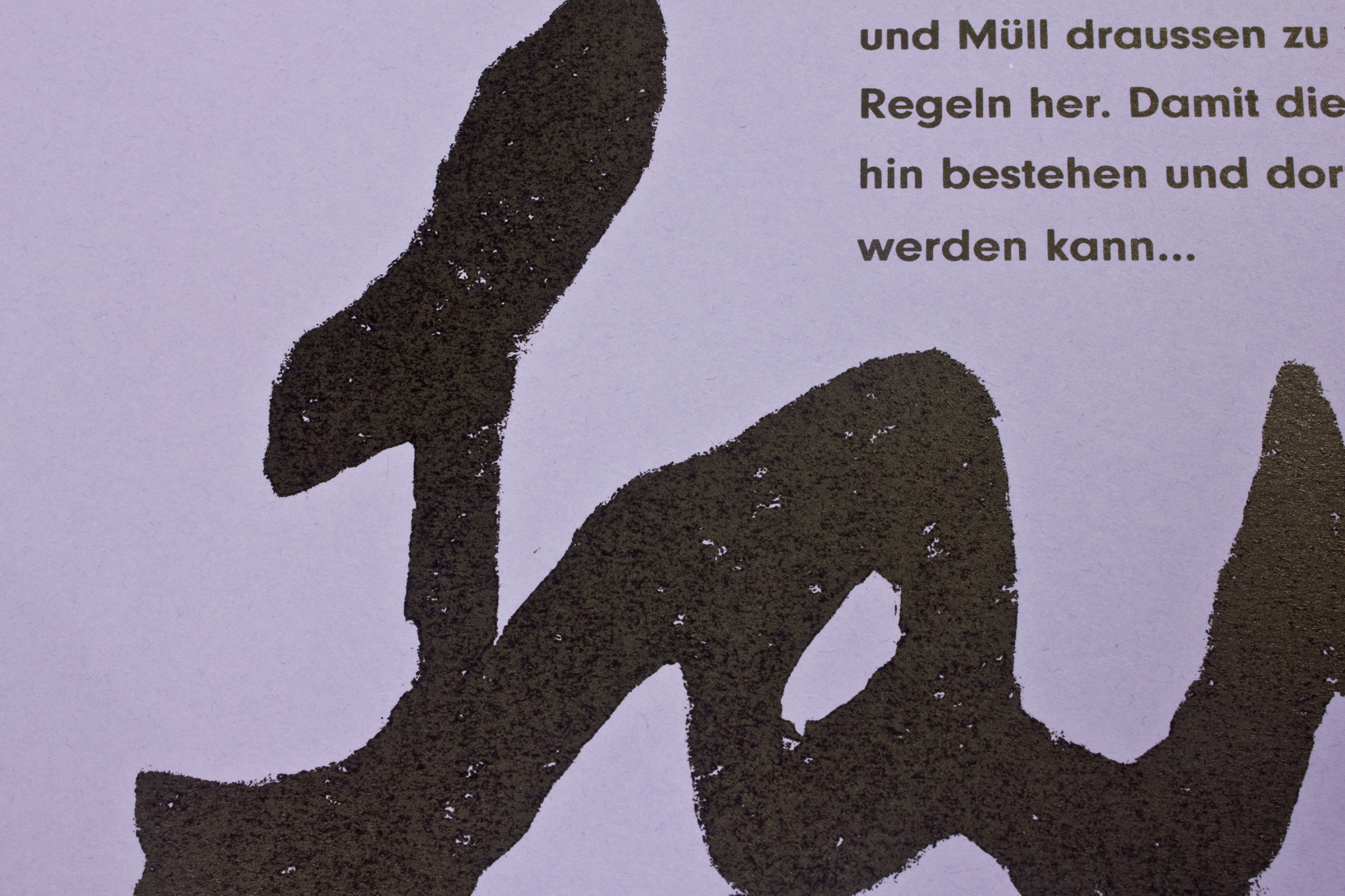
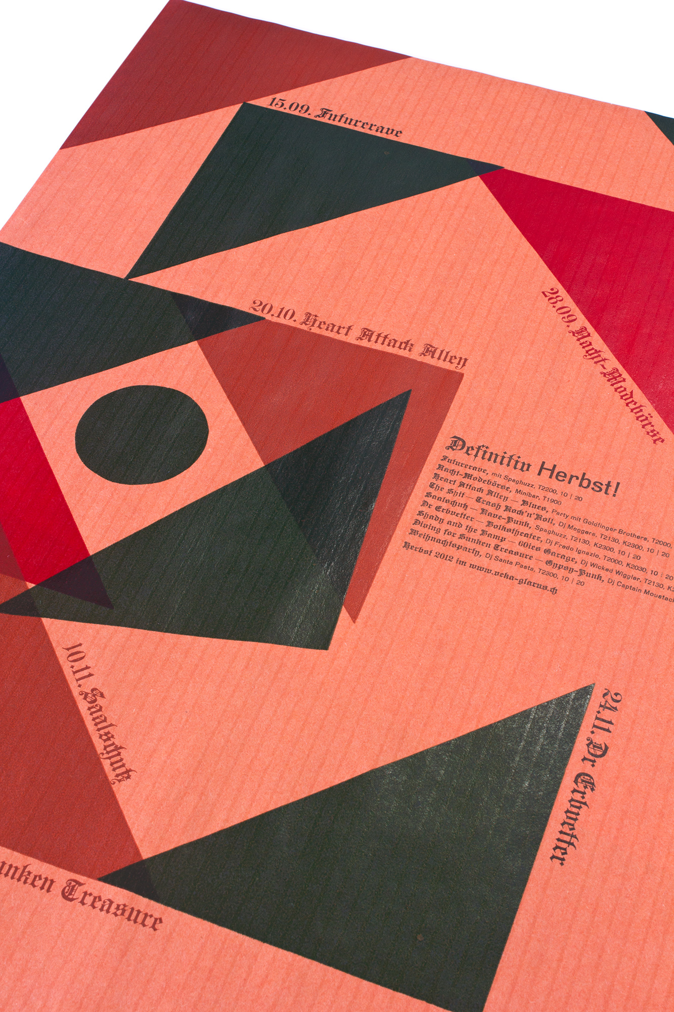
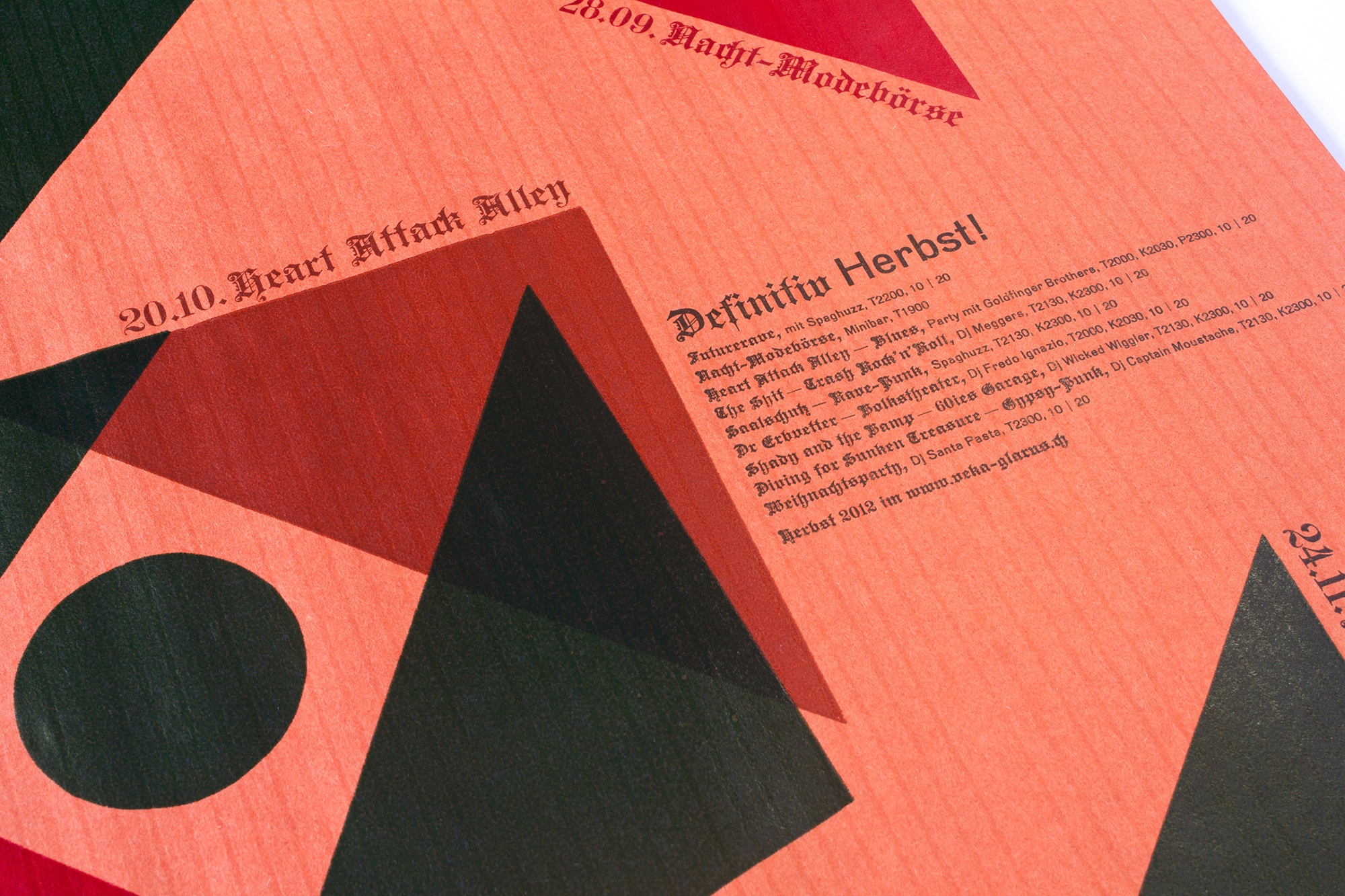
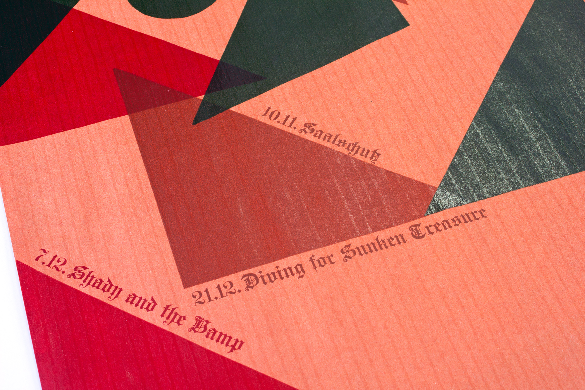
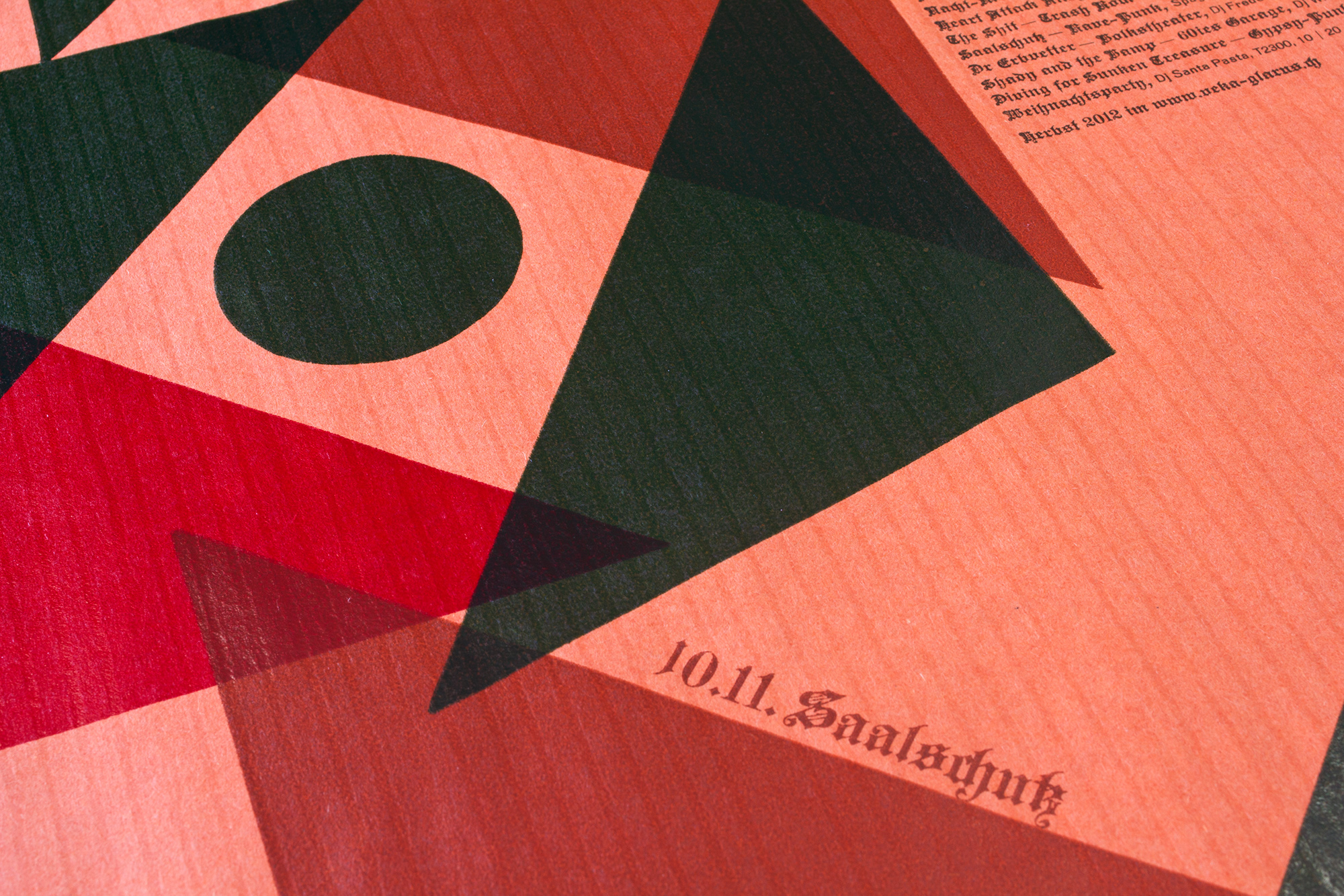
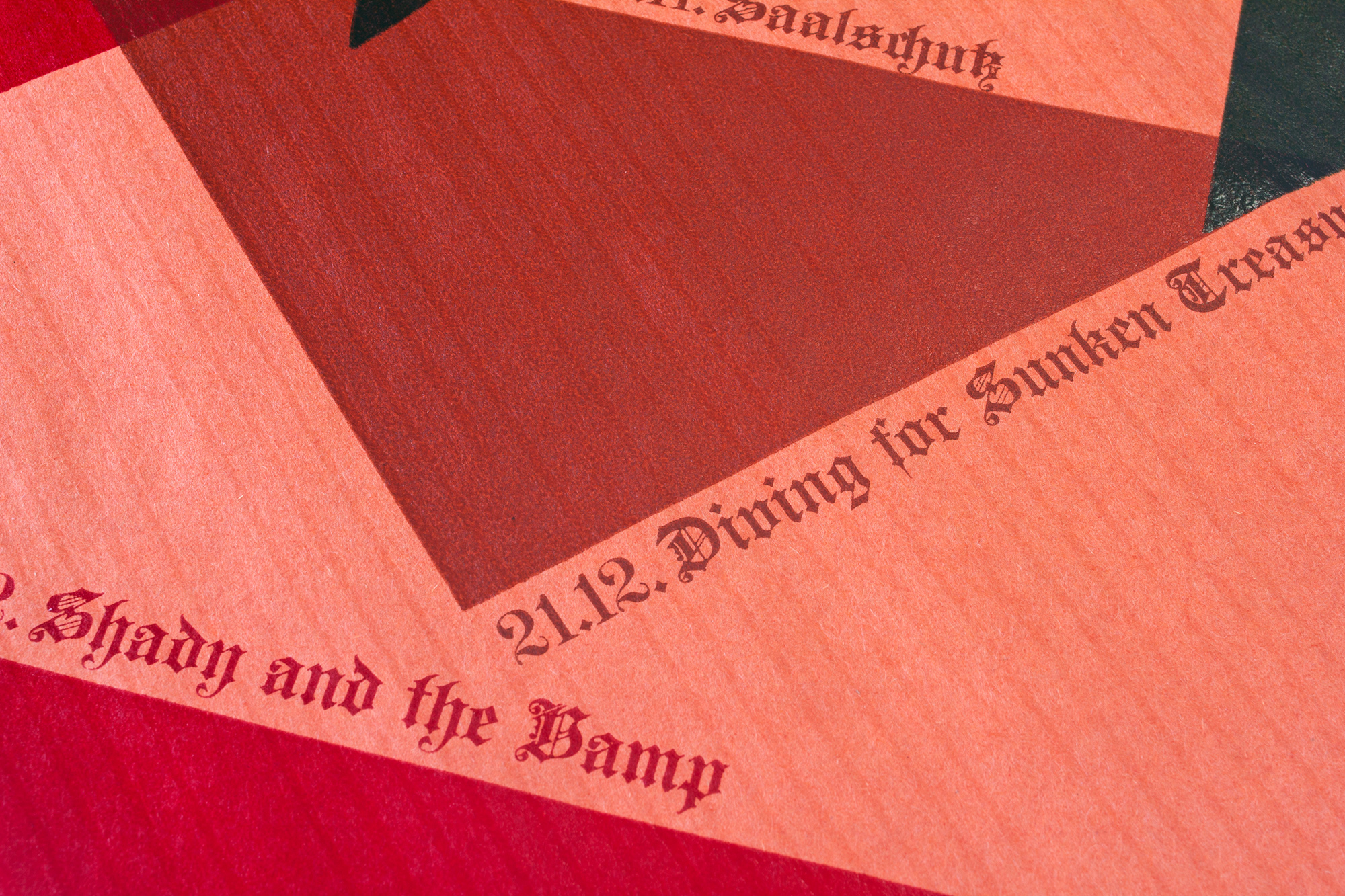
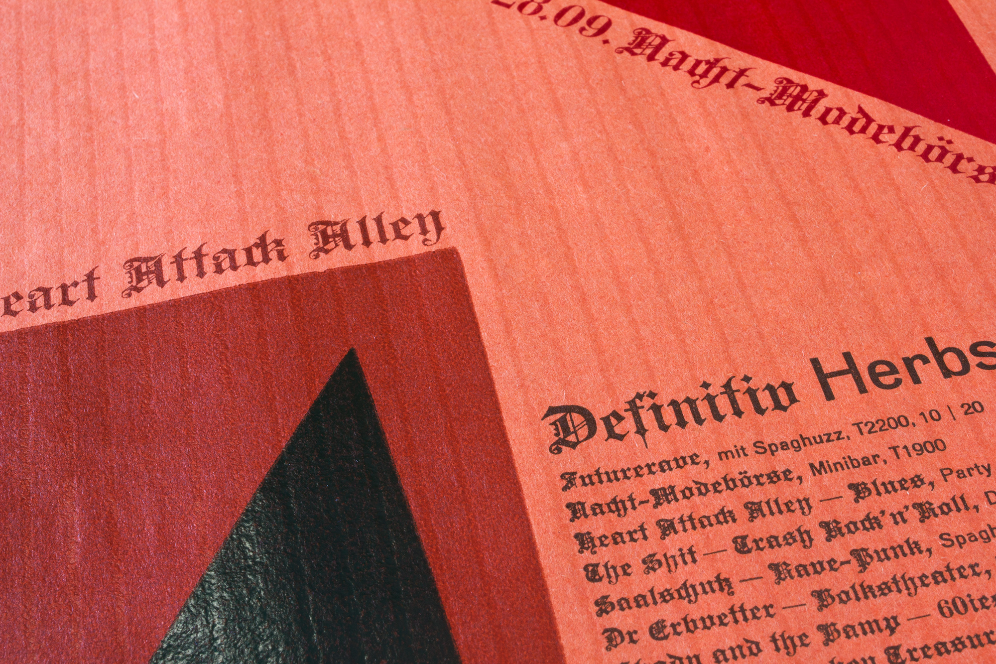
Definitiv Herbst!
500 letterpress posters for the program of veka-glarus.ch. Printed in 6 colourruns from lino-triangles and traditional lead type.
The concept was to make a geometric arrangement that seems to start to fall apart. Like the leafs that start to fall from the trees. For the paper I took this very old craft paper from an old typefoundry (they used to wrap up type with this paper!). The colour mood was very important with that poster.
These posters have been machine-folded and sent out to the club members.
Client: Veka-Glarus, Glarus
Format: 37.5×55.6cm
Paper: 40 years old craft paper
Edition: 500 posters on a FAG Control 405
September 2012
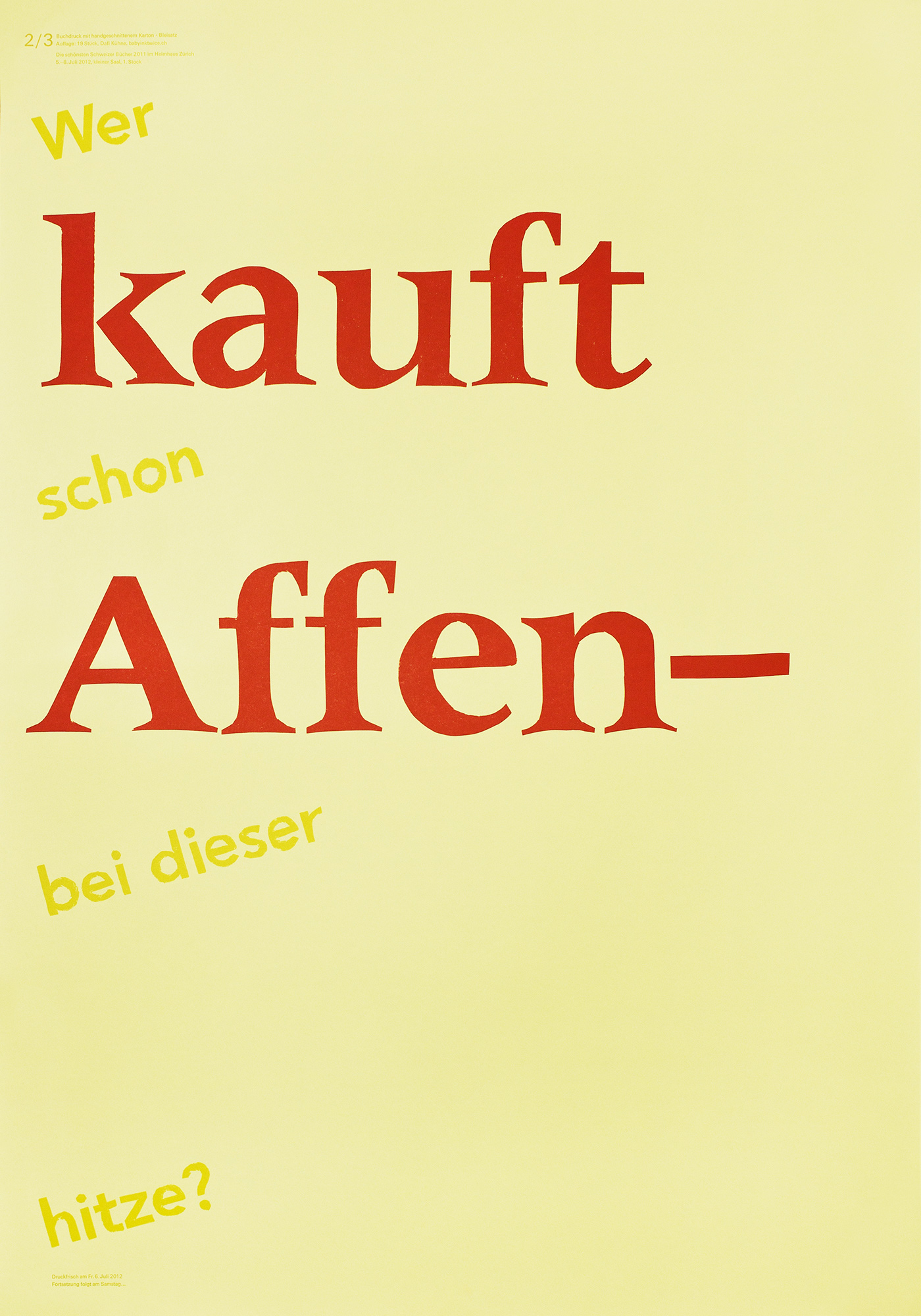
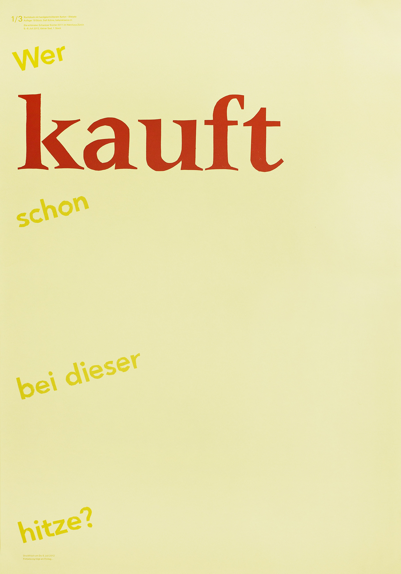
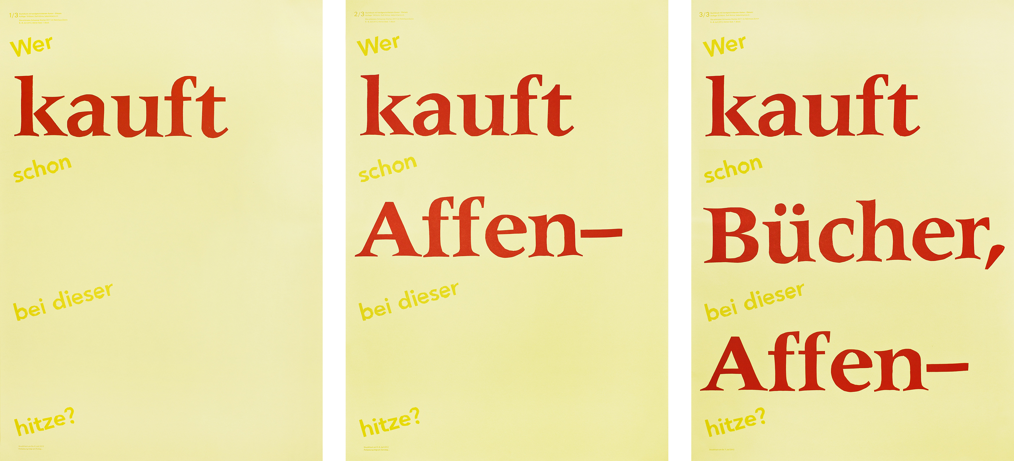
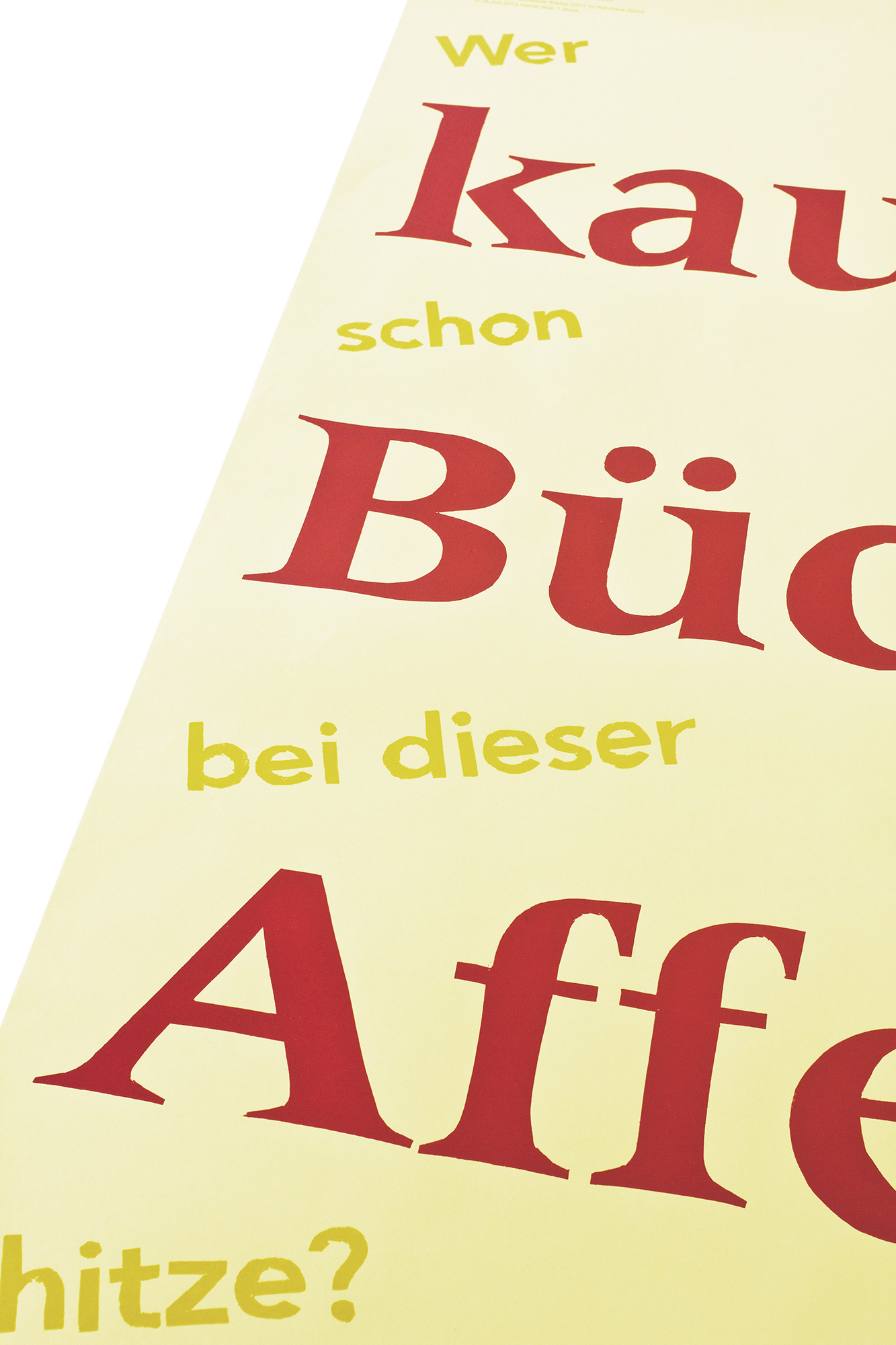
Kauft Bücher, Affen–
A series of 3 letterpress posters for a popup bookstore at the ‹100 most beautiful Swiss books›-exhibition. Over three days, every day a new poster got hung up.
The first message was: ‹Who buys at this heat?› – with the main message ‹Buy!›. The second message was: ‹Who buys monkeys, at this heat?› – with the main message ‹Buy monkeys!›. The third message was: ‹Who buys books, at this monkey heat?›* – with the main message ‹Buy books, monkeys!› *The translation of ‹Affen-Hitze› (monkey heat, haha) would be: ‹…at this scorching heat!›
Client: 100 Schönste Schweizer Bücher
Format: 70×100cm
Paper: Rainbow hellgelb, 80g/m2
Edition: 89 posters on a FAG Control 900
July 2012
Endless Spiral
500 letterpress posters for the program of veka-glarus.ch . All handset wood and metal type. All good old and slow hand work. No computerized highspeed shit. haha
The concept was to have a repetition of the content in different sizes to give the impression of flipping, rotating and scaling. Rhythmic like music, like a stack of postcards lying on the floor. Like an endless spiral in the universe.
Client: Veka-Glarus, Glarus
Format: 37.4×55.8cm
Paper: Popset, spring green, 90g/m2
Edition: 500 posters on a FAG Control 405
May 2012
Industrie- & Gewerbefilme
Follow up project for last years ‹Industriefilme› poster. For this poster I used screenshots from the actual industrial- and crafts-movies from the 1940ies and 1960ies.
The large and black letters symbolize the heavy industrial production in the shown movie about a village building a hydro-electric power plant in the 1960ies. On the other hand there is these colourful images, that symbolize the craftswork of some established shops in that same village in the 1940ies.
Client: Verein Glarner Industrieweg, Glarus
Format: 25.5×56cm
Paper: Chromolux Superweiss, 80g/m2 / 250g/m2
Edition: 519 posters on a FAG Control 900 and 405
April 2012
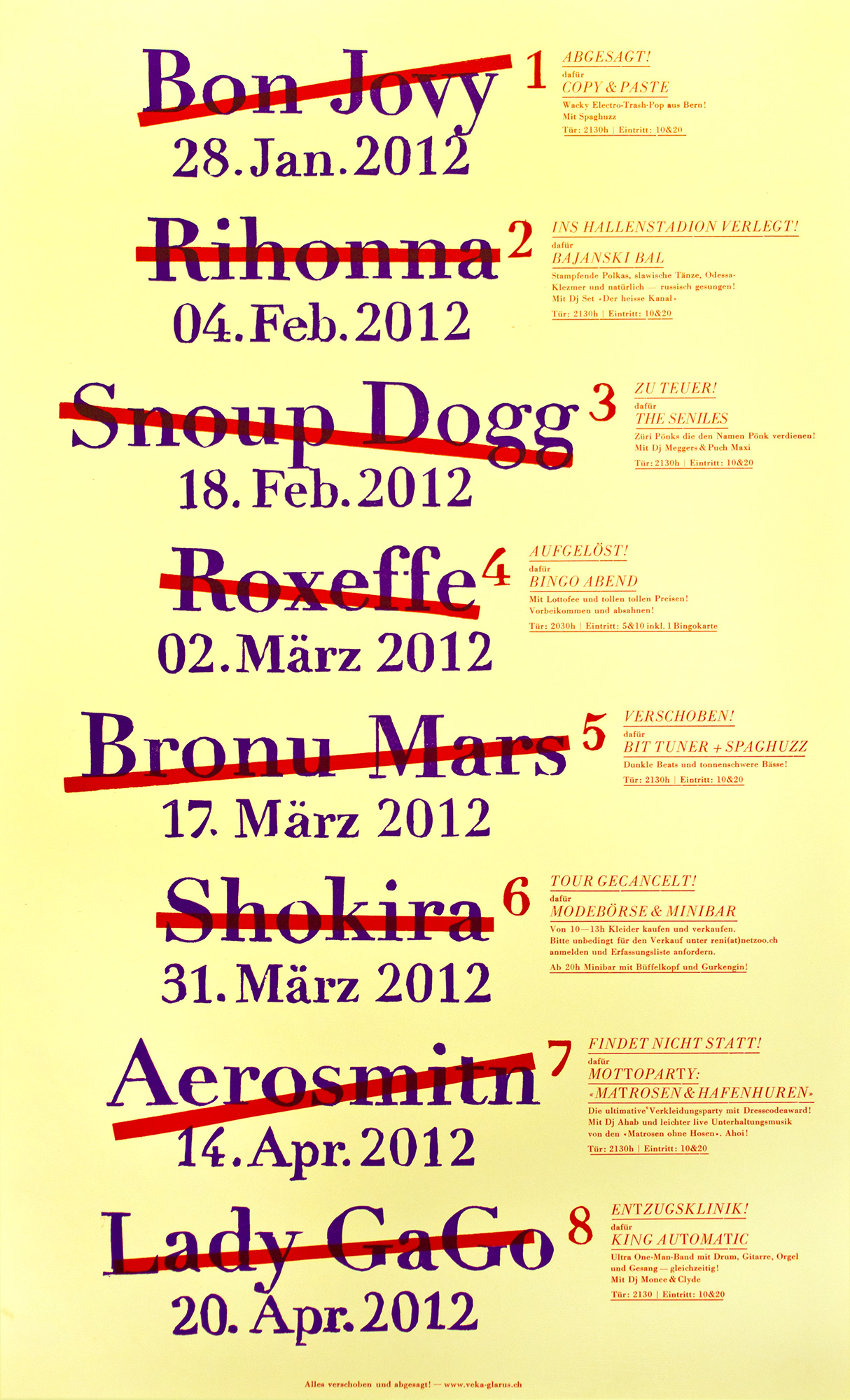
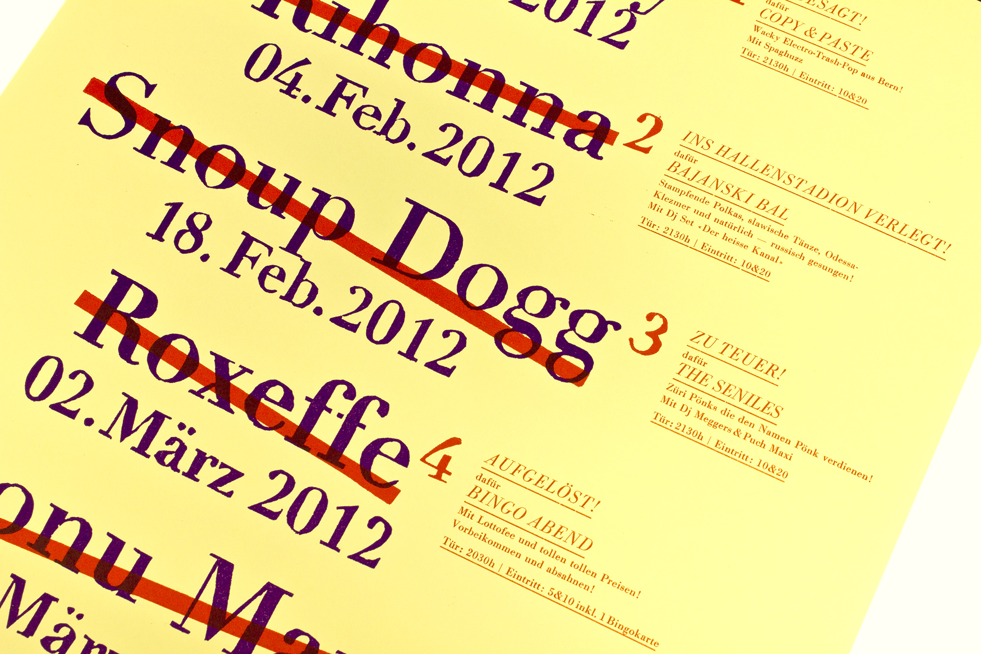
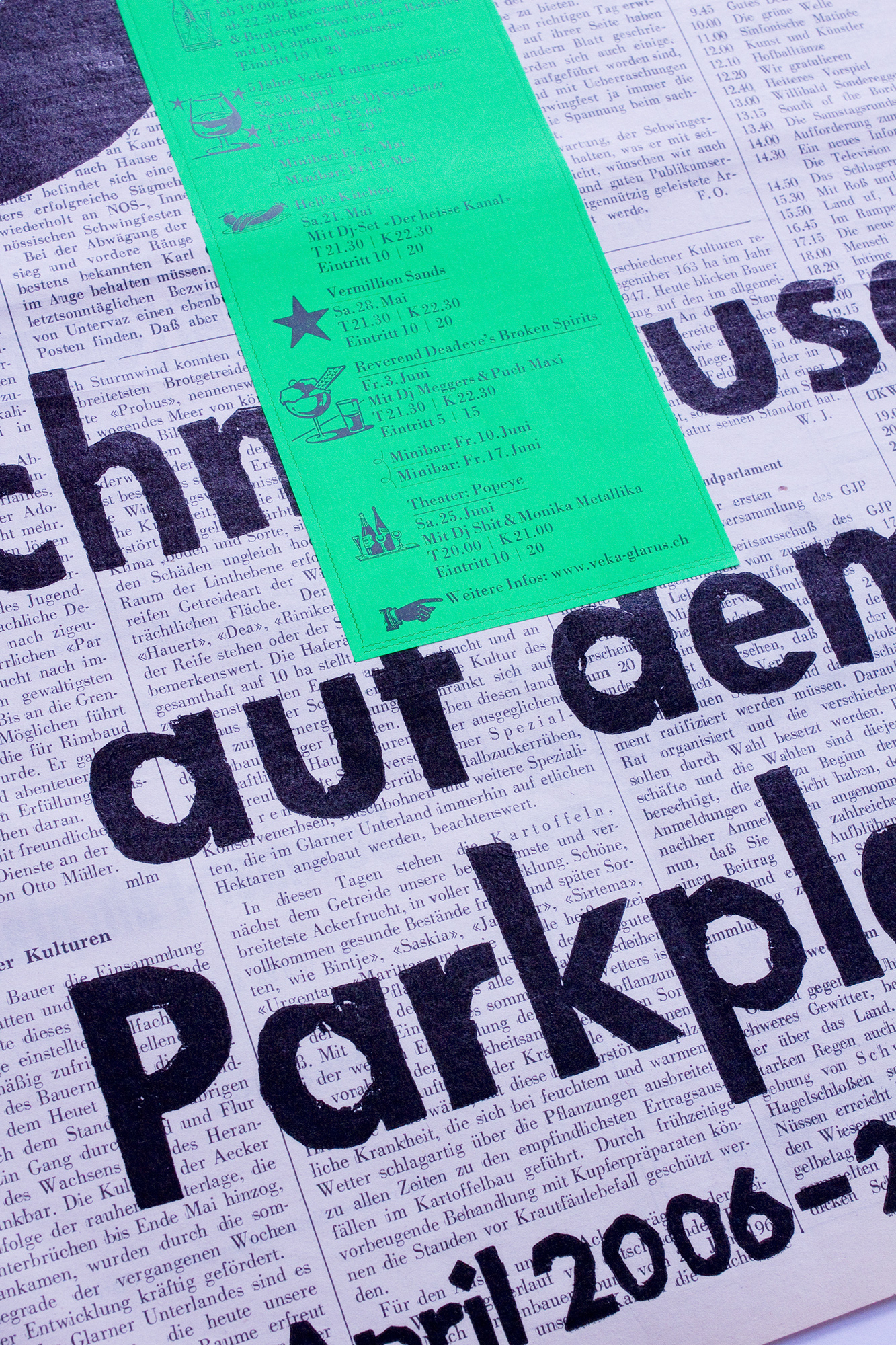
Alles verschoben und abgesagt!
Everything canceled and rescheduled — 400 letterpress posters for the program of veka-glarus.ch . Unfortunately all shows had to be canceled on that poster. But there was a pretty good alternative program…
The «canceled» shows have been crossed out and in the sidenote there is a fake reason like «rescheduled» or «too expensive» and the information about the alternative event. This poster was my reaction of some shows have being canceled on the last progra from fall 2011.
Client: Veka-Glarus, Glarus
Format: 34×56cm
Paper: Rainbow hellgelb, 120g/m2
Edition: 400 posters on a FAG Control 405
January 2012
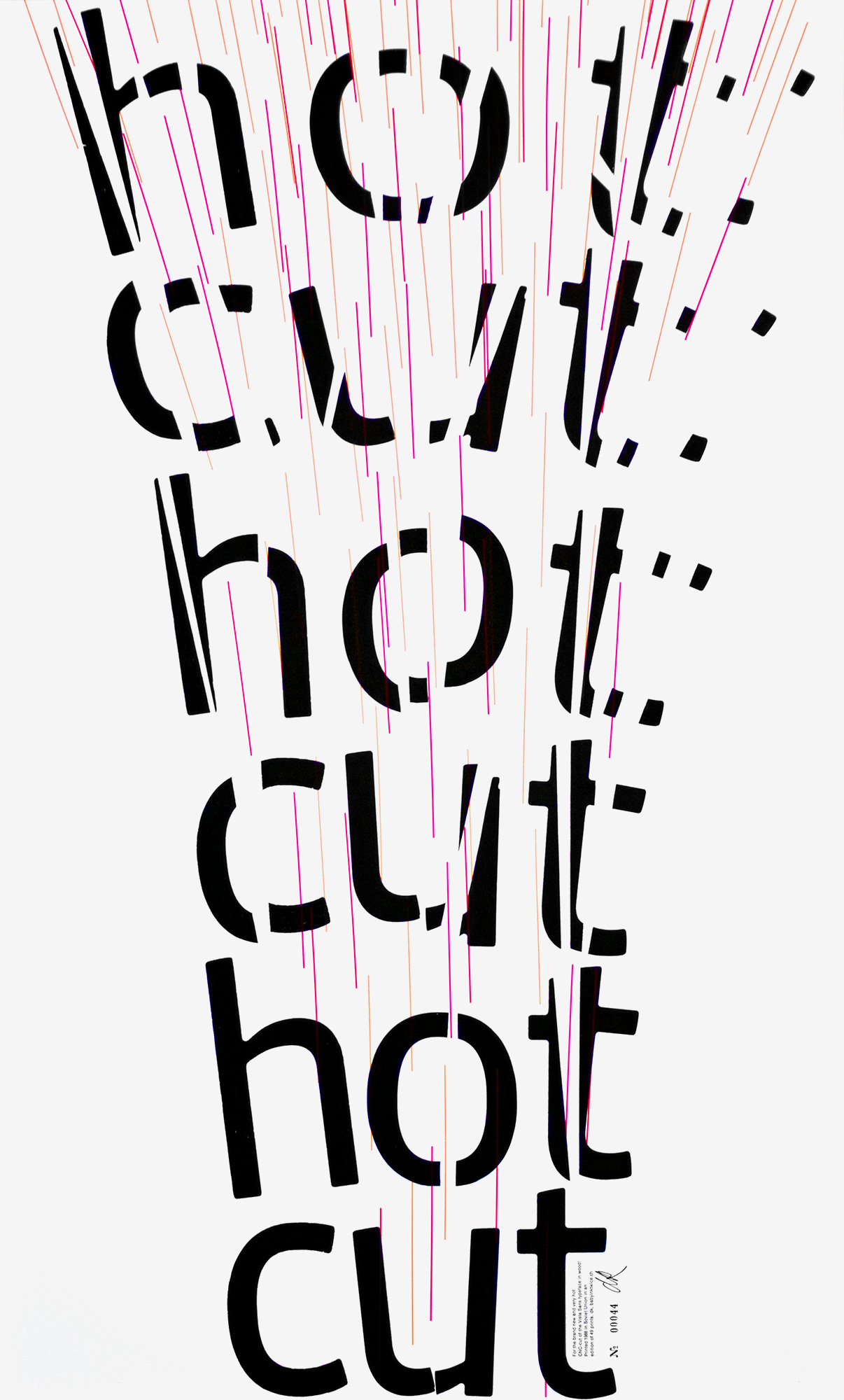
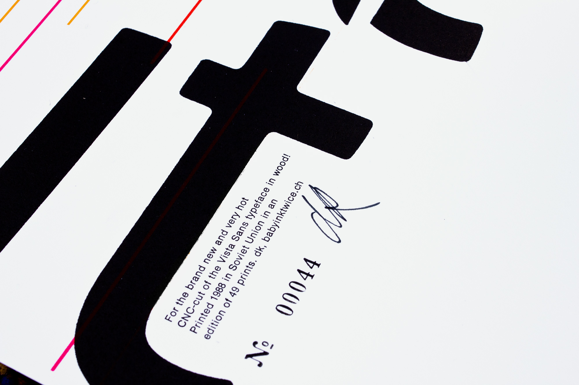
Hot cut
My participation with the ‹Vista Sans Wood Type Project›. All participants got 5 CNC cut letters (t-o-u-c-h) from the Vista Sans typeface in wood. Each letter was from a different sort of wood and we were asked to design and print a poster for that Vista Sans typeface.
I wanted to make a connection between the process of producing/cutting new type and my poster. So I thought about words I could use on that poster that would fit this topic. Which words are possible with using just the letters «t o u c h». Since it was only a short run of posters, I could also use some letters twice or more times. Or flip them around to make a «n» with the «u» or even a «y» with the «h». So I thought about short words like: hot, you, not, cut, toy, cnc… I got stuck with the words «hot» and «cut».
Client: Vista Sans Wood Type Project
Format: 44×72cm
Paper: 240g/m2
Edition: 49 posters on a FAG Control 900
January 2012
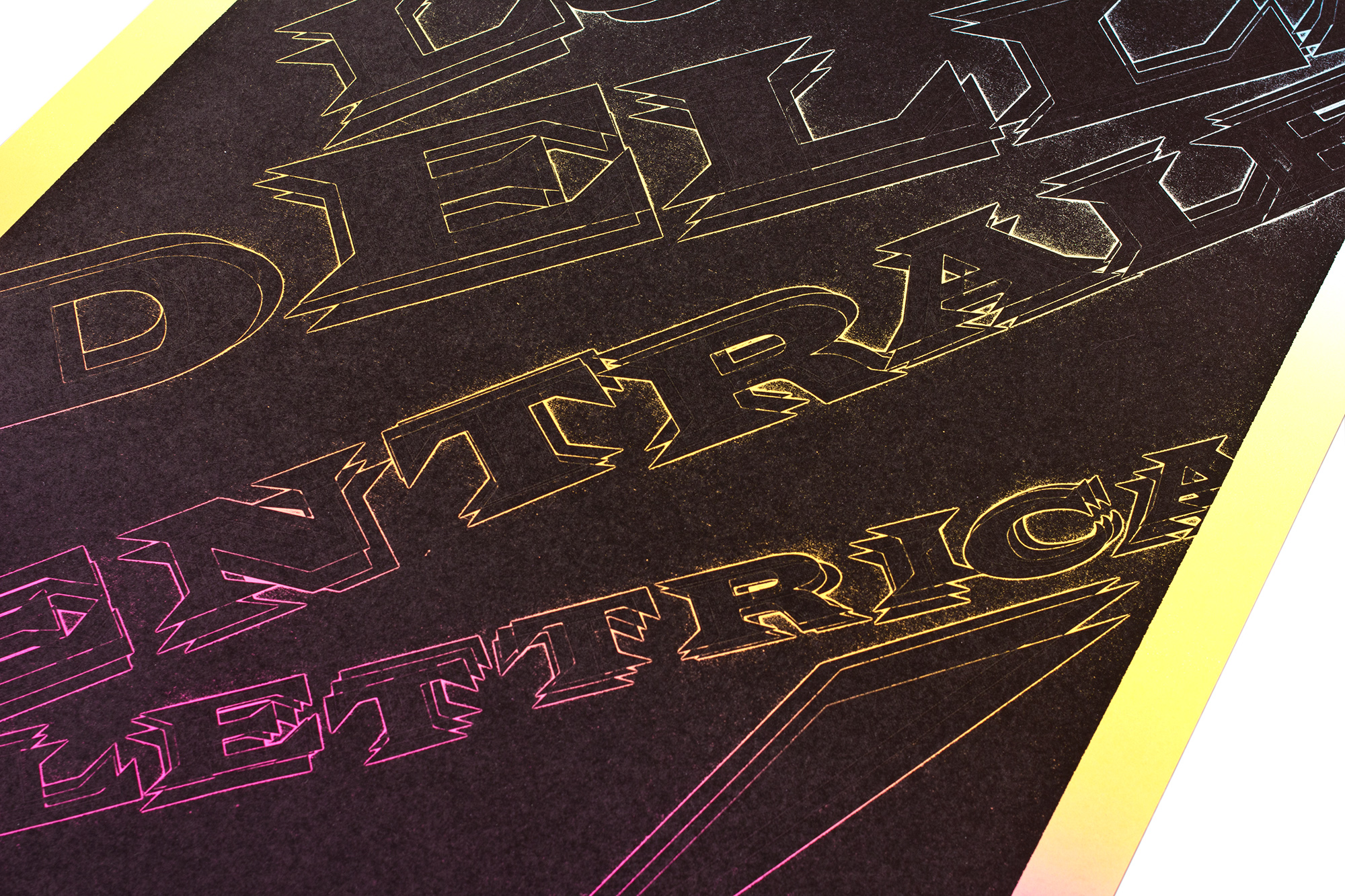
Le Luci della Centrale Elettrica
120 letterpress posters for an italian band called ‹le luci della centrale elettrica› means ‹the lights of the electric power company›. Printed in two colourruns from two MDF woodblocks and some adhesive stickers.
I wanted this poster to look flashy and fresh, but still suit an italian folk (not electro! haha) band! It just had to have a certain electricity, without getting too much techno! So I used that light 4c splitfountain to cover all the background. Then I used adhesive stickers on the second MDF block, that was just a bit smaller than the first one. By using adhesive stickers for the type, the edges of the letters start just flashing like lights flashing at night. By using several layers of adhesive stickers, I added kind of a shaking movement of someone touching electricity.
Client: Studio Foce, Lugano
Format: 50×80cm
Paper: Munken Print Cream, 80g/m2
Edition: 120 posters on a FAG Control 900
December 2011
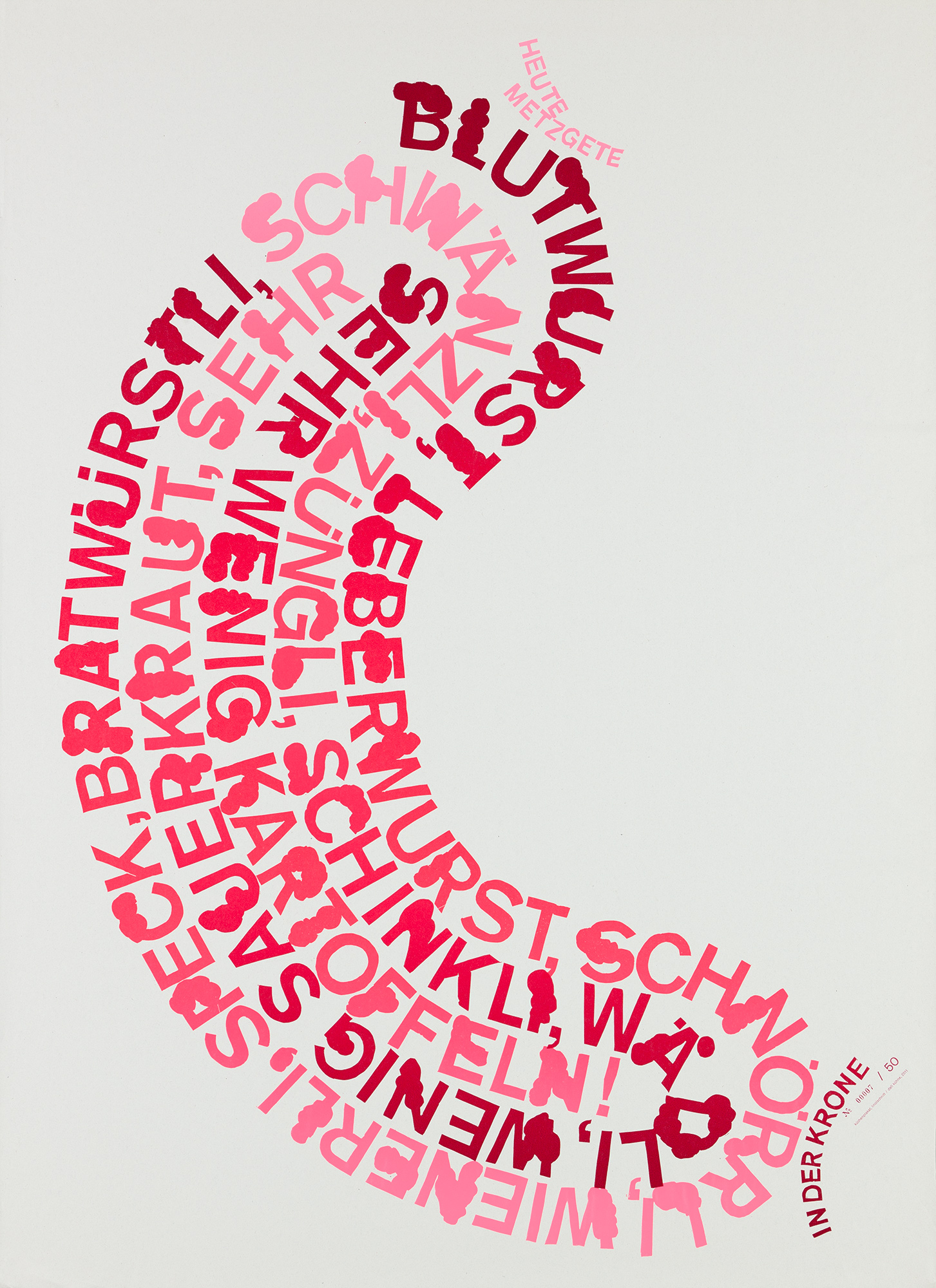
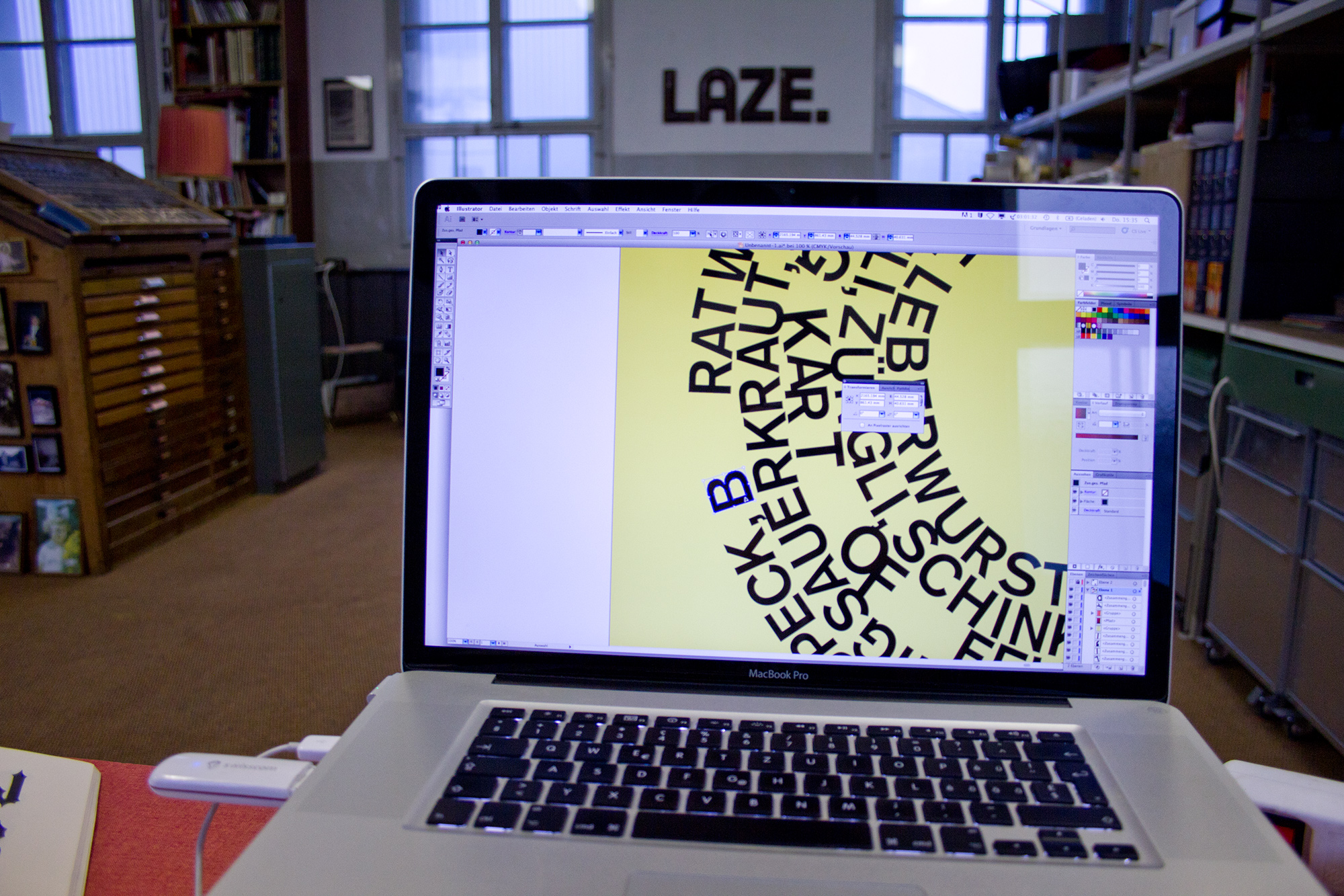
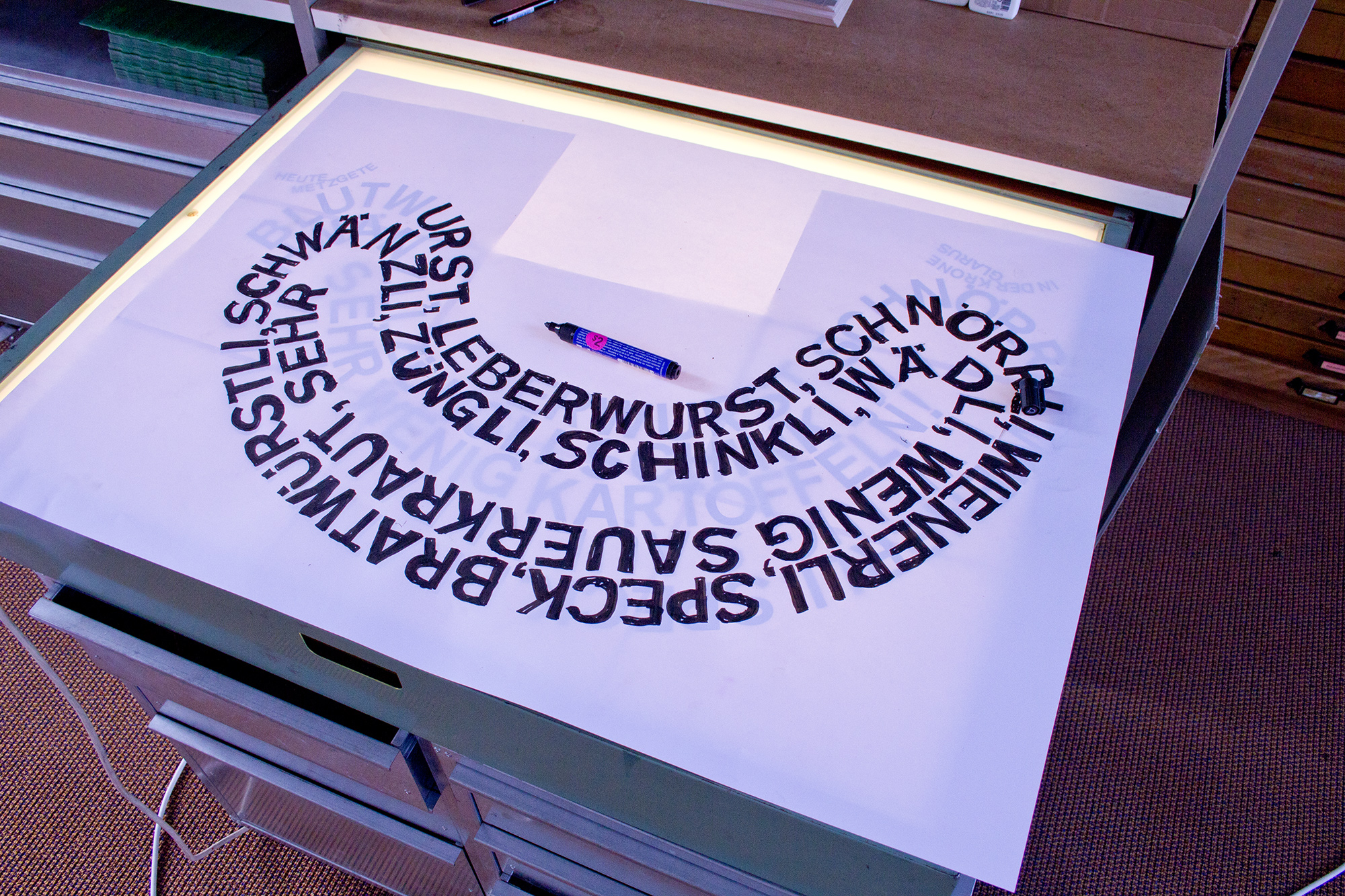
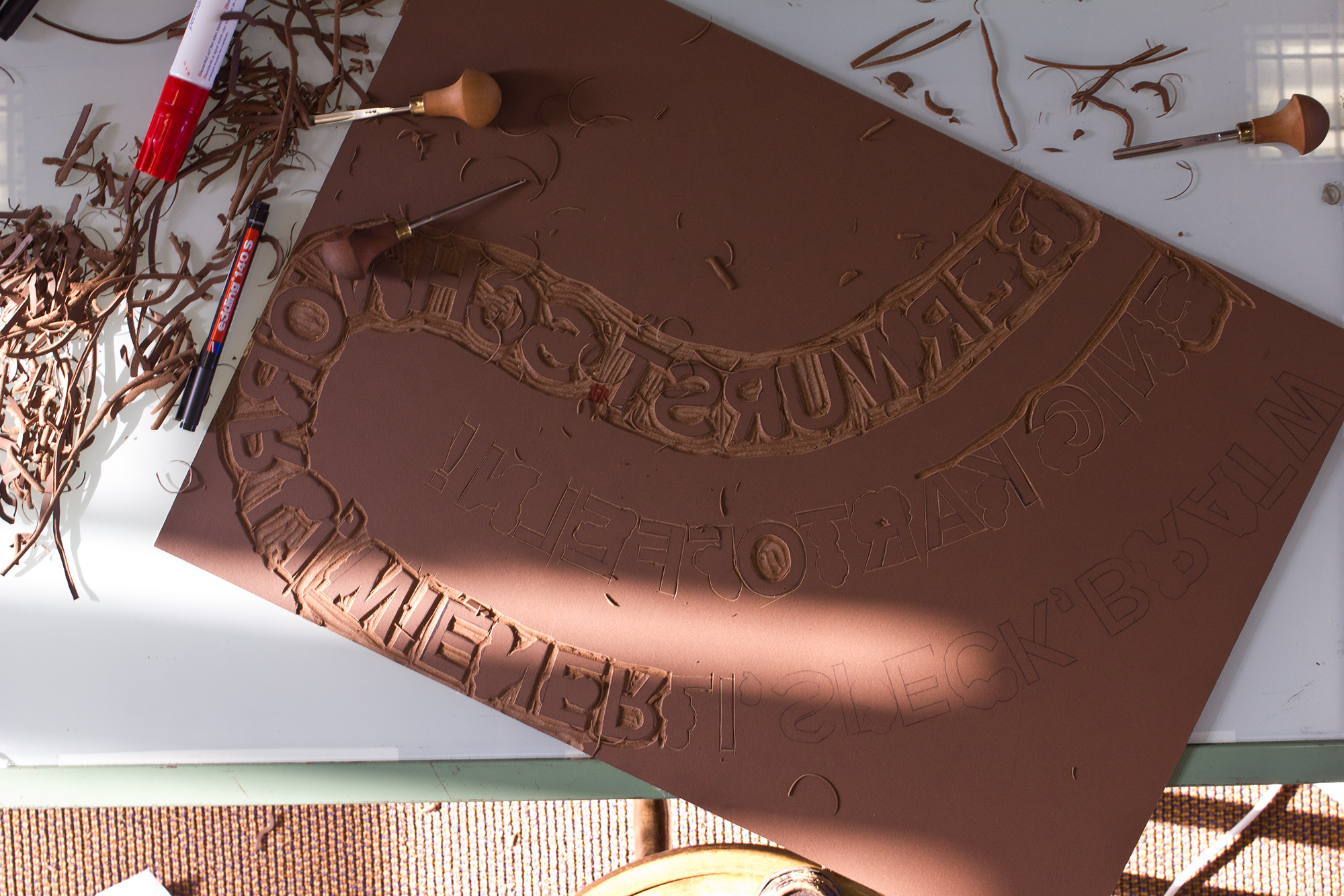
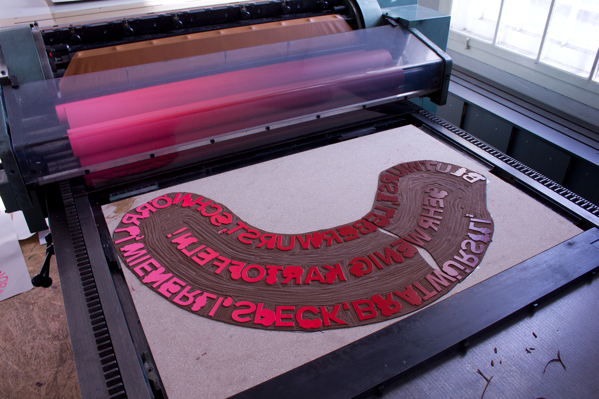
Heute Metzgete
50 letterpress posters from two large handcut linoblocks. Printed in two splitfountain sausage colourruns on my ‹FAG Control 900›. This poster is for meatlovers and other fetishists! Yeah!
Freshly cut from a block of linoleum. Butchered sausage typography in all meaty colors. Blood sausage, liver sausage, snout, wiener sausage, bacon, bratwurst, tail, tongue, ham, shank, little sauerkraut, very very few potatoes.
Client: Designkiosk/Designomat, Zürich
Format: 64×88cm
Paper: Newsprint, 48g/m2 / Munken Print Cream 240g/m2
Edition: 50 posters on a FAG Control 900, November 2011
2nd Edition: 55 posters on a FAG Control 900, June 2015
3rd Edition: 69 posters on a FAG Control 900, July 2019
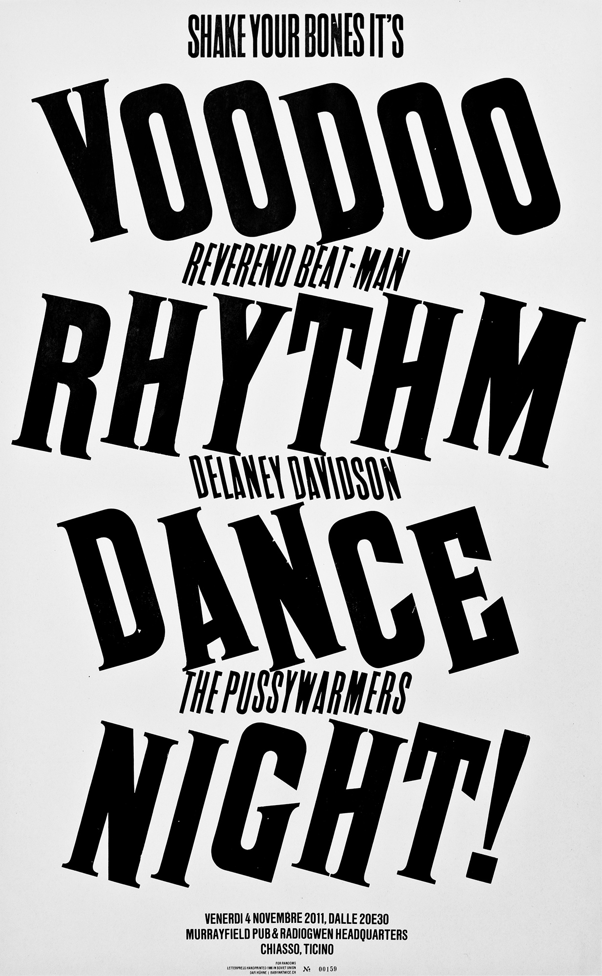
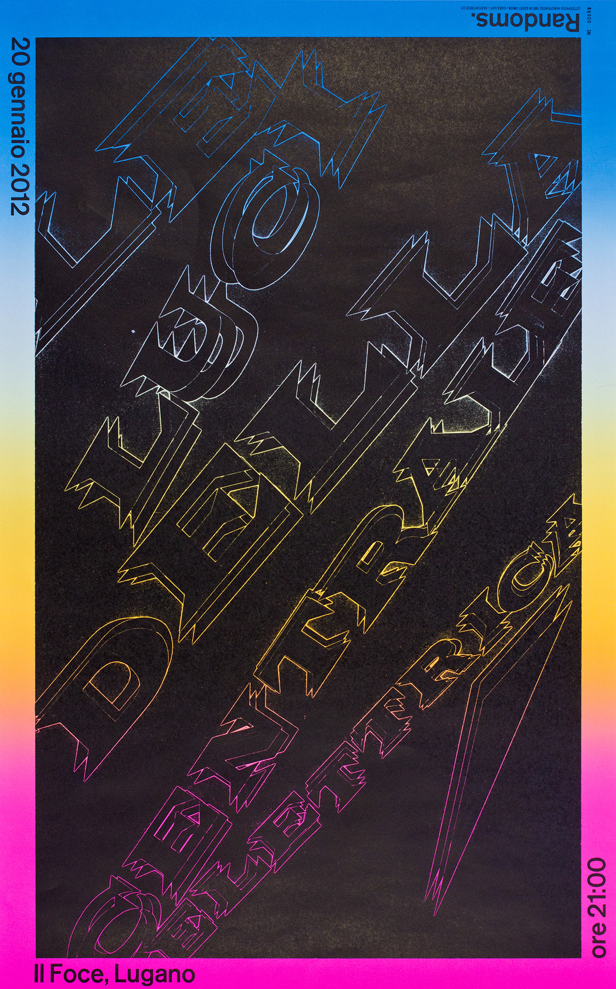
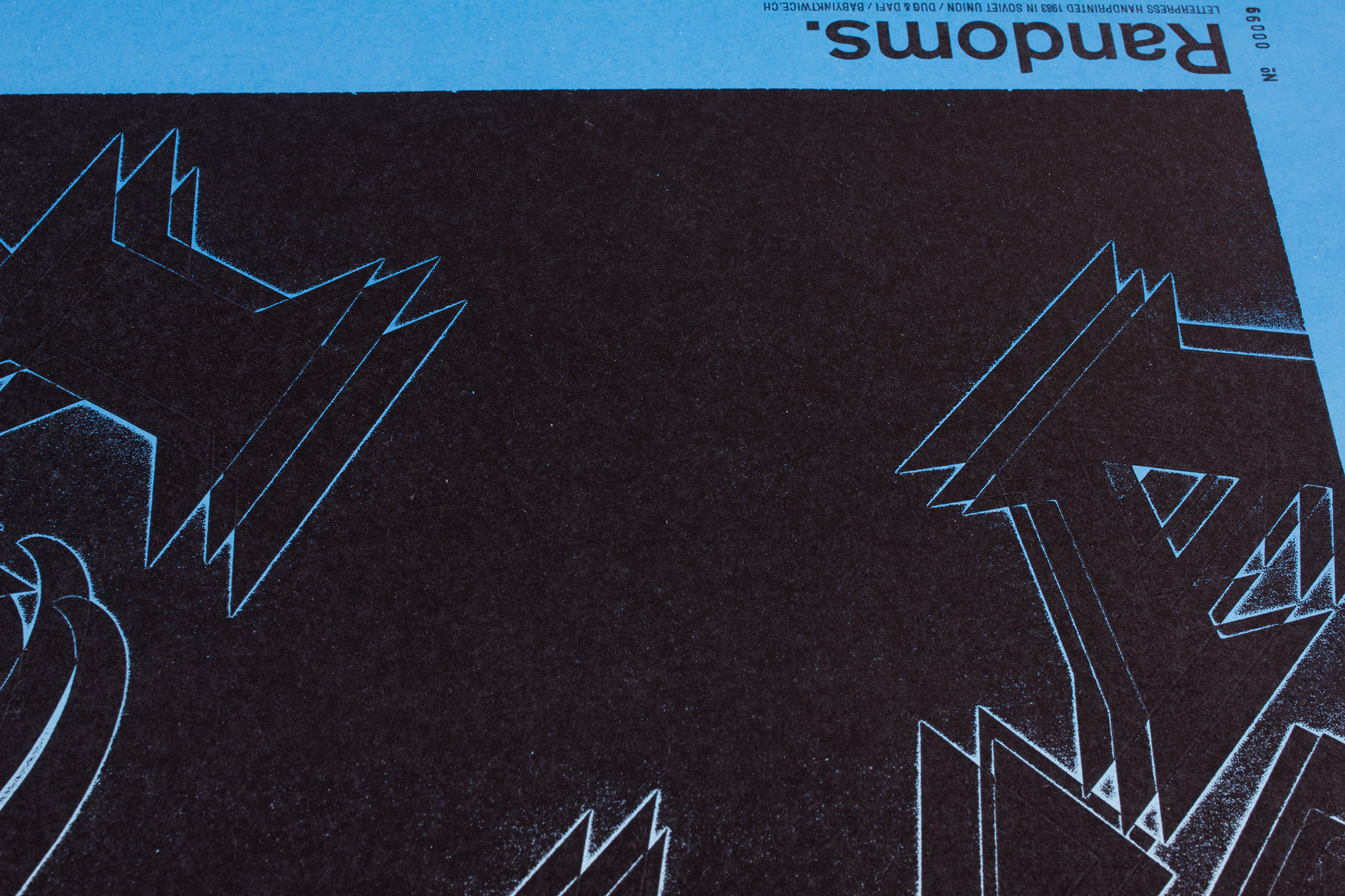
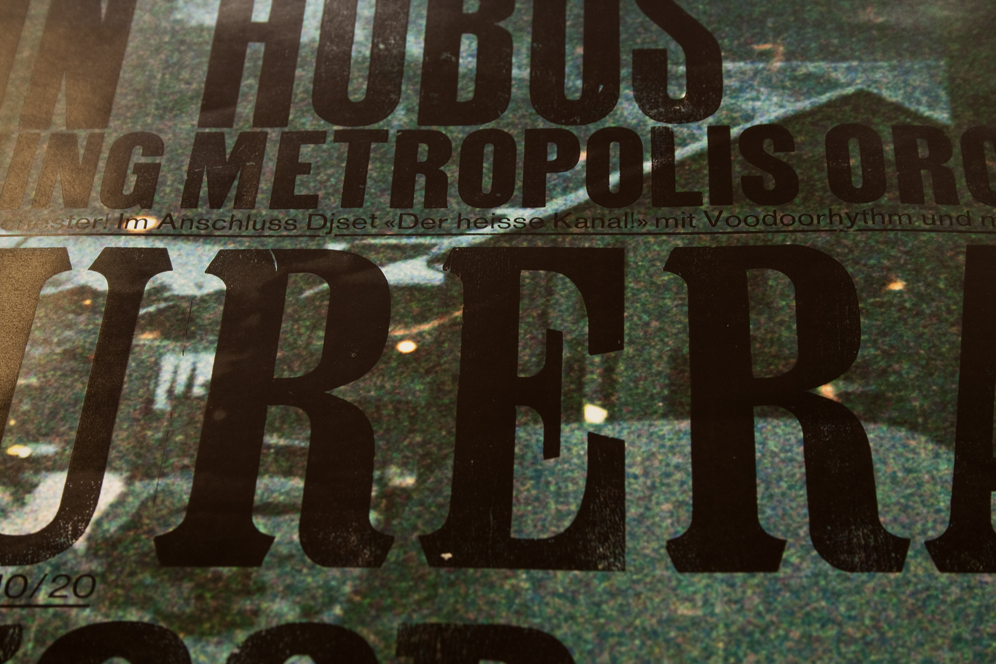
Voodoo Rhythm Dance Night
160 letterpress posters from conventional wood and leadtype. Printed in 4 colourruns on my ‹FAG Control 900›. Who wouln’t dance on that evening, if these letters on the poster shake their bones that wild…?
I did most of the design process analog by proofing the type I wanted to use, then waxcoat it, cut it, paste it on a layout paste-up and finally typeset it from that maquette.
Client: Randoms, Lugano
Format: 50×80cm
Paper: Newsprint, 48g/m2
Edition: 160 posters on a FAG Control 900
October 2011
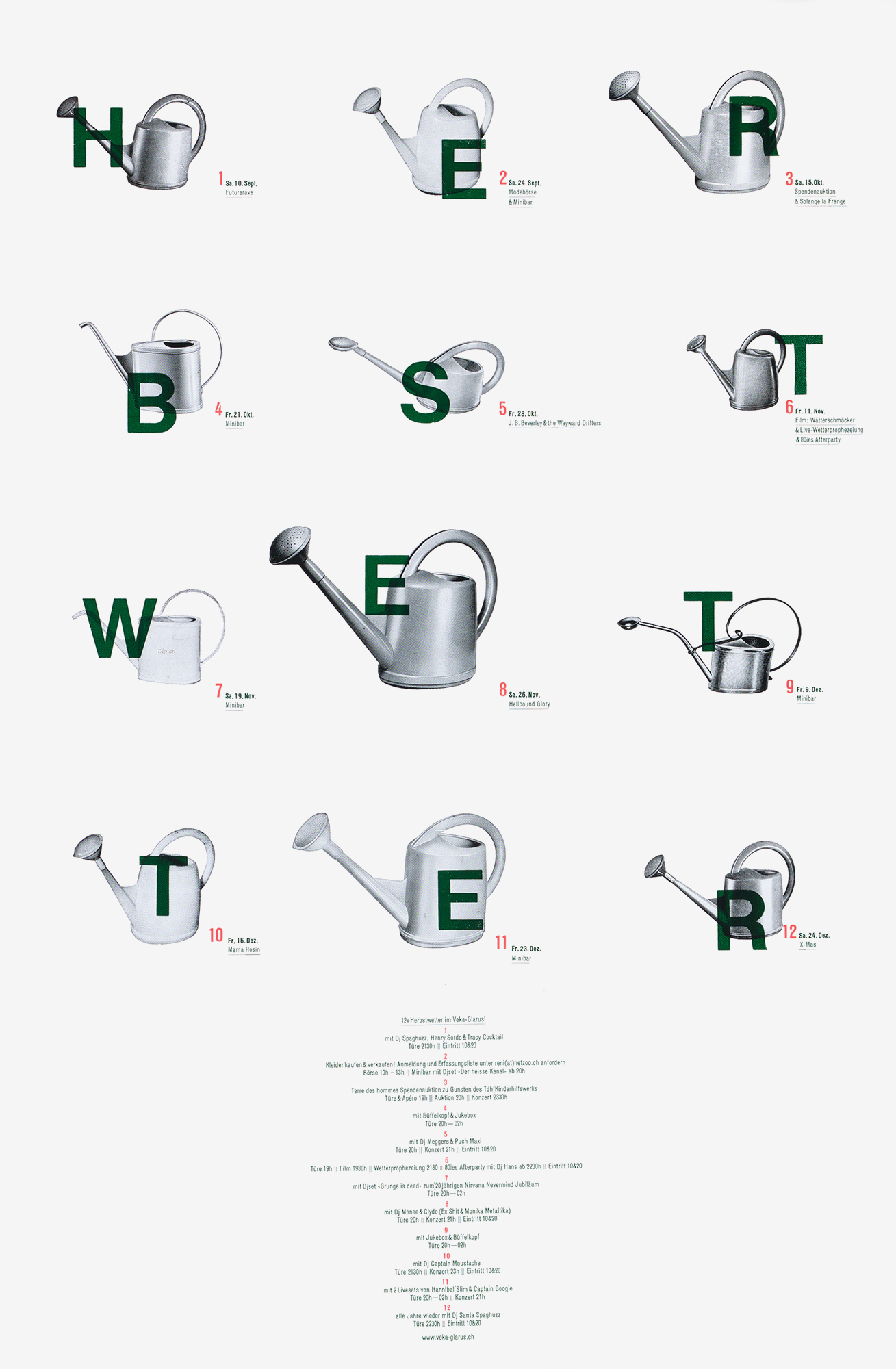
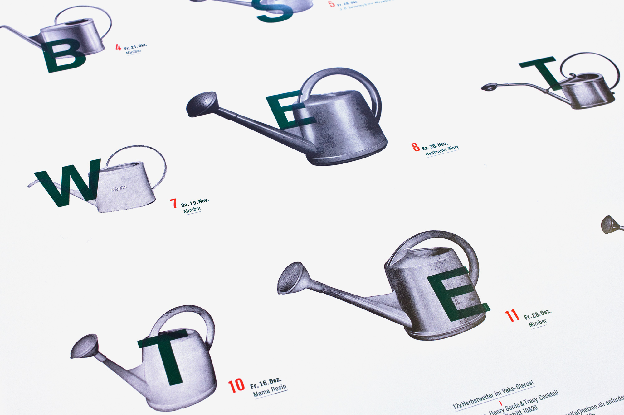
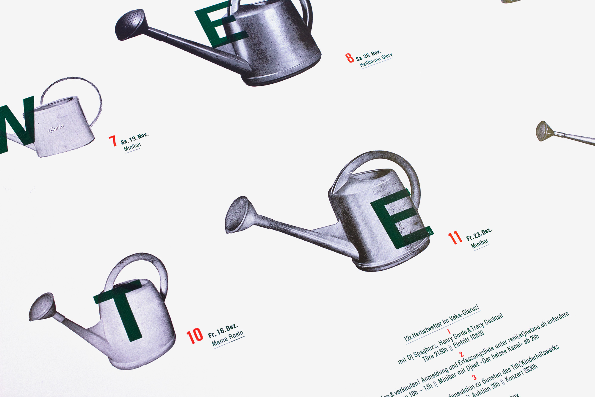
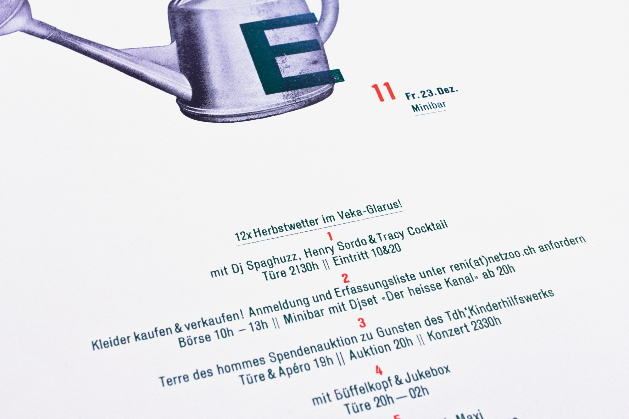
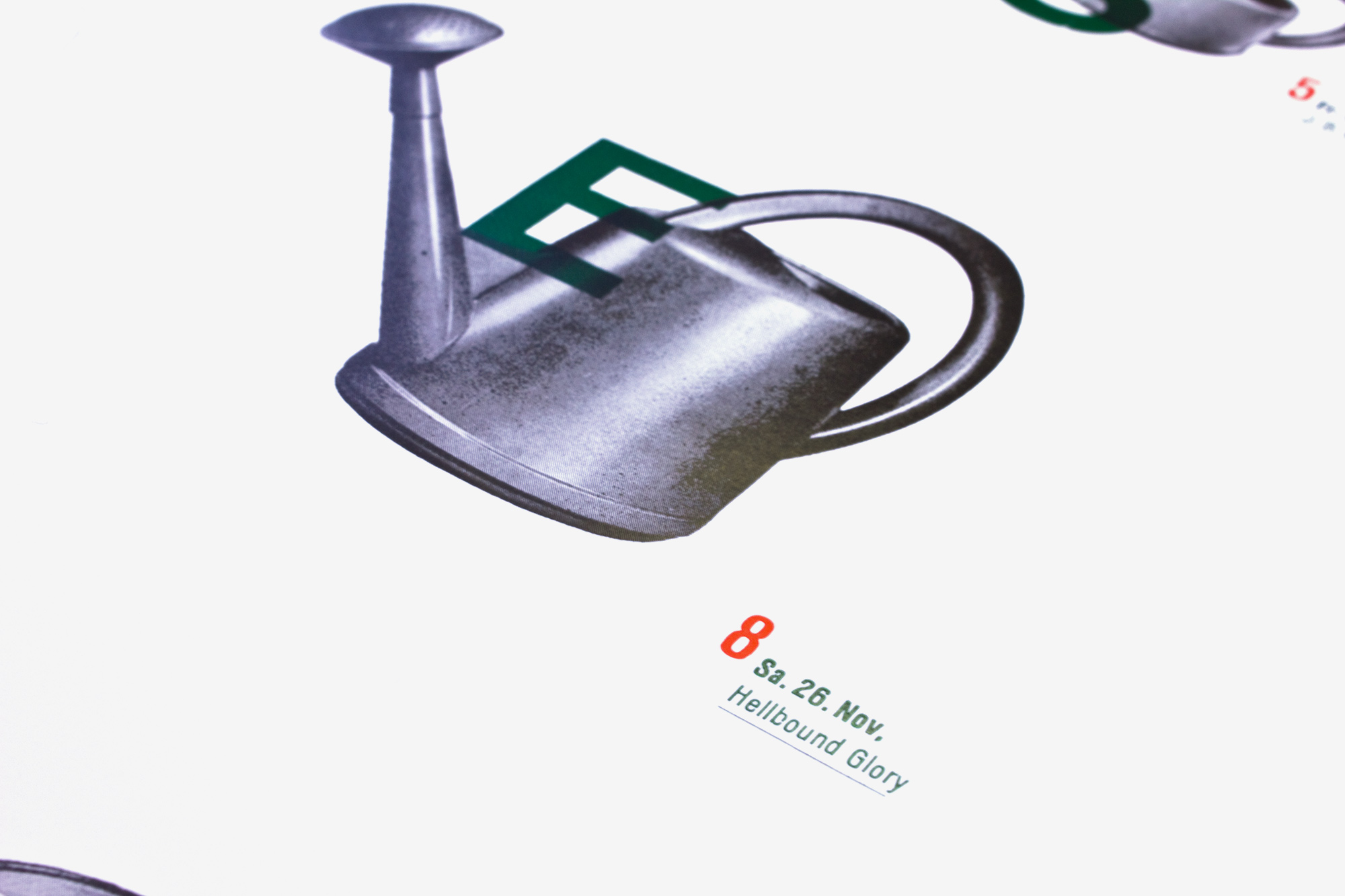
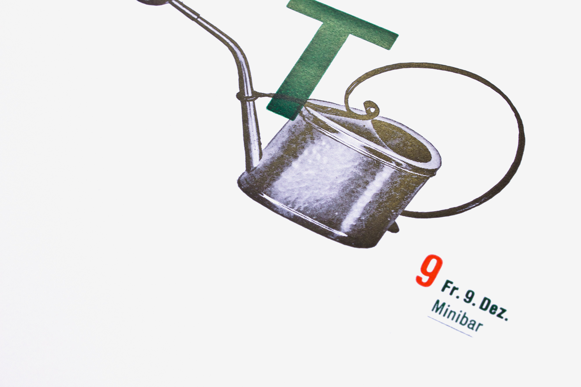
Herbstwetter
3c letterpress posters for the program of veka-glarus.ch . To symbolize the autumn weather, I used some old magnesium plates of watering pots that I got from an old printmaker. The type is all handset from wood- and leadtype
This was quite a complex typesetting job from the aspect of color separation and positioning. The larger woodtype letters that go on top of the old watering pots and the small type next to each watering pot where on the same printing form. Since the large type is aranged loosely but the small type lies in an exact layout grid it was really a lot of work to bring both into the same printing form…
Client: Veka-Glarus, Glarus
Format: 38×58cm
Paper: LuxoArt Silk, 115g/m2
Edition: 500 posters on a FAG Control 405
September 2011
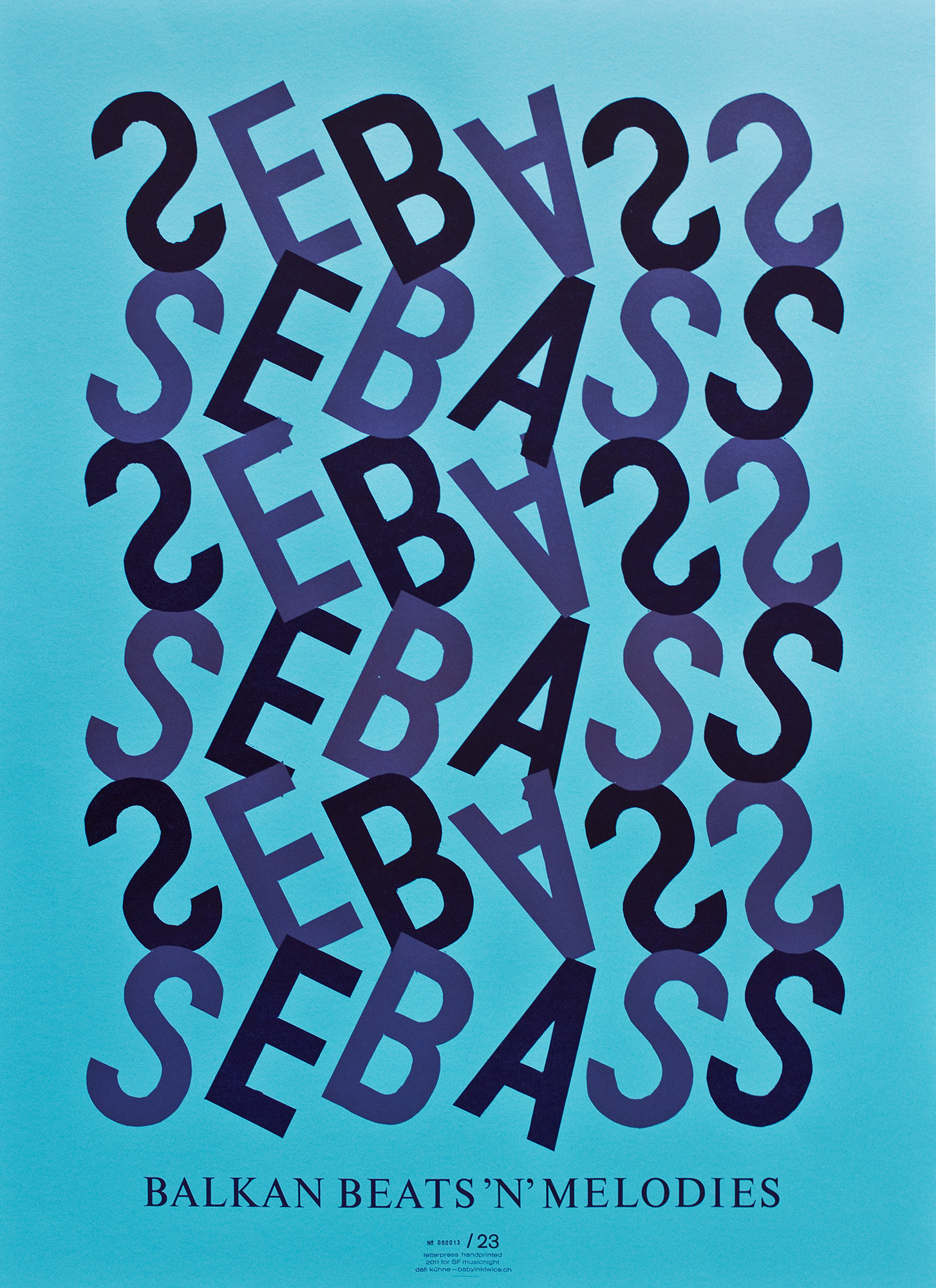
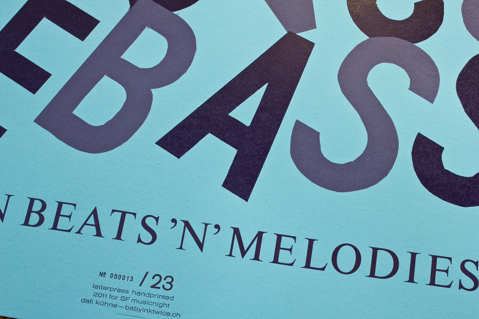
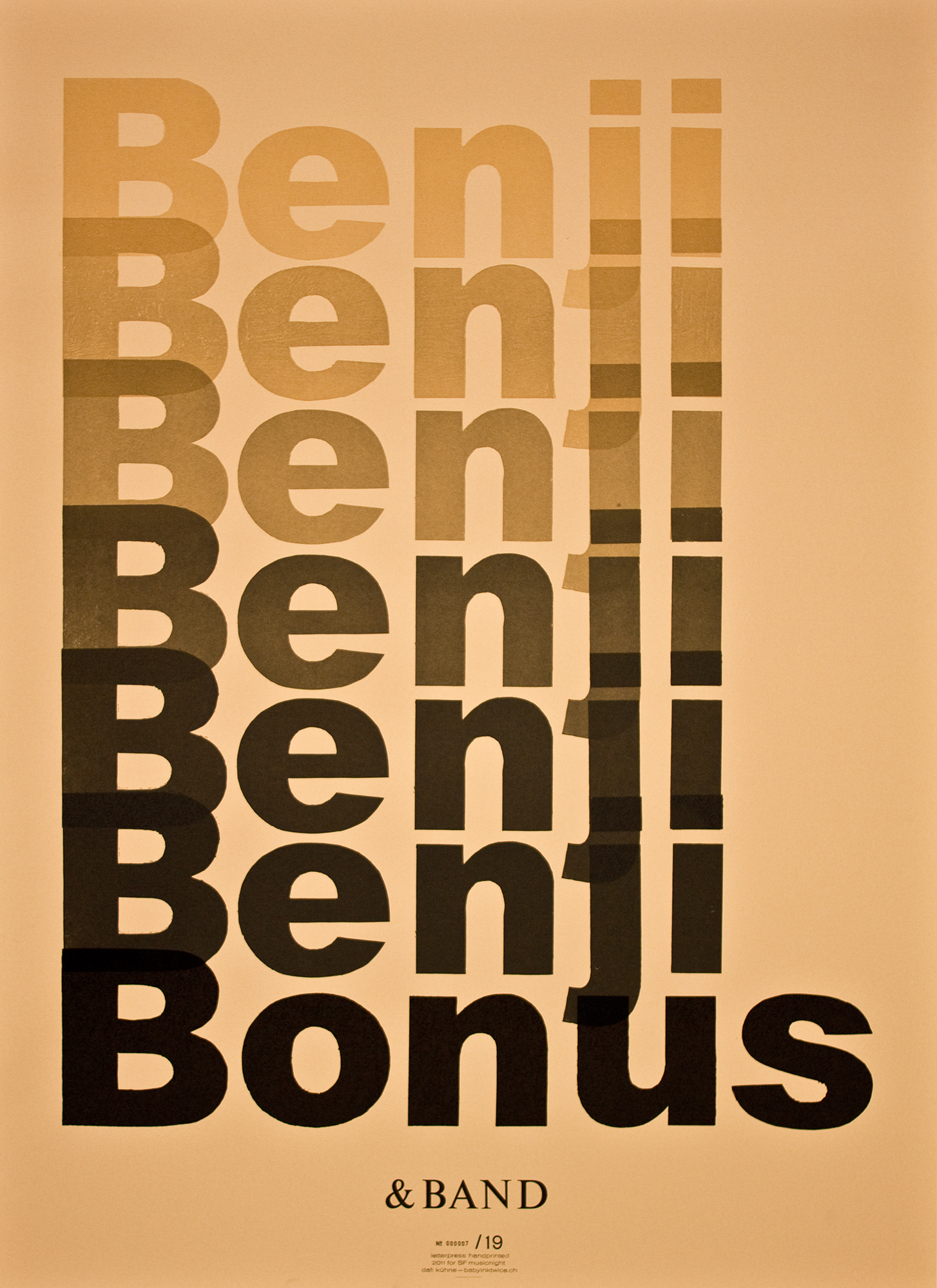
SF Musicnight 5–8
2nd serie of 4 small editions of letterpress posters. I did around 20 posters each for a musicprogram on Swiss Television. They are printed in 2–10 colourruns from handcut cardboard and lead type.
Like the first series (1–4) I had to be efficient with producing these posters. So all the big type was hand cut from chipboard. The bottom line is handset lead type.
Client: SF Musicnight, Swiss Television, Zürich
Format: 64×88cm
Paper: Pop’Set, 240g/m2
Edition: 20 posters each on a FAG Control 900
September 2011
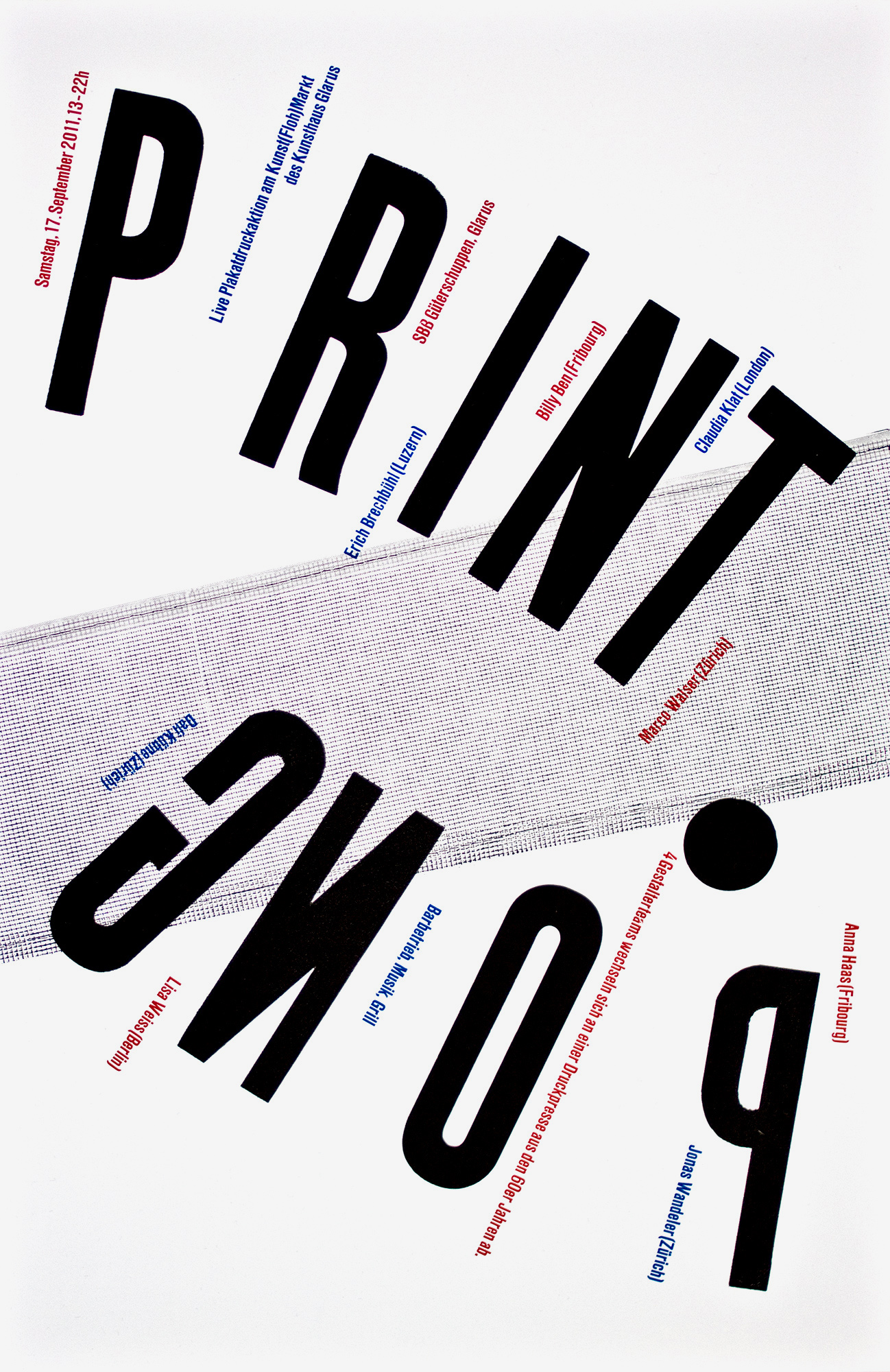
Print Pong
4c letterpress posters for a printingworkshop held at Kunsthaus Glarus with 7 other graphic desingers. Printed from cardboard-, lead- and woodtype and a real ping pong net. Design- & printworks in collaboration with Jonas Wandeler.
In that workshop, 4 designer- & printmaker-teams (2 persons each) are gonna collaborate by turns on some letterpress posters. Each teamplayer alternately designs and prints one colour of the poster. Like playing ping pong – just with a printing press…
Client: Kunsthaus Glarus, Glarus
Format: 37×57cm
Paper: Chromolux, 80g/m2
Edition: 250 posters on a FAG Control 405
August 2011
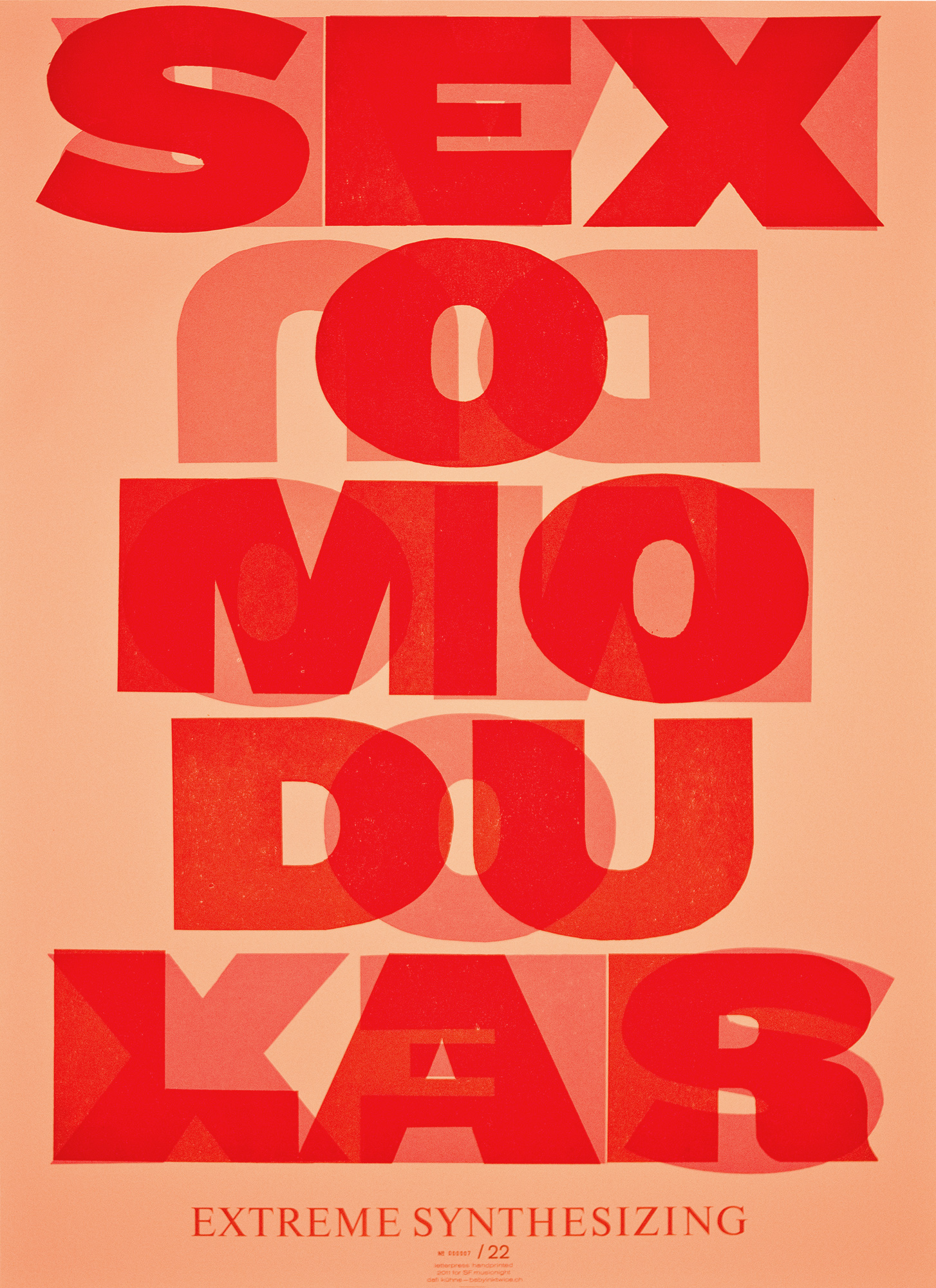
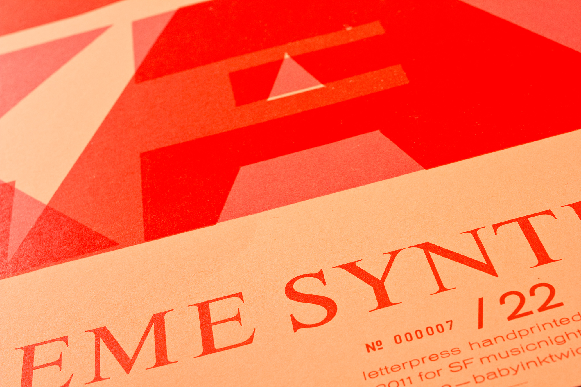
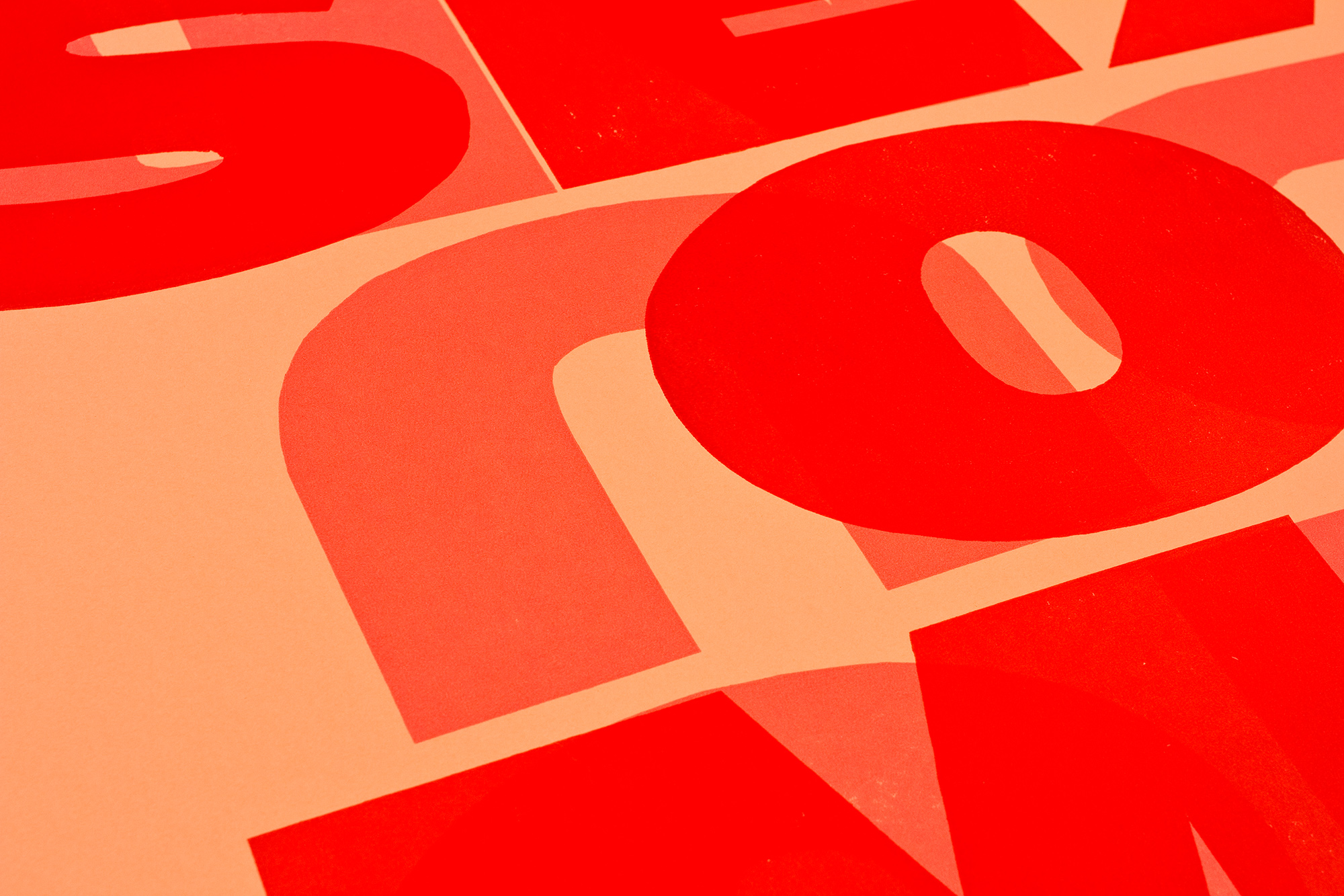
SF Musicnight 1–4
4 small editions of letterpress posters printed in 2–7 colours from wood- and lead type and handcut cardboard.
The client asked me if I can print a poster for each months bands playing an acoustic set in their little trailer wagon underneath a bridge. I designed these posters to be produced as efficient as possible. All the big type was handcut from chipboard, since they only needed tiny editions. These posters have been used in the clips of the bands playing. Each one had it’s 2 seconds of fame, haha. Unfortunately the clips are not online anymore.
Client: SF Musicnight, Swiss Television, Zürich
Format: 64×88cm
Paper: Falkenkarton, 240g/m2
Edition: 20 posters each on a FAG Control 900
August 2011
Industriefilme
5 colour letterpress printed posters for an industrial movie project. Printed white on a thin shiny black Chromolux paper. Wrapped with a perforated thicker black Chromolux sheet.
The repetition of the letters ‹I-I-I-N-N-N-D-D-U-…» is meant to show the rhythm and repetition of an industrial production. The flashy colours if the horizontal and vertical strings symbolize of strings in a textile weaving.
The posters have been printed 3 times white, then with the rest of the four colours. All printed from lasercut plexiglas and photopolymer plates.
Client: Verein Glarner Industrieweg, Glarus
Format: 32×49.5cm
Paper: Chromolux Black, 80g/m2
Edition: 412 posters on a FAG Control 405
April 2011
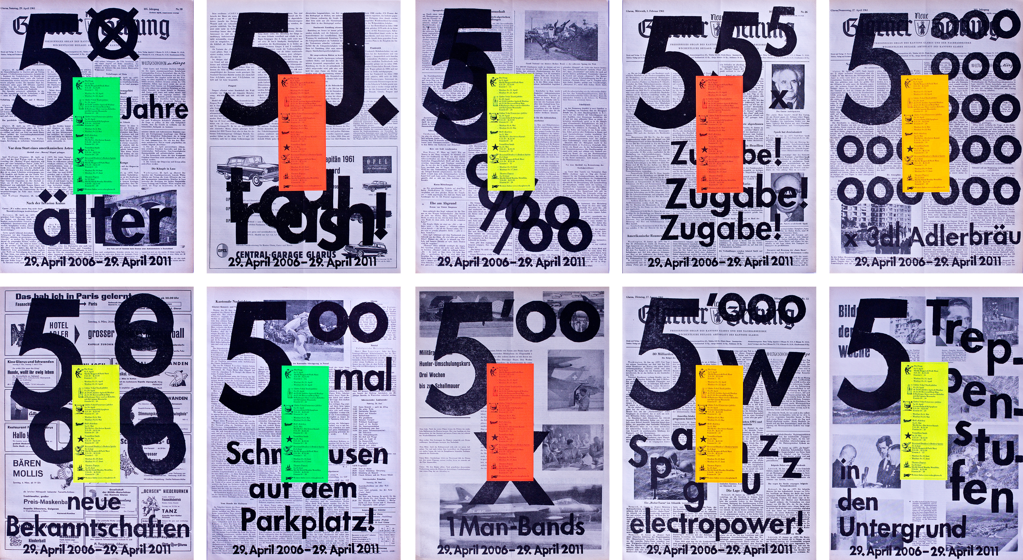
Old newspaper
10 different versions of a total of 600 posters for the 5 year jubilee of Veka-Glarus. Each poster is printed on origial 50 years old newspaper and has a random coloured sticker on it. The type on these posters is quick-handcut from cardboard which gives it that rough look with alot of distress.
The content in the background is like a fake-statistic of what happened at the club during the last 5 years. For example: ‹5000000000 x 3dl Adlerbräu› means ‹500000000 plasticcups of beer have been drunken›. Or ‹5ø Jahre älter› means ‹5 or maybe felt 50 years older›.
Client: Veka-Glarus, Glarus
Format: 34×48cm
Paper: Old newspaper from 1961, 62g/m2
Edition: 600 posters on a FAG Control 405 and a Frontex Stop Cylinder
April 2011
Zürich–Milano
For the ‹Italian design is comin home – to Switzerland› project I was invited to do a poster each in collaboration with Marco Nicotra. We decided to use the Google-Maps-Route from Zürich to Milano and each would design and layout the information in his style.
From a distance, that black heavy block is all you can see. Zürich looks old fashioned with that blackletter typeface. Milano a little fresher with that geometric sans. But still both are black and nothing special. Just if you get closer you can see little neon sparks that show the friction between Zürich and Milano…
Client: Will & Tommaso, Amsterdam
Format: 50×70cm
Paper: Favini Super Gloss, 160g/m2
Edition: 110 posters on a FAG Control 900
March 2011
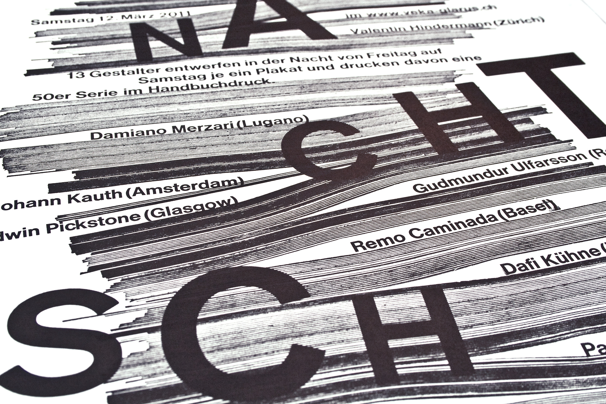
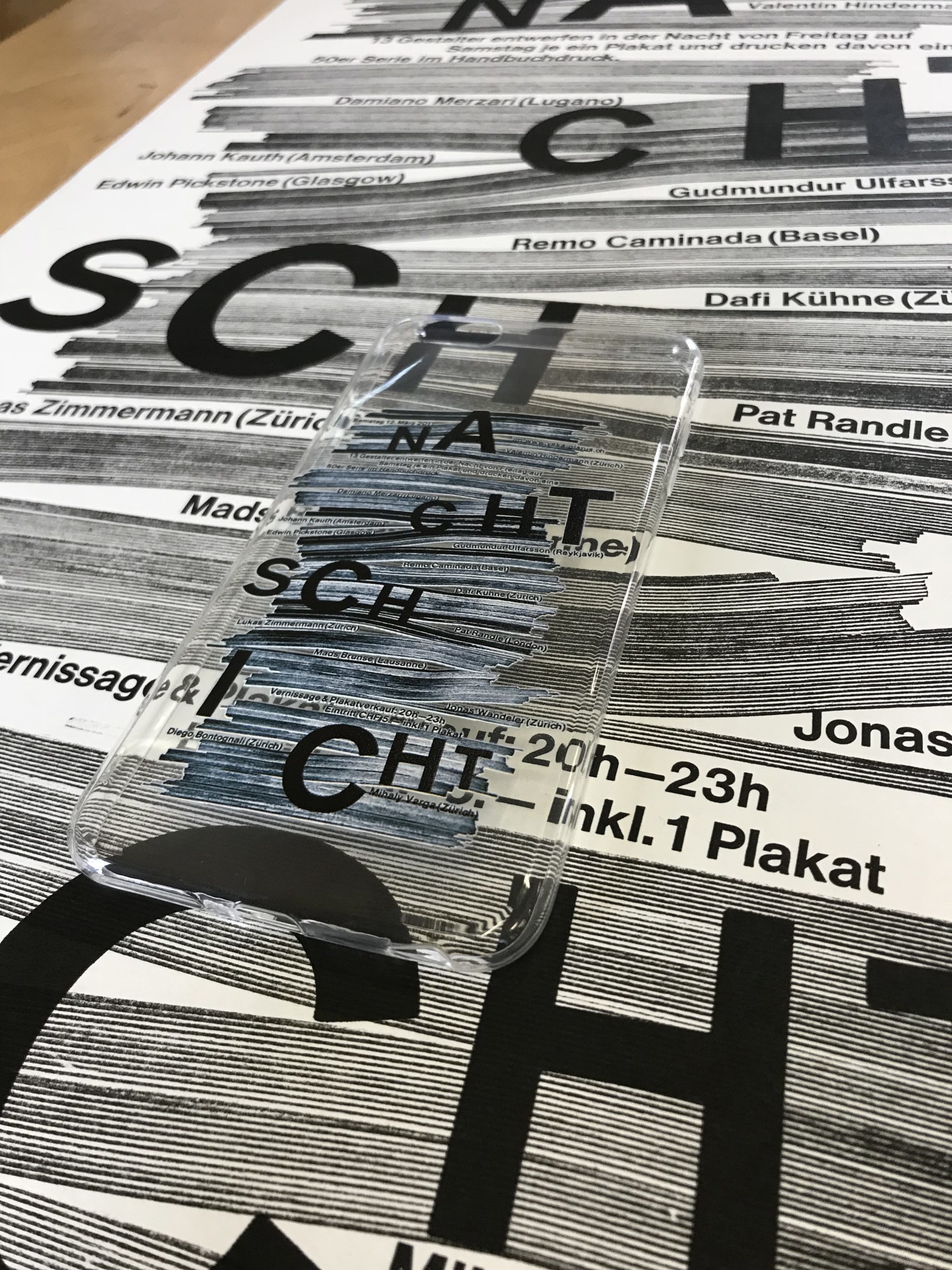
Nachtschicht
3c letterpress posters for a one night poster workshop with 13 international poster designers. Printed from vertical chipboard strips, lead- and photopolymer type. Design- & printworks in collaboration with Jonas Wandeler.
Since in that workshop the designers were working with chipboard as a main material to produce the letterpress printing blocks, we also wanted to use chipboard. So the first print was from chipboard strips brought to typeheight. The second print was lead type set into the lowered cardboard strips. the third print was from photopolymer letters.
In 2018, this poster has been stolen and produced as an Iphone case!
Client: Veka-Glarus, Glarus
Format: 37×57cm
Paper: Munken Print Cream, 90g/m2
Edition: 250 posters on a FAG Control 405
January 2011
Dark, glossy winter
1c letterpress posters for the monthly program for veka-glarus.ch. Printed on an offset preprinted photo I took with an analog camera. The whole type was handset with wood- and lead type.
The offset printer warned me, that I couldn’t get enough contrast by overprinting that offset print, since I already had a lot of saturation especially in that upper left corner. They didn’t realize that 100% offset black has nothing to do with that huge amount of shiny black black ink I applied on that poster with my letterpress print! haha.
Client: Veka-Glarus, Glarus
Format: 49×74cm
Paper: LuxoArt Silk, 115g/m2
Edition: 500 posters on a FAG Control 900
December 2010
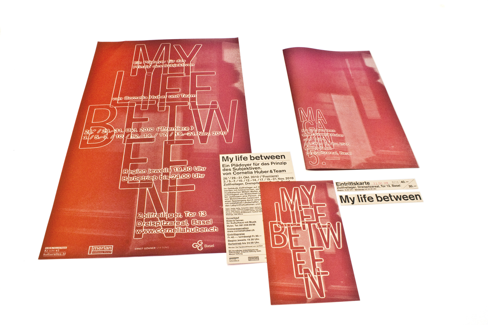
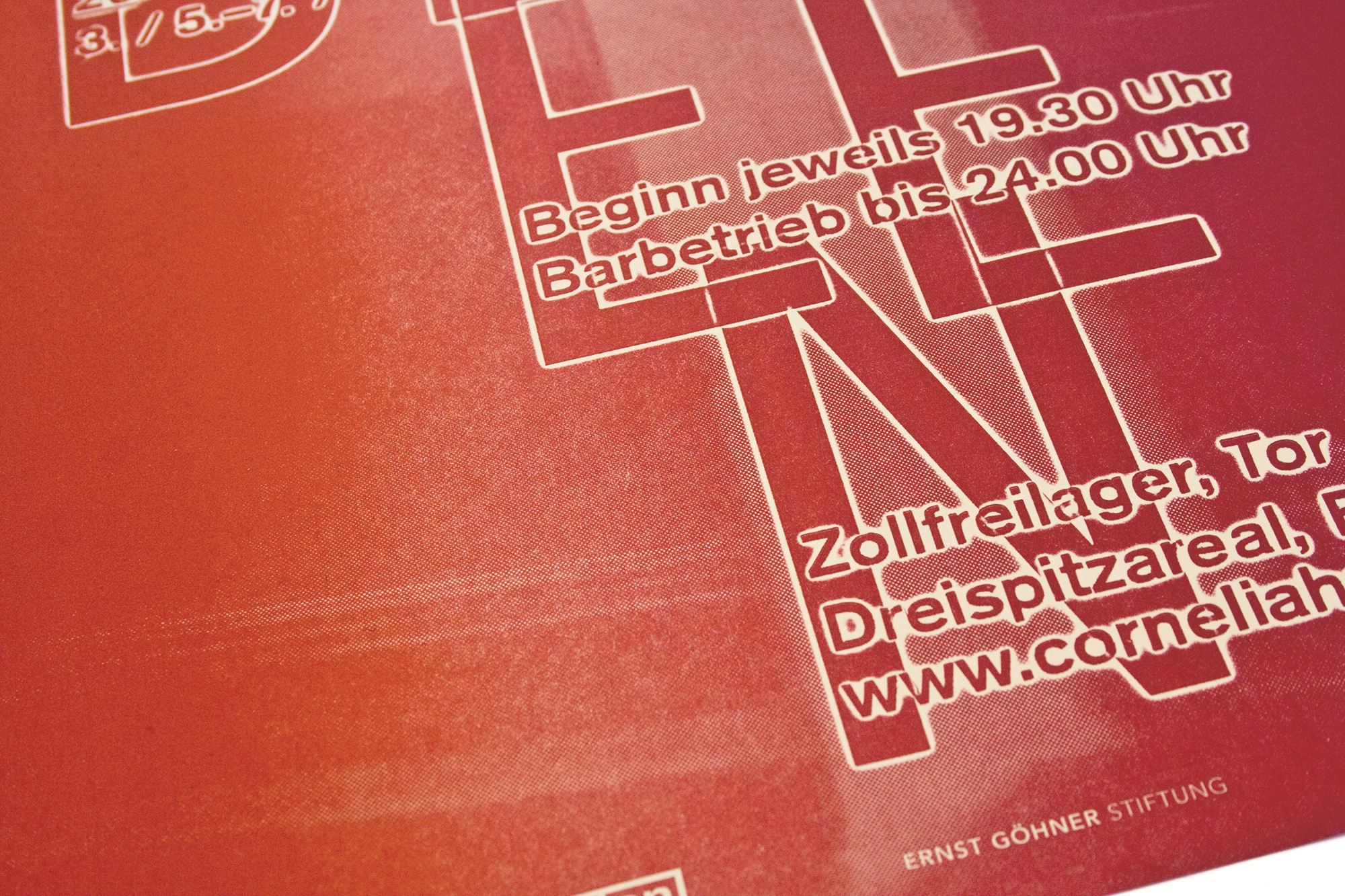
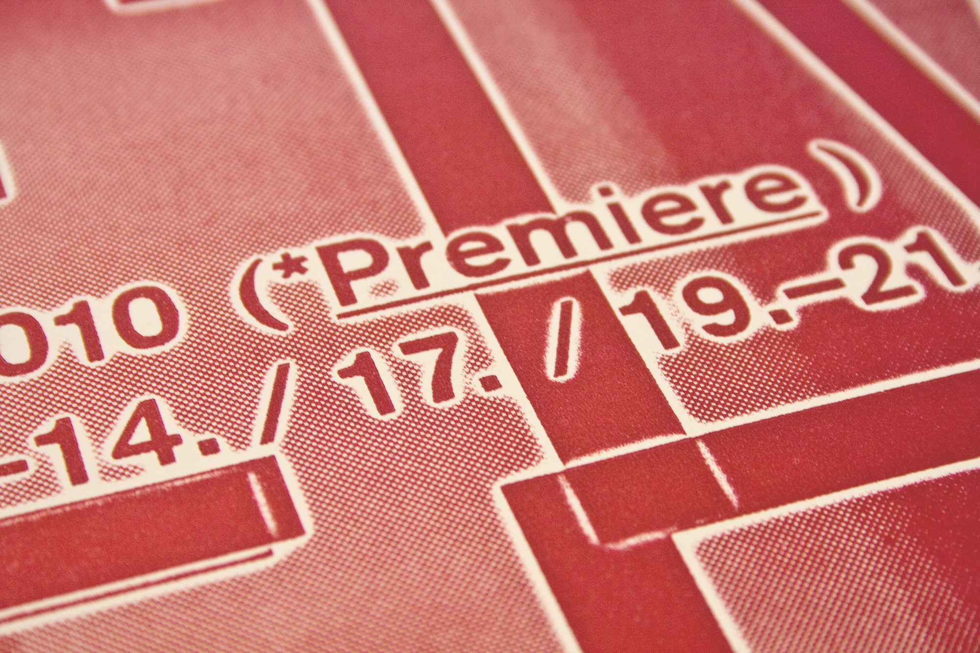
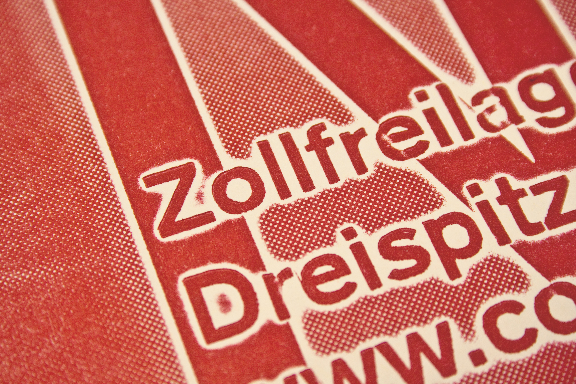
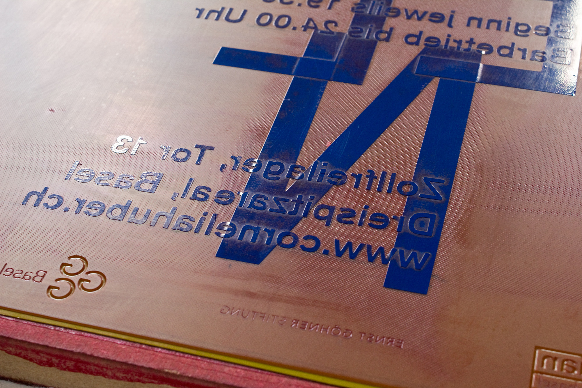
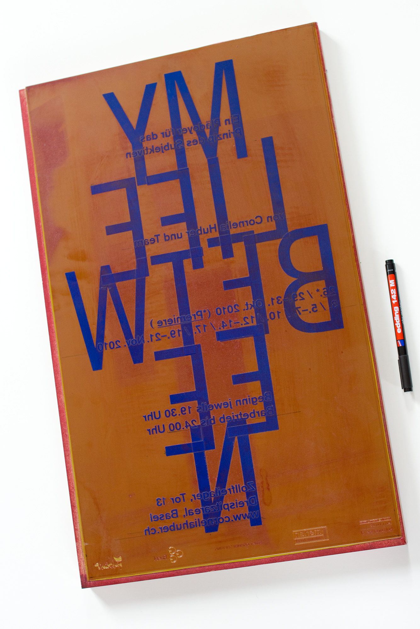
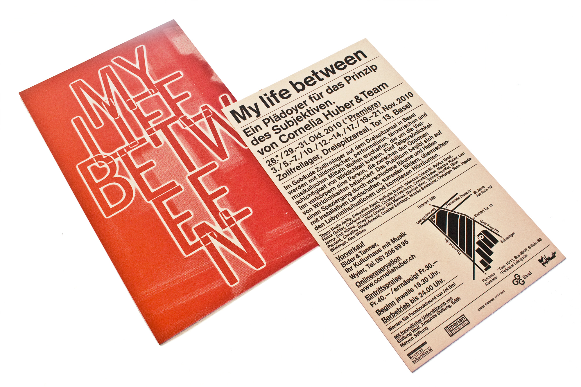
My life between
600 2colour splitfountain posters, 10’000 2c cards, 500 magazines and some tickets. All letterpress printed. A huge project with alot of printing on different printing presses. Watch the video at the end of the images to see how complex that project was…
This was a project for a theatric art performance in Basel. I used halftone photoplates and put the type with cut adhesive foil on top of them. So the poster, the frontside of the card and the first page of the magazine is a one colour splitfountain print with type and image.
Client: Kulturist GmbH + Cornelia Huber, Basel
Format: 33.3×55.5cm
Paper: Rainbow Lachs, 80g/m2 and 230g/m2
Edition: 600 posters on a FAG Control 405
February 2018
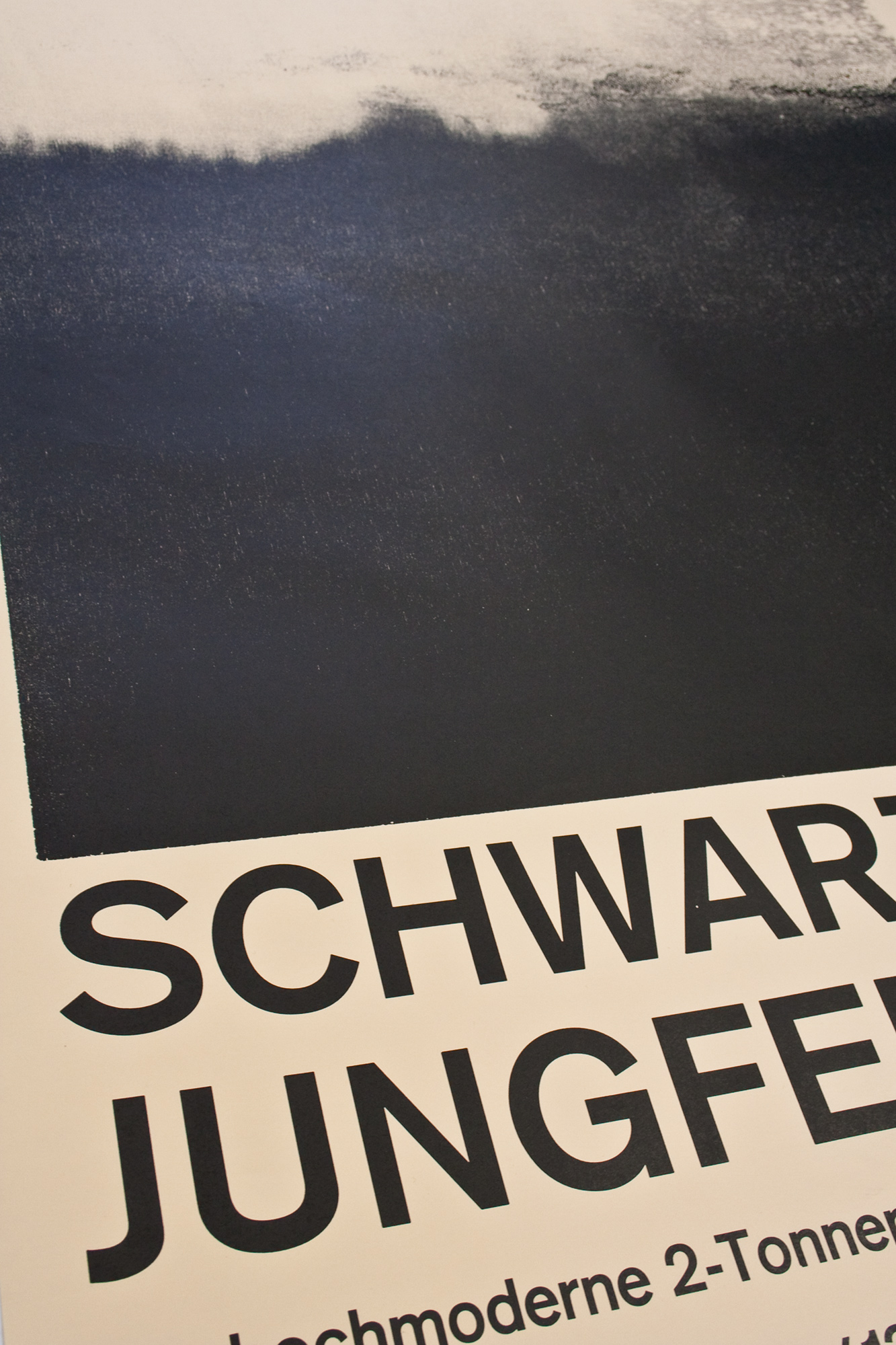
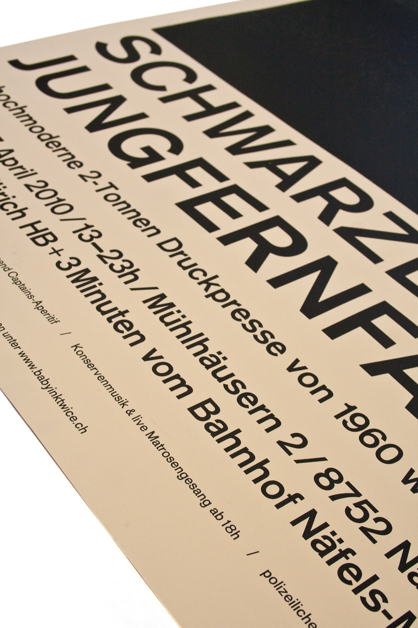
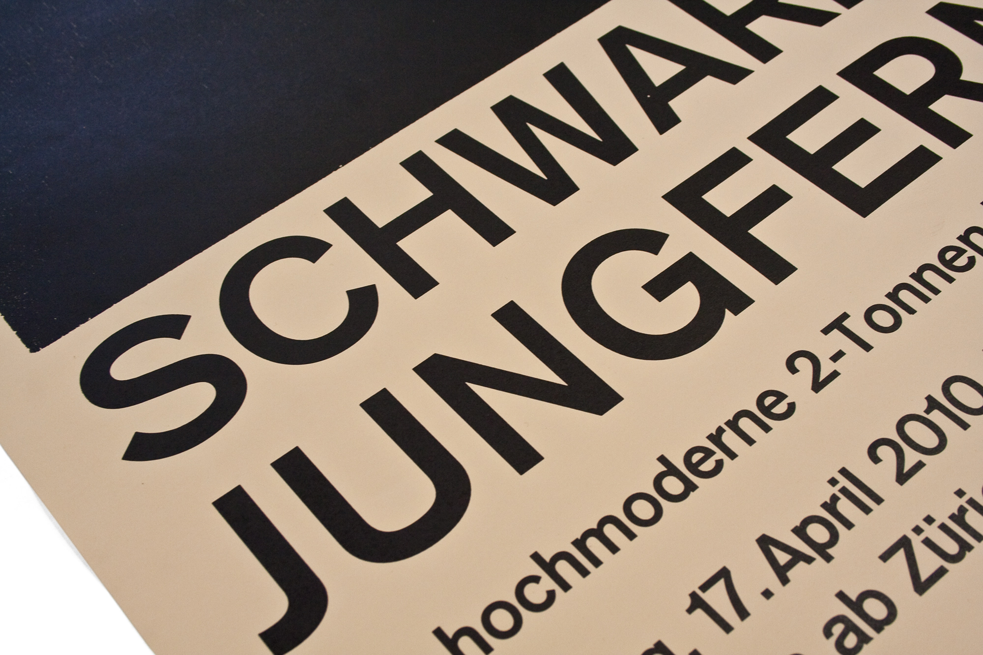
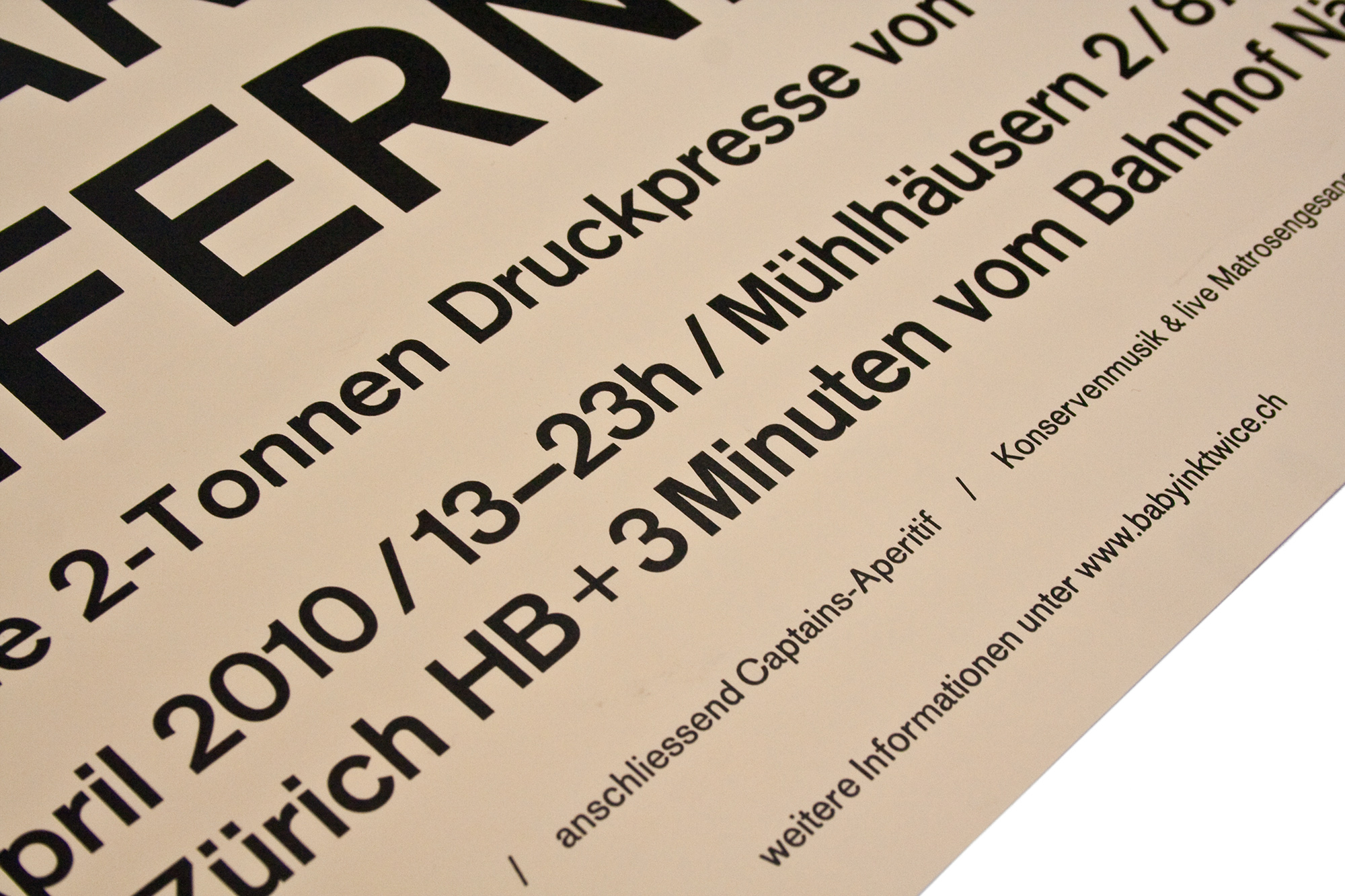
Schwarze Jungfernfahrt
1c letterpress posters for the naming ceremony for my new ‹FAG Control 900›. The black maiden voyage of my press is symbolised by a gradation from top to the bottom of a black woodblock. Printed from lead type, mdf-block and photopolymer plates on a thin rose/skin paper.
Hopefully the naming ceremony is gonna end up luckily and the bottle of champagne is gonna break…
Client: Self initiated
Format: 61×80cm
Paper: Plano Color, 80g/m2
Edition: 120 posters on a FAG Control 900
March 2010
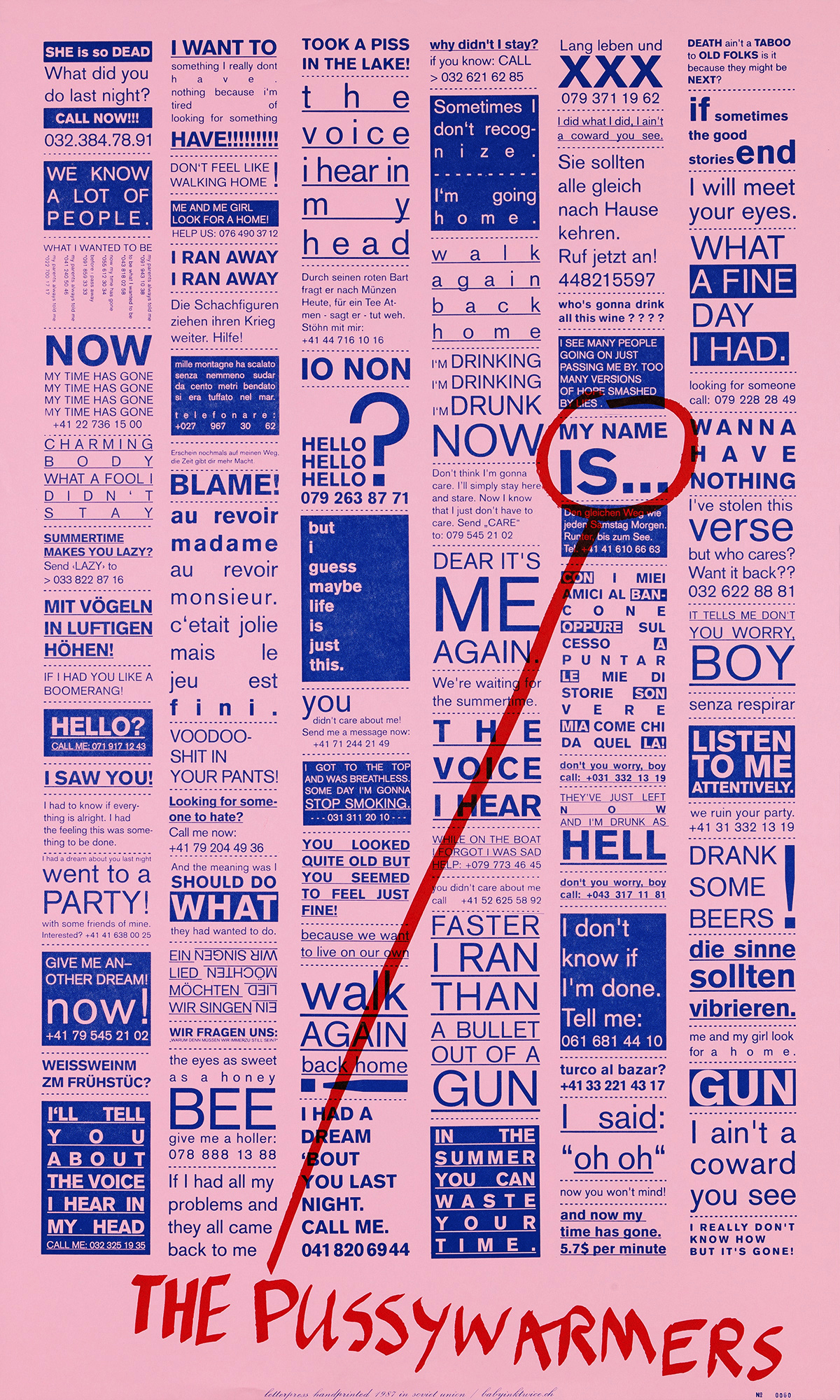
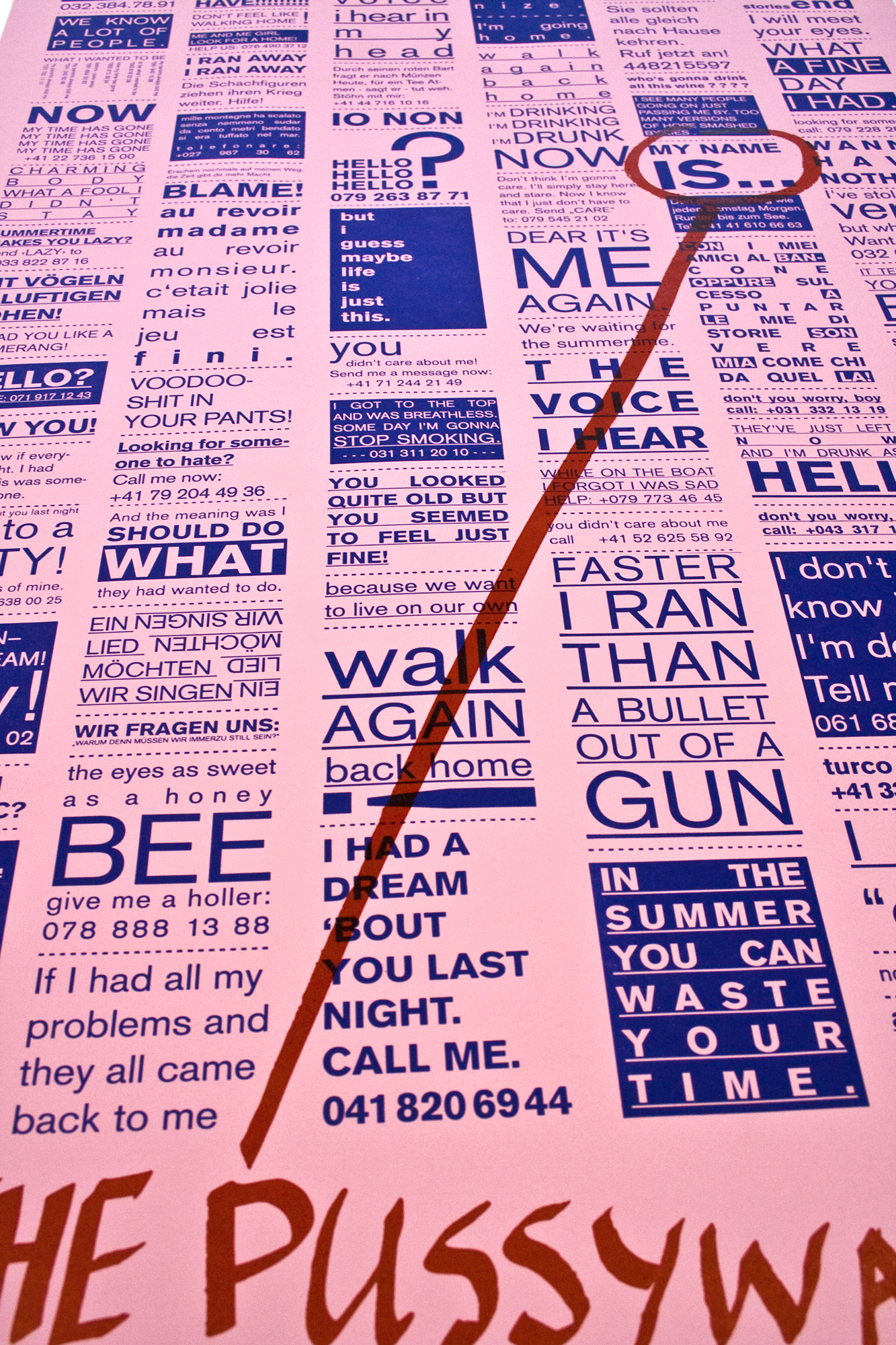
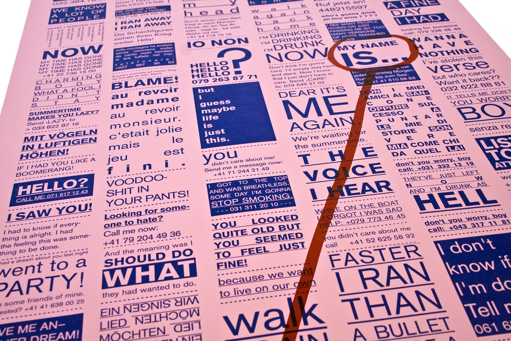
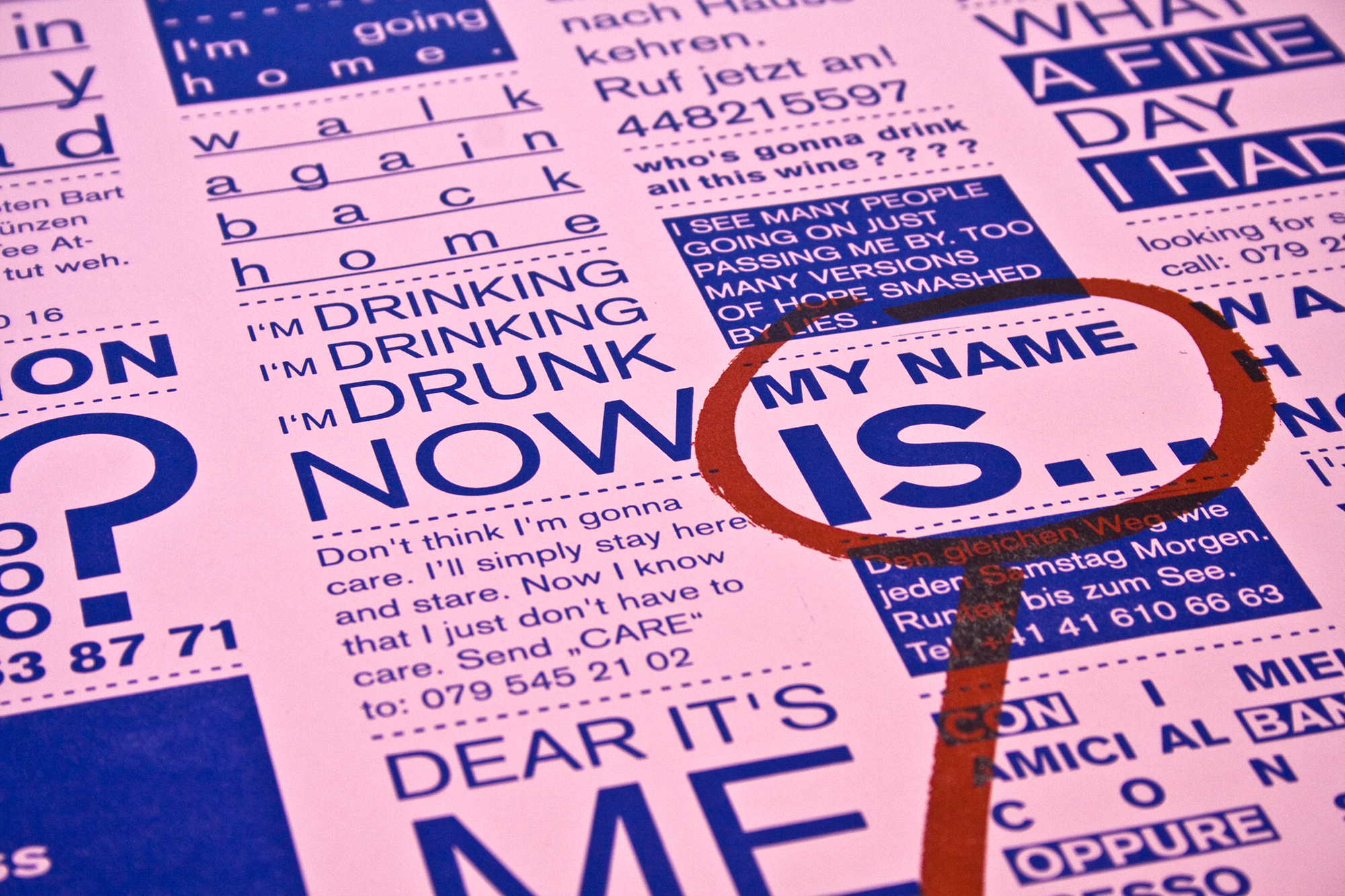
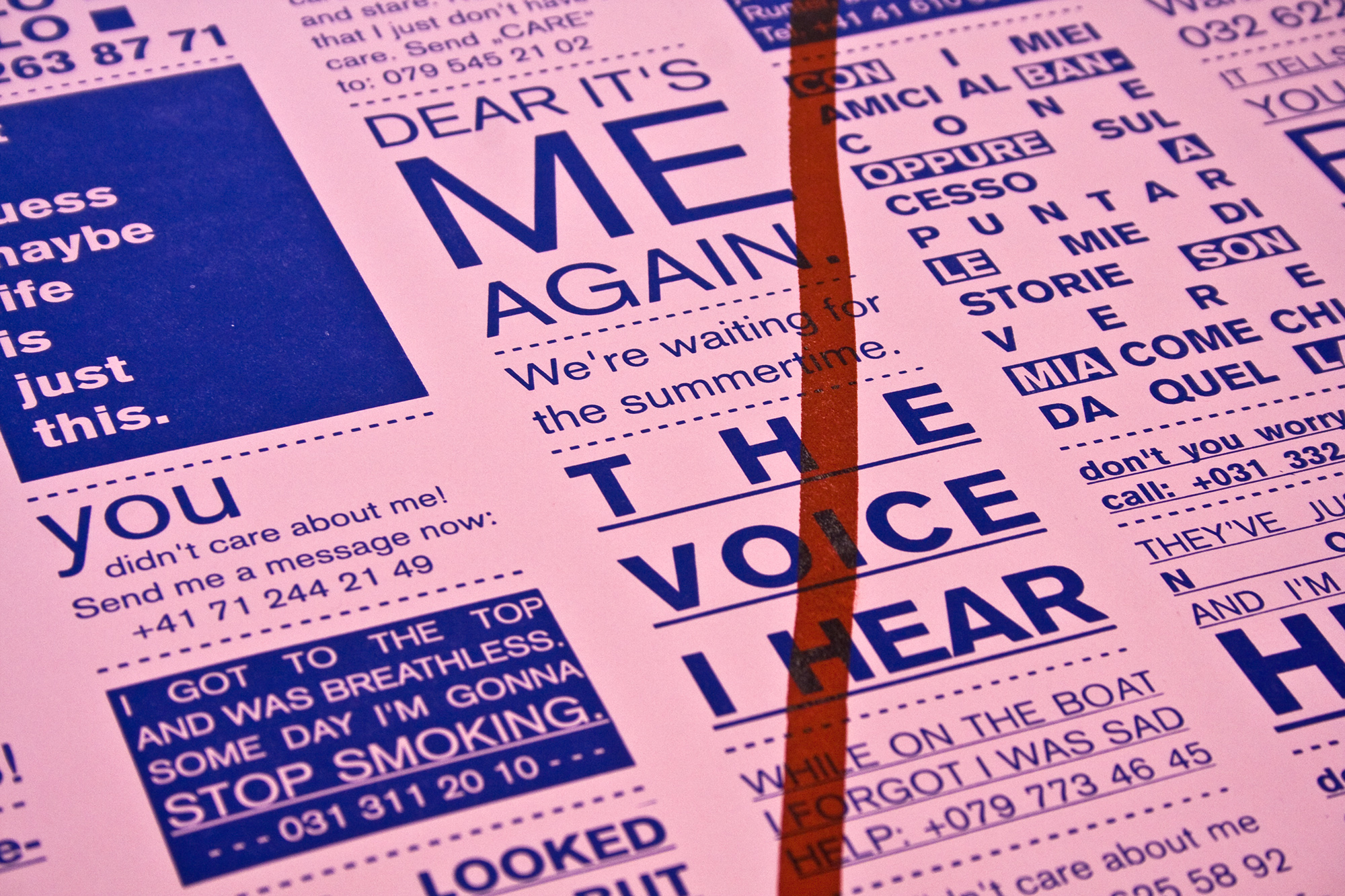
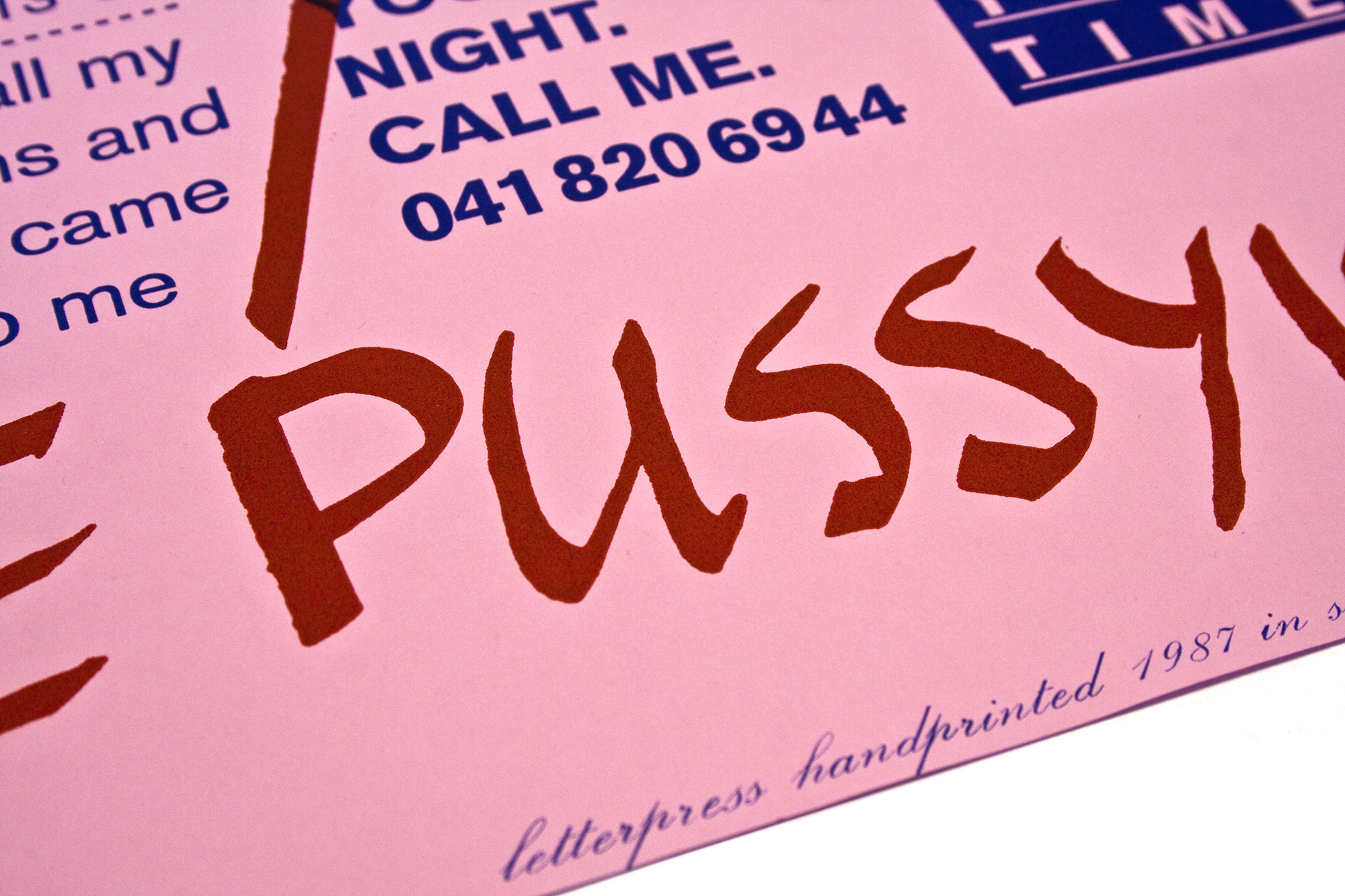
The Pussywarmers
2c letterpress posters for the Pussywarmers. I used extracts from Pussywarmers lyrics to layout them like cheap newspaper ads using just one font in two weights. By giving the lyrics a new context, they lead to interesting new associations.
These merchandise posters don’t have a specific show date. The Pussywarmers just asked me to do a poster for them to sell after the concerts. Everything is printed from photopolymer plates exept for the number and the tagline printed from metal type.
Client: The Pussywarmers, Lugano
Format: 53×88cm
Paper: Plano Color, 80g/m2
Edition: 120 posters on a FAG Control 900
April 2010
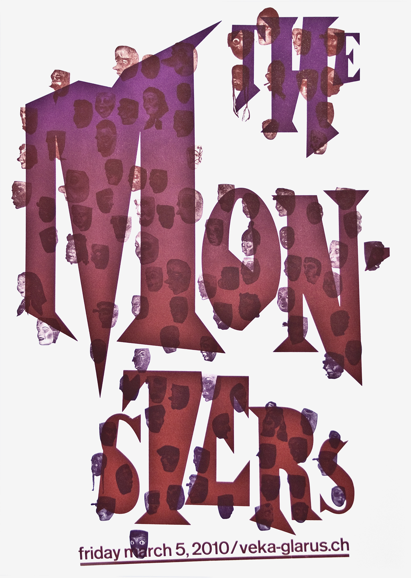
The Monsters
2c letterpress posters for a concert of the Swiss punk trash legends ‹The Monsters› at veka-glarus.ch . Two reversed 2c splitfountain prints. Printed from lasercut linoleum and some old magnesium plates I got from a printmaker.
About two years ago I got 500 small photoplates of carneval masks and faces. I always thought of printing a poster with them. Finally I did it… haha. I printed about 30 prints on newsprint 50g/m2, another 15 on munken 160g/m2. Printed on a Vandercook Uni IV. The first edition of 50 posters has been sold out in 2010, so I printed a second edition of 100 posters in 2011.
Client: Veka-Glarus, Glarus
Format: 59×82.7cm
Paper: Munken Print Cream, 160g/m2
Edition: 50 posters on a Vandercook Universal IV, December 2009
2nd Edition: 100 Posters on a FAG Control 900, January 2011
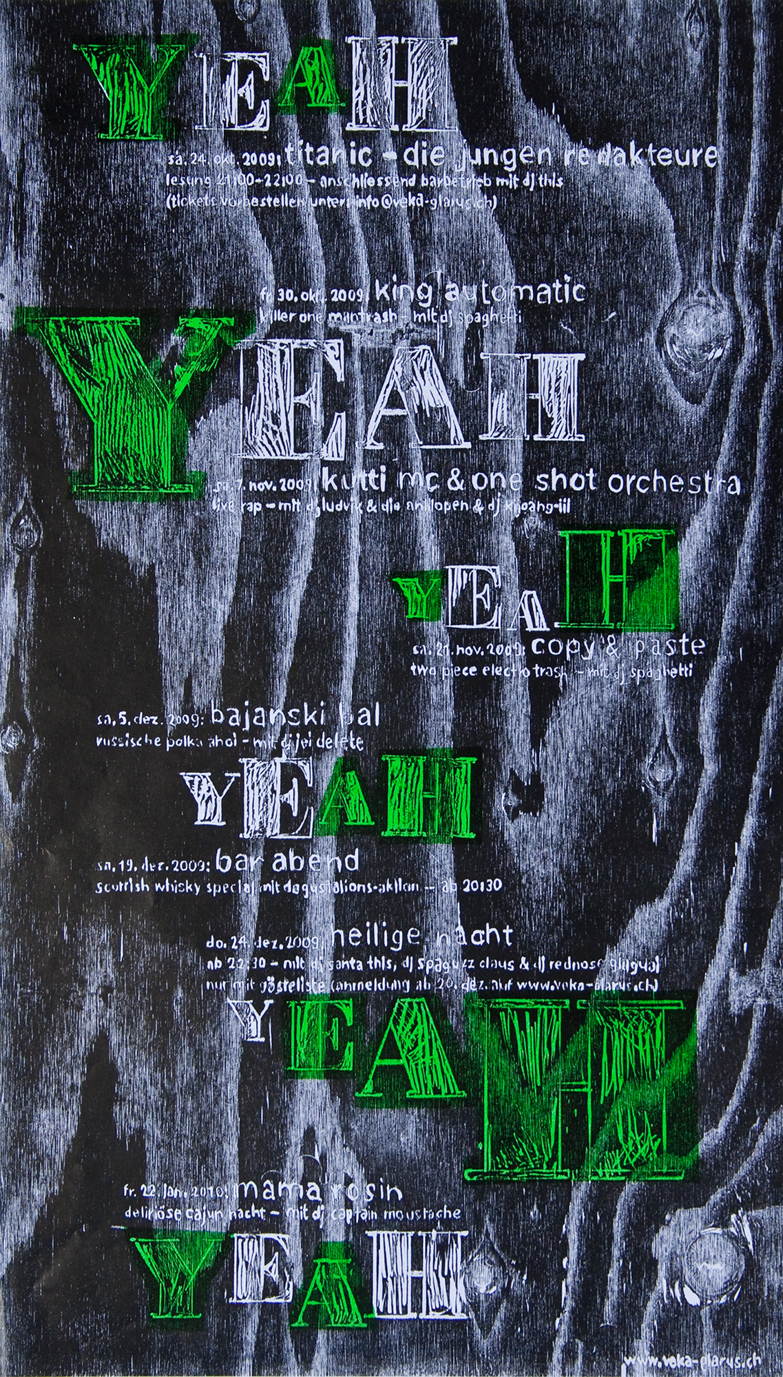
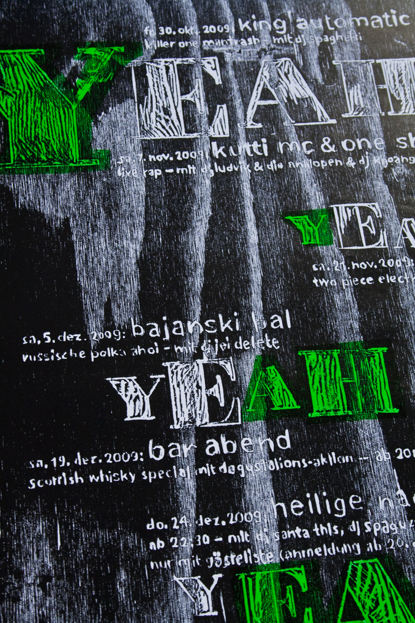
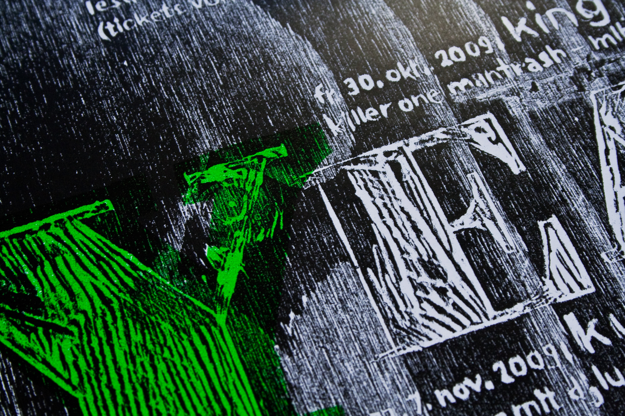
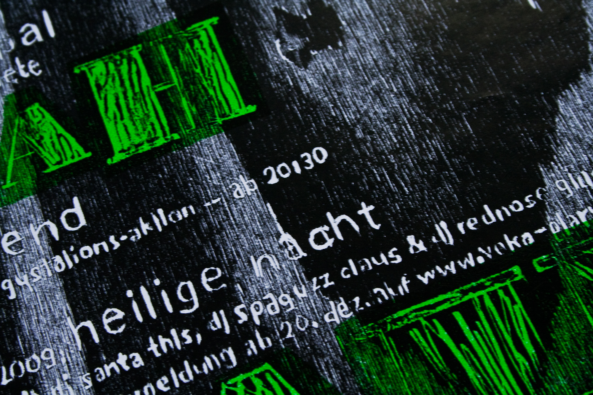
Yeah!
2c letterpress posters for the monthly program for www.veka-glarus.ch. I drew the whole poster on a plywood plate. The impression of the pen was deep enough to print 500 copies.
The first Print was a neon-green lino cut of the highlighted letters. The second print was the plywood plate. I used a glossy paper to give that rough print a very smooth and clean surface. Printed on my ‹FAG Control 405›.
I also printed the same poster just in black on a large Vandercook Uni IV. 47cm x 79cm!
Client: Veka-Glarus, Glarus
Format: 32×55cm and 47×79cm
Paper: Mega Gloss, 80g/m2
Edition:500 posters on a FAG Control 405
October 2009
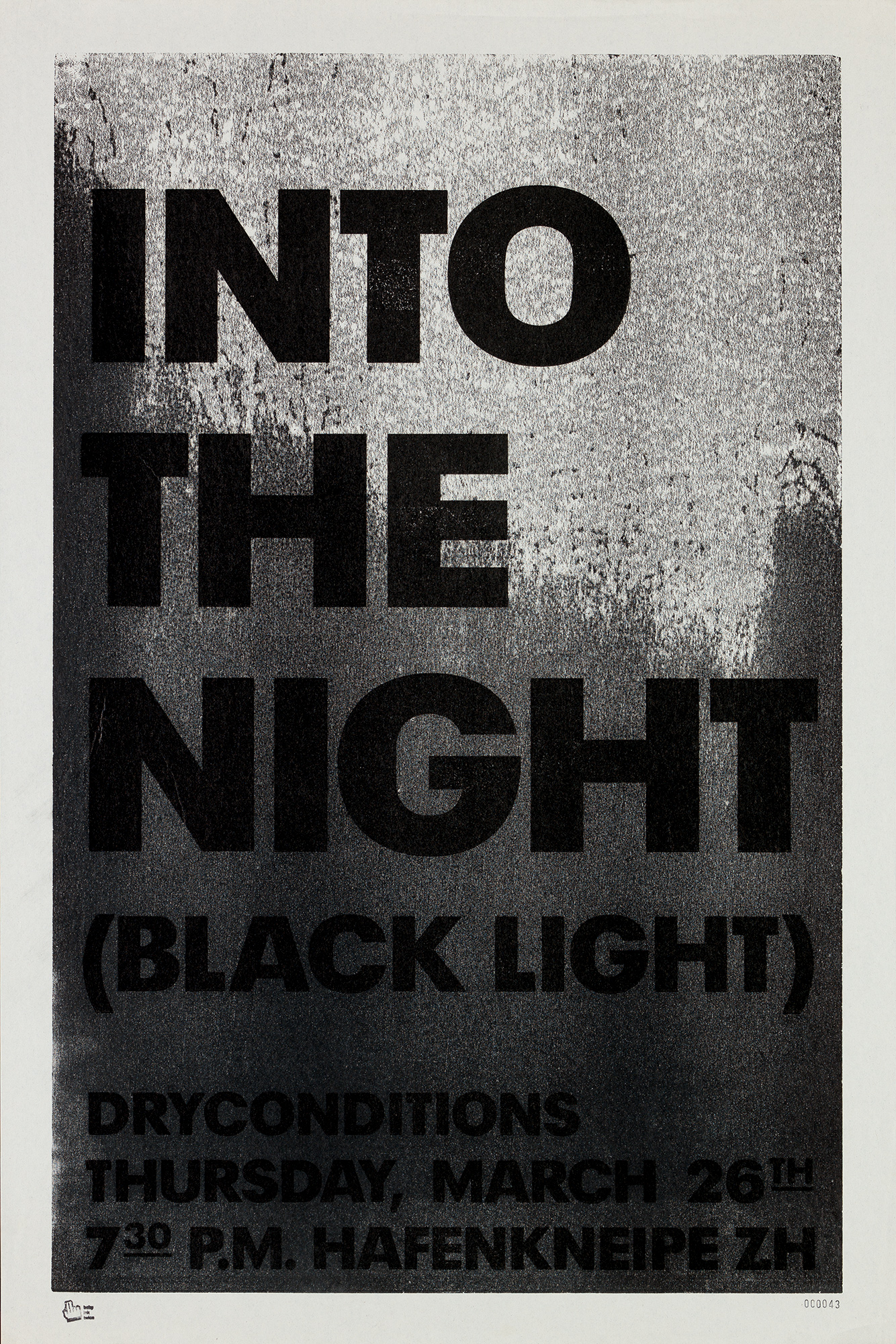
Into the night
2c letterpress poster for a cd release. Printed glossy black on matt black from lasercut MDF woodblocks. Bon Jovi did it ‹BACK to BACK› with Richie Sambora! Dryconditions do it ‹BLACK on BLACK›… Haha
The first block was a massive mdf woodblock. On one side I put some paper underneath the block to get an uneven impression. This gives me that weird gradation on the first print. After I let them dry for about 12hours, I powdered them to take off the gloss on that first print. Then I printed the black typography which now appears glossy on the matte background. Yes!
Client: Dry Conditions, Zürich
Format: 40×65cm
Paper: Newsprint, 62g/m2
Edition: 50 posters on a Schneider Proof Press0
March 2009
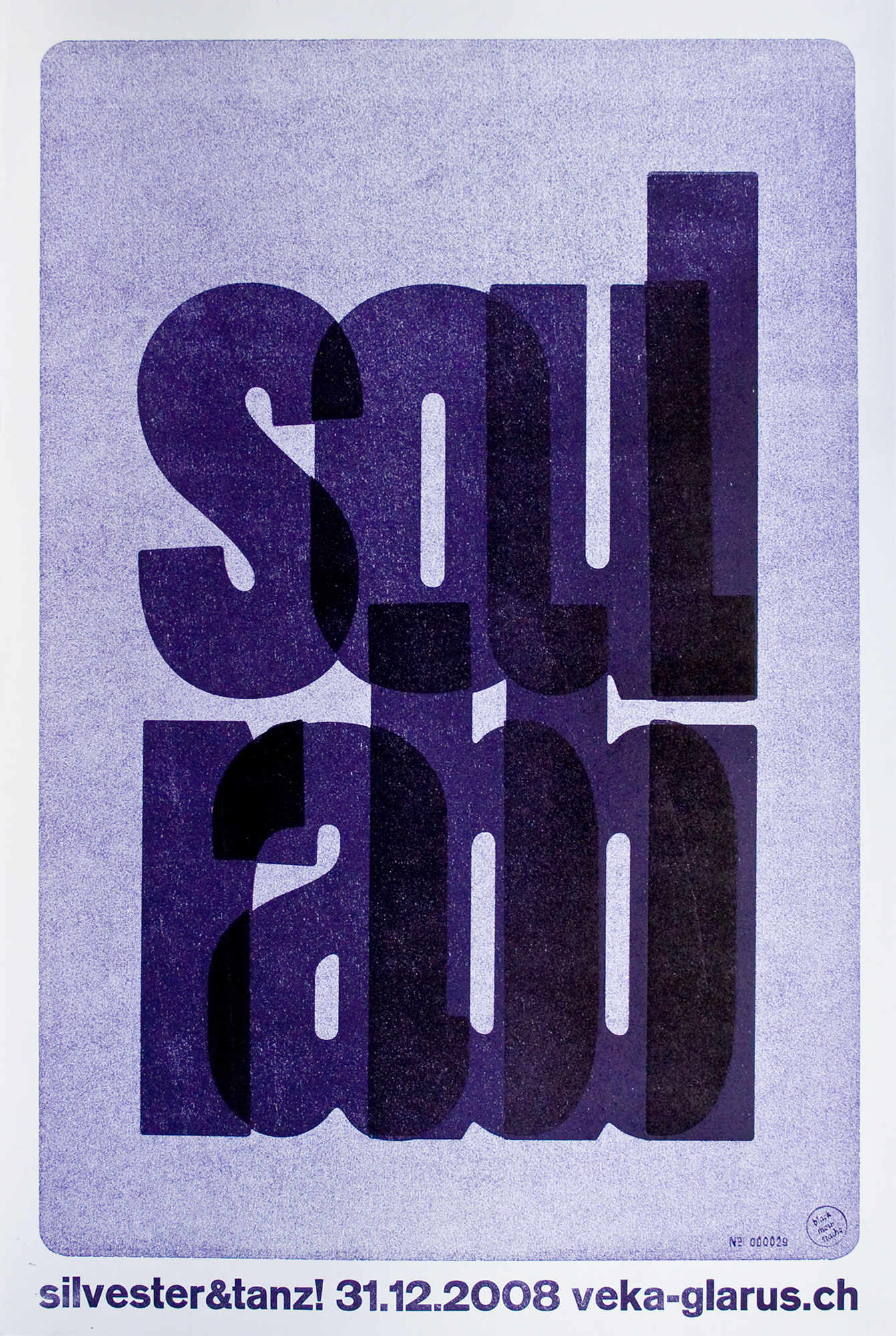
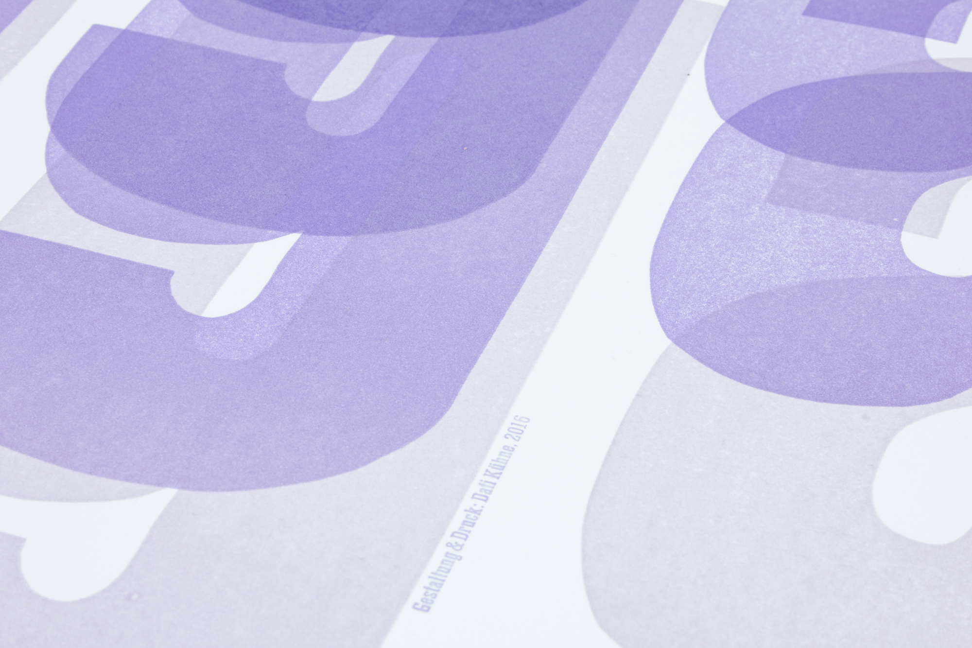
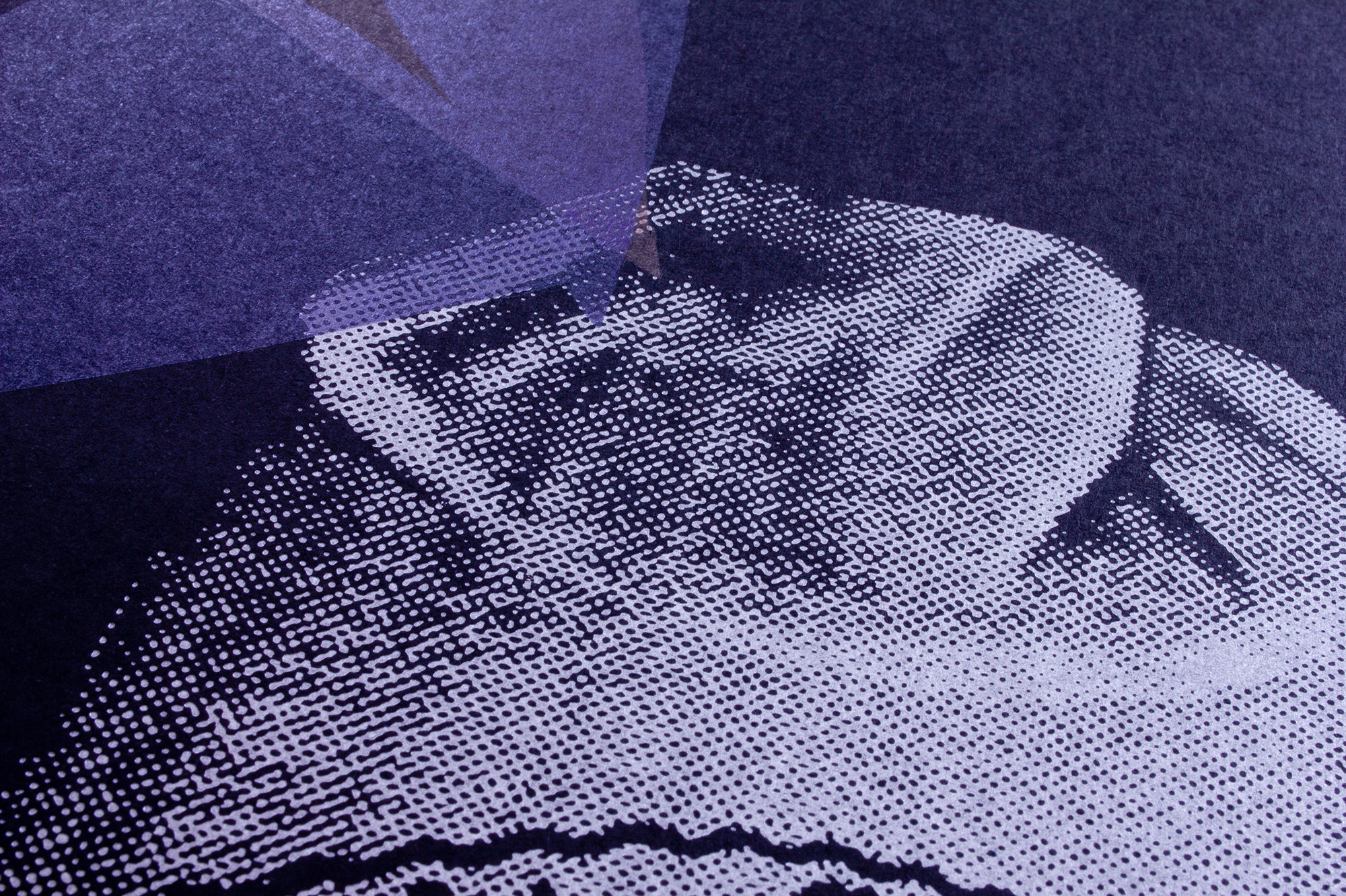
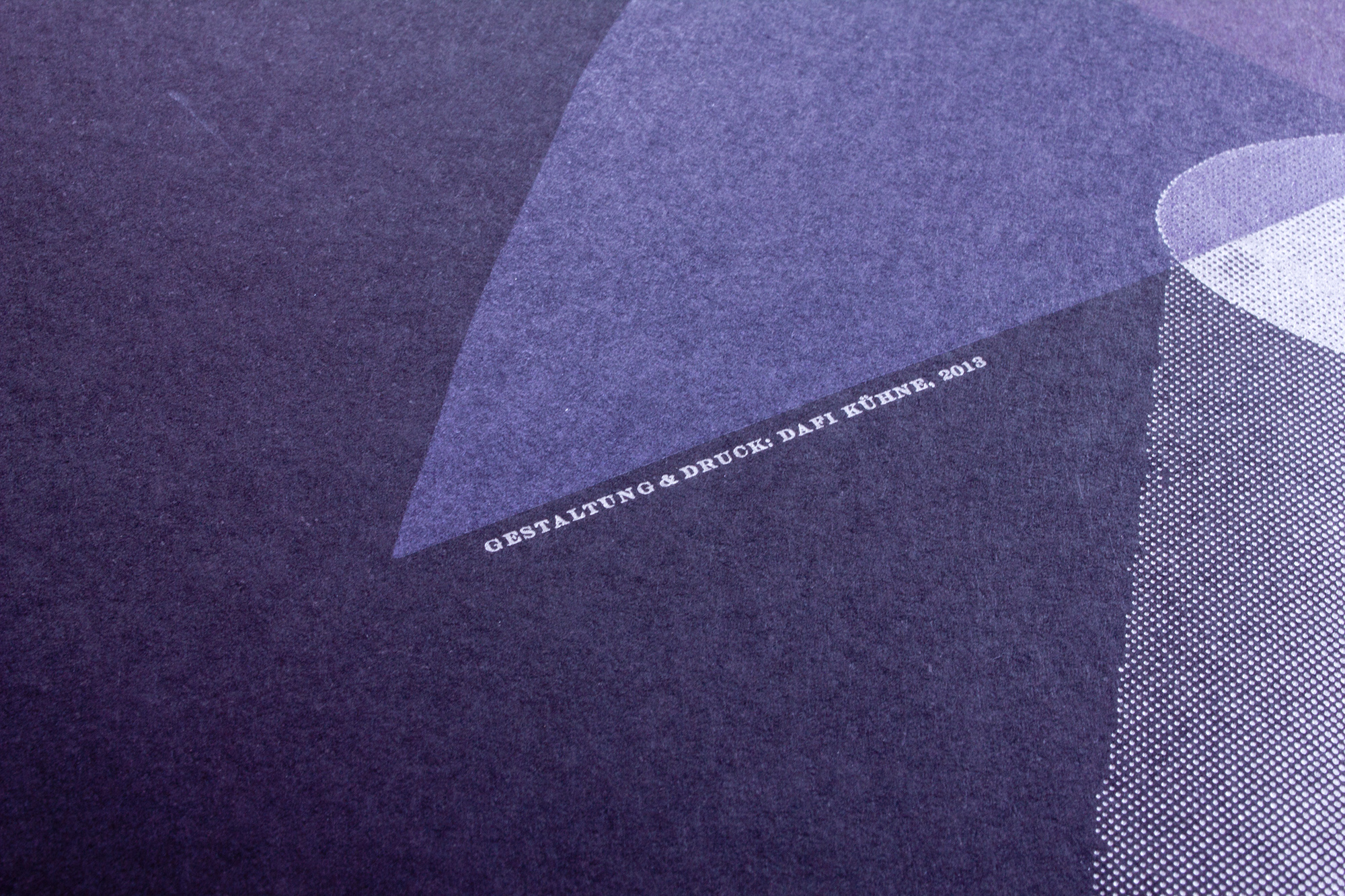
Soul Rabbi
3c purple letterpress posters for a new year’s party at veka-glarus.ch. Printed from MDF and plywood blocks. Since it was not possible to print anyway, the overlapping of the letters was completely faked.
The first print was a full block MDF plate. The second was the type including the overlapping. The third print was just the overlapping parts. I printed the first colour with less pressure, then added a little more pressure and ink for the second and the third print.
Client: Veka-Glarus, Glarus
Format: 40×70cm
Paper: Munken 120g/m2
Edition: 100 posters on Schneider Proof Press
December 2008